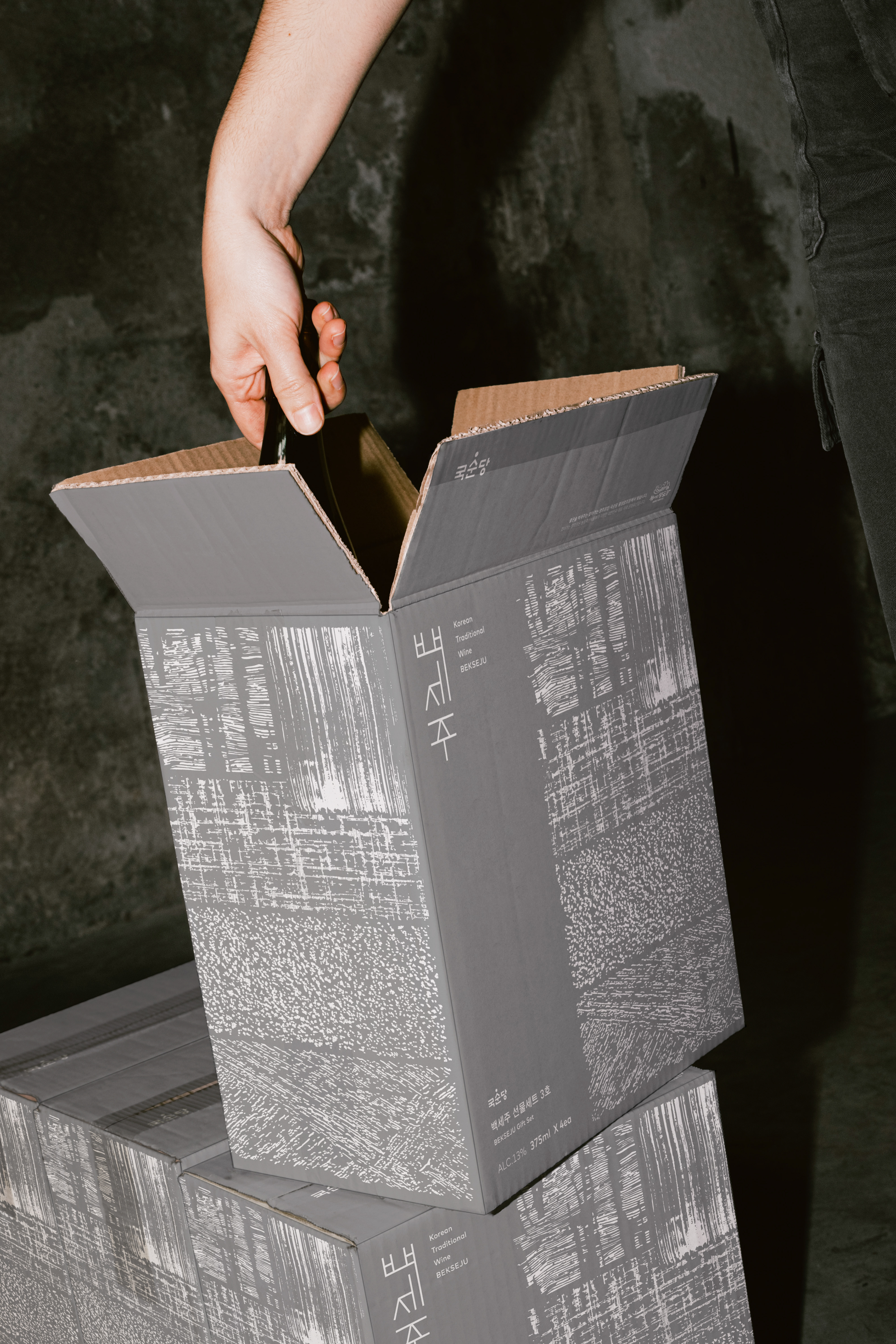
CFC redesigned the visual identity of Bekseju, a signature liquor of Kooksoondang. The project began with a fundamental change: replacing the transparent bottle with an amber one. However, the most significant transformation lies in the philosophy embodied in the label design. While the previous design conveyed humor inspired by traditional folklore, the new design focuses on the enduring spirit of Bekseju, which has been faithfully preserved for 32 years, and incorporates elements of Korean aesthetics.
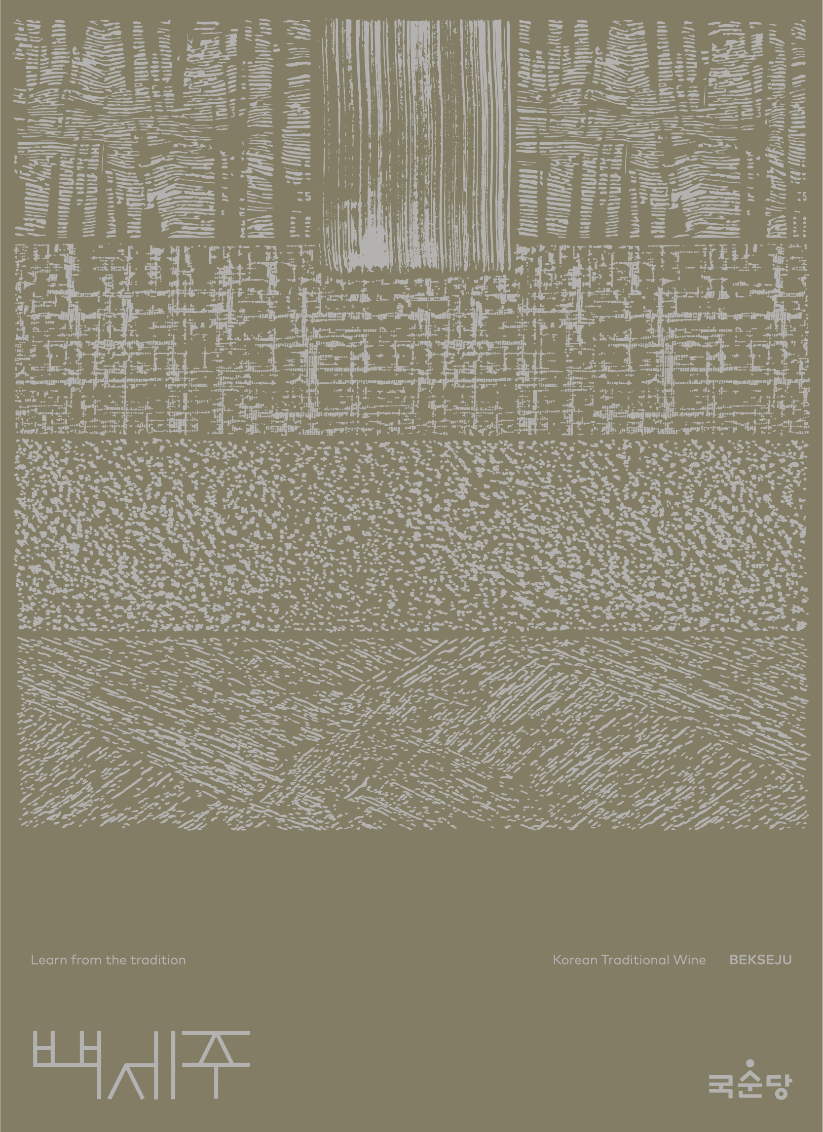
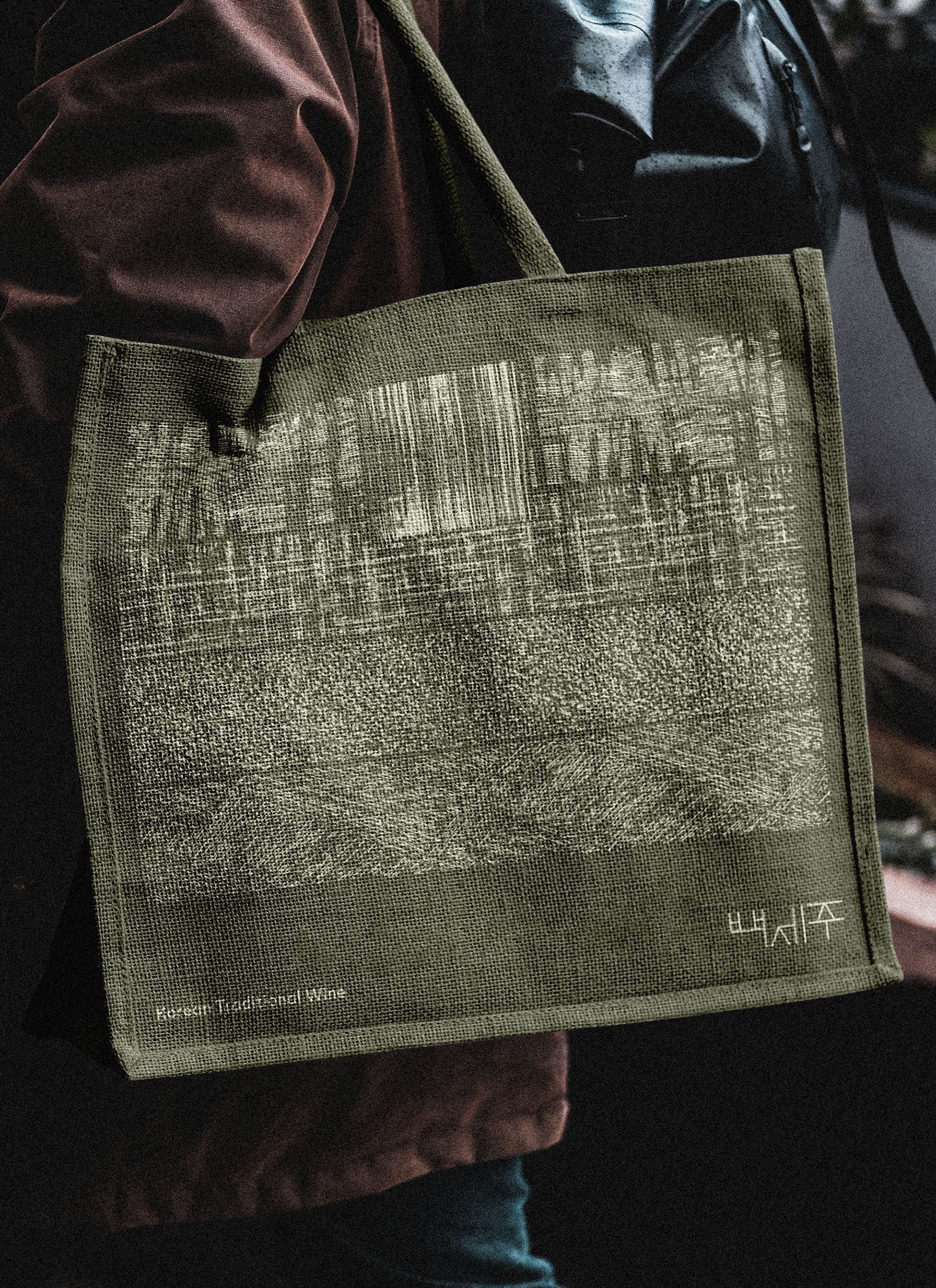
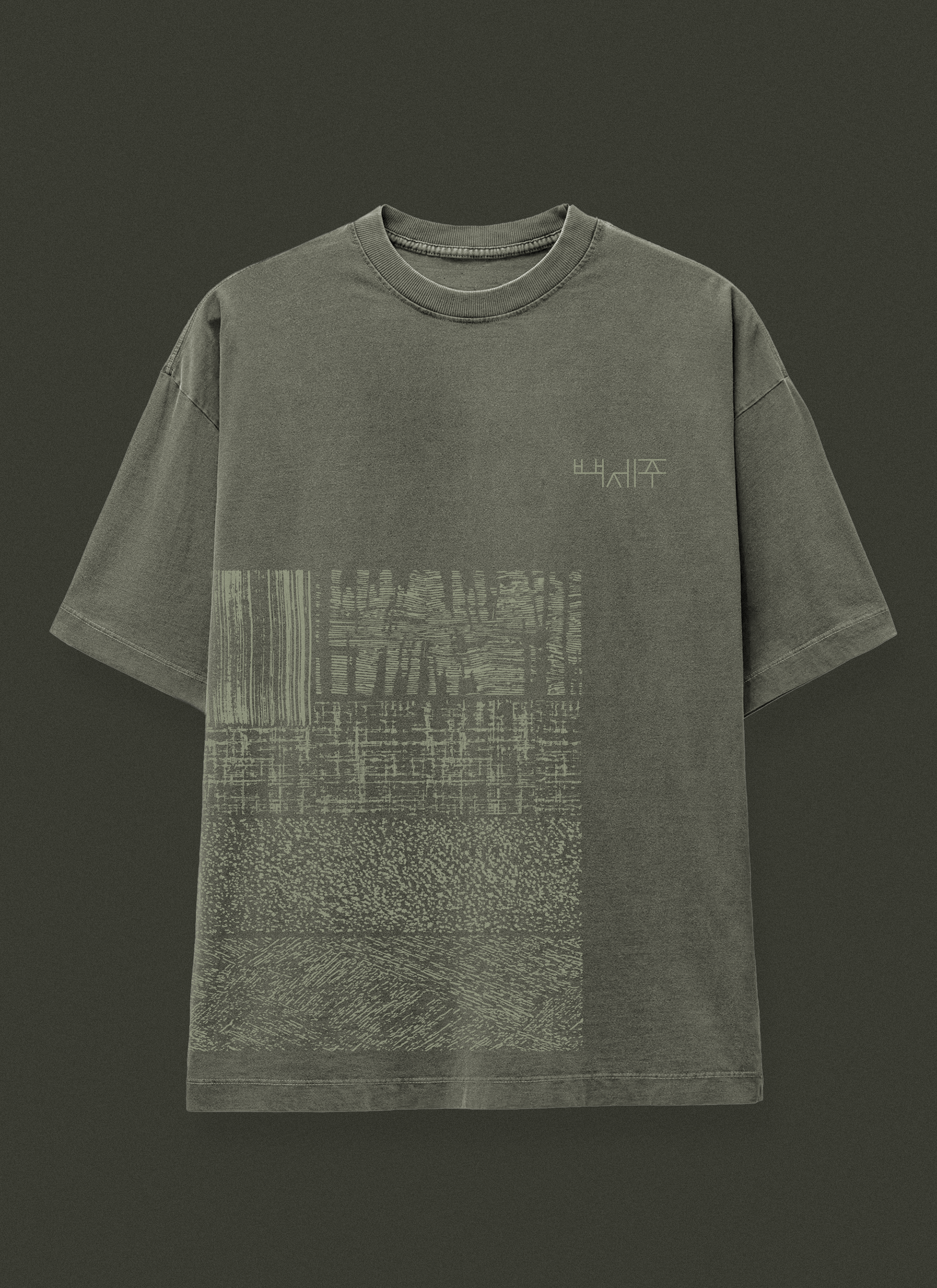
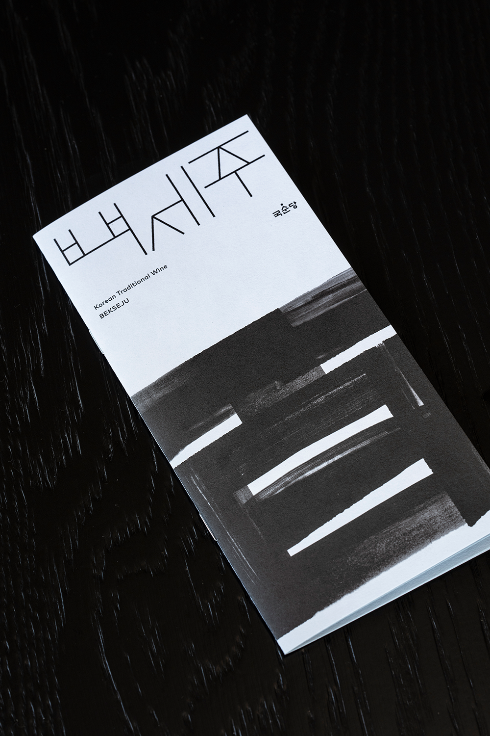
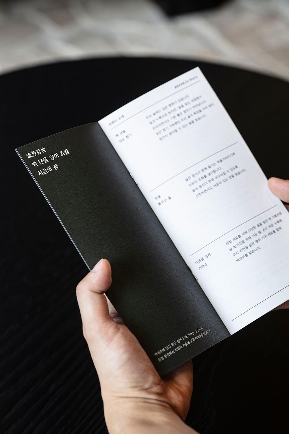
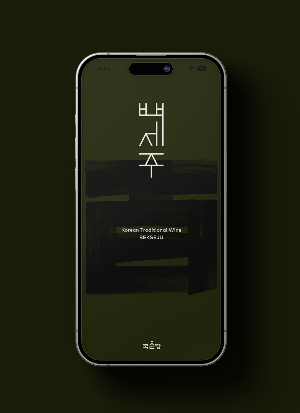
Drawing inspiration from the natural beauty and tactile quality seen in Korean monochrome paintings, CFC reinterpreted the Chinese character "百" (Bek) through texture and imagery, placing it prominently on the label. The bold brushstrokes and their nuanced contrasts poetically reflect the spirit of Kooksoondang and the natural surroundings of the Jucheon River area, home to its brewery. The bold "百" character is juxtaposed with a delicate and structured Korean logotype, which conveys the brand's understated sophistication. The lines of the Korean logotype serve as a foundational layout system, while the "百" graphic expands into a pattern reflecting the textures of nature.
This project sought to infuse the design with the authenticity and dignity embodied in Bekseju, creating a visual representation of the brand’s ethos.






Bekseju Renwal
2024
Client: Kooksoondang
-
Project Team
PM: Kooksoondang Marketing Team
Brand Strategy: Bemyguest
Design: CFC, Kooksoondang Design Team
Product Photography: Pilmo Studio
-
CFC
Art Direction: Charry Jeon
Design: Charry Jeon, Hyungseok Lim, Seoin Song, Seoyoung Lee, Junghun Lim
www.comtentformcontext.com

