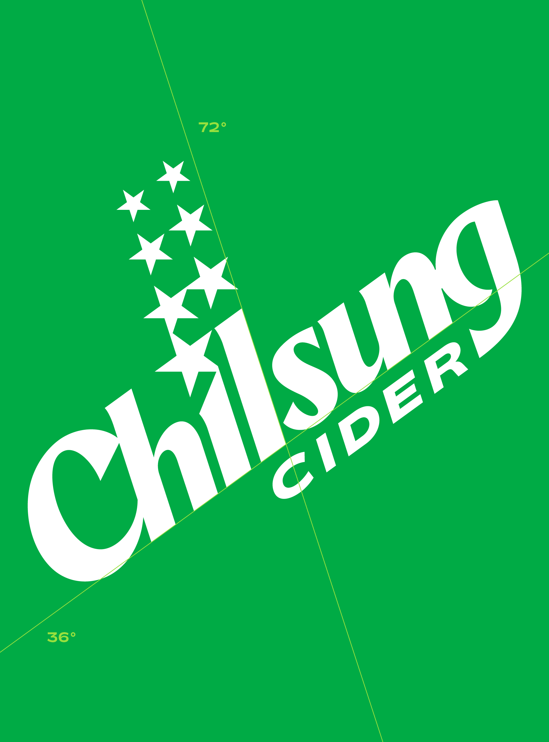
CFC redesigned Chilsung Cider in 2024 to modernize its iconic image, which has resonated with generations of consumers for 73 years. Our goal was to bring a sense of freshness to the brand while preserving its timeless identity.
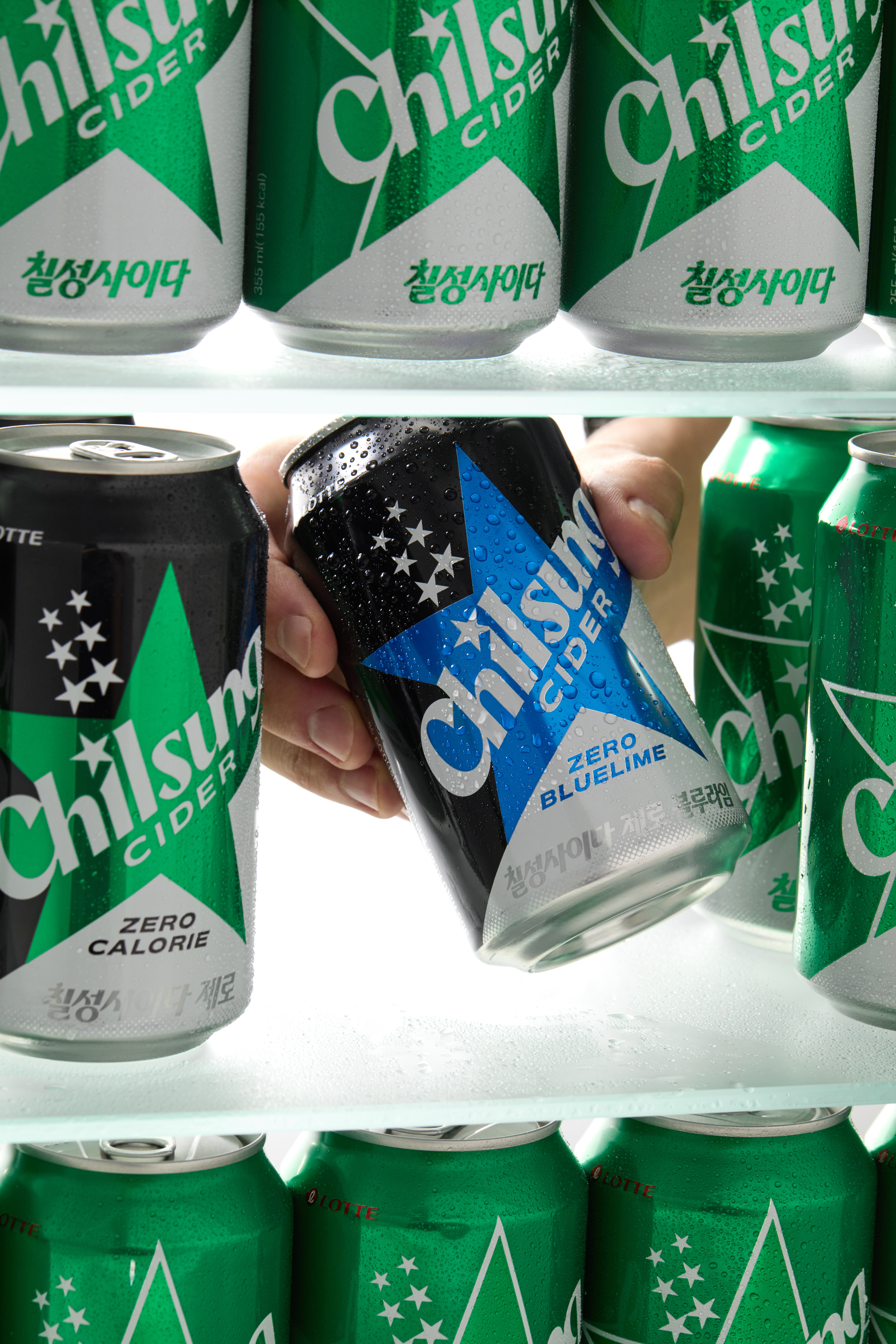
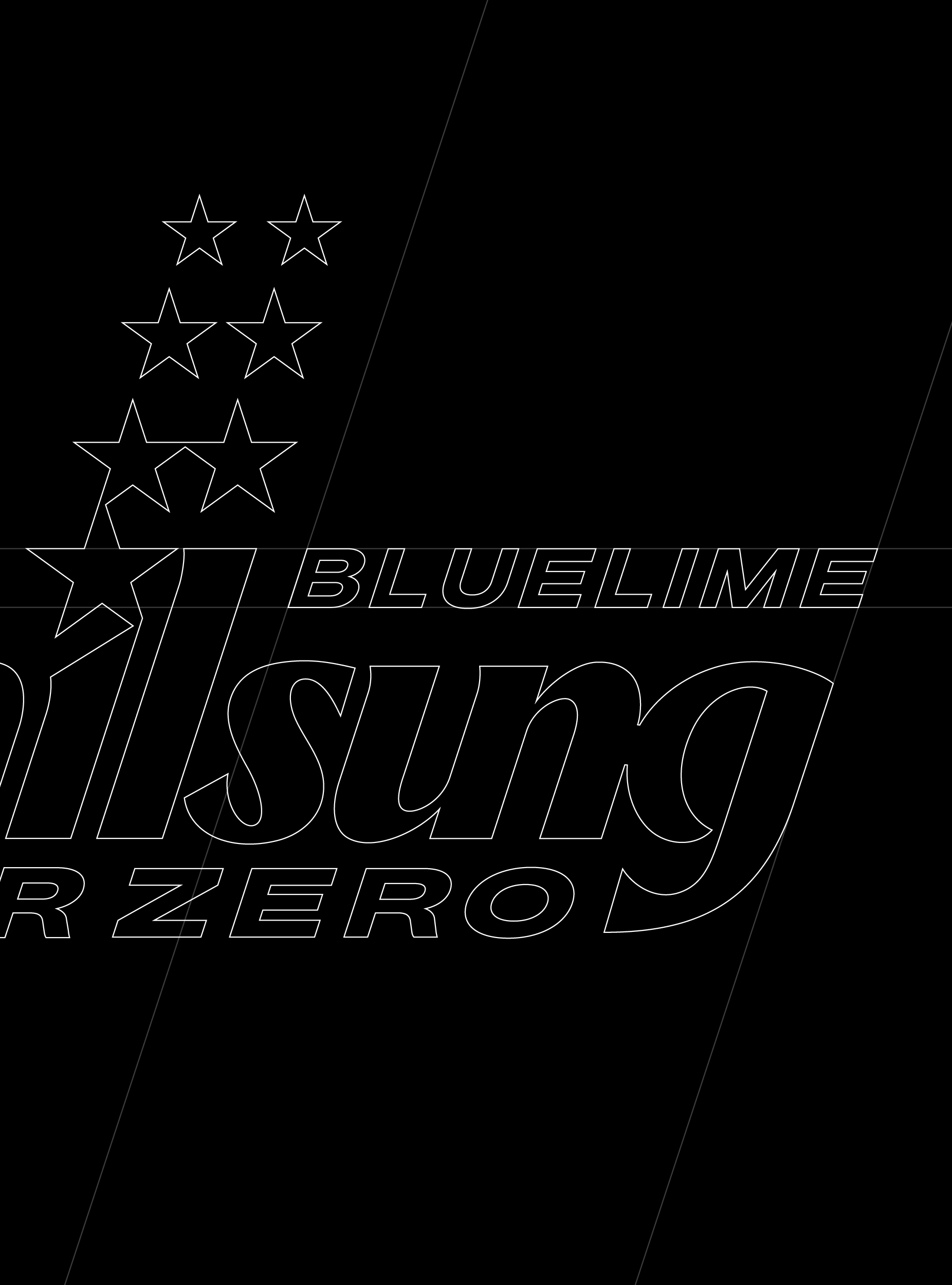
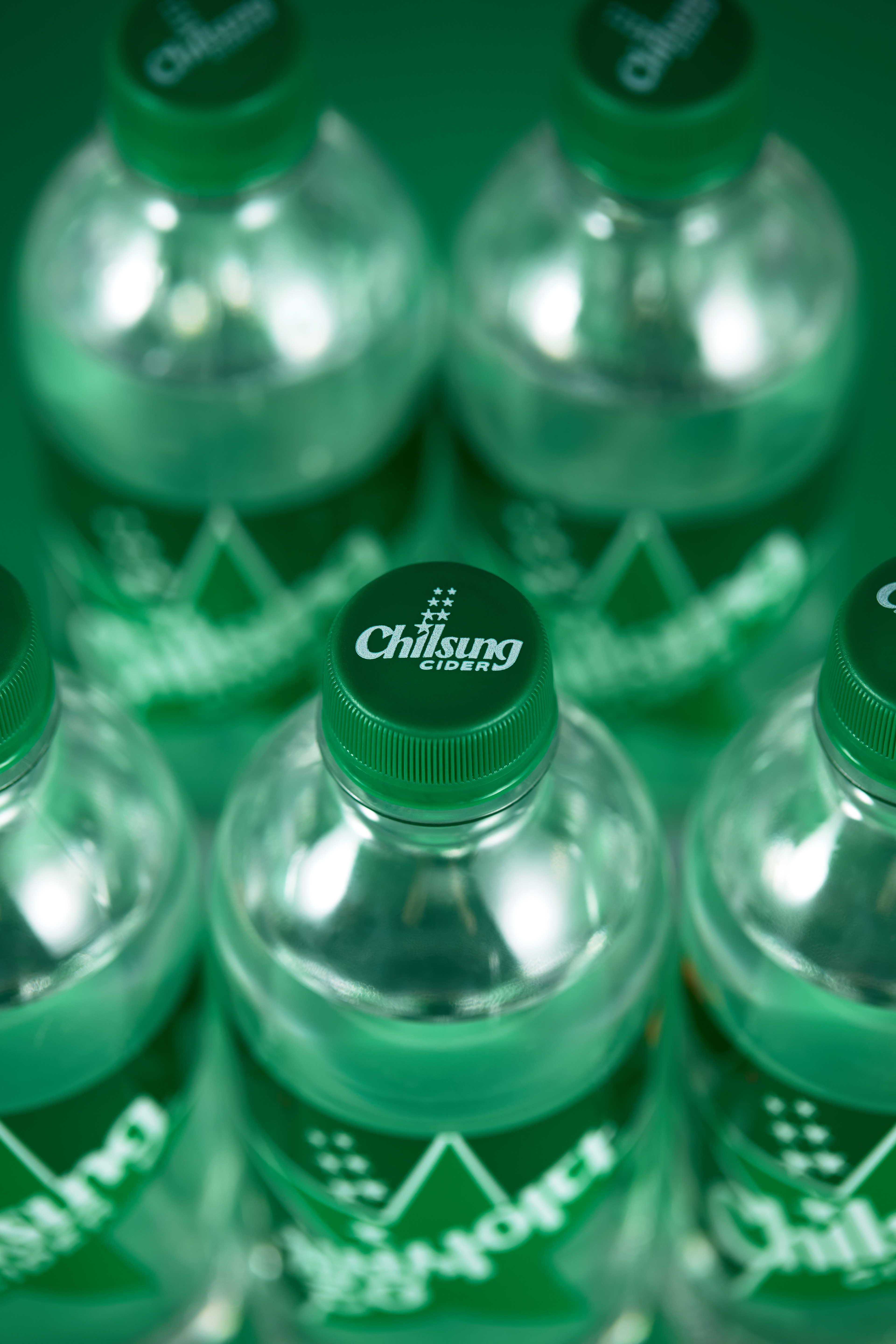
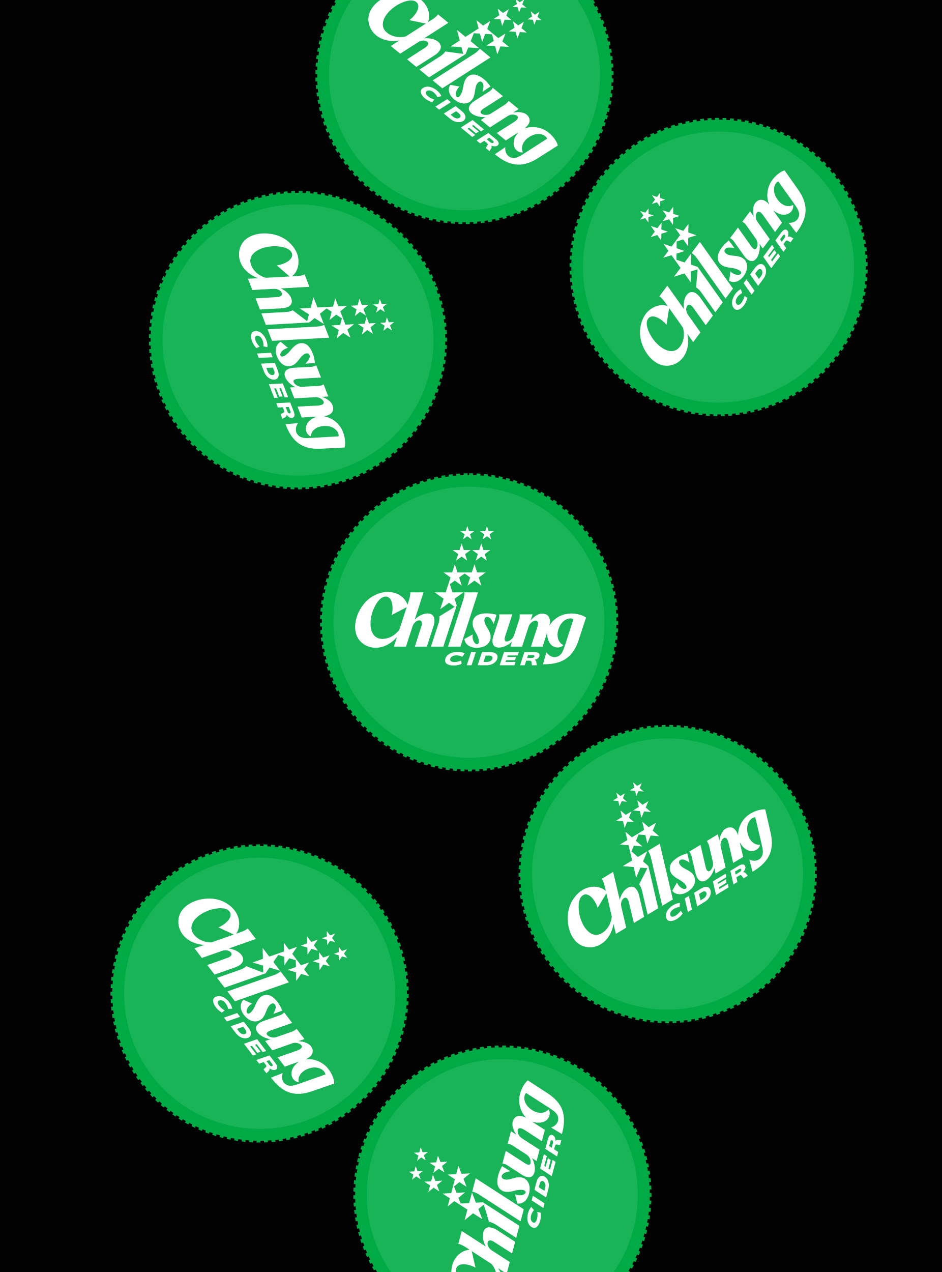
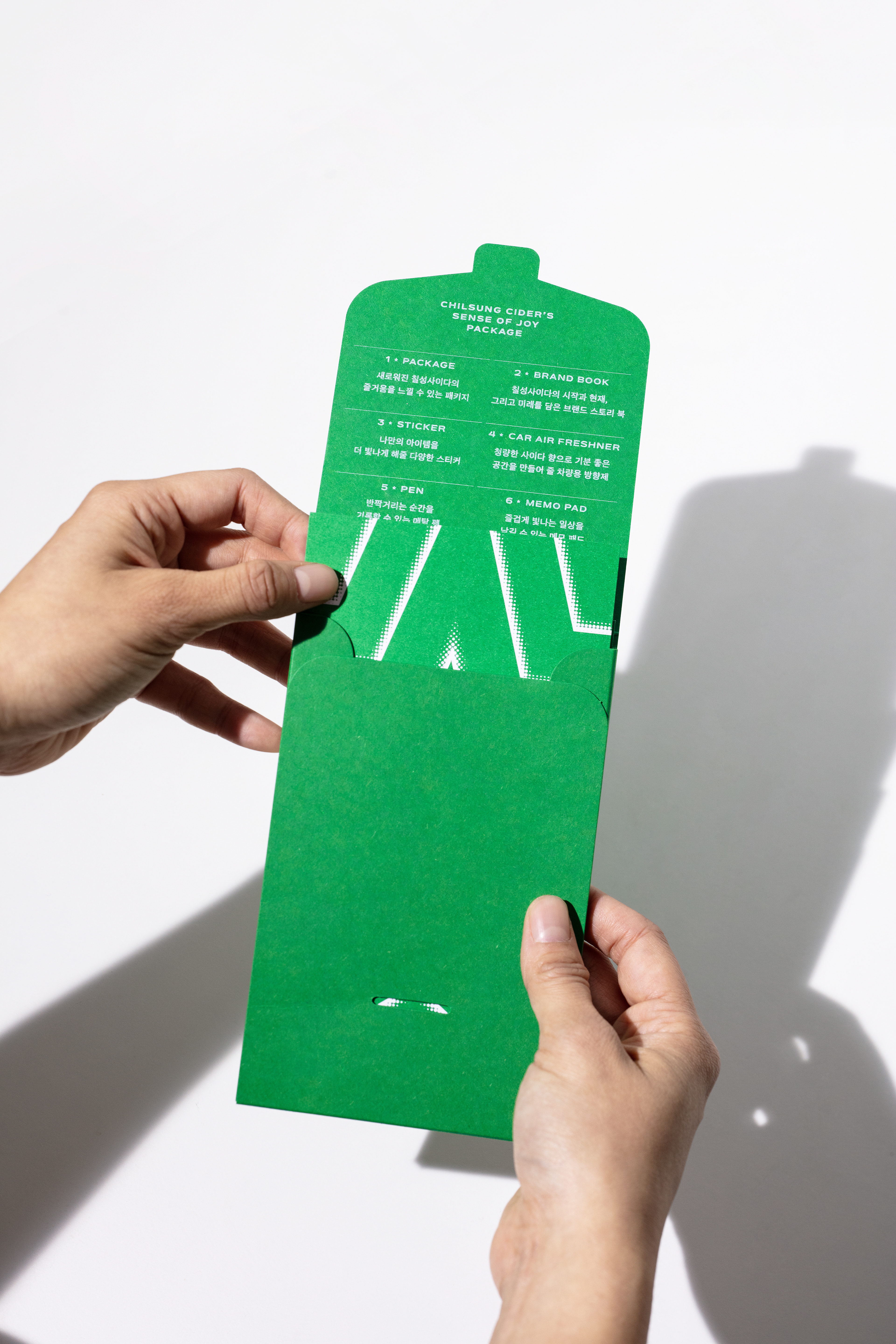
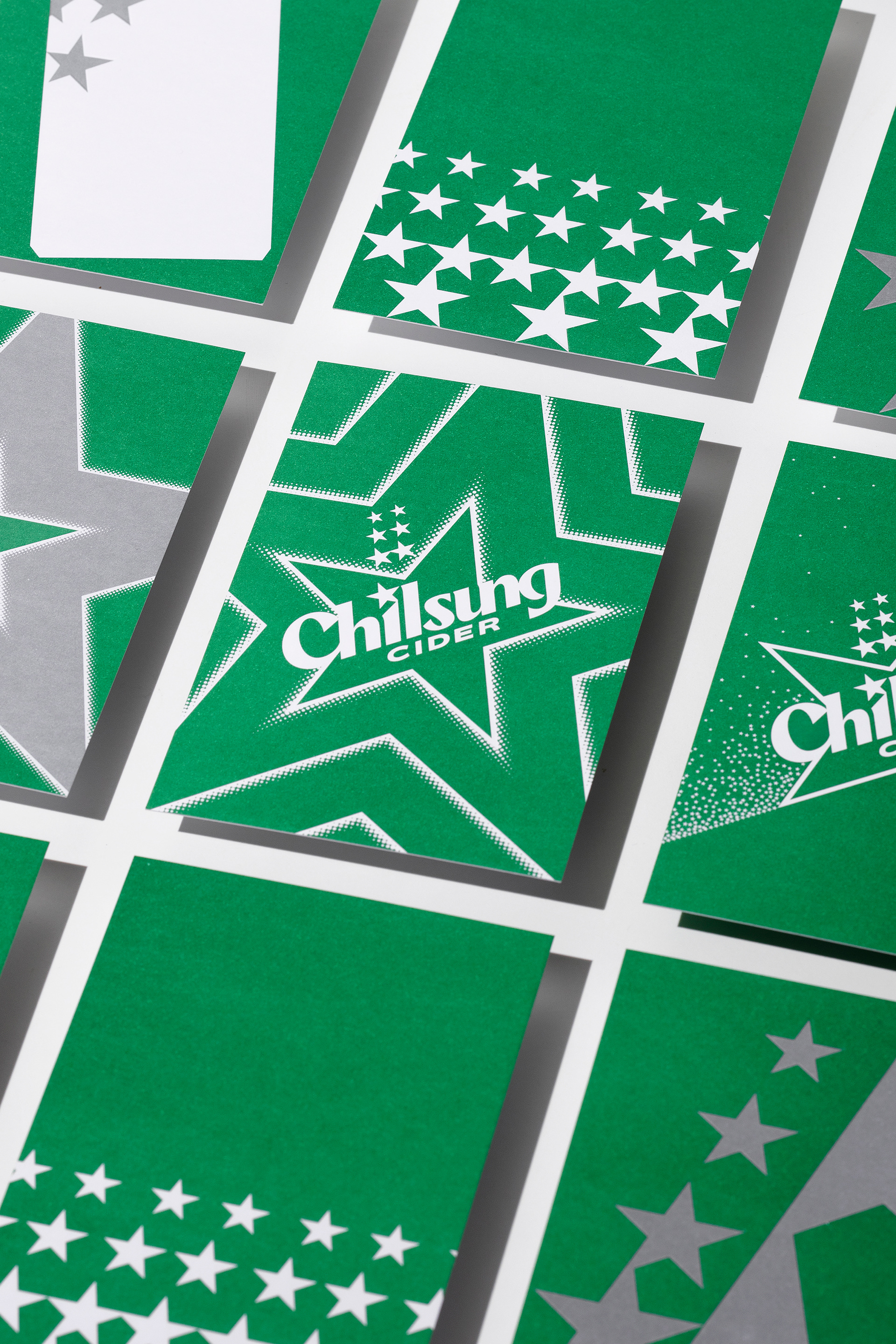
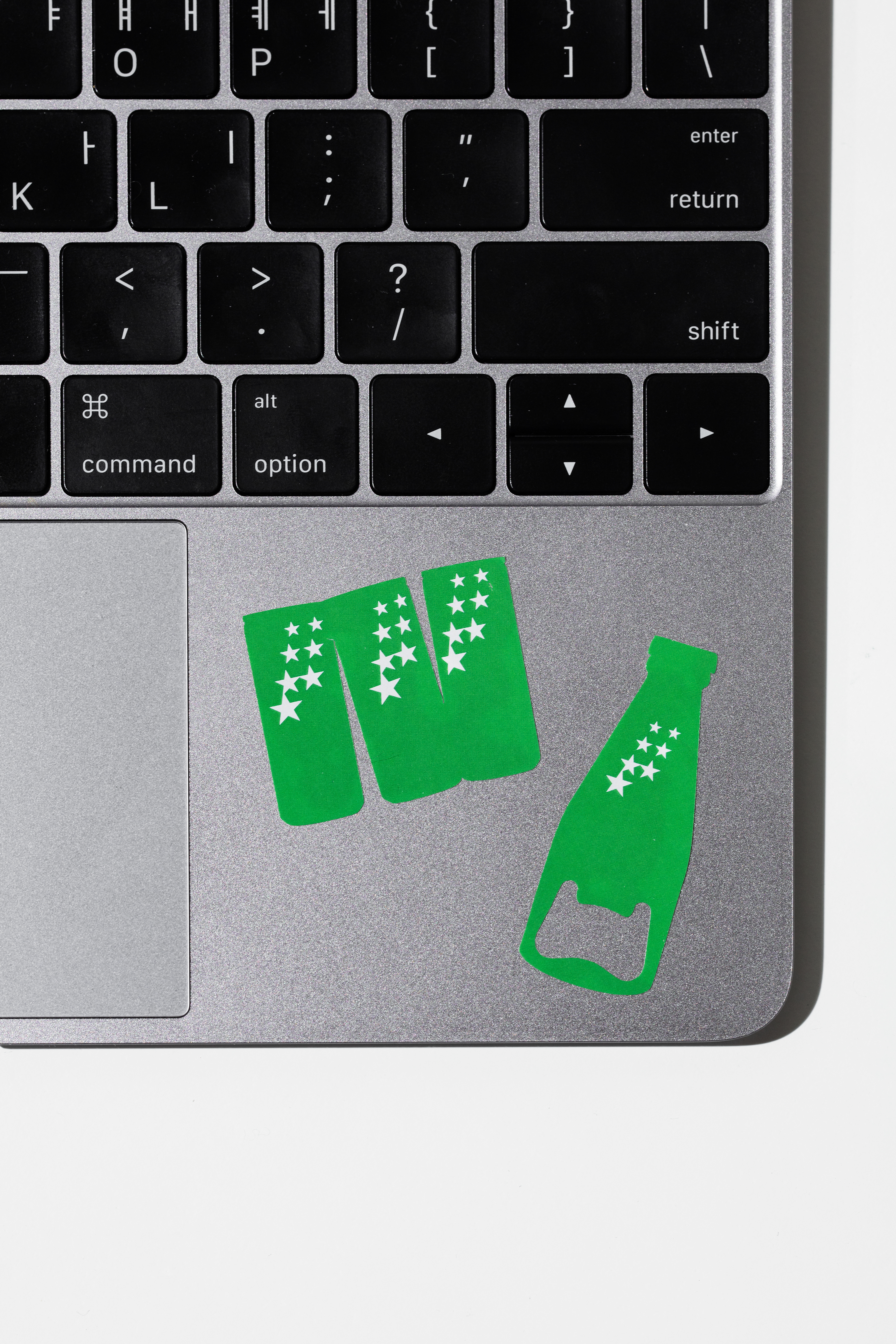
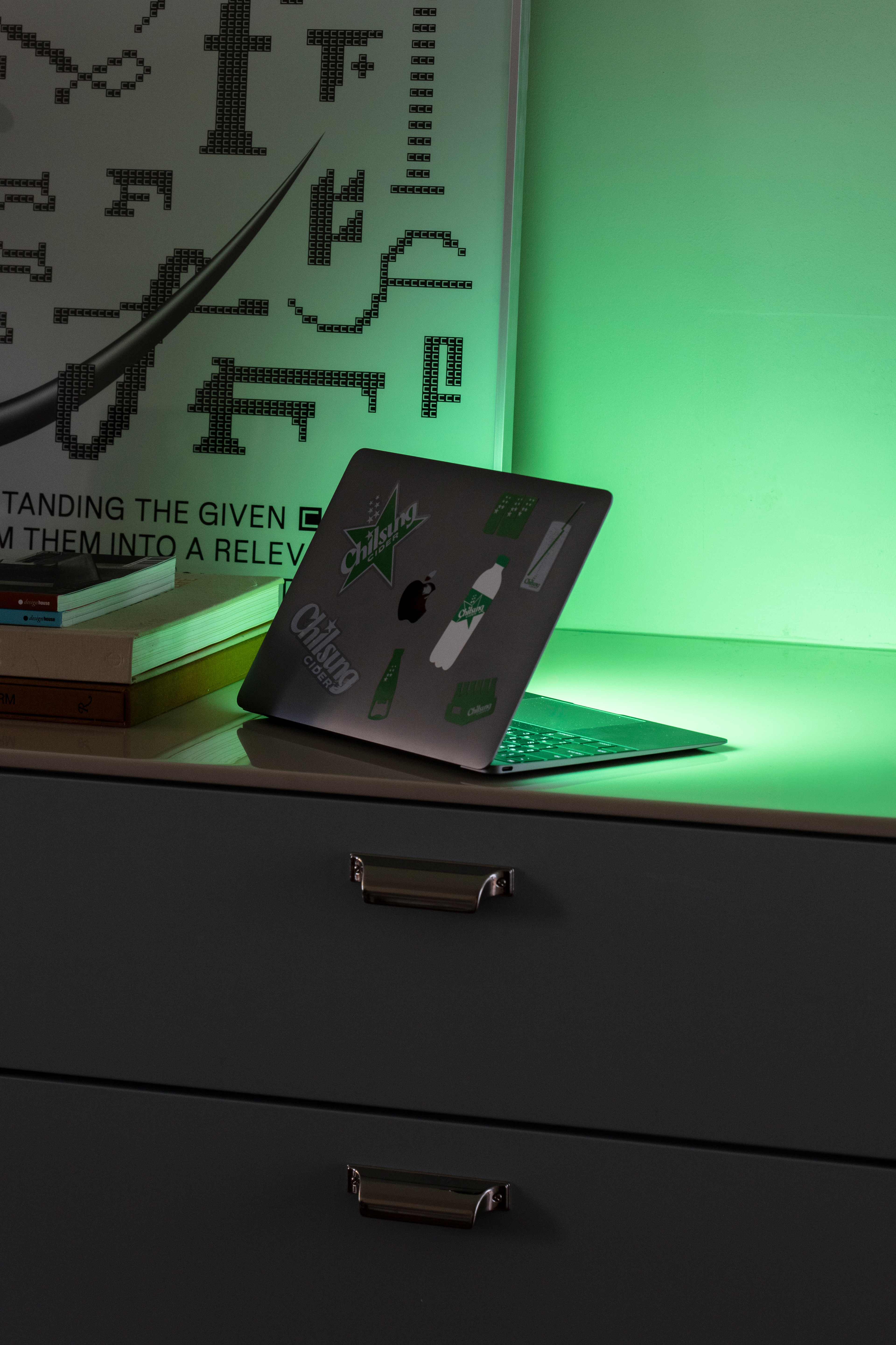
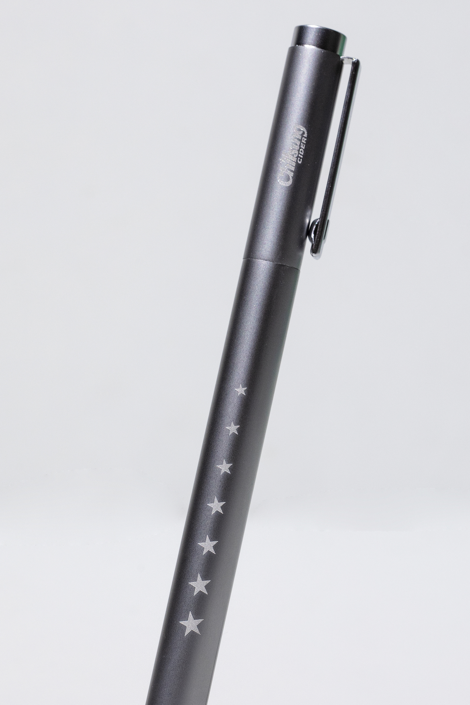
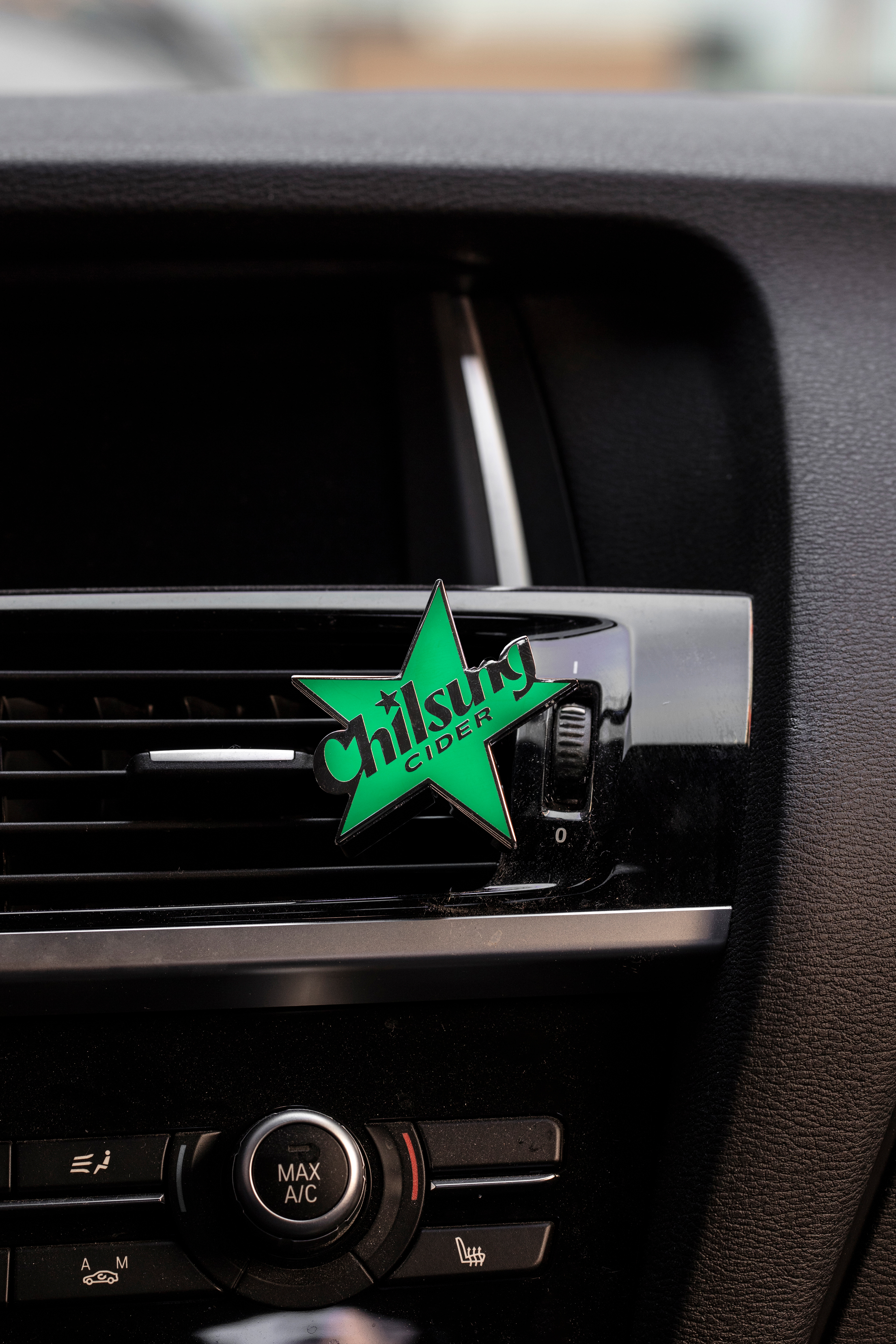
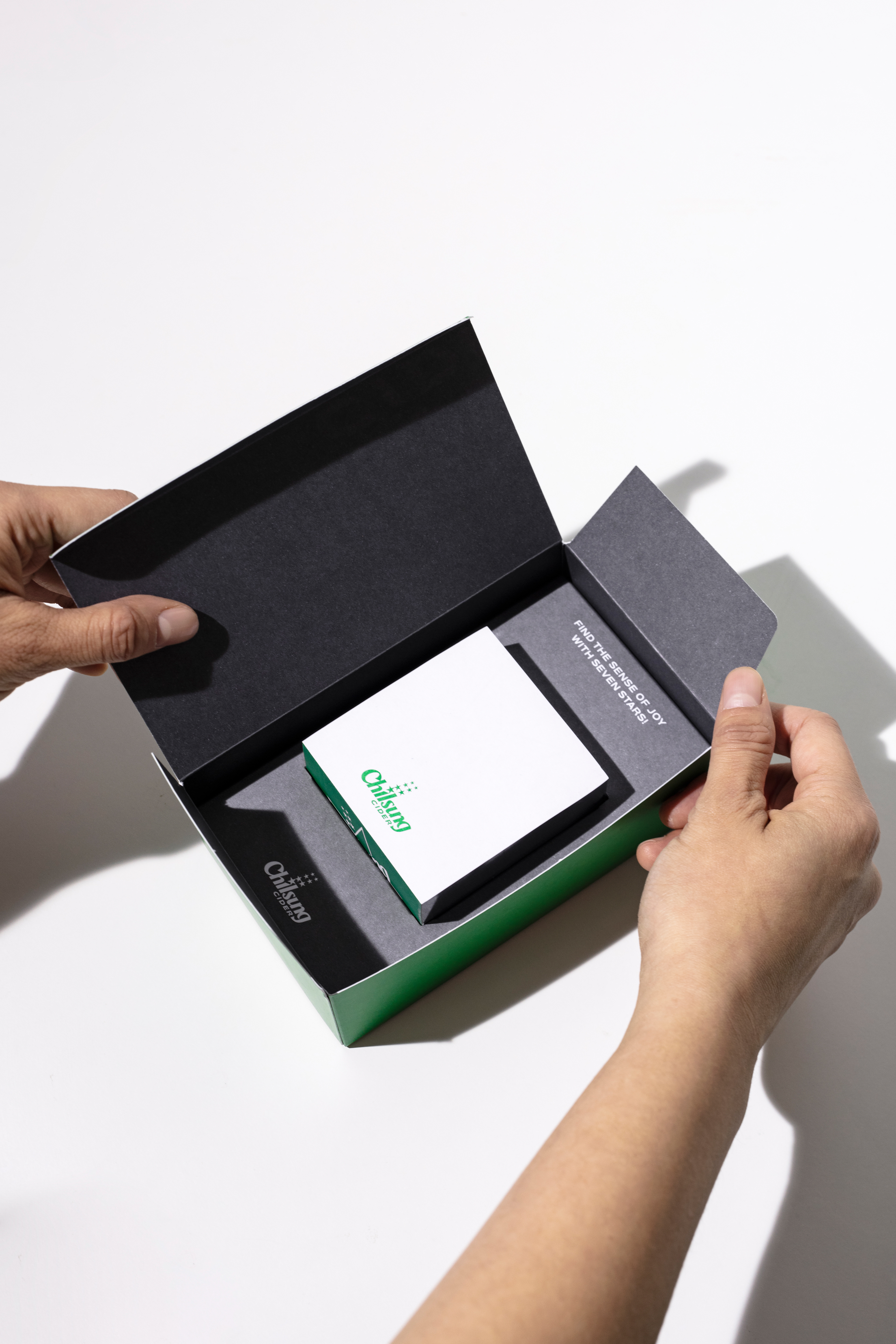
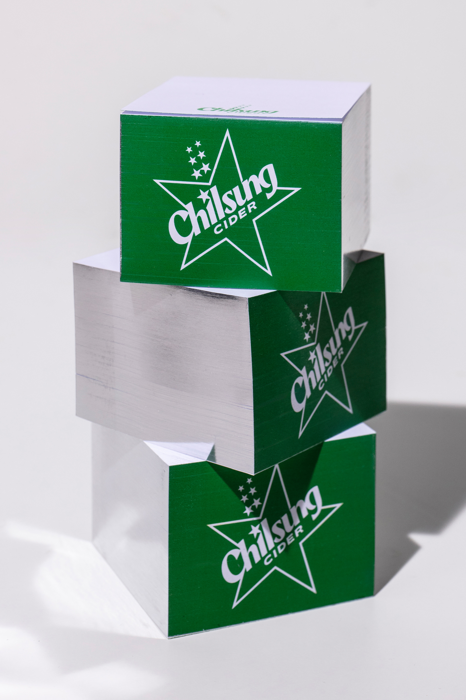
We reinterpreted Chilsung Cider’s signature “star” and “green” to strengthen its visual identity and connect with a new generation through a contemporary look. The seven upward-ascending stars symbolize the fizzy excitement of carbonation, while the contrast between smooth curves and sharp lines gives the wordmark its distinctive character. A fresh, translucent green and the iconic star emblem embody the brand’s essence, ‘Sense of Joy,’ in a vibrant and tangible way.
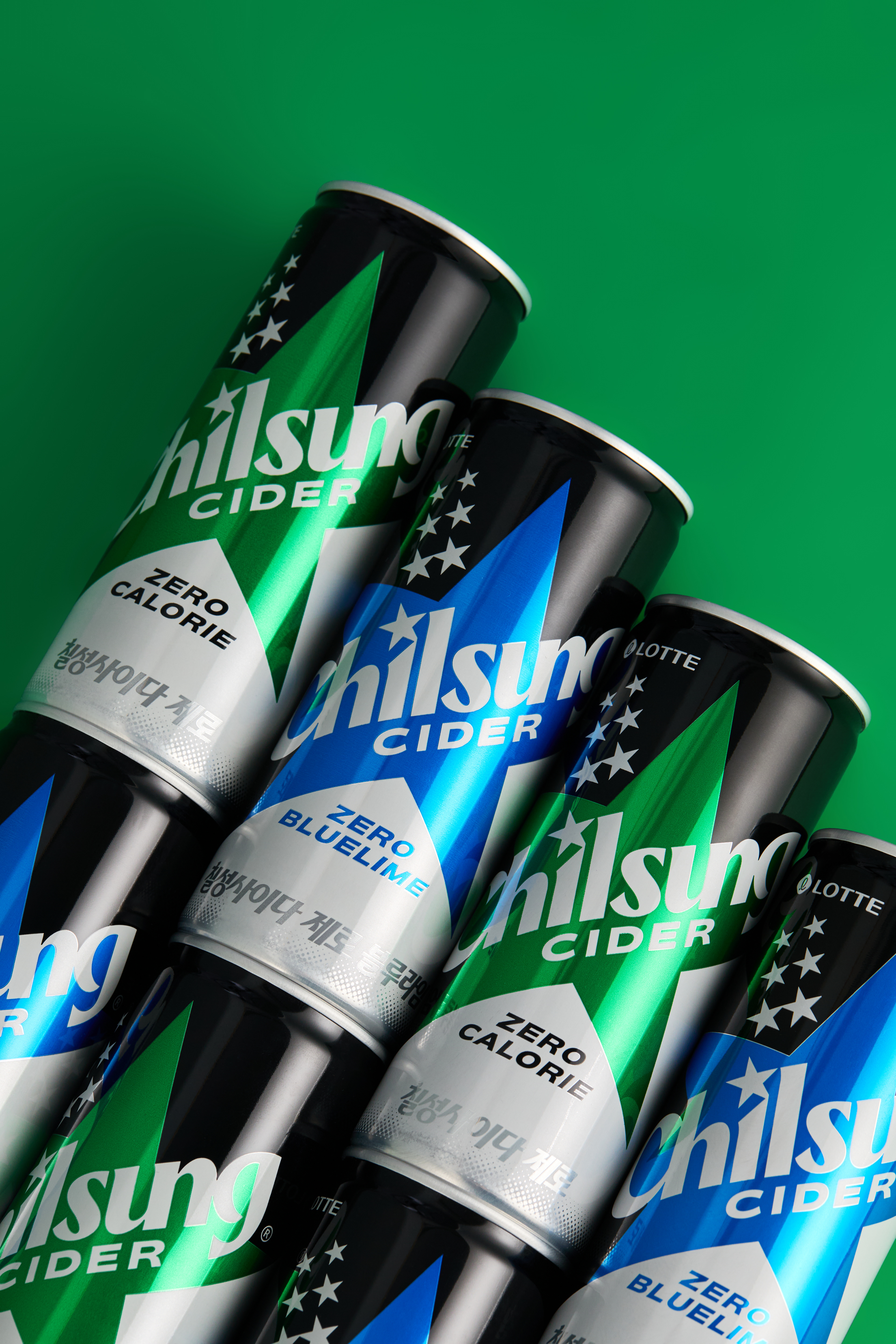
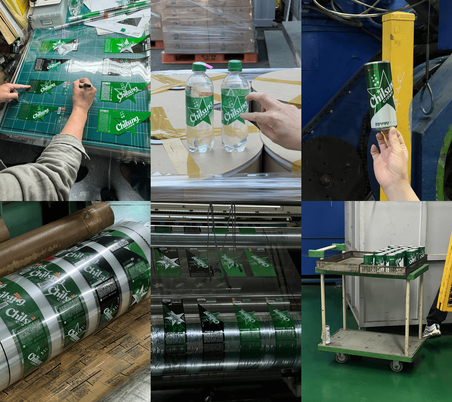
Our BI-focused, minimalistic layout enhances shelf impact, while the green-and-white diagonal design communicates Chilsung’s unique spirit with a refined, modern touch. This diagonal layout and emblem adapt seamlessly across product lines—including Original, Zero, and Blue Lime—with distinctive color variations, creating a cohesive and flexible packaging design system.


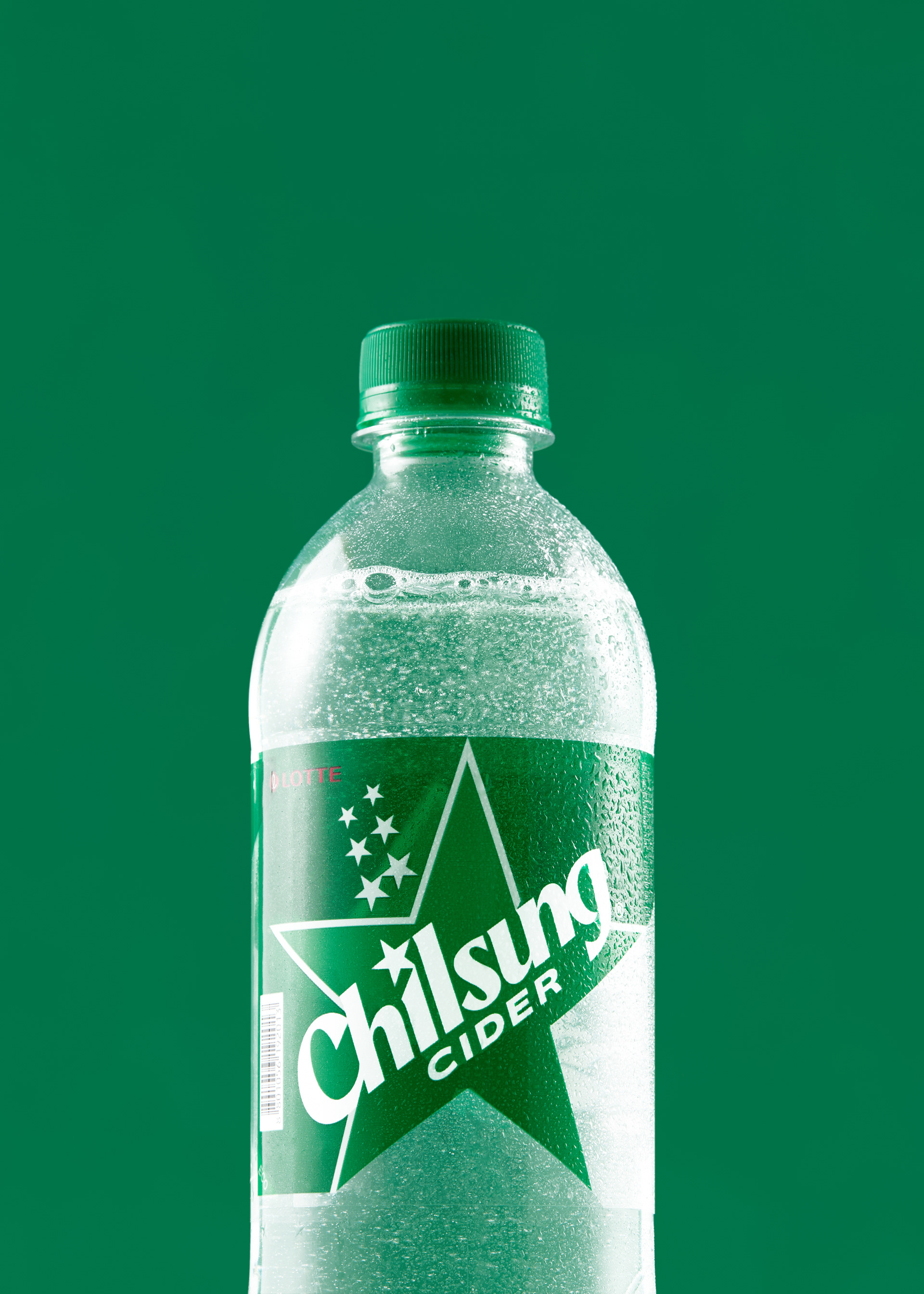
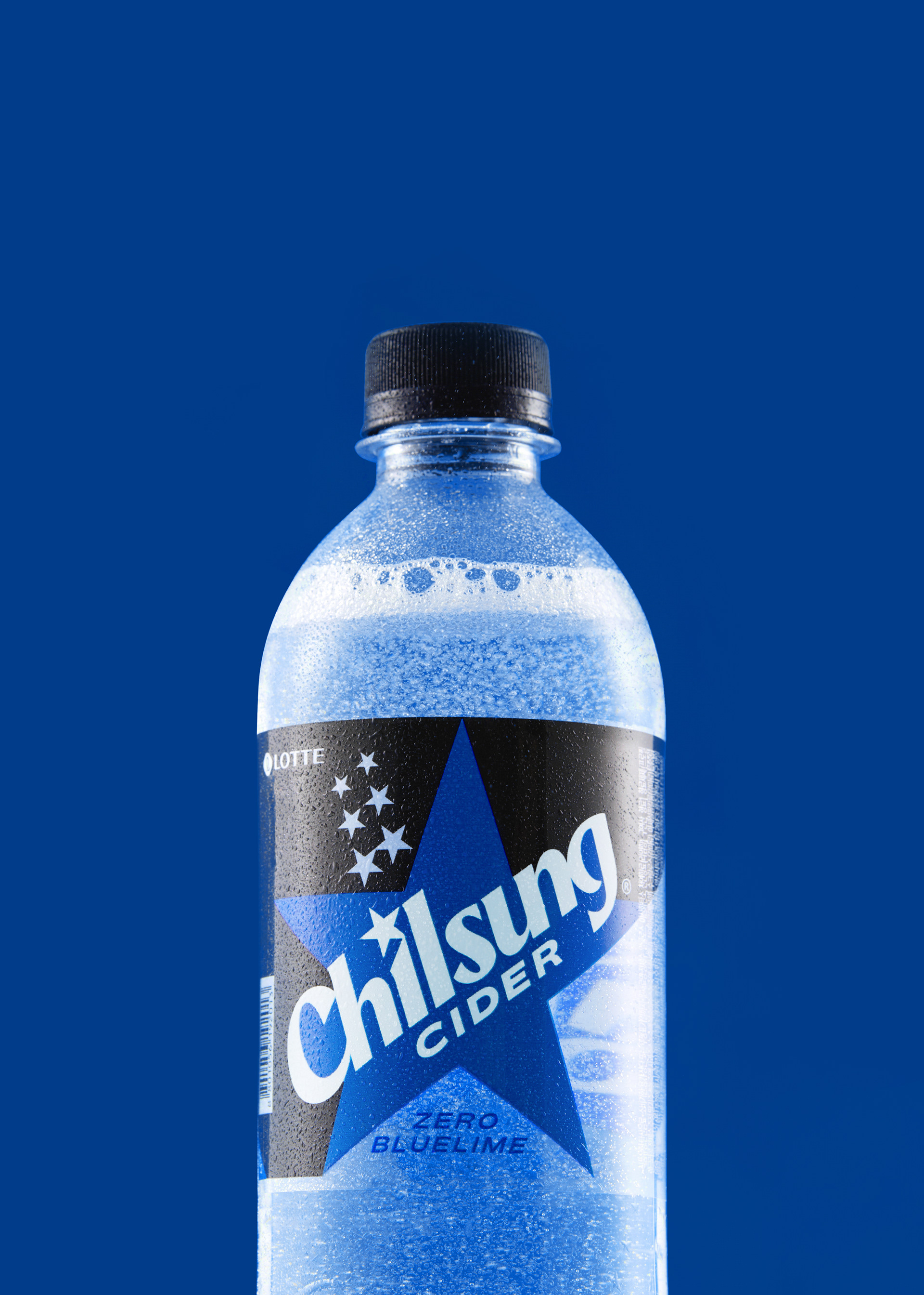
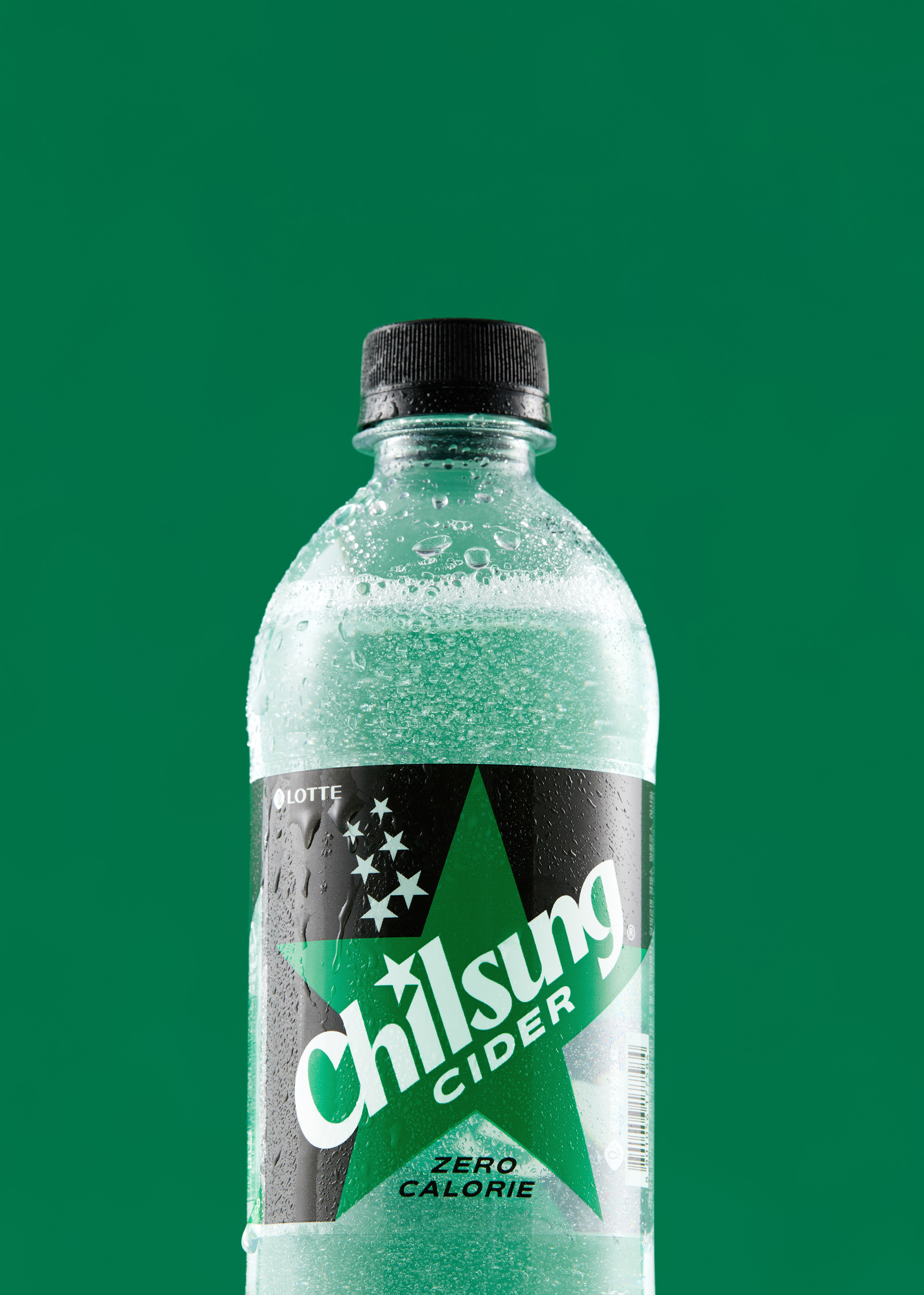

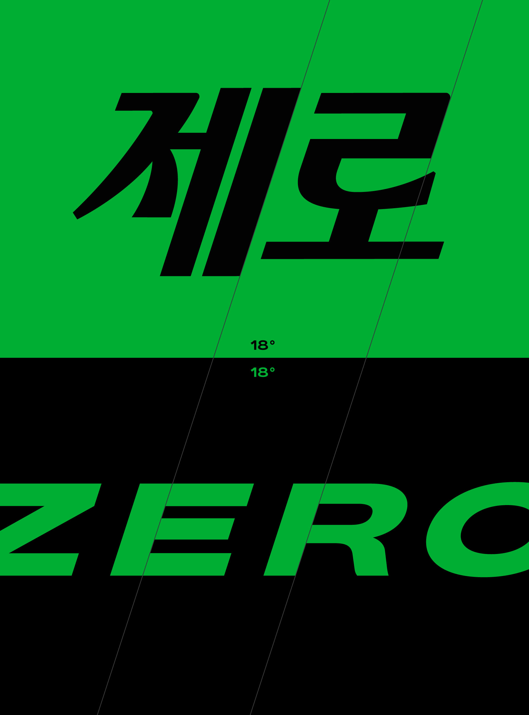







Chilsung Cider BI & Package Design Development
Client: Lotte Chilsung
2024
-
Project Team
Project Direction: Lotte Chilsung Marketing Team
Brand Strategy: Clay
BI & Package Design: CFC
Brand Film: V-Code
Product Photography: LCC
-
CFC
Art Direction: Charry Jeon
BI & Package Design: Charry Jeon, Seyoun Kim, Jeongmoon Choi, Junghun Lim
Design Application: Seyoun Kim, Junghun Lim
Application Photography: Kiwoong Hong
www.contentformcontext.com

