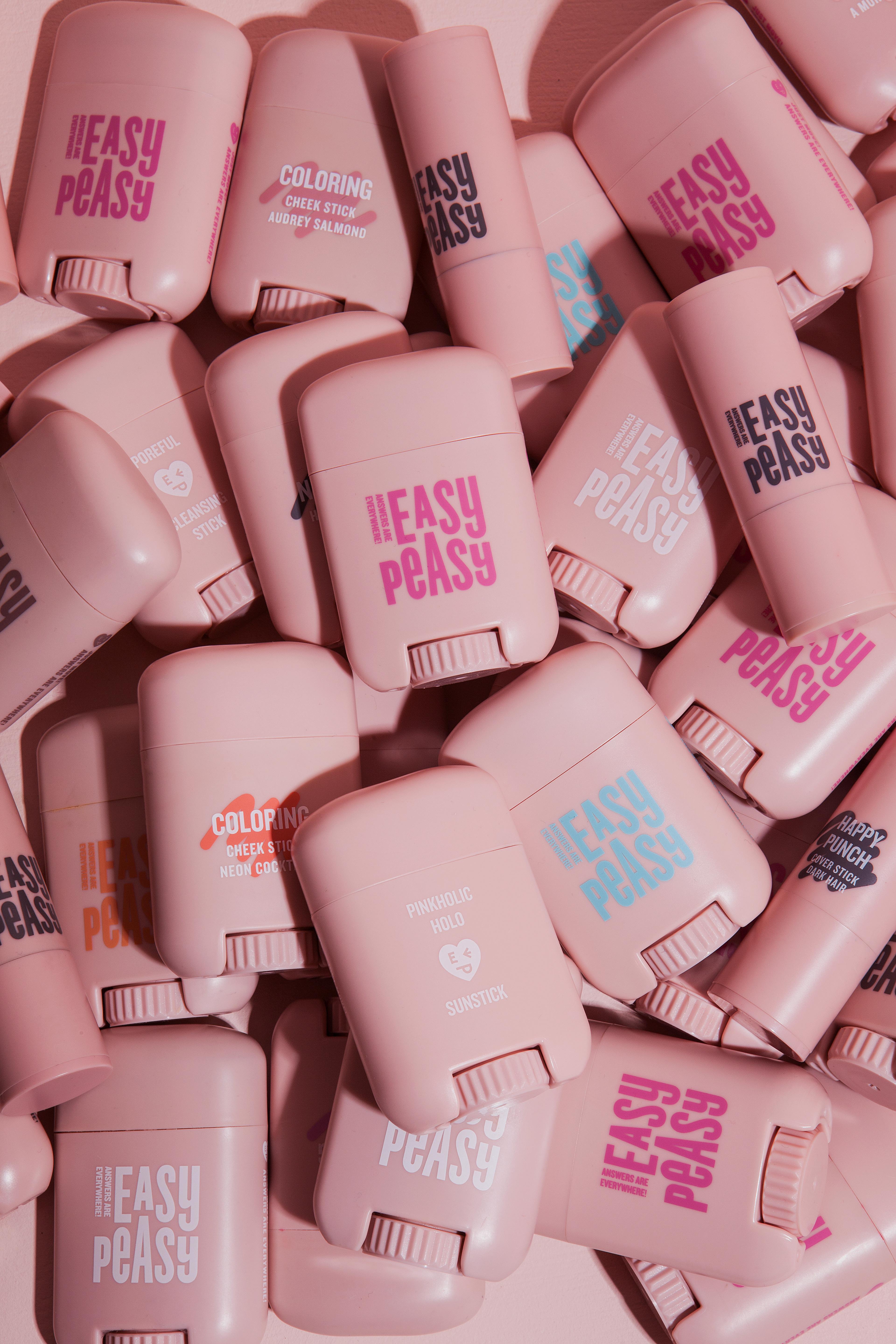
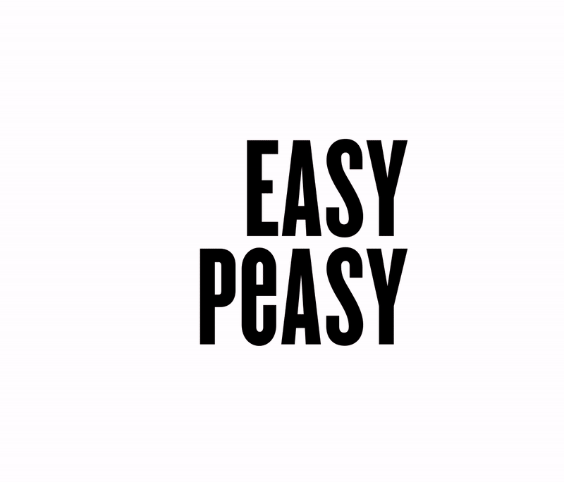
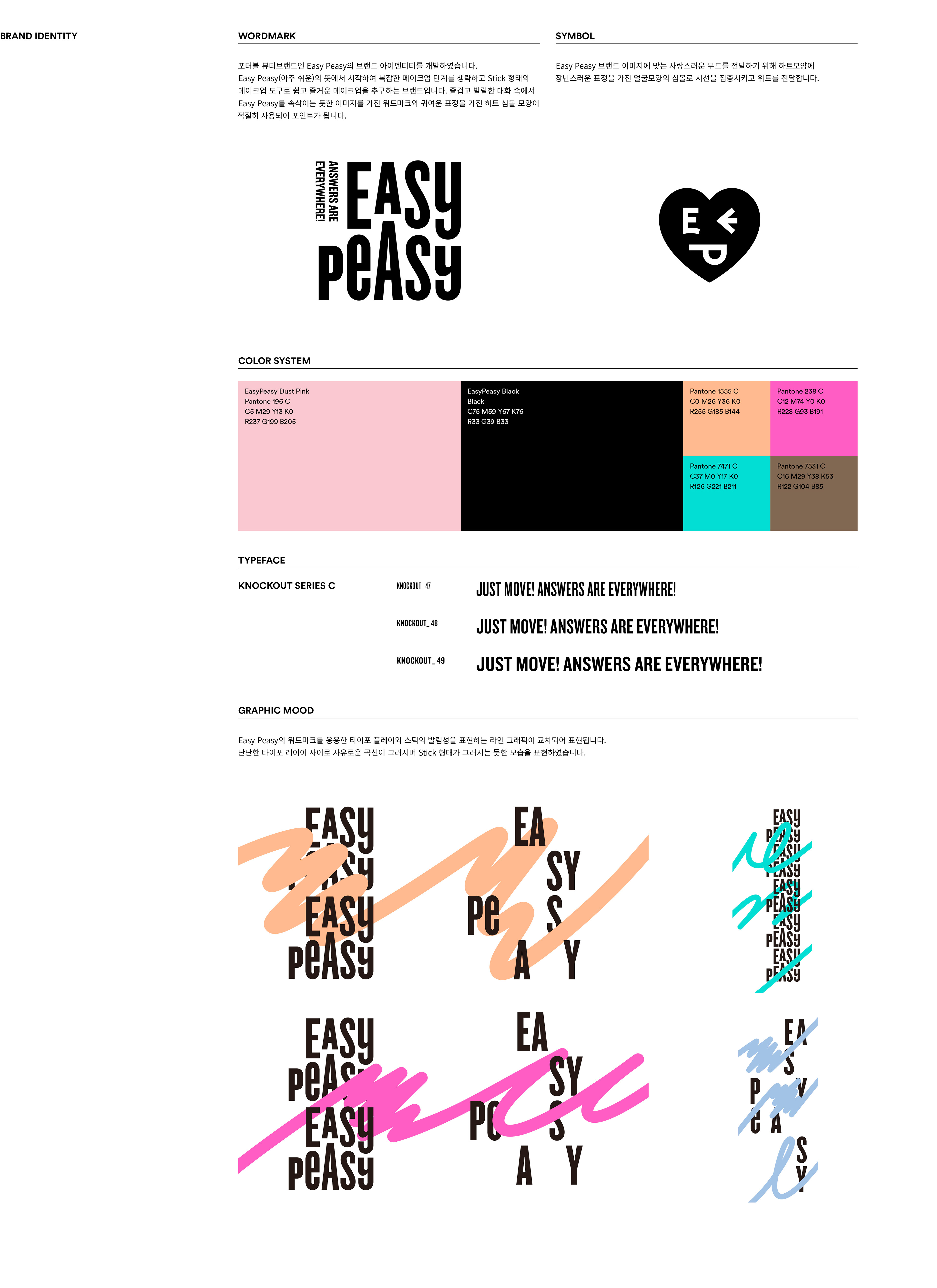
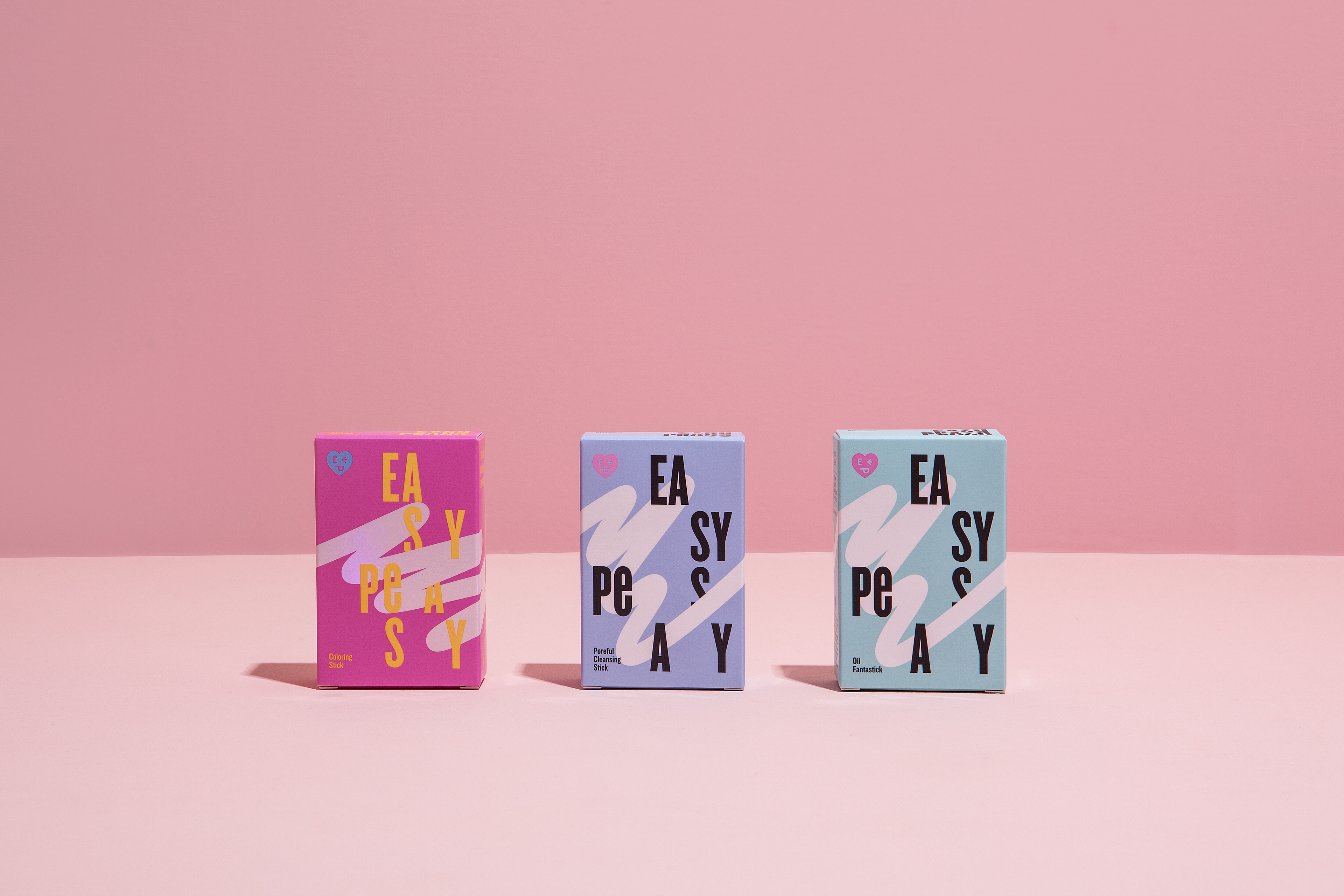
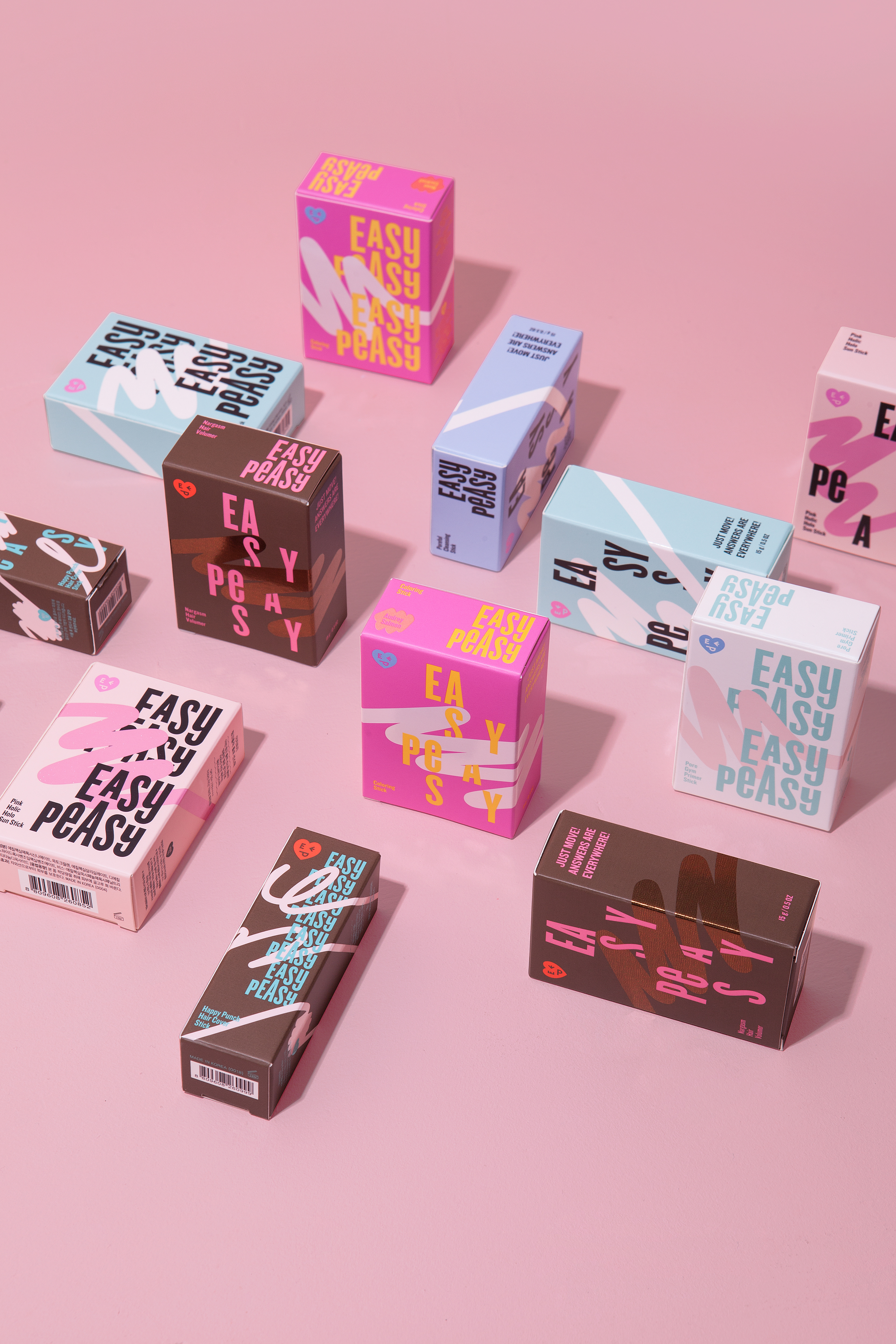
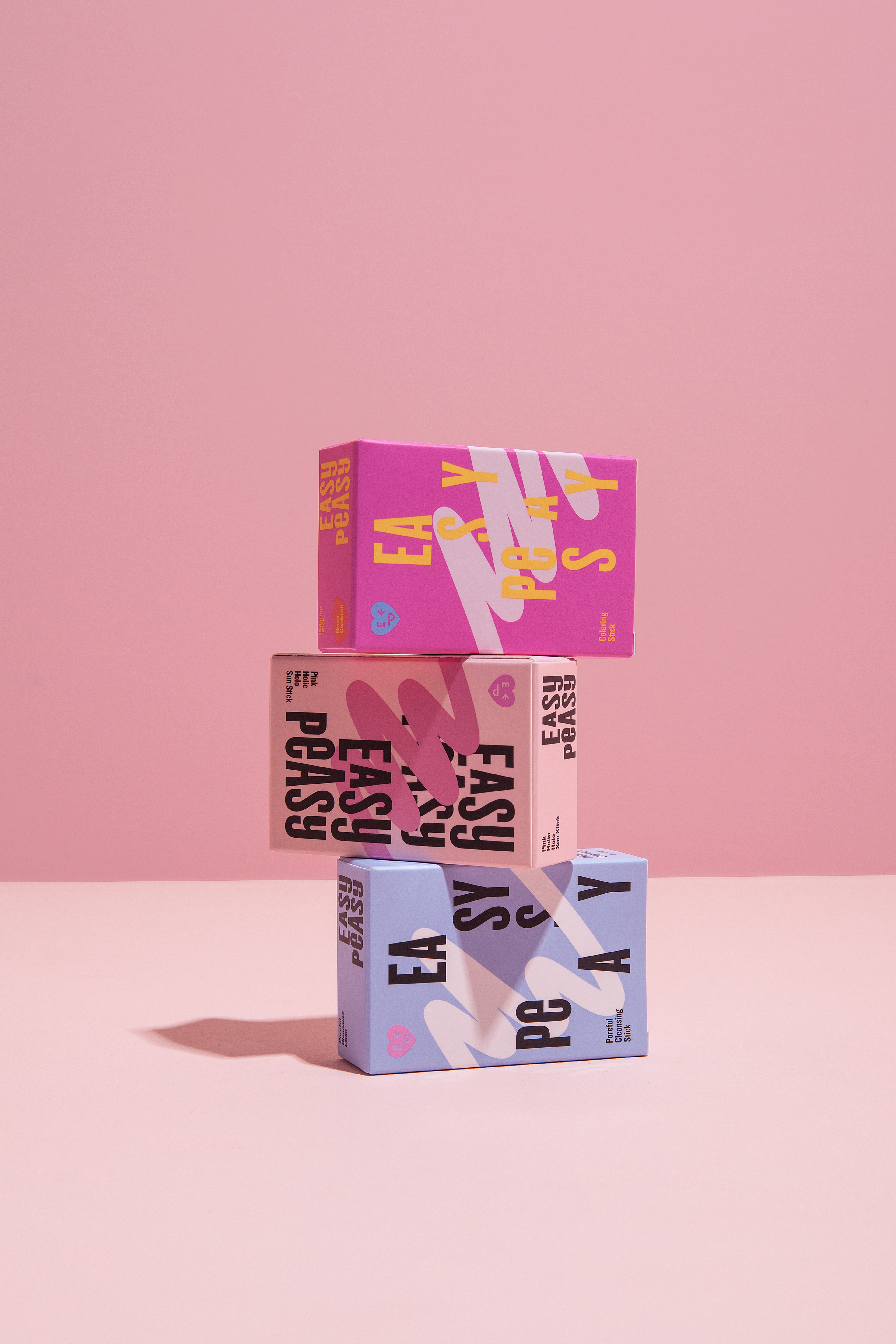
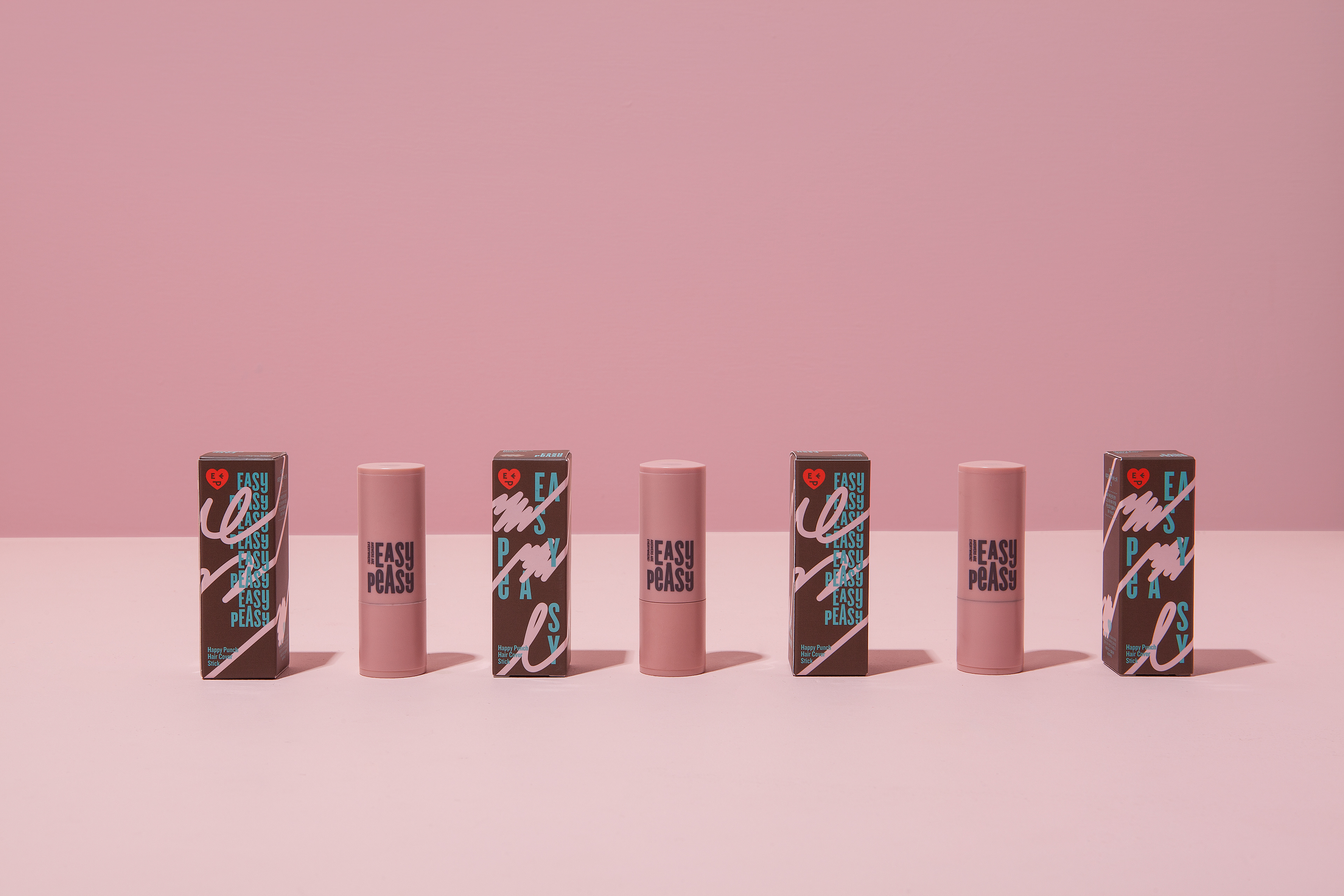
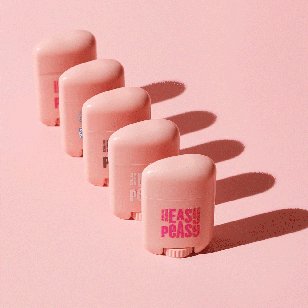
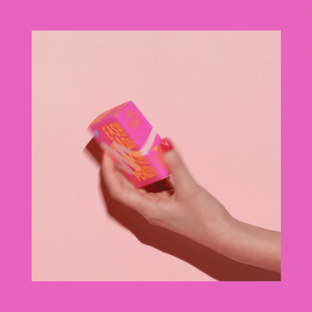
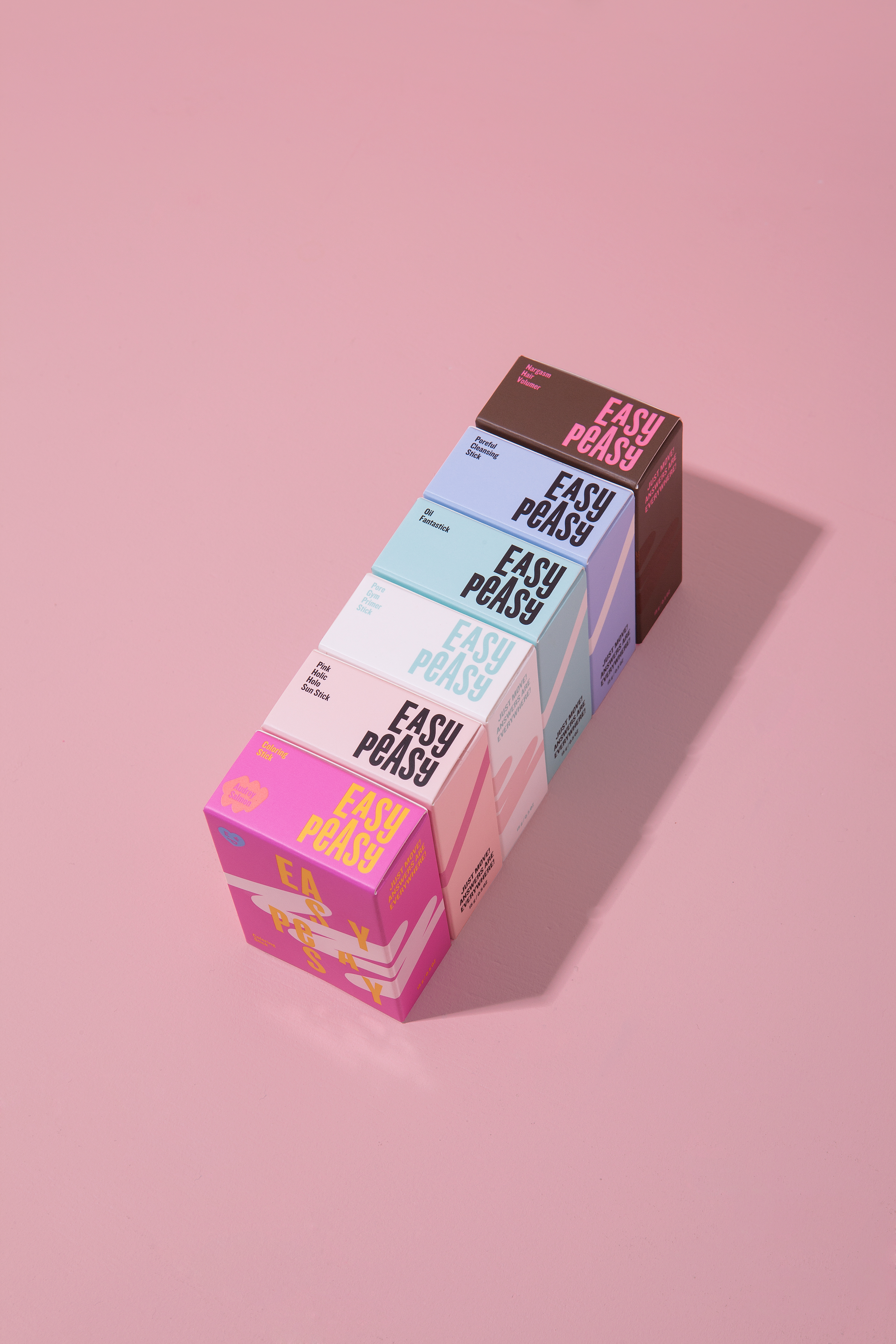
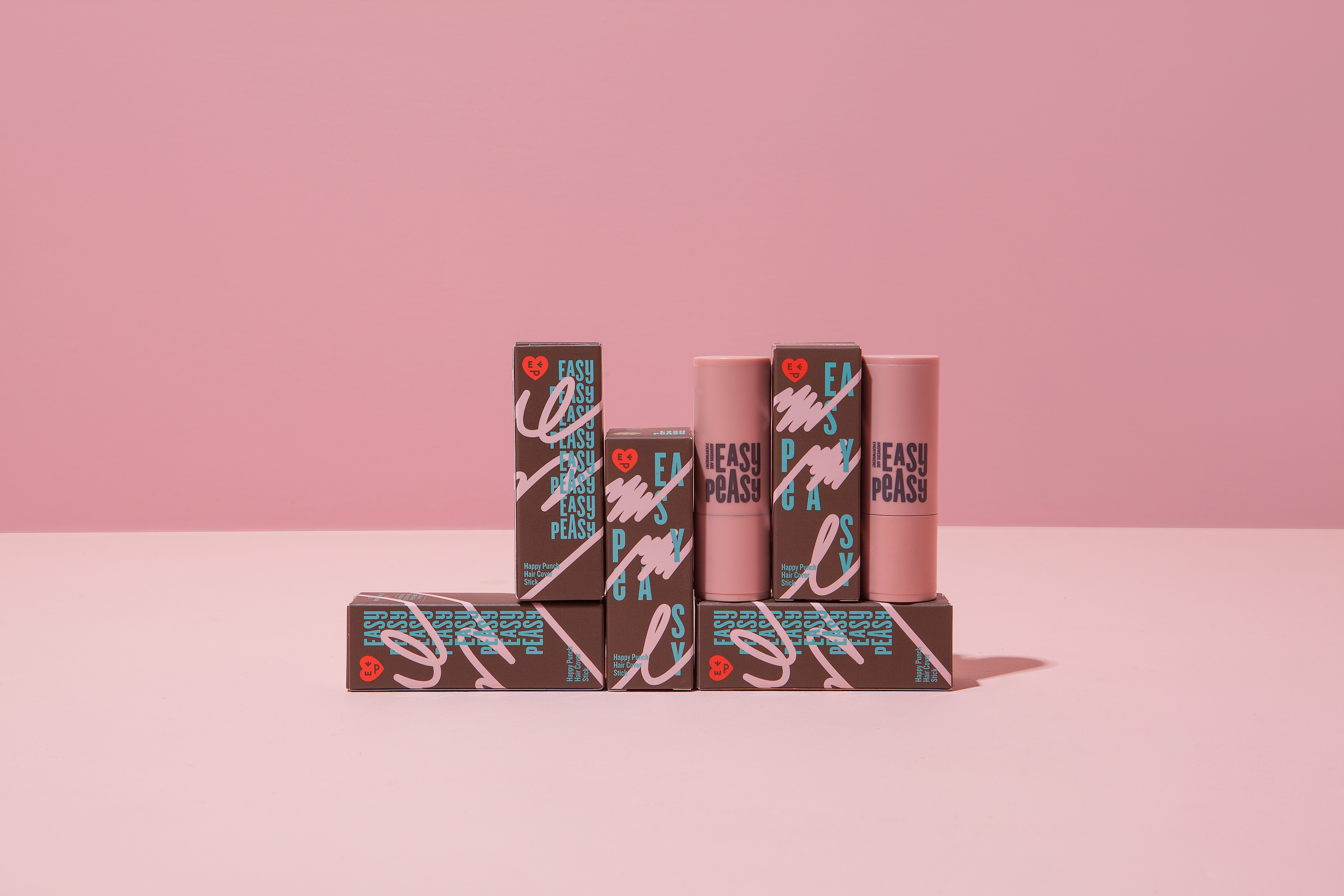
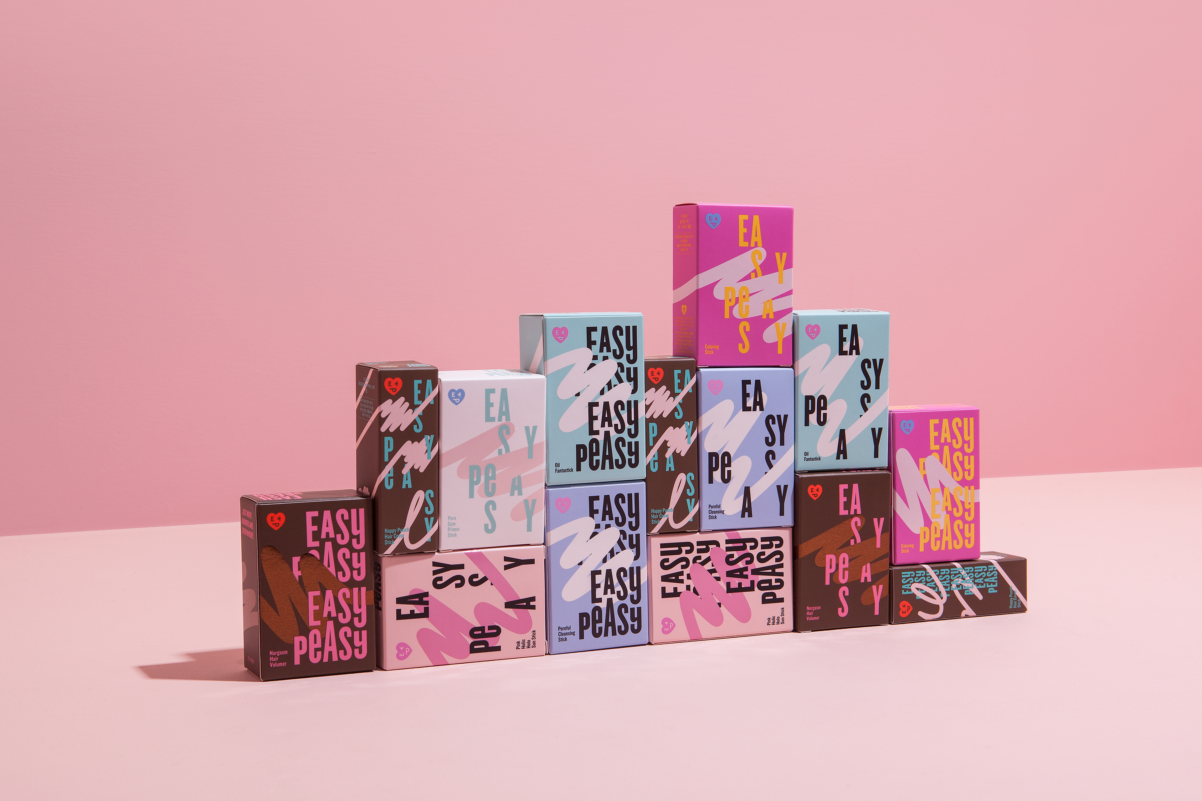
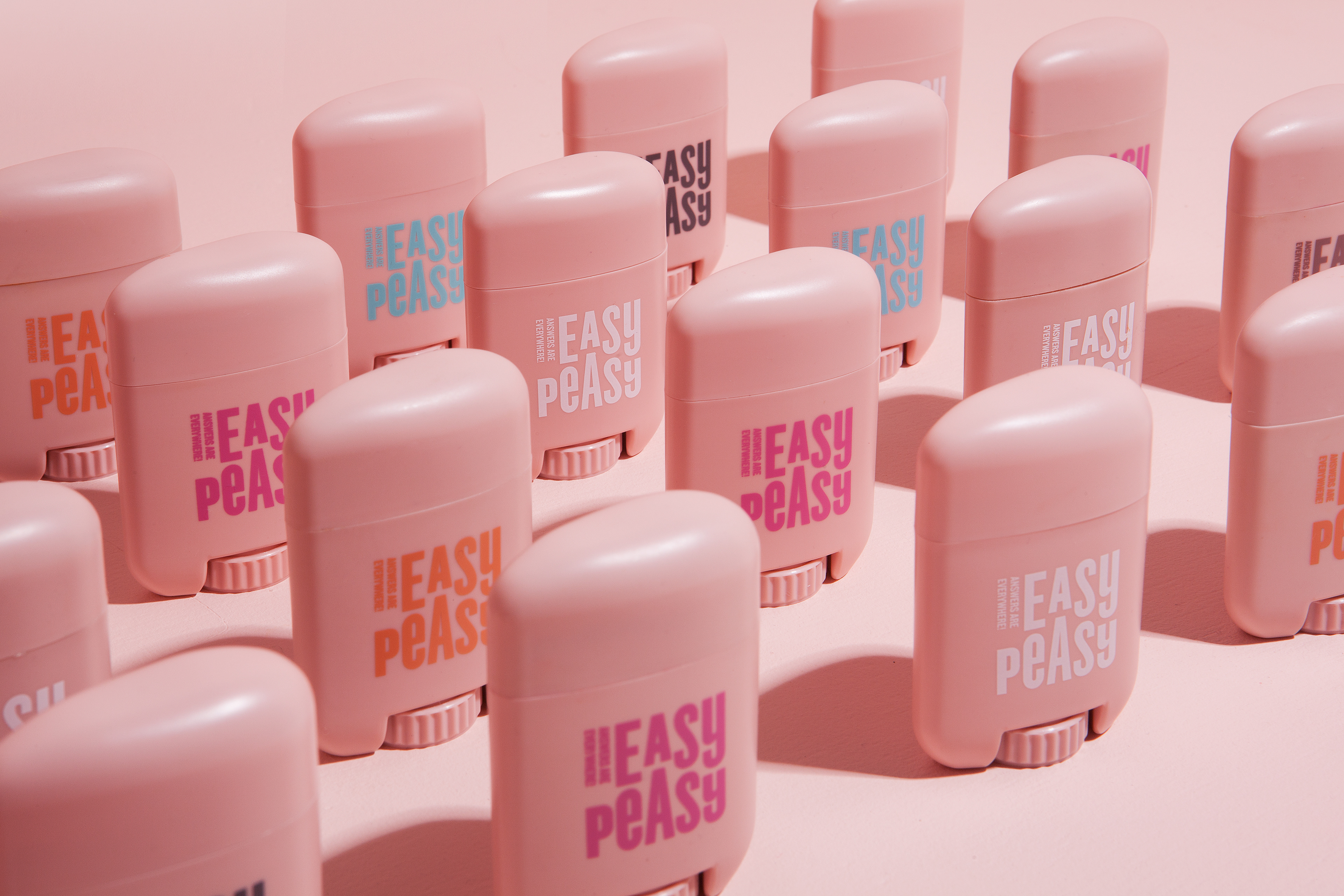
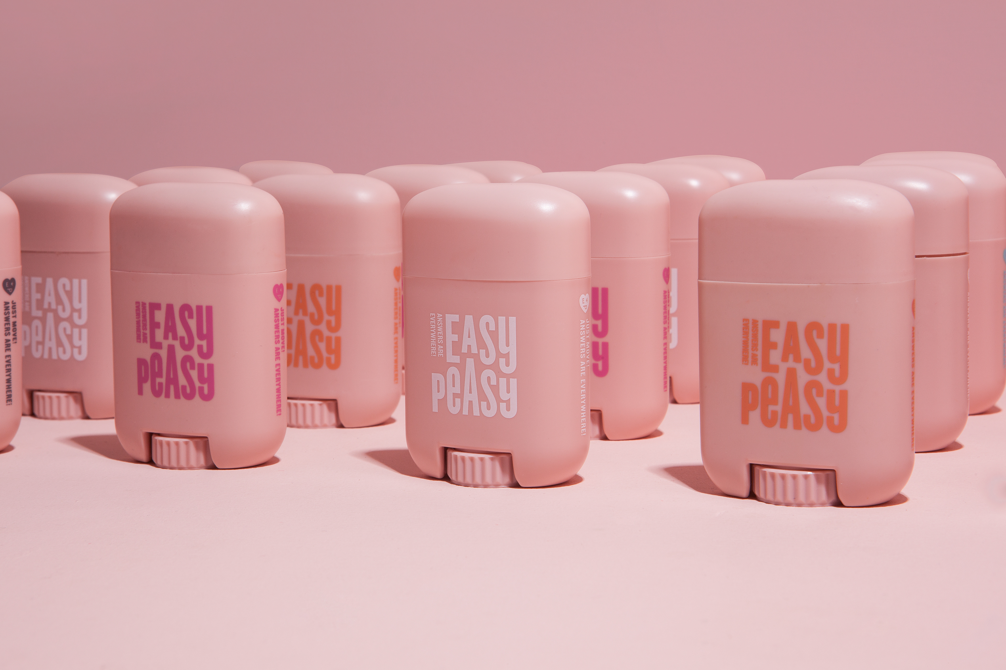
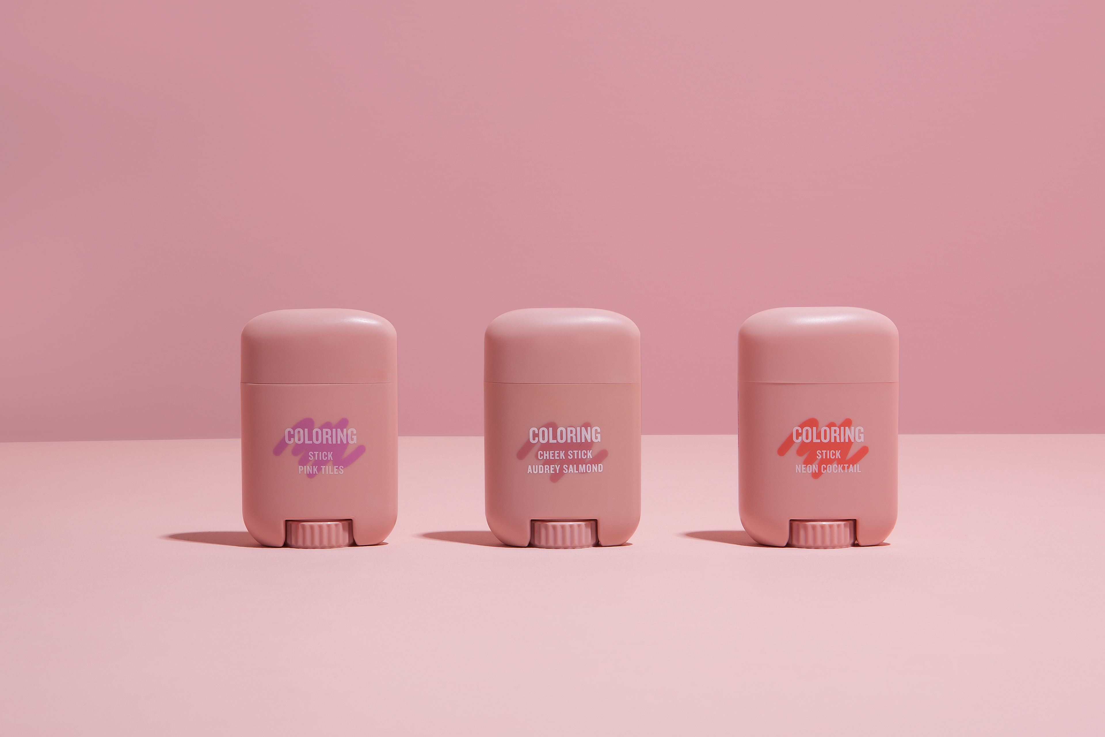
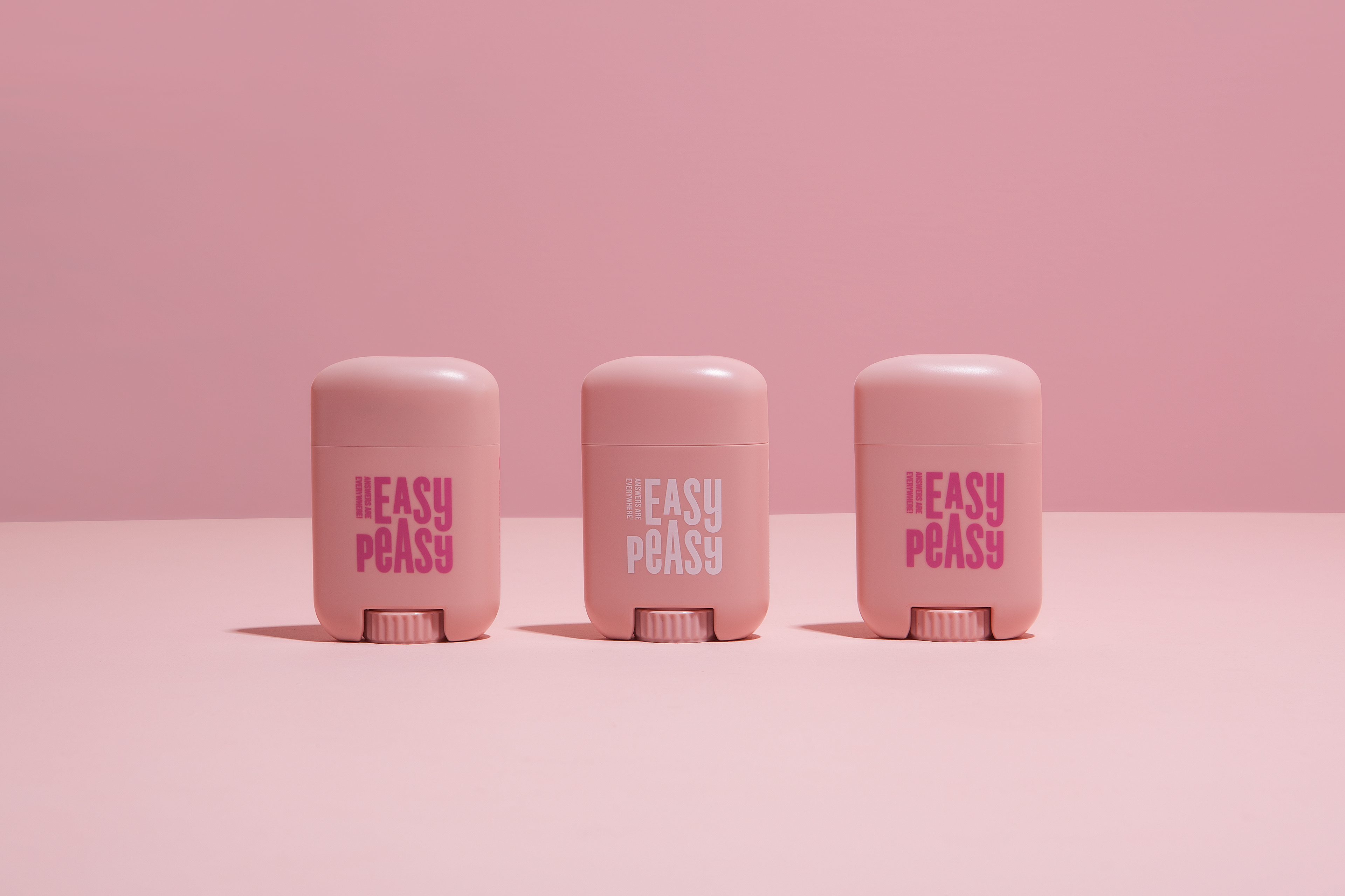
Easy Peasy is an indie cosmetic brand recently launched by Amore Pacific. The brand name meaning 'very easy' is literately the key concept of the brand. Their stick-shaped products make makeups easy yet perfect.
Keywords of the brand were: easy, active, fun, bold, chat.
To convey the brand essence, CFC created a typographic wordmark and symbol with sense of humor. Inspired by multiple colors and textures of their products, we designed packaging with bold typography and colorful graphics. We also developed a short film introducing the brand concept and products.


Easy Peasy Visual Identity, Packaging Design, and Brand Film Development
2018
Client: Amore Pacific
Project Team
-
Mamonde Design Team
Project Direction & Design Implementation
-
CFC
Visual Identity, Packaging Design & Brand Film Development
Art Direction & Design: Charry Jeon
Designer: Eunju Kim, Jiyoung Kim, Saerom Kang
Assistant: Yoonji Nam, Nara Yoon
Product Photography: Kiwoong Hong
**Brand Film Credit
Film Shooting: Jewon Park
-
Motion Graphic: Seung-ah Yoo
-
Sound
Arranger: Youngjic Kim (Dyota Music)
Composer: Jongseong Yoon (AT&T)
Supervisor: Apple Kim (AT&T)
www.contentformcontext.com