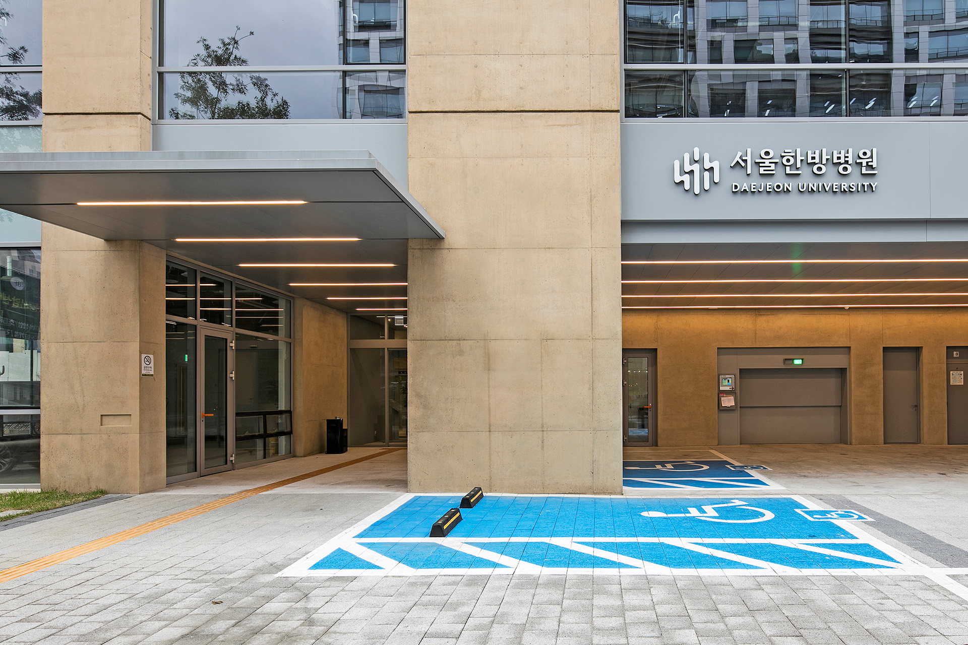
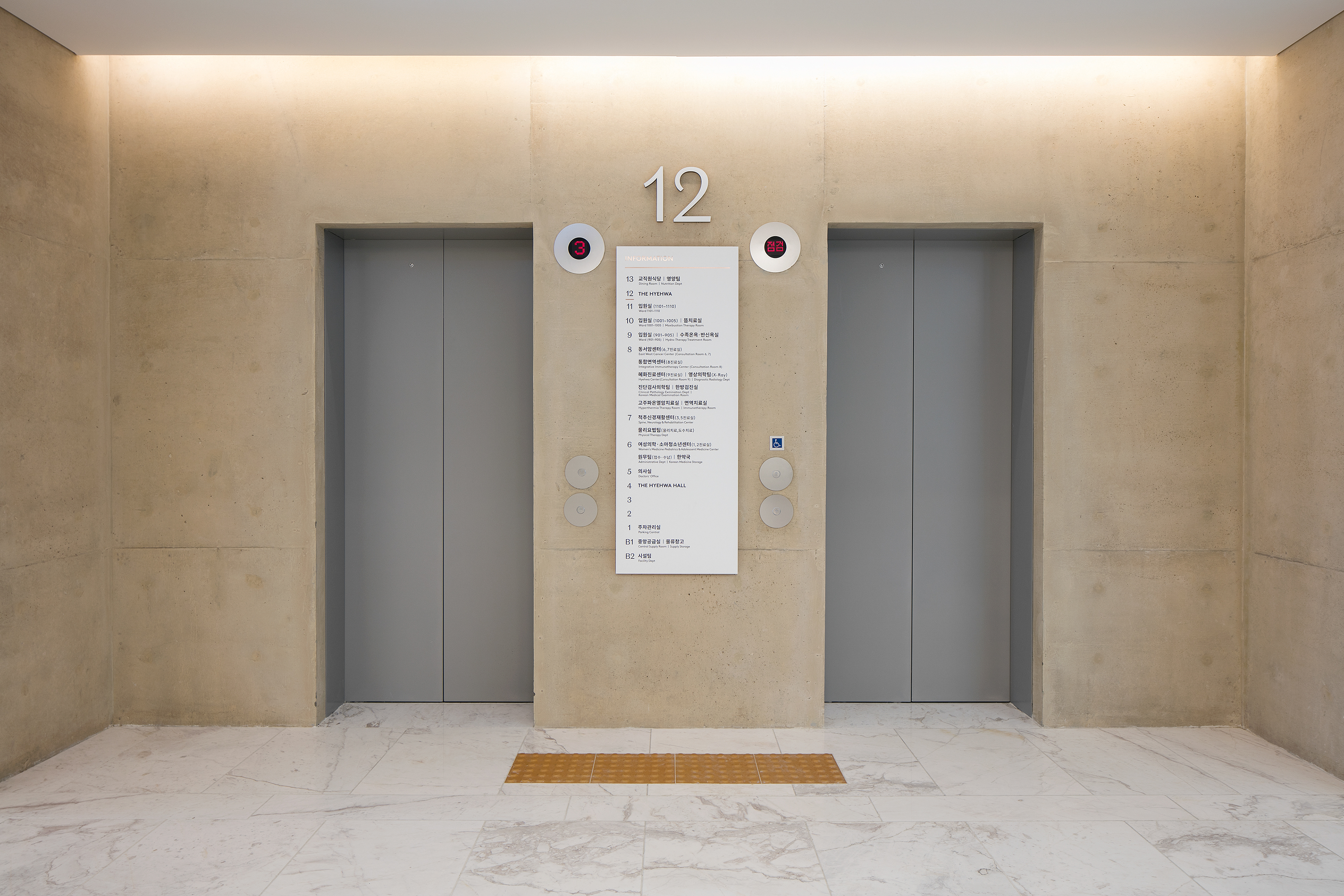
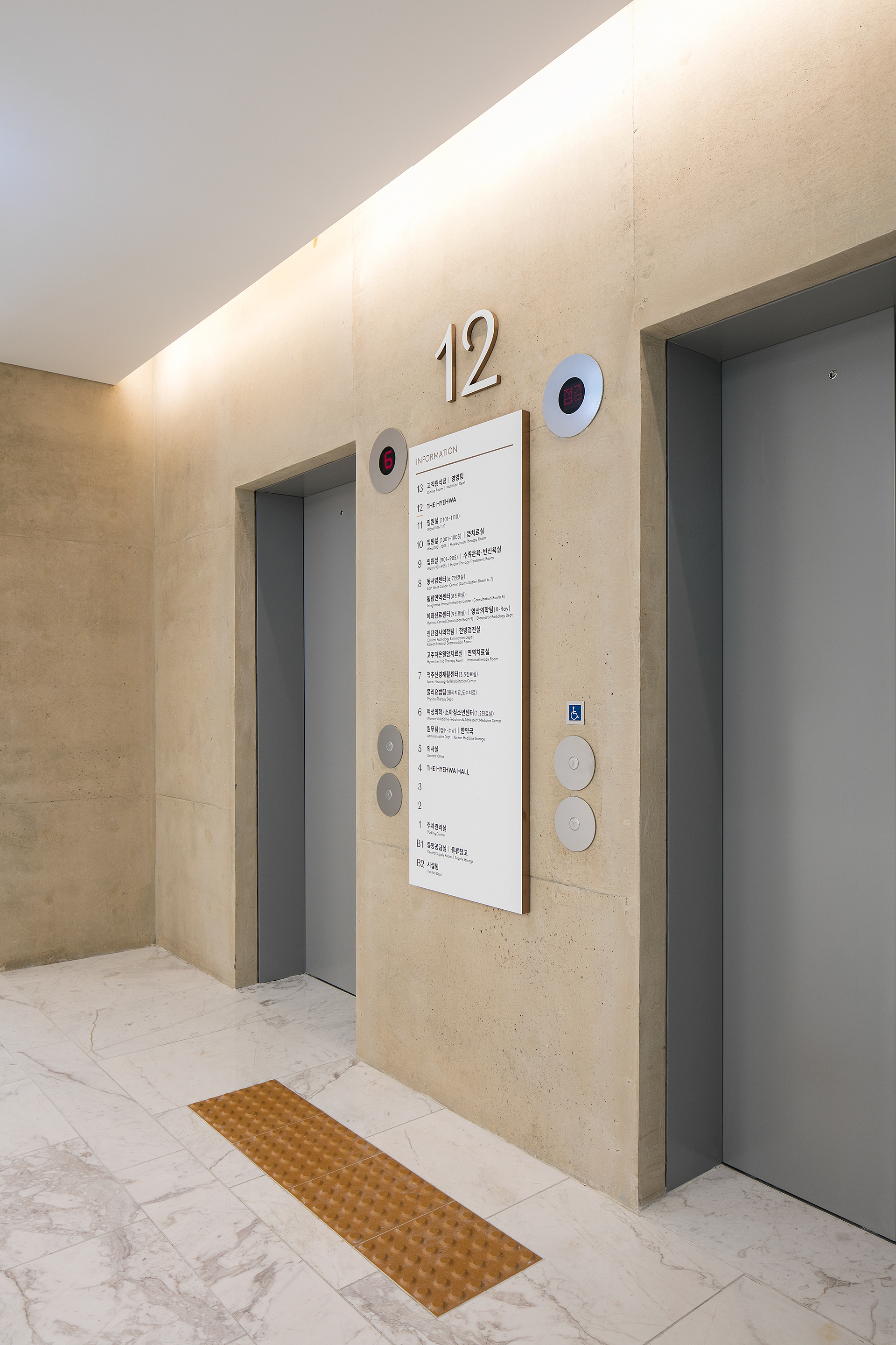
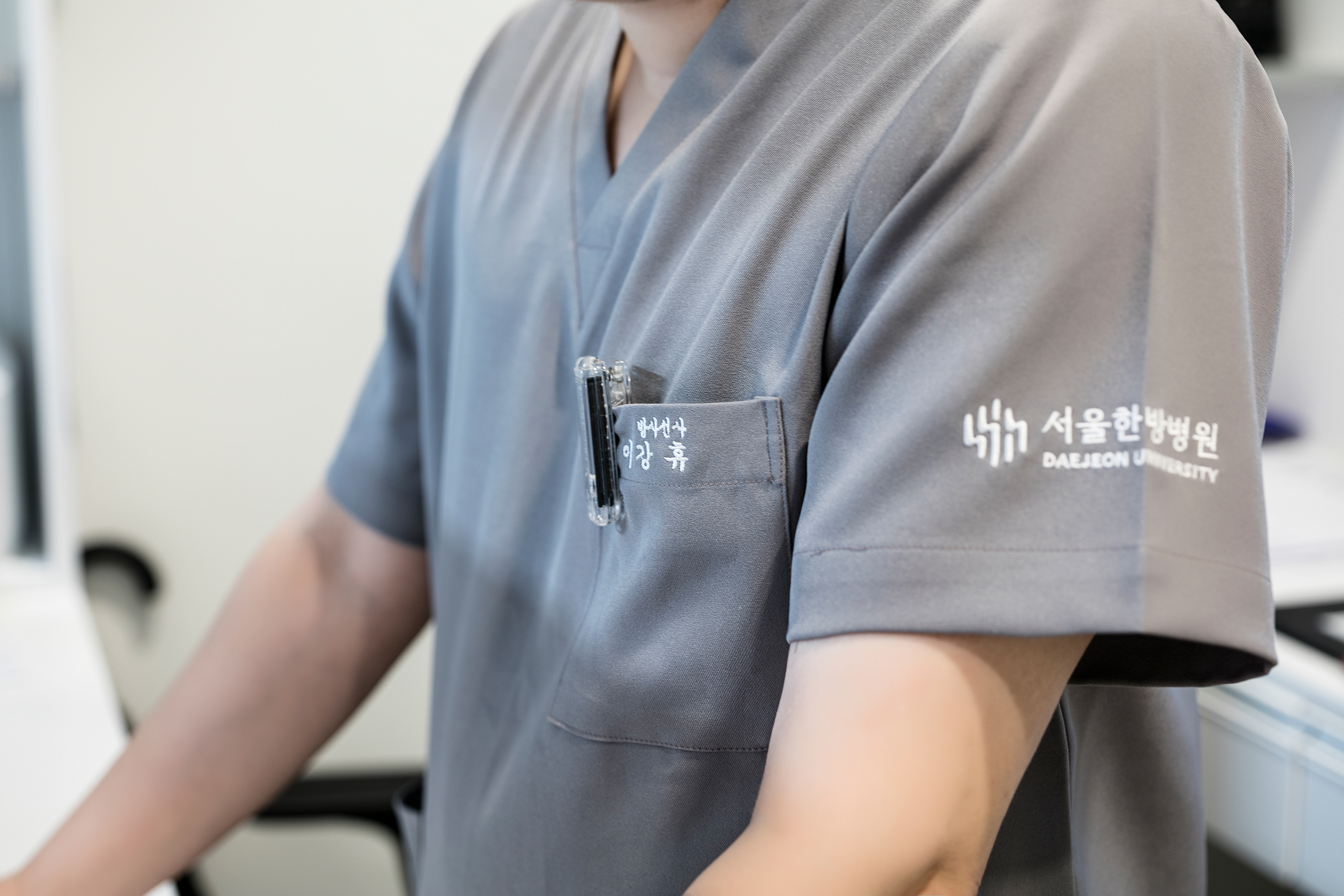
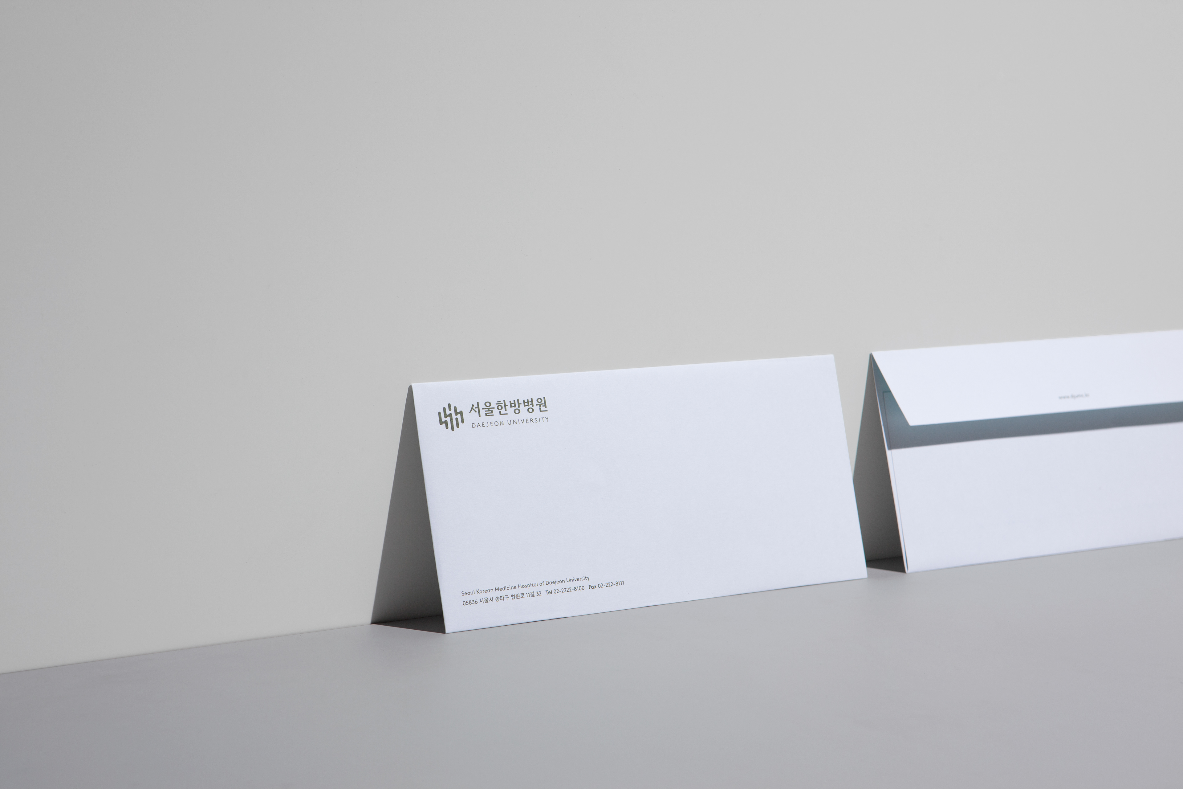
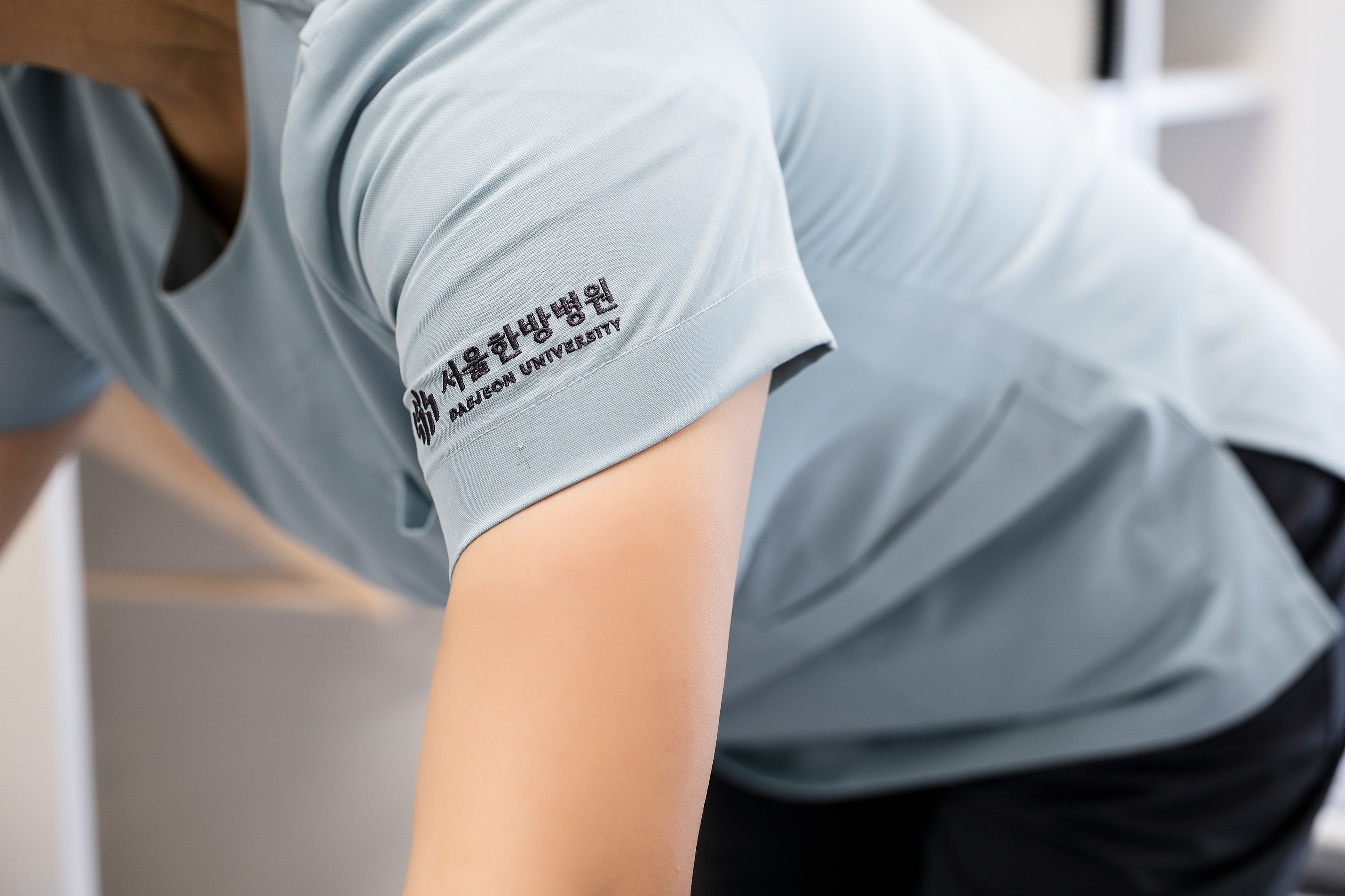
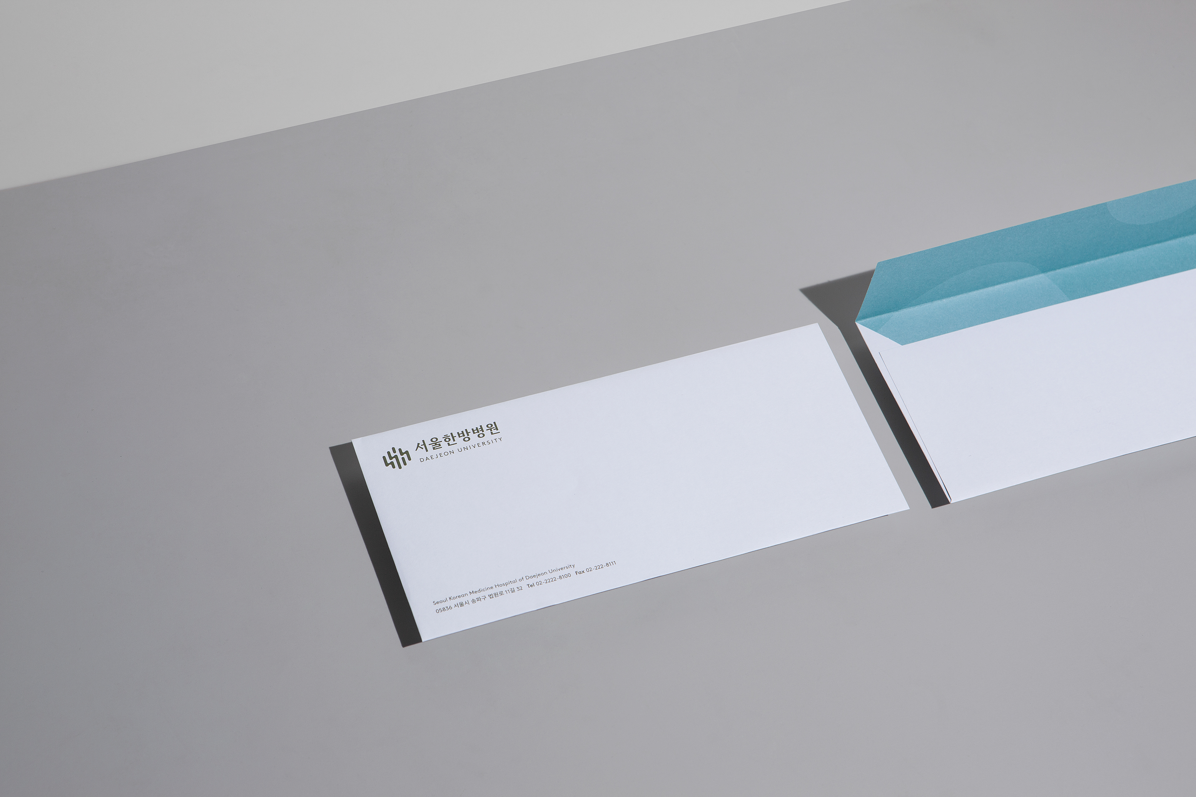
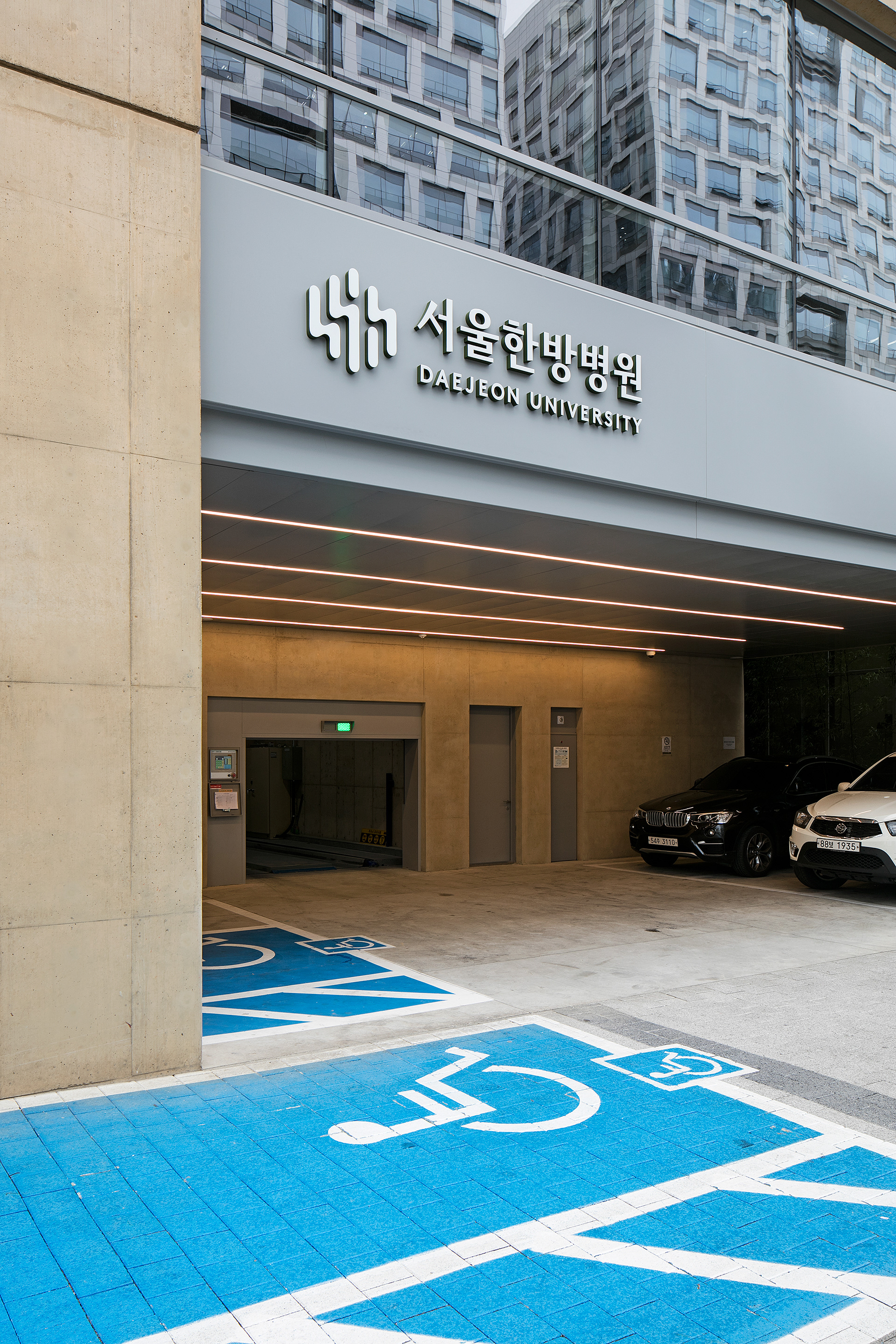
CFC has renewed hospital identity for ‘Korean Medicine Hospital of Daejeon University’ and developed the visual identity system of the Seoul branch.
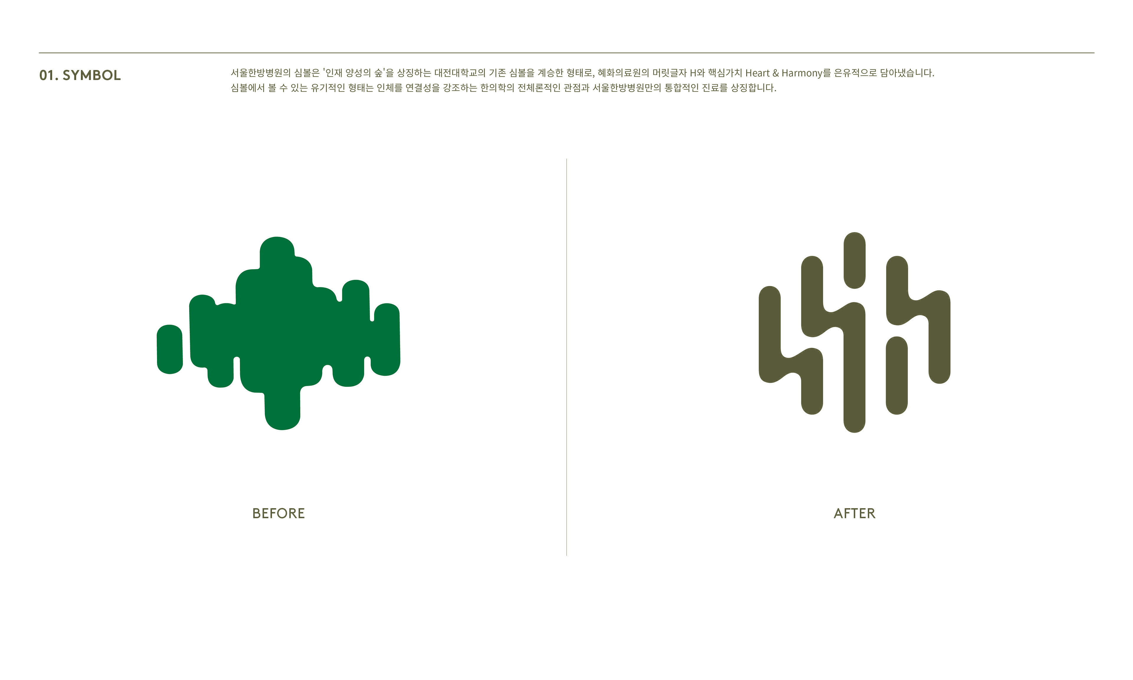
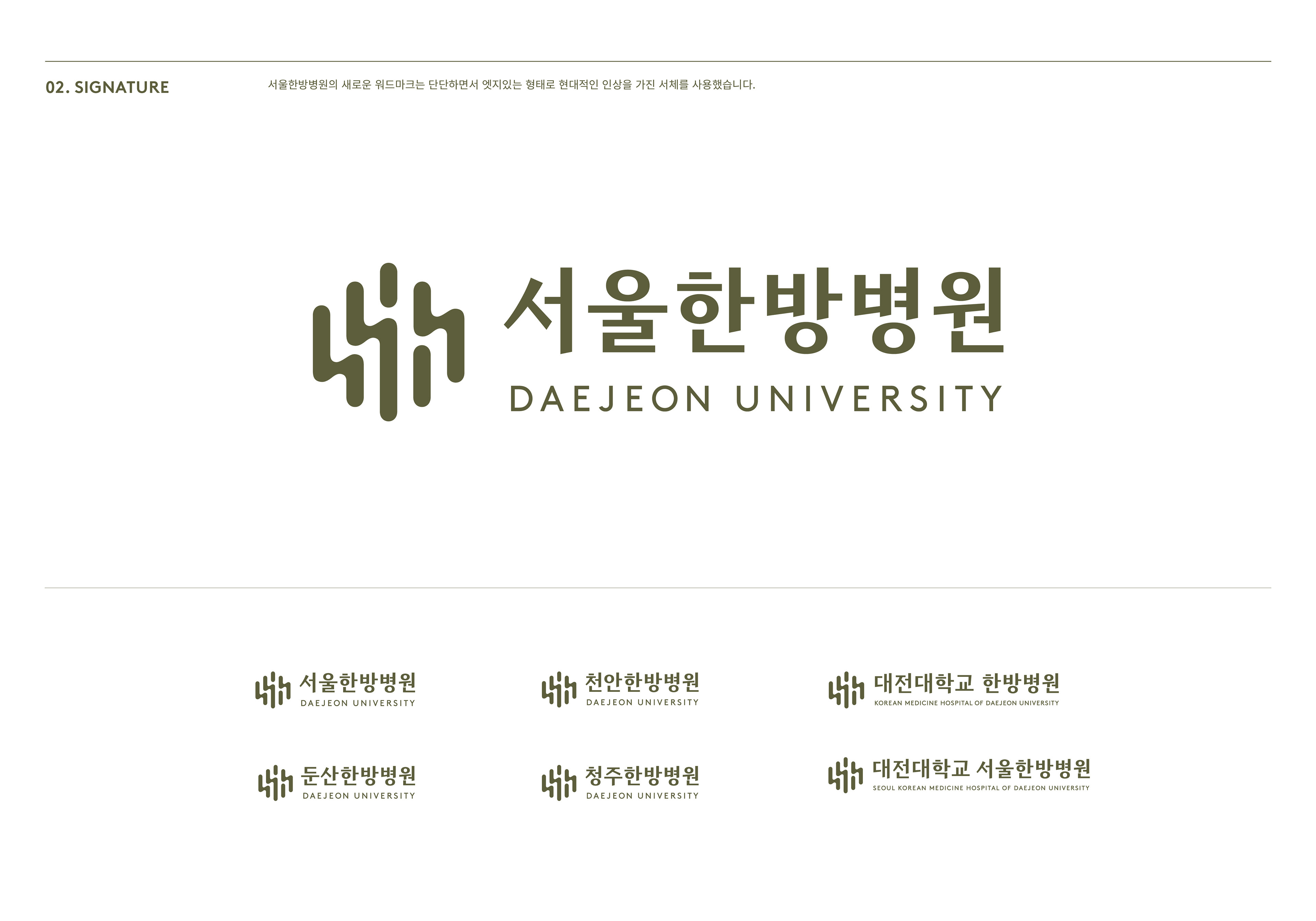
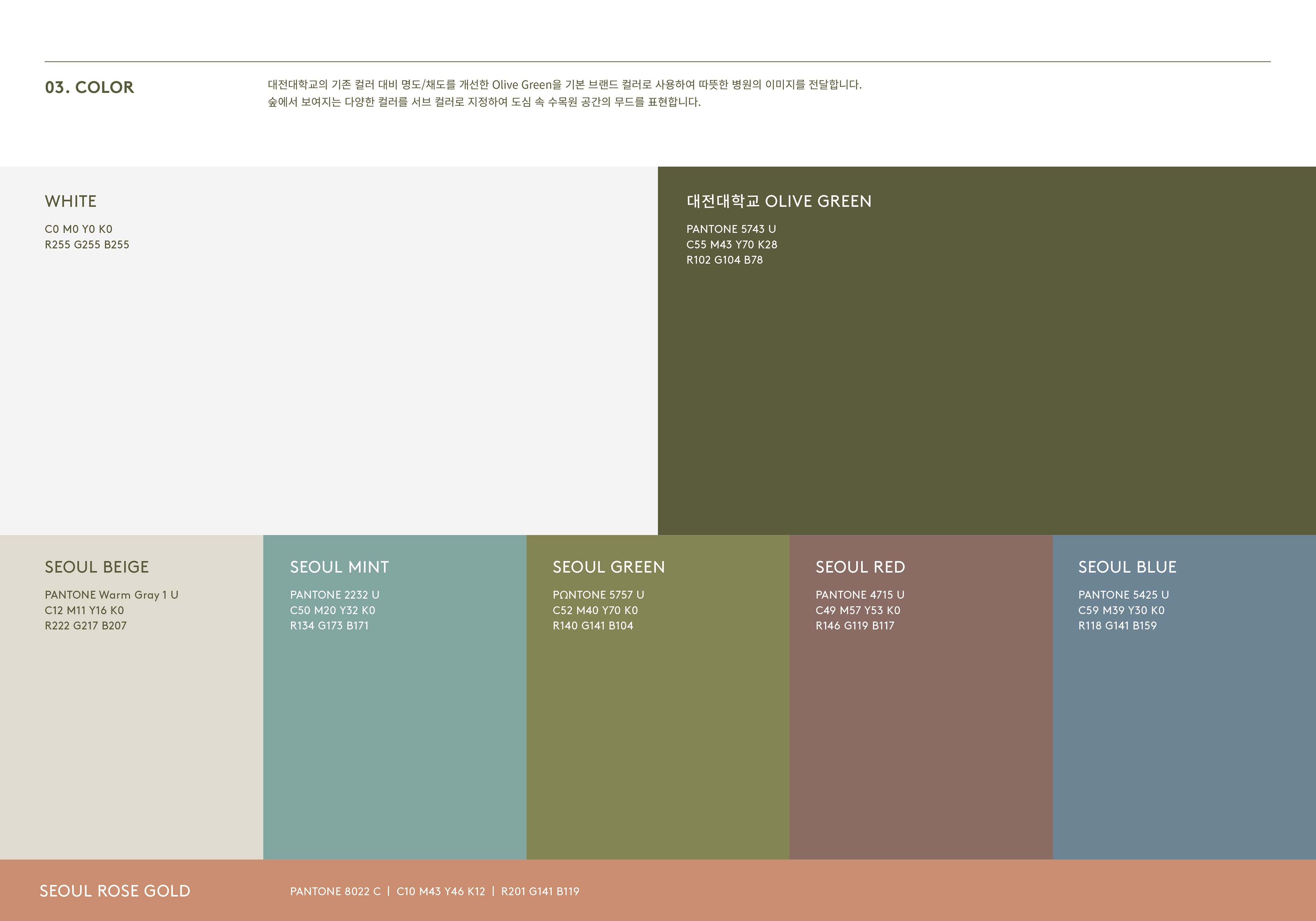
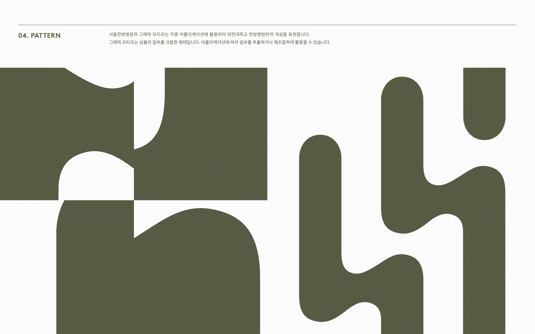
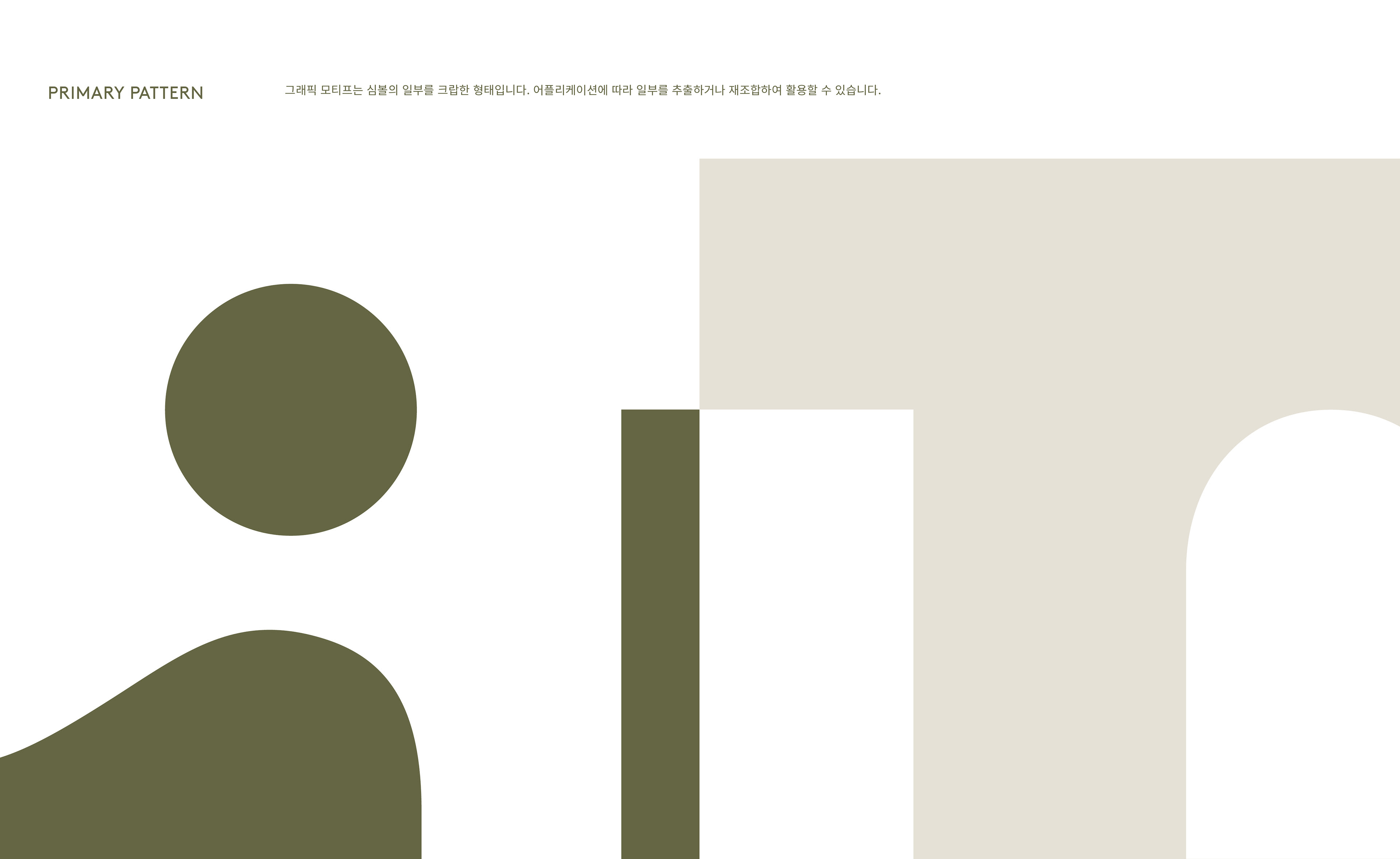
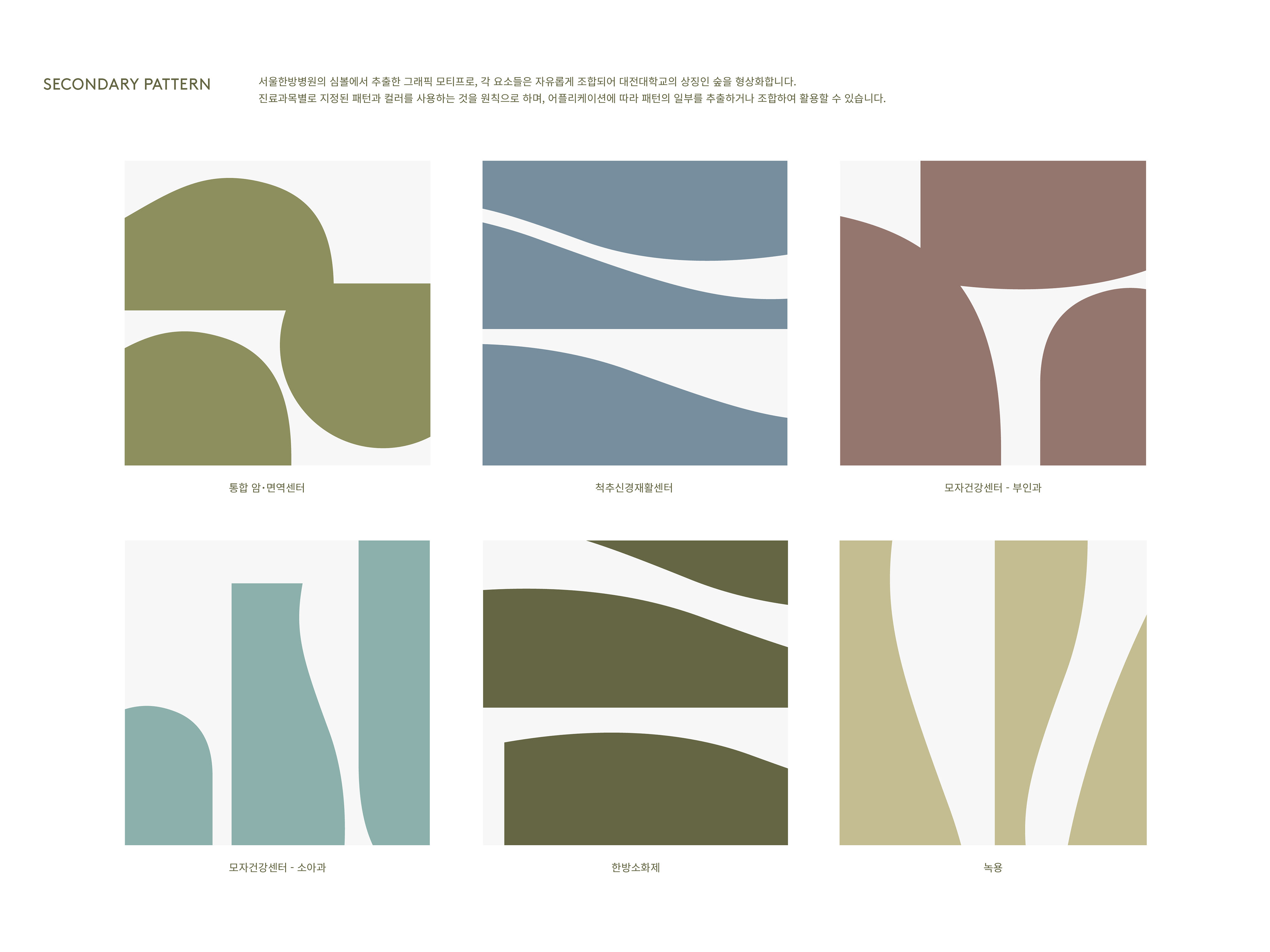
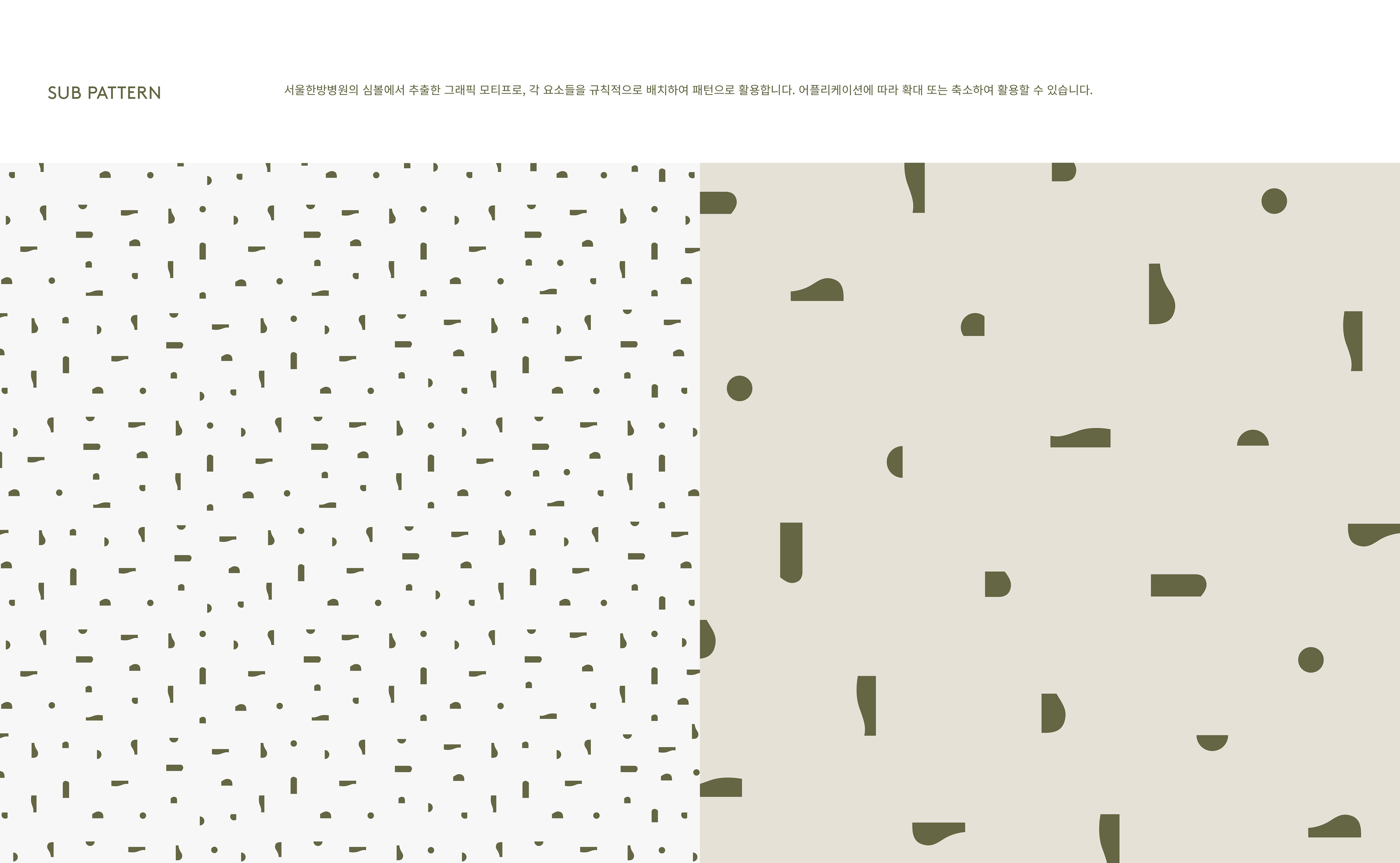
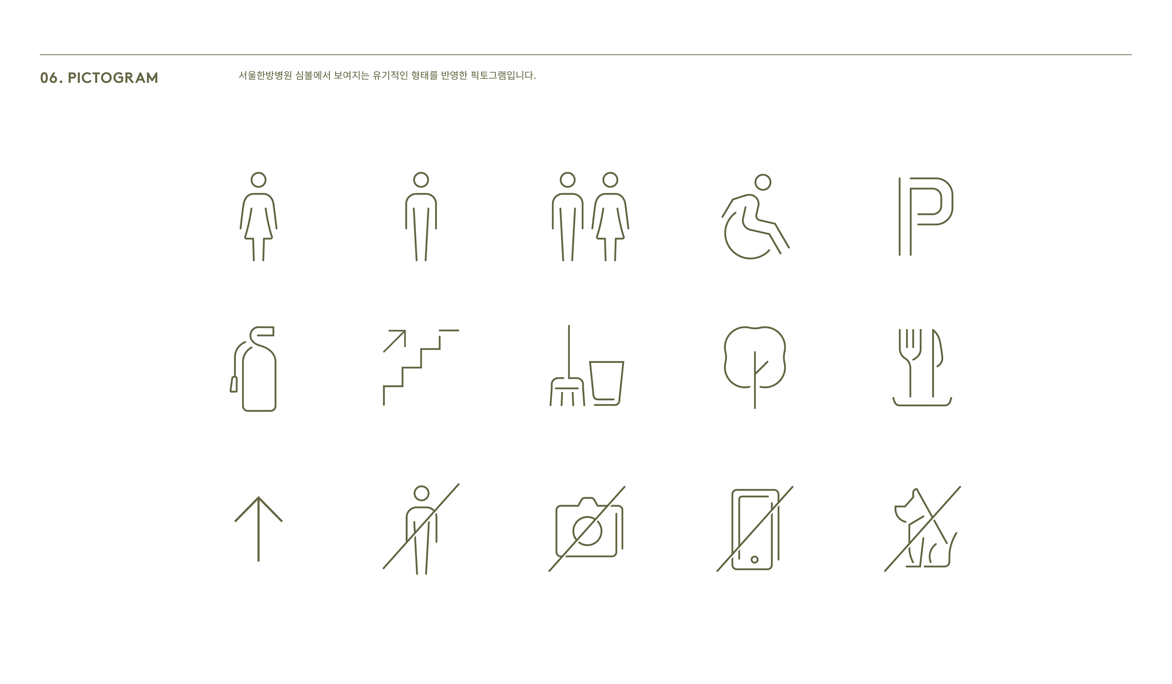
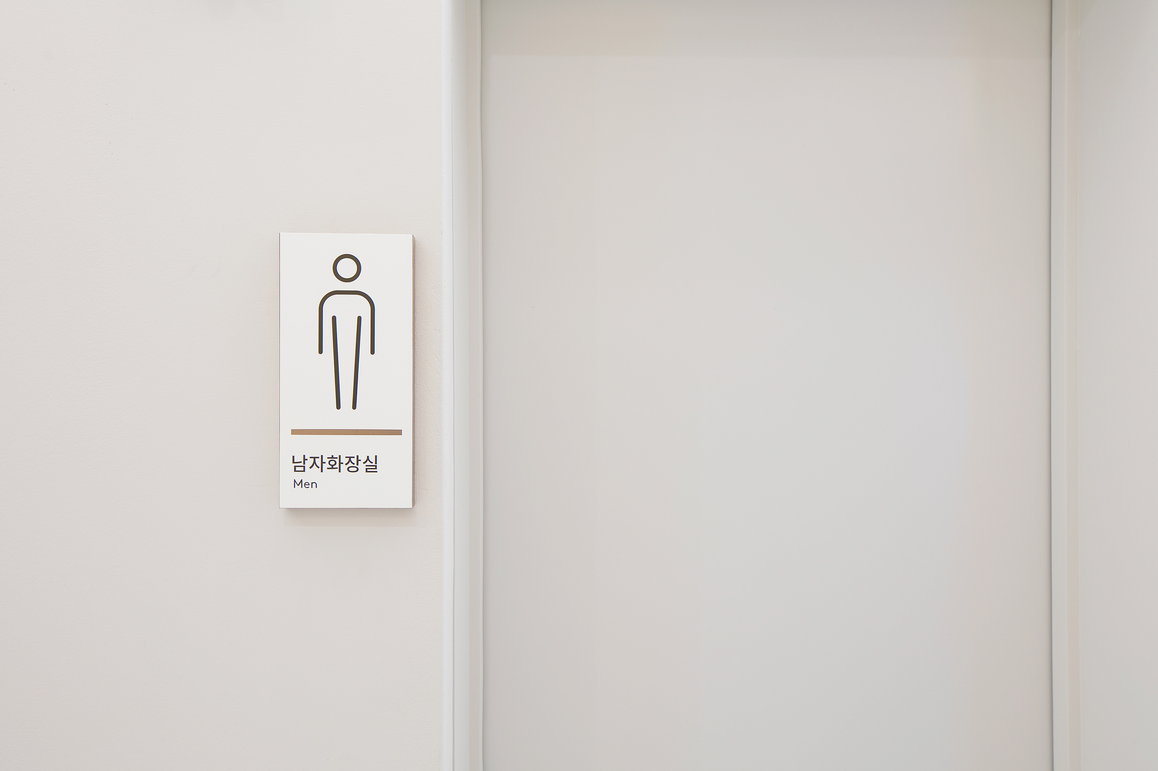
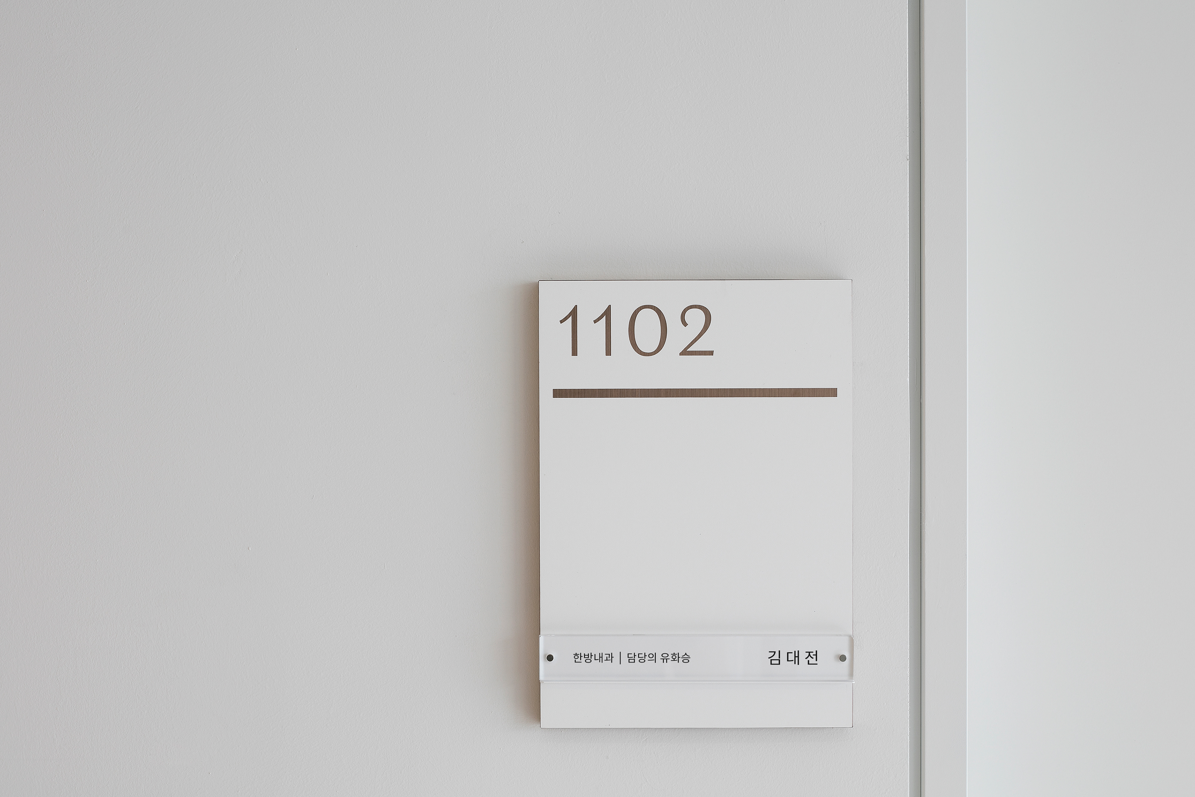
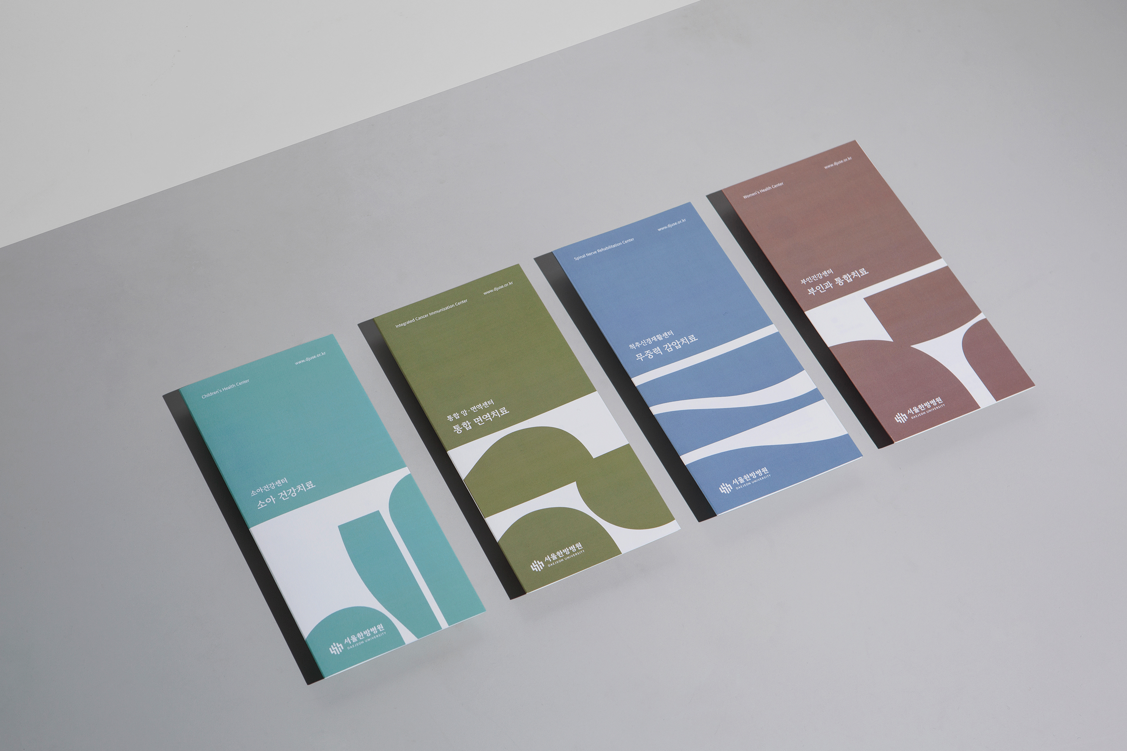
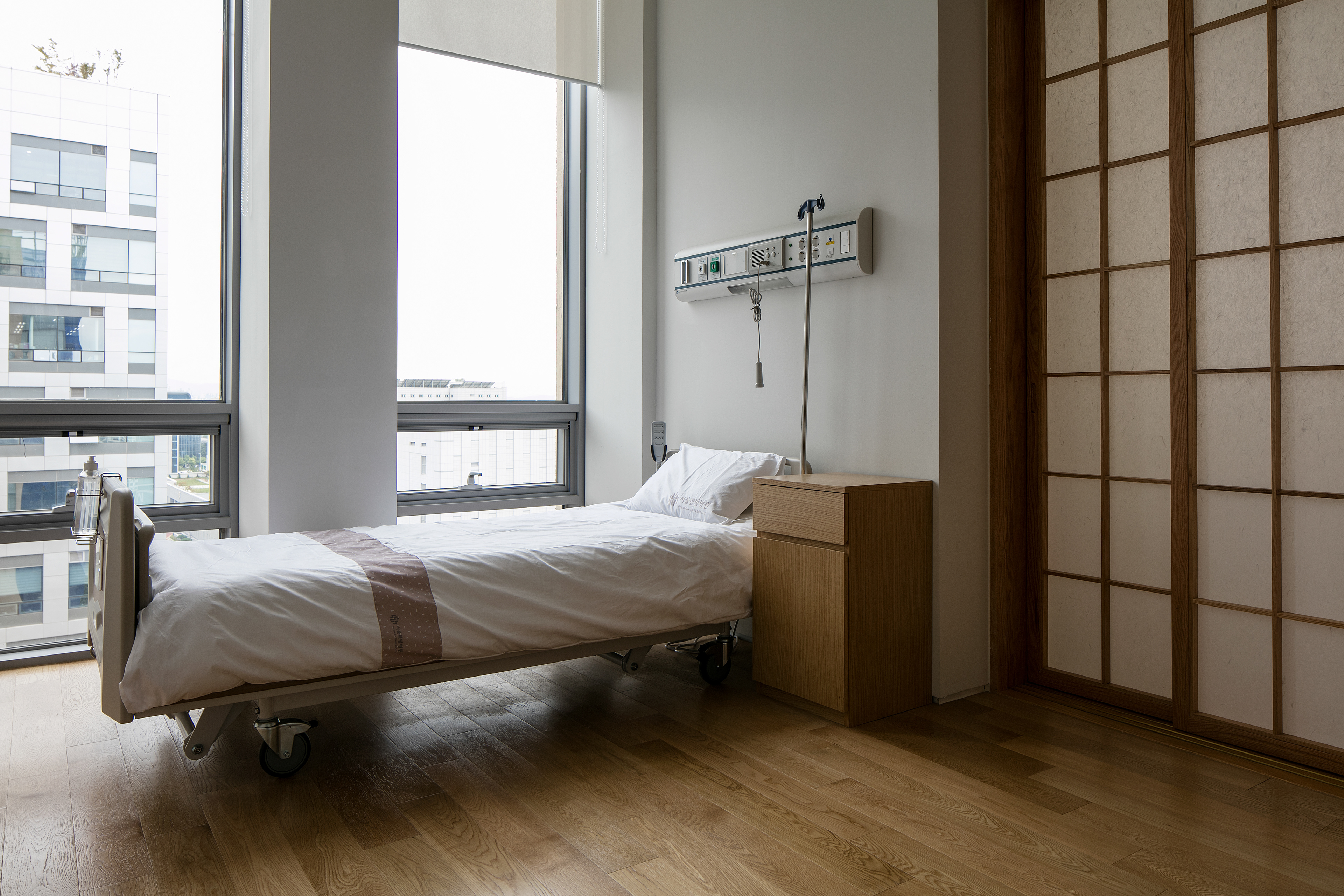
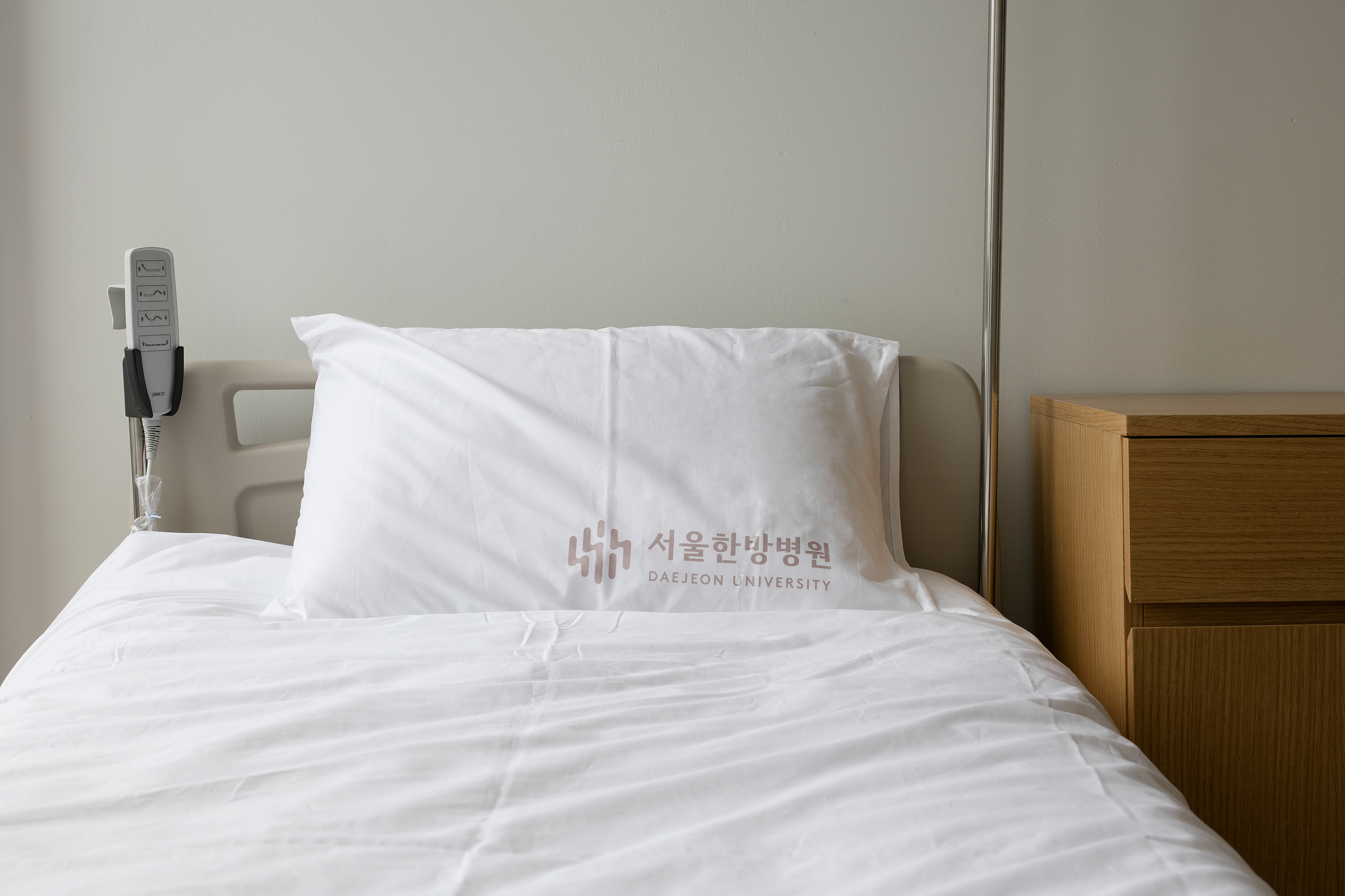
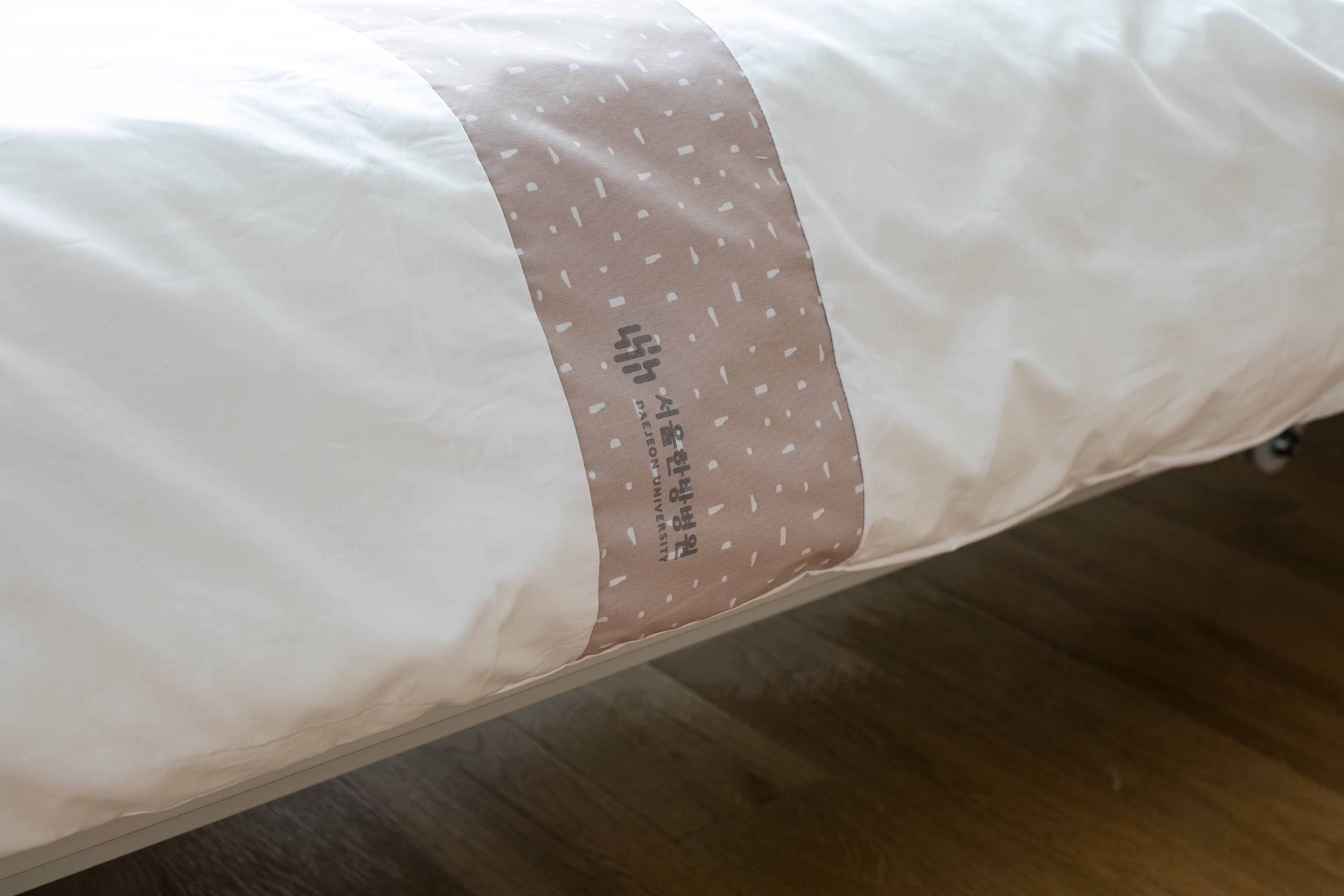
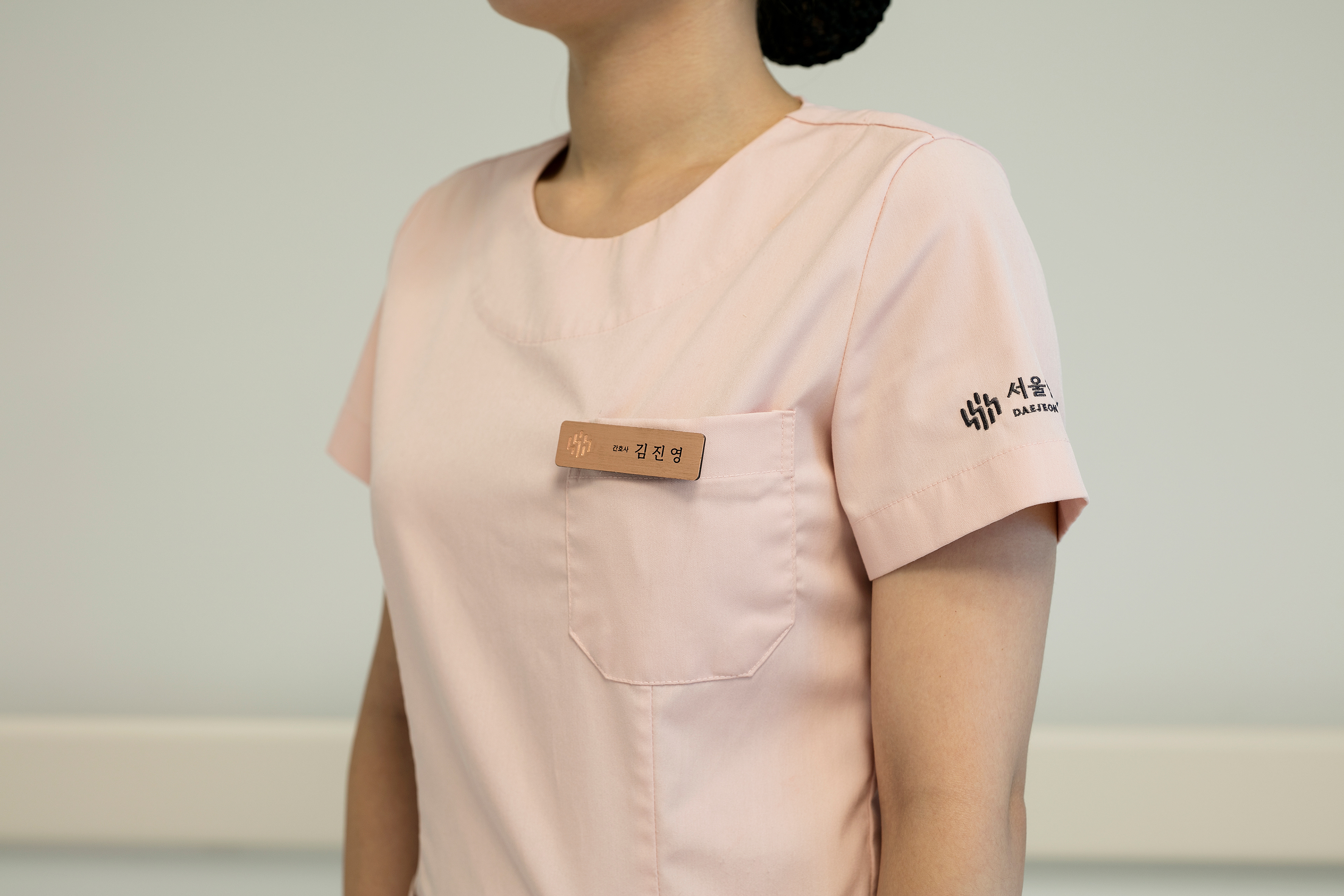
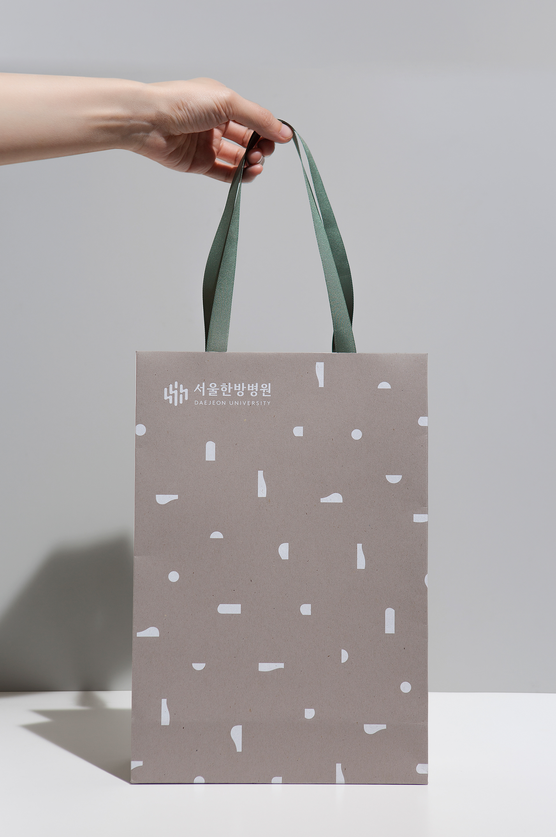
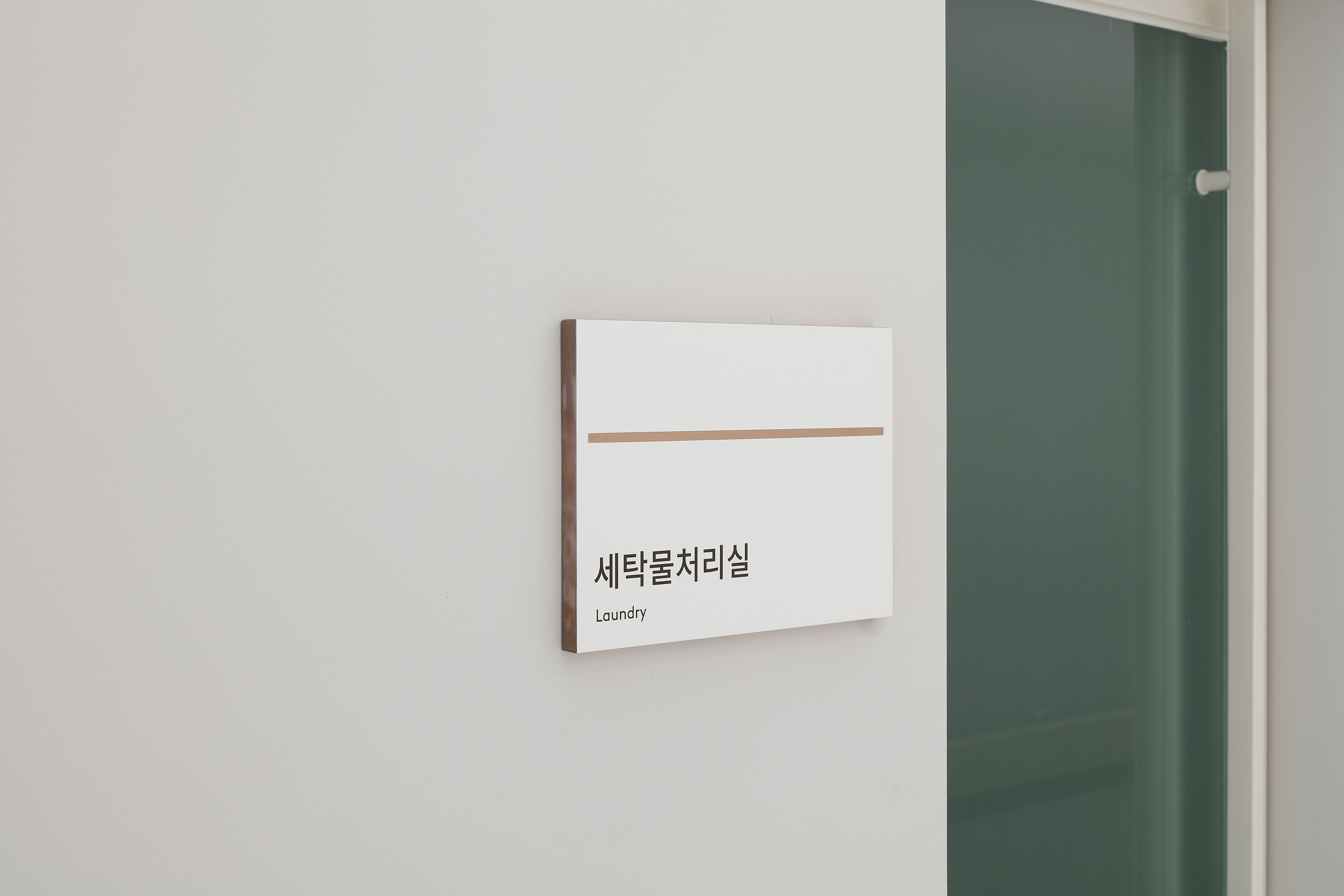
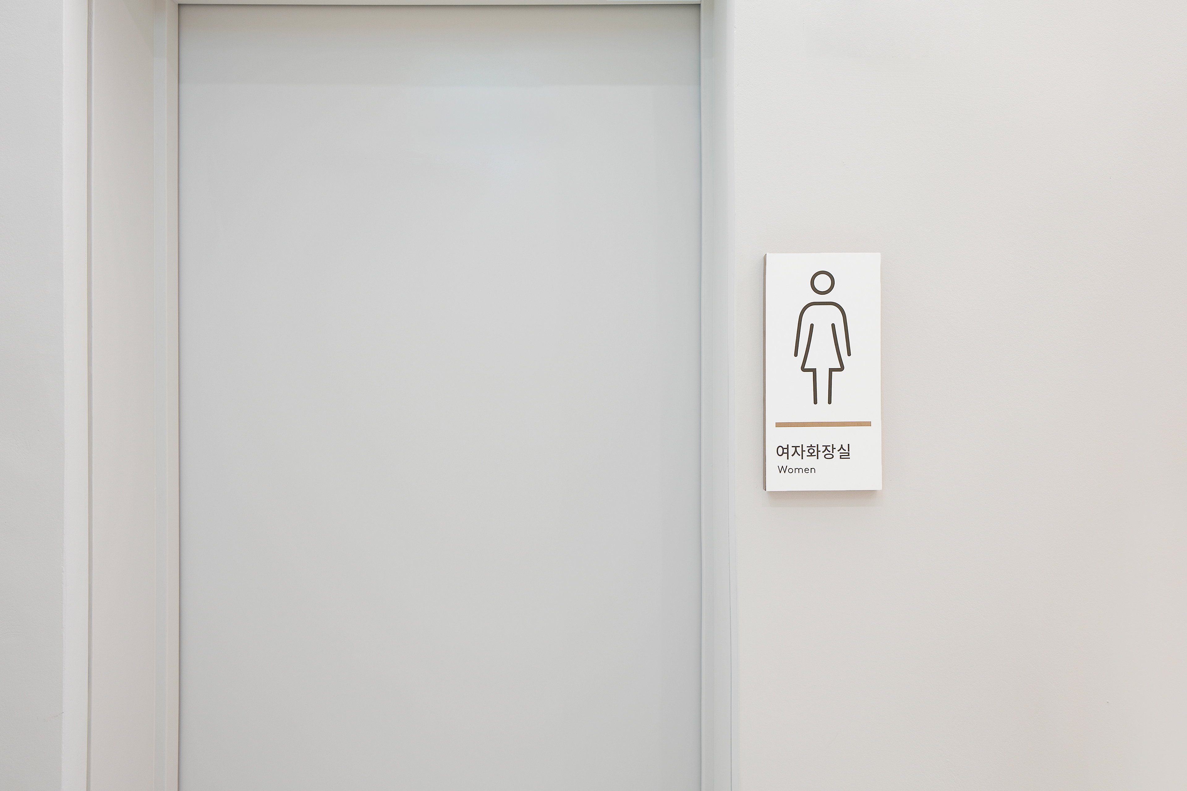
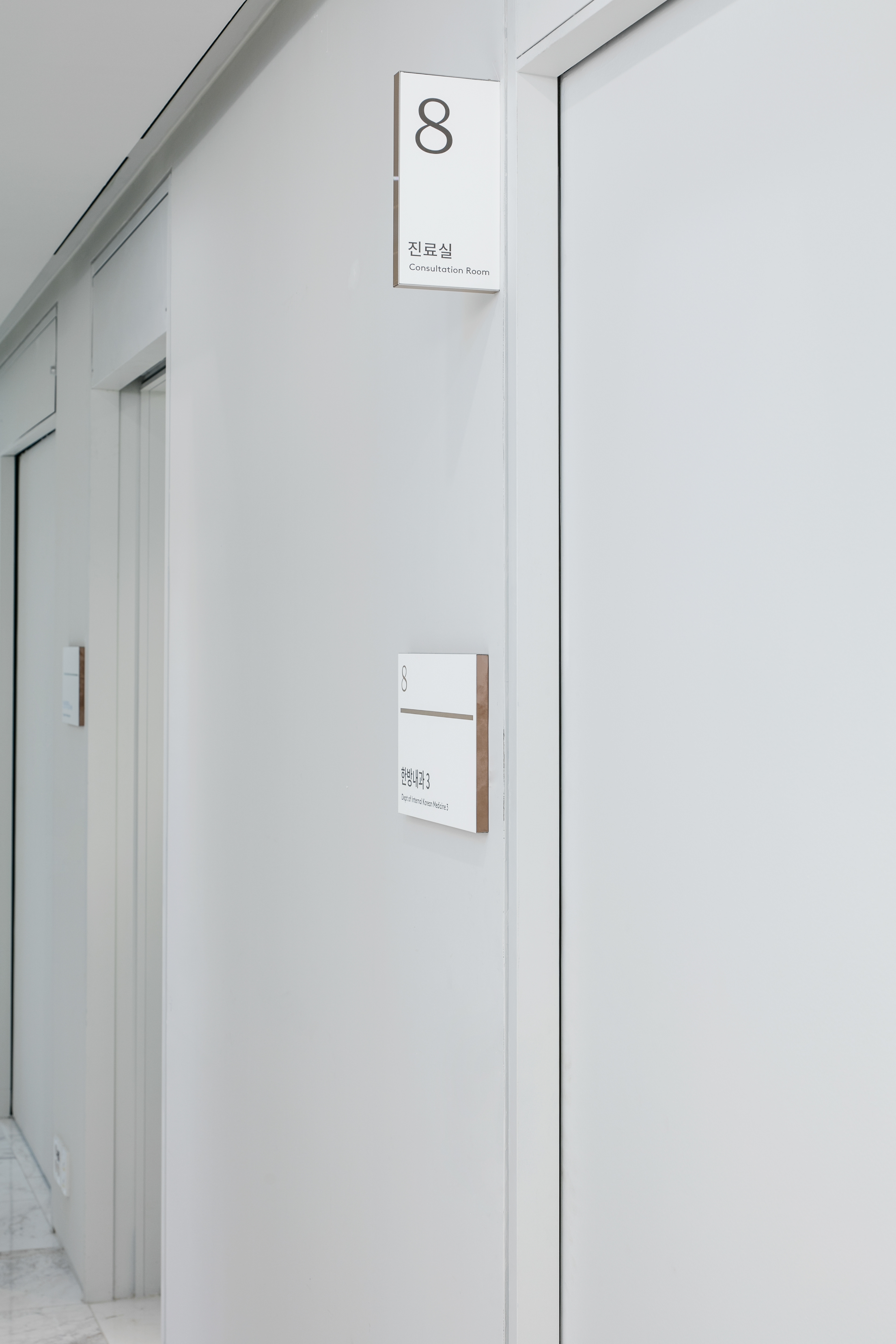
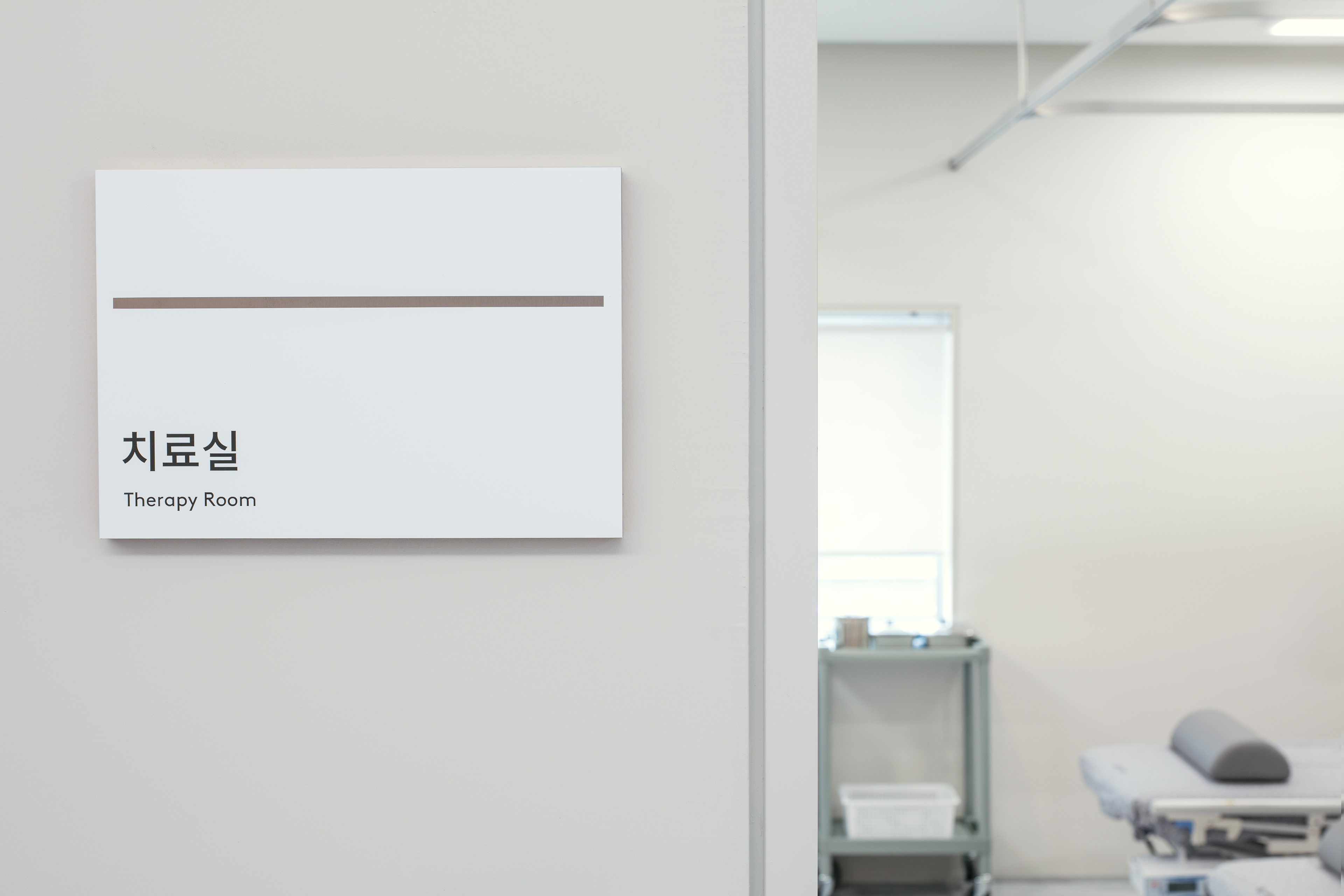
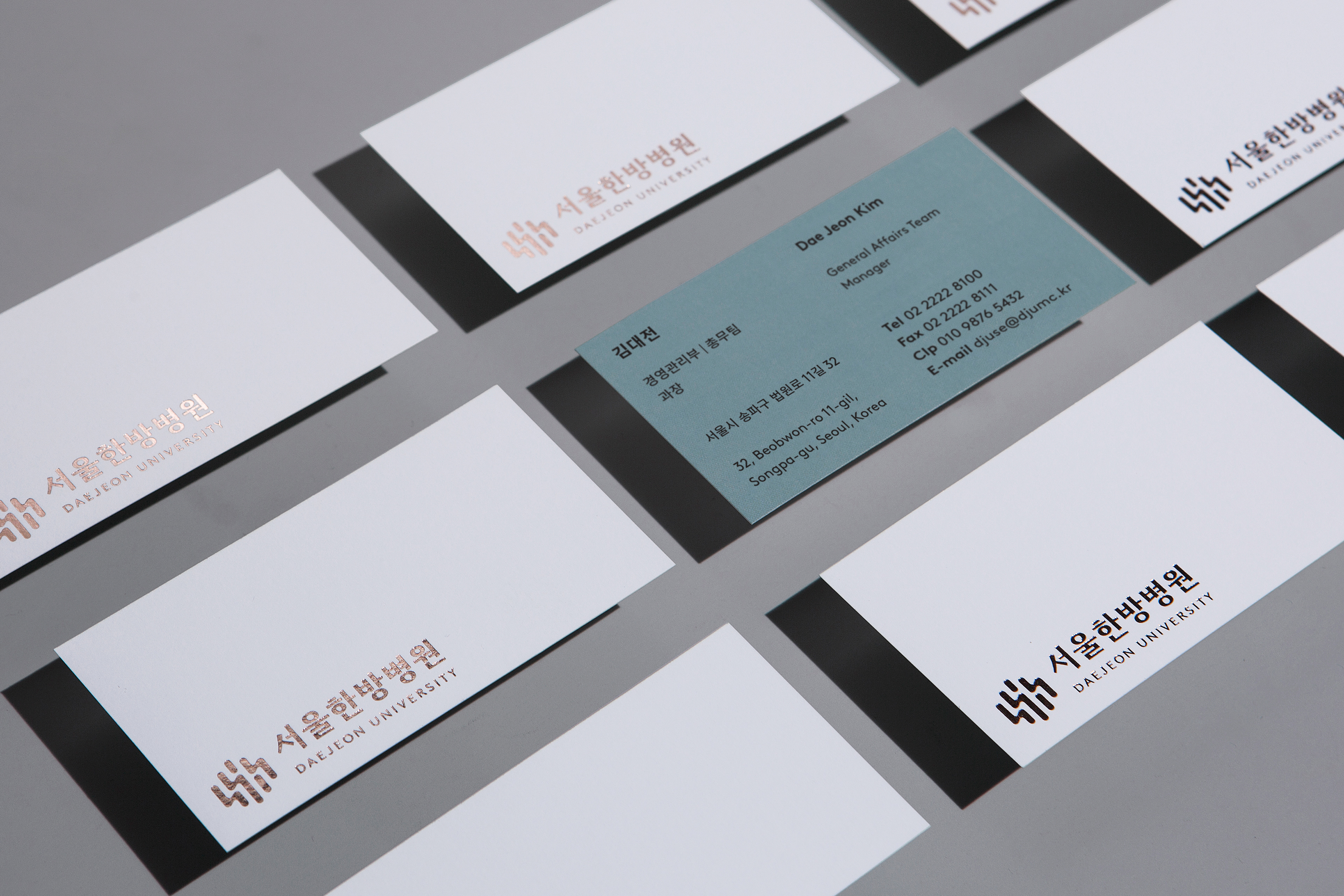
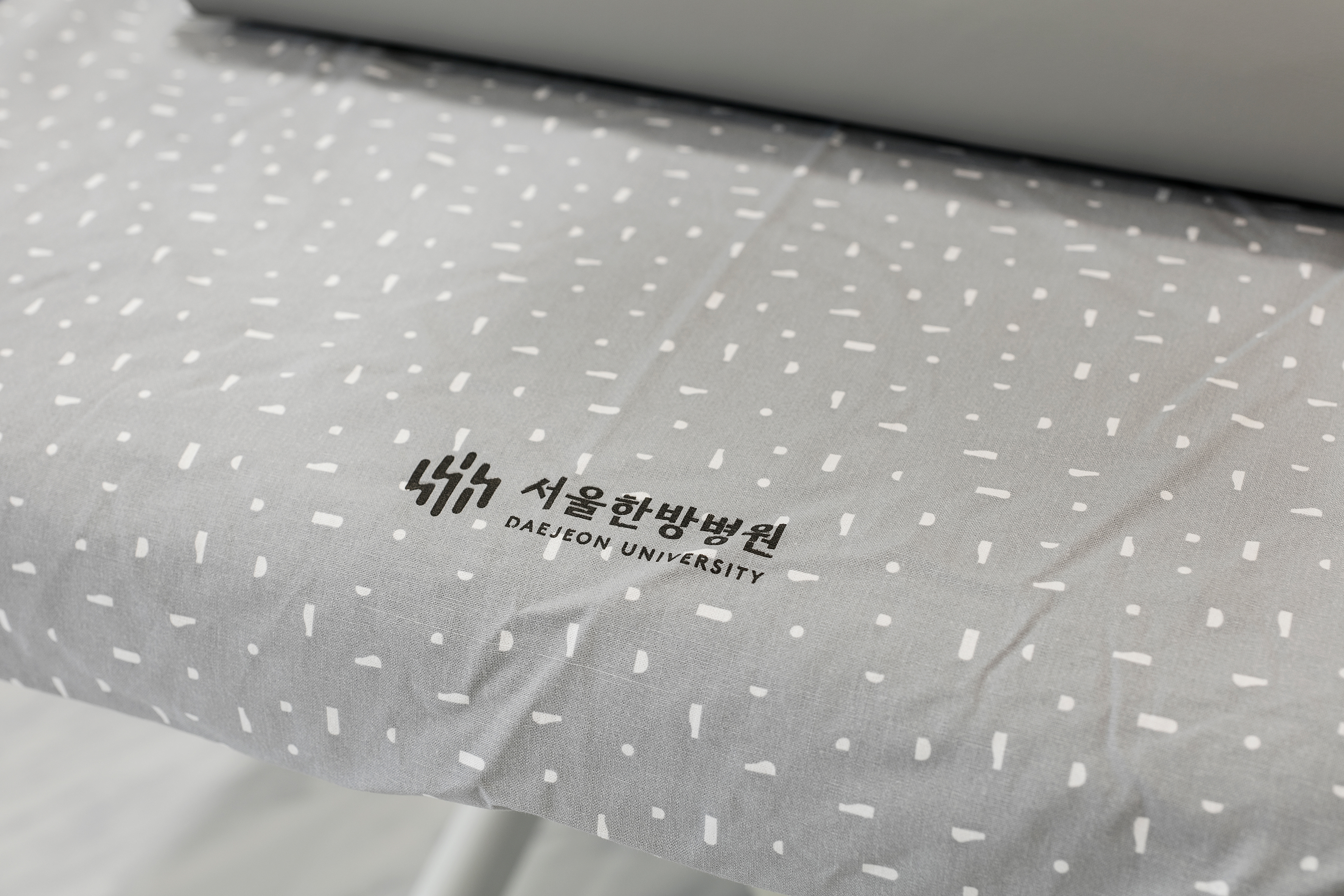
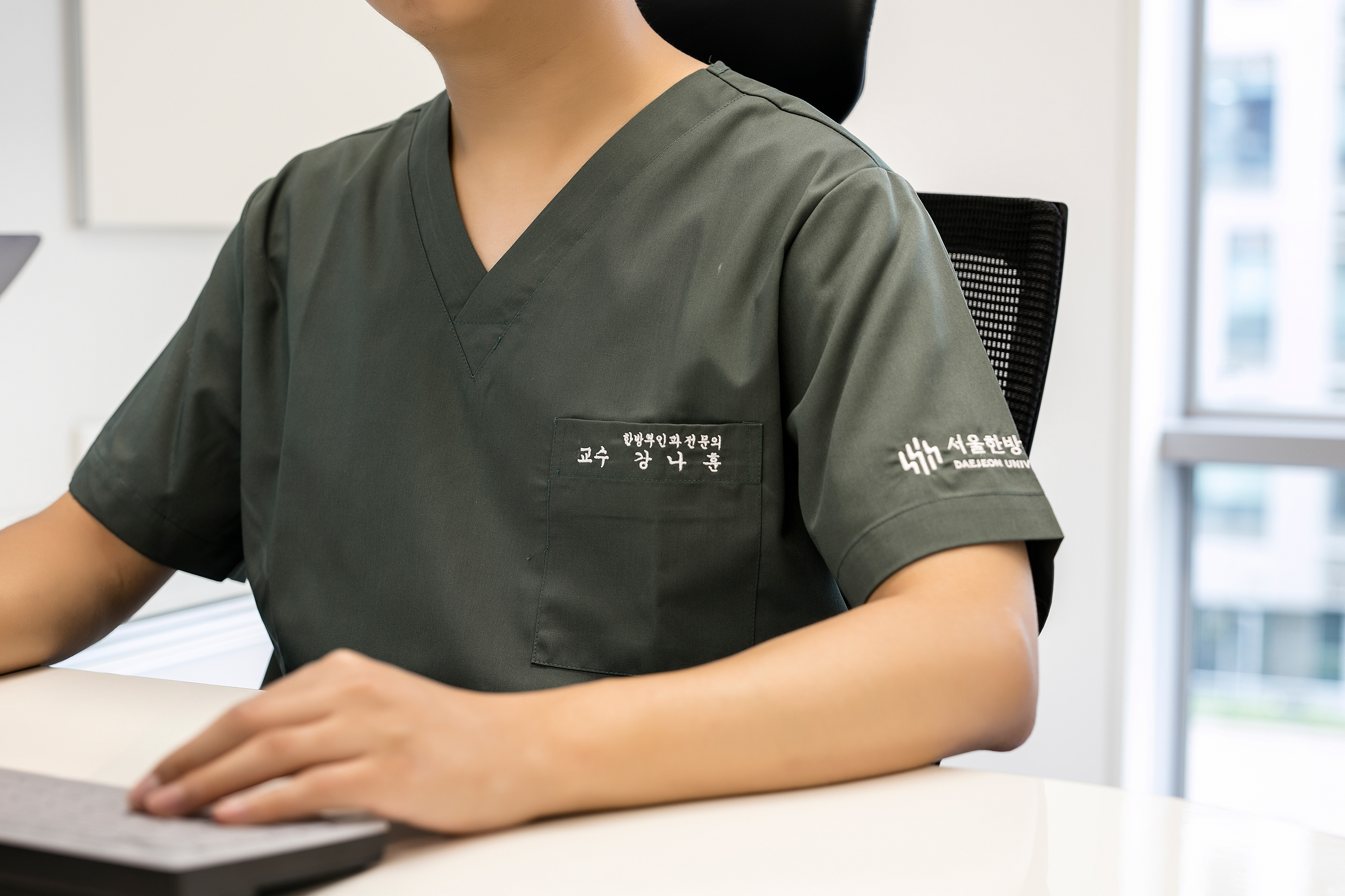
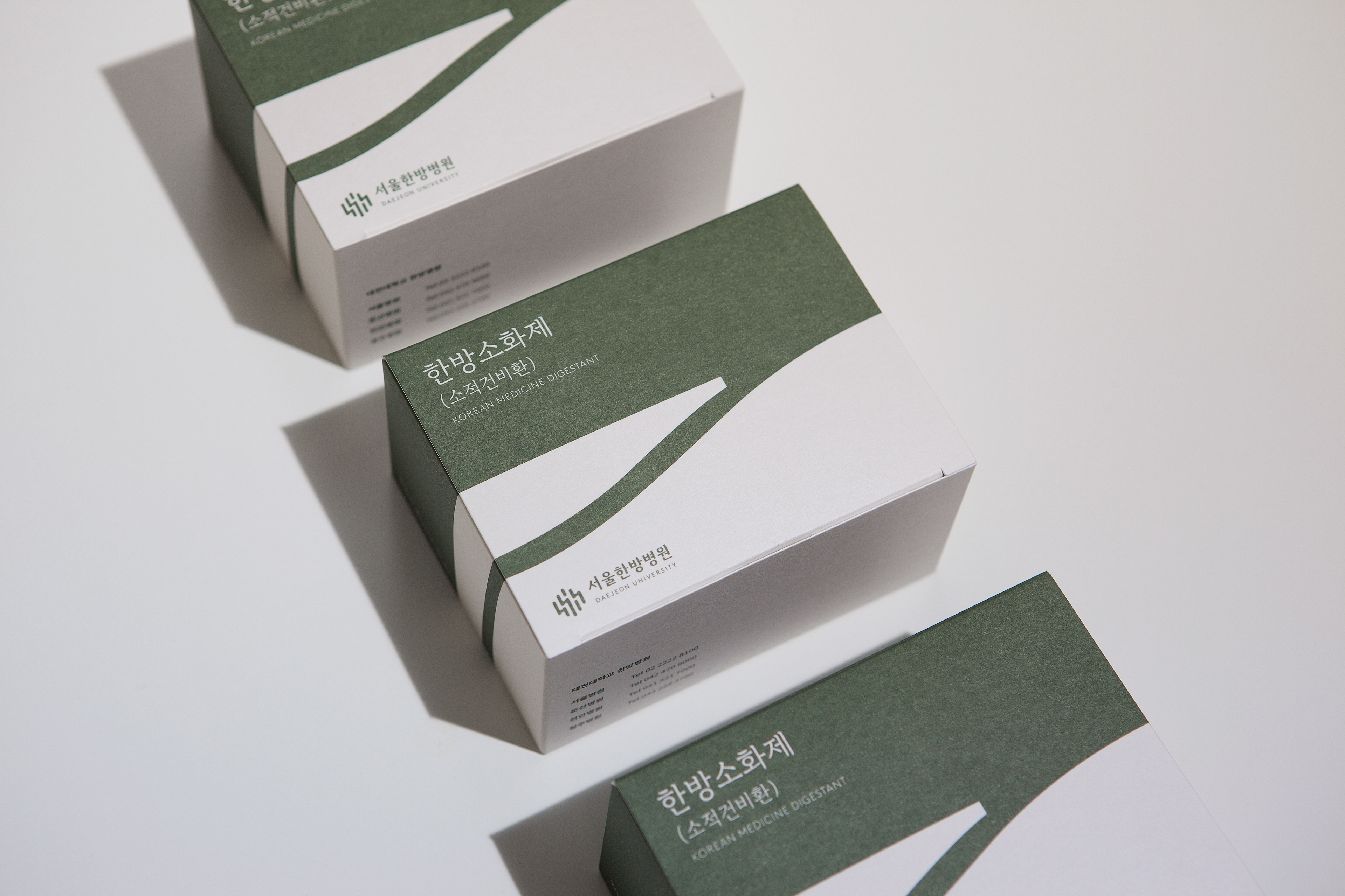
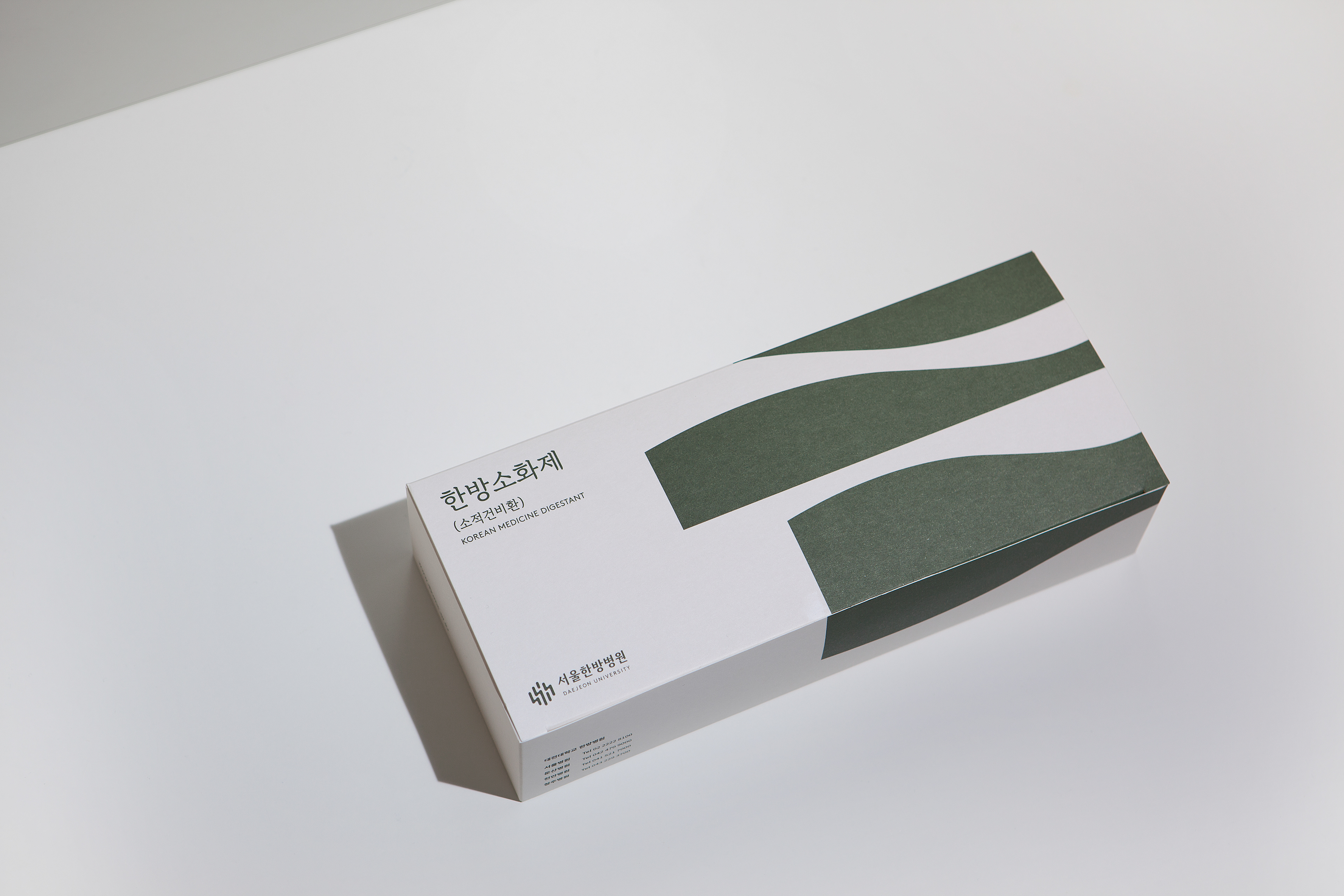
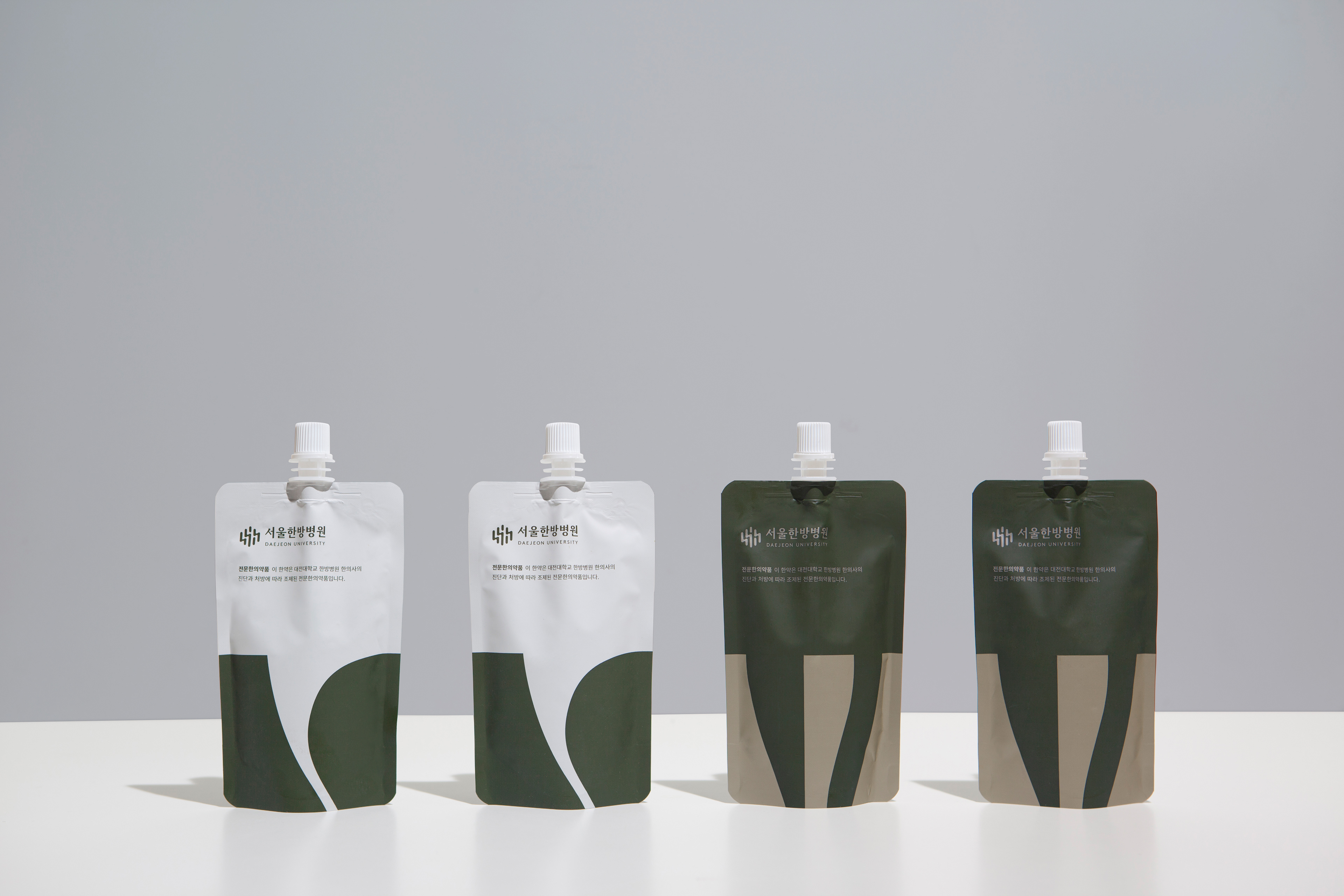
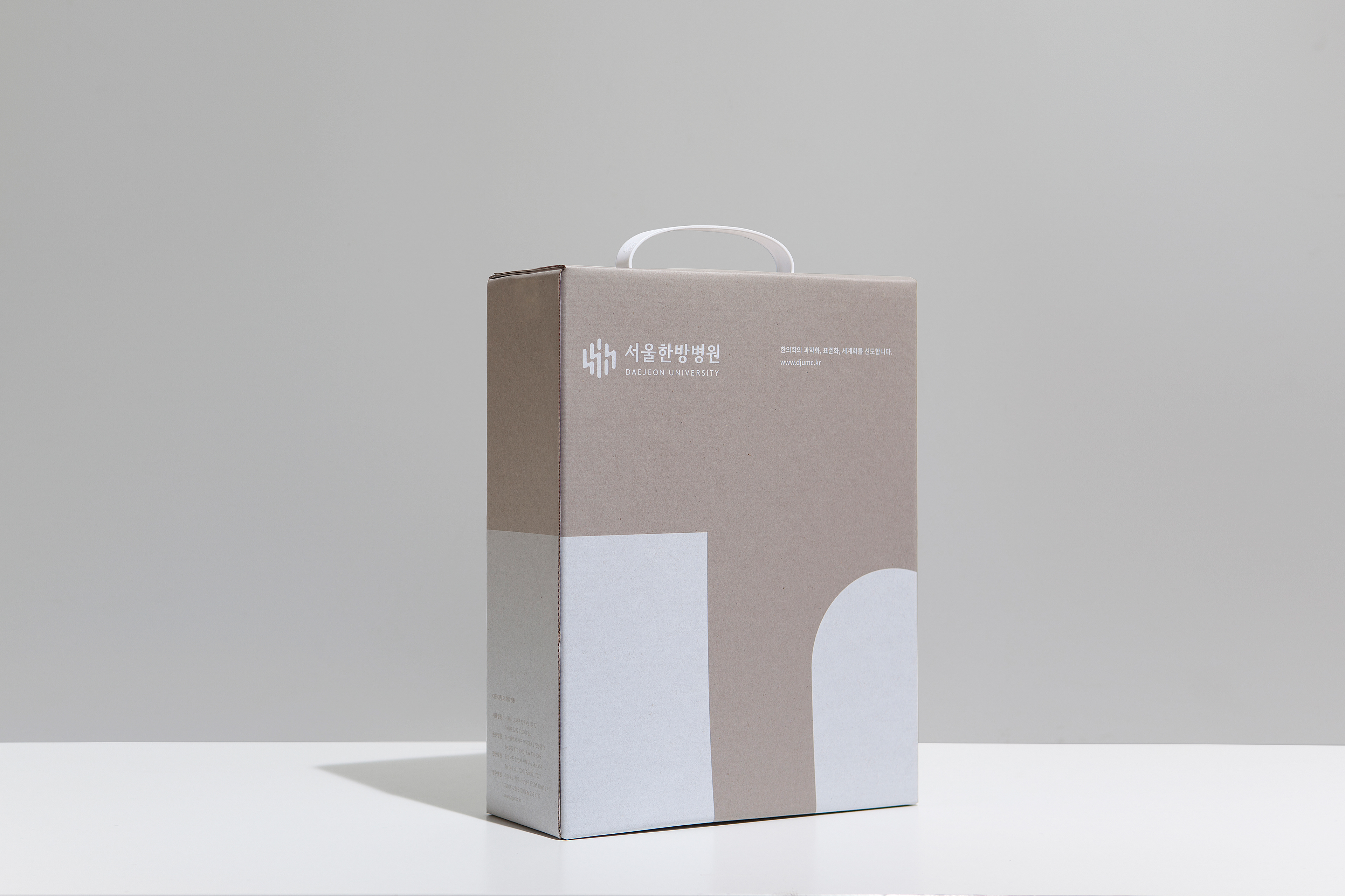
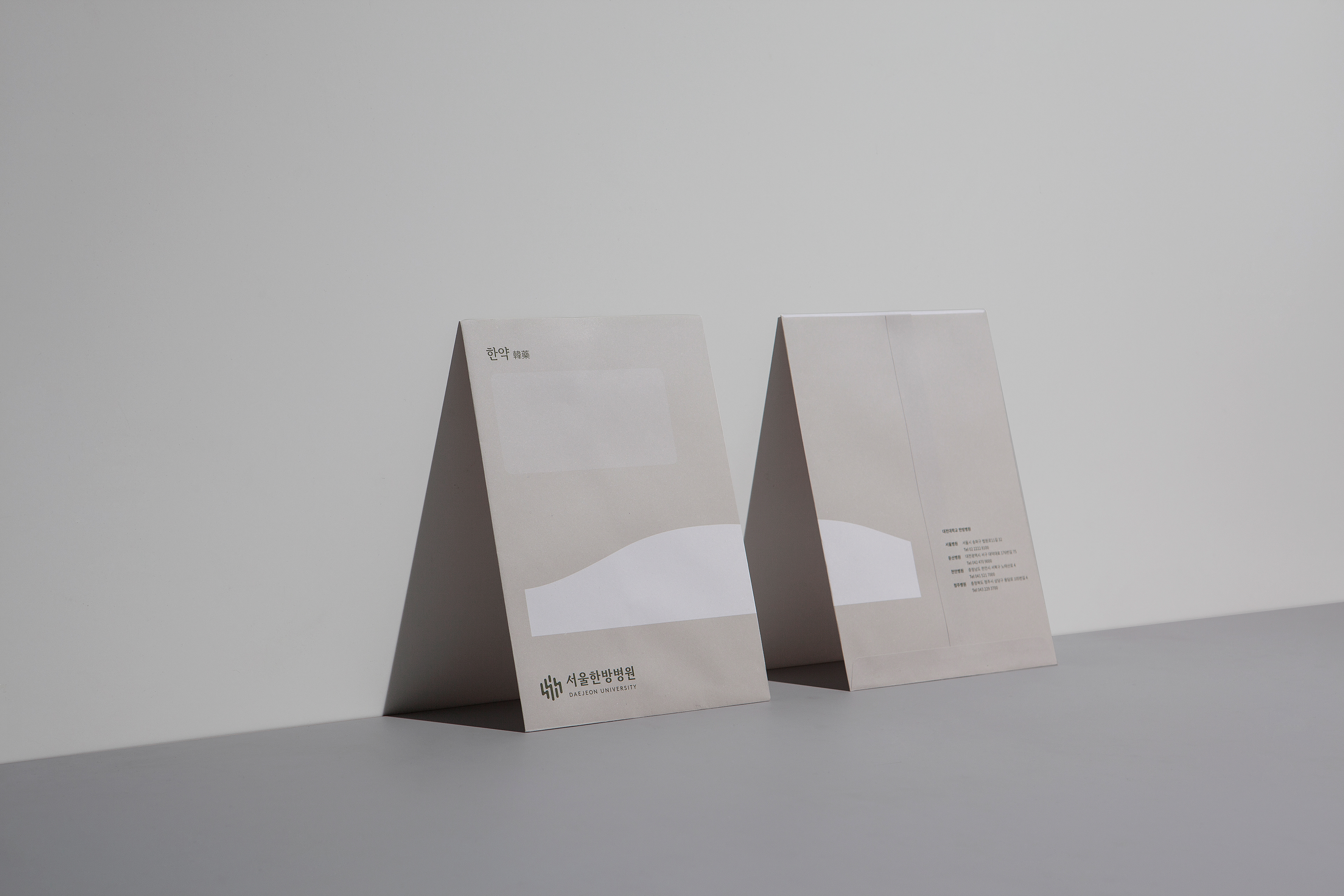
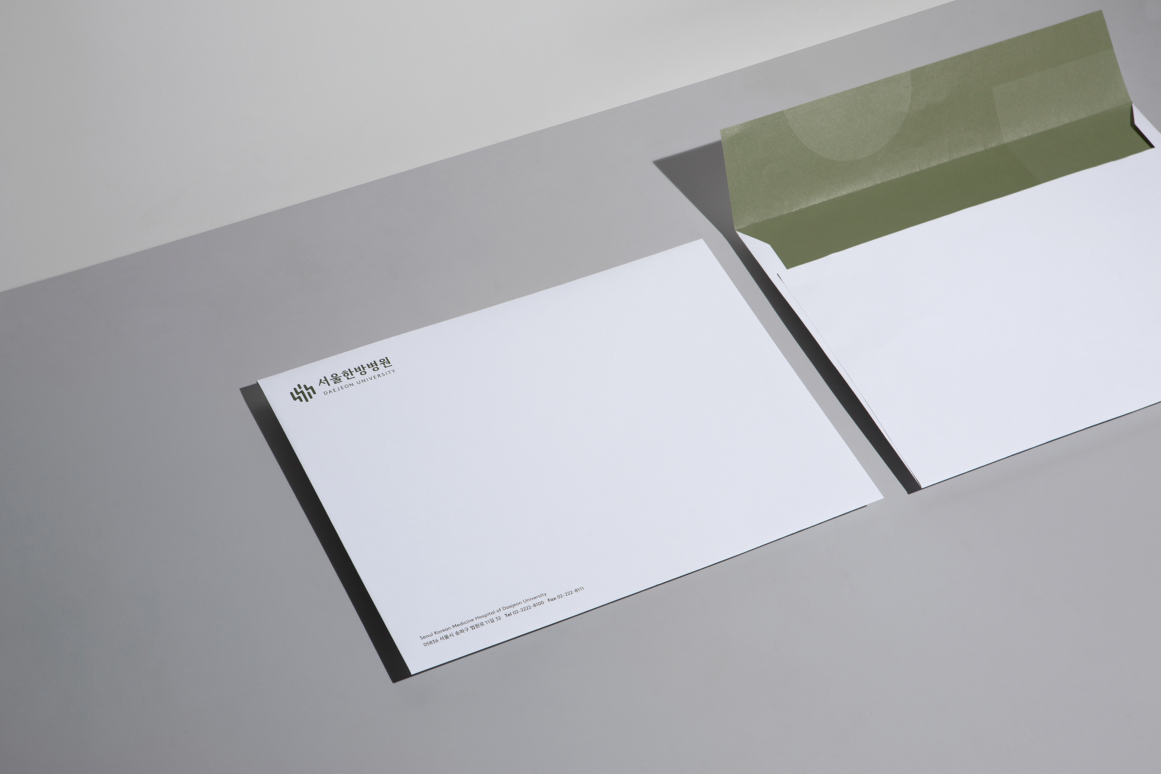
The existing symbol of the Hospital means 'Forest of Human Resources Development’, originated from Daejeon University. The new symbol conveys the value pursued by Korean Medicine Hospital of Daejeon University by adding the initial letter H of 'Hyehwa', an important value of Daejeon University Hospital, to the existing symbol with refined form. The visual identity system of Seoul Korean Medicine Hospital consists of a pattern and color palette inspired by nature by expanding the meaning of a symbol that metaphorizes for “forest”. CFC interpreted nature's close-up view as organic graphics and applied it to various applications including brochures, shopping bags, and packages.


Korean Medicine Hospital of Daejeon University HI Renewal
2019
Client: Seoul Korean Medicine Hospital of Daejeon University
Project Team
-
CFC
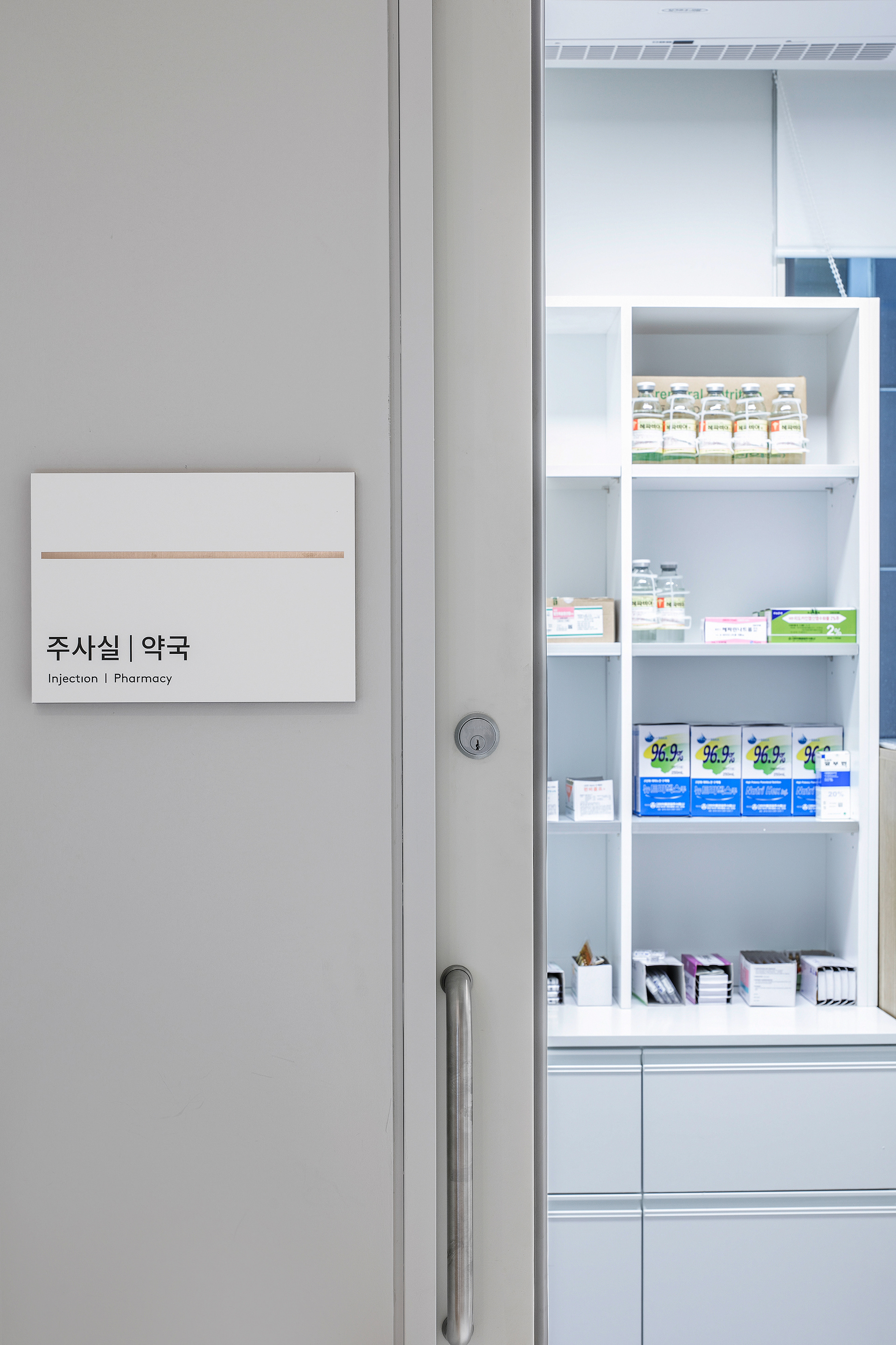
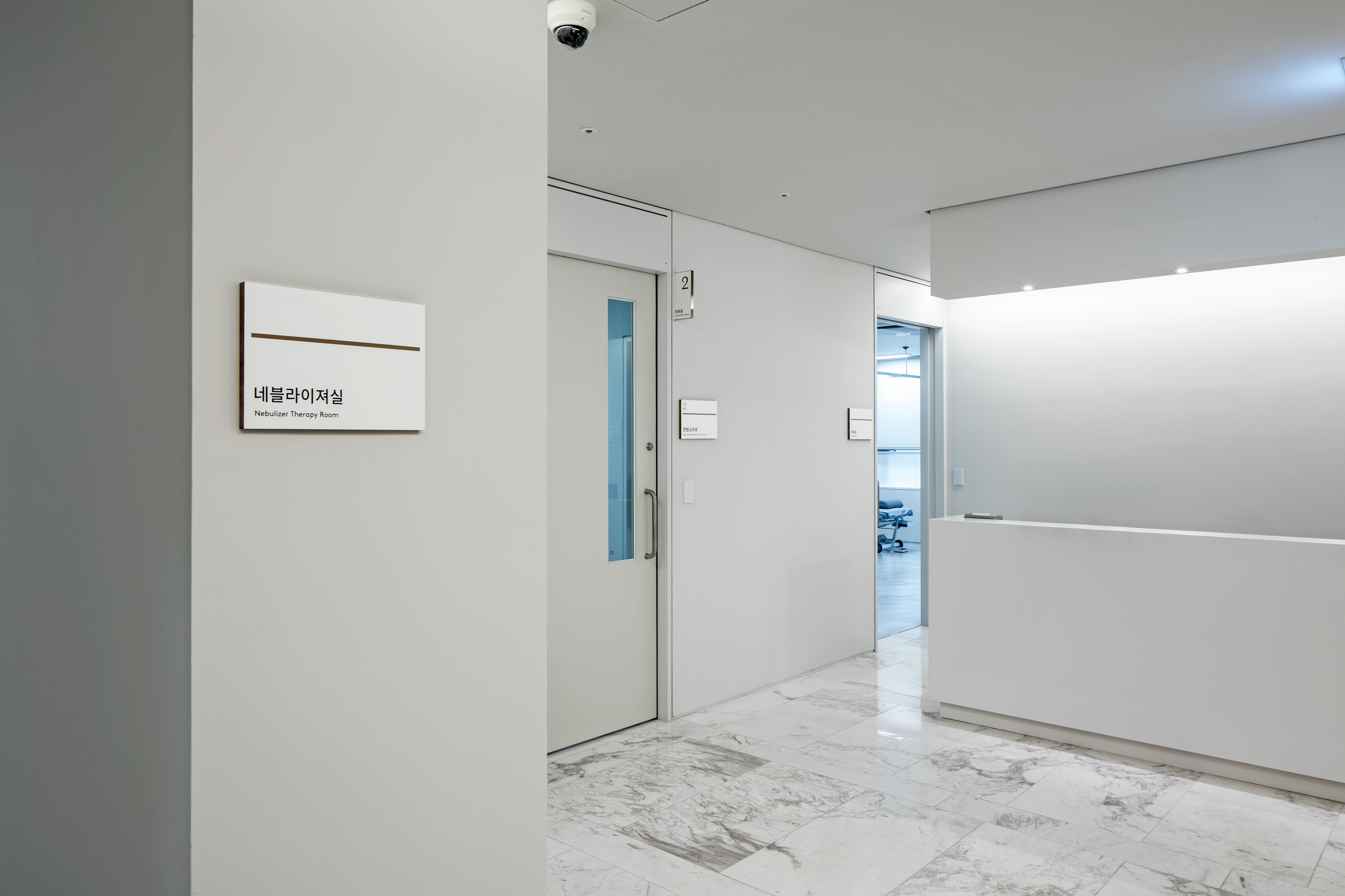
Brand Identity, Application & Signage Design Dev.
Art Direction & Design: Charry Jeon
Design: Jiyoung Kim, Eunju Kim
Assist: Saerom Kang, Nara Yoon
Photography: Kiwoong Hong
Heejoon Choi
Korean Logotype Design
www.contentformcontext.com