CFC has renewed BI for the ‘Market Kurly’, a distribution company that has been in business for five years.
The renewal direction was simple. “Communicate more confidently with what ‘Kurly’ does well.”
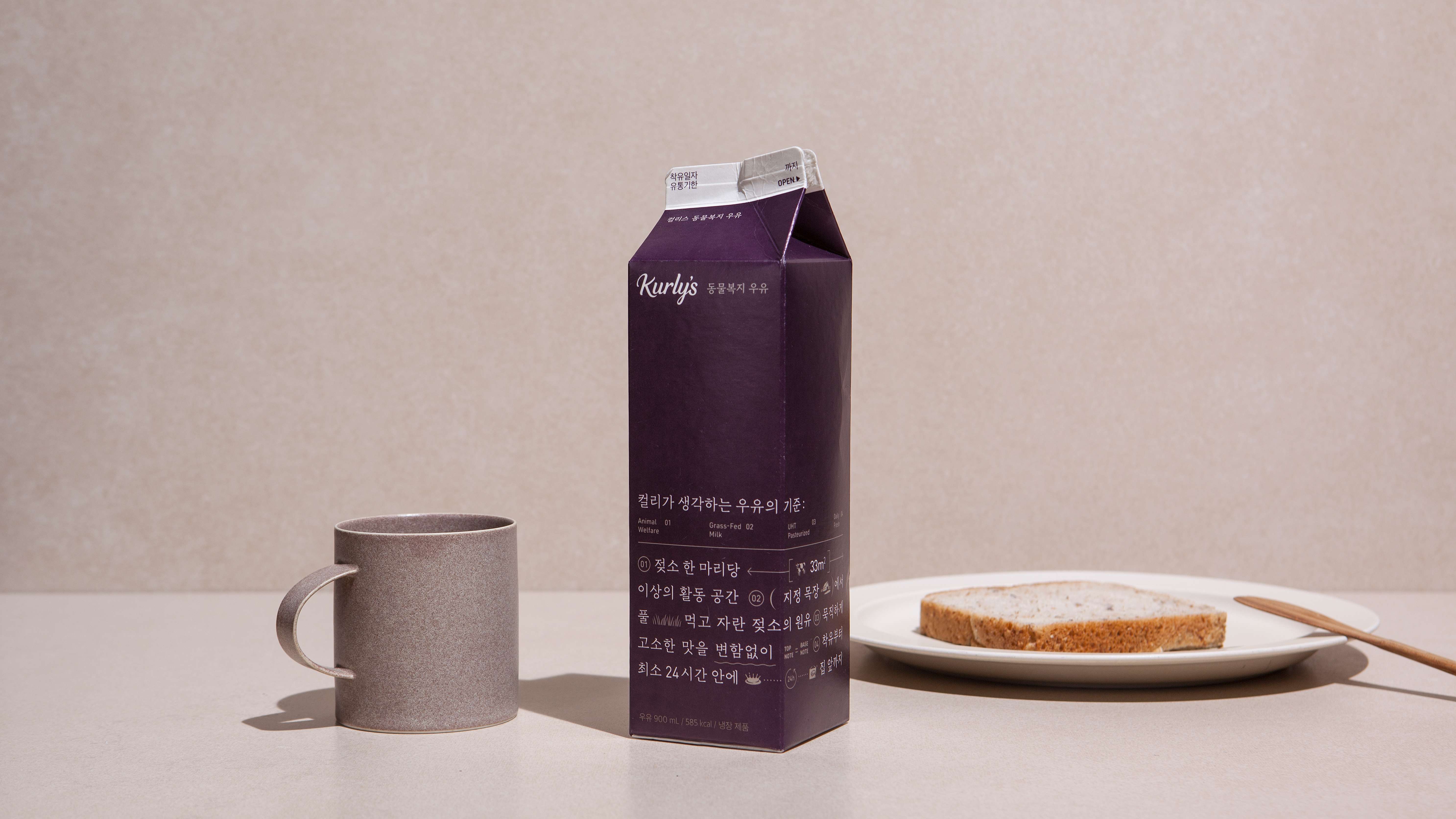
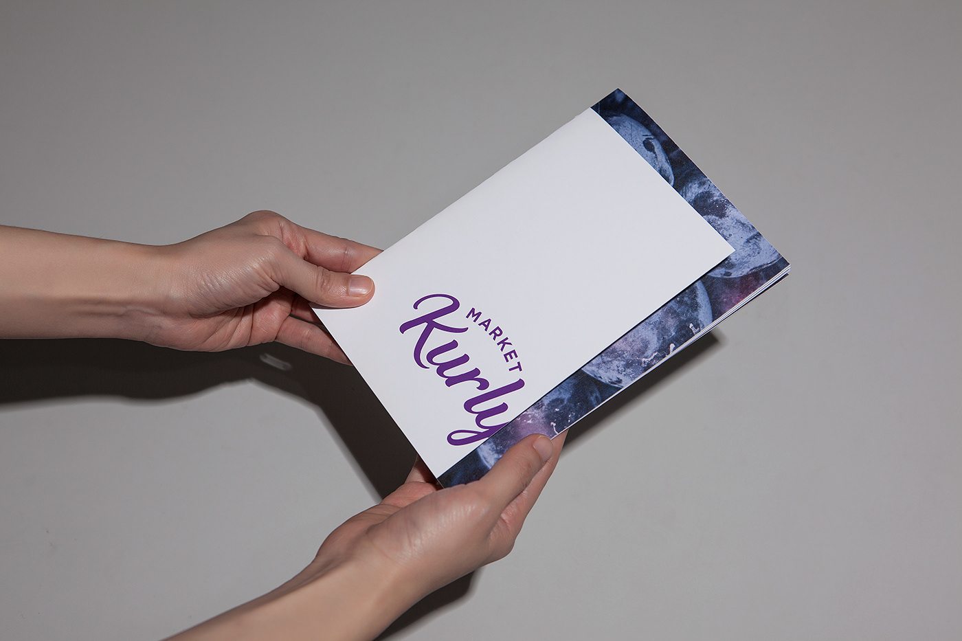
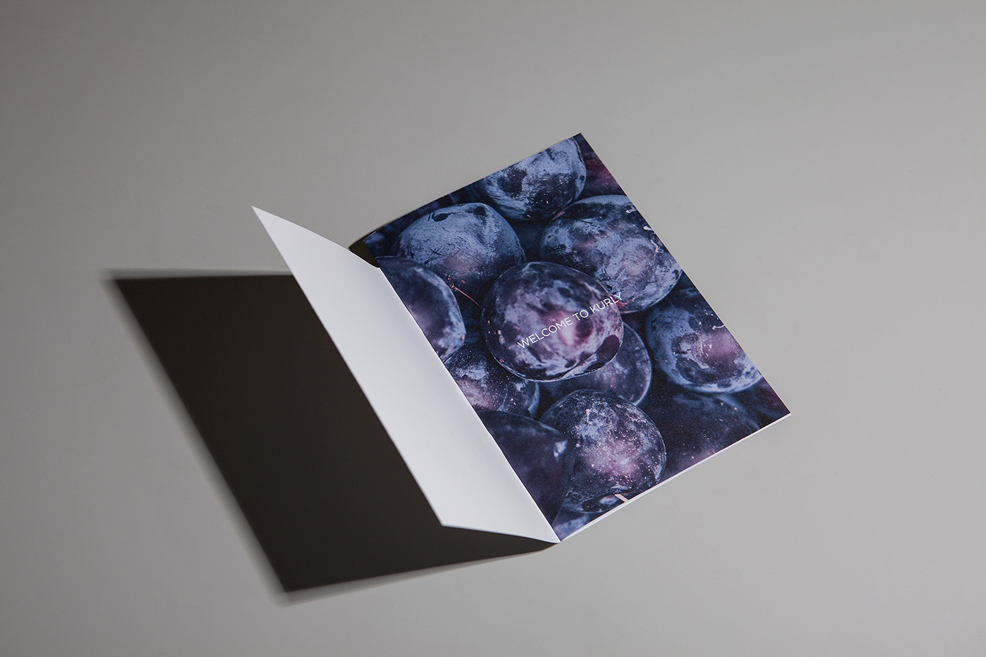
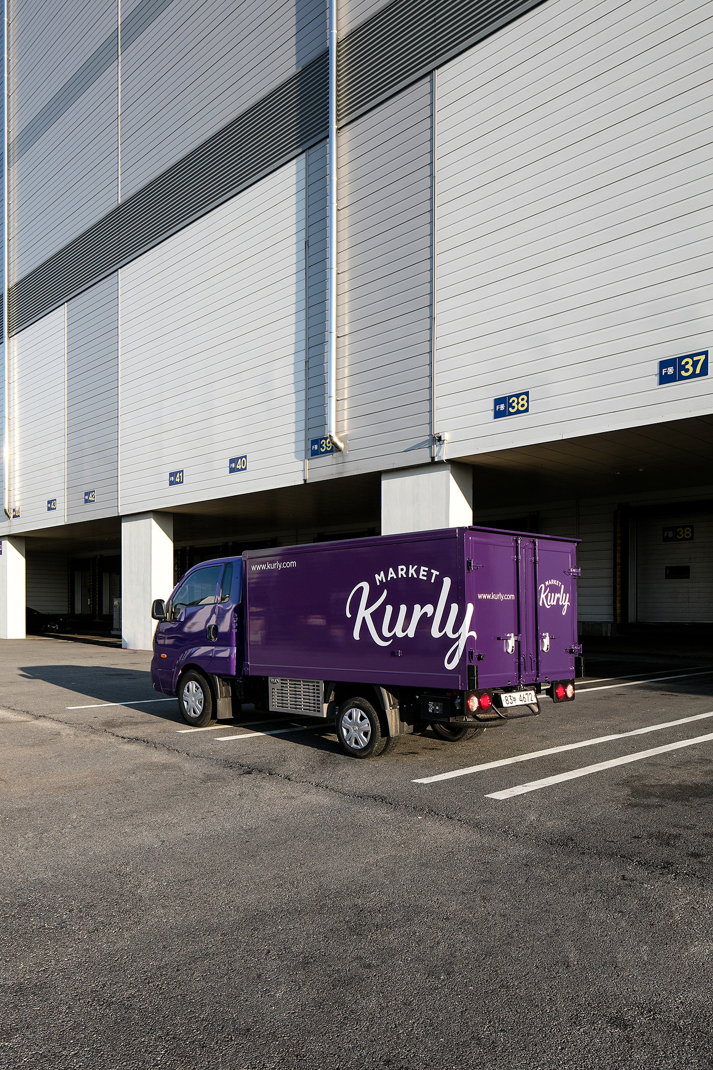
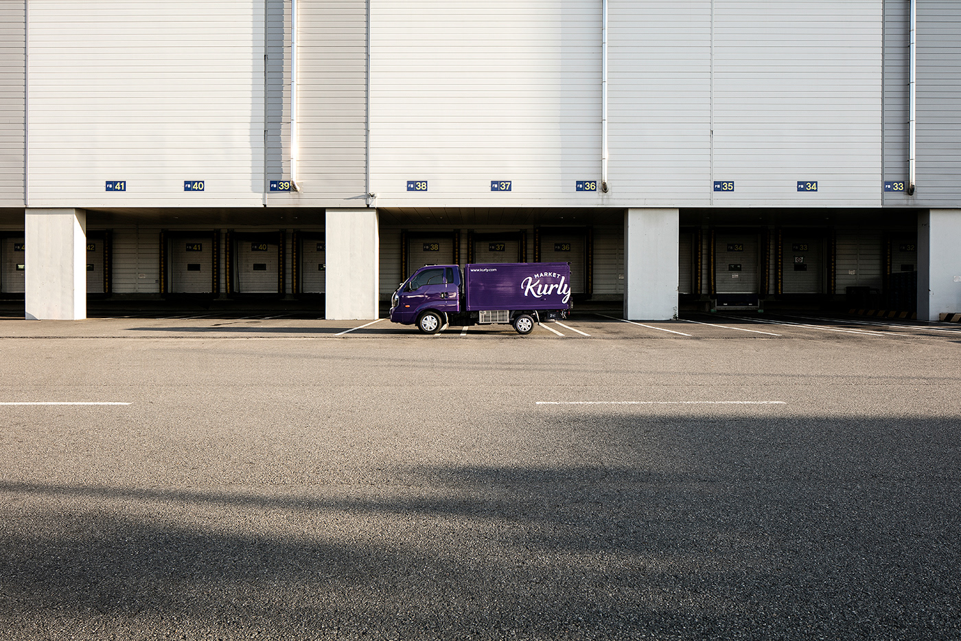
We kept the visual assets that emerged in the ‘Market Kurly’ - purple and scripted logotypes - and improved them to a fresher, more sophisticated form. The newly defined ‘Kurly Purple' is a color with improved saturation and brightness. The new logotype is simpler and more powerful than the existing one, improving readability.
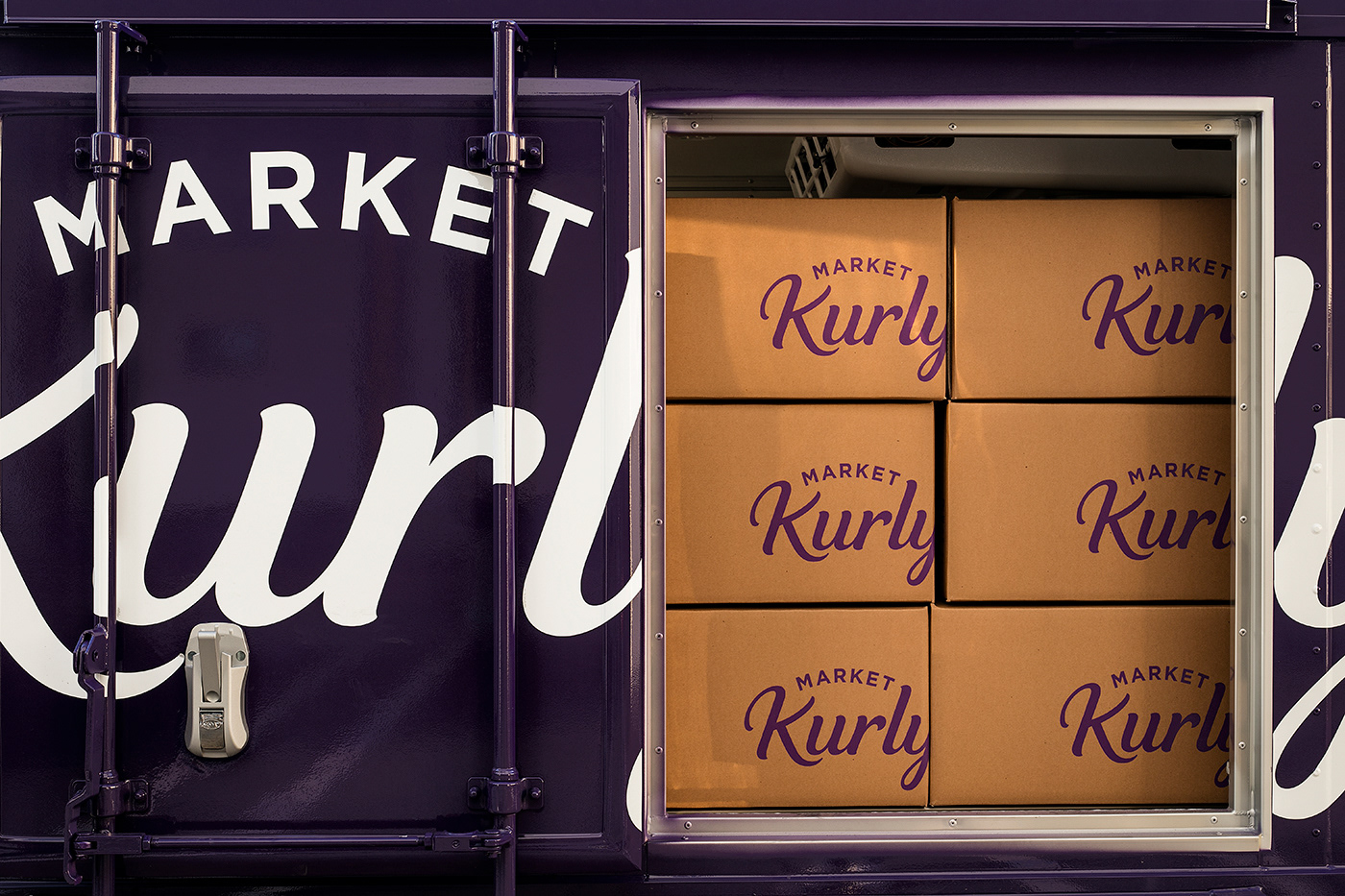
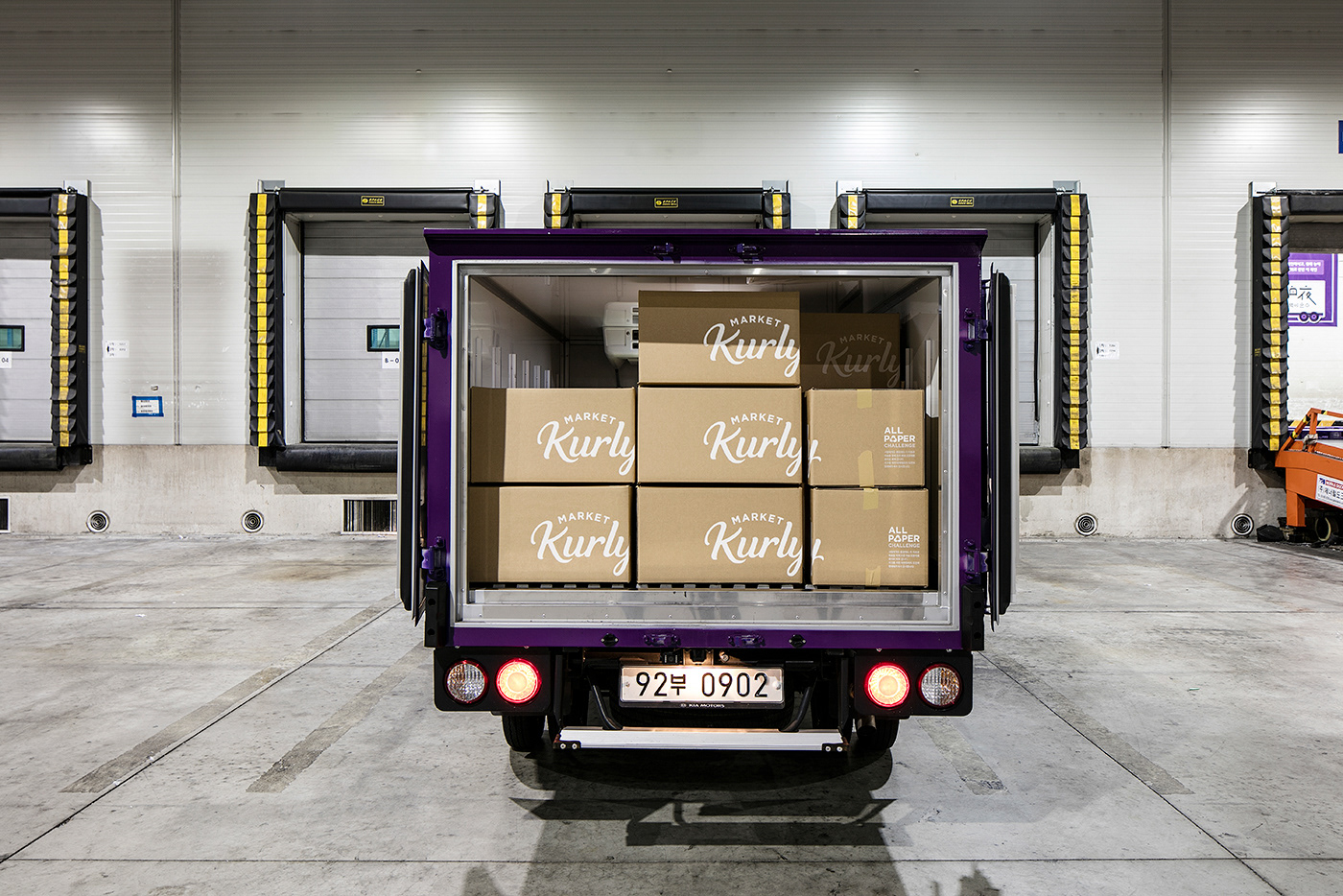
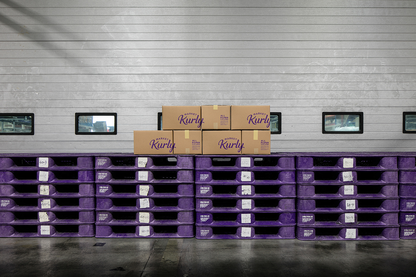
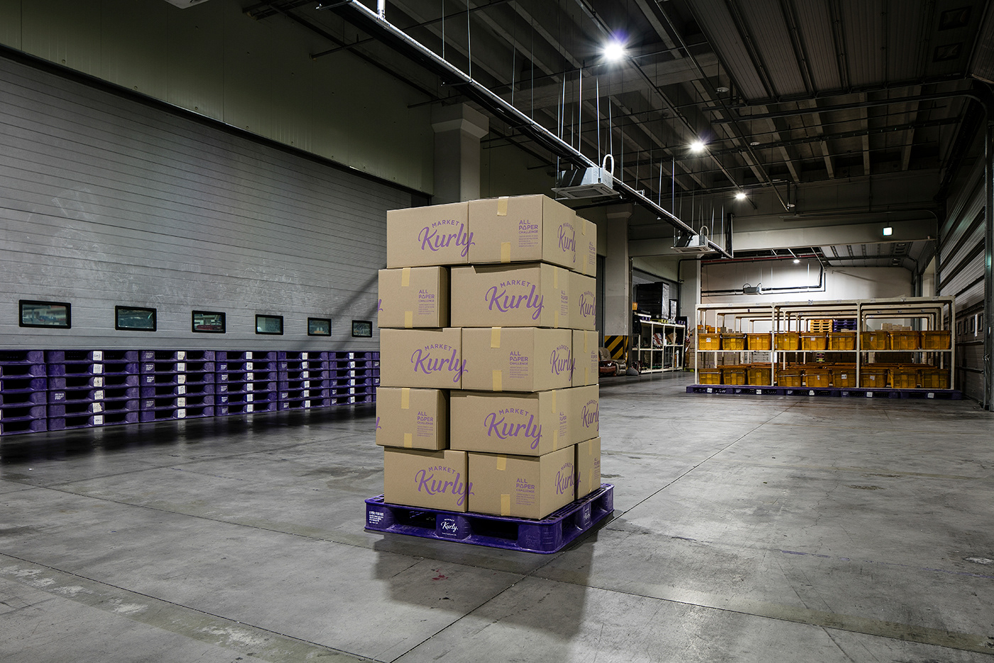
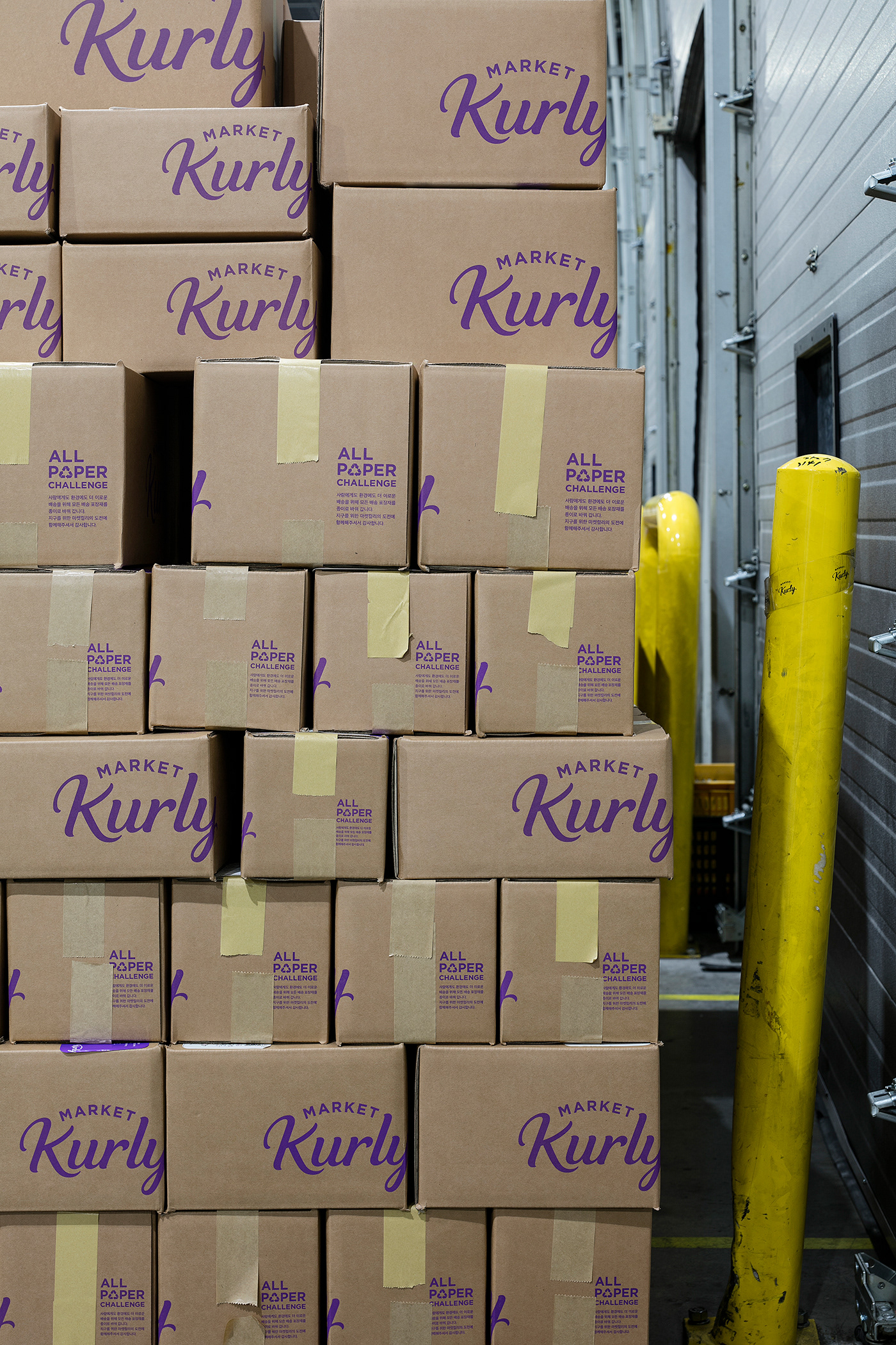
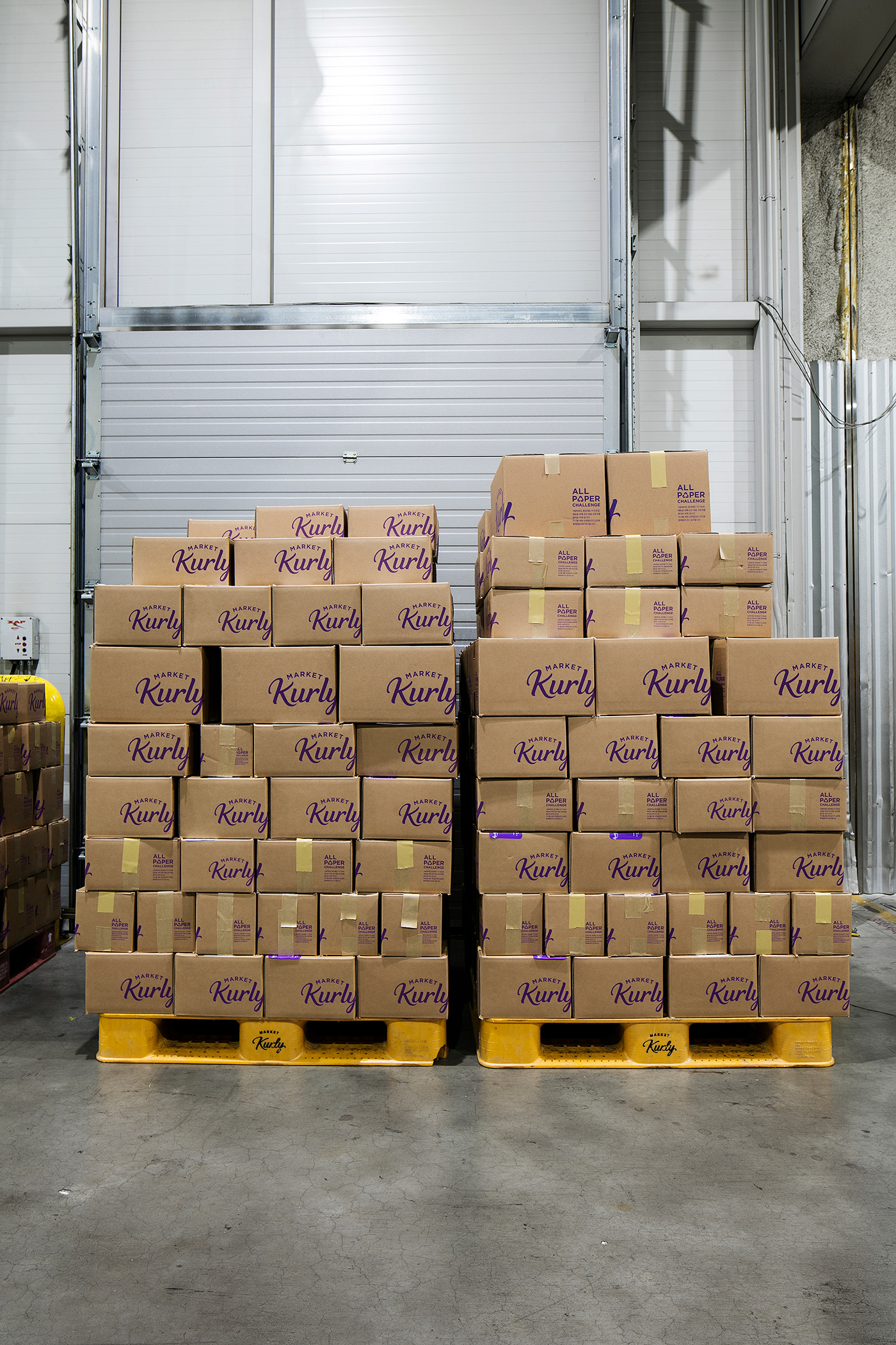
We applied a cropped form of BI to the shipping box and truck so that the logotype could be used as the brand's graphic motif. In addition, the new shipping box has different colors for room temperature, refrigeration and freezing to convey temperature information intuitively.
By injecting new moods while maintaining a unique design identity, consumers naturally perceive the brand image.
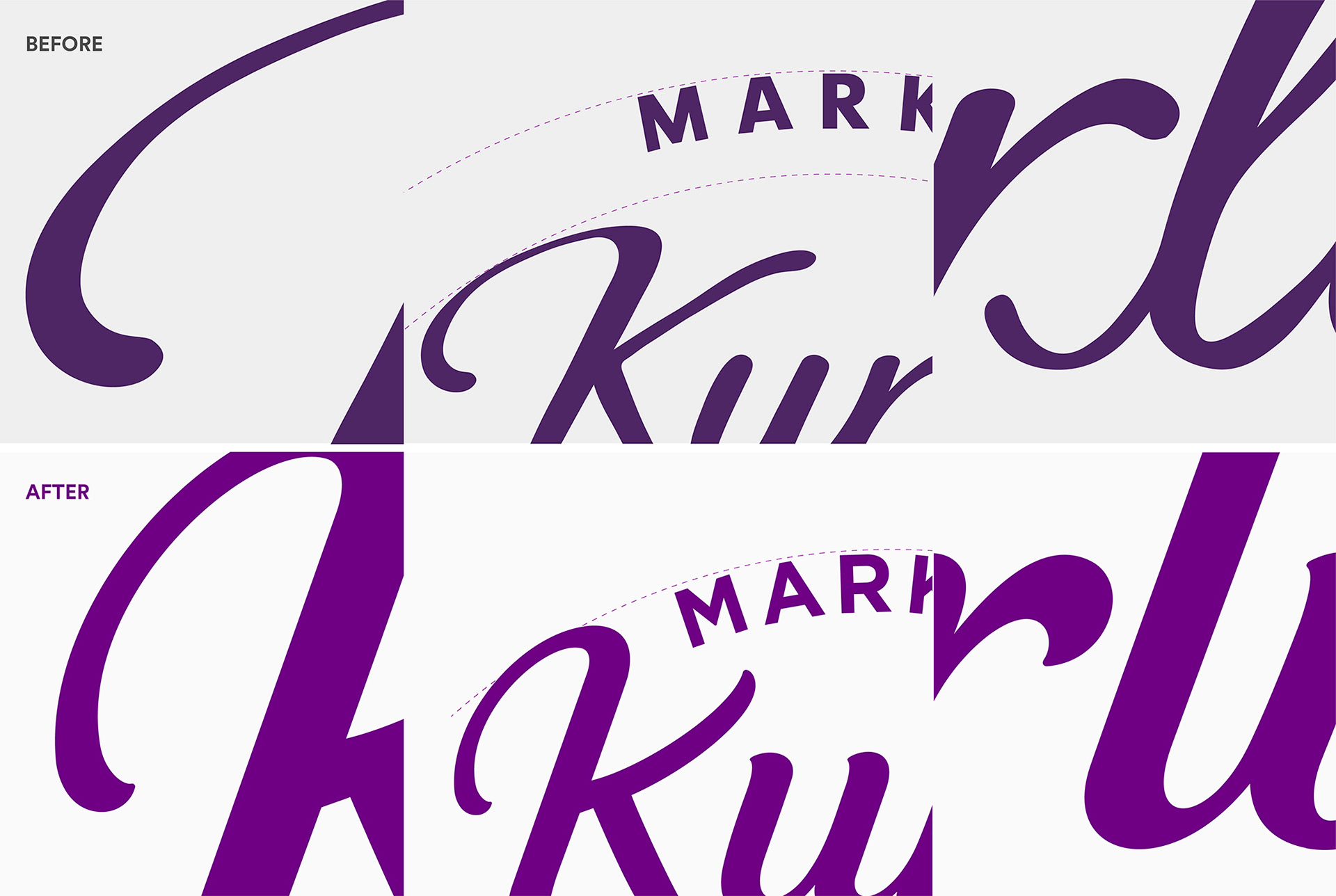
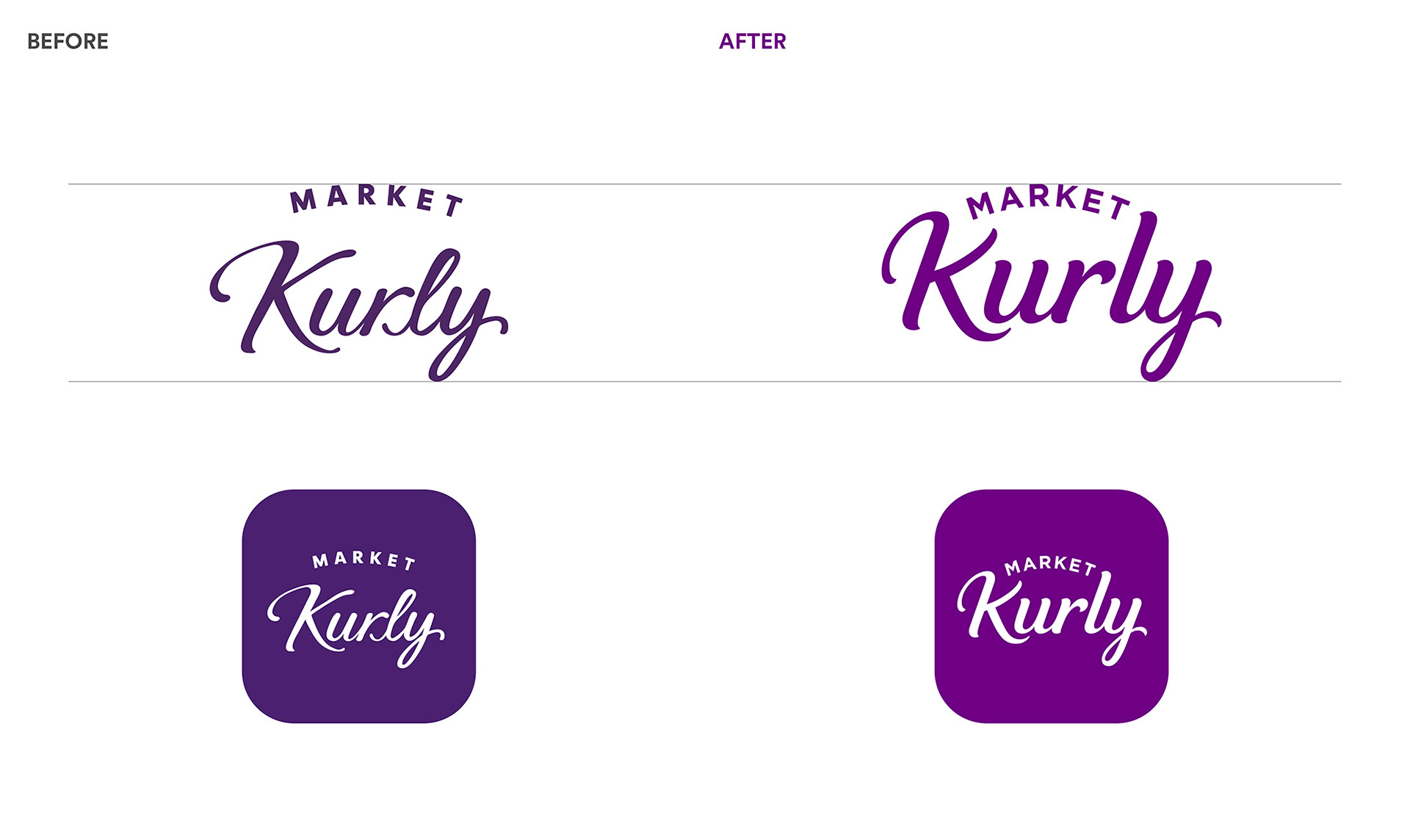
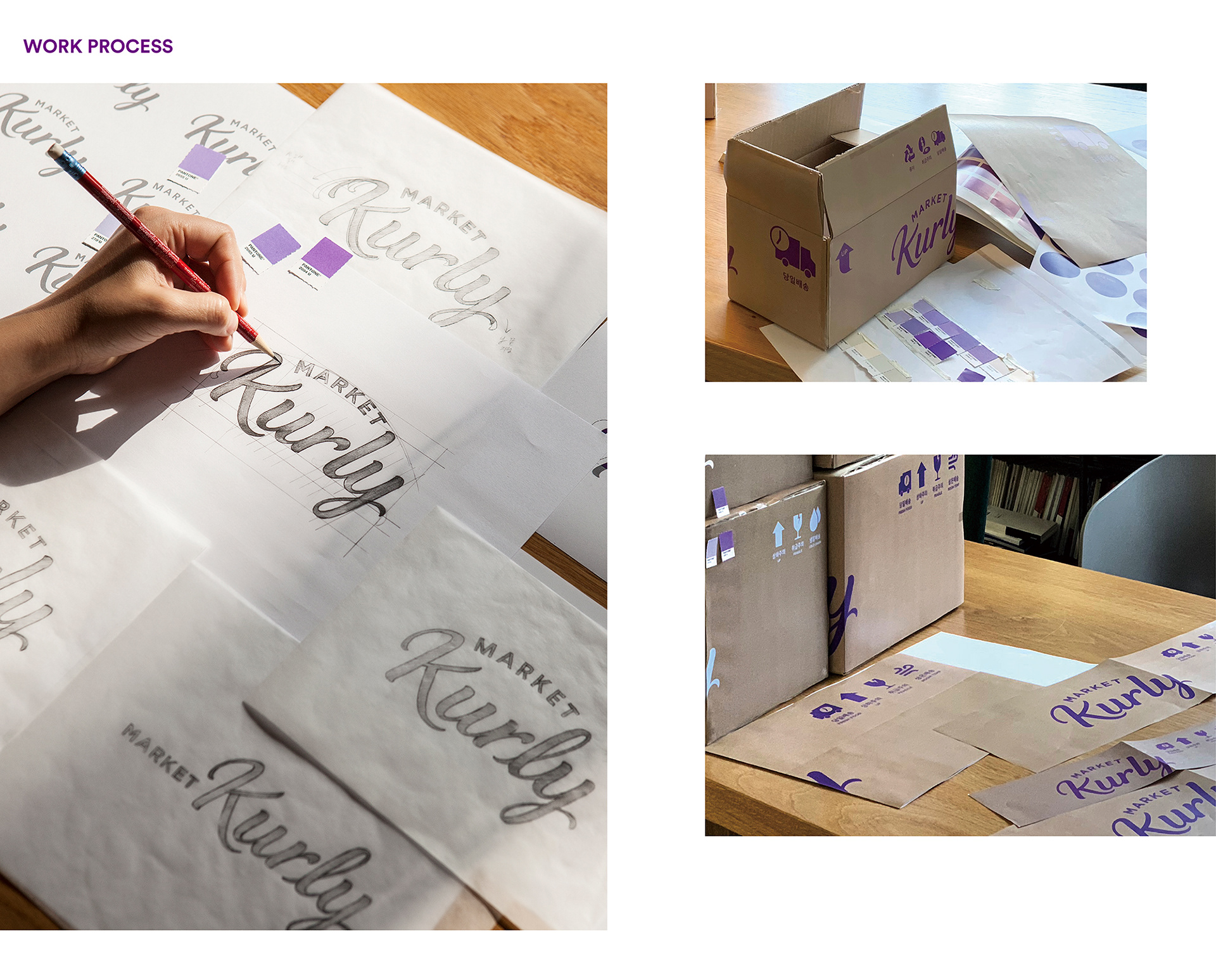
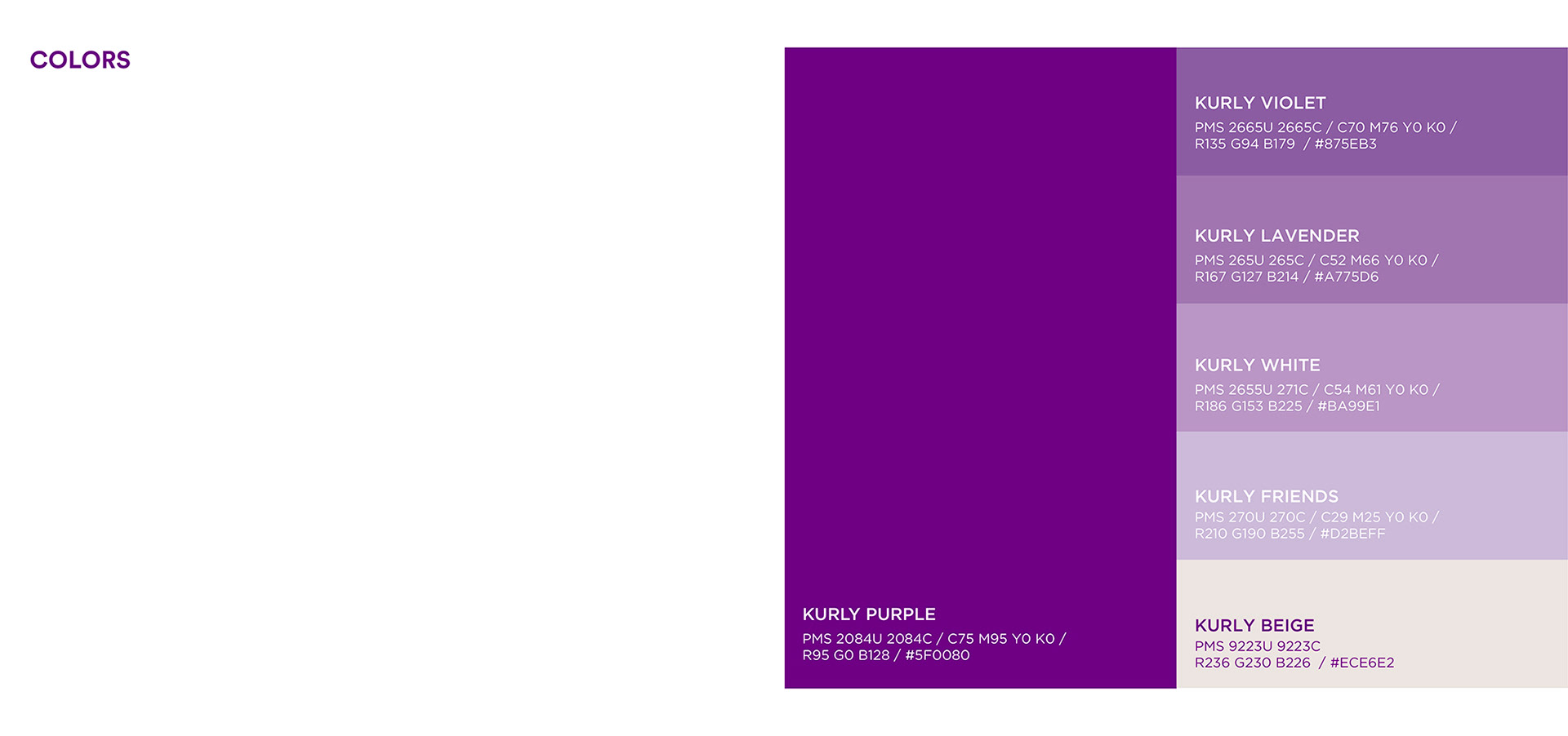
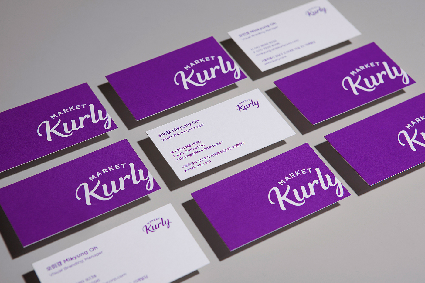
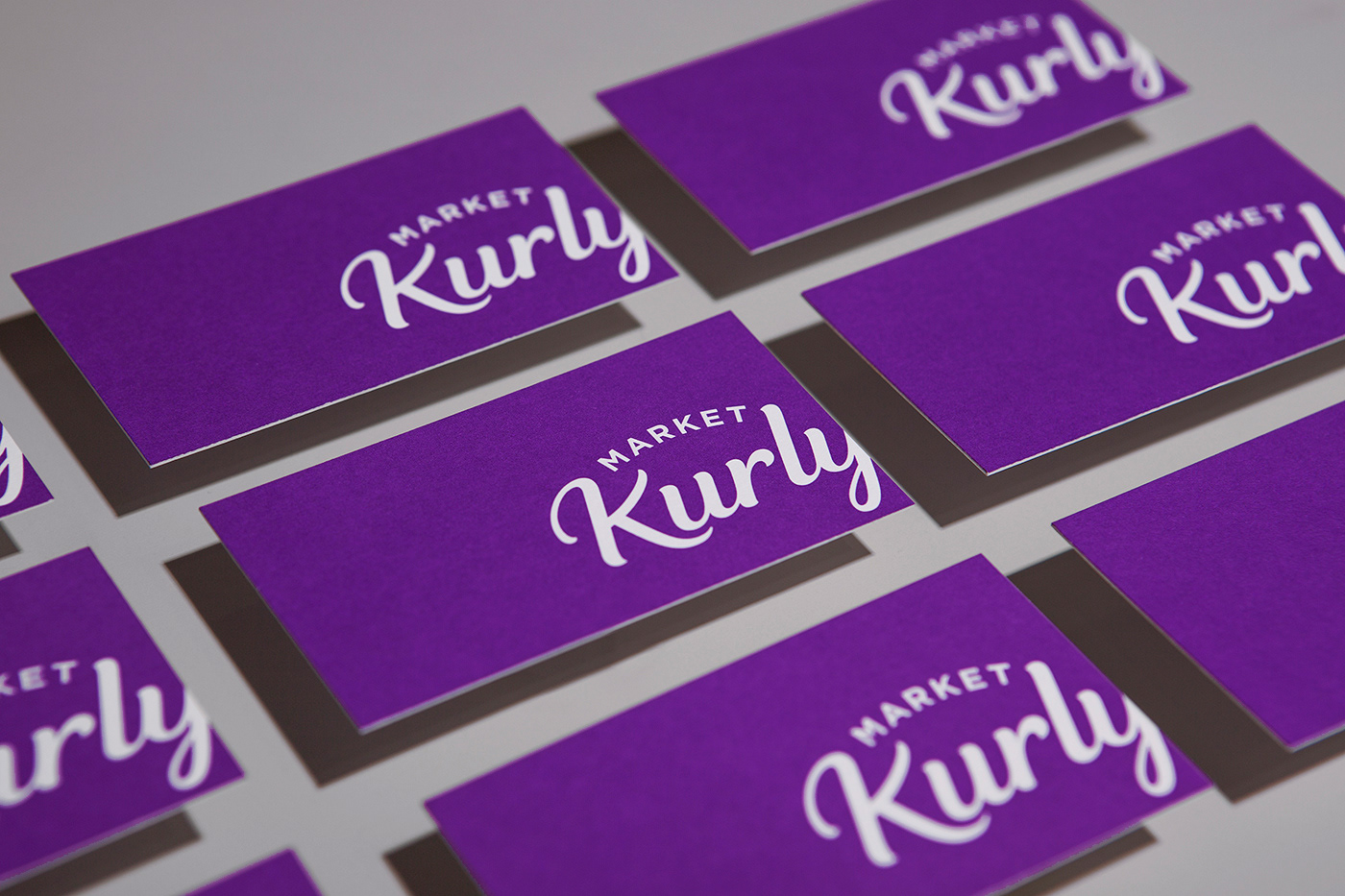
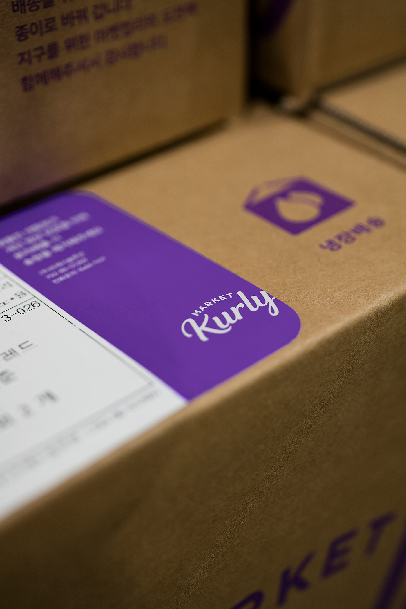
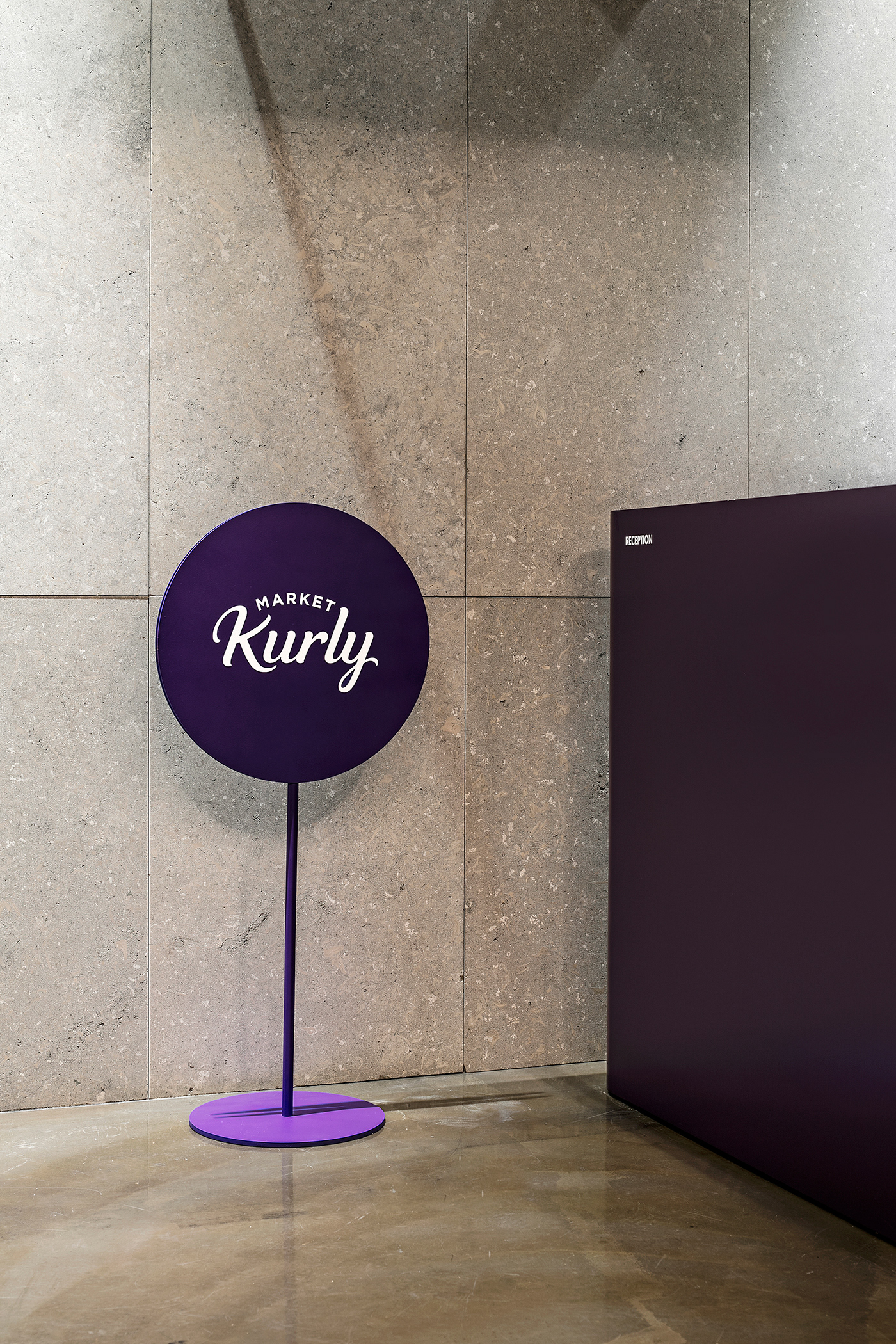
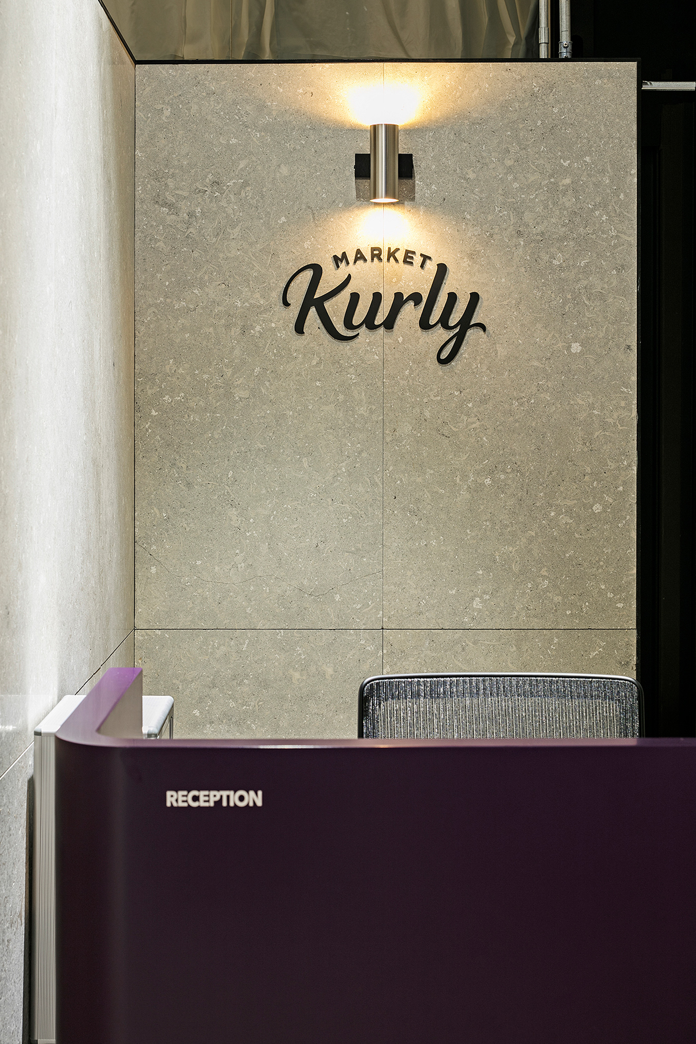
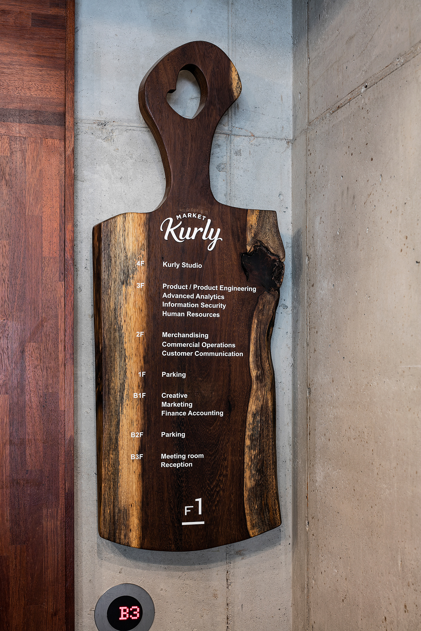
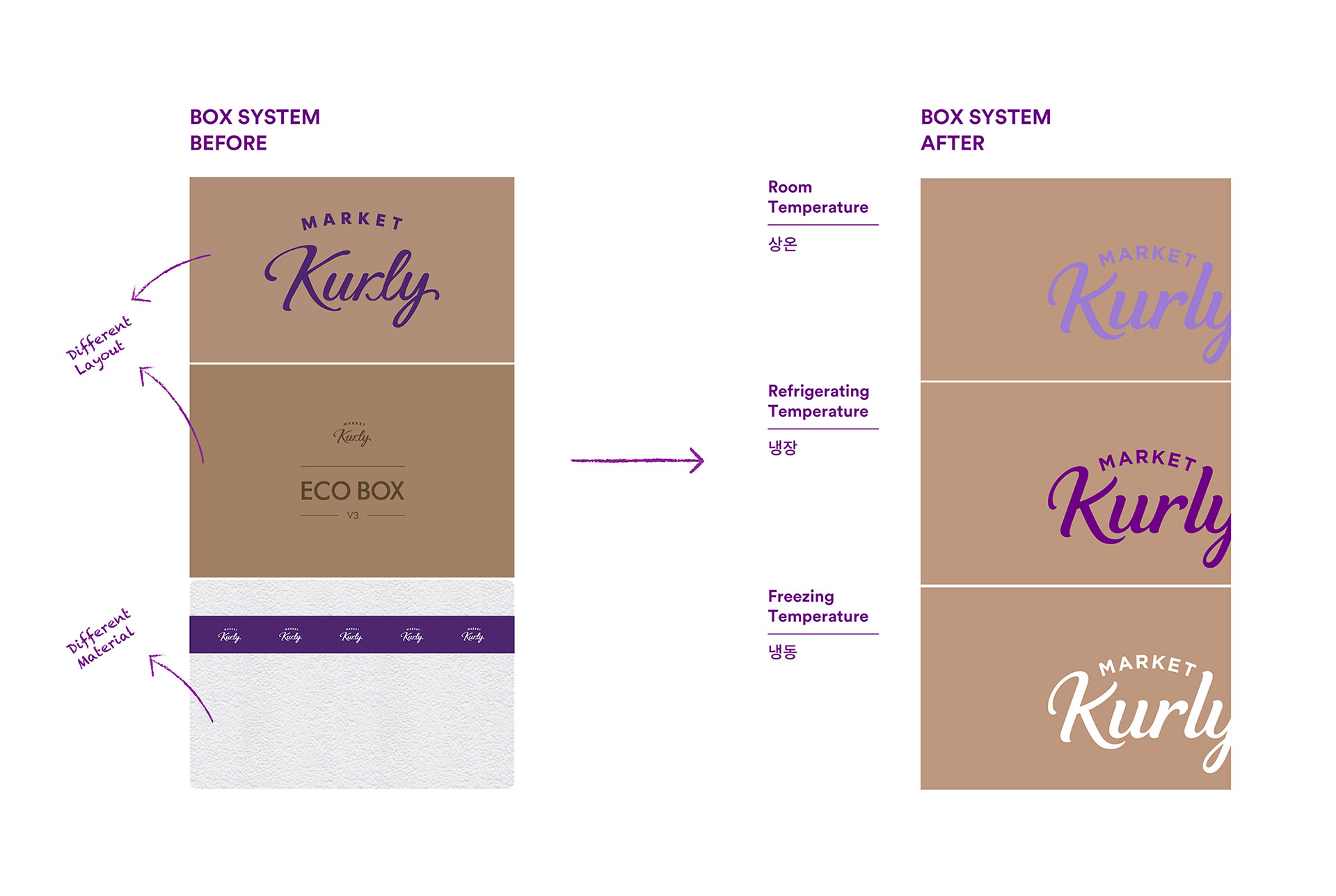
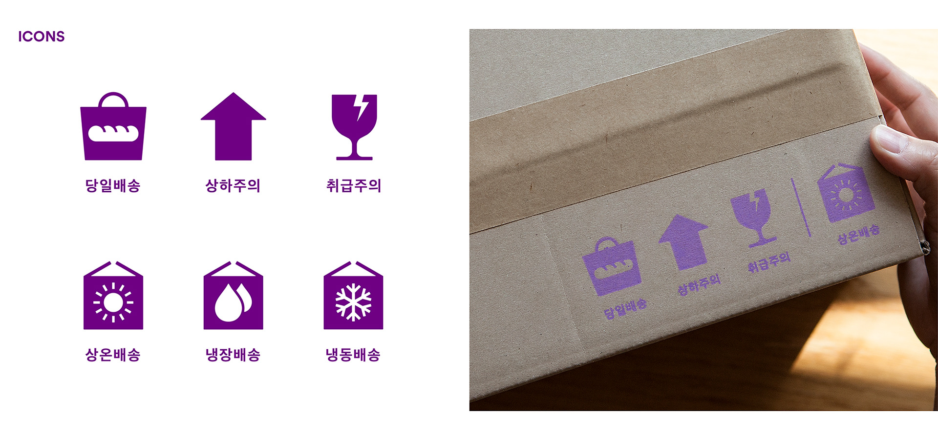
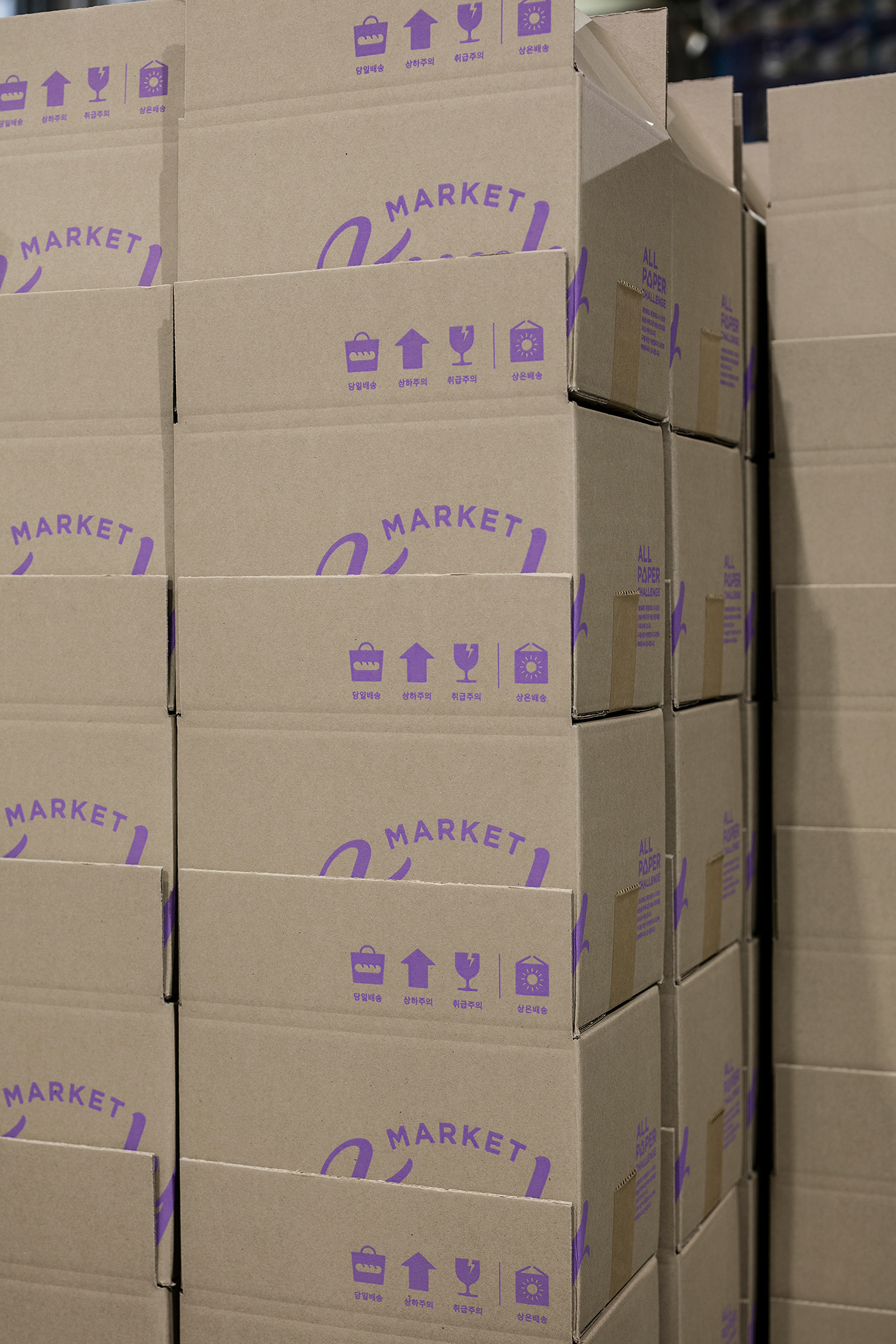
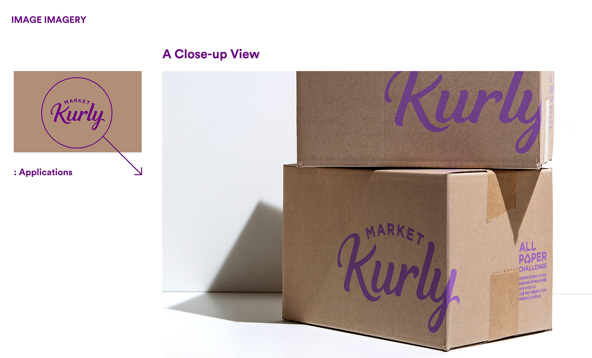
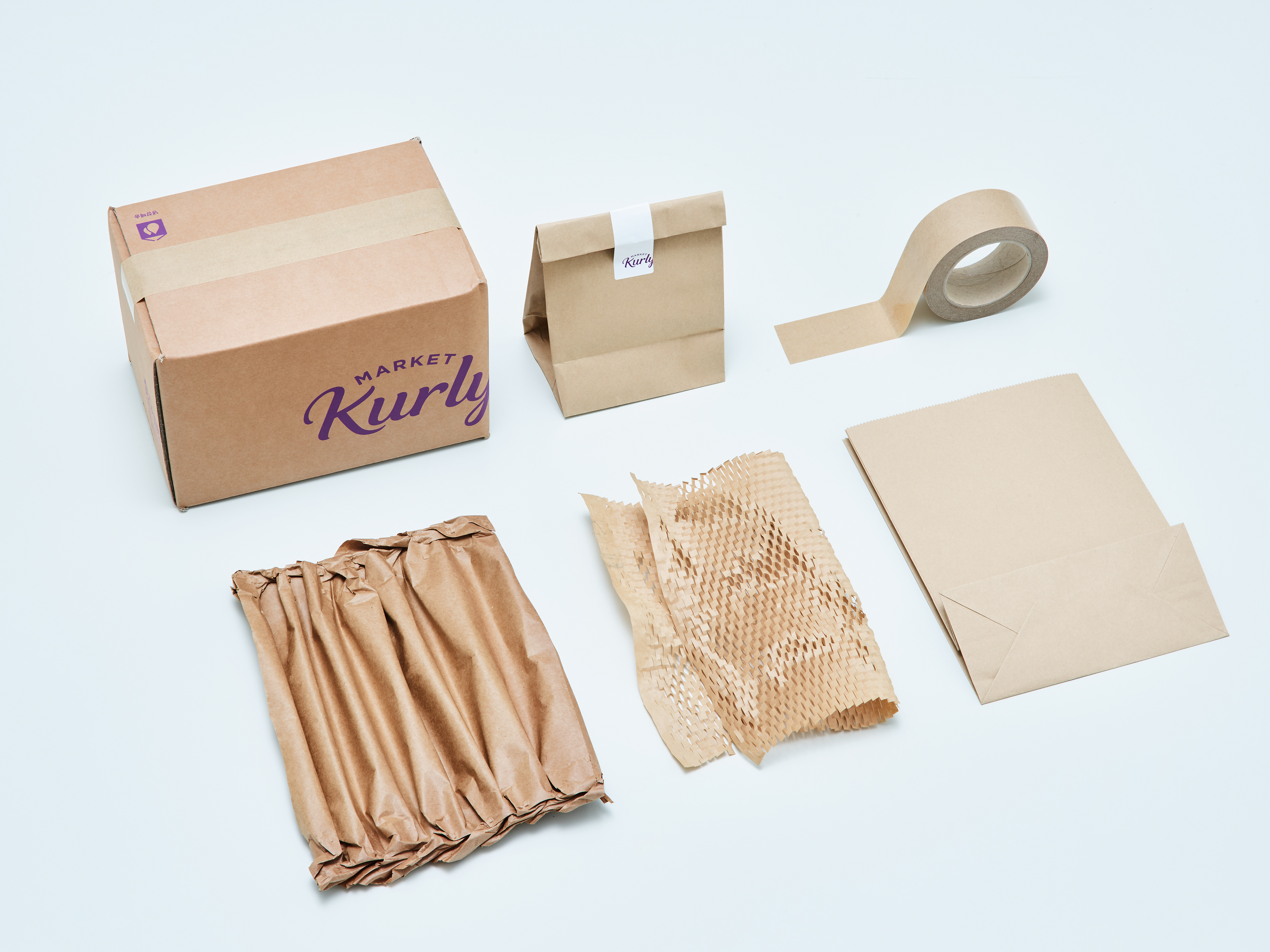
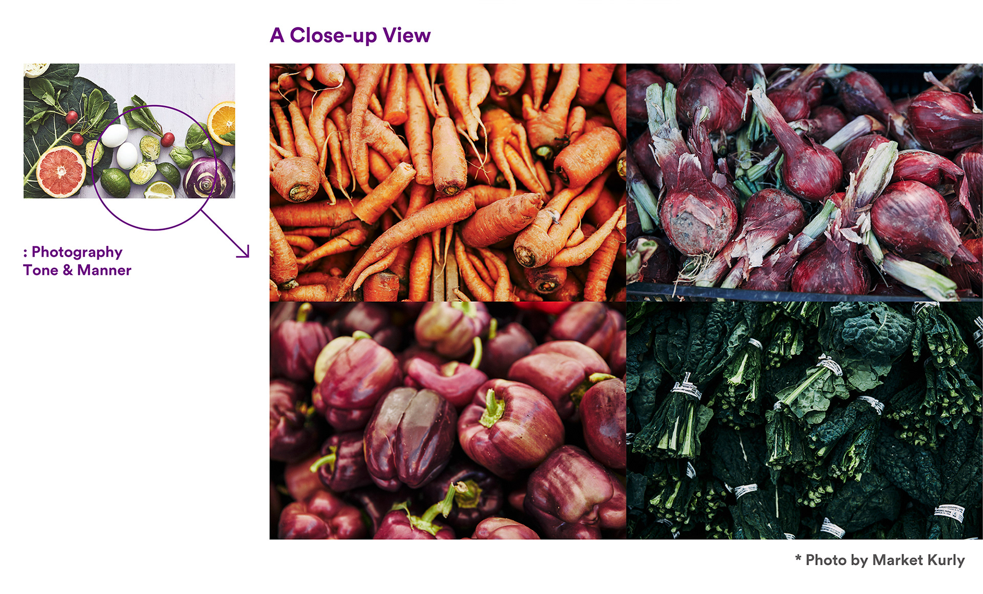
*Photo by Market Kurly
Market Kurly Brand Identity Design Renewal
2019
Client: Kurly Corporation
Project Team
-
Market Kurly Brand Contents Team
Project Management (Eunsae Park, Minkyung Oh, Jeongwon Kim)
-
CFC
Brand Identity & Application Design Dev.
Art Direction & Design: Charry Jeon
Design: Minsun Lee, Jiyoung Kim, Yoonji Nam, Nara Yoon
Photography: Kiwoong Hong
www.contentformcontext.com