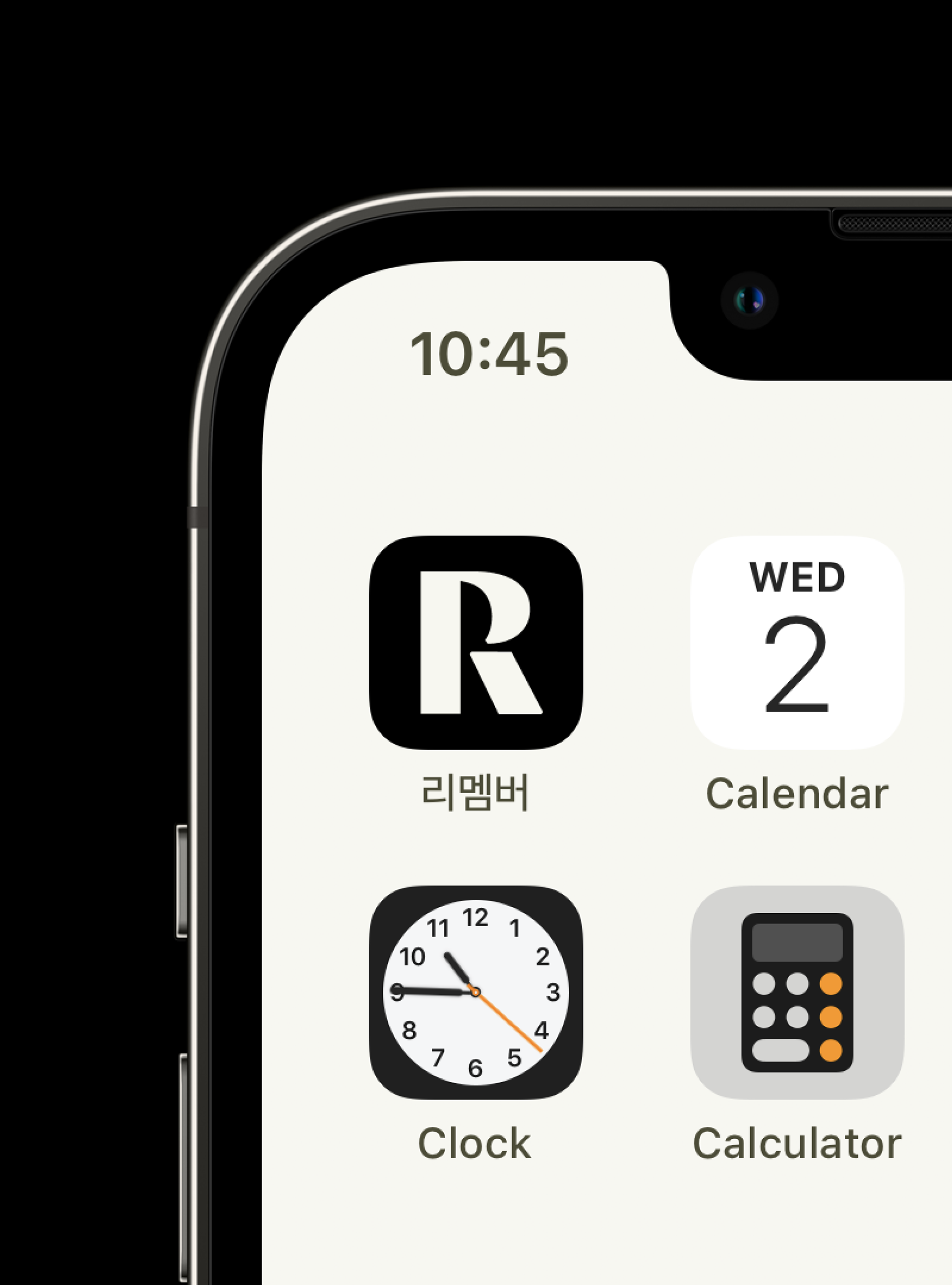
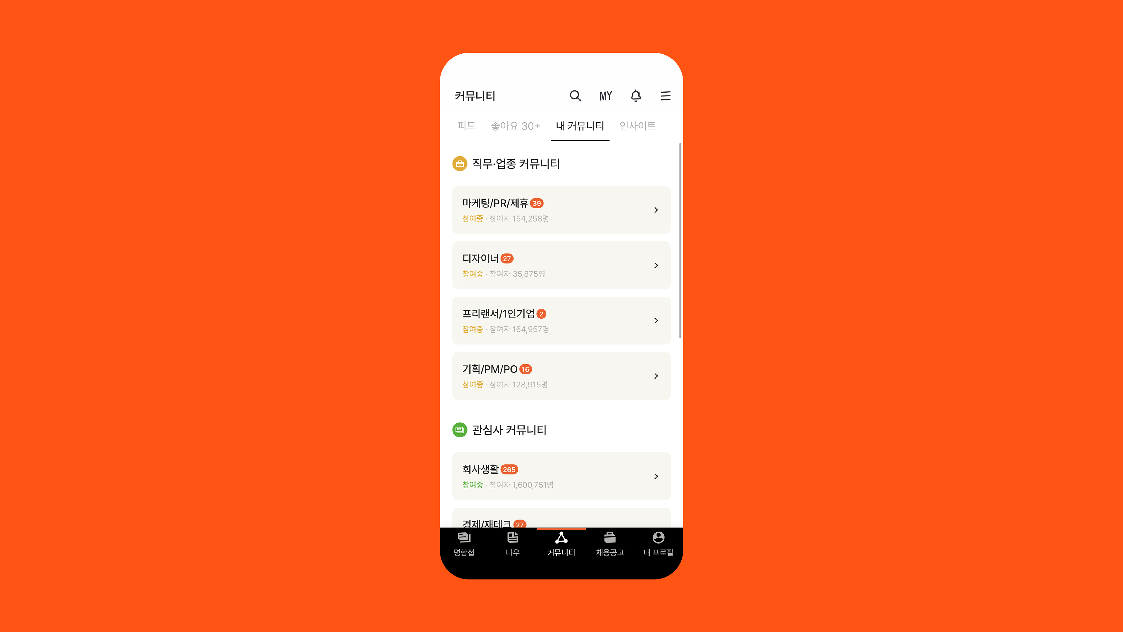
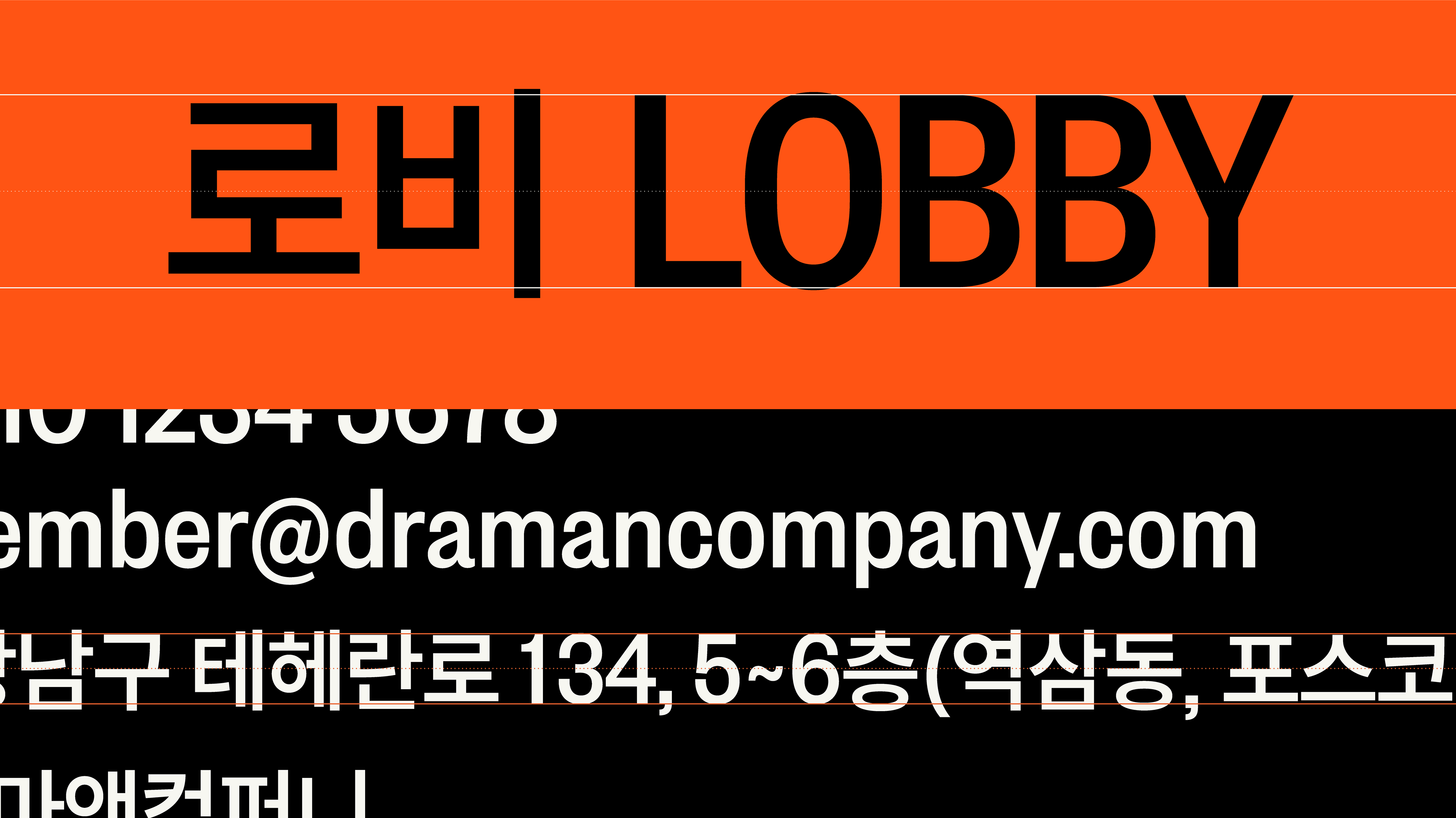
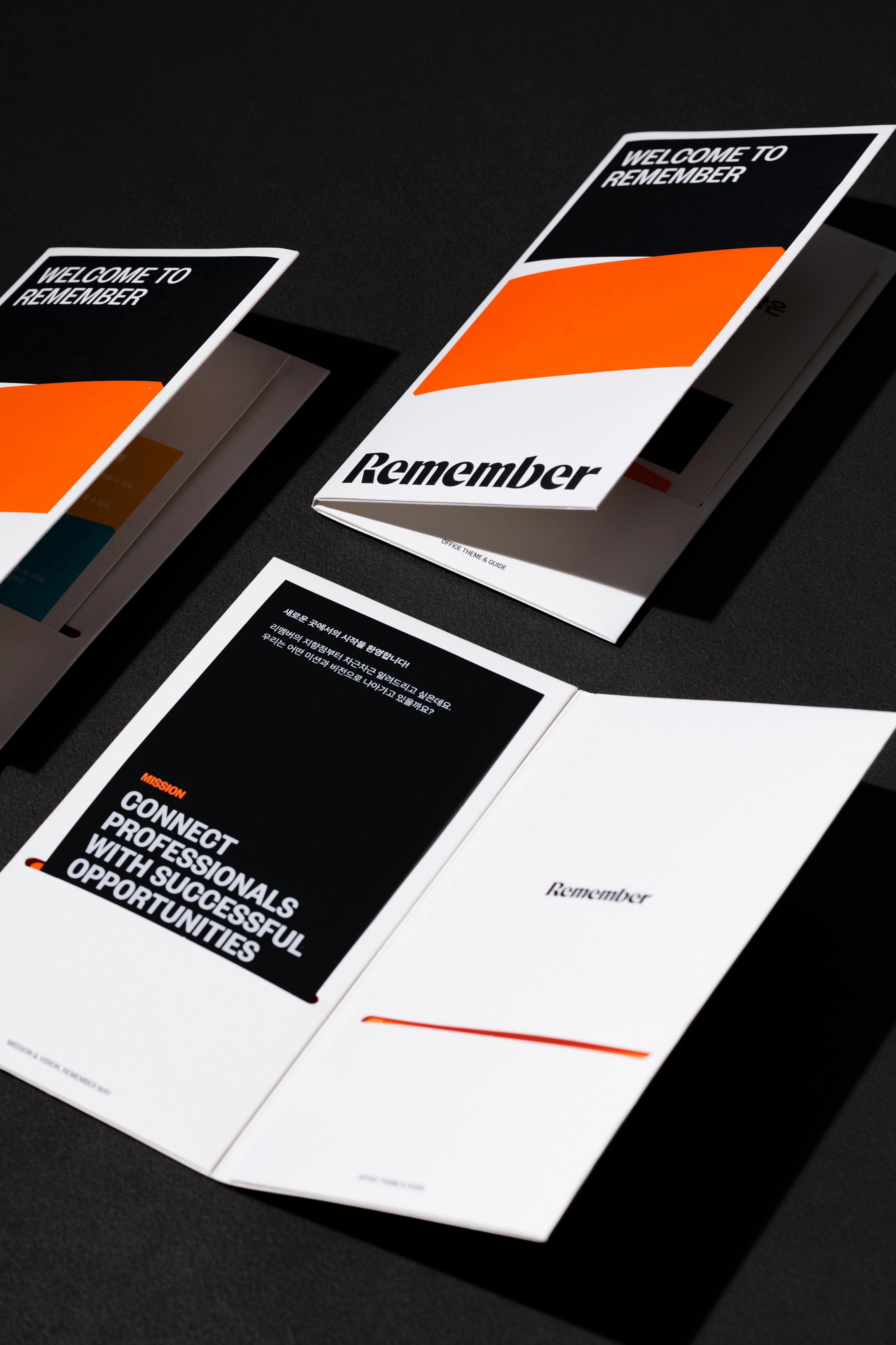
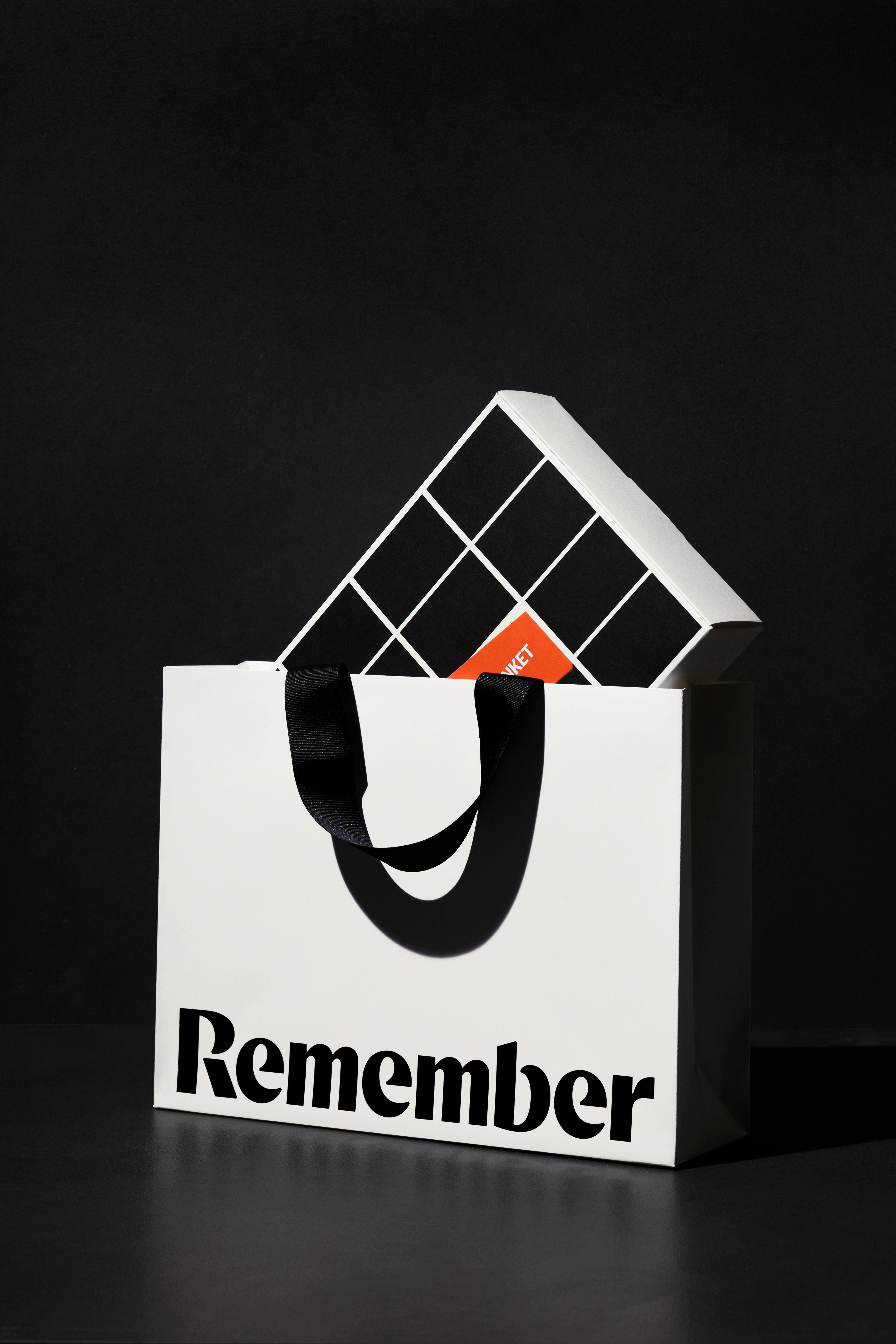
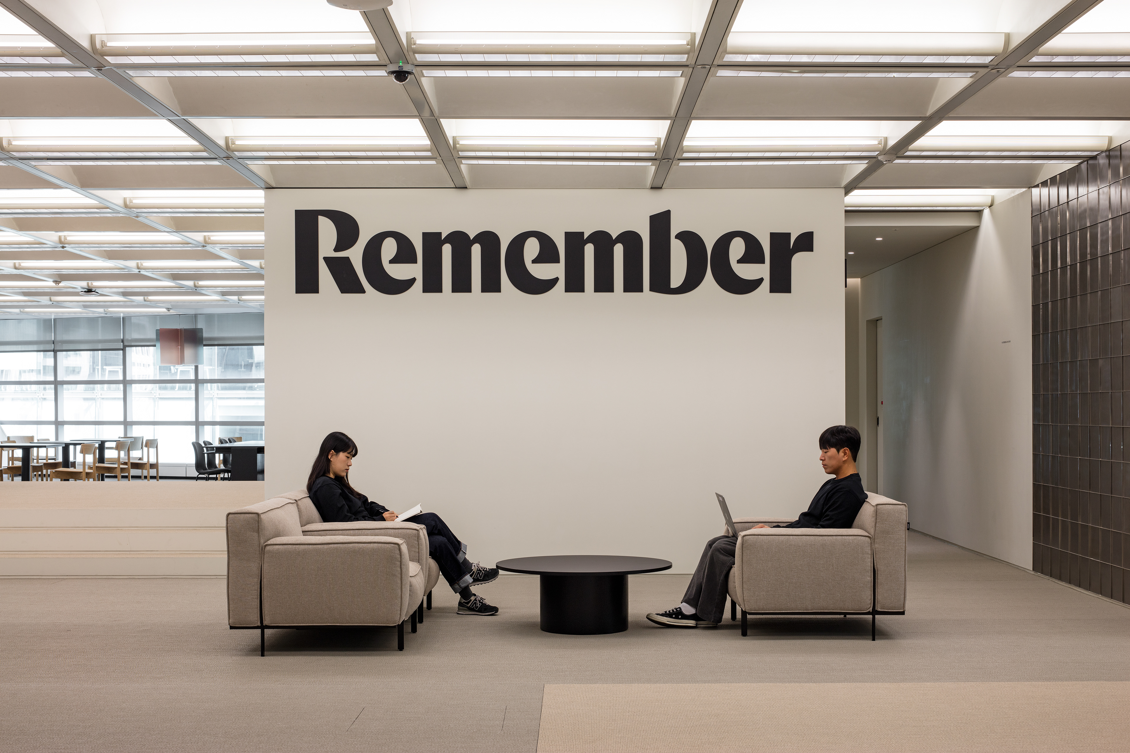
Last year, CFC collaborated with the Remember BX team to establish a new brand identity for Remember. Starting as a business card management service, Remember has grown into an essential app for professionals, offering various services such as recruitment, community, and business content.
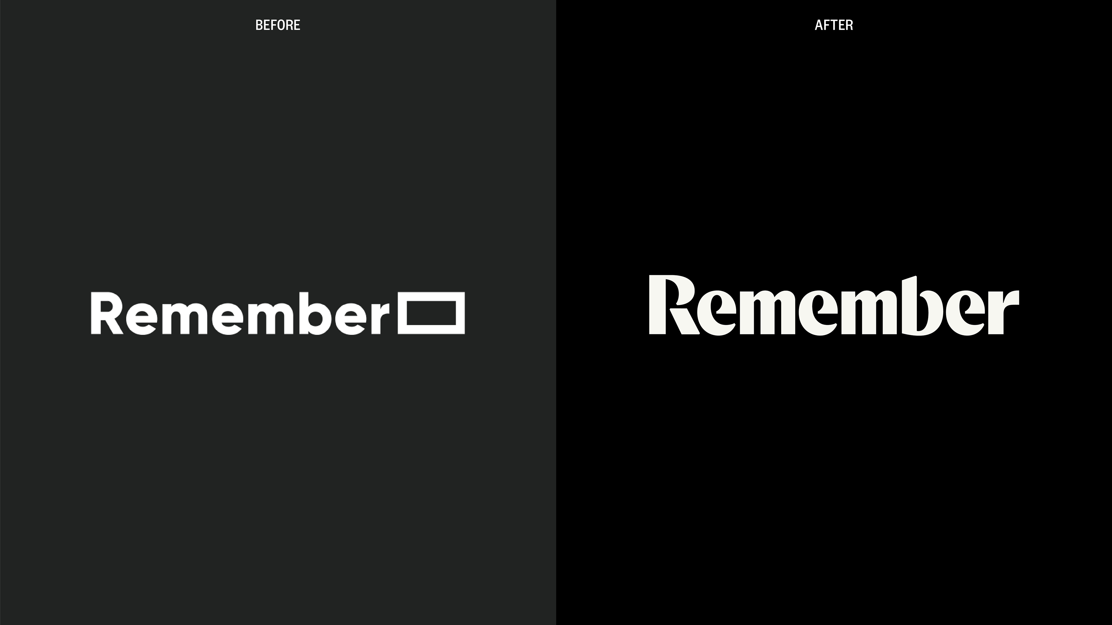
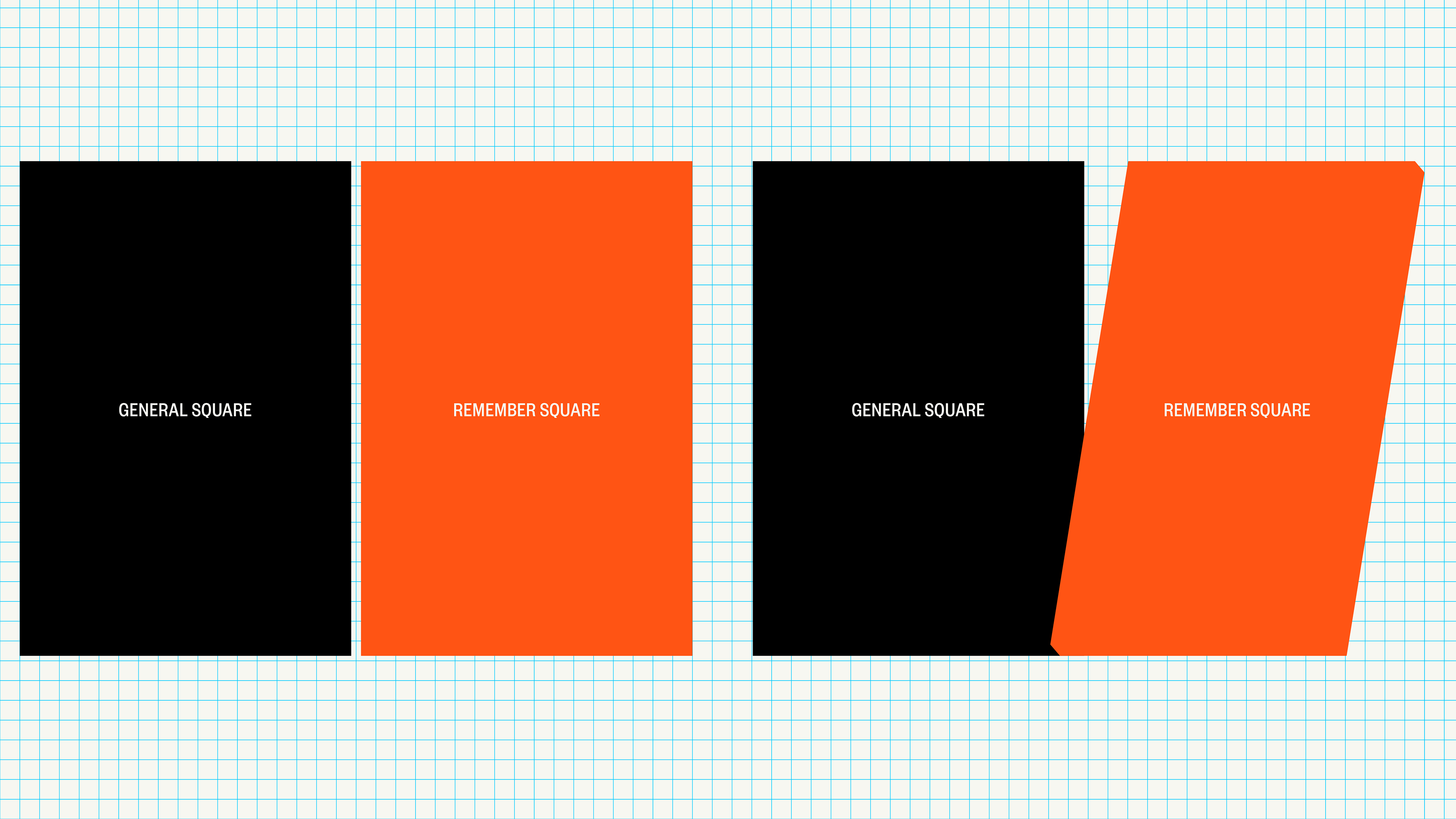
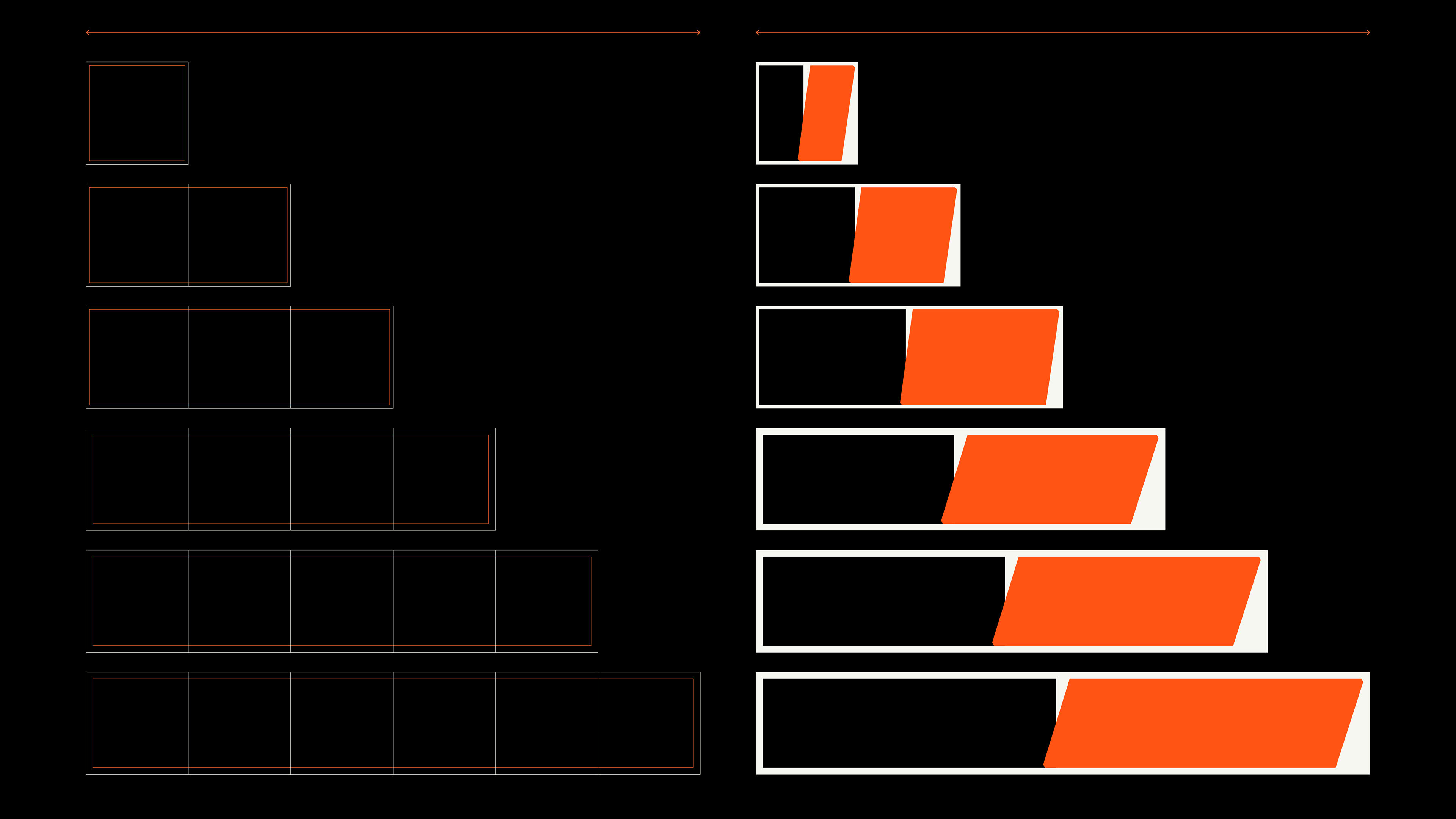
CFC had two primary objectives for this rebranding: firstly, to transform the current symbol, which combined a square representing business cards and the alphabet R, into a more concise and symbolic form that represents Remember's comprehensive value; secondly, to establish Remember's distinctive brand personality that sets it apart from its competitors and embody it through design.
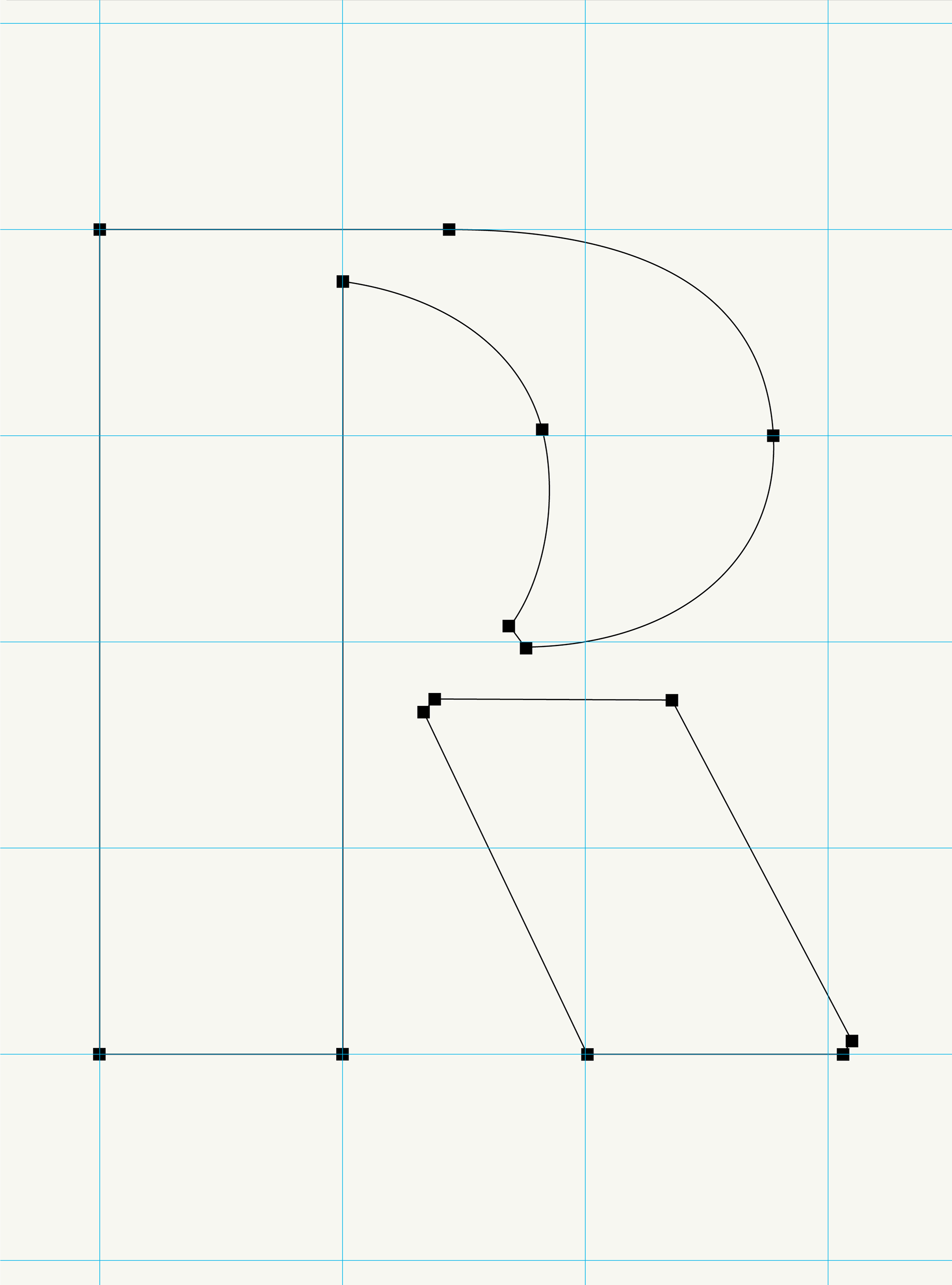
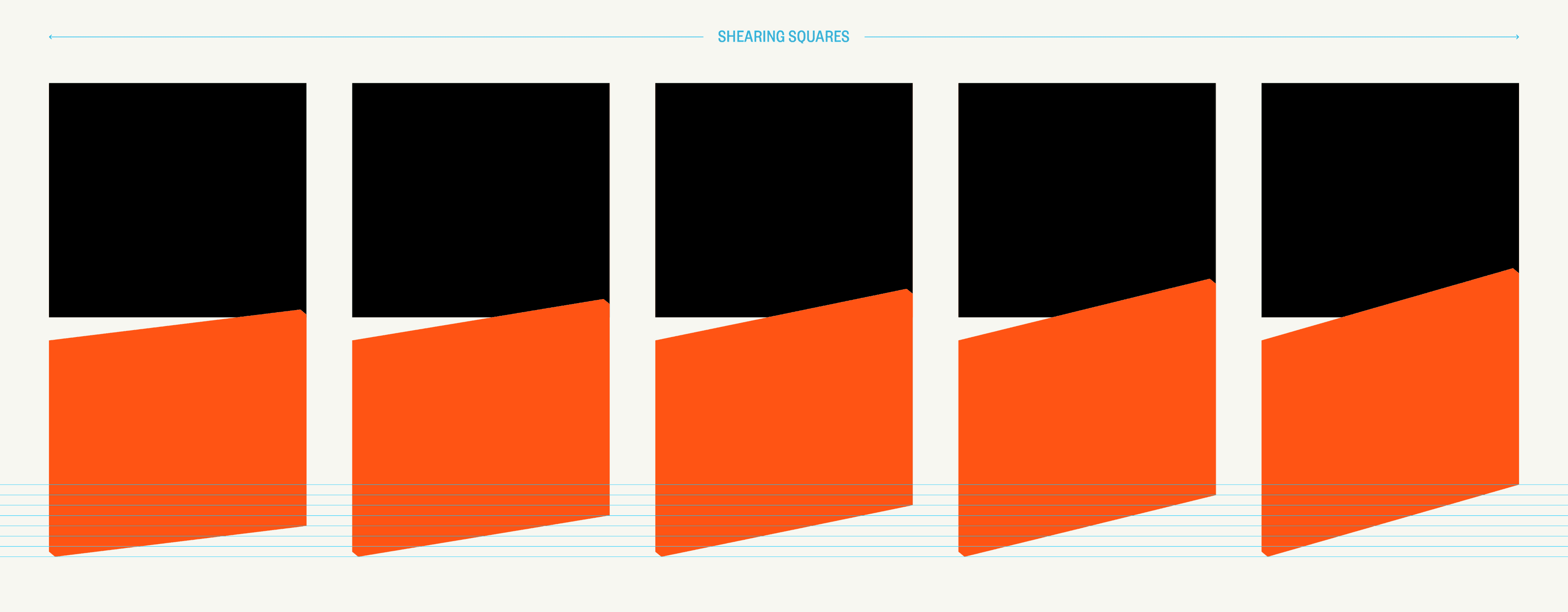
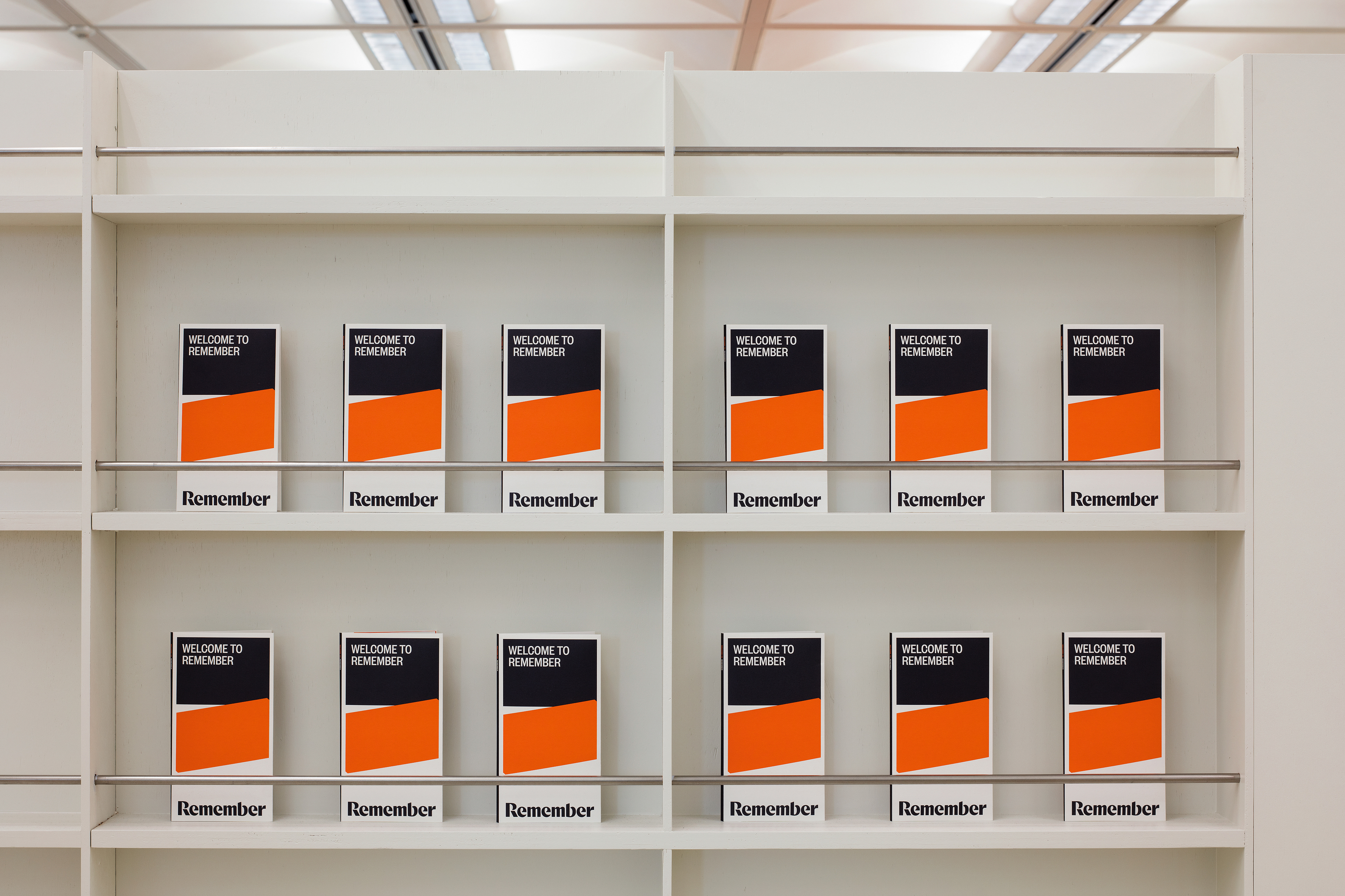
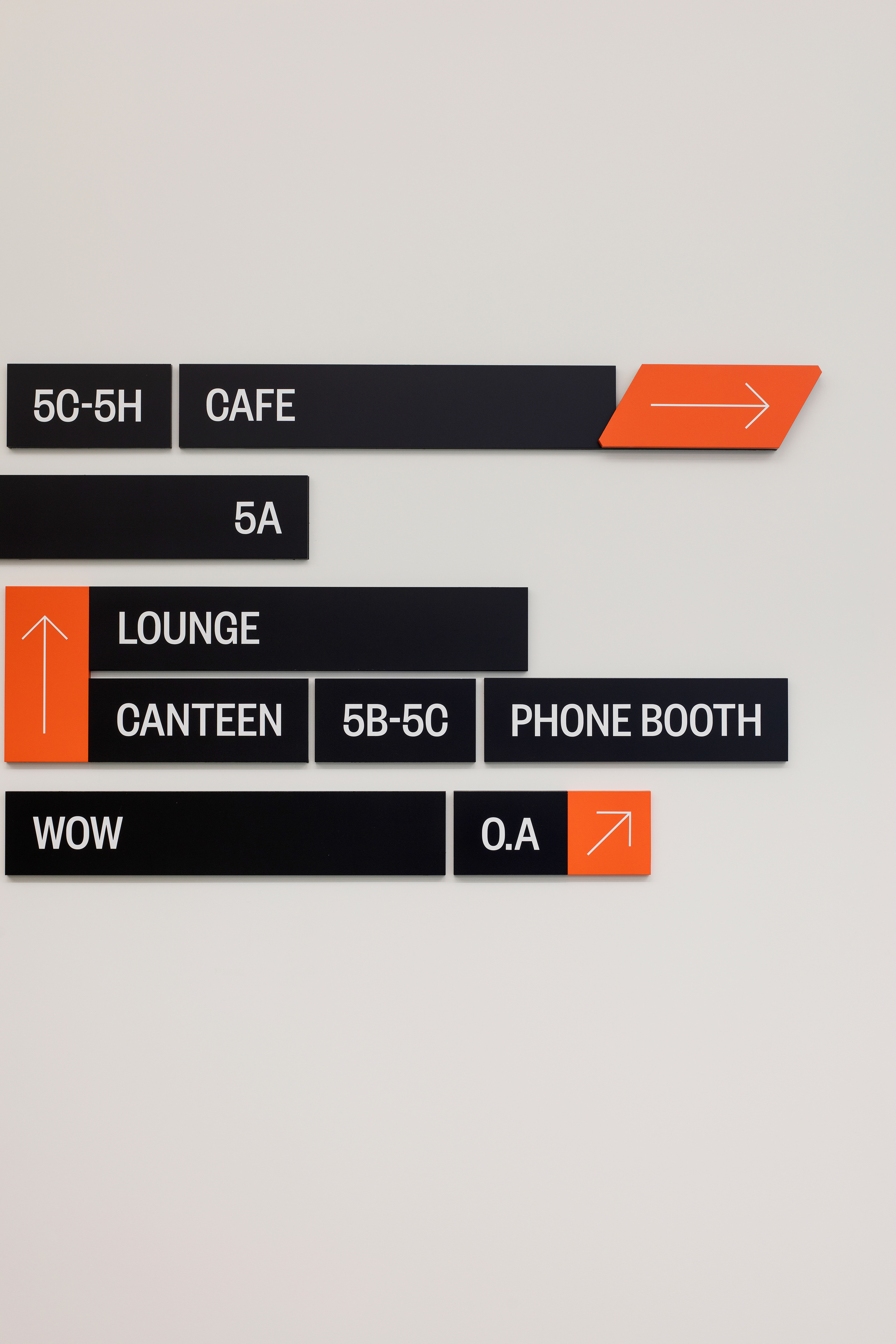
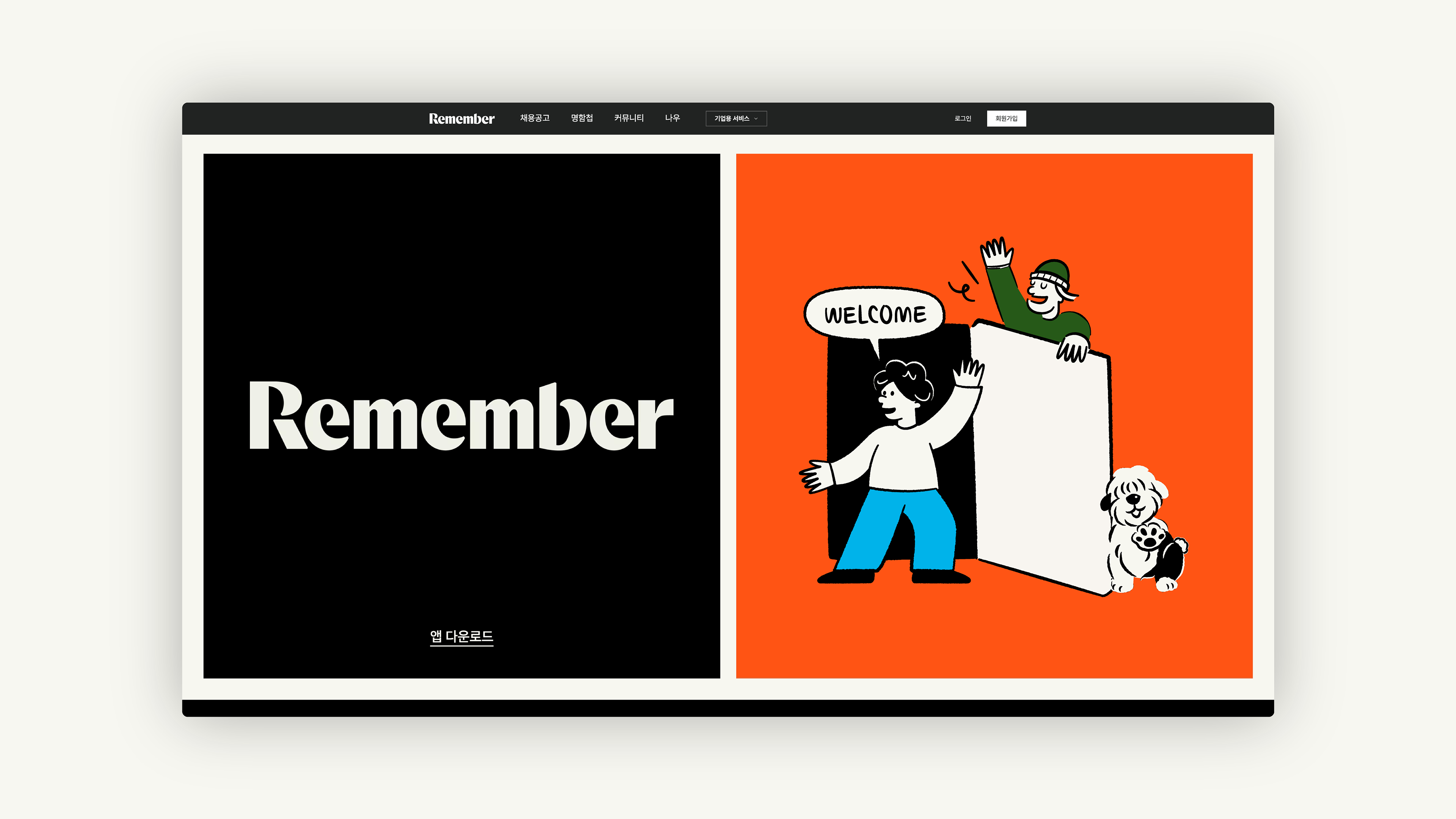
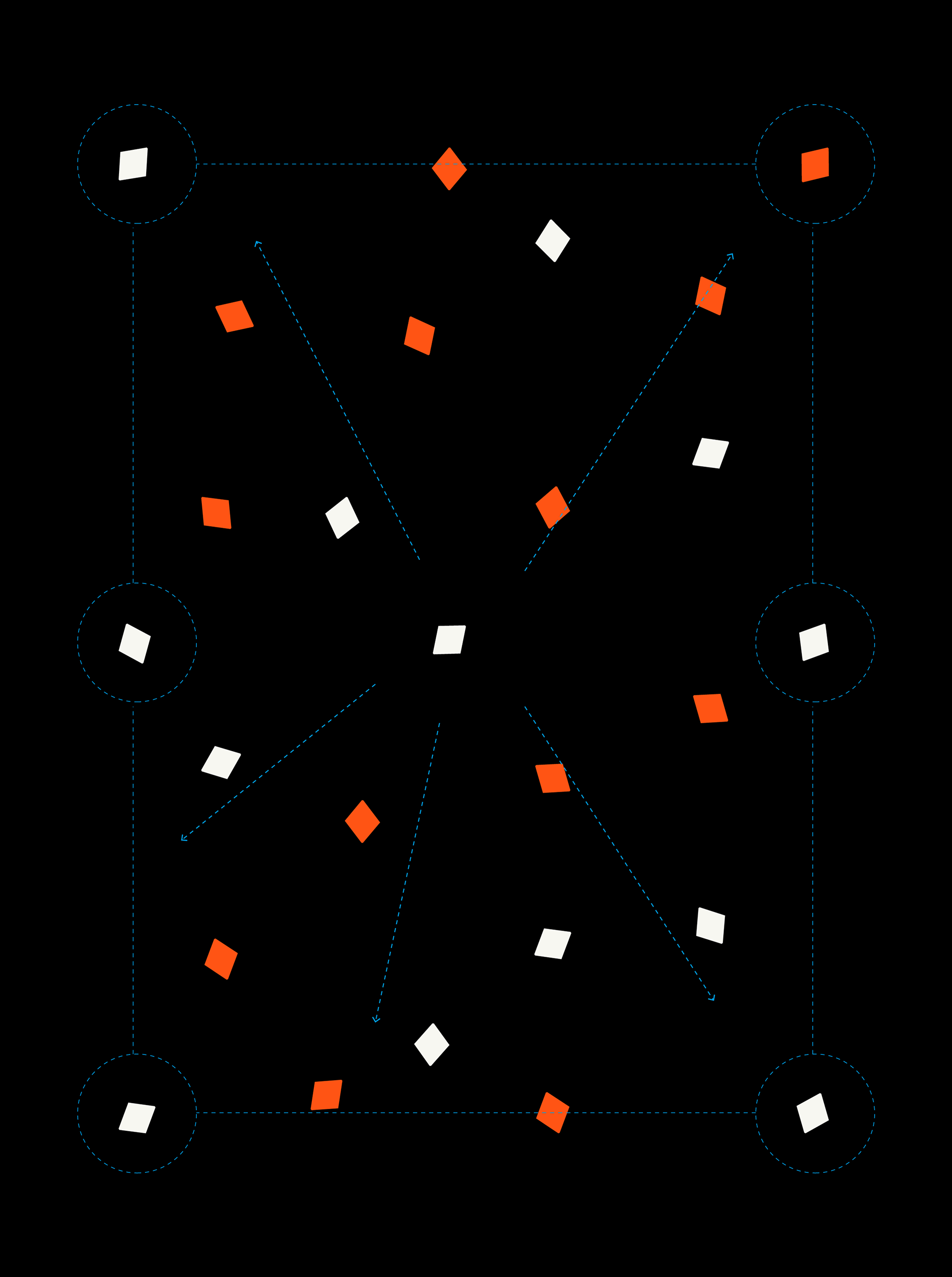
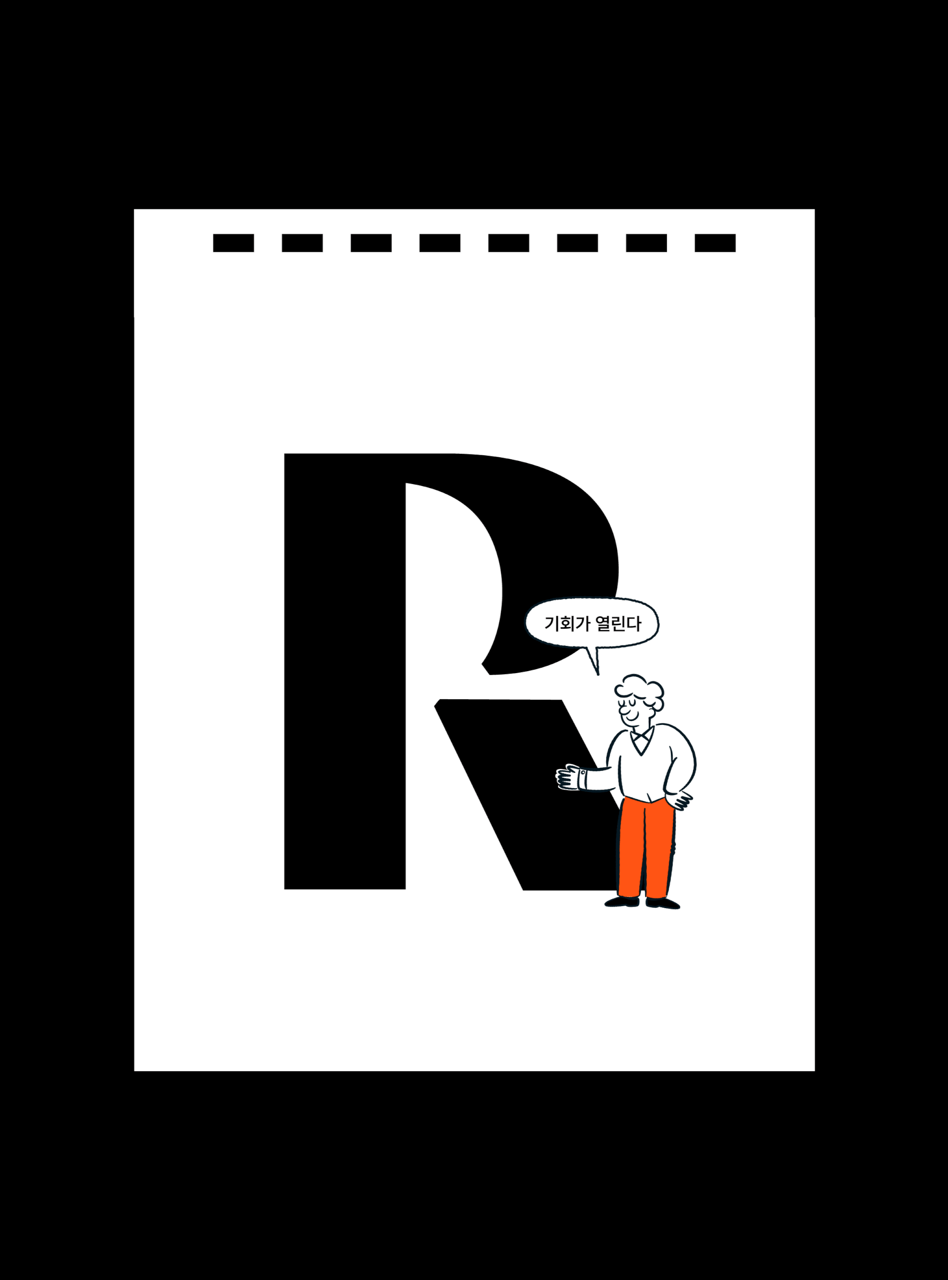
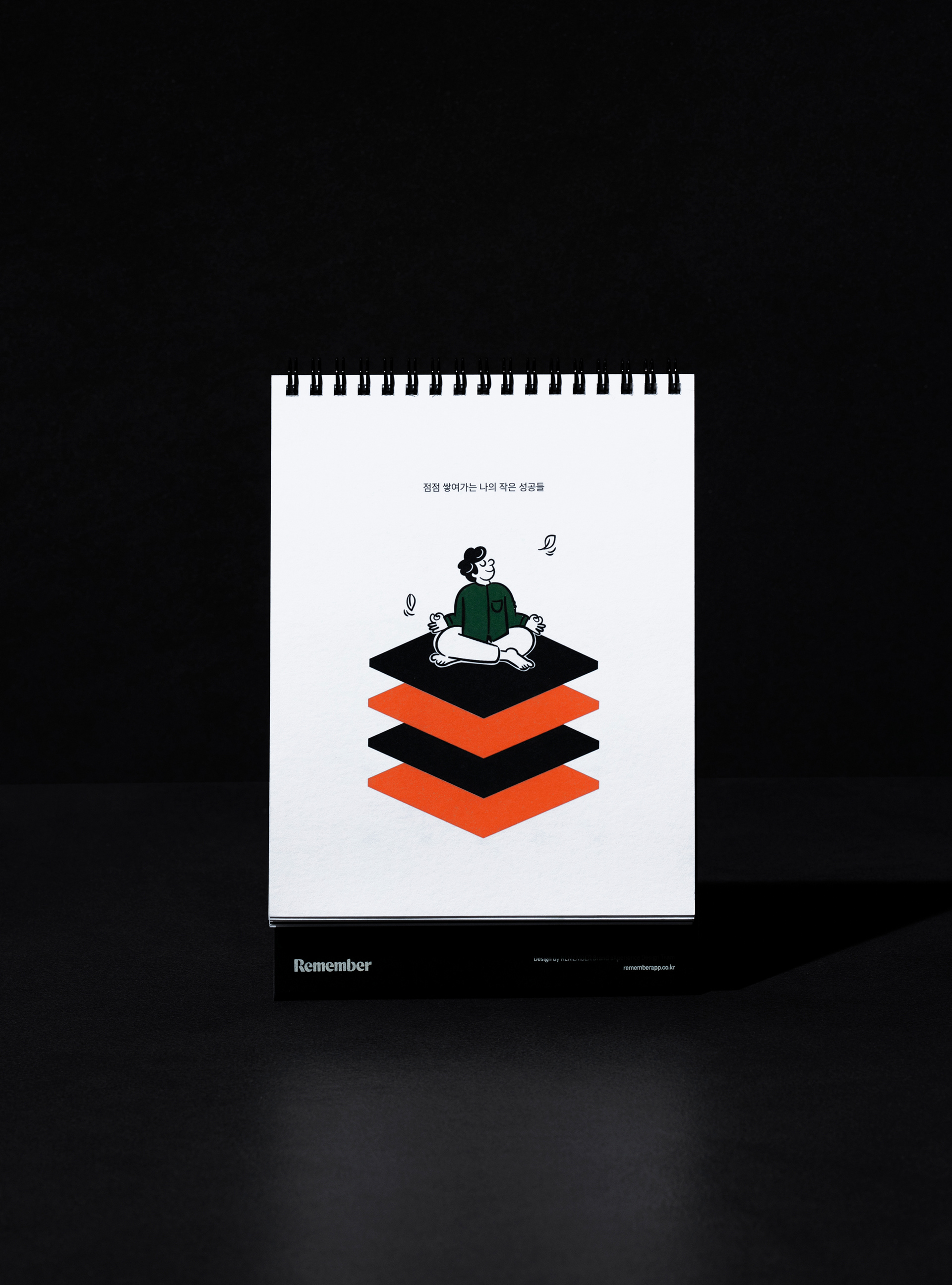
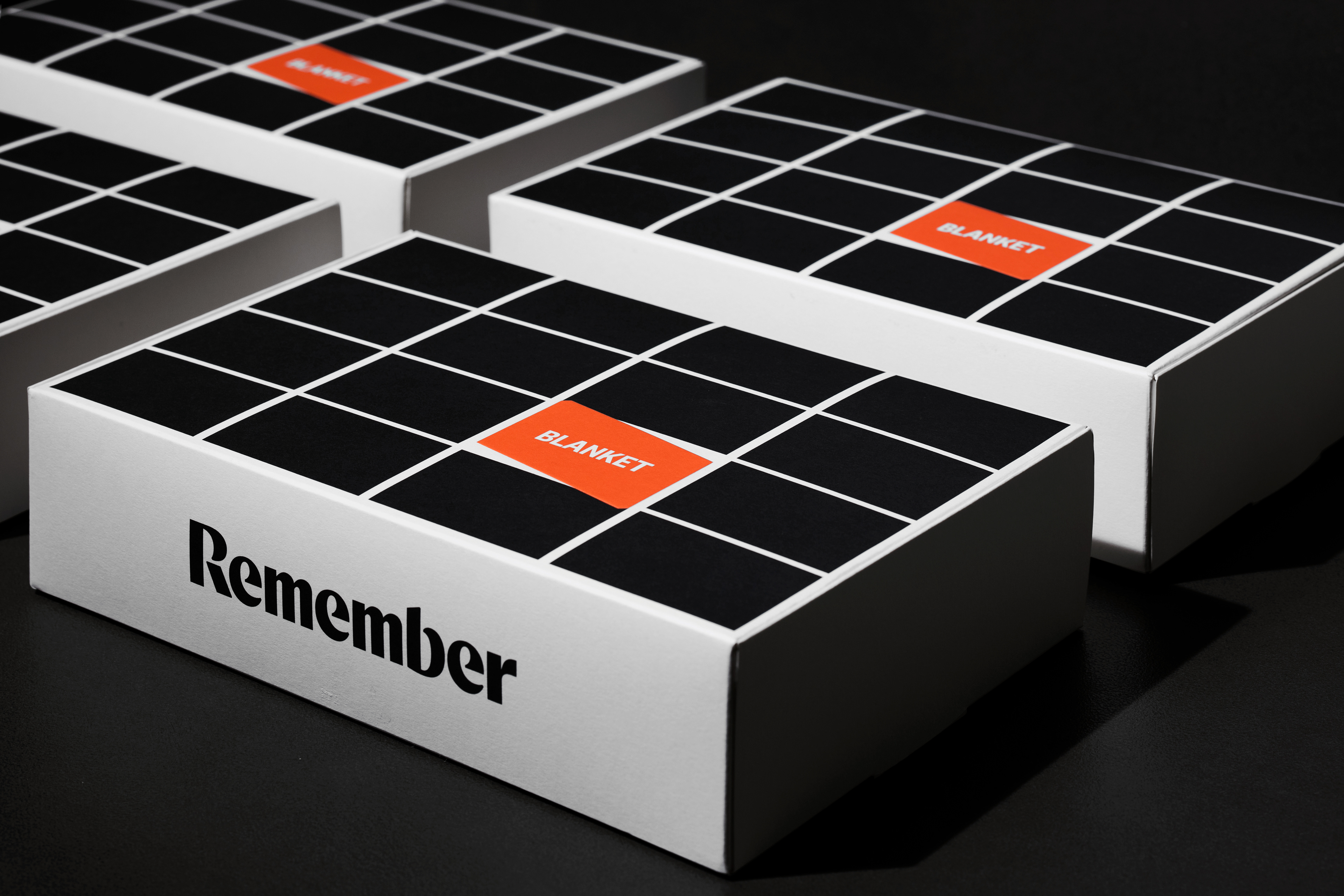
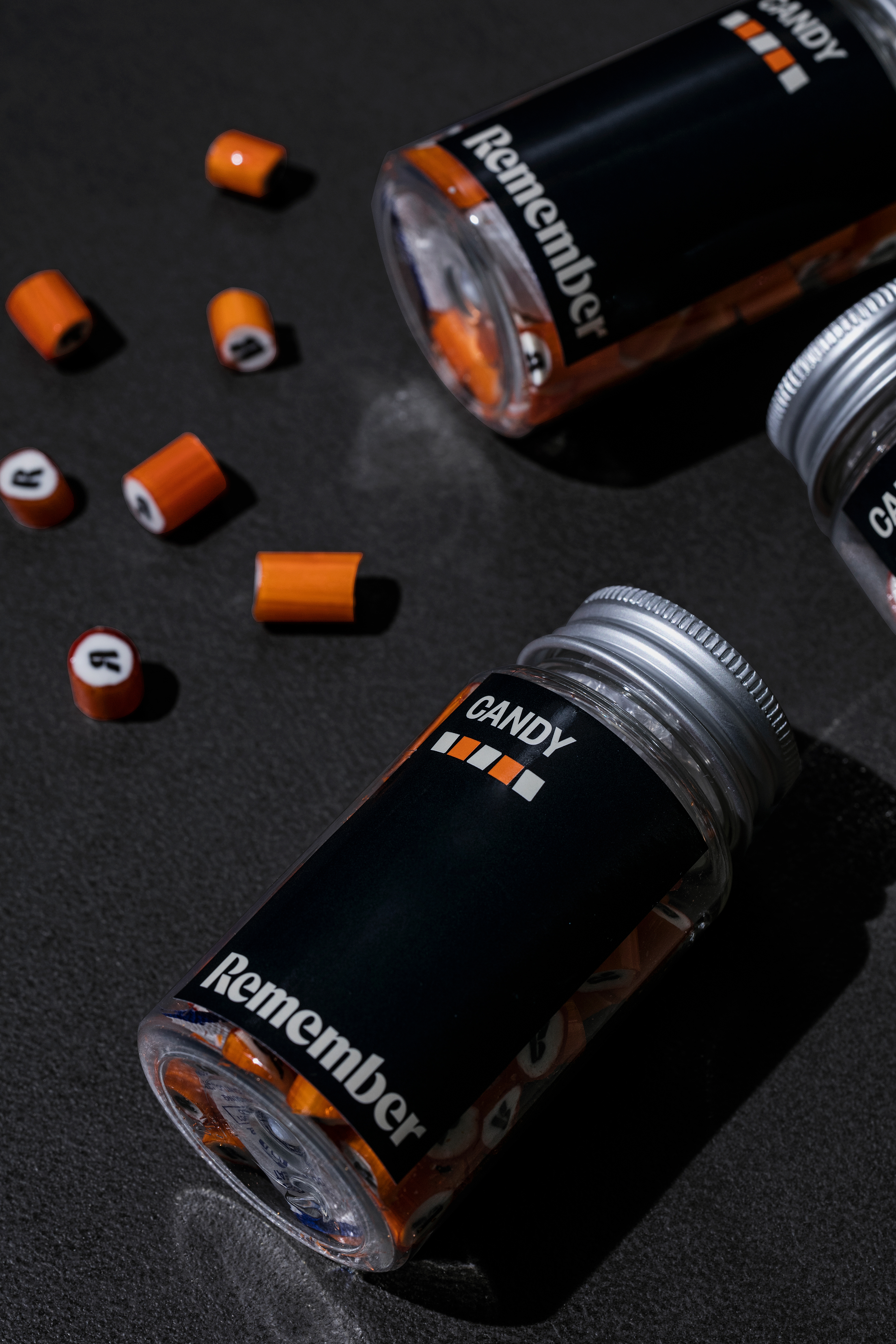
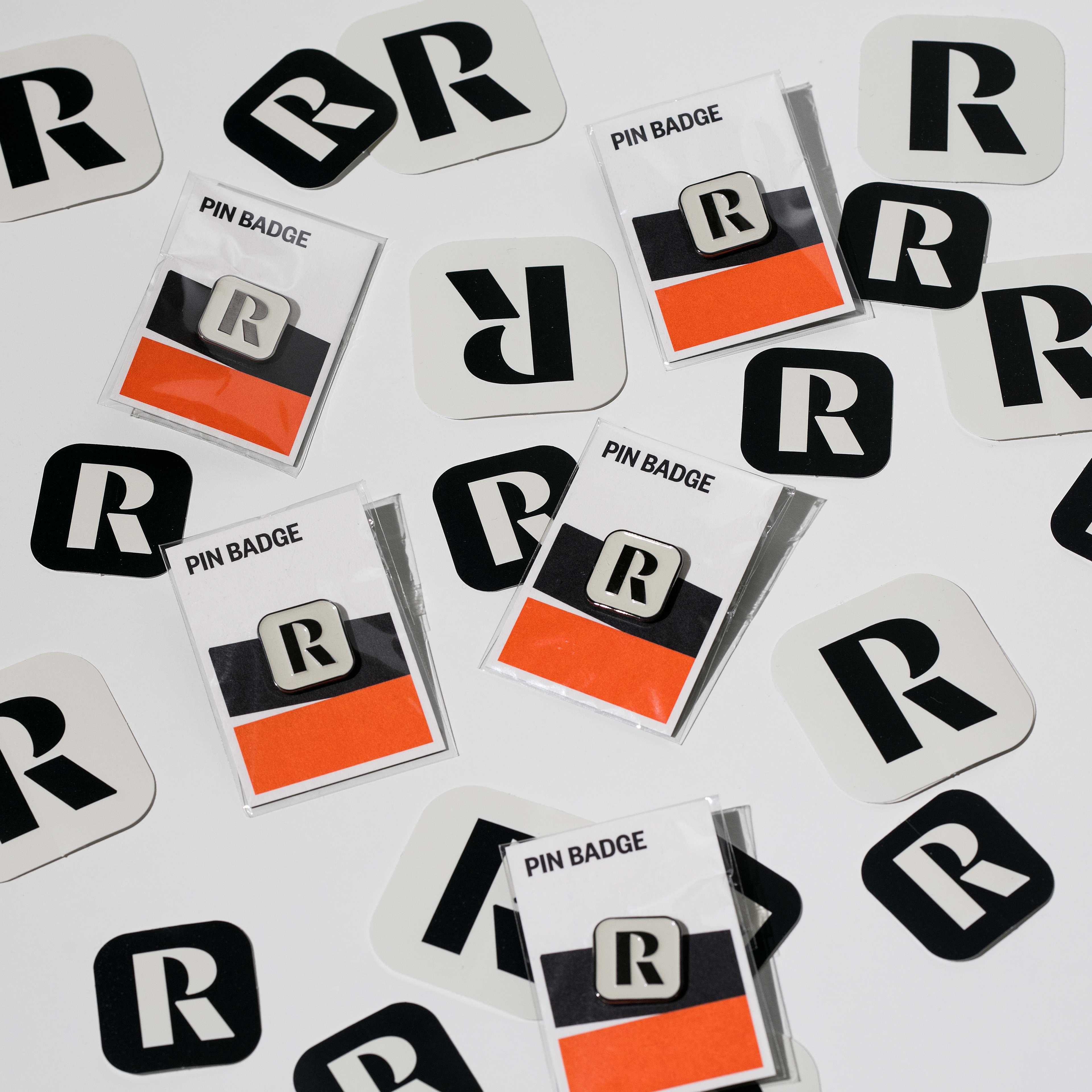
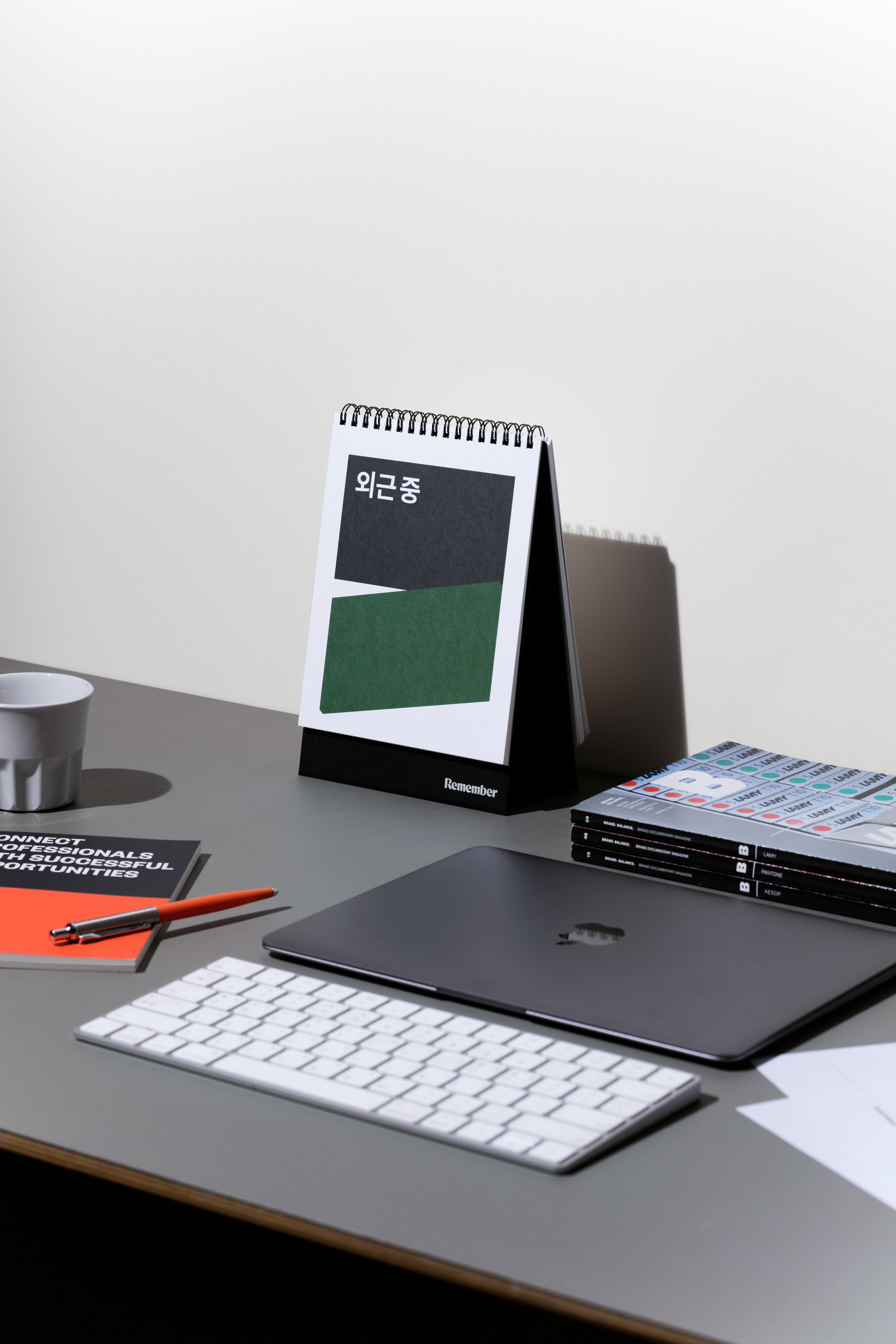
The growth of professionals is an ongoing process. CFC interpreted Remember Square as a "moment when opportunities for career advancement open up" and incorporated it into the initial R, expanding it throughout the graphics. The dynamic impression conveyed by Remember Square, with angles on both ends, adds vitality to the brand in various applications.
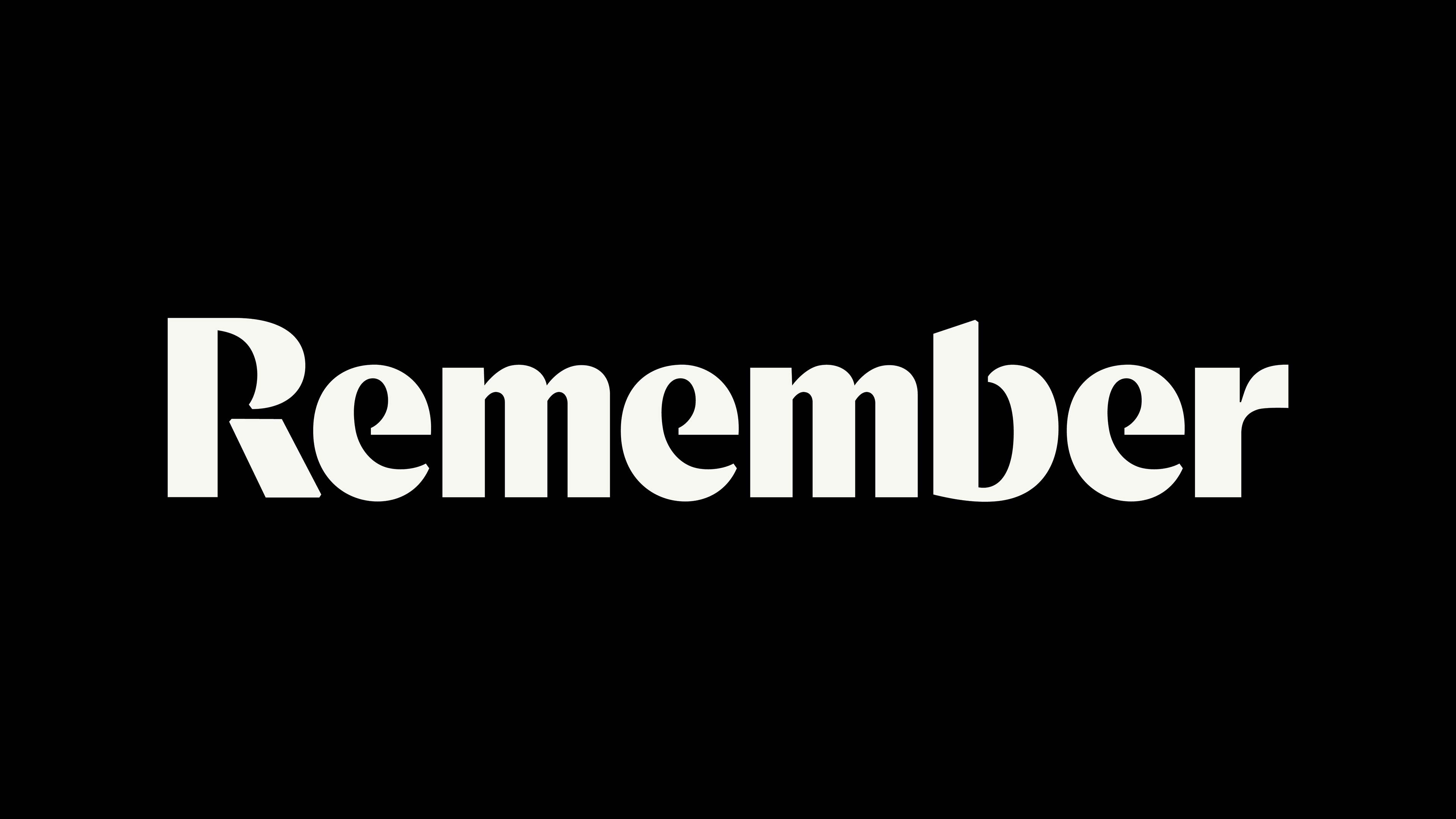
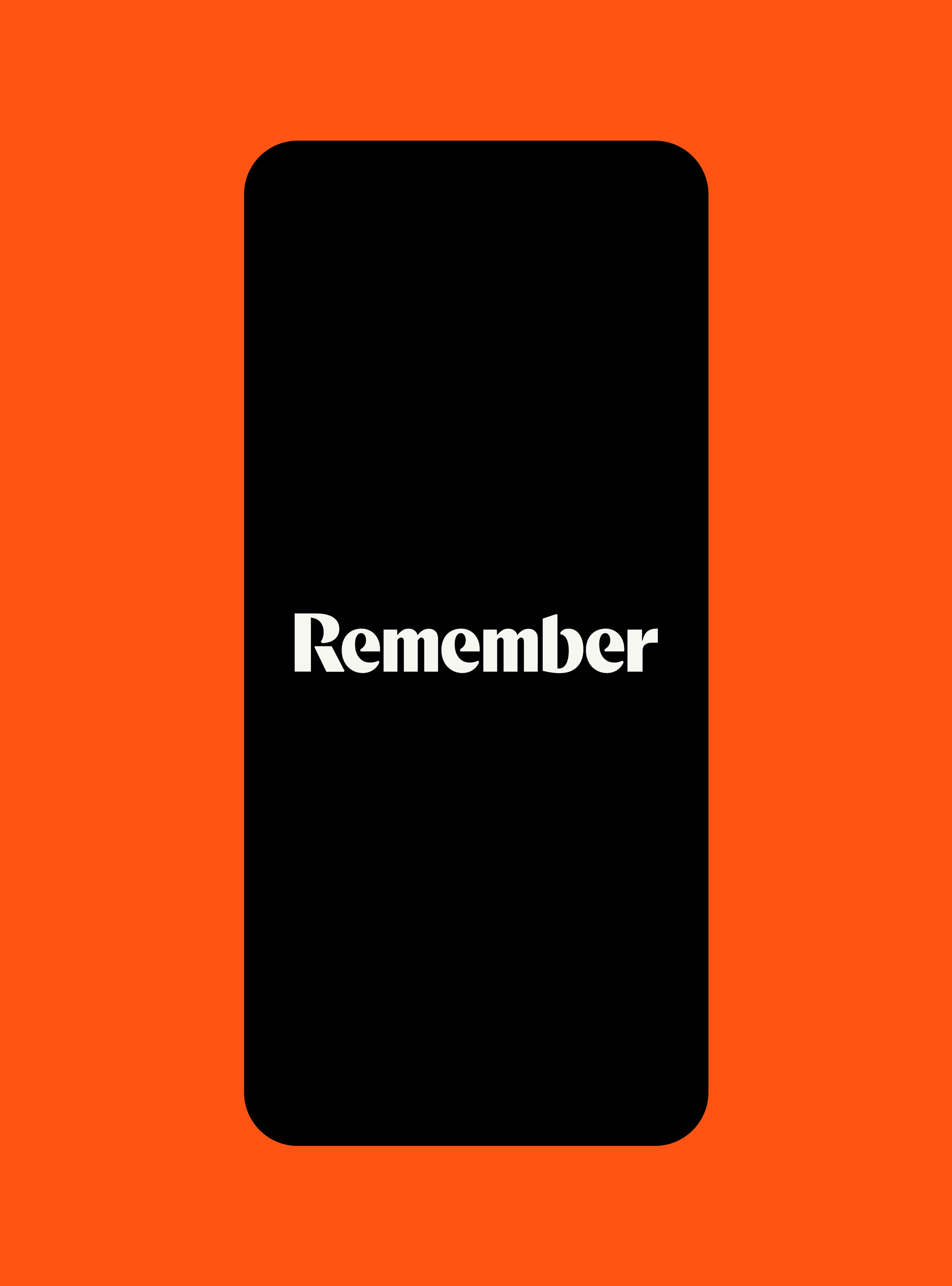
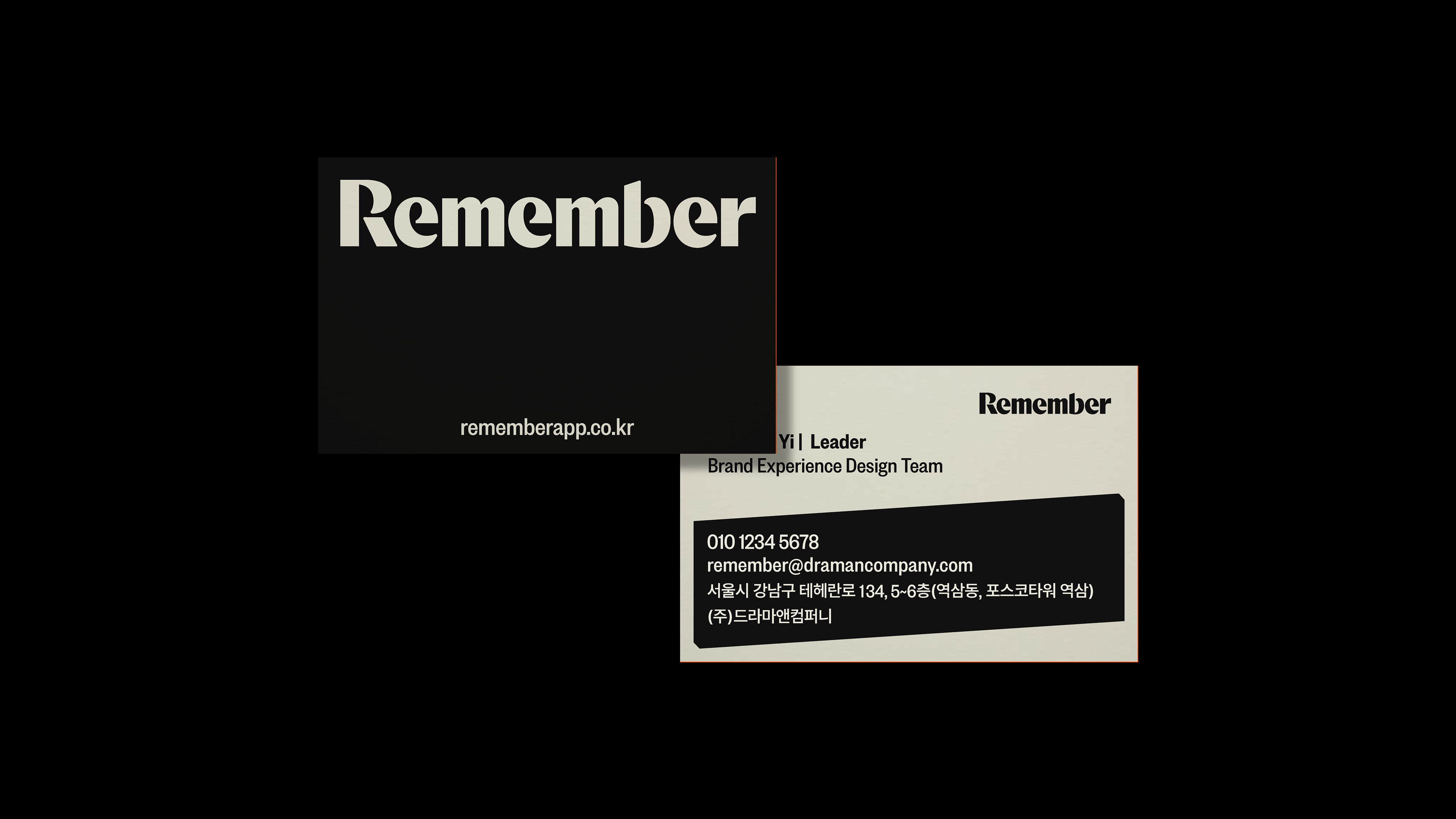
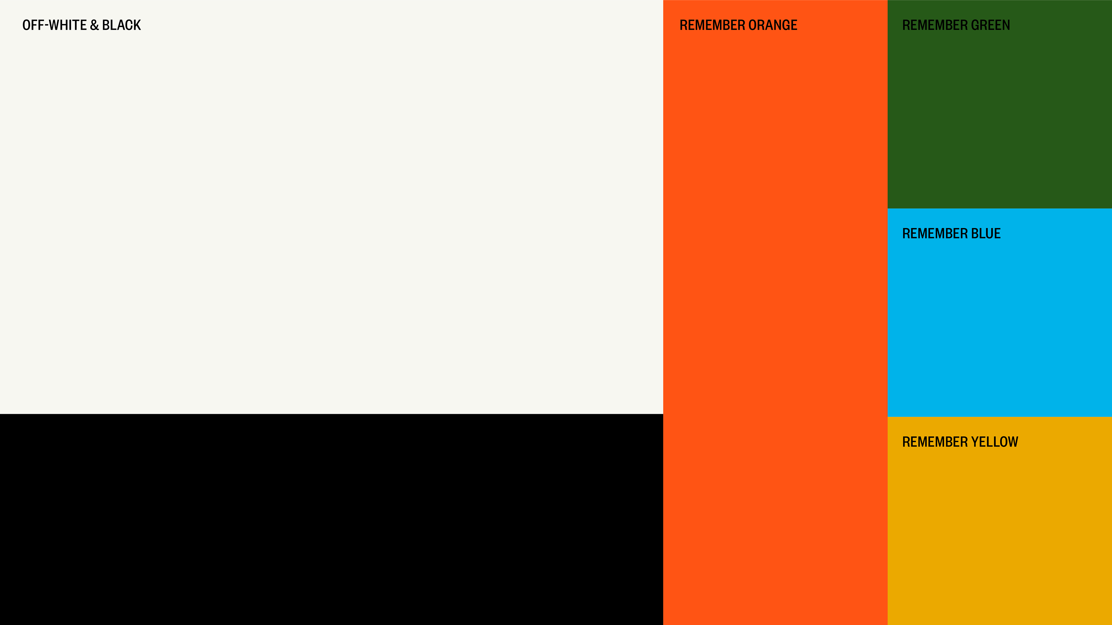
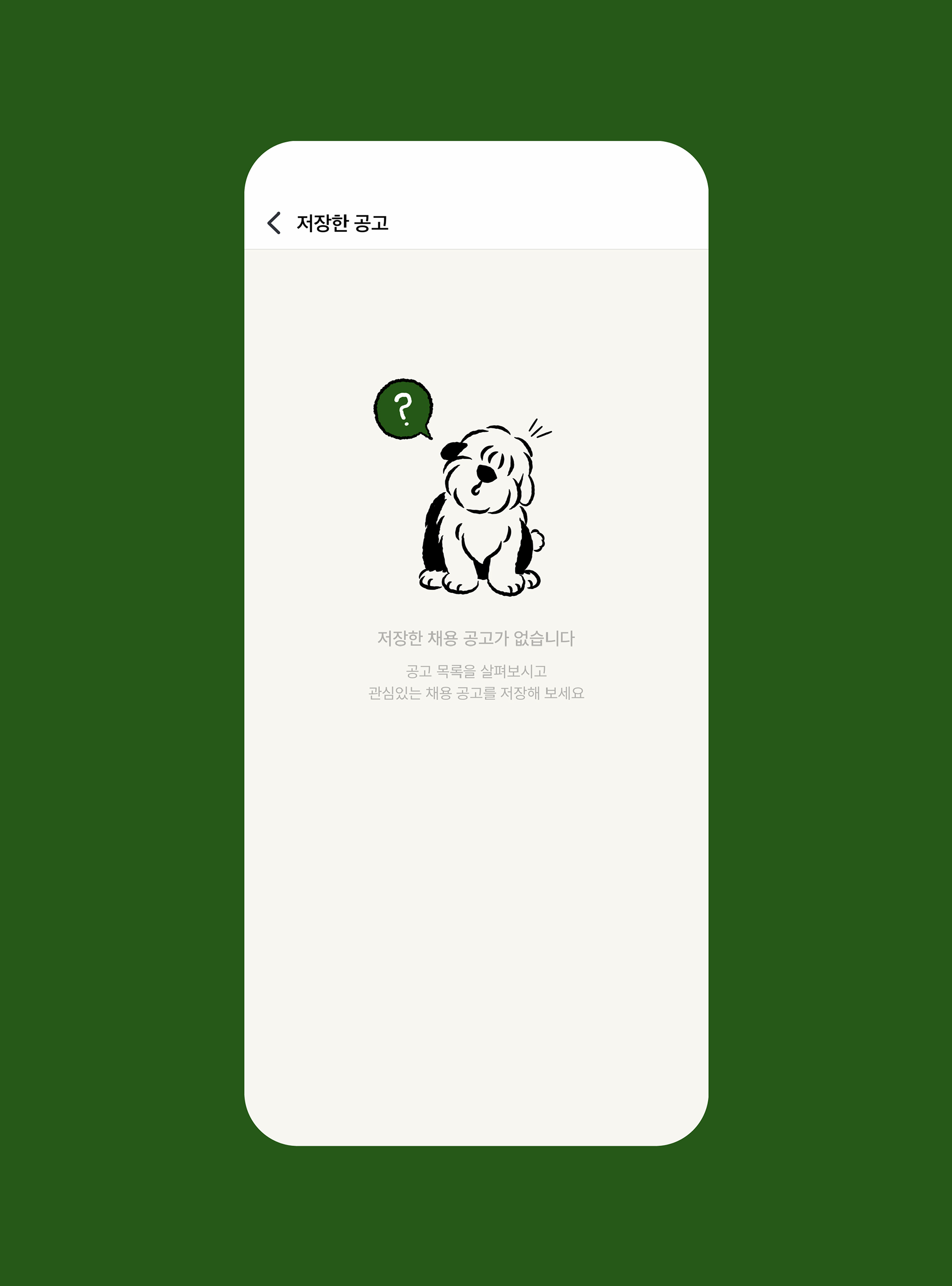
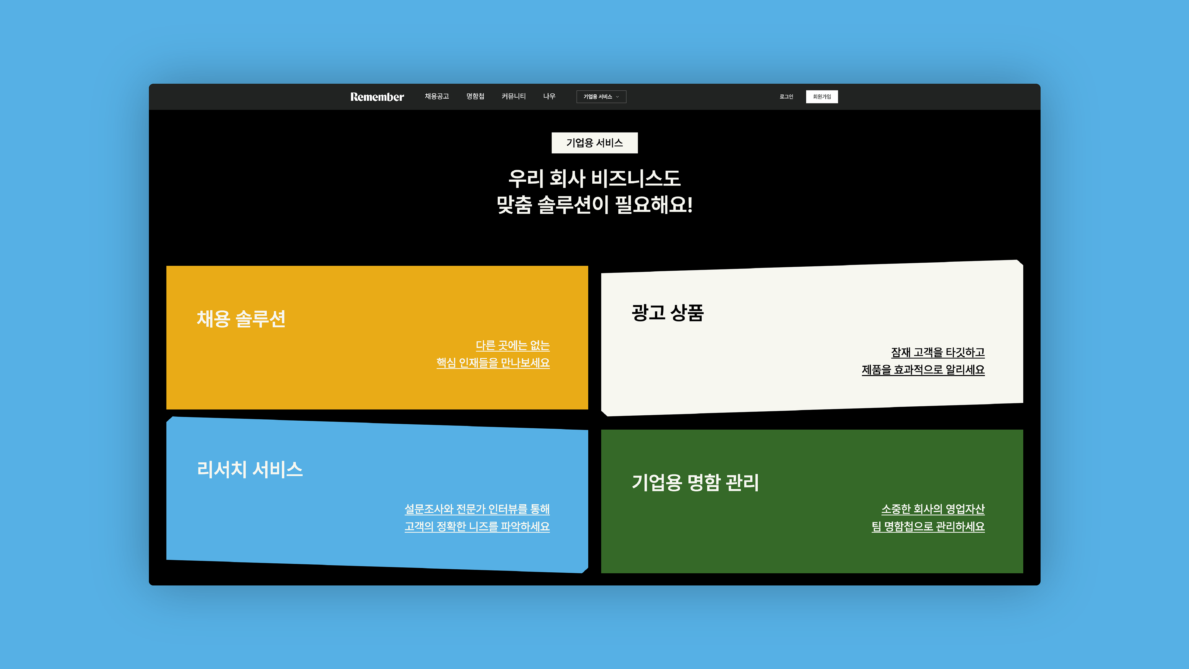
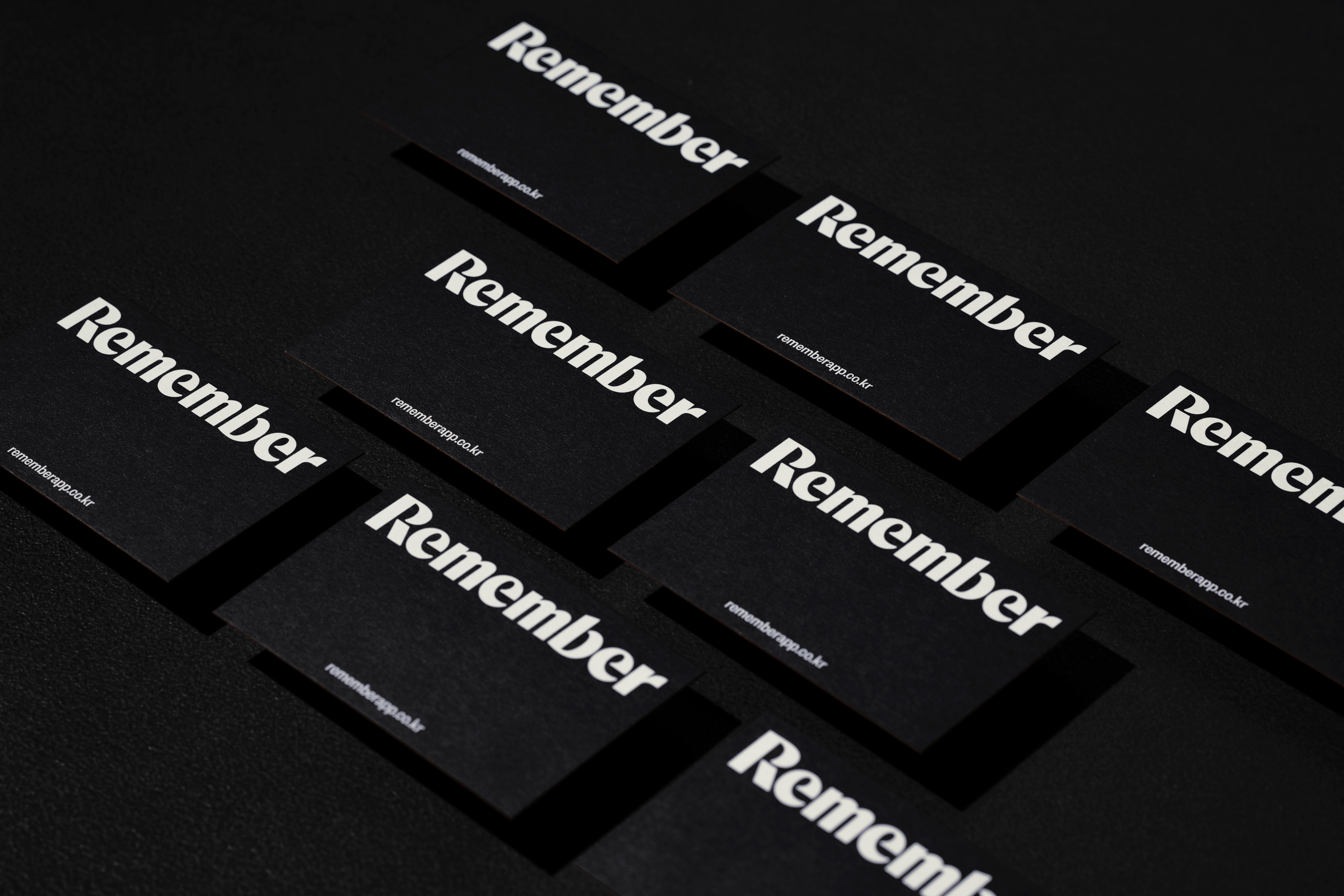
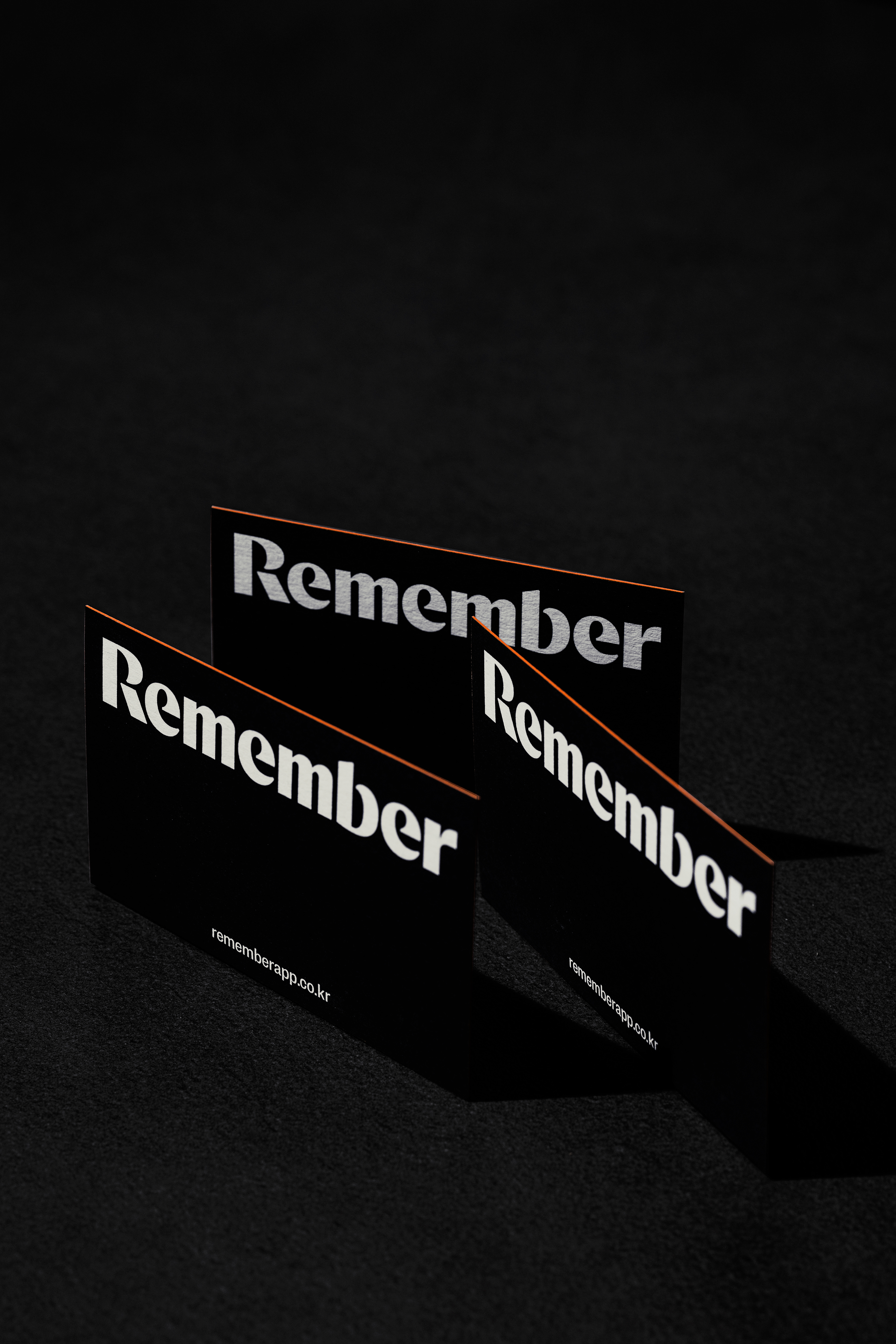
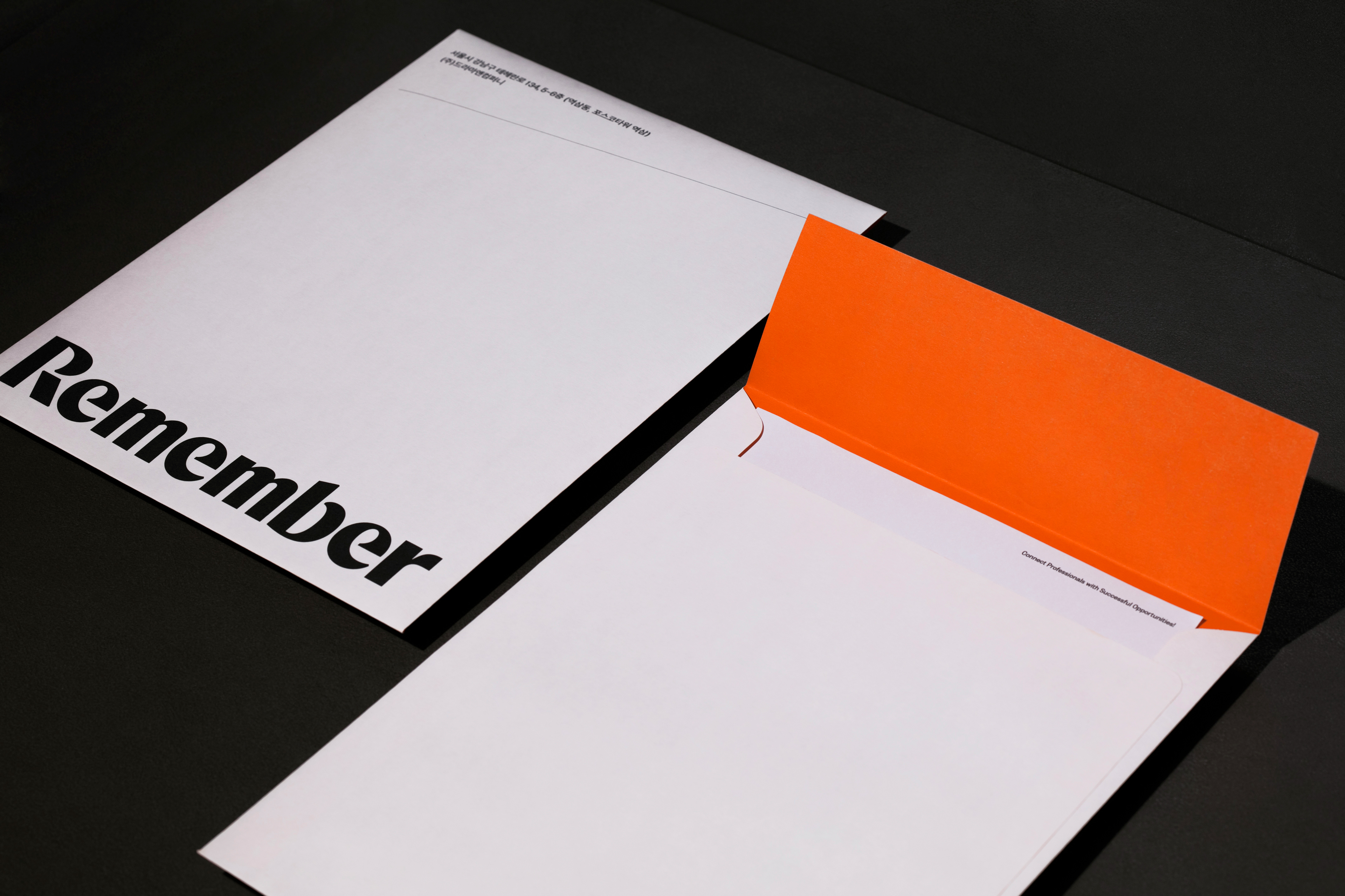
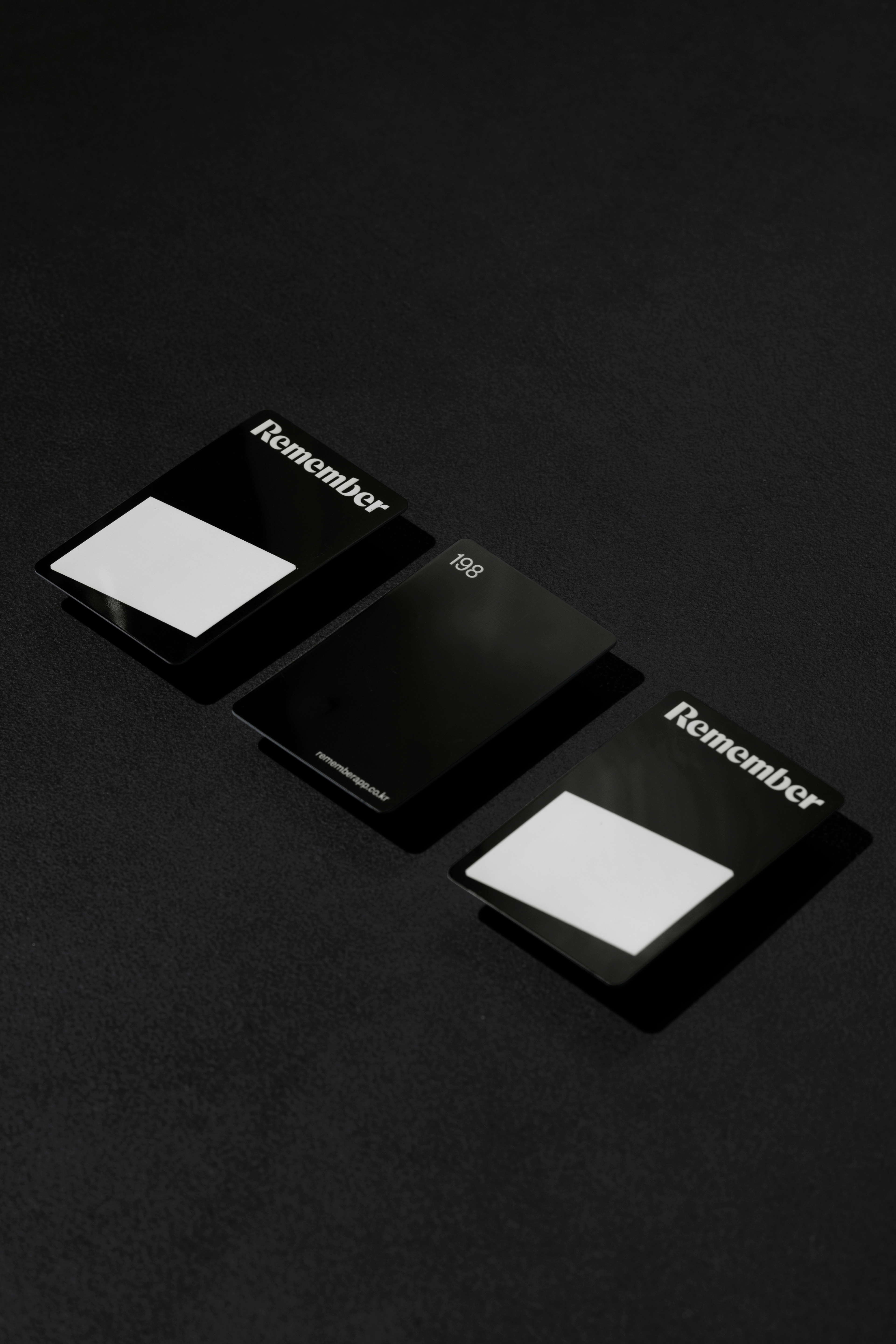
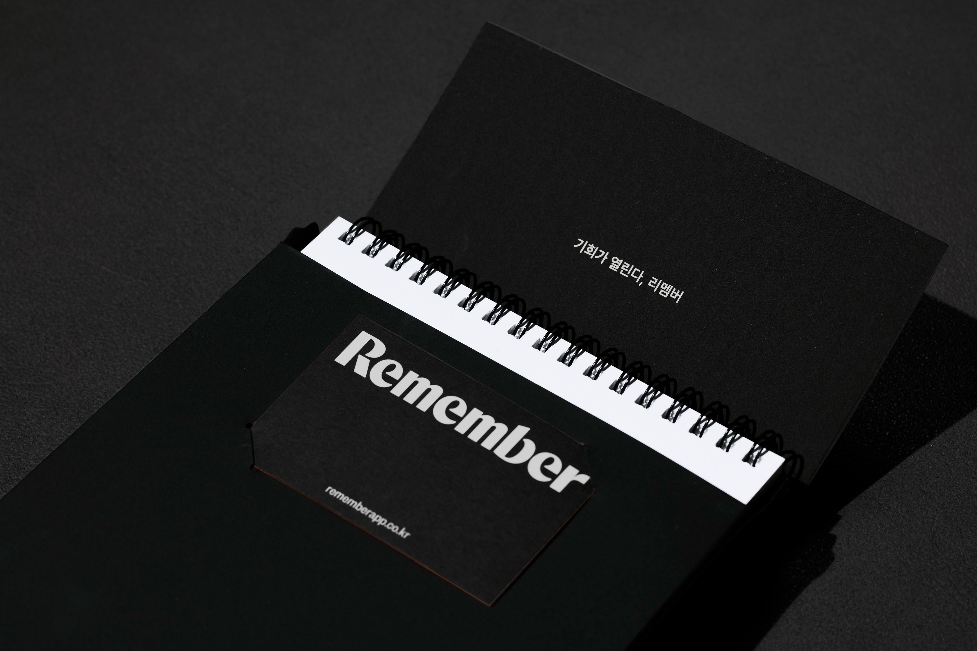
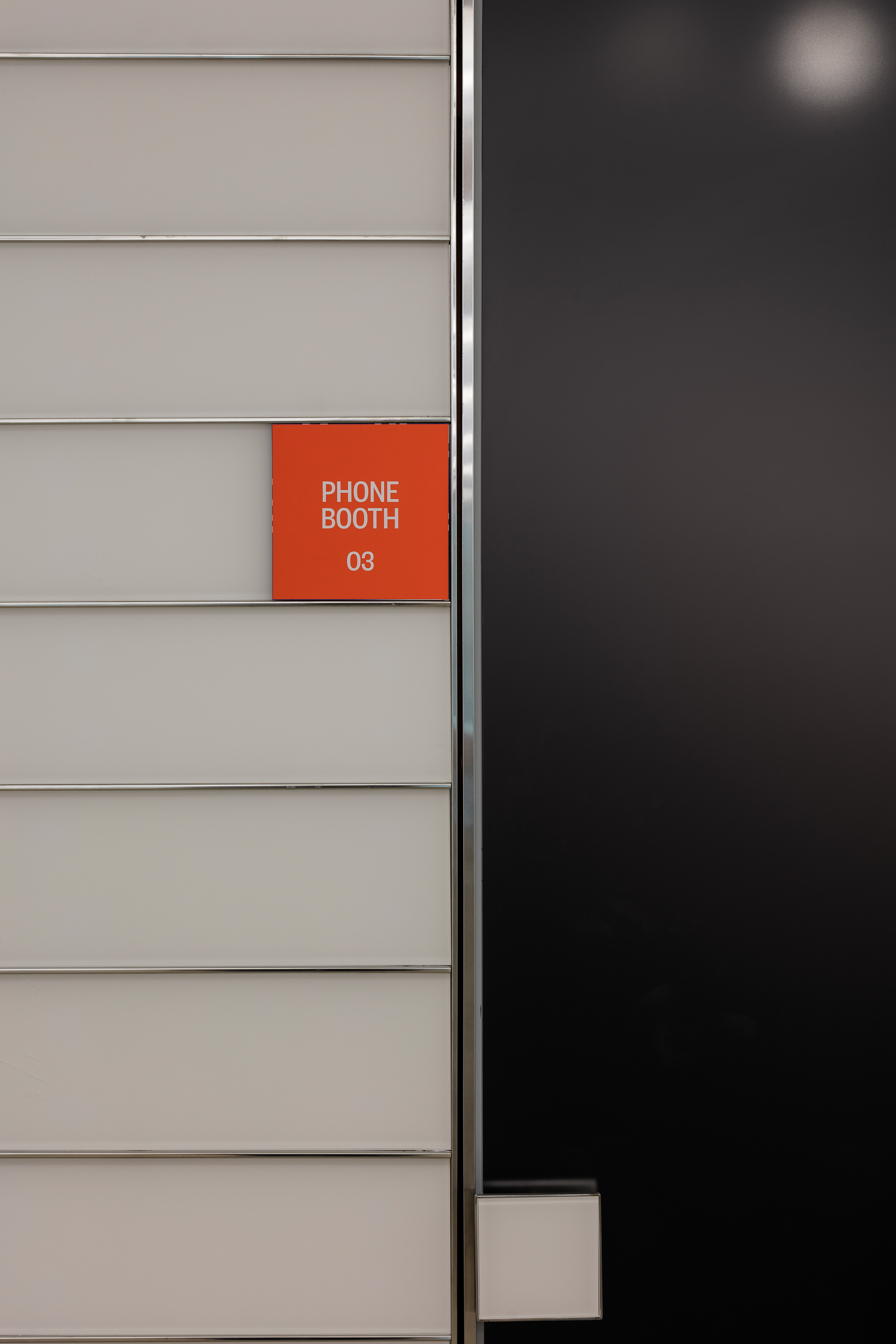
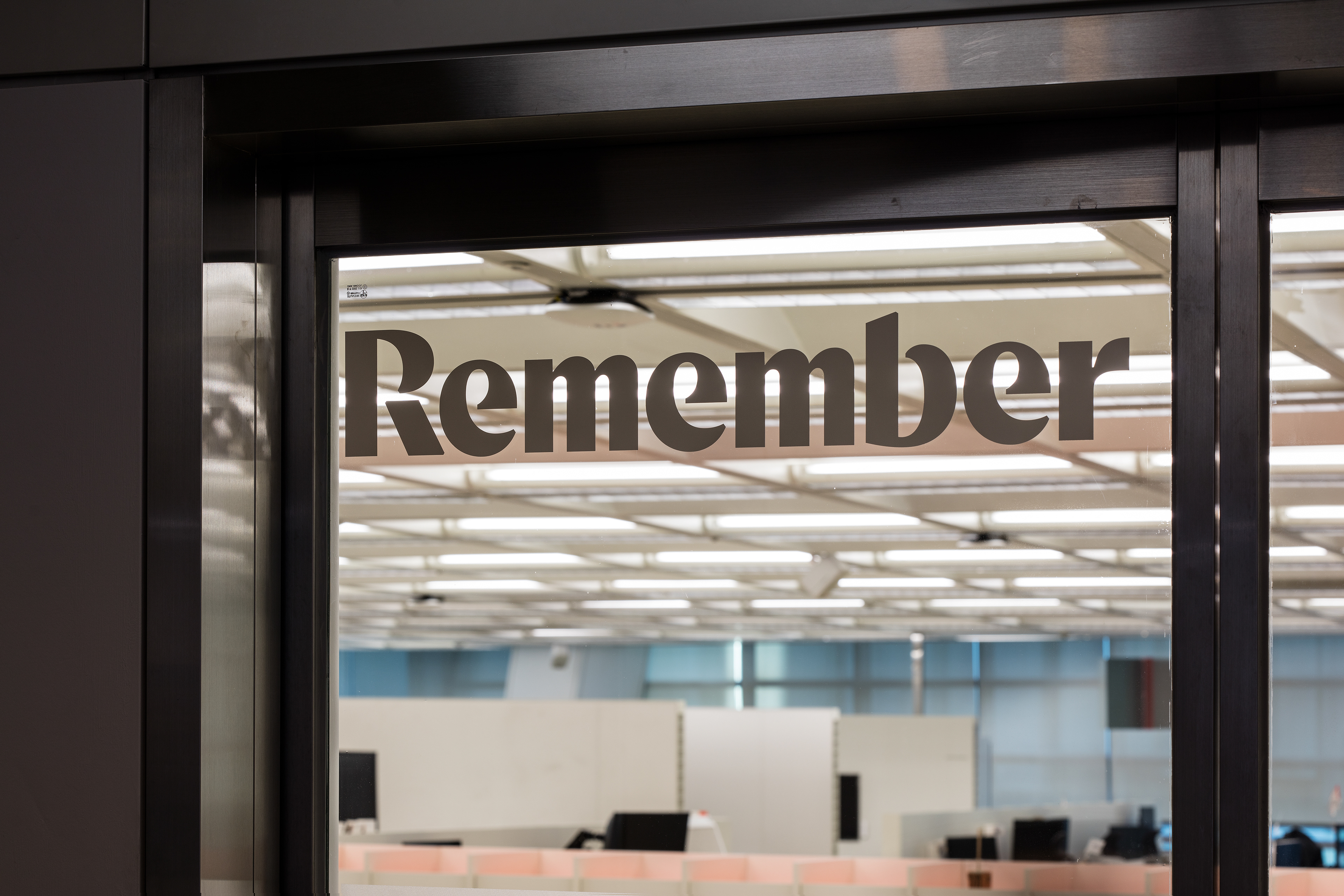
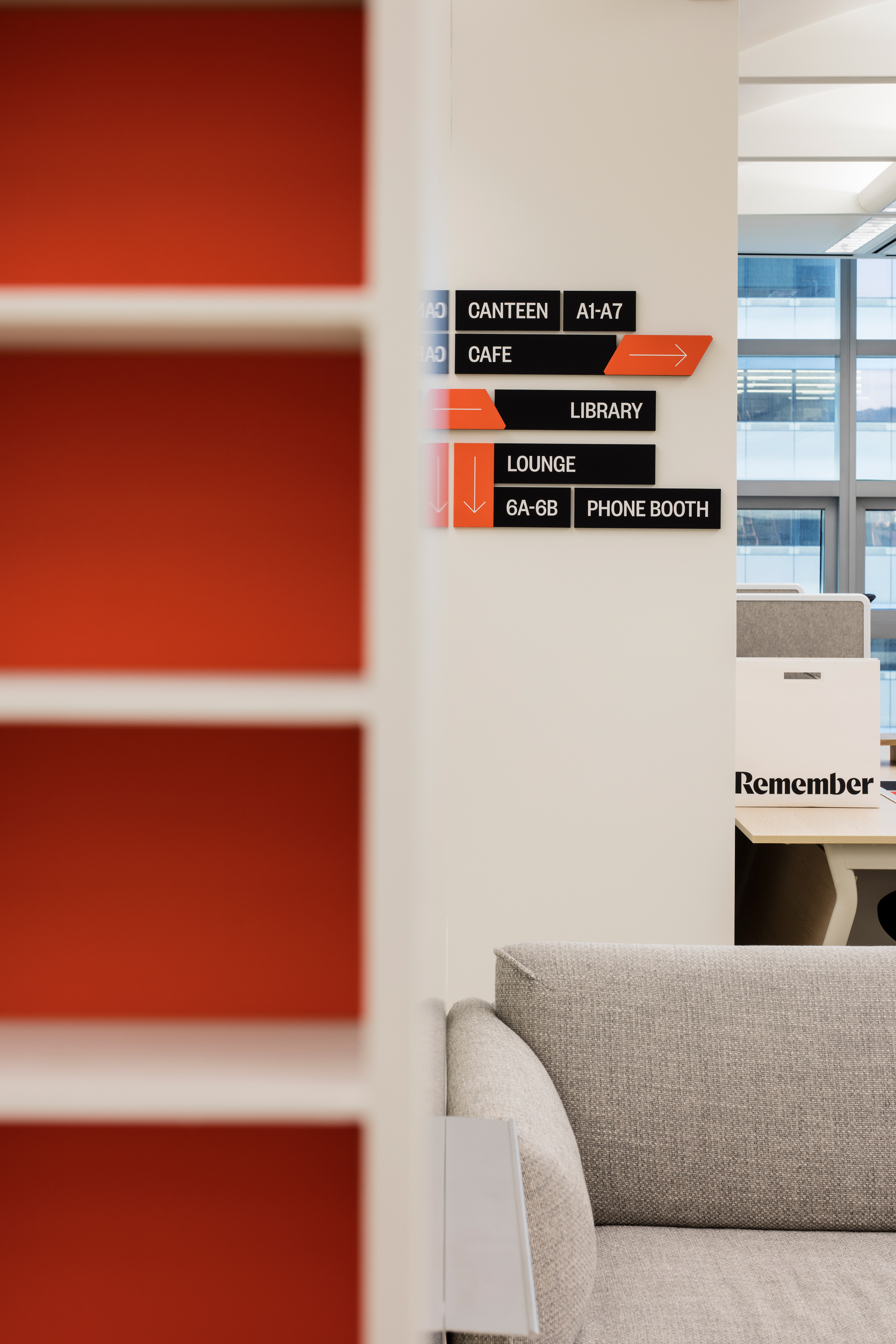
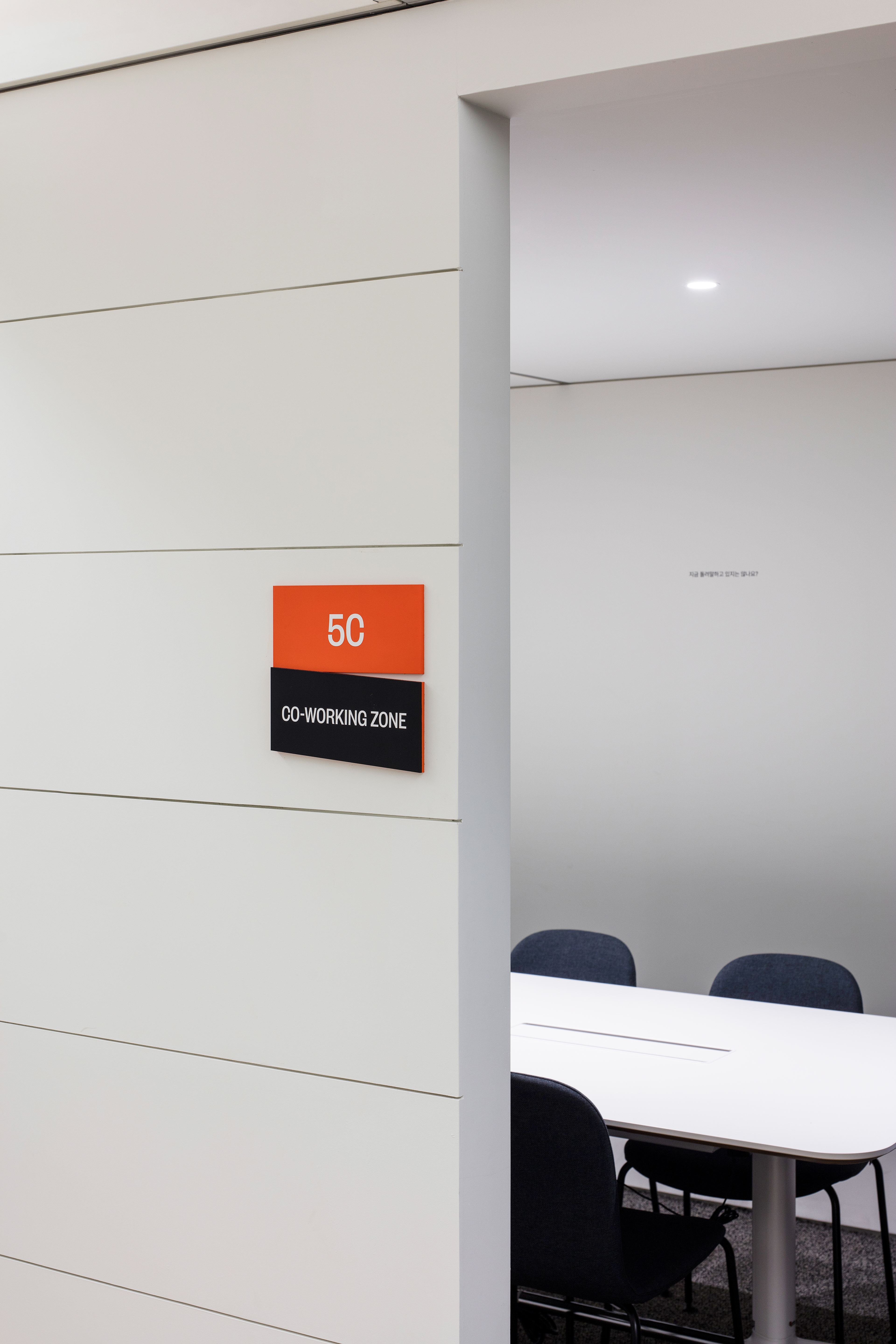
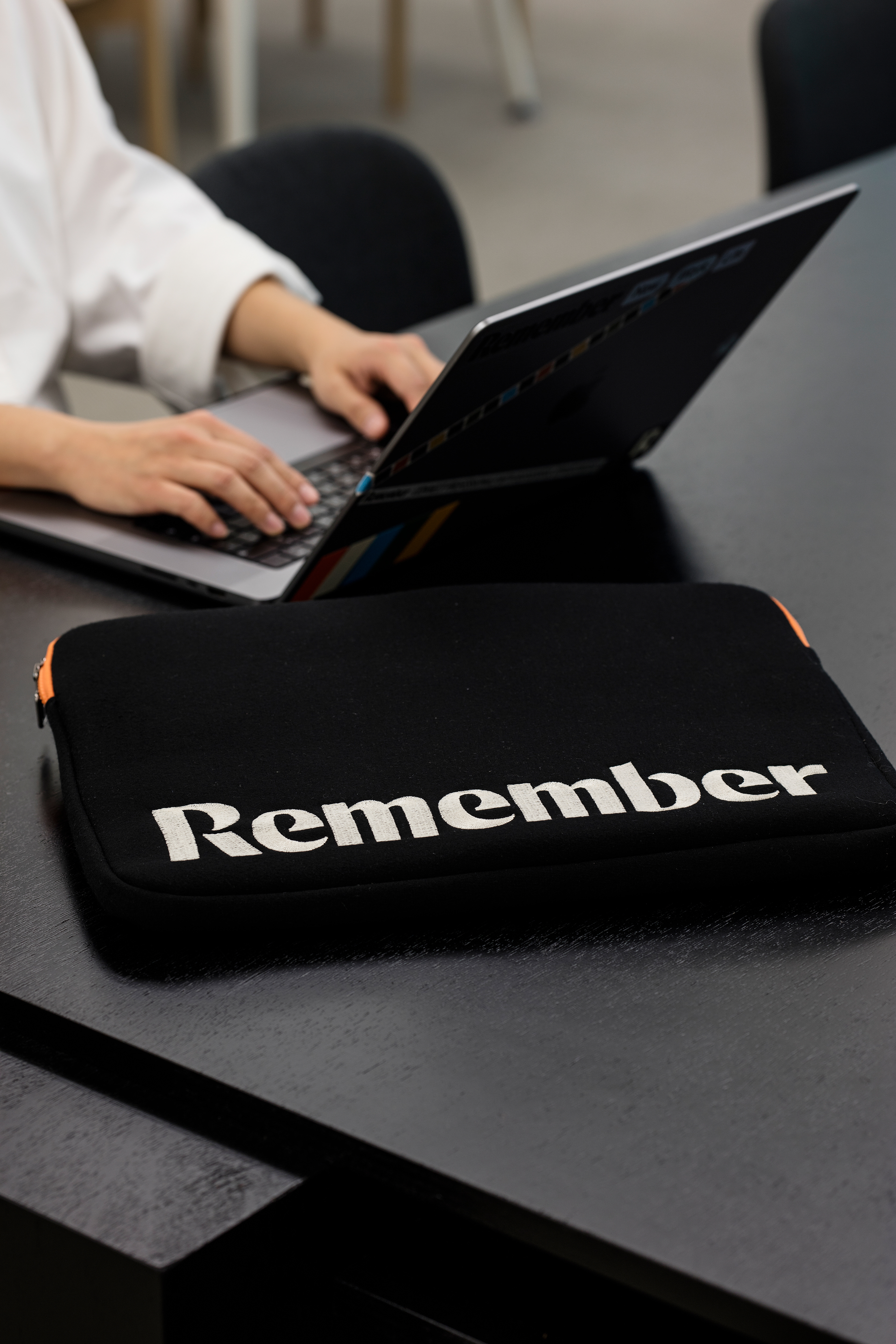
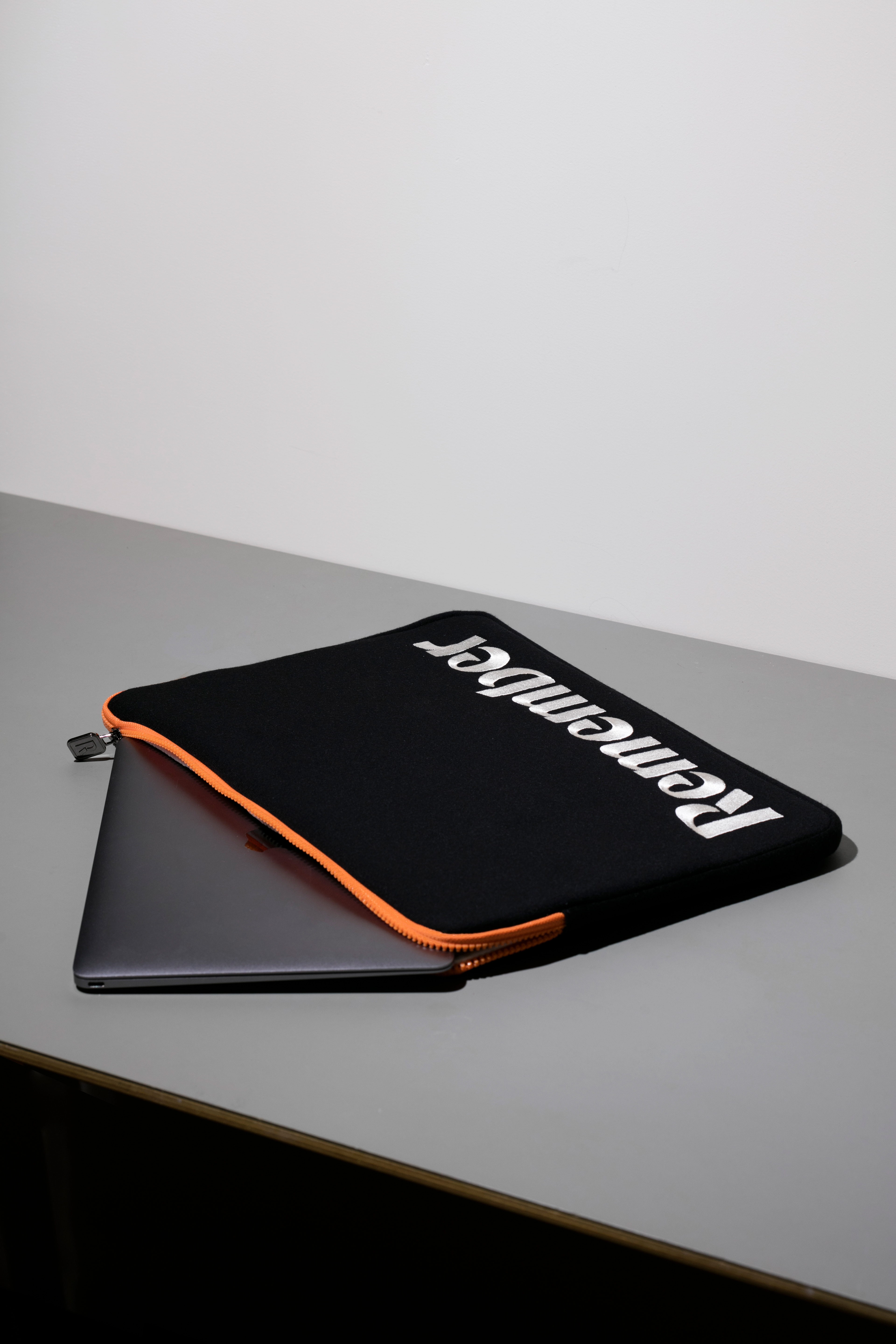
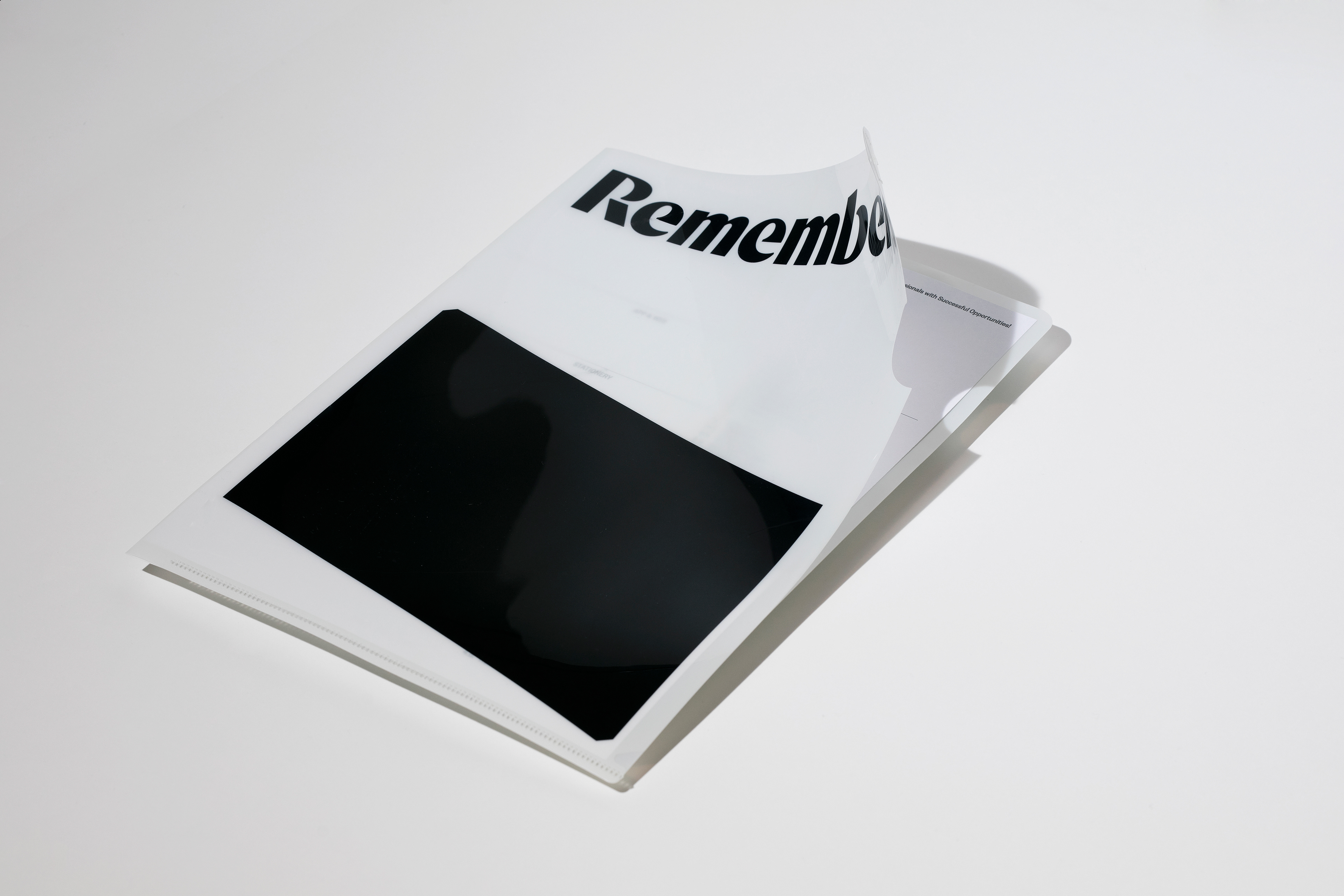
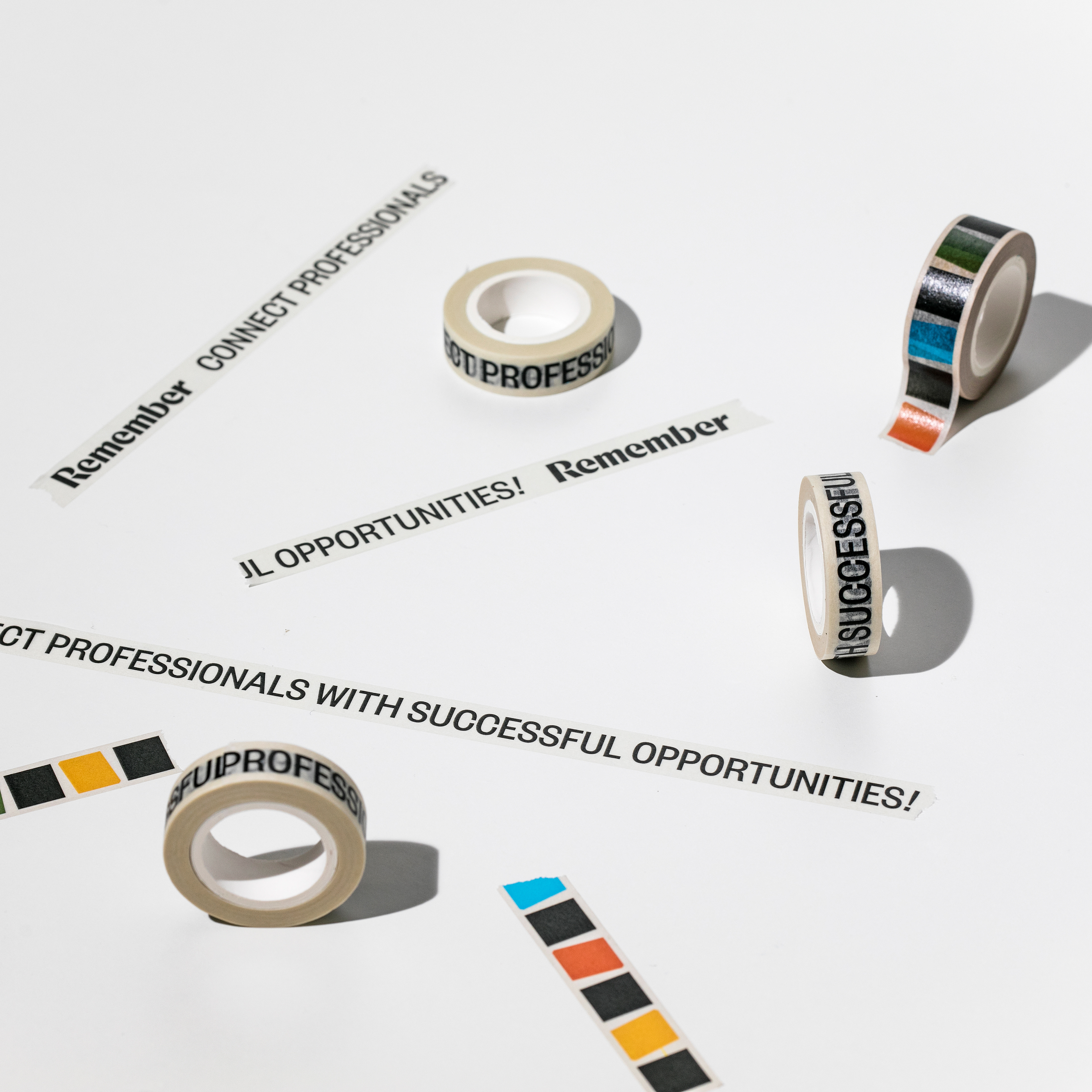
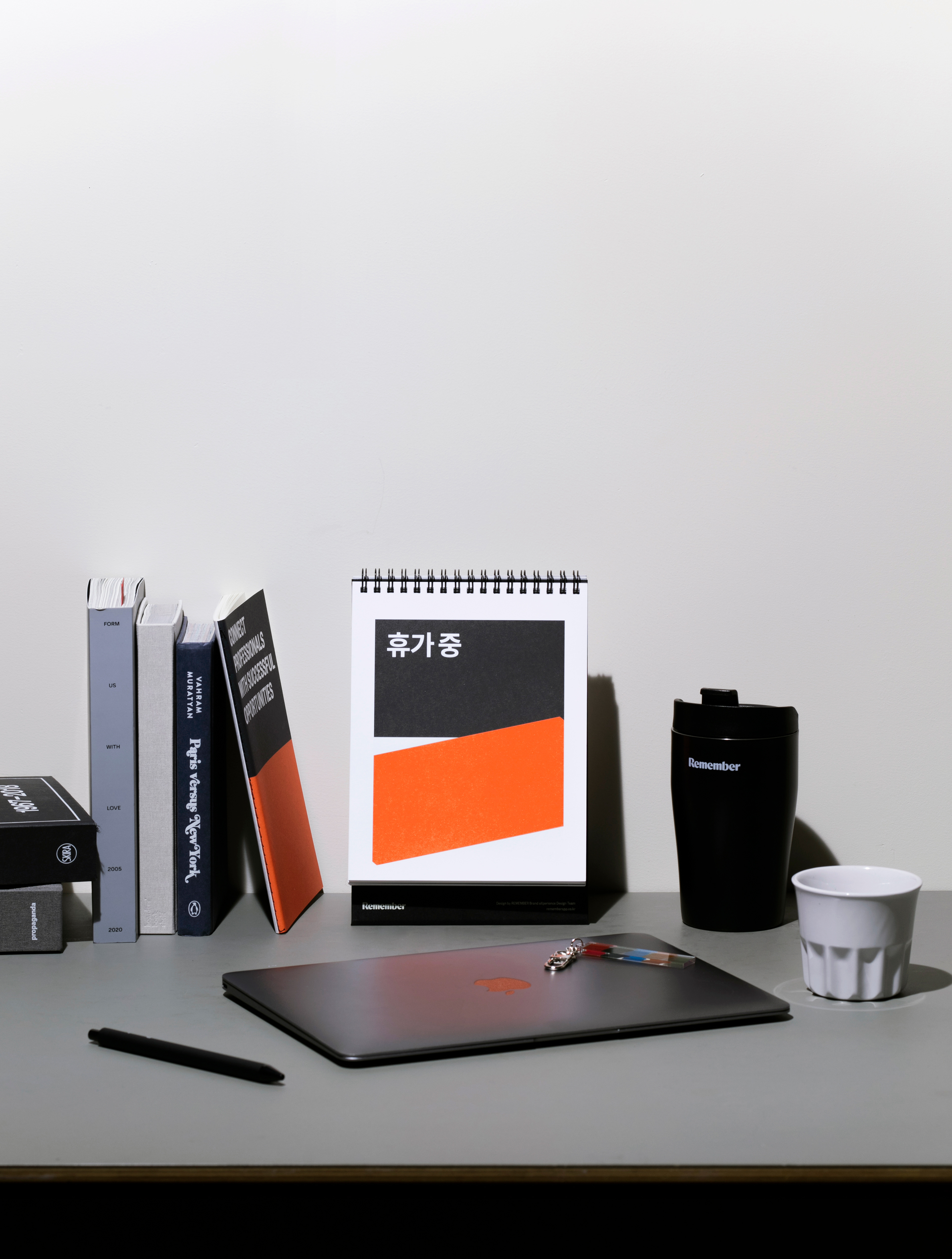
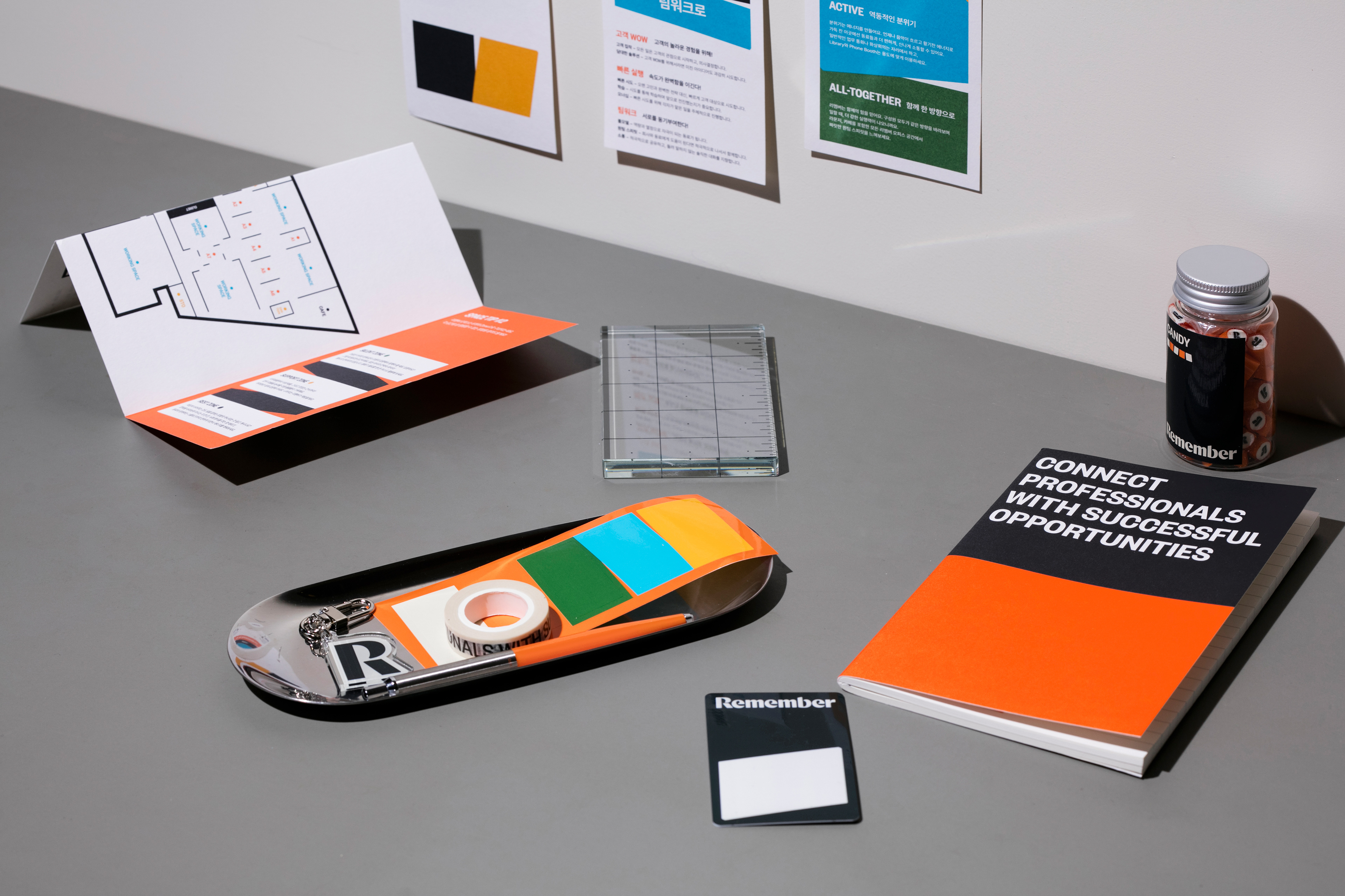
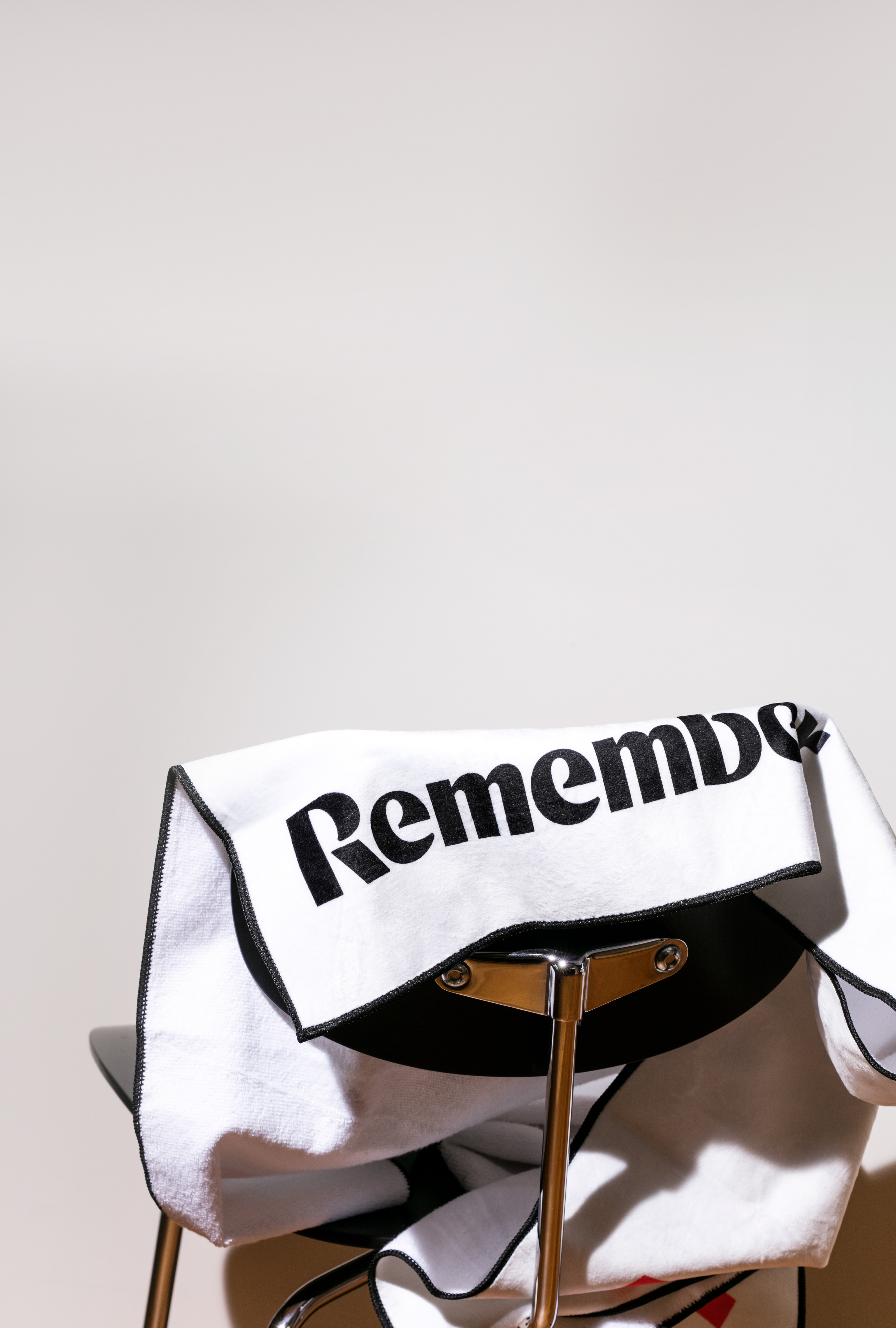
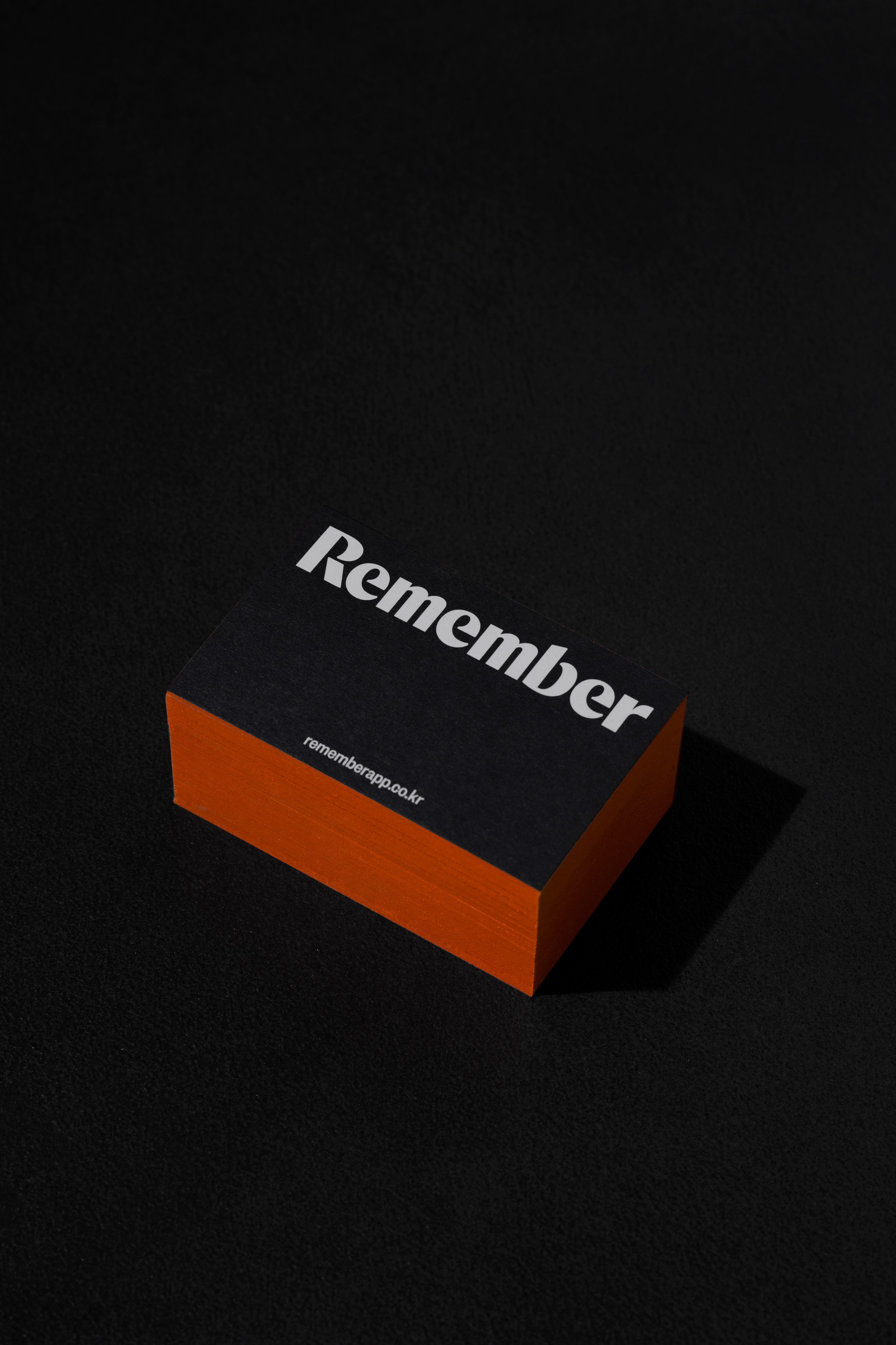
When many job search services use blue colors, Remember has utilized black as the main color to bring differentiation. CFC established a premium and lively brand image by introducing orange and ivory colors to the existing color system. The bold wordmark, which contrasts between straight and curved lines, and witty illustrations blend intellectual and classic sensibilities with modernity.


REMEMBER Visual Identity Design
2022
Client: Drama & Company
-
Project Team
PM: Remember BX Team
BI System Design: CFC
BI Design Application: Remember, CFC
Space Design: Studio Fragment
-
Remember
Project Management: Sun Yu
BI Design Application: Sun Yu, Sanghee Gil, Chaerin Seo
-
CFC
Art Direction: Charry Jeon
BI System Design: Charry Jeon, Saerom Kang, Hyungseok Lim, Seyoun Kim
BI Design Application: Hyungseok Lim, Seyoun Kim
Photography: Kiwoong Hong
Copyright 2023. (CFC) all rights reserved.