CFC developed the brand identity and package design system for “KURLY'S”, Private Brand by Market Kurly. KURLY’S deep purple, which has lowered the brightness and saturation from the existing Kurly purple, forms the premium sensibility of KURLY’S with the medium saturation sub-color system.
Designing KURLY’S package design system, which will expand from food to everyday goods, was an important task for this project. It was our goal to deliver the mission of KURLY’S, "presenting the standard of good products" to consumers.
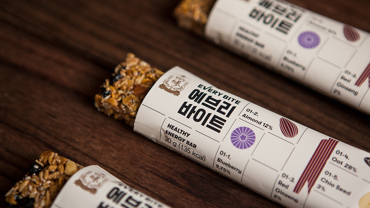
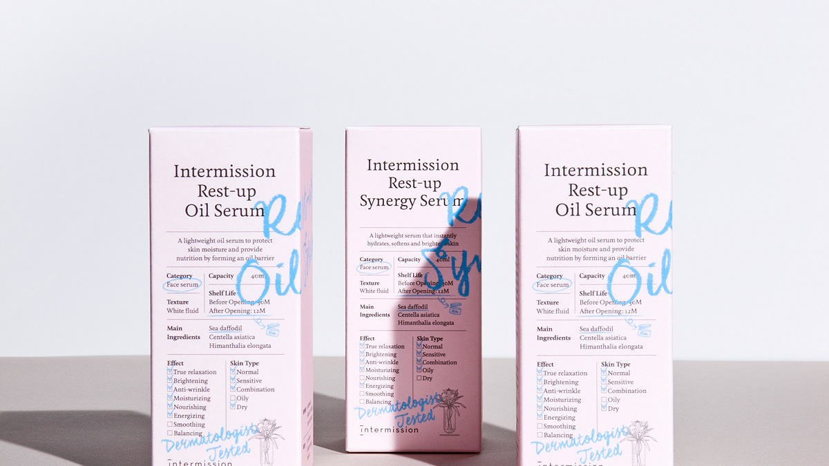
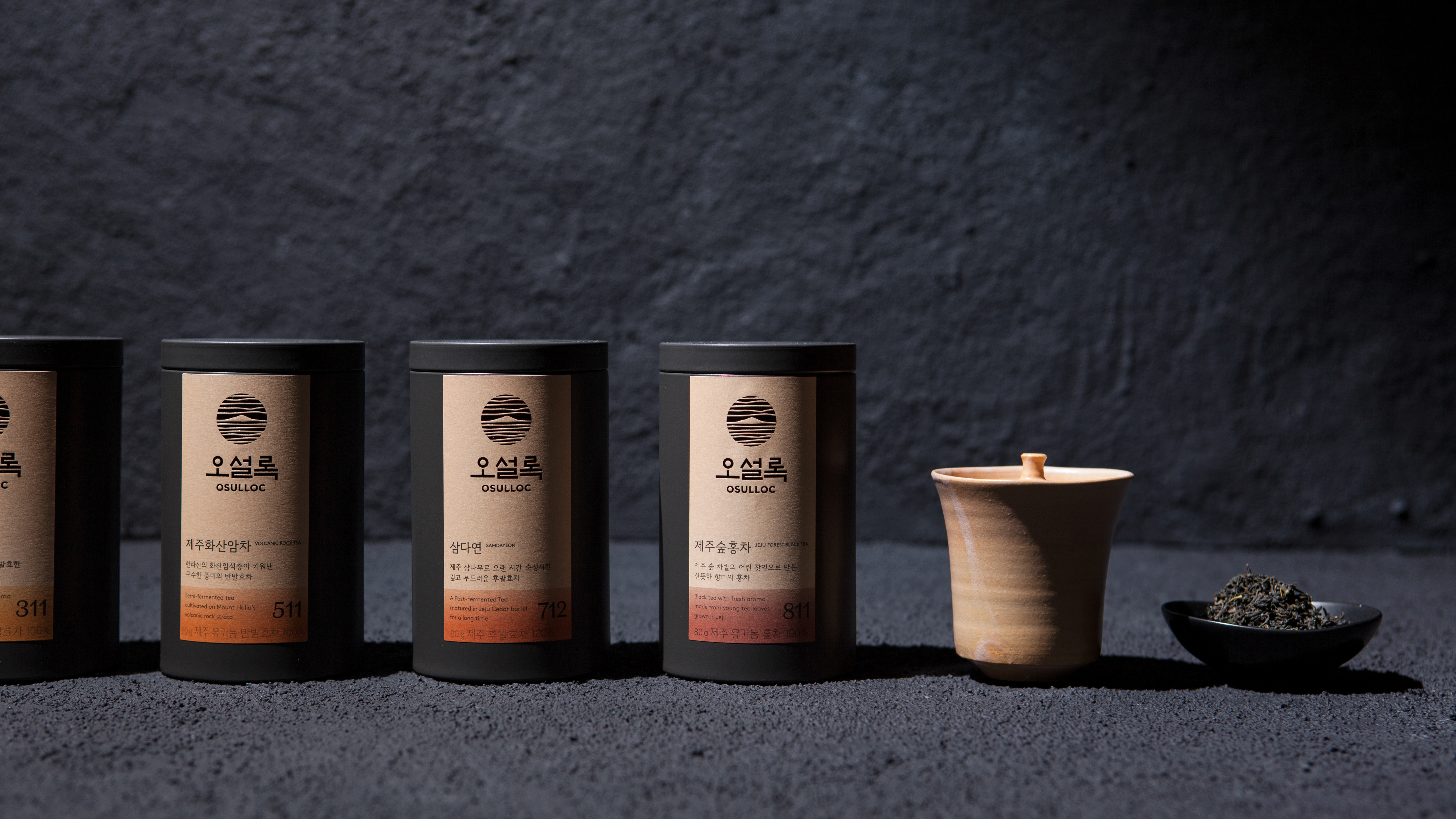
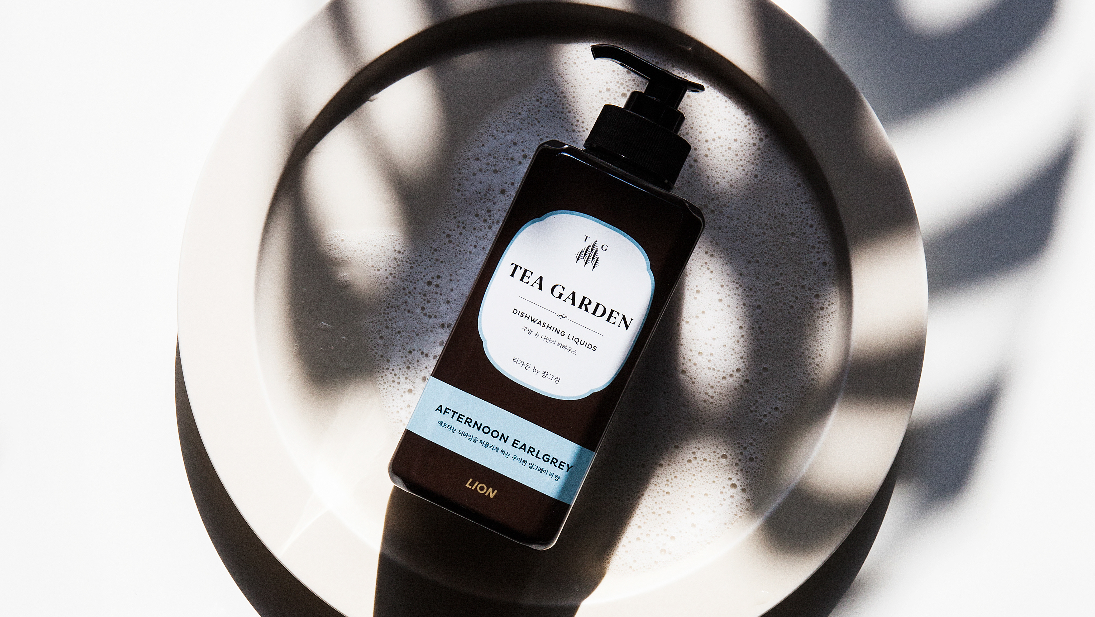
Our direction for the package design was 'design for reading, friendly information.' Other graphics were excluded so that only information about the product could be contained. We put numbers on some of the main points of each product, and annotated the bottom to make it easier for consumers to understand. We also added some illustrations to help convey information.
Kurly’s BI and package design system
2020
Client: Market Kurly
-
Project Team
PM : Market Kurly
Design : CFC, Market Kurly
-
CFC
Art Direction & Design: Charry Jeon
Design: Ziyoung Kim, Minsun Lee
Assist: Yoonji Nam, Jeongmoon Choi
Photography: Kiwoong Hong
www.contentformcontext.com

