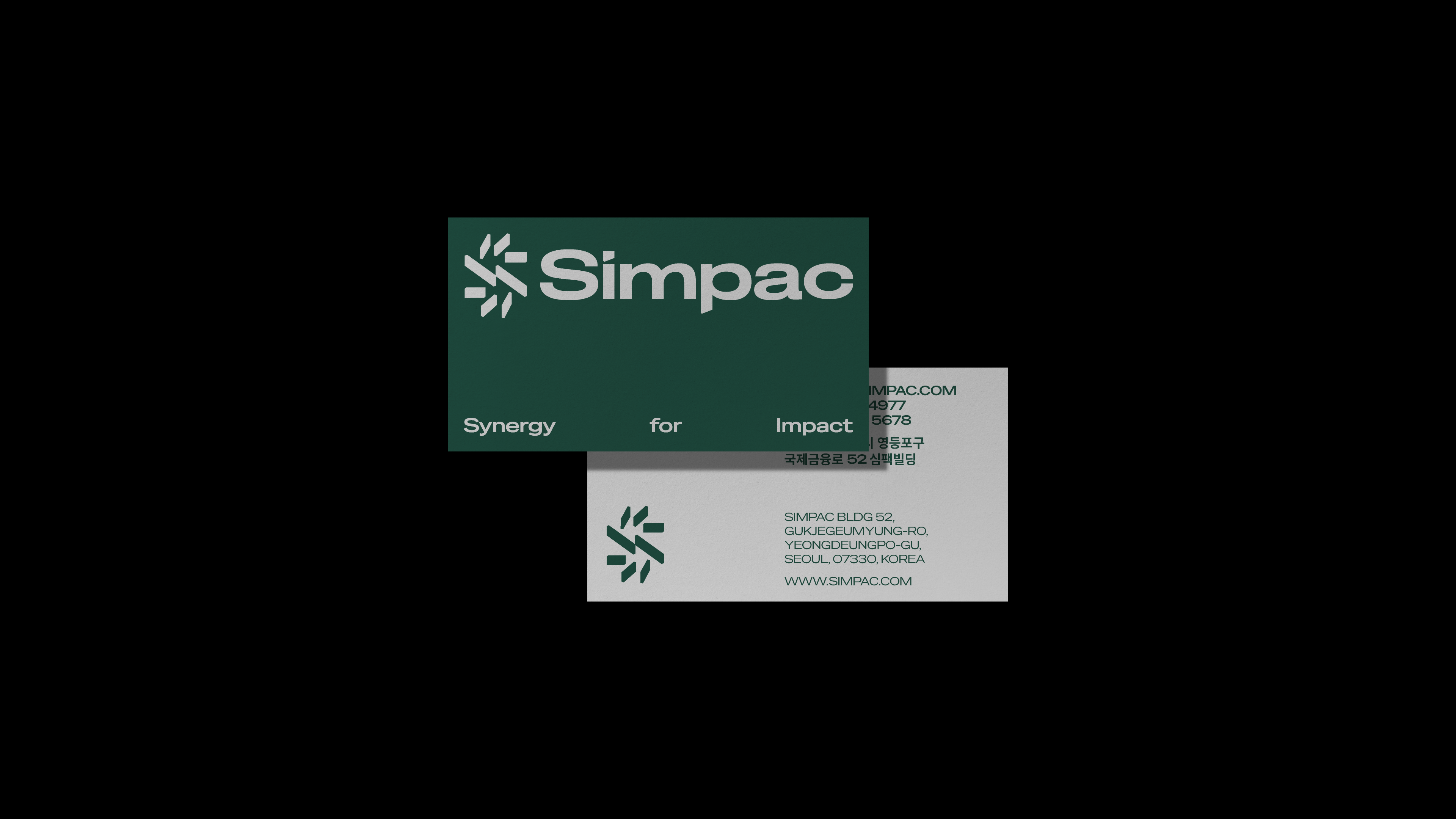
CFC redesigned the corporate identity of SIMPAC in 2025. The project aimed to reinforce SIMPAC’s credibility as the No.1 company in the press machinery sector while establishing a new brand identity that encompasses its expanding portfolio from B2B to B2C. The identity reflects the philosophy of Simple & Compact, a principle that has long defined the brand. CFC restructured the CI, which had remained largely unchanged since 2002, and rebuilt it through a simple and clear formal language that expresses SIMPAC’s future vision.
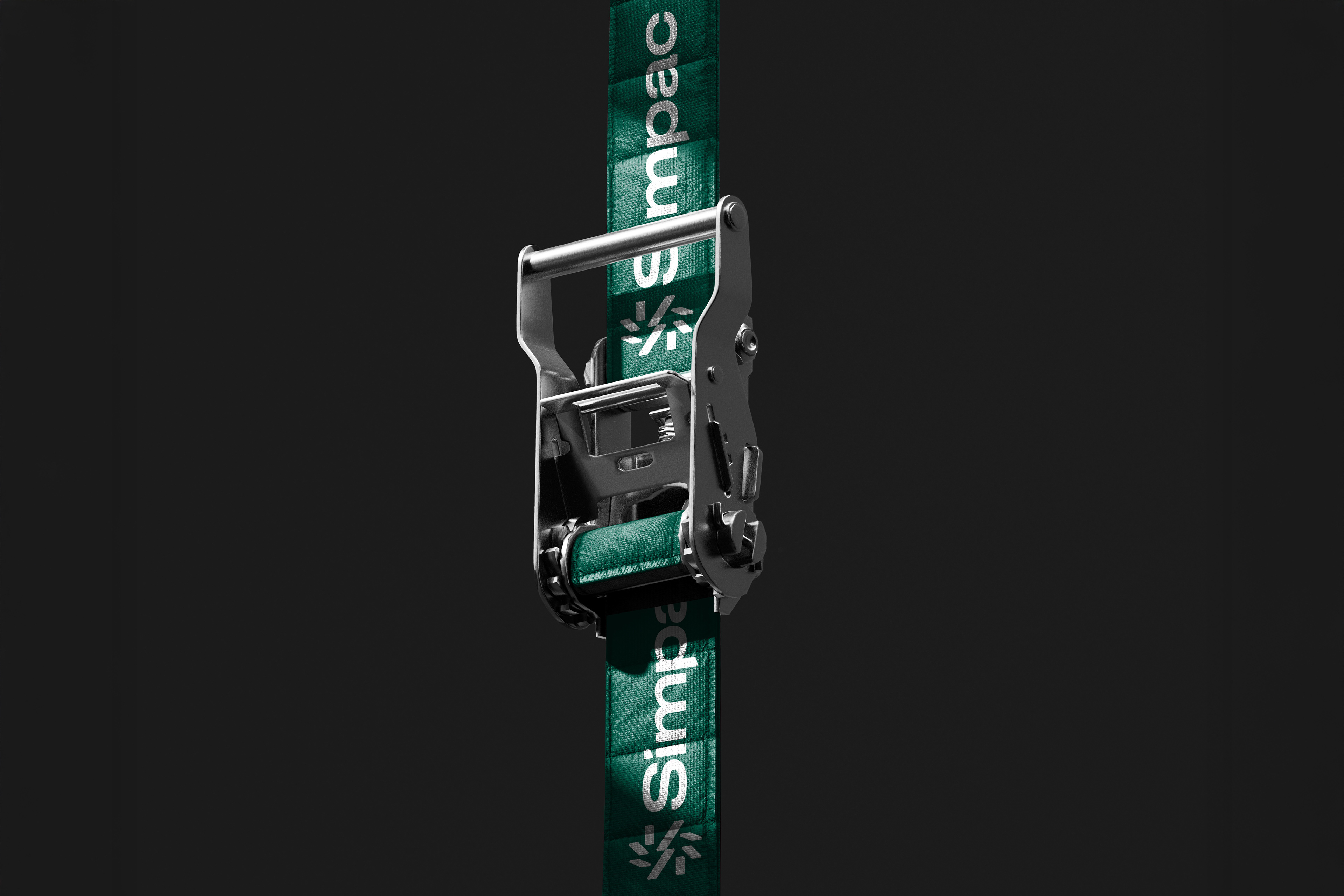
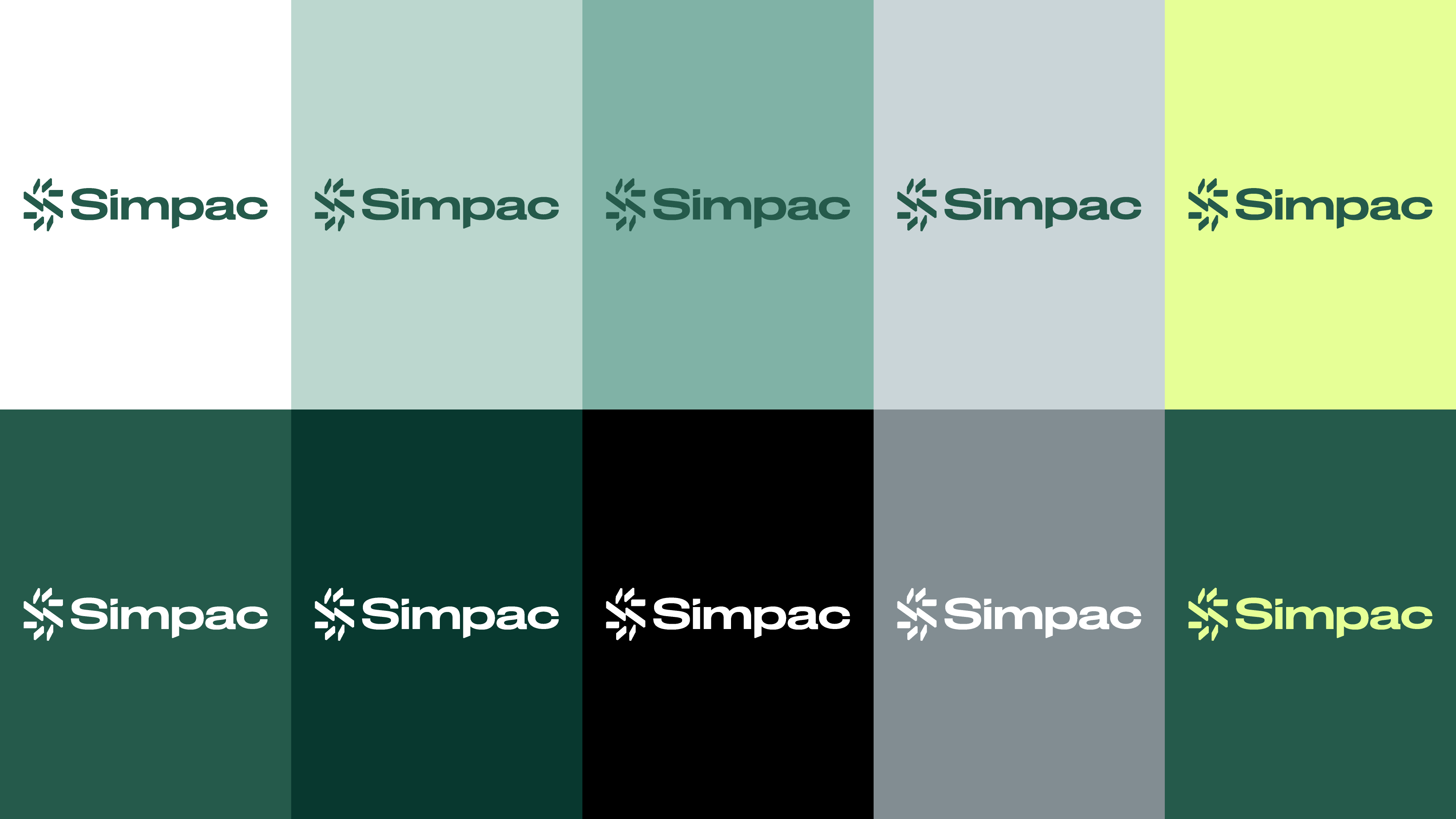
The circular ‘S’ symbol represents the continuous movement of machinery and the End-to-End industrial structure spanning press, metal, scrap, and automation. It visualizes a cycle in which the end of one process leads to the beginning of another, expressing circulation and sustainability. The logotype, built on a wide-proportioned sans-serif structure, conveys a solid and stable impression, while the distinctive details applied to the ‘i’ and ‘p’, derived from the geometry of the symbol, introduce a contemporary character.
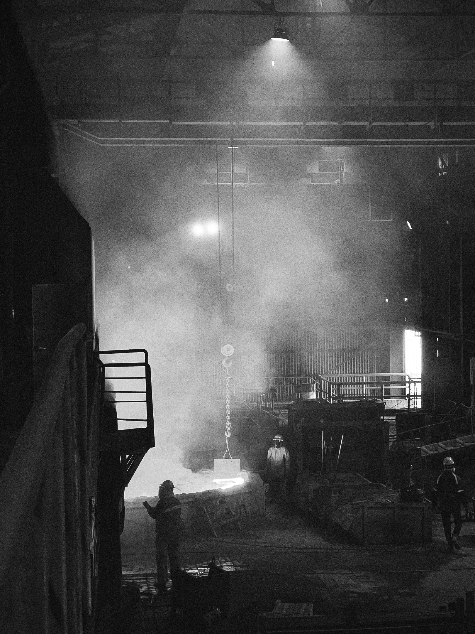
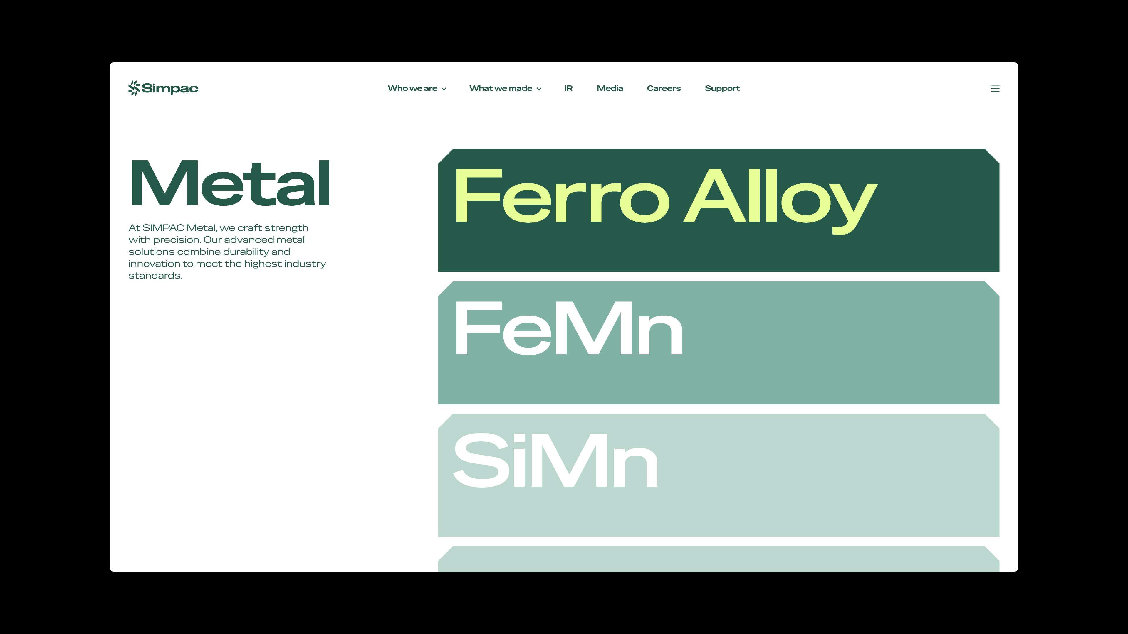
Graphic units expanded from the symbol connect and transform organically, materializing the values of SIMPAC. CFC further extended the identity by establishing the visual direction for sensorial and realistic 3D assets, translating SIMPAC’s technological capability into an intuitive visual experience.
The 3D motion assets and website design featured in this project were developed by DFY. (https://www.dfy.co.kr/)


SIMPAC CI Design Development
2025
Client: SIMPAC
CI Design System & Application: CFC
3D Motion assets & Website: DFY (https://www.dfy.co.kr/)
-
CFC
Art Direction: Charry Jeon
CI Design: Charry Jeon, Seyoun Kim, Soomin Woo, Seoyoung Lee
www.contentformcontext.com