THE CHALLENGE
In collaboration with the Sustainability and Design teams at Yuhan-Kimberly, CFC renewed the identity of Keep Korea Green, the company's iconic environmental campaign, for its 42nd anniversary.
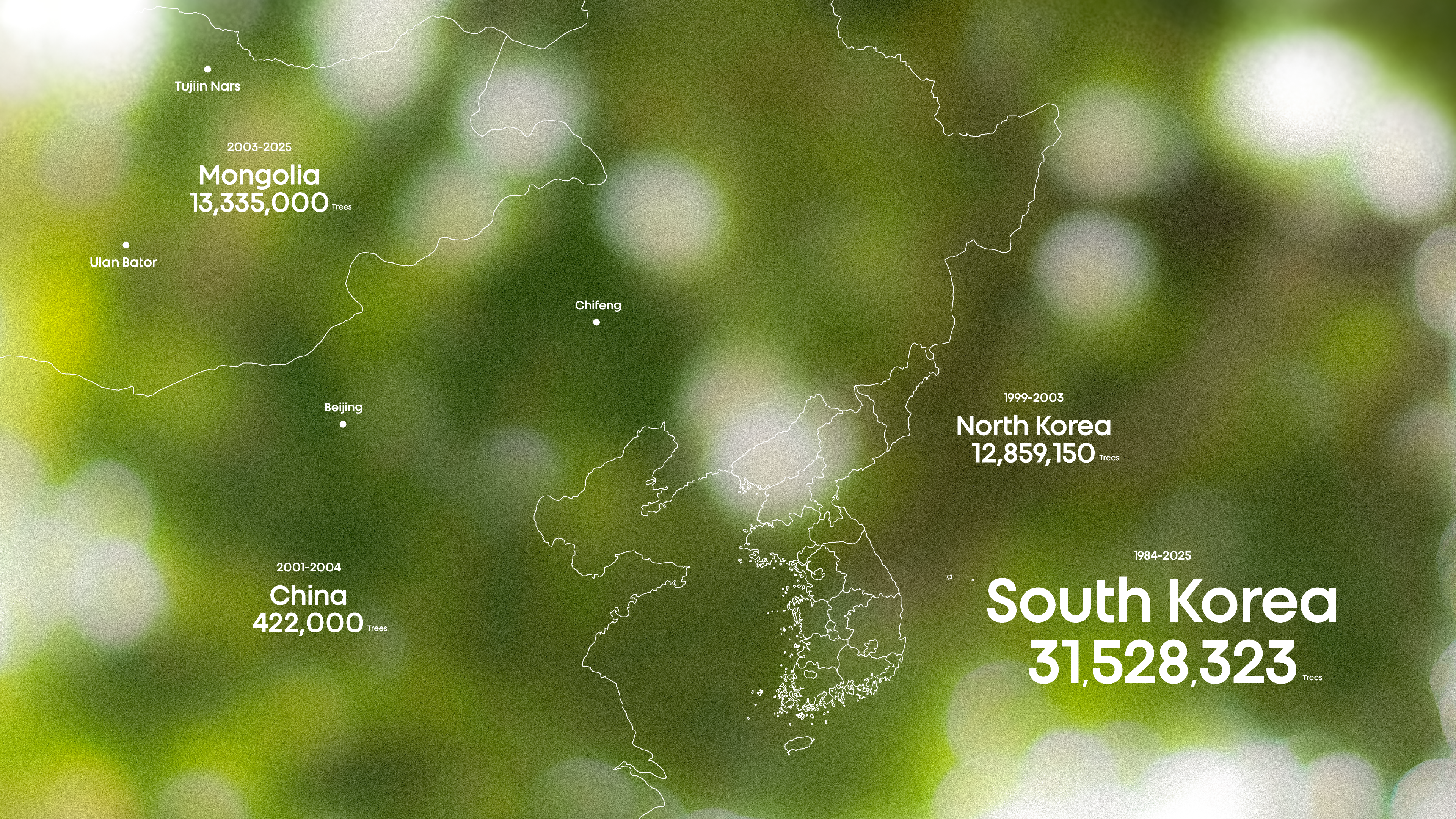
‘Keep Korea Green’ is an environmental campaign launched by Yuhan-Kimberly in 1984 and sustained for more than four decades. As the campaign reached its 42nd anniversary in 2026, the identity was renewed to highlight the value of forests as an essential response to the climate crisis while carrying forward the campaign’s original spirit.
The challenge was to communicate the idea of ecosystem restoration through forests, create a design system capable of bringing together a wide range of campaign activities under one unified message, and develop an emblem that captures the vitality of nature with clarity and strong visibility.
THE SOLUTION
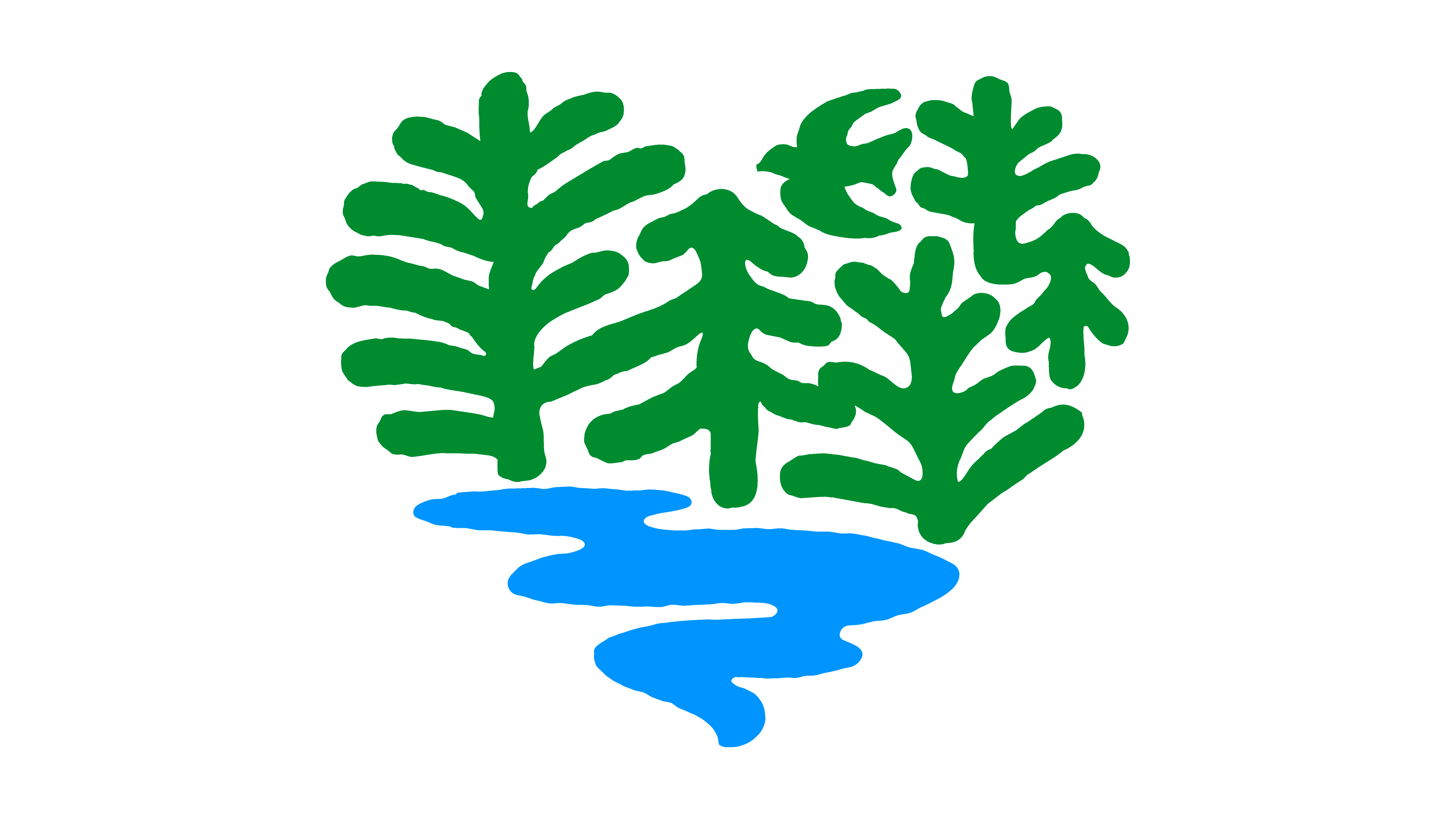
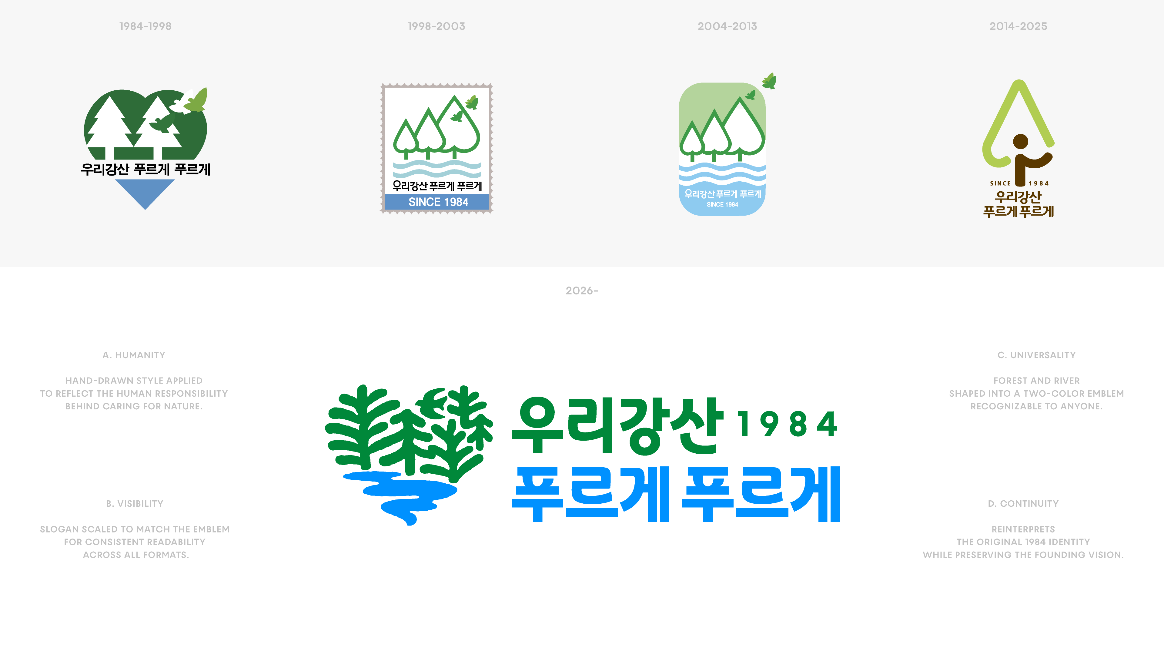
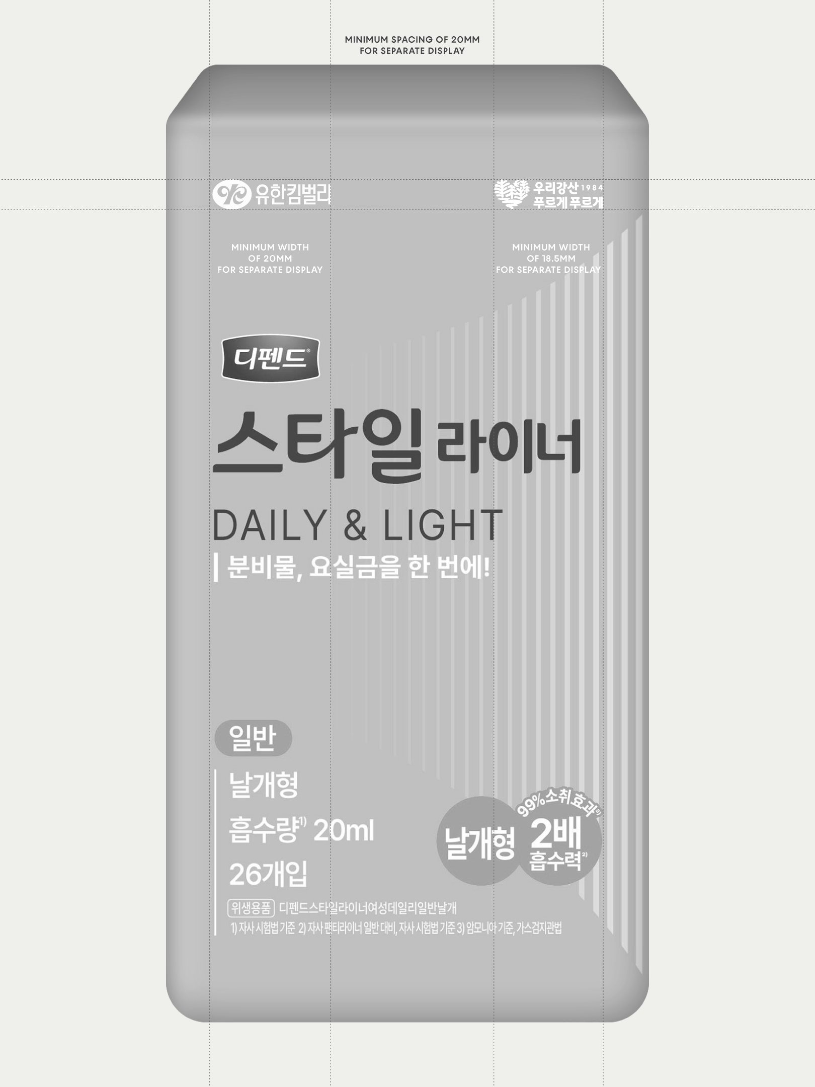
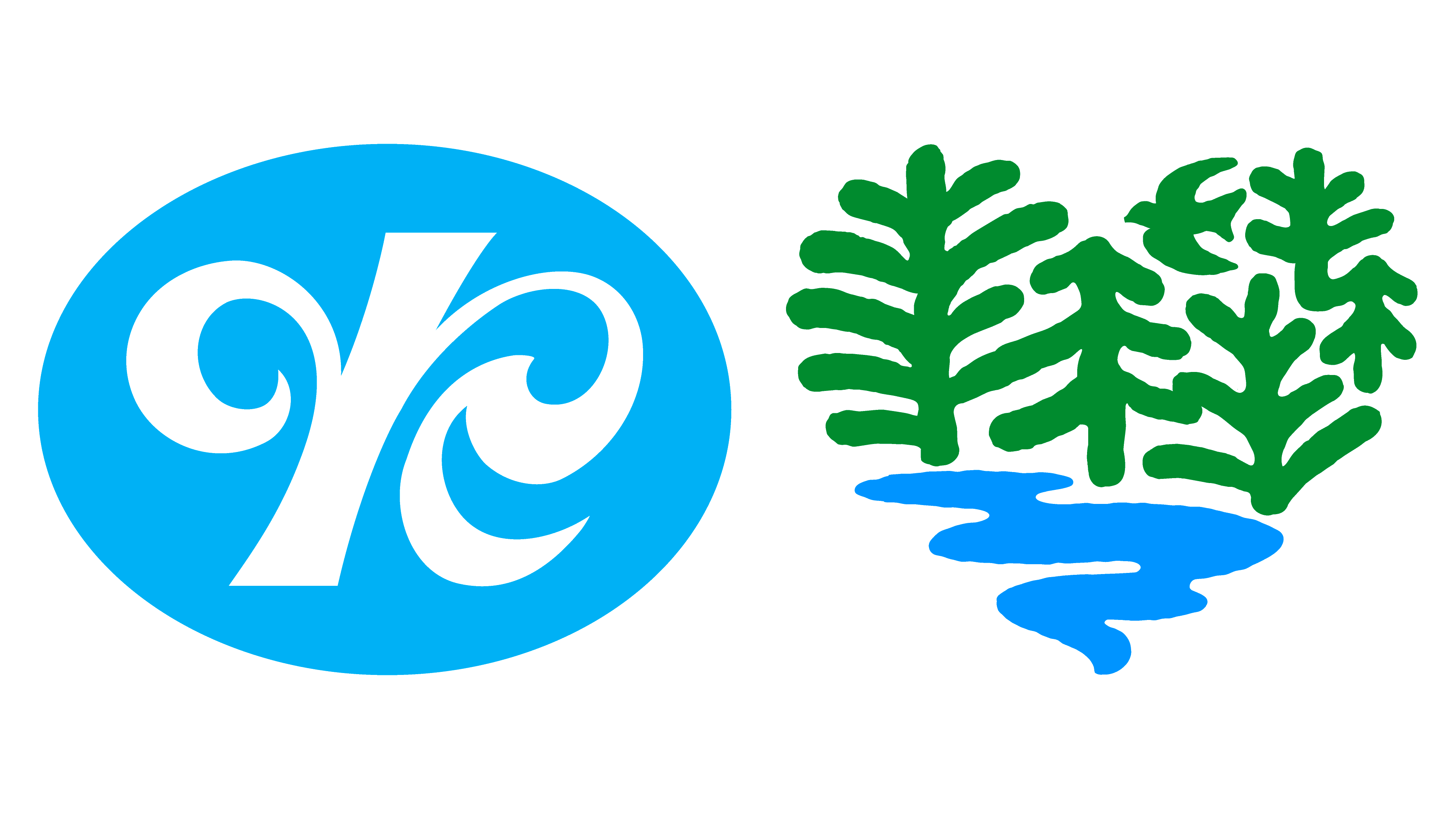
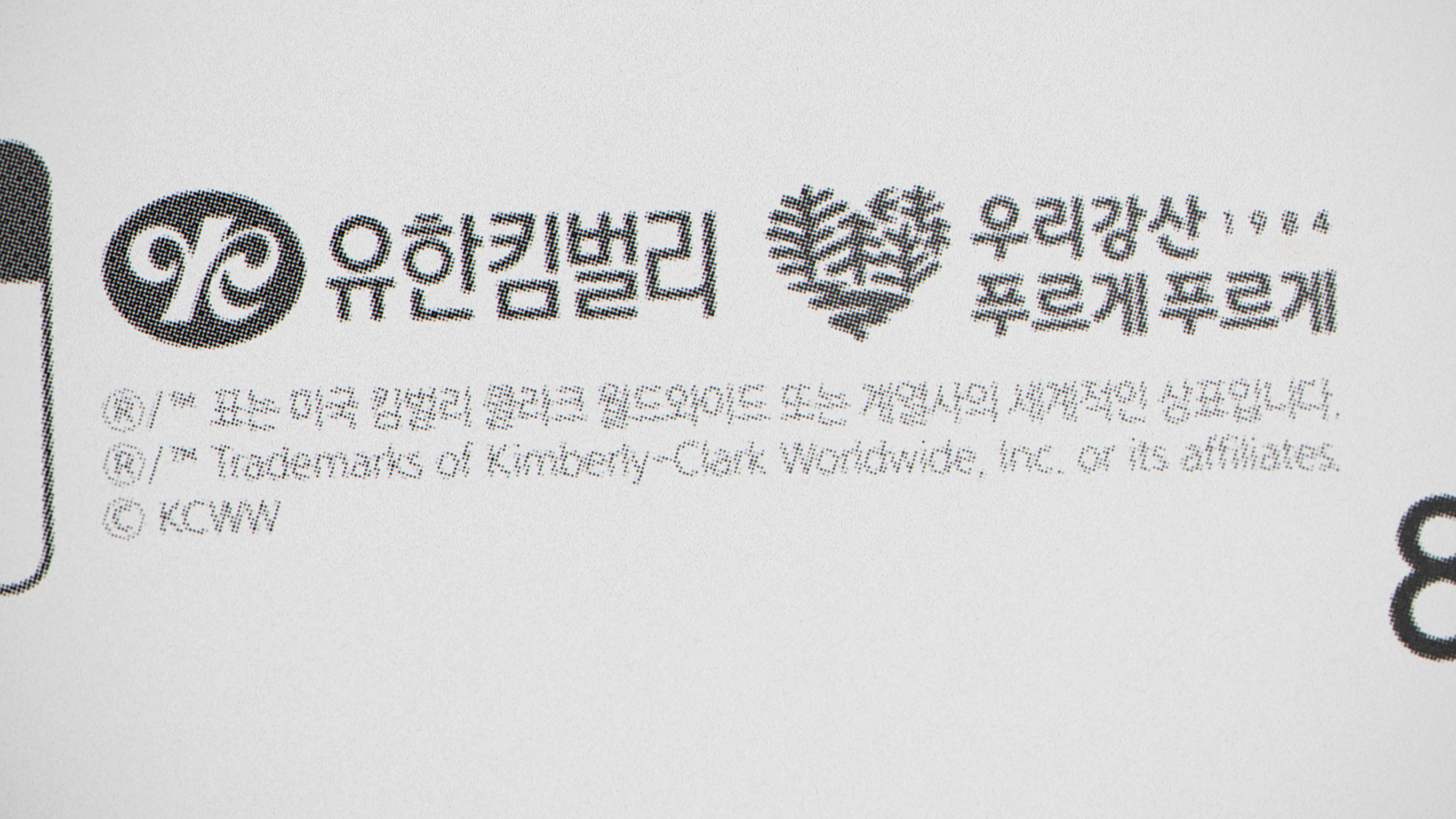
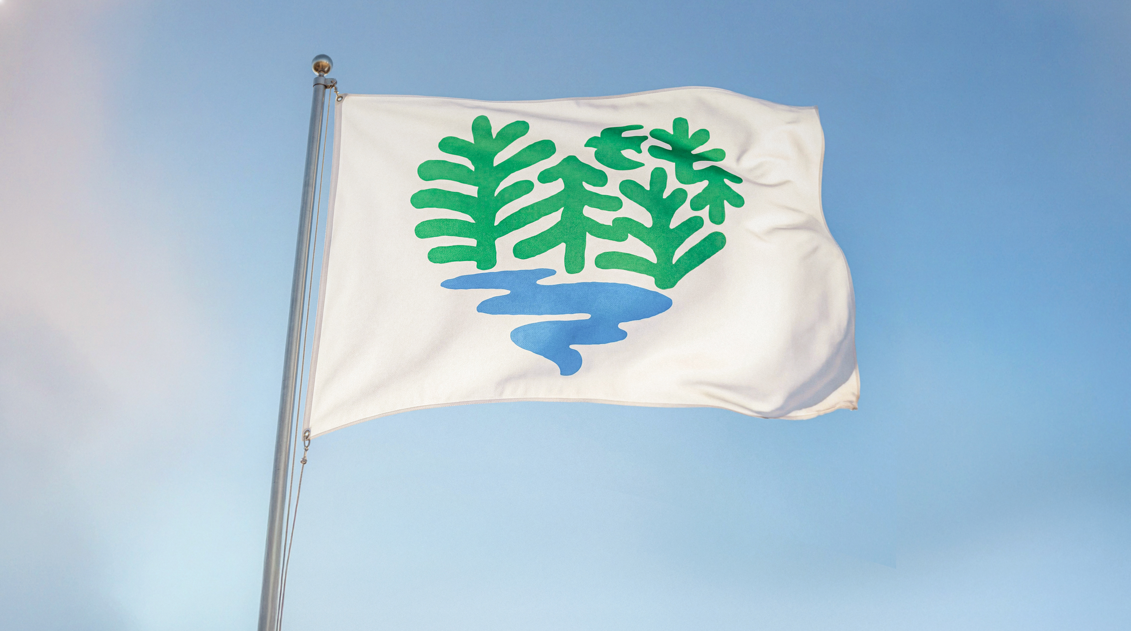
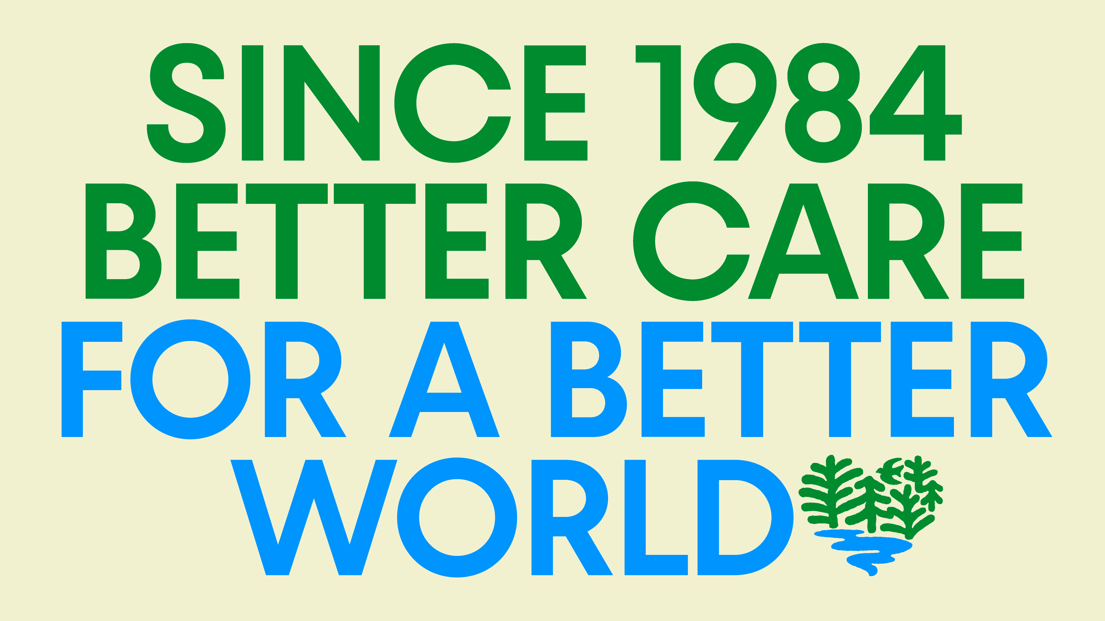
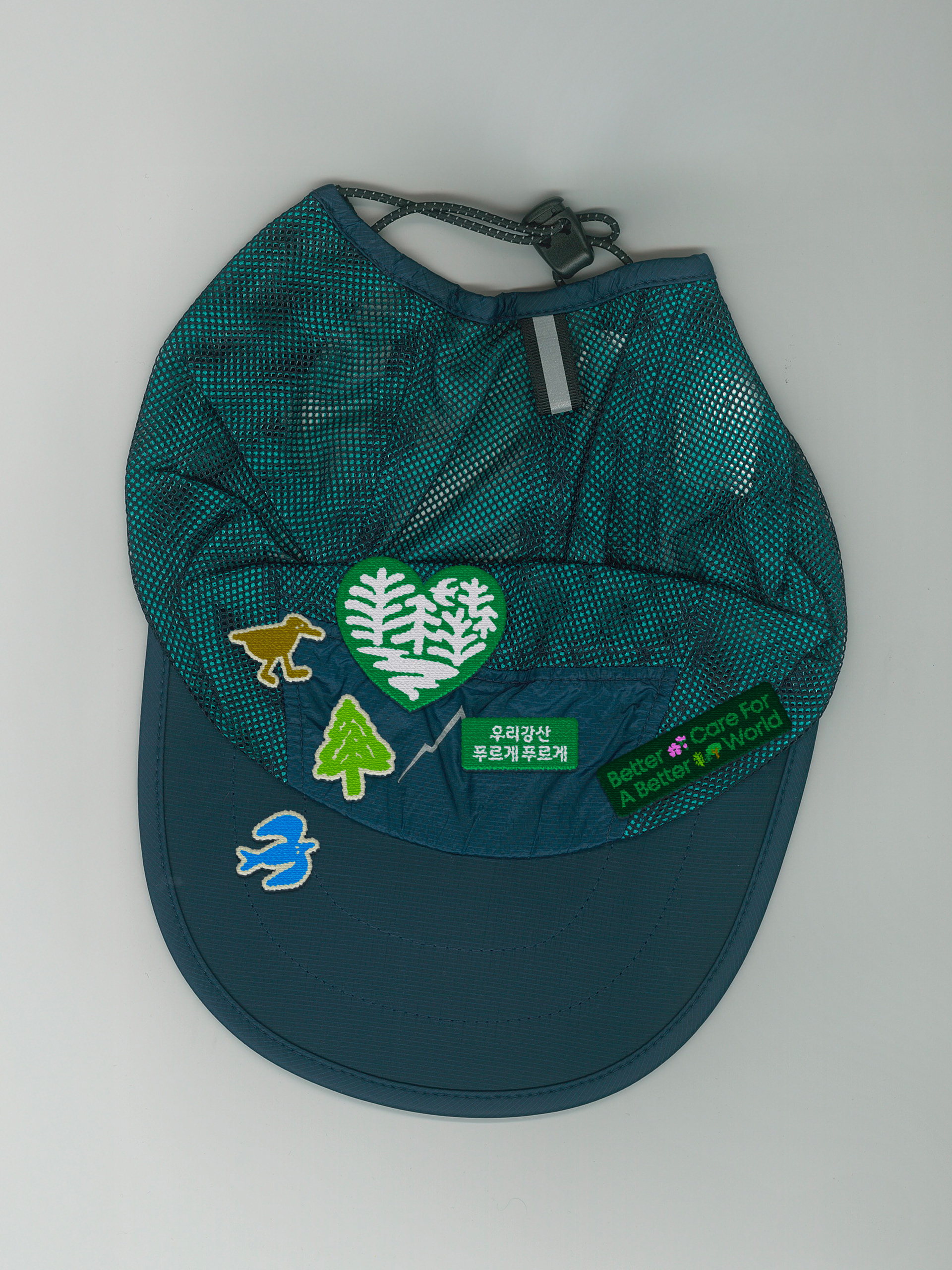
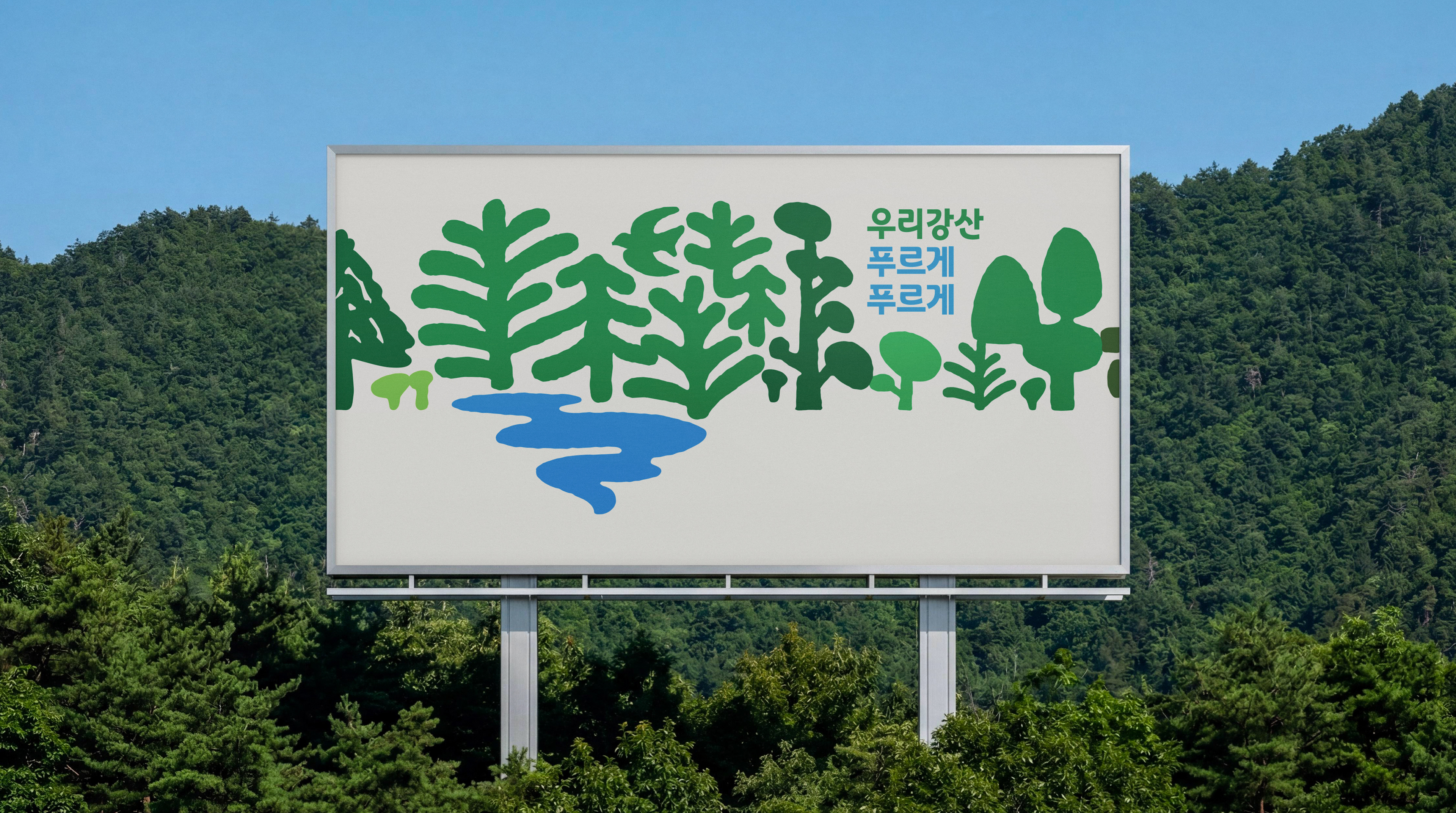
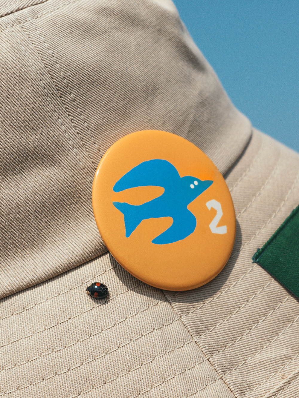
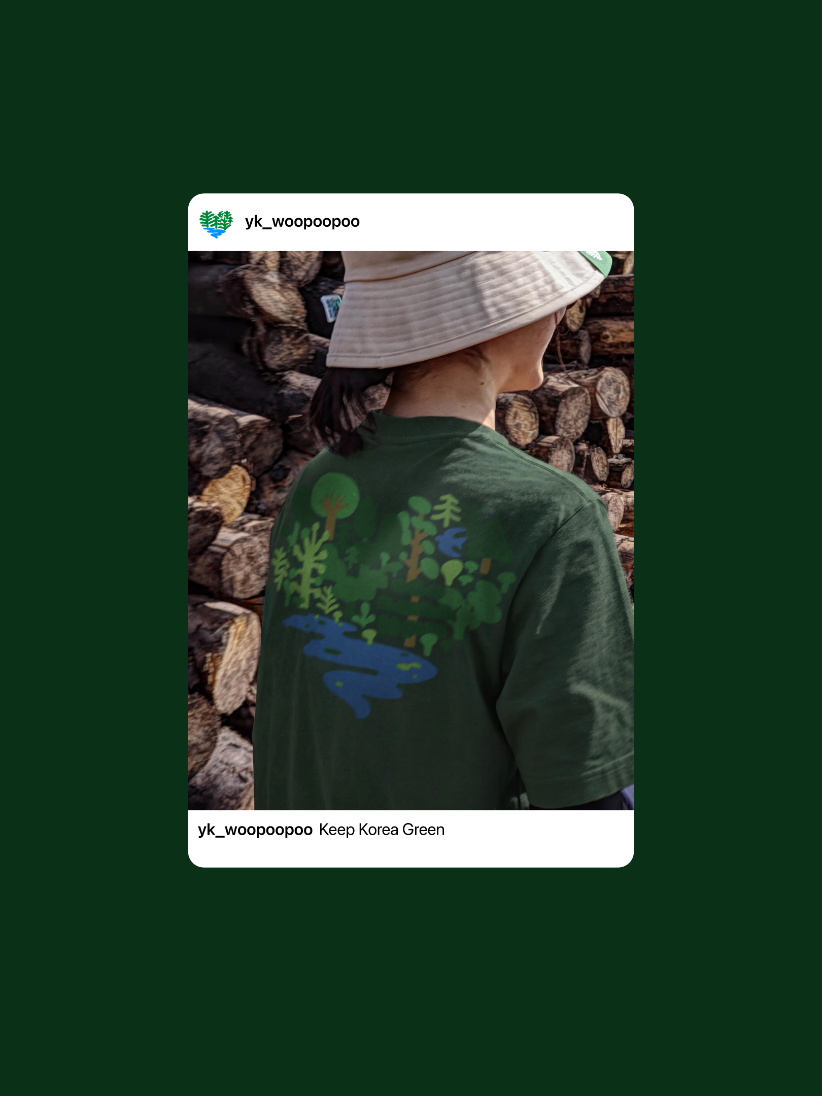
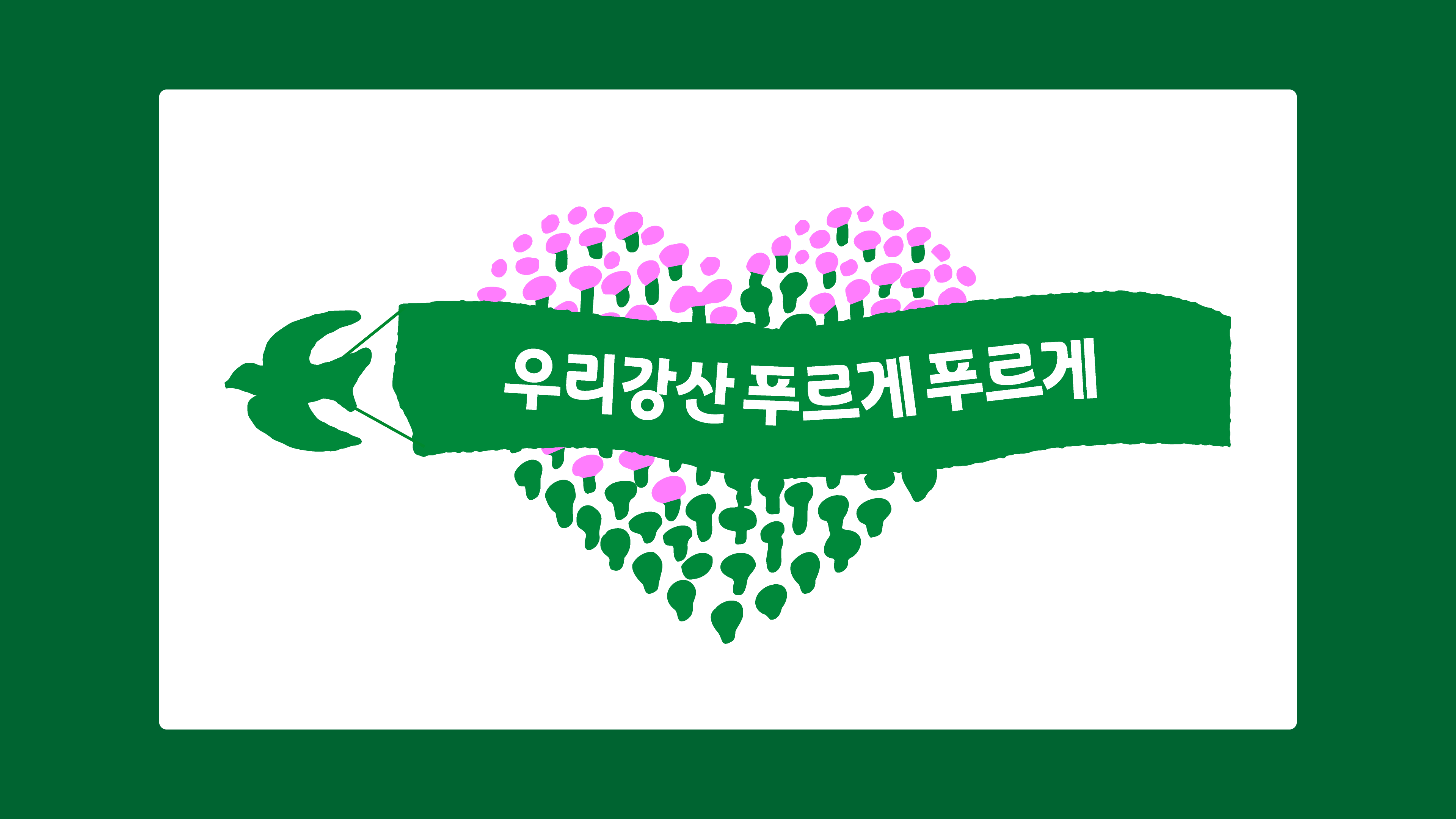
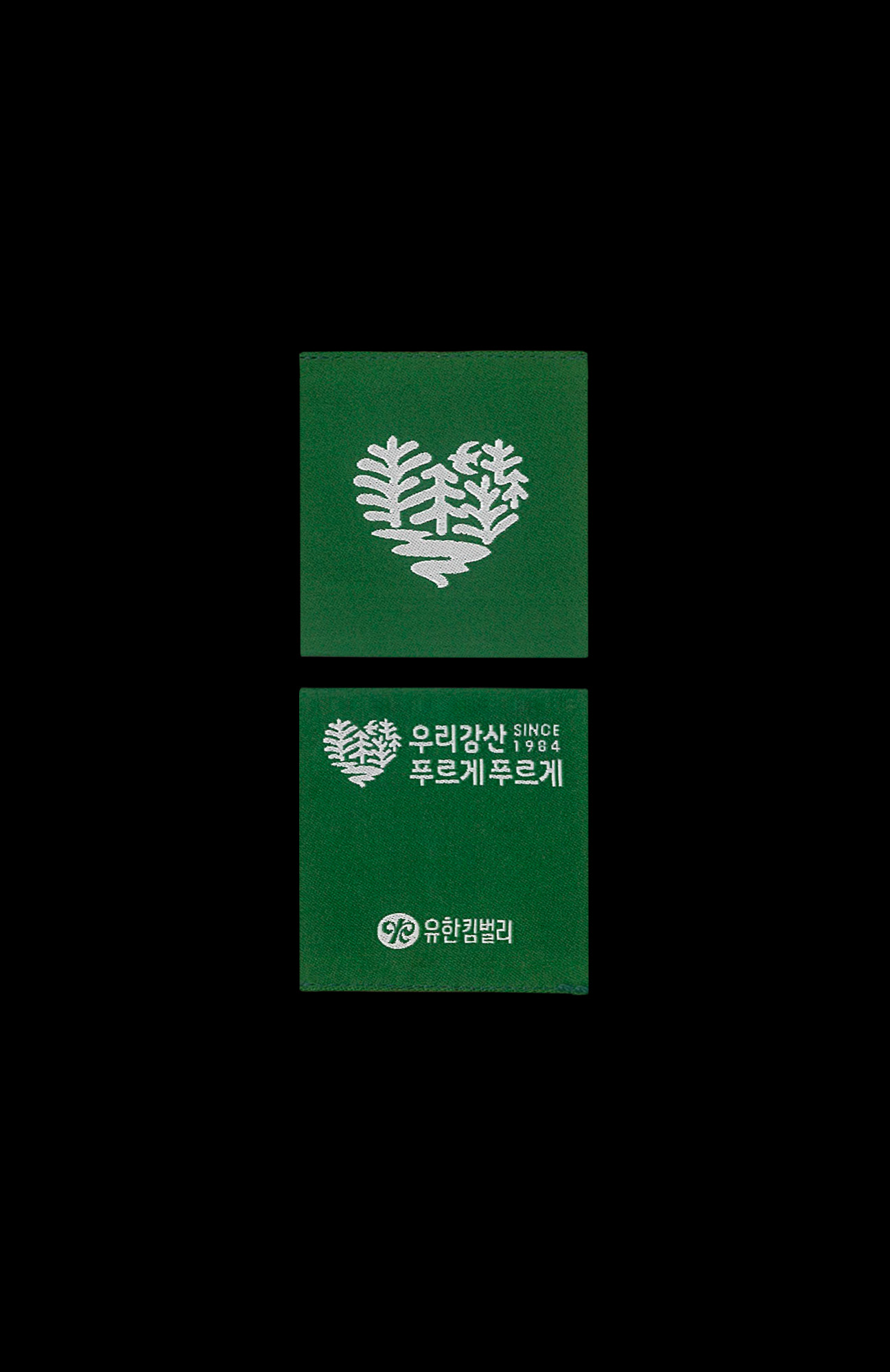
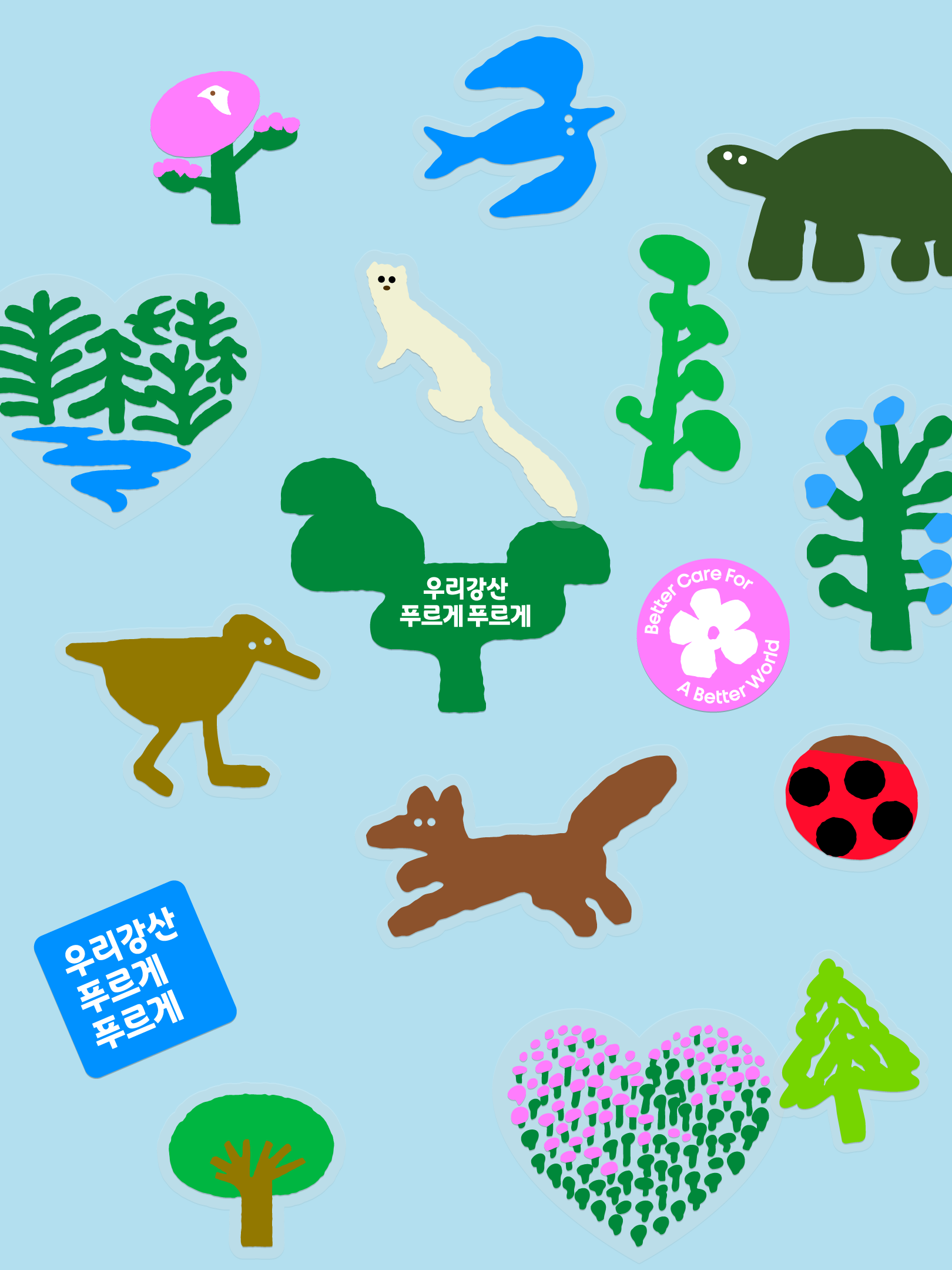
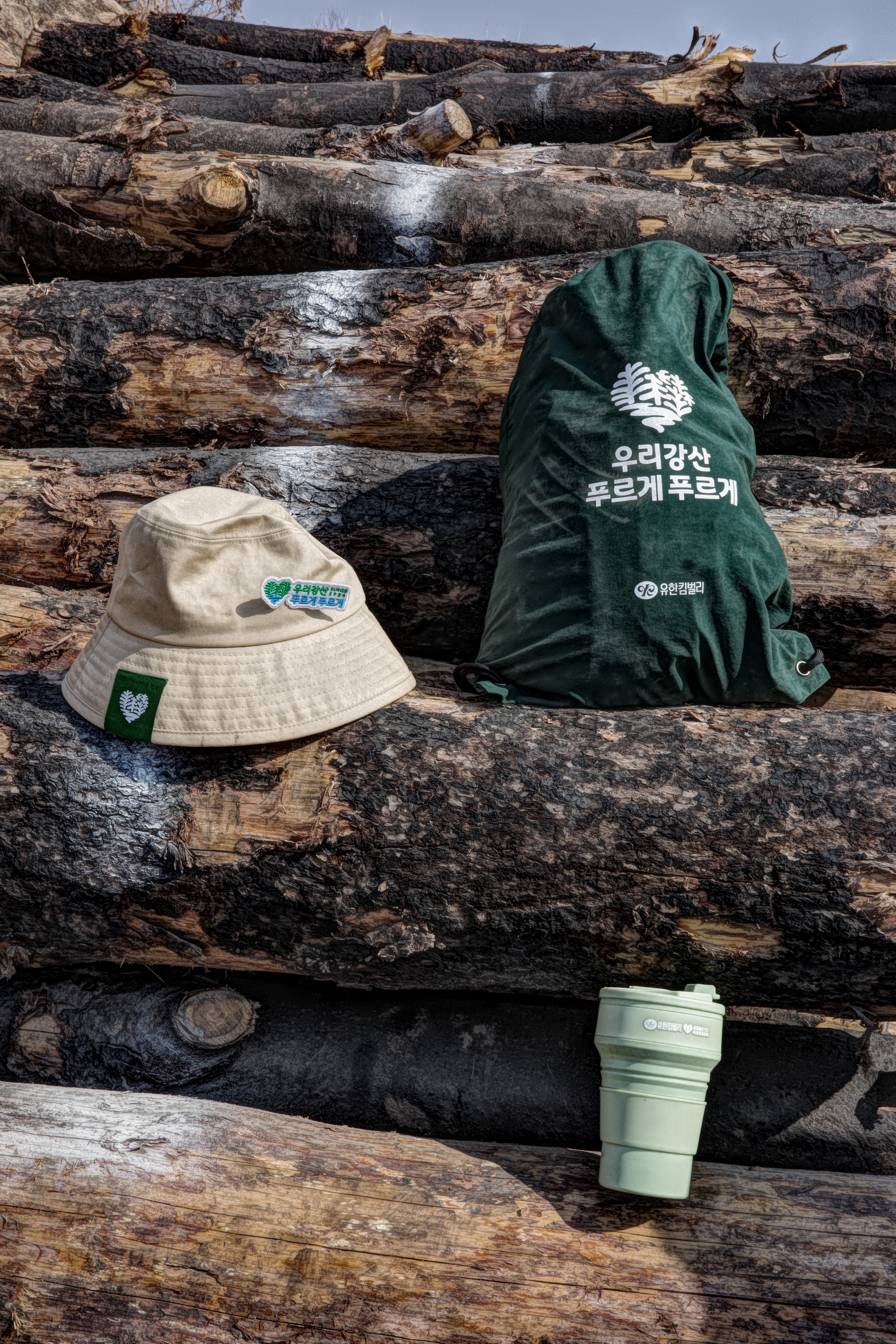
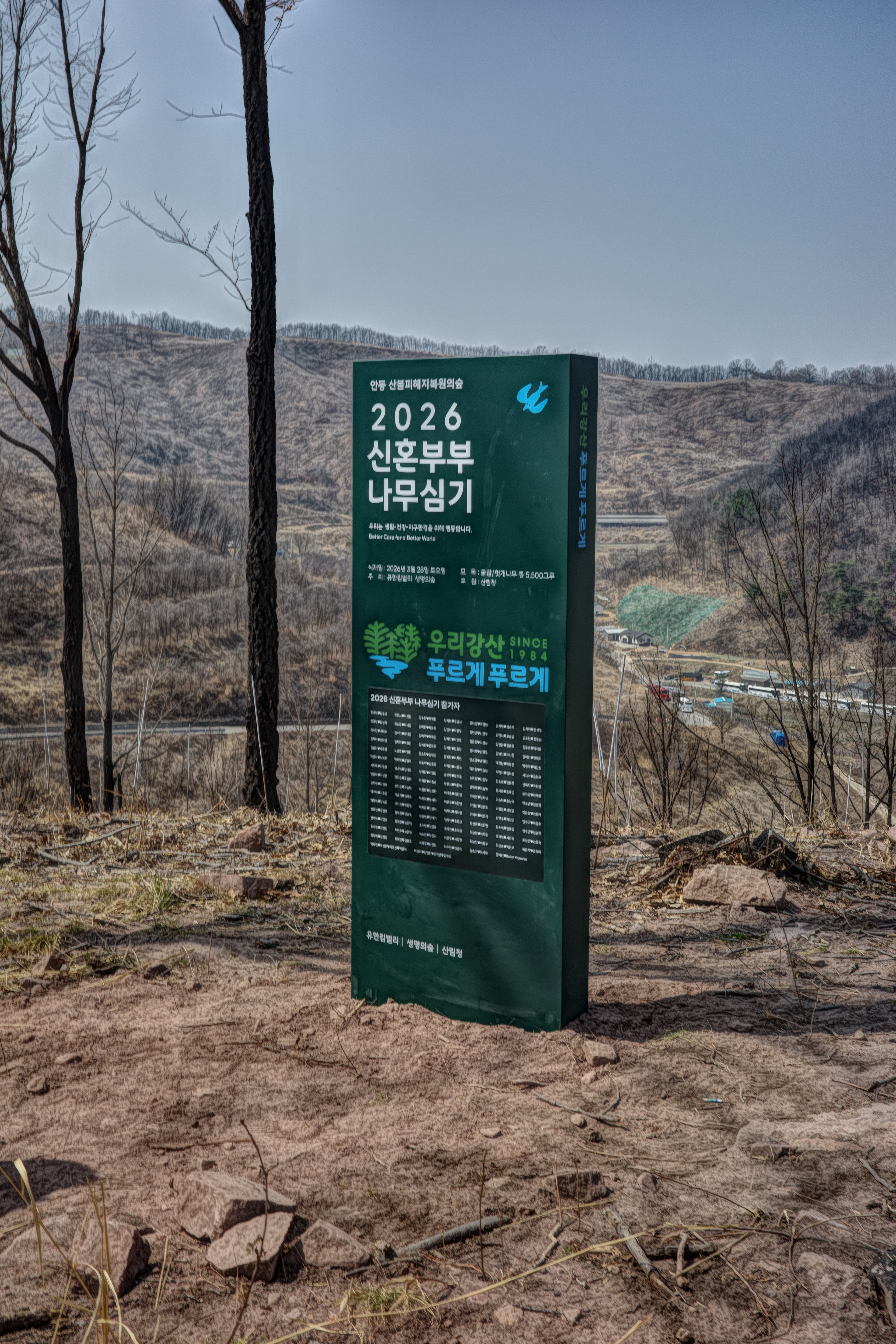
The new emblem takes inspiration from the heart-shaped symbol found in the original 1984 logo, revisiting the campaign’s founding spirit. The heart silhouette, composed of a forest, a river, and a small bird, represents a healthy ecosystem where diverse forms of life are connected and thrive together.
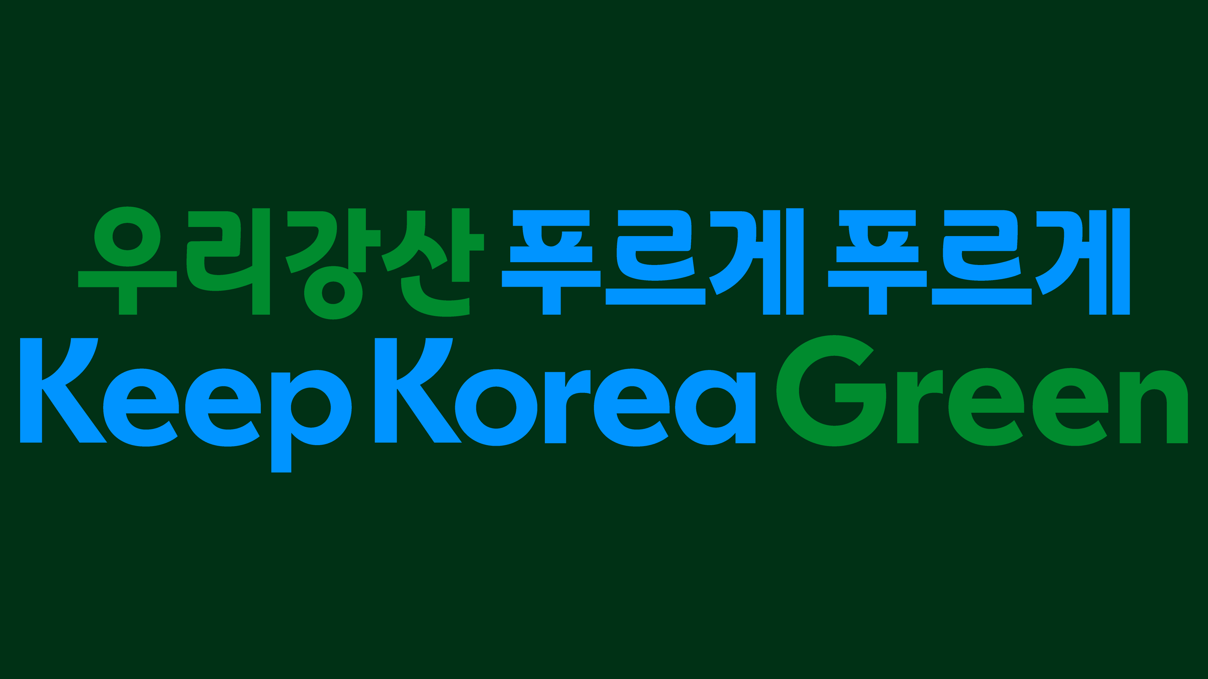
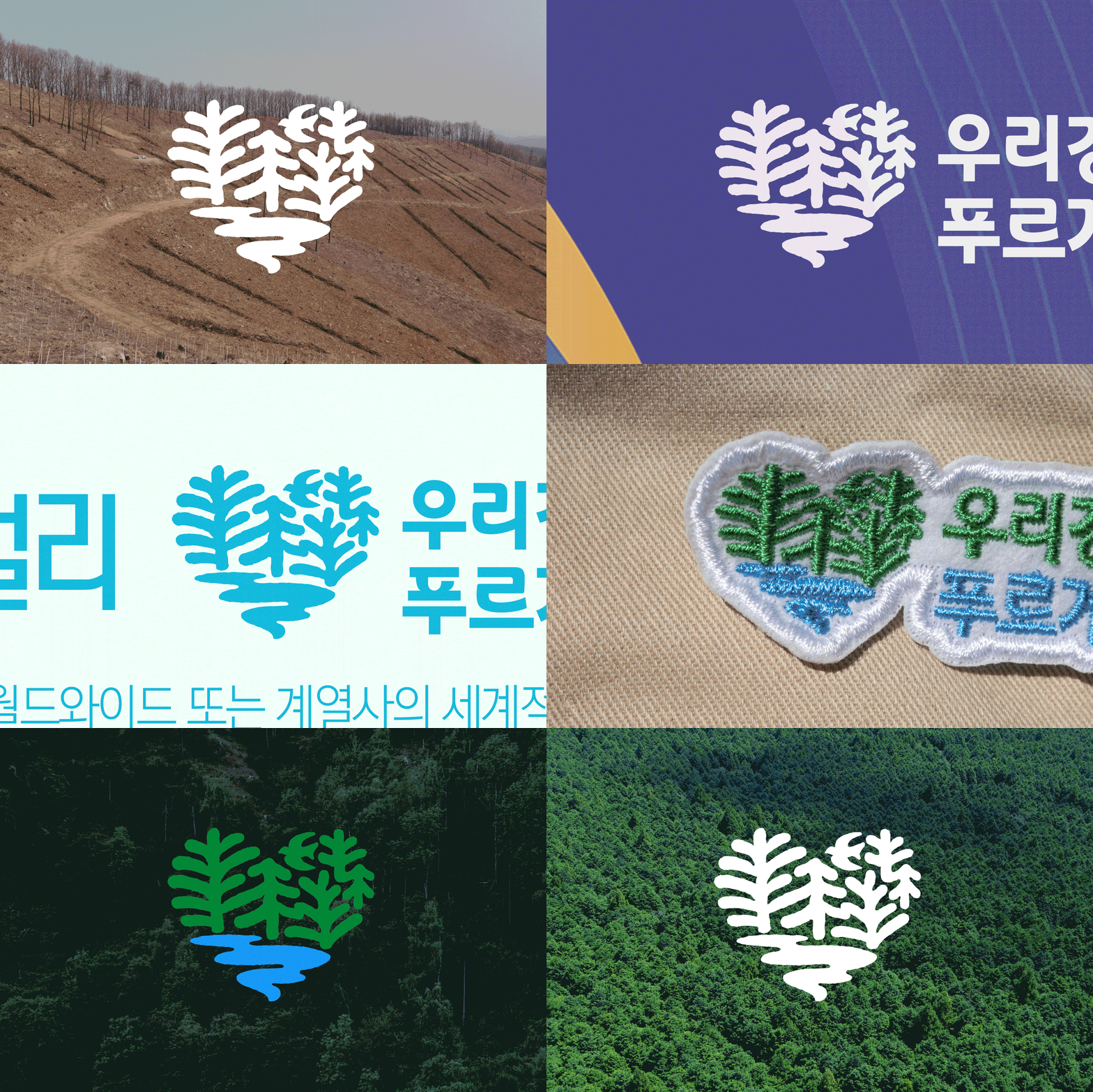
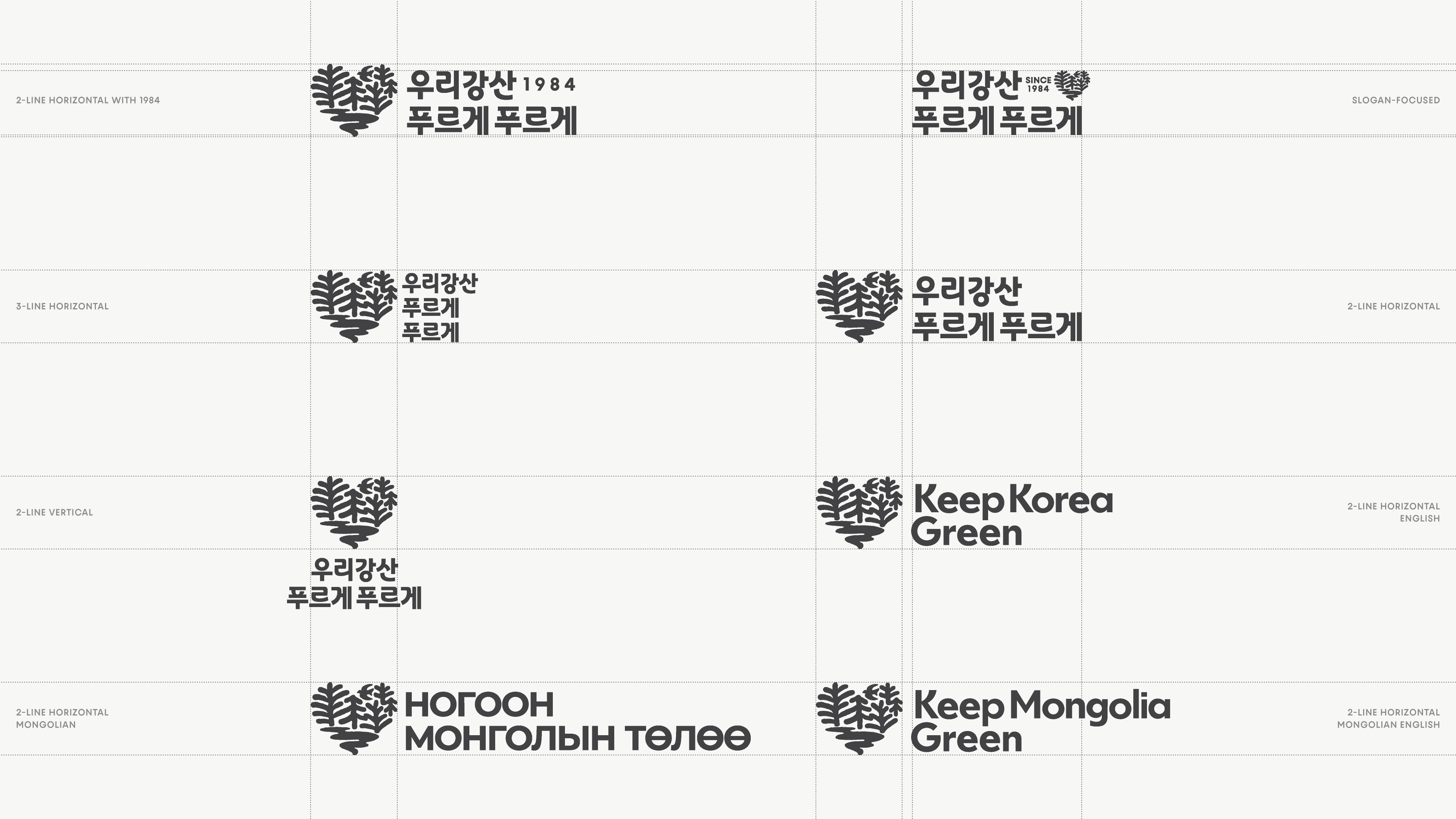
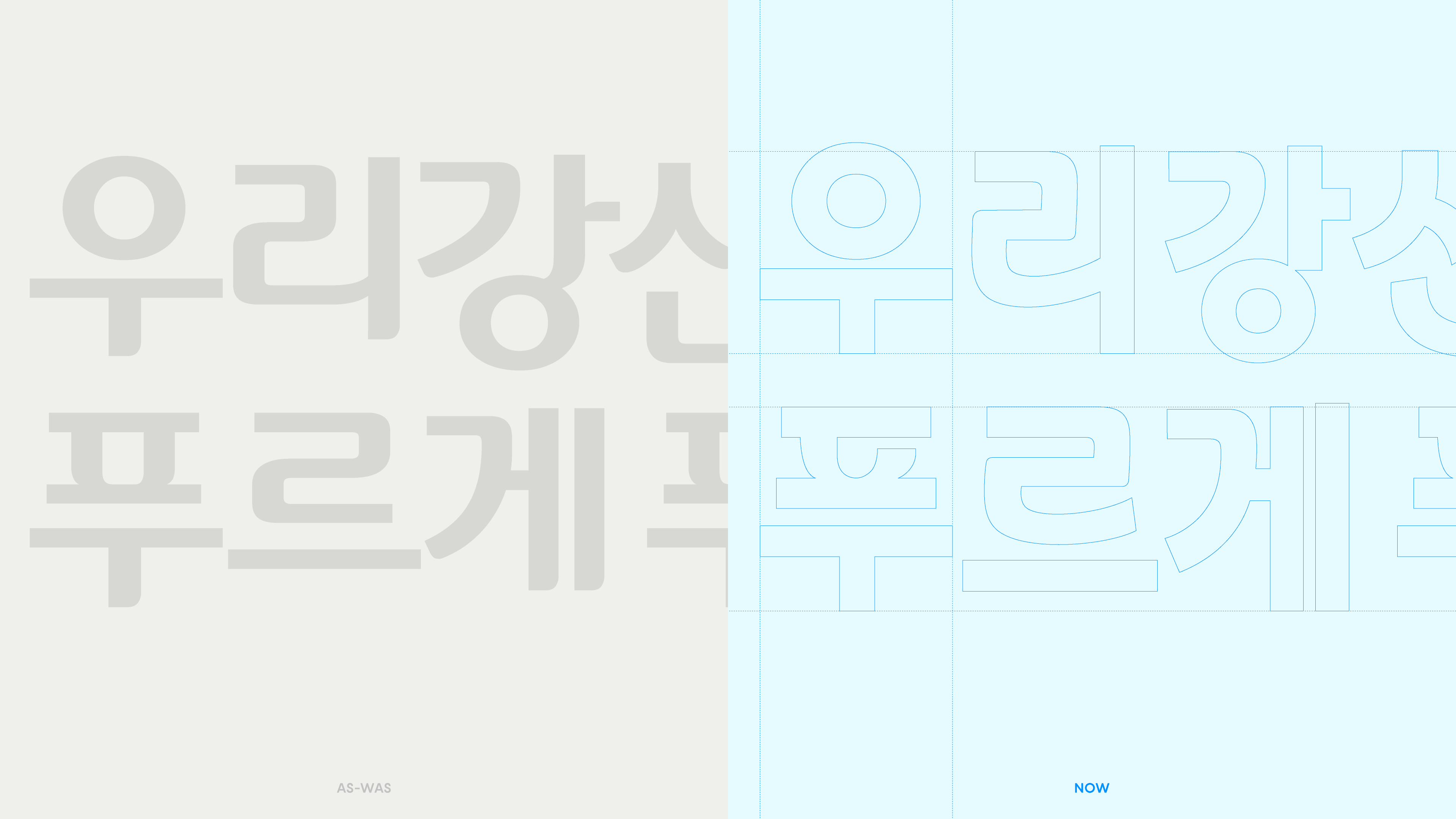
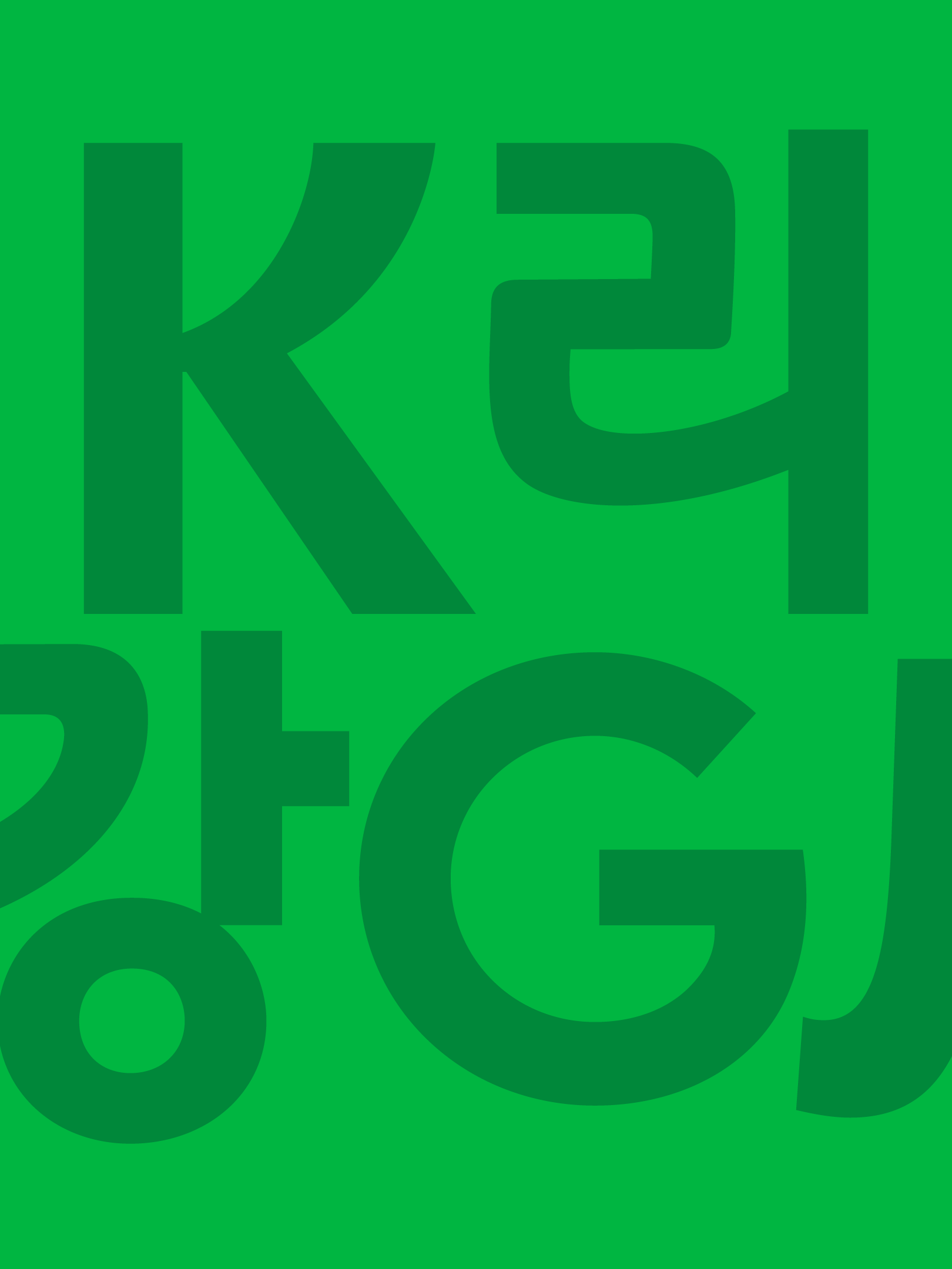
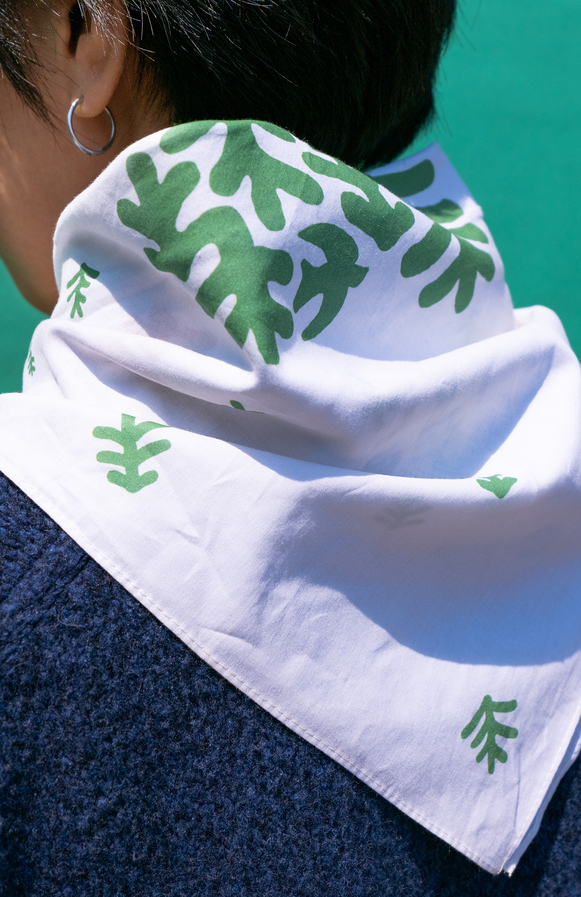
Its soft, hand-drawn organic form expresses an emotional connection between people and nature. The campaign typography balances strength and warmth, conveying the trust and continuity of a campaign that has been shared across generations.
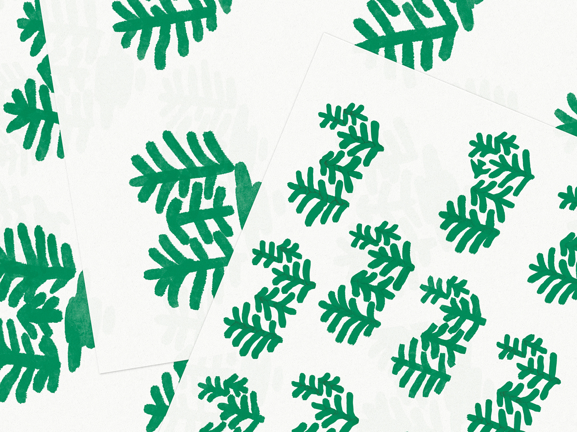
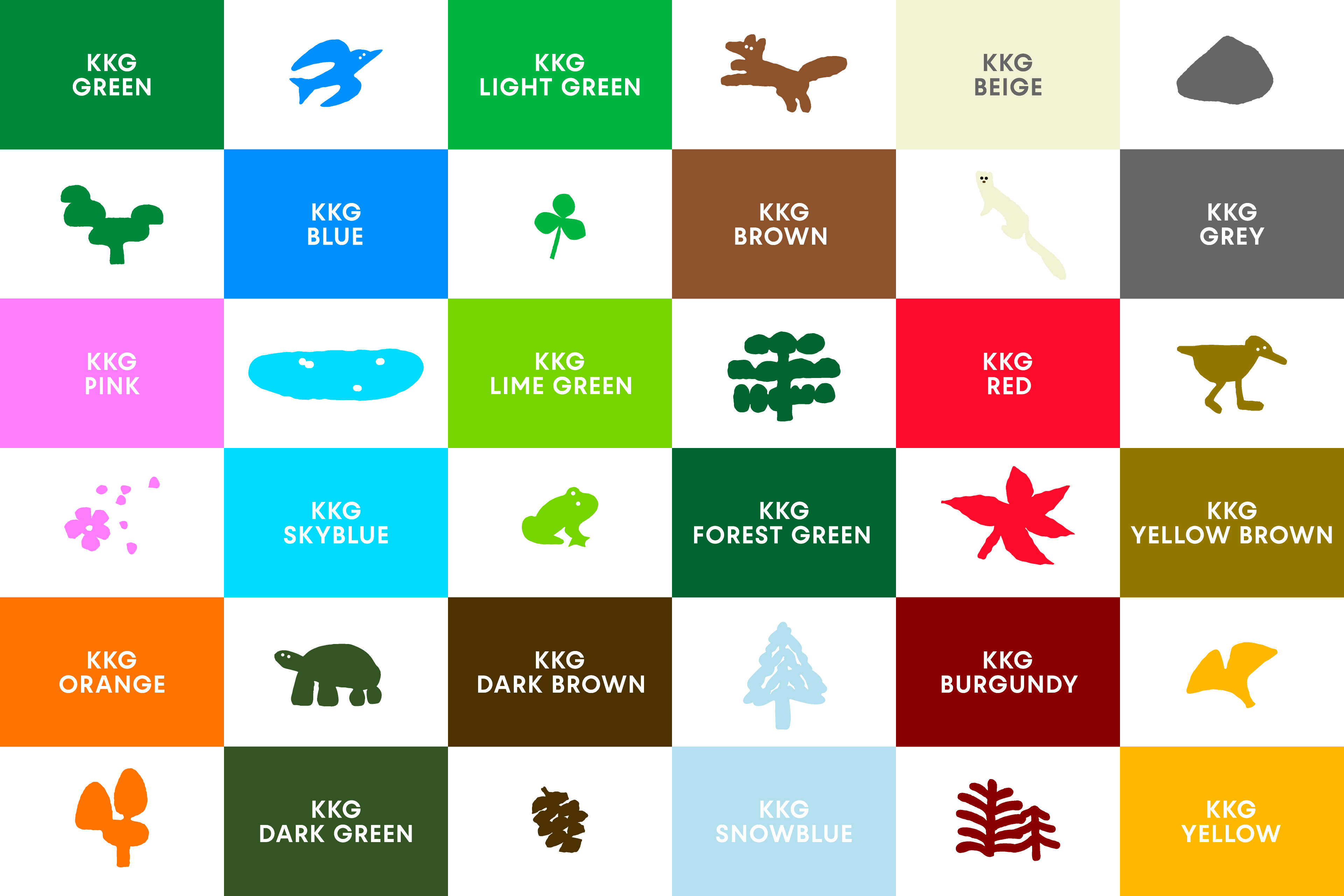
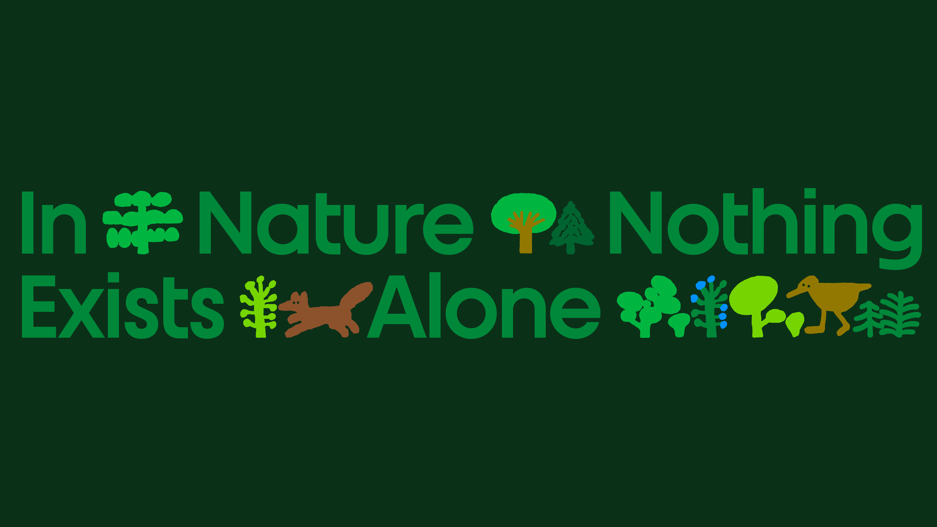
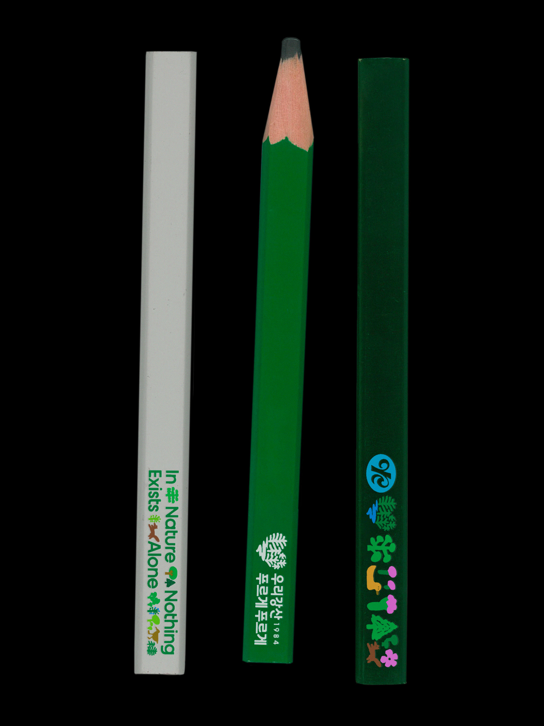
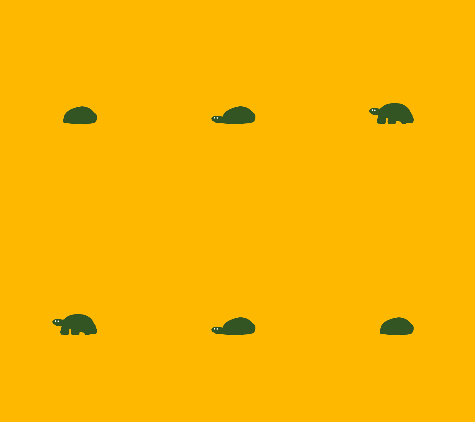
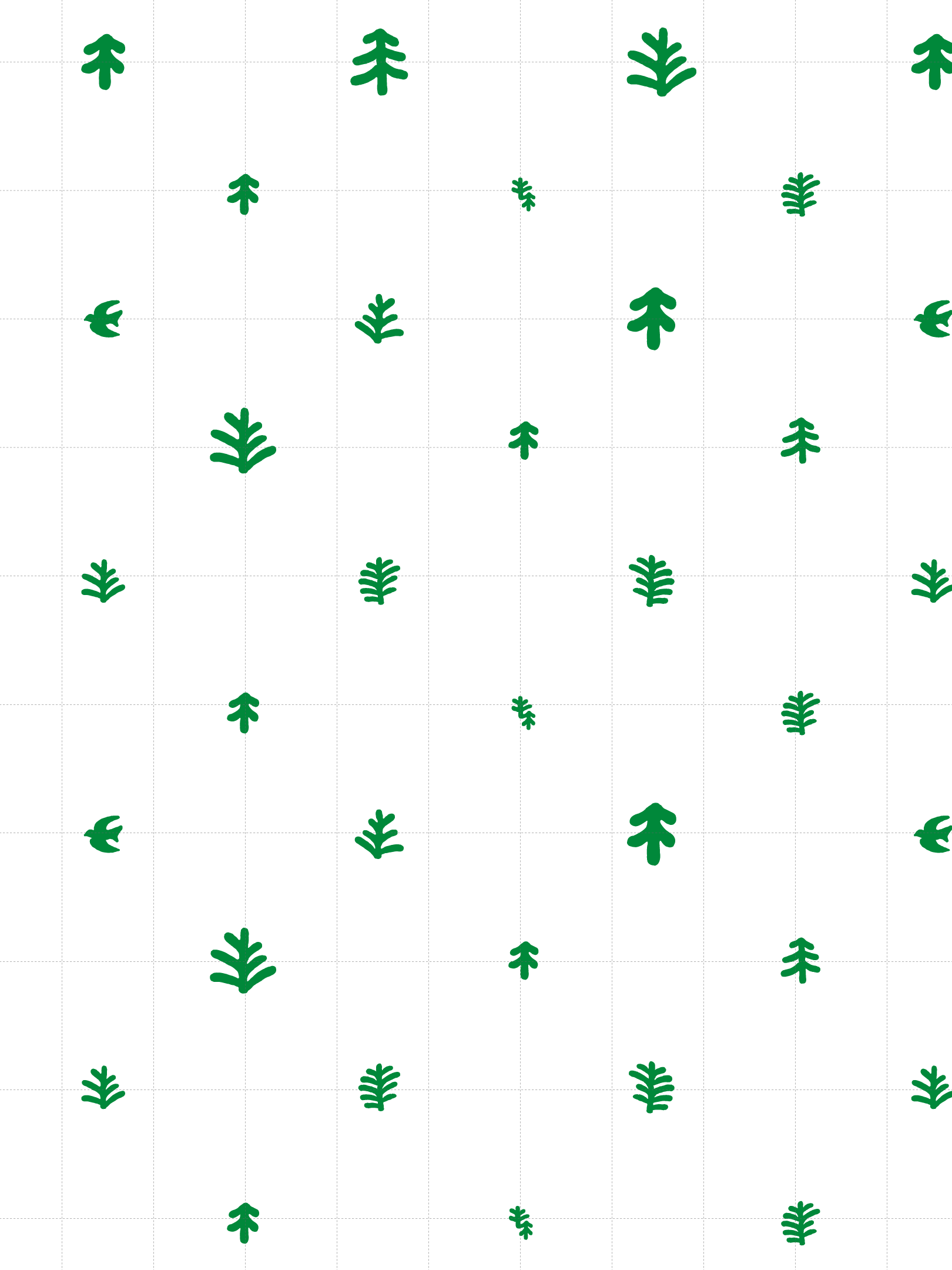
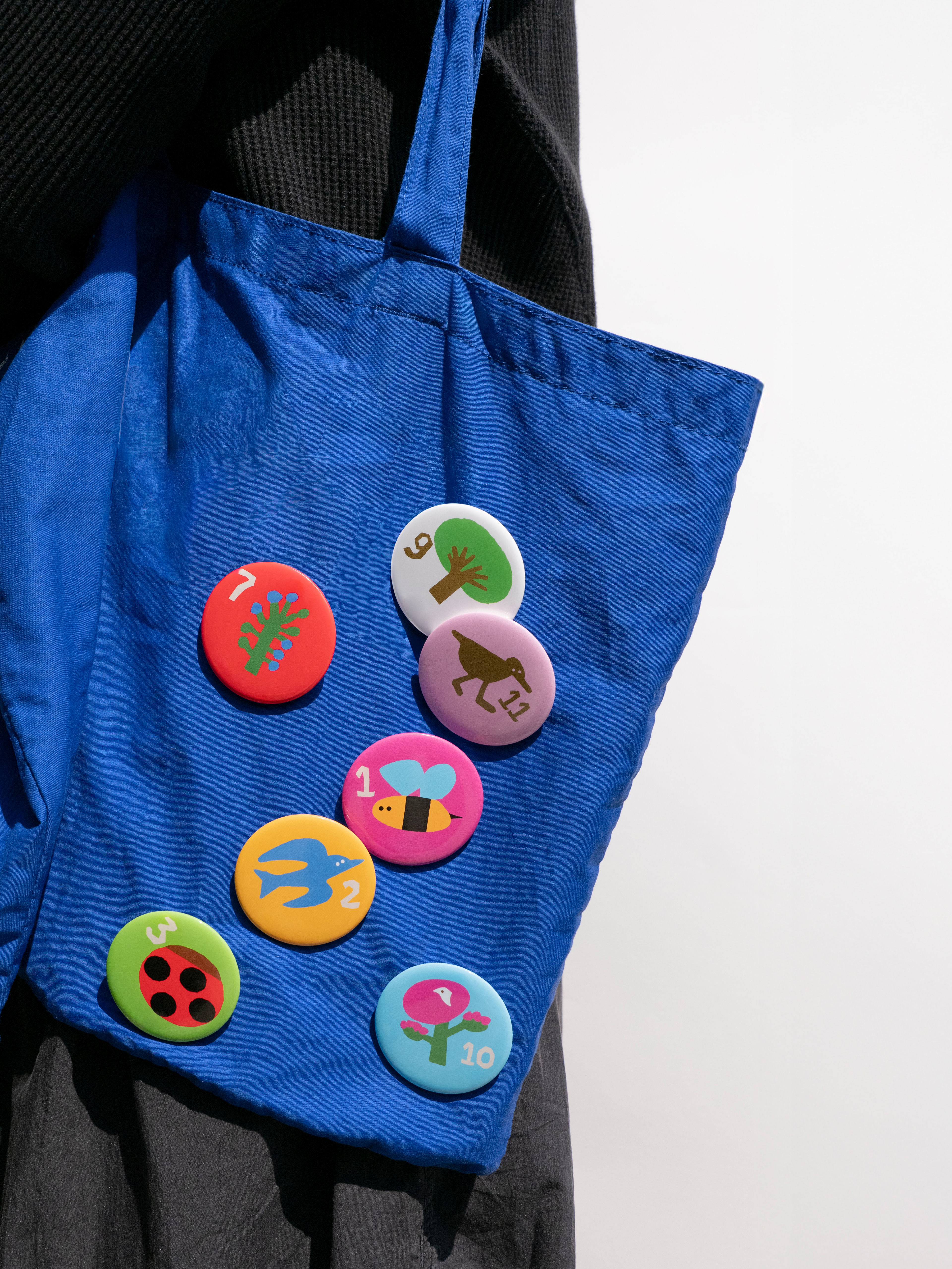
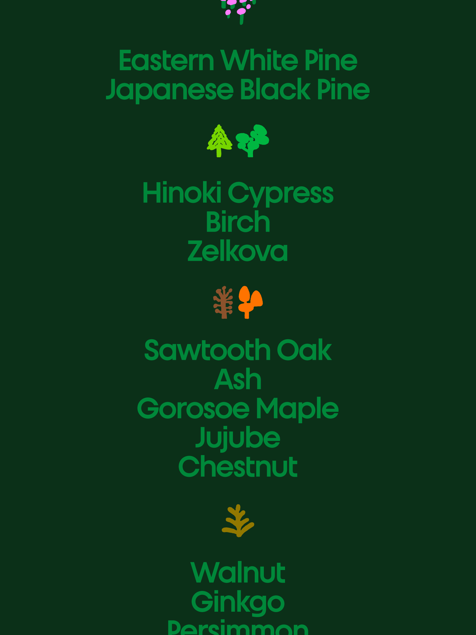
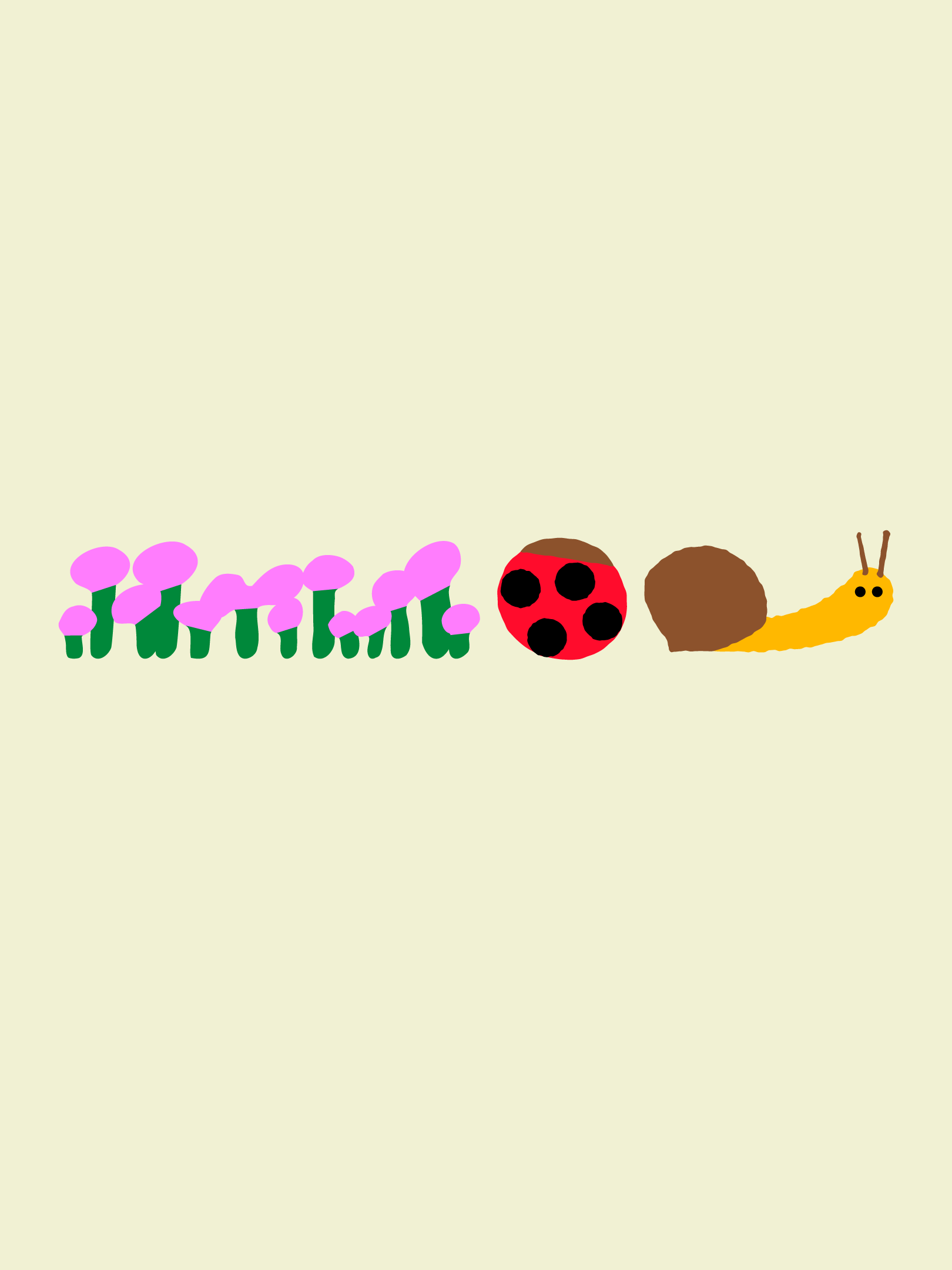
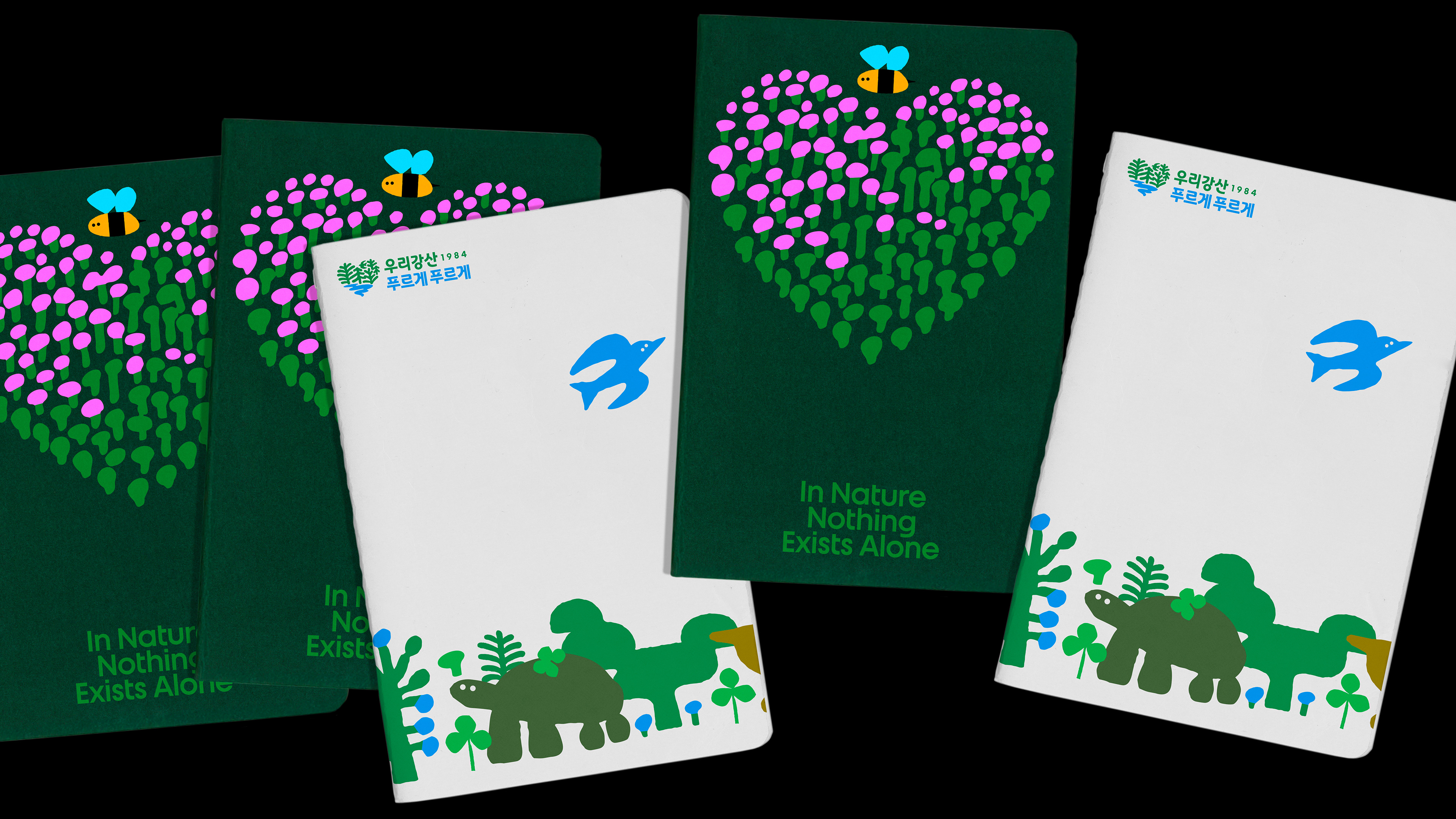
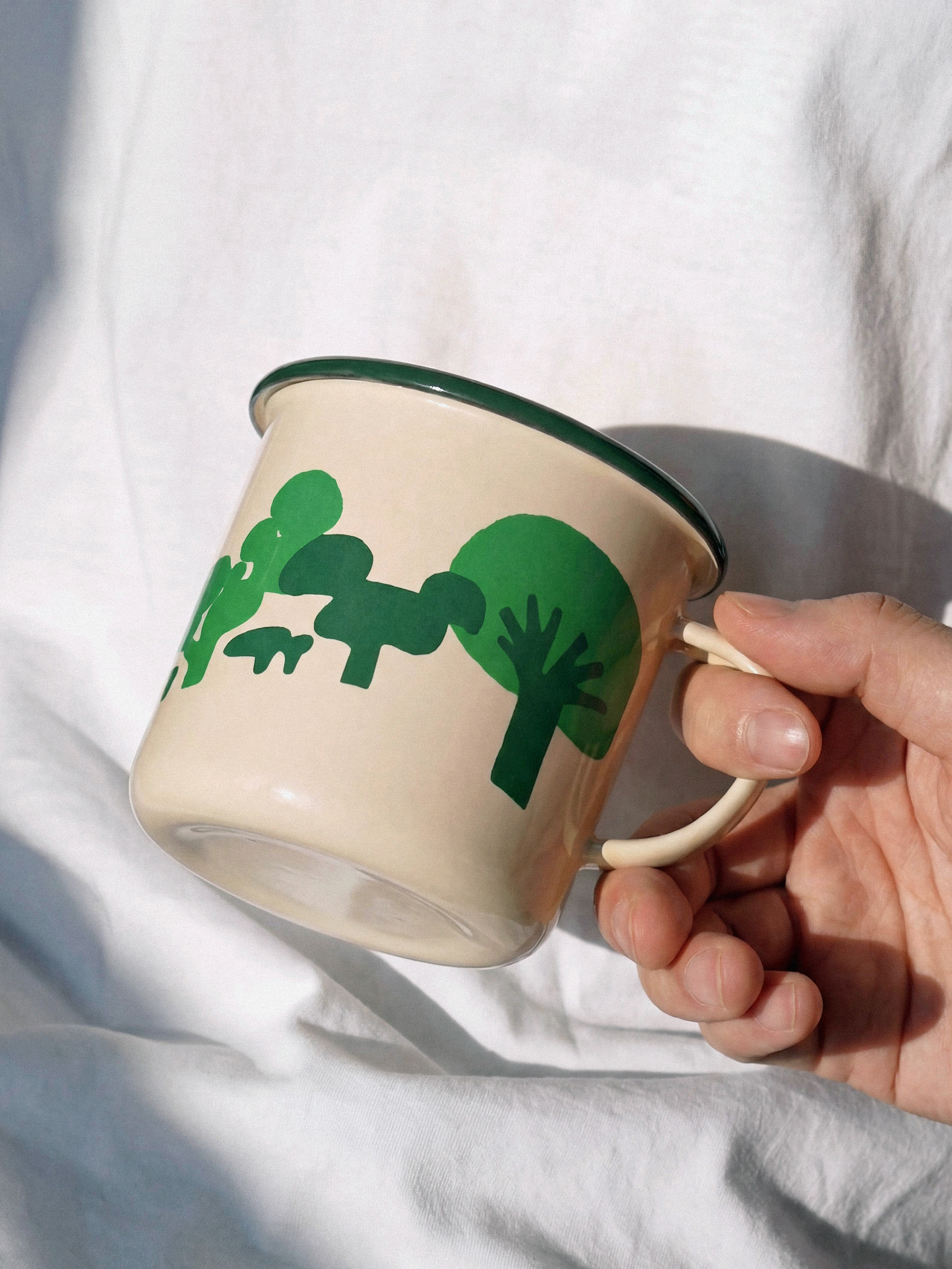
Illustrations inspired by the four seasons of Korea expand into a rich color palette, depicting the diverse ecosystems that evolve throughout the year. The renewed identity was designed to engage a new generation while encouraging people to connect with, participate in, and carry forward the meaning of the campaign.
THE CHALLENGE
CFC는 2026년 유한킴벌리 지속가능경영팀•디자인팀과 협업해 ‘우리강산 푸르게 푸르게’ 캠페인 아이덴티티를 리뉴얼했습니다.
‘우리강산 푸르게 푸르게’는 유한킴벌리가 1984년부터 현재까지 지속해온 캠페인입니다. 2026년 42주년을 맞이한 ‘우리강산 푸르게 푸르게’의 리뉴얼은 전 지구적 과제인 기후위기에 대응하는 해법으로서 숲의 가치를 재조명하고, 캠페인의 본질적 가치를 이어가면서도 시대와 공명할 수 있는 상징적인 아이덴티티를 구축하기 위해 진행되었습니다.
‘숲을 통한 생태계 복원’이라는 메시지를 전하고, 다양한 캠페인 활동을 하나의 엠블럼 안에 일관된 메시지로 연결할 수 있는 디자인 시스템을 설계하며, 선명한 가시성으로 자연의 생명력을 담아낸 엠블럼을 개발하는 것이 프로젝트의 과제였습니다.
THE SOLUTION
새로운 엠블럼은 캠페인이 처음 시작된 1984년 로고의 하트 형상에서 출발해 42년 전 처음의 마음을 되새기고자 했습니다. 푸른 숲과 강, 그리고 작은 새가 어우러진 하트 실루엣은 숲에 사는 다양한 생명들이 서로 연결되어 이루는 건강한 생태계를 형상화합니다. 손으로 그린 듯 부드럽고 오가닉한 형태는 자연과 사람의 정서적 연결을 표현합니다. 단단함과 유연함이 공존하는 캠페인 타이포그래피는 전국민적 캠페인에 걸맞은 신뢰감과 지속성을 담아냅니다. 강산의 사계절을 담아낸 일러스트레이션은 풍성한 컬러 팔레트로 확장되며, 계절의 흐름에 따라 변주되는 다채로운 생태계를 그려냅니다. 새로운 세대에게 매력적으로 다가가면서도, 캠페인의 의미와 진정성에 공감하고 참여할 수 있는 아이덴티티를 구축하고자 했습니다.


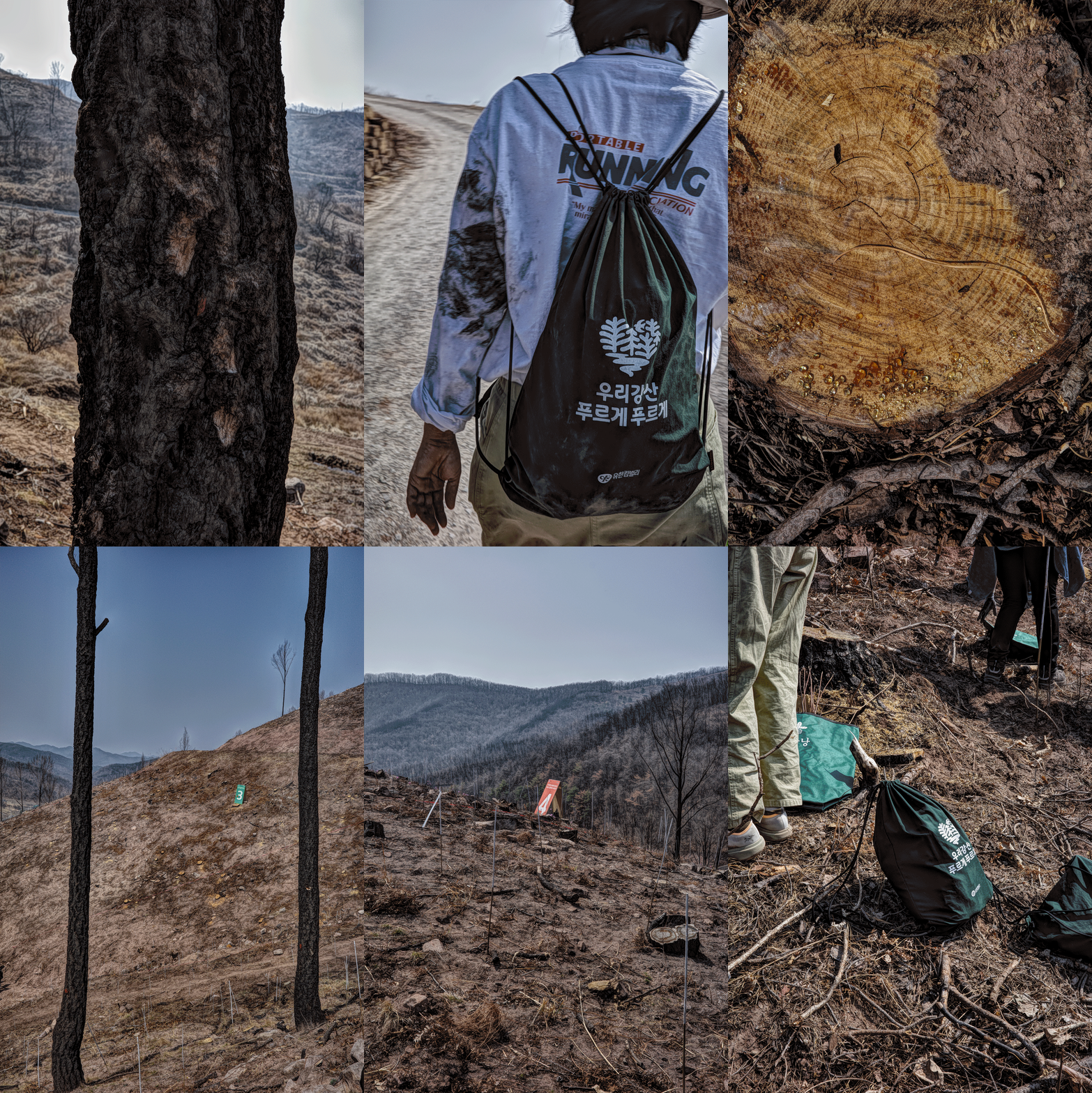
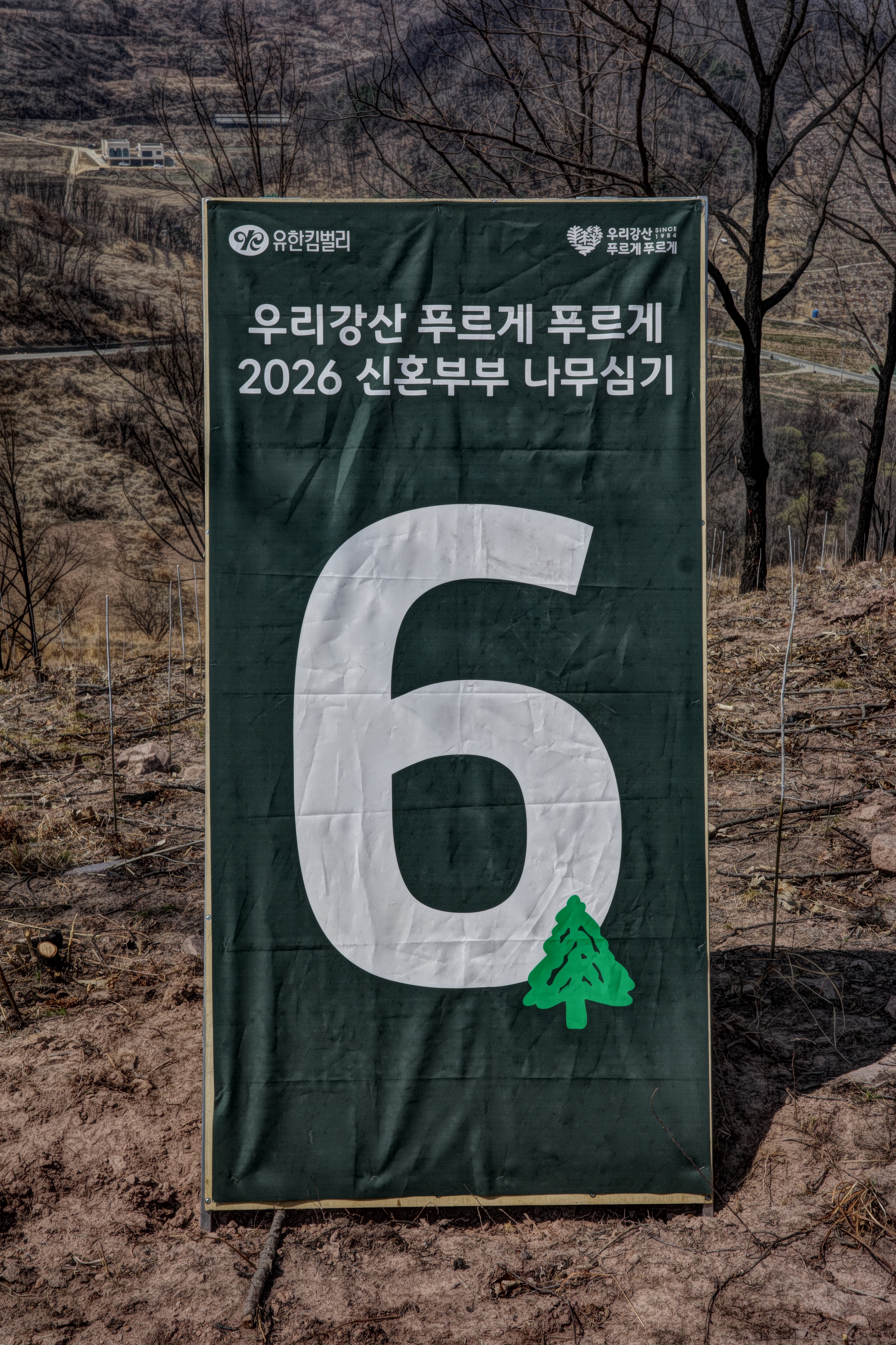
Keep Korea Green Campaign Identity Renewal
2026
Client: Yuhan-Kimberly
PM: Yuhan-Kimberly Design Team•Sustainability Management Center
Design: CFC
Motion Design: VCode
-
CFC
Art Direction: Charry Jeon
Design: Charry Jeon, Seyoun Kim, Seoin Song, Soomin Woo, Seoyoung Lee