CFC developed the brand identity design for FIGURE AND GROUND, a cultural complex, located in Garosu-gil, Gangnam-gu, Seoul.
‘Figure and ground’ is originally an art term meaning ‘foreground and background’. As a retail space, FIGURE AND GROUND means something more. When an impressive space design made of red bricks is perceived as a 'ground', various brands with unique style in the space are each recognized as a 'figure’, respectively.
We extended the meaning of the space name to the design. Inspired by the fact that the number of letters of ‘FIGURE’ and ‘GROUND’ are the same, we made them into a vertical combination of monotype fonts and added ‘AND’ on the left and right, indicating the infinite cycle of two words. The graphic system expanded from the logotype is combined with images/text to capture the coexistence of space and brand in a variety of ways. The visual system harmonizes with the witty typographic gestures, adding vitality to the space.
We extended the meaning of the space name to the design. Inspired by the fact that the number of letters of ‘FIGURE’ and ‘GROUND’ are the same, we made them into a vertical combination of monotype fonts and added ‘AND’ on the left and right, indicating the infinite cycle of two words. The graphic system expanded from the logotype is combined with images/text to capture the coexistence of space and brand in a variety of ways. The visual system harmonizes with the witty typographic gestures, adding vitality to the space.

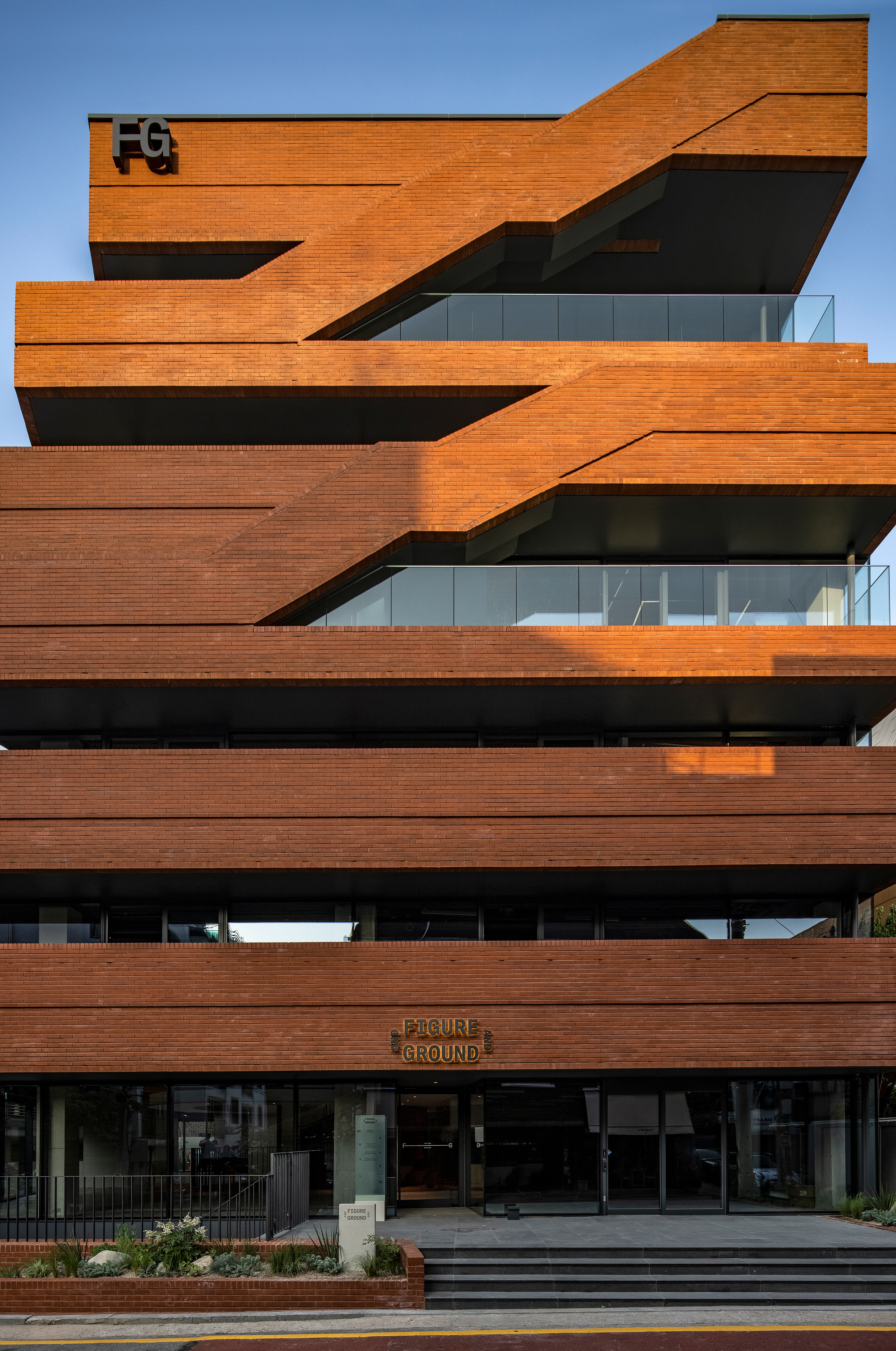
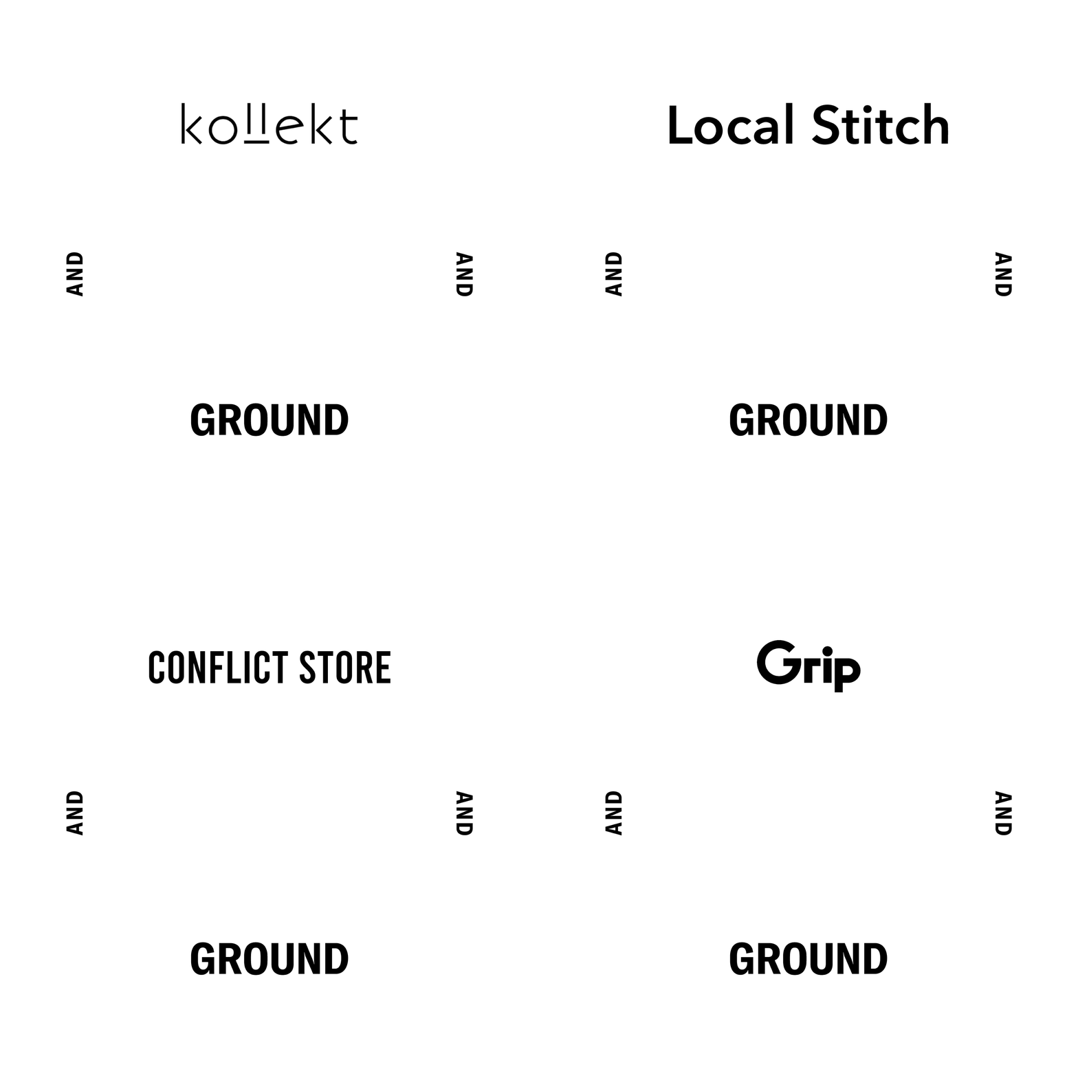




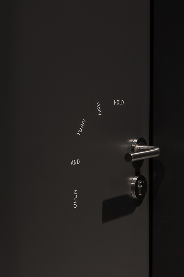
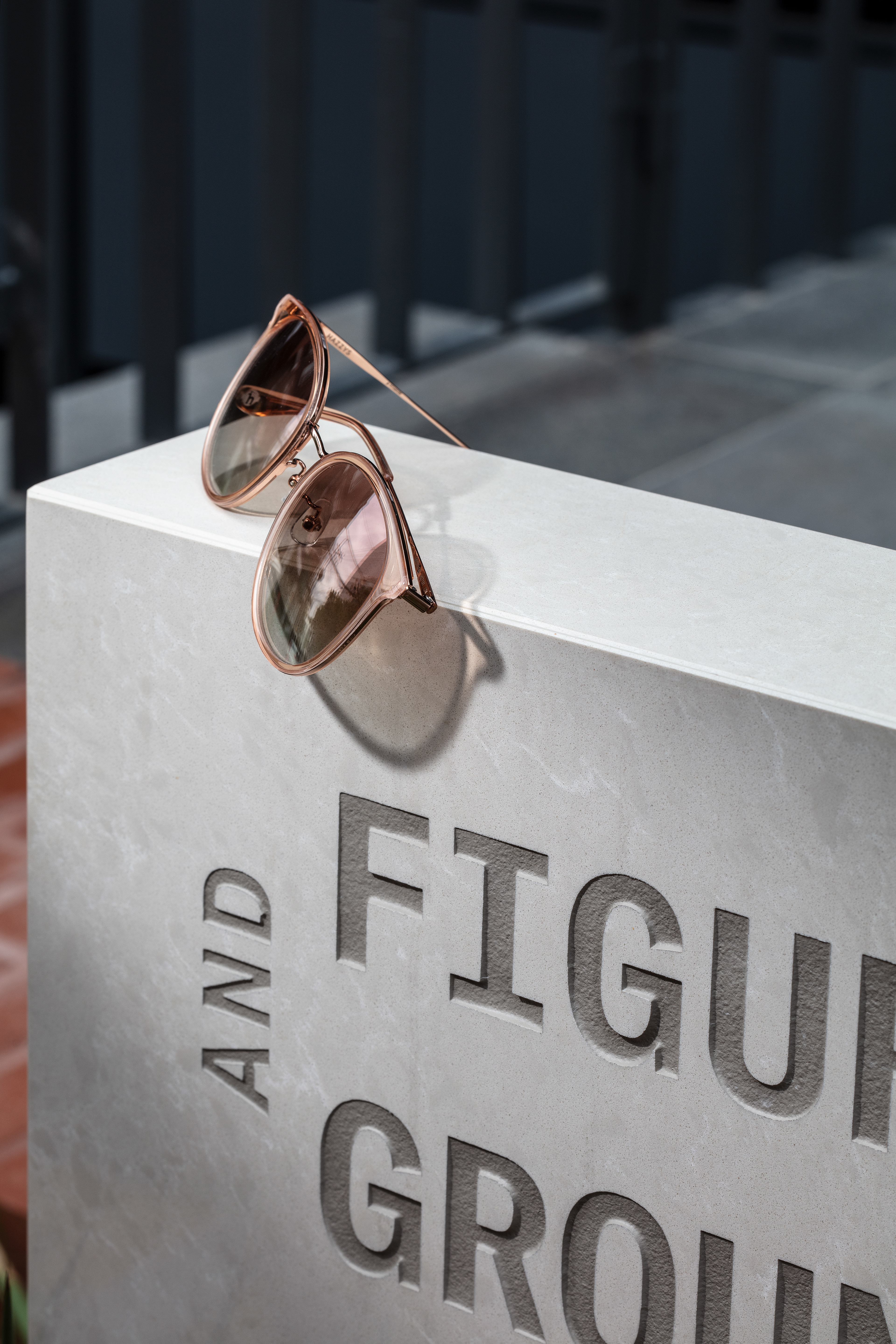

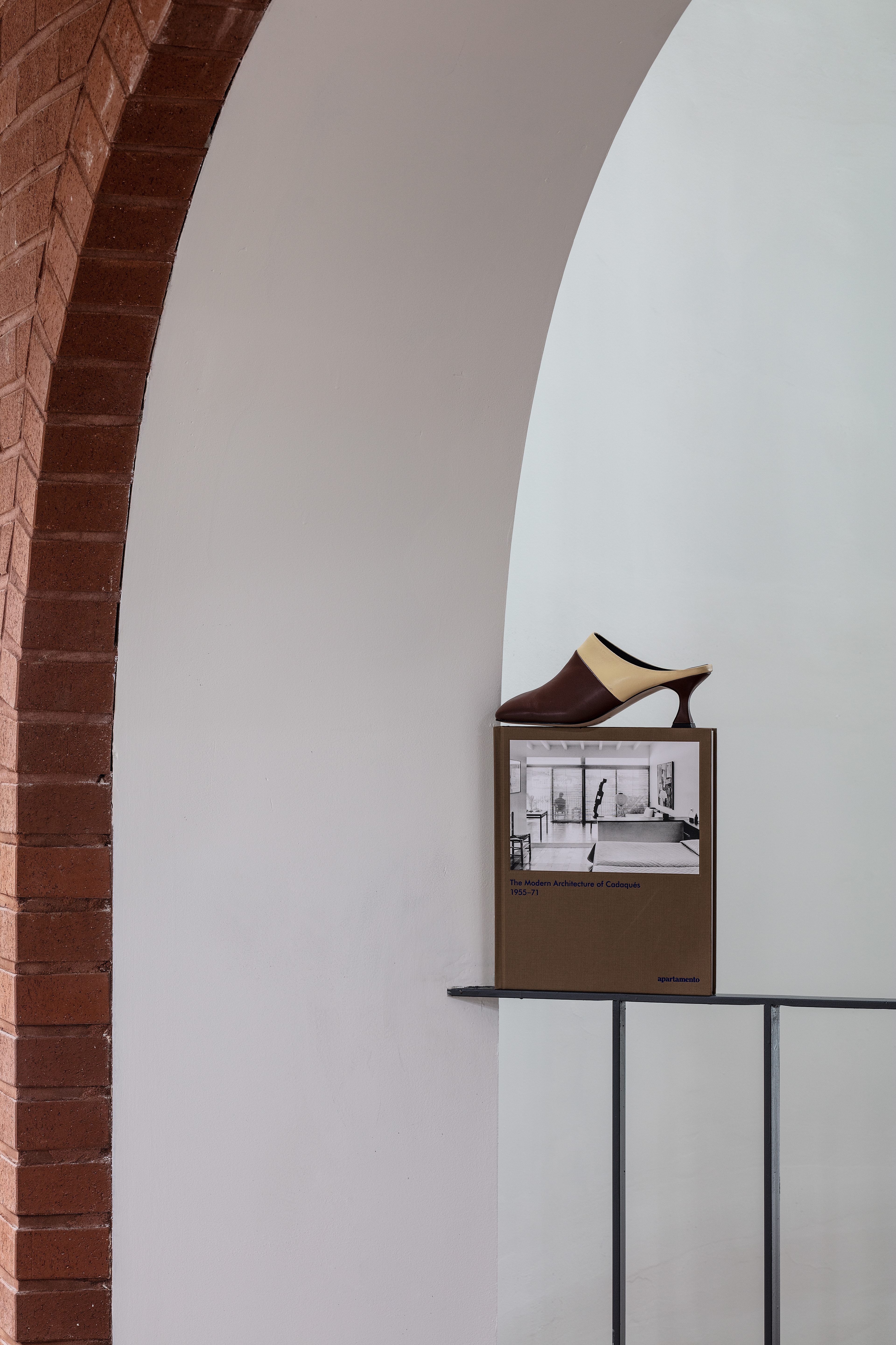
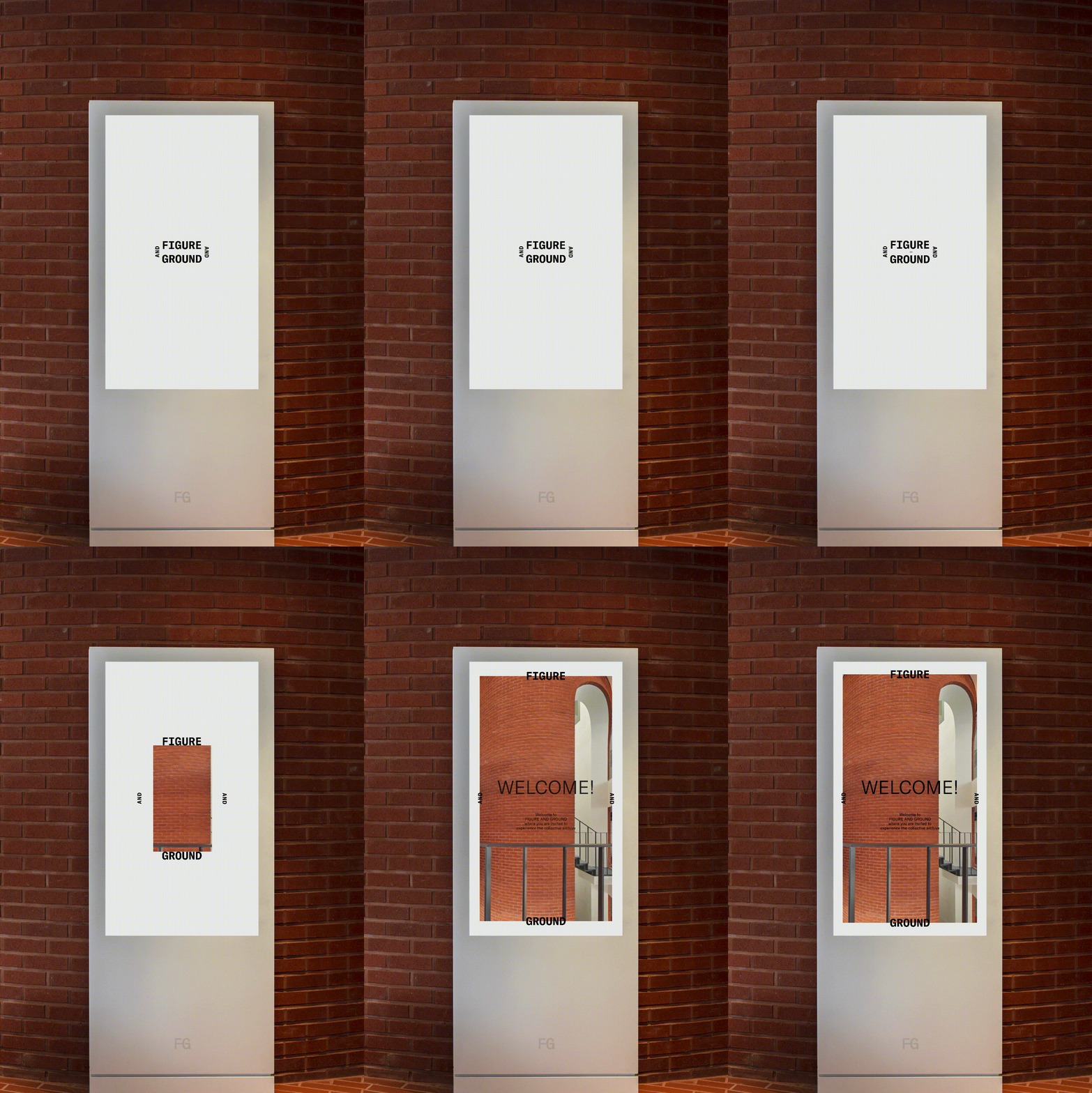
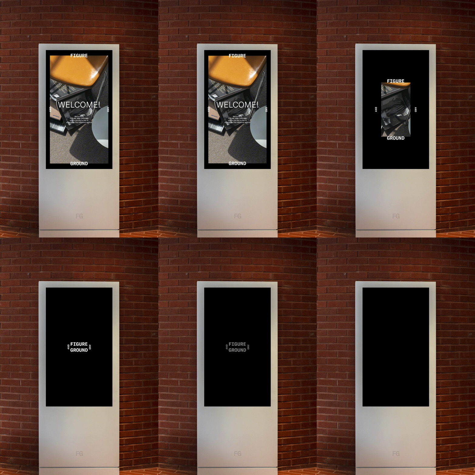
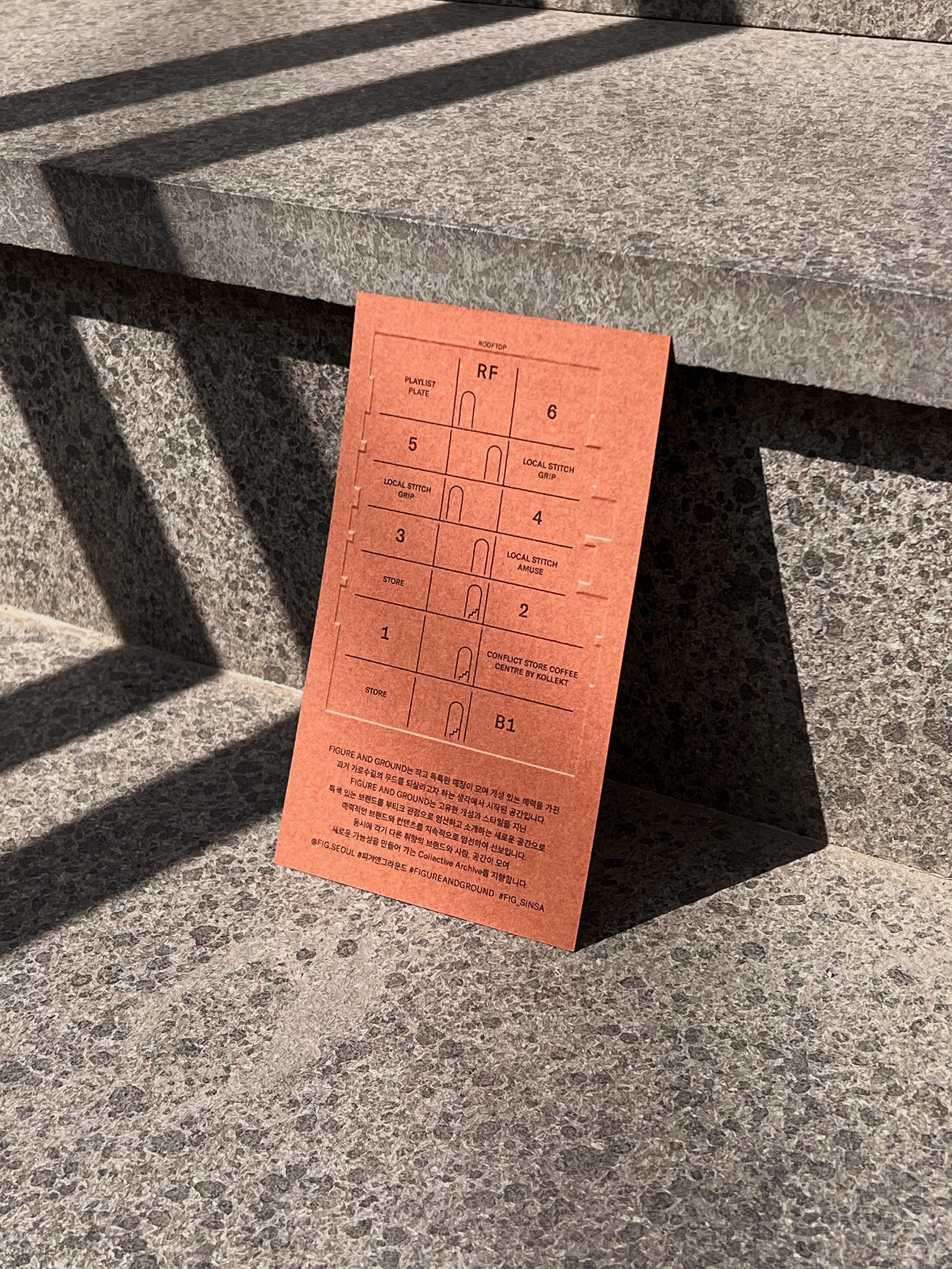
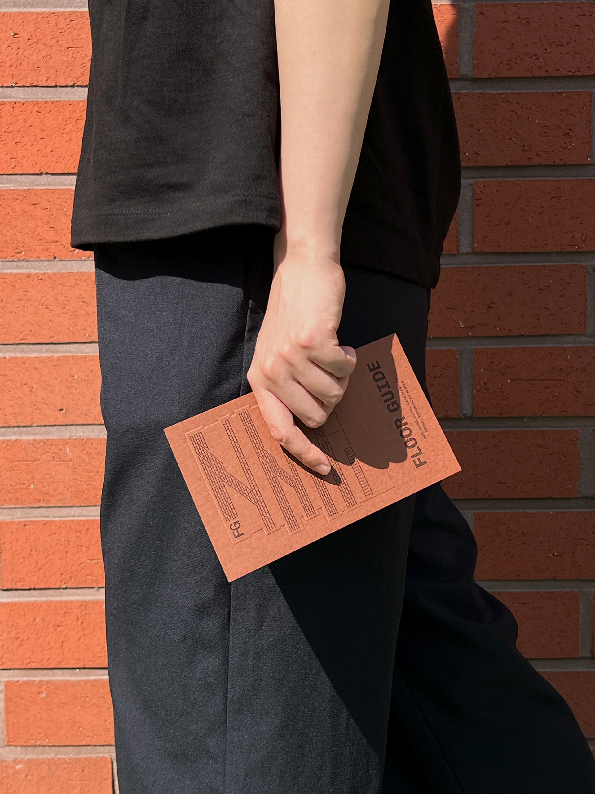
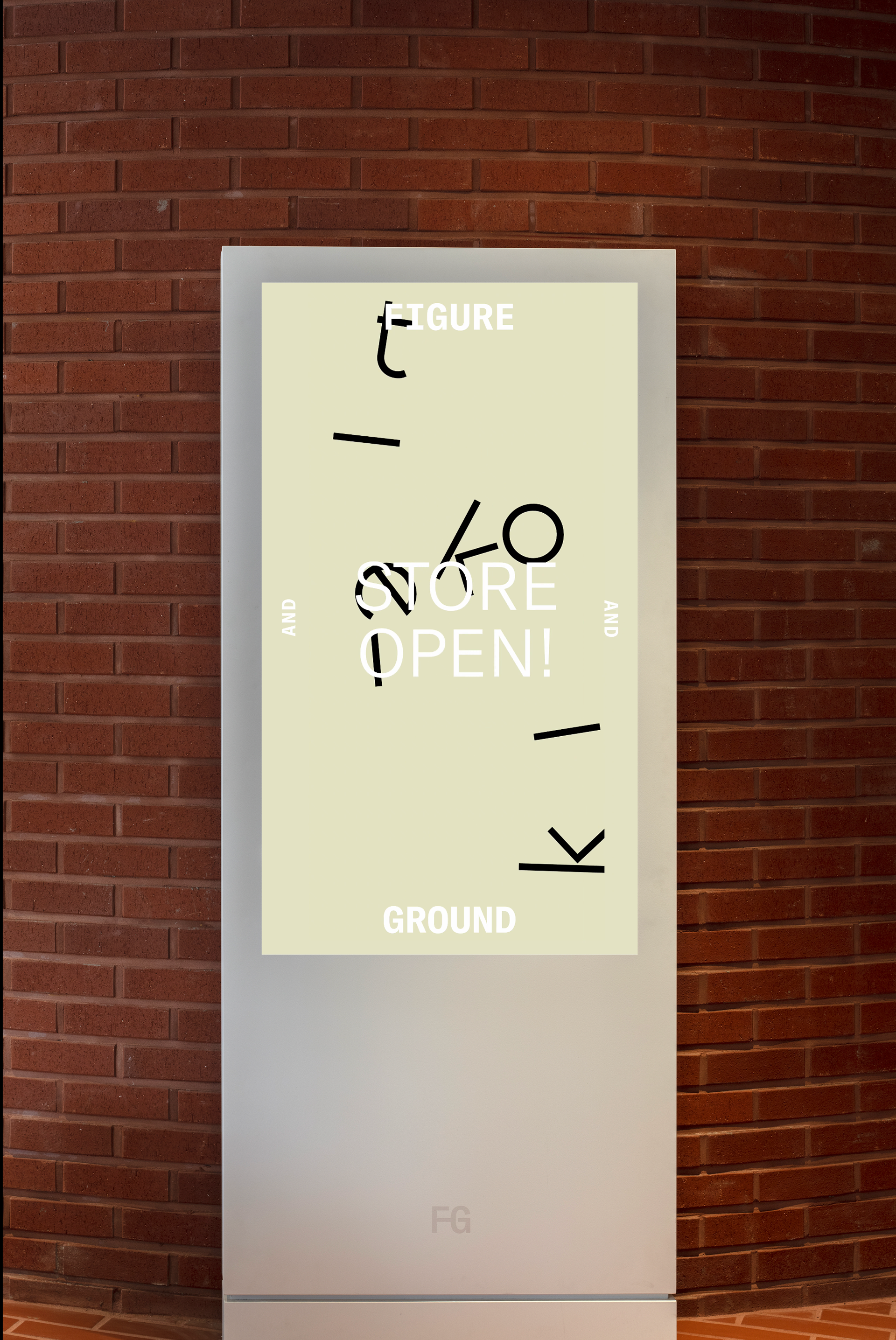
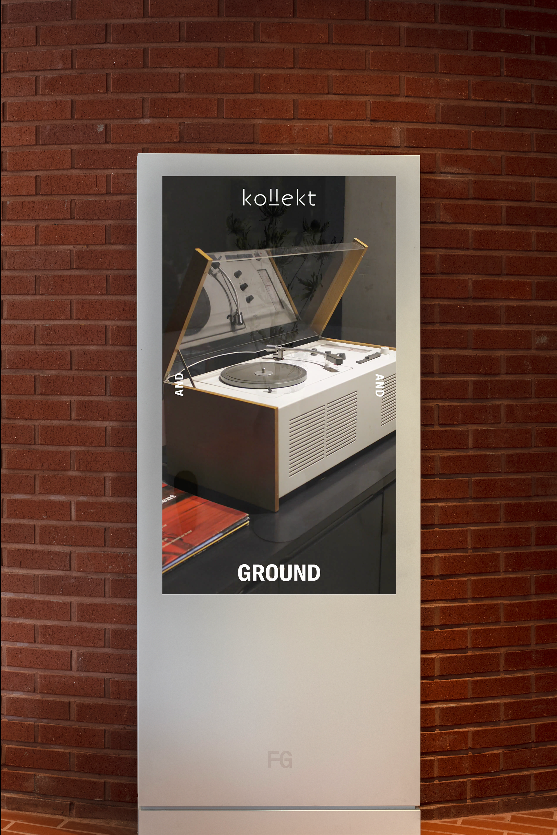
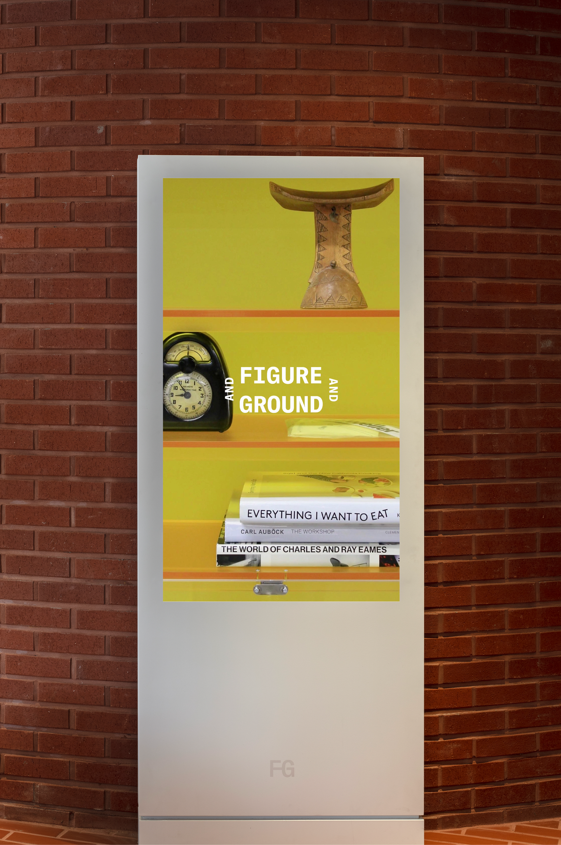
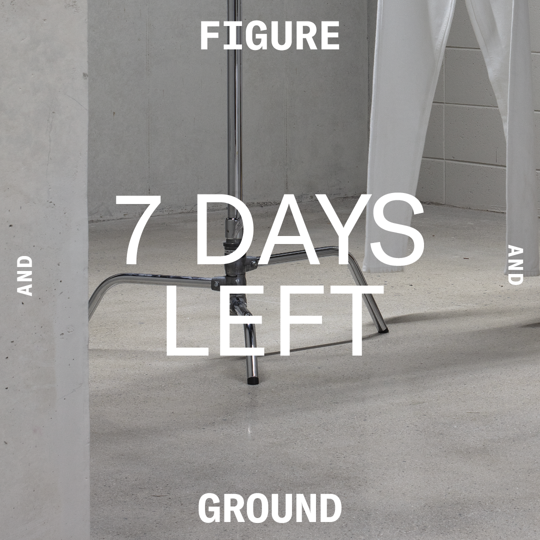
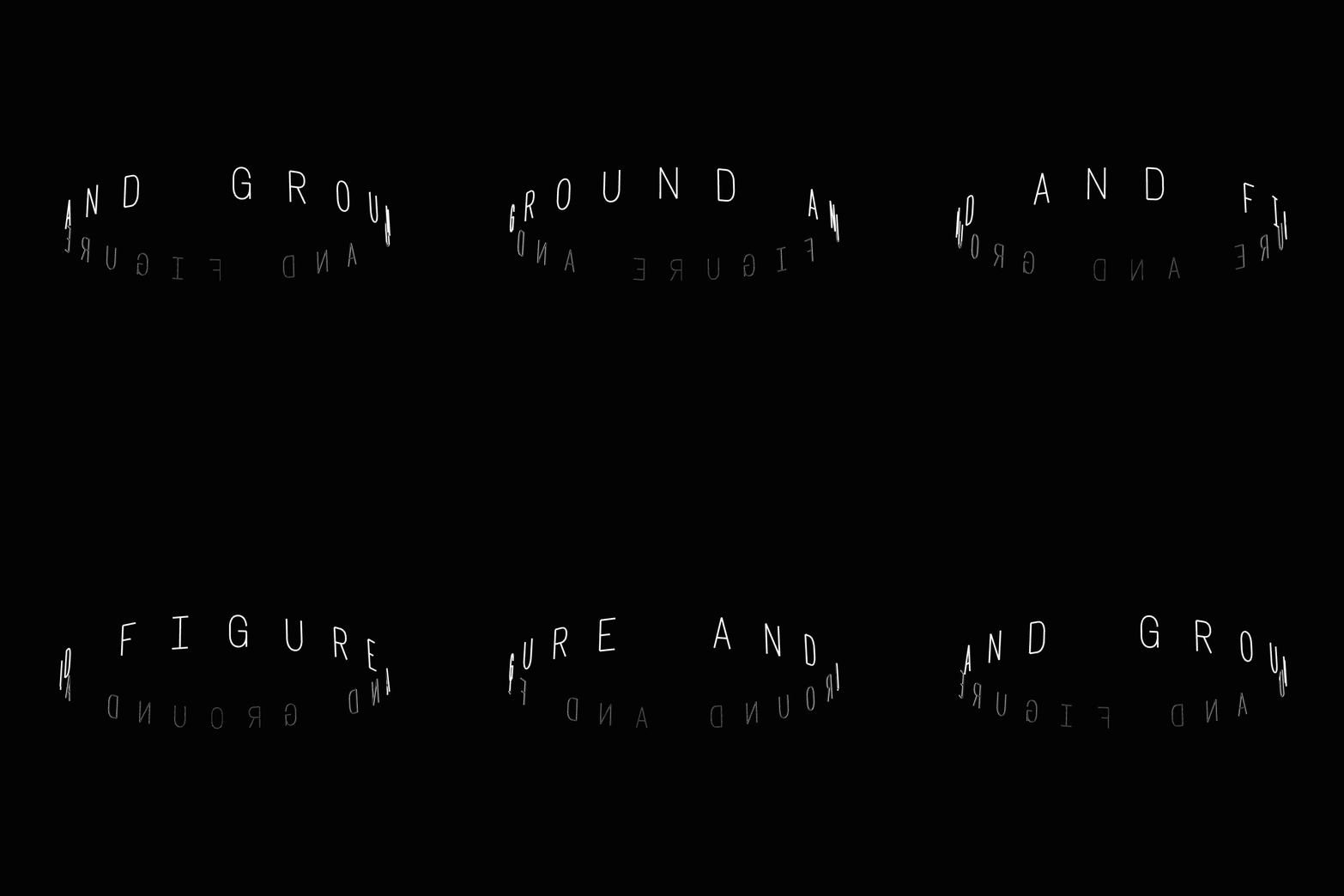
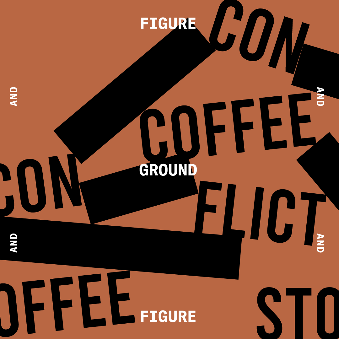
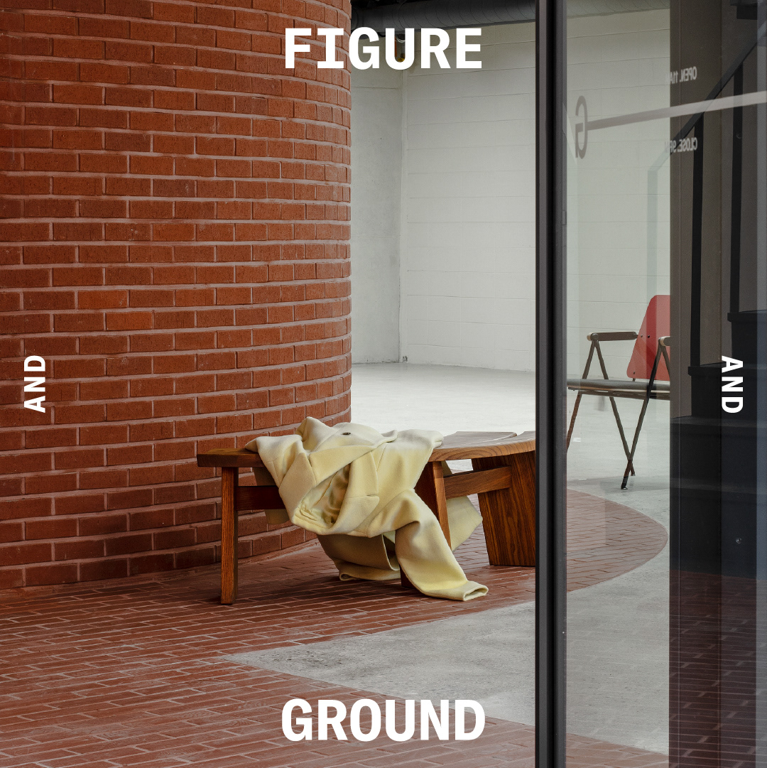
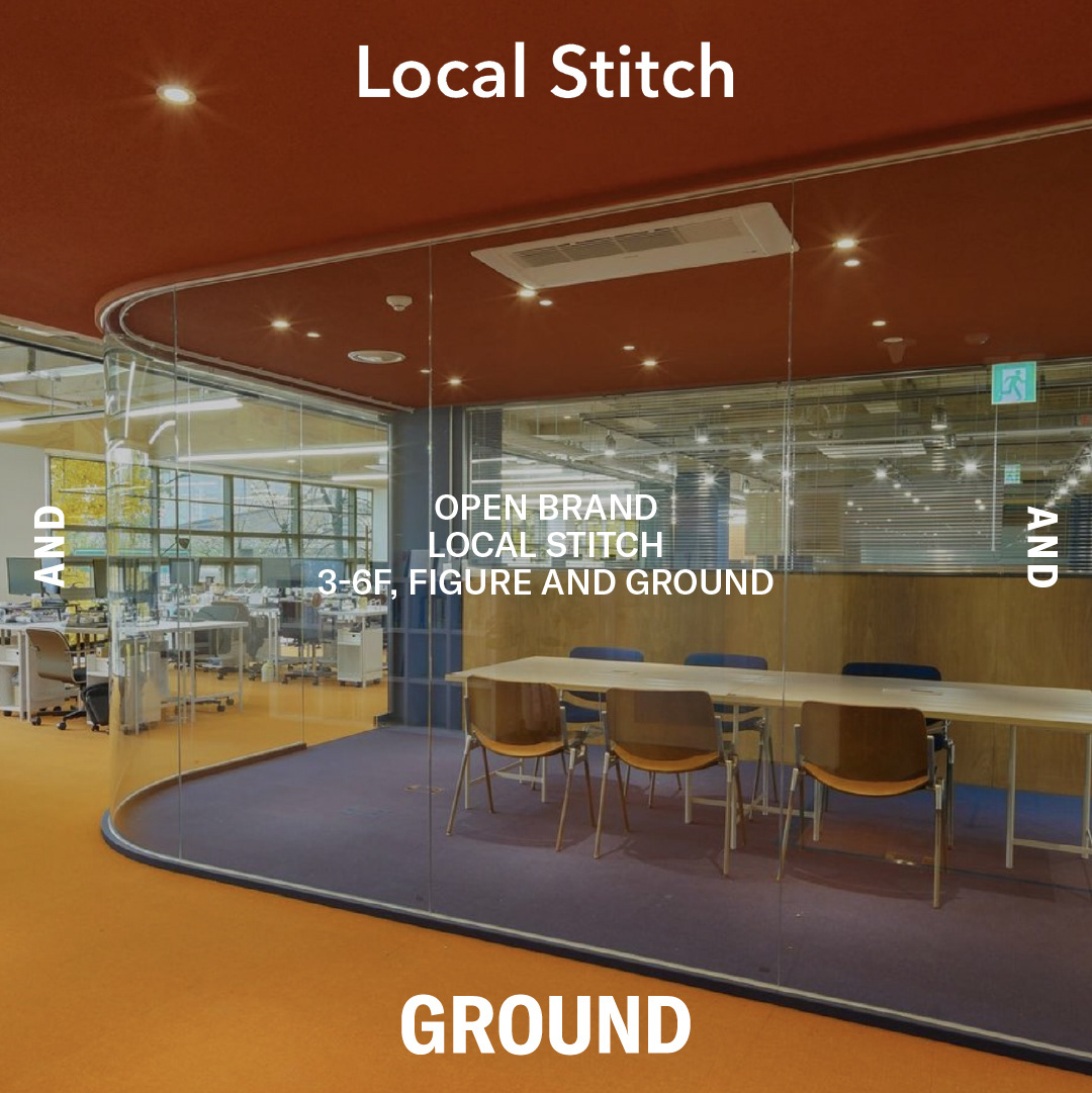
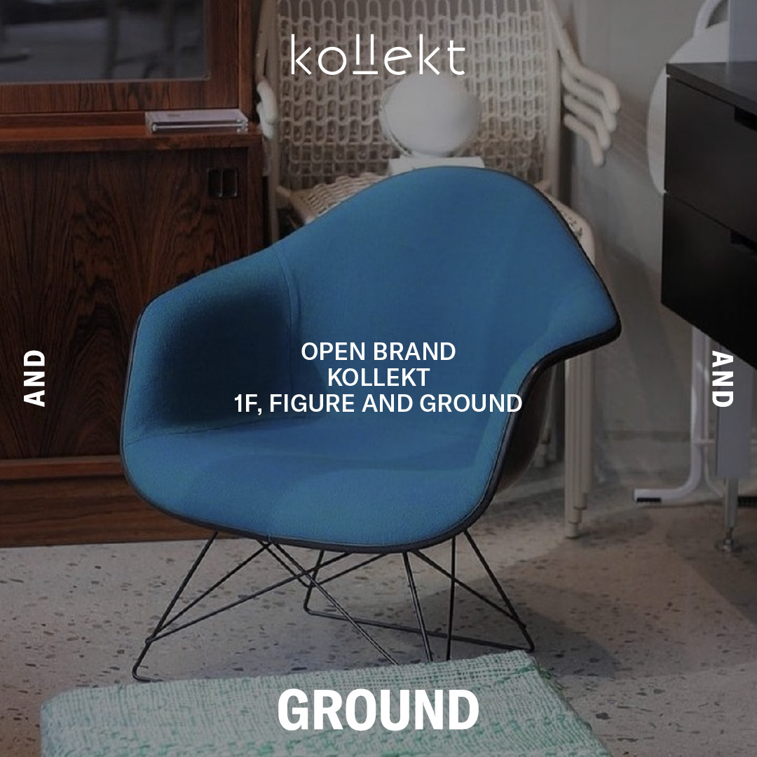


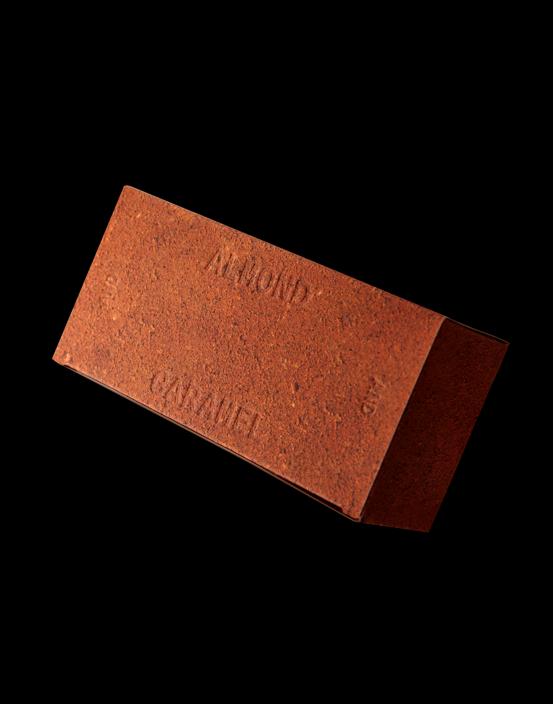


FIGURE AND GROUND BI System Design
2021
Client: IGIS Asset Management
-
Project Team
PM: IGIS Contents Strategy Team
Brand Strategy & Naming: STNDRD
BI System Design: CFC
Signage Execution Drawings: 2B
Space Styling: Minam Company
Photography: CFC (Kiwoong Hong)
-
CFC
Art Direction: Charry Jeon
BI System Design: Charry Jeon, Seyoun Kim, Jeongmoon Choi, Eunjoo Kim
Design Application: Seyoun Kim, Jeongmoon Choi, Hyungseok Lim
Photography: Kiwoong Hong

