THE CHALLENGE
Founded in 1970, Hanssem has played a leading role in shaping Korea’s residential culture. In 2024, the company undertook its first corporate identity renewal in 32 years.
The goal of the renewal was to build a contemporary brand image that reflects evolving values and expectations while preserving the expertise and heritage Hanssem has established over 54 years. The project aimed to retain the iconic character of its red, yellow, and blue block symbol while improving its usability and versatility across various brand touchpoints, including digital platforms. It also sought to establish a cohesive identity system that brings its sub-brands together under a unified visual language.
-
1970년 창립 이래 국내 주거문화를 이끌어온 한샘은 2024년, 32년 만에 CI 리뉴얼을 진행했습니다.
이번 리뉴얼의 목표는 한샘이 54년간 축적해 온 주거환경에 대한 전문성과 정통성을 이어가며, 변화하는 시대에 부합하는 현대적인 브랜드 이미지를 구축하는 것이었습니다. 빨강, 노랑, 파랑 블록으로 이루어진 심볼의 상징성을 계승하며 디지털 환경을 비롯한 다양한 브랜드 접점에서의 사용성과 확장성을 높이고, 하위 브랜드를 아우르는 일관된 아이덴티티 체계를 정립하는 것이 프로젝트의 목표였습니다.
THE SOLUTION
CFC reinterpreted Hanssem’s iconic block symbol to create a simpler, clearer visual identity system. The brightness and saturation of the original primary colors were refined to enhance their vibrancy, while the number of blocks was reduced from nine to seven, improving the symbol’s versatility across applications.
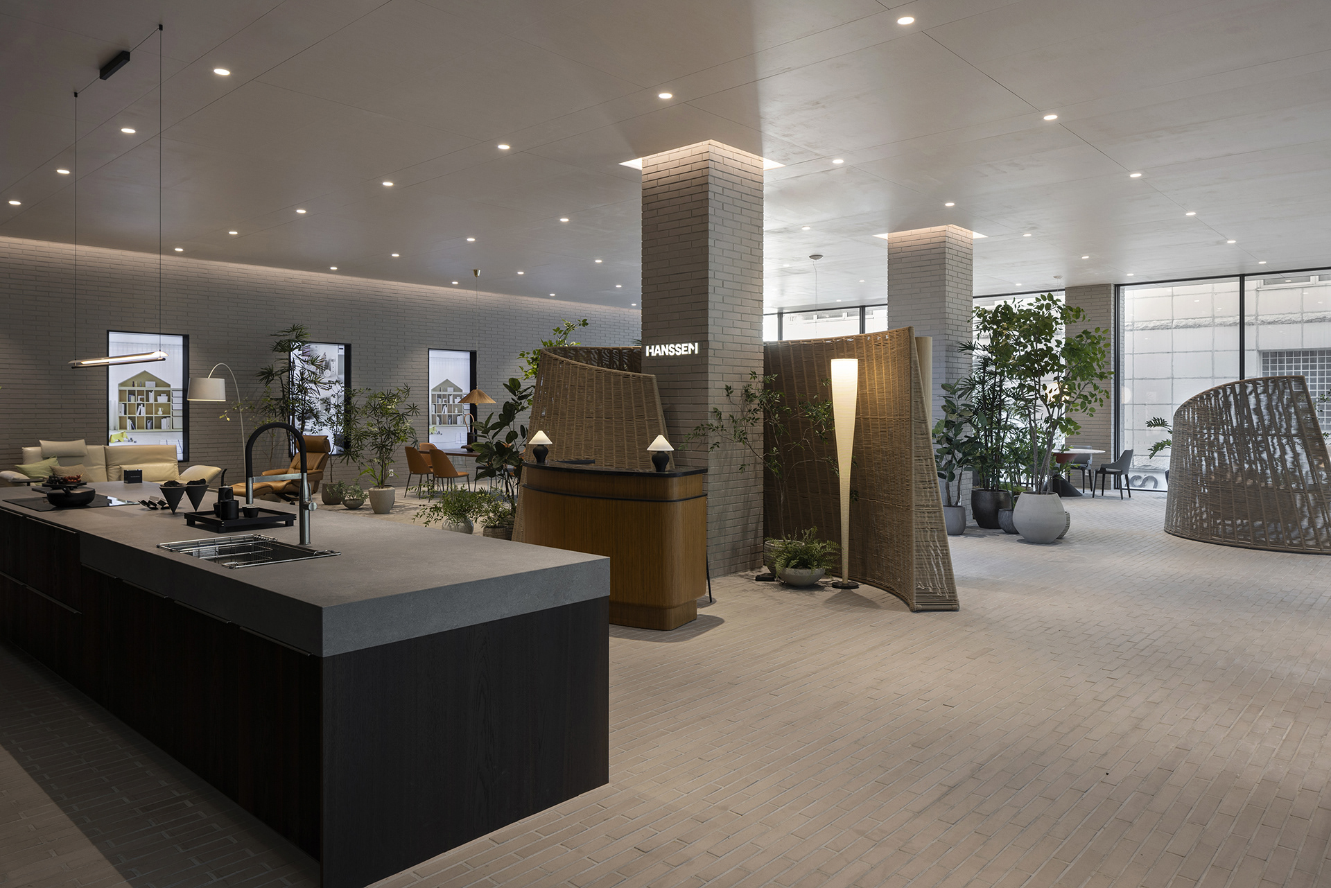
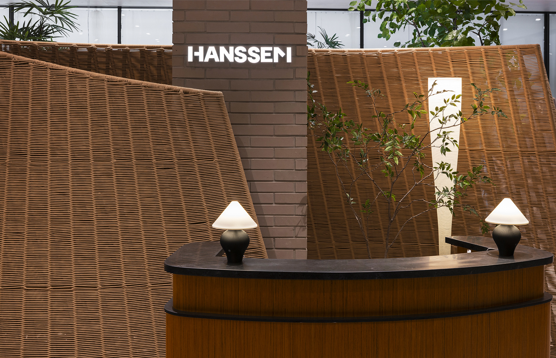
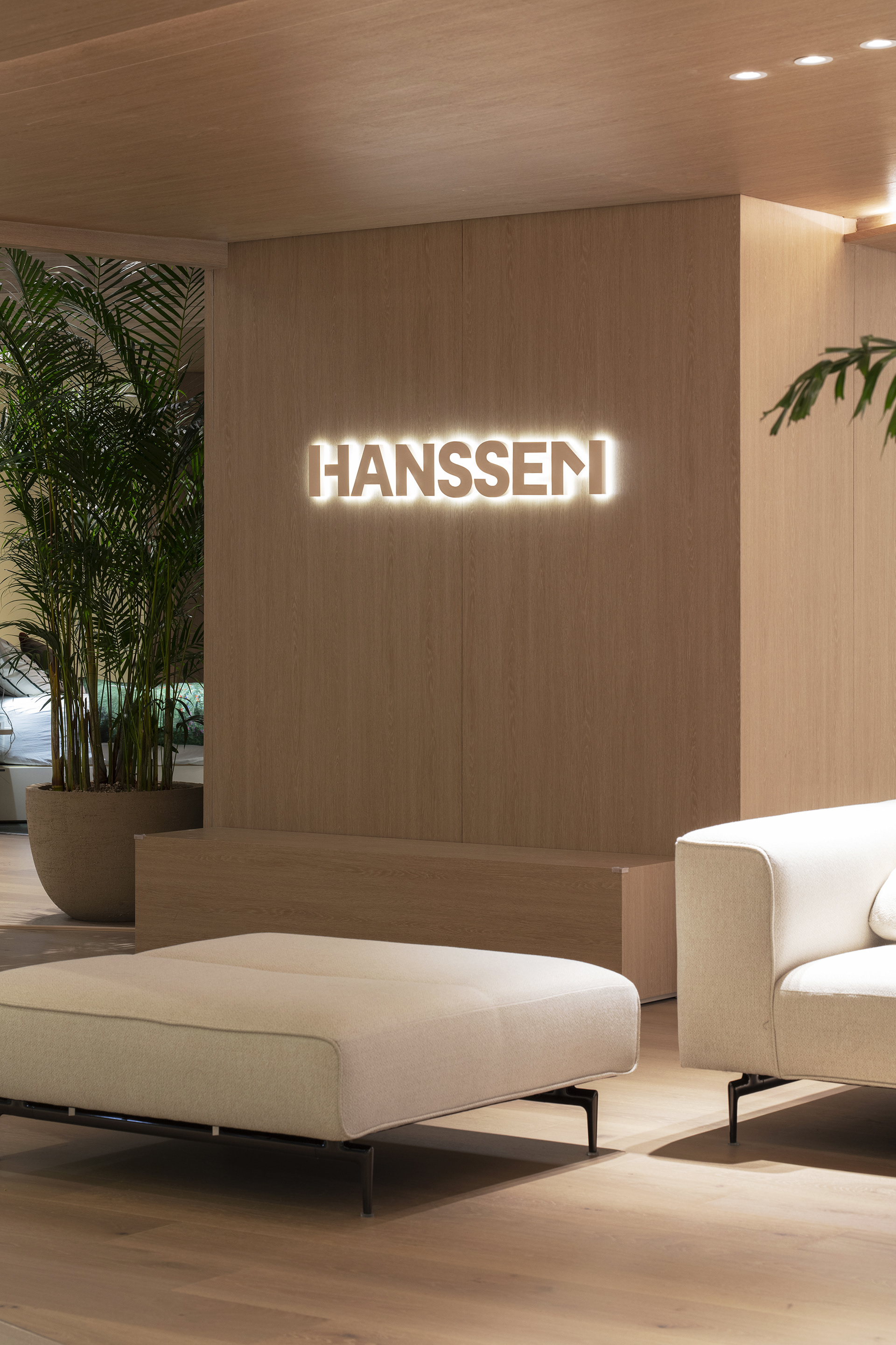
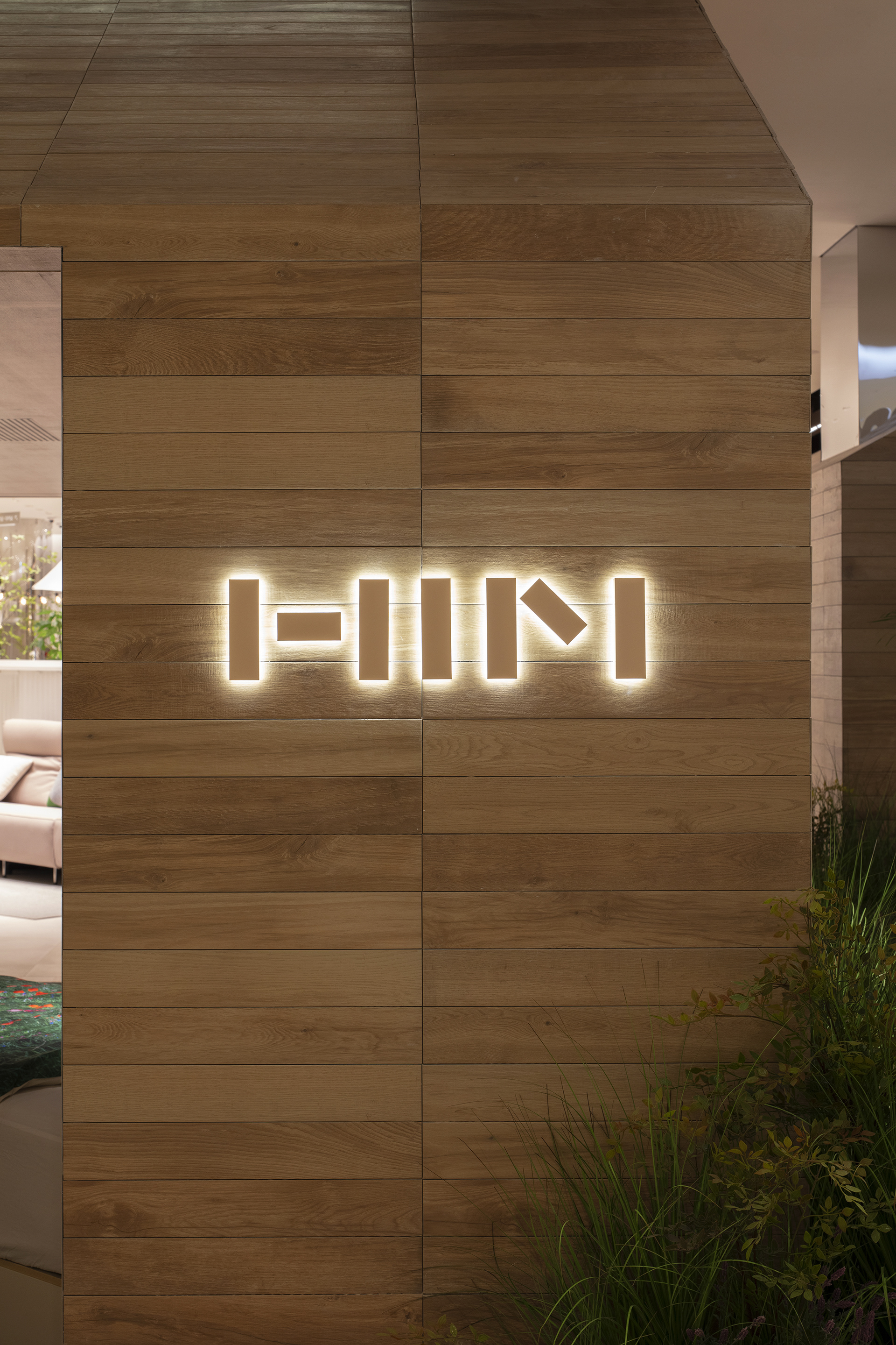
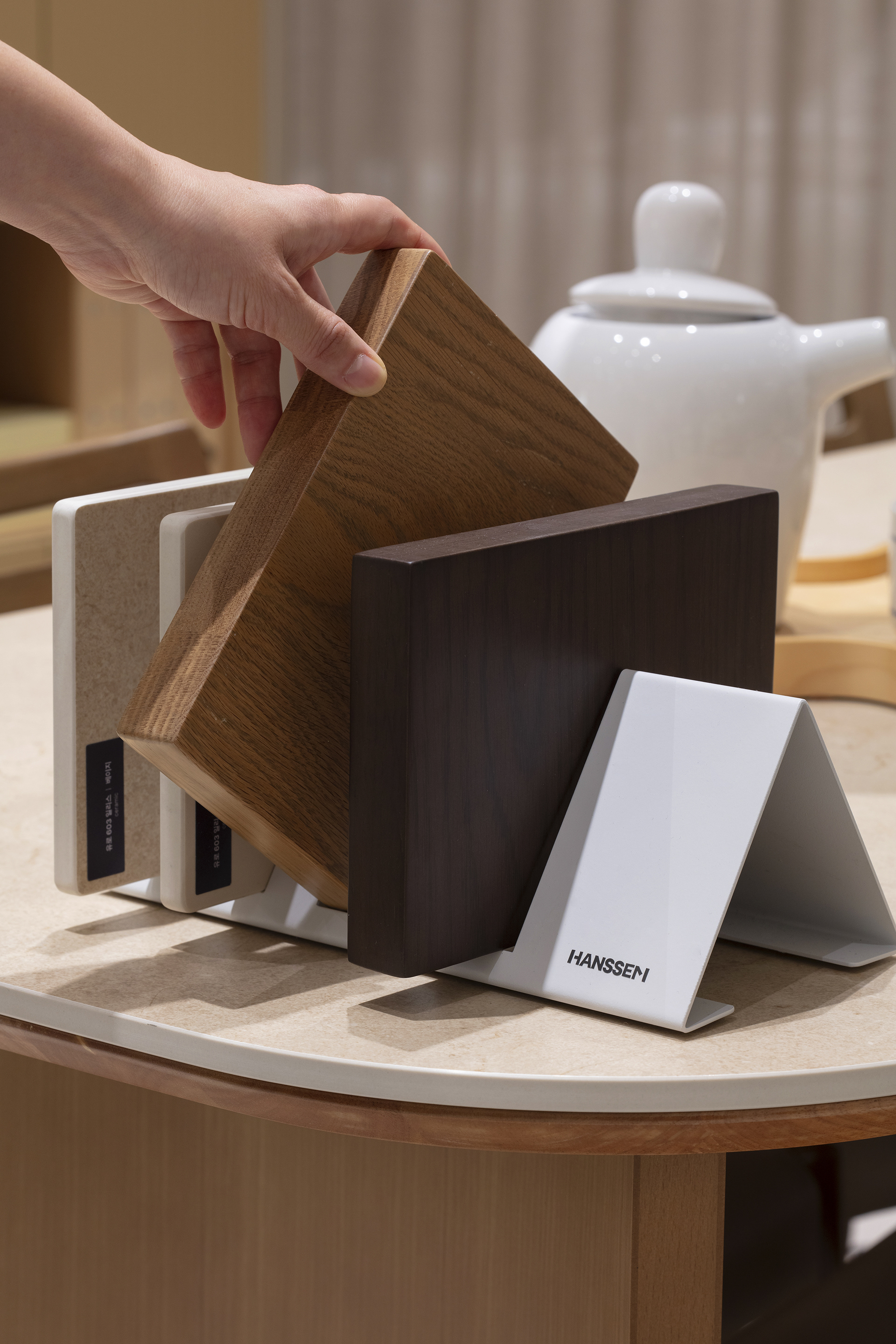
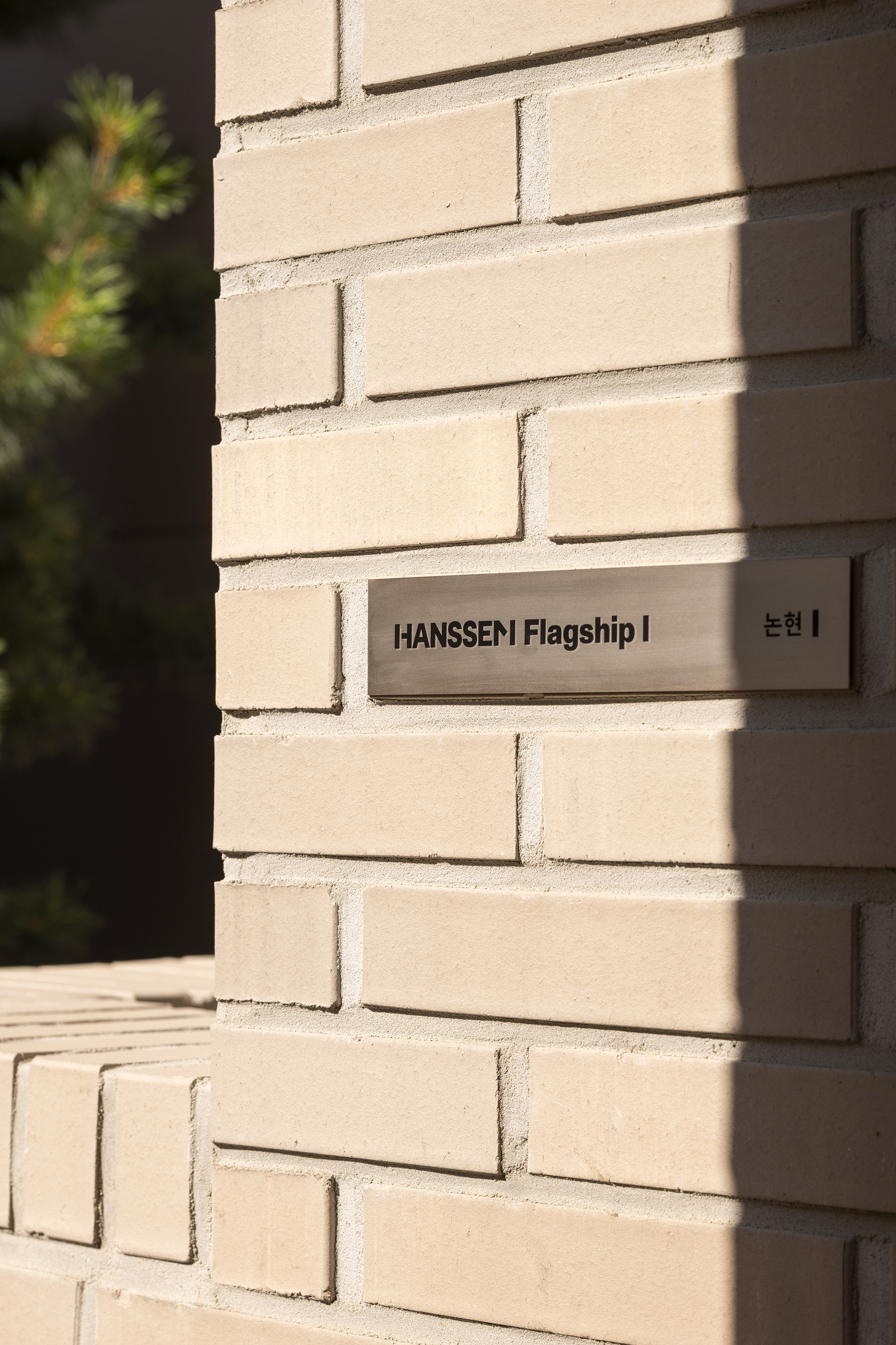
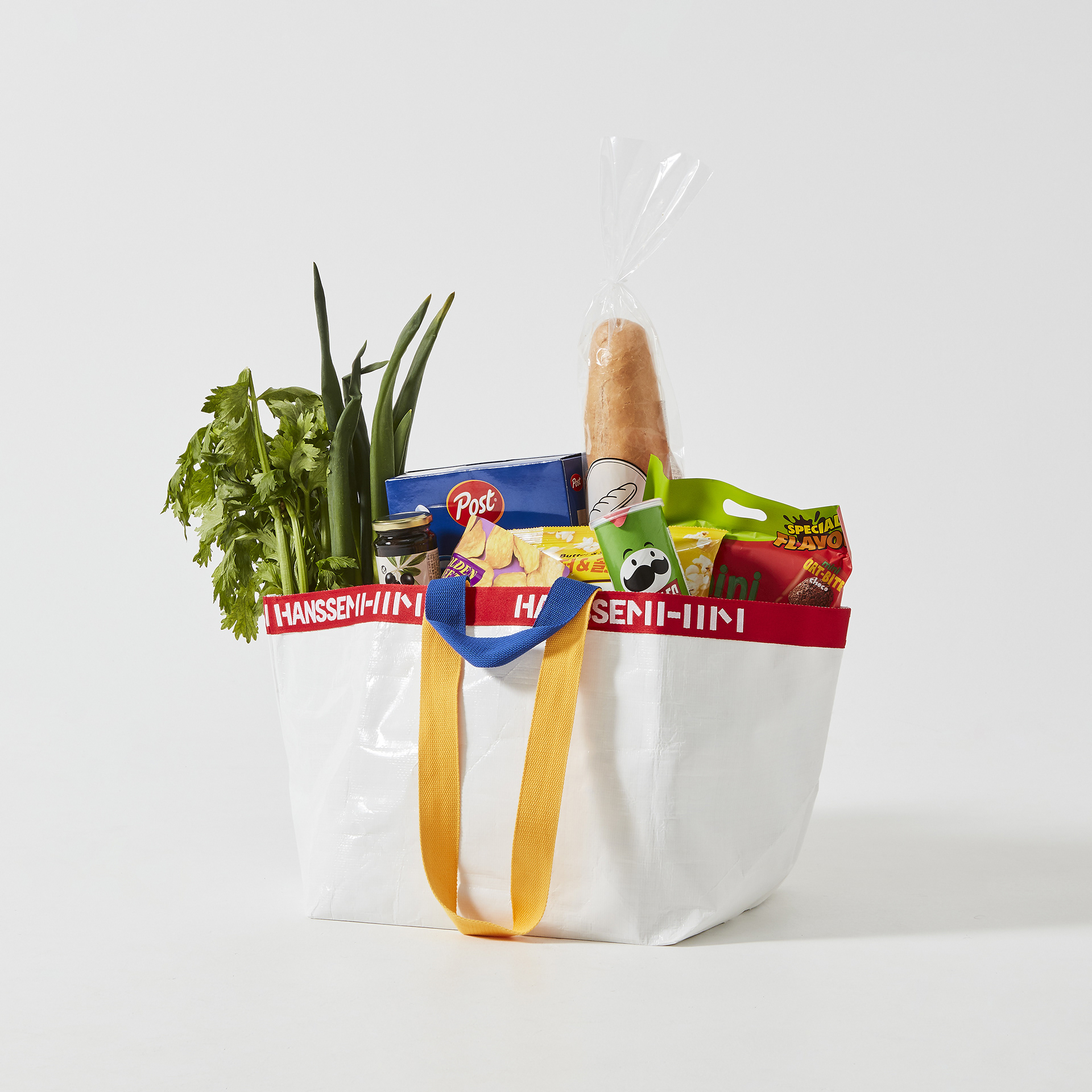
The newly developed logotype draws on the geometric characteristics of the symbol, incorporating block-inspired forms into parts of the first letter H and the final letter M of “HANSSEM.” This creates a stronger visual connection between the symbol and logotype. With its bold, solid construction, the logotype extends across sub-brands and services, including Hanssem Rehaus and Hanssem Service, forming a unified identity system.
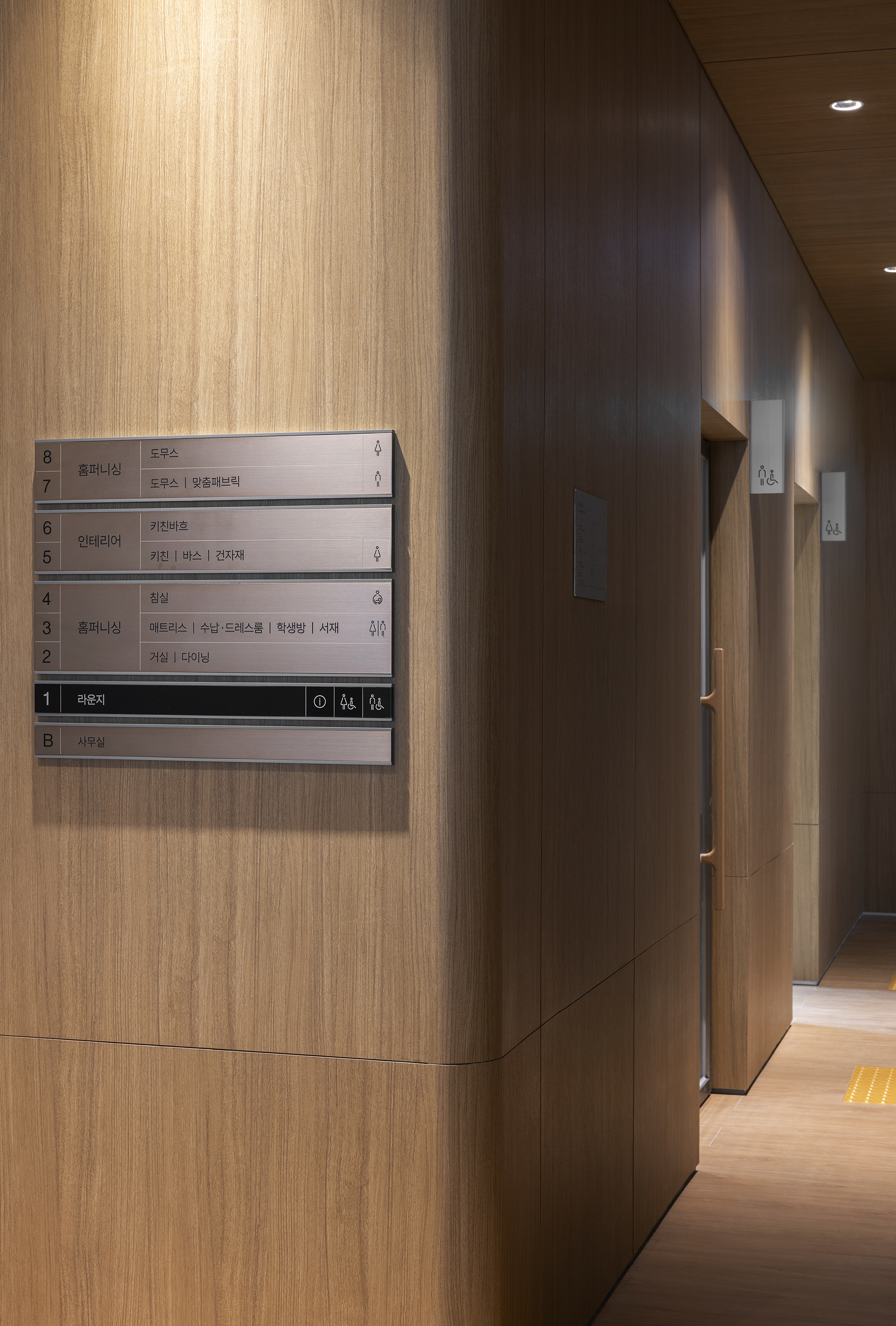
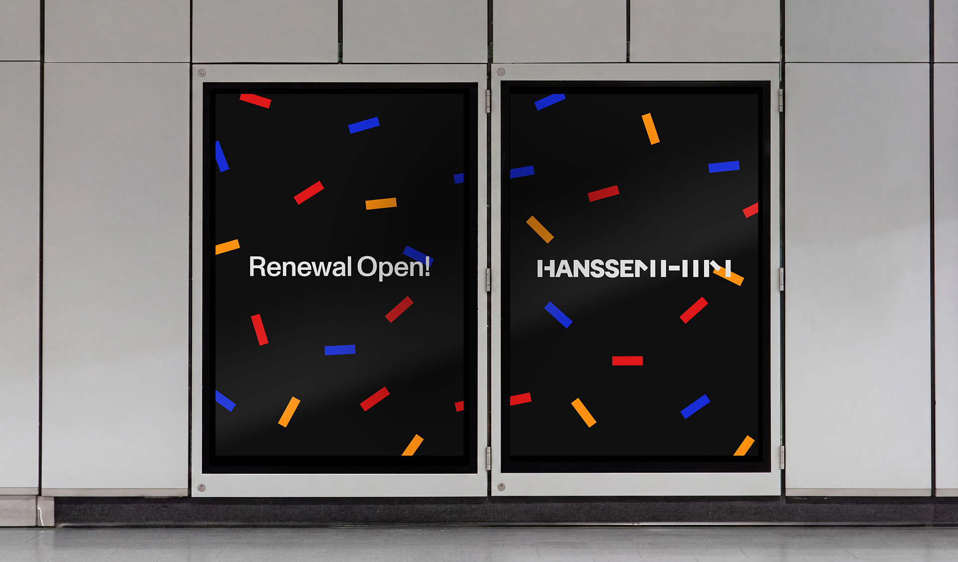
The blocks of the symbol extend into a graphic motif that runs throughout the visual identity. Flexibly adapted within a structured grid, the blocks serve as frames or dynamic graphic elements, conveying Hanssem’s expertise and vitality across various physical and digital brand touchpoints.
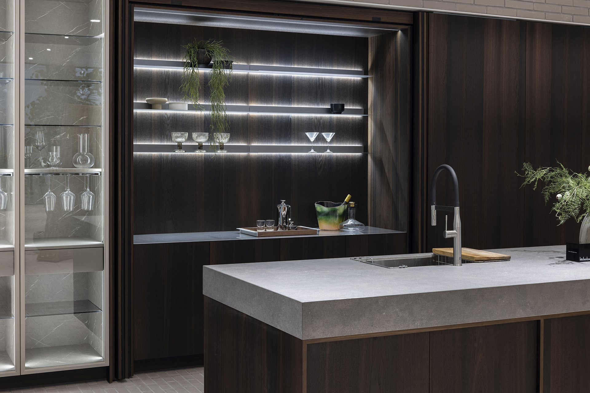
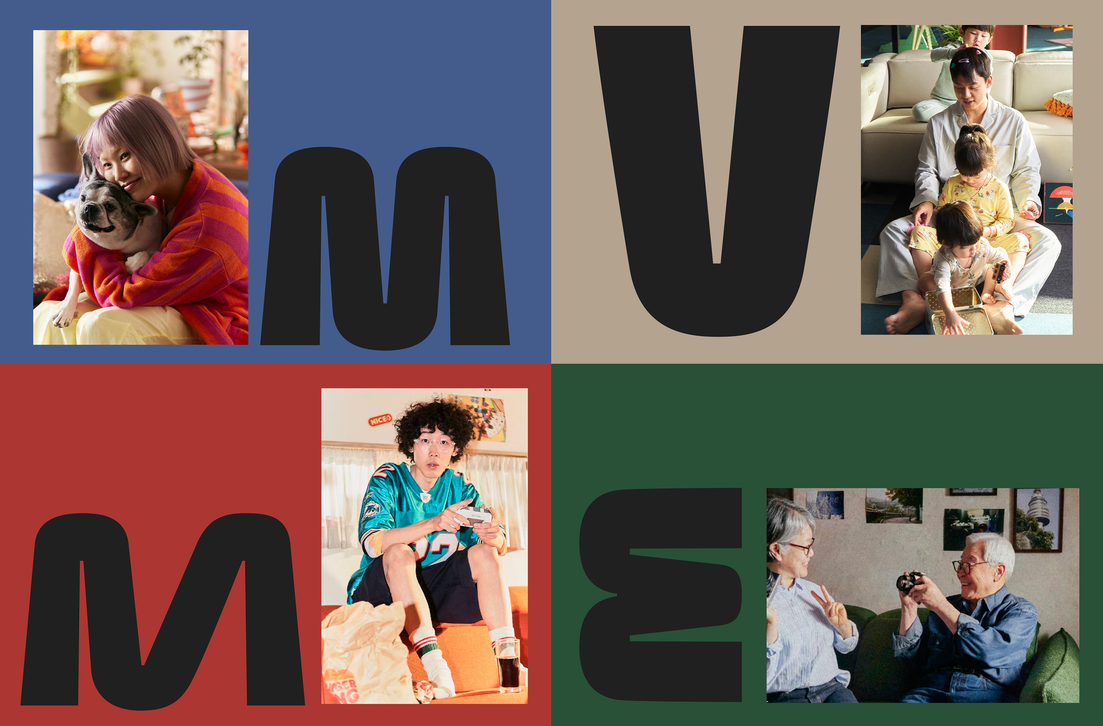
Following the CI renewal, CFC also developed brand identities for Hanssem’s premium kitchen brand, Kitchenbach, and sofa brand, MVME, each reflecting its distinct character. Kitchenbach expresses a refined and sophisticated aesthetic, while MVME establishes a youthful and playful brand image.
-
CFC는 한샘의 핵심 시각 자산인 블록 심볼을 재해석해, 보다 간결하고 선명한 비주얼 아이덴티티 시스템을 구축했습니다. 기존 삼원색의 명도와 채도를 조정해 색상의 선명도를 높이고, 9개로 구성된 블록을 7개로 단순화해 활용성을 개선했습니다.
새롭게 개발된 로고타입은 심볼의 조형적 특징을 반영한 형태로, ‘HANSSEM’의 첫 글자 H와 마지막 글자 M의 획 일부에 블록 형태를 도입해 심볼과의 시각적 연결성을 강화했습니다. 볼드하고 견고한 로고타입은 한샘리하우스, 한샘서비스 등 하위 서비스와 결합되어 통합적인 아이덴티티 체계를 형성합니다.
심볼의 블록은 비주얼 아이덴티티 전반을 관통하는 그래픽 모티프로 확장됩니다. 구조적인 그리드를 기반으로 유연하게 변주되는 블록은, 때로는 프레임으로, 때로는 역동적인 그래픽으로 활용되며 온·오프라인의 다양한 브랜드 접점에서 한샘이 지닌 전문성과 생동감을 전달합니다. CI 개발에 이어 진행된 한샘의 프리미엄 키친 브랜드 키친바흐와 소파 브랜드 MVME의 BI개발에서는 각 브랜드의 고유한 정체성을 시각화했습니다. 키친바흐는 정교하고 세련된 미학을, 소파브랜드 MVME 는 젊고 유쾌한 감각을 중심으로 차별화된 브랜드의 이미지를 구축했습니다.















Hanssem CI Design Dev.
Client: Hanssem
2024
-
PM: Hanssem Marketing Team
CI Design: CFC
-
CFC
Art Direction: Charry Jeon
Design: Charry Jeon, Jeongmoon Choi, Hyungseok Lim, Soomin Woo, Seyoun Kim
www.contentformcontext.com
ⓒ 2026. Contentformcontext Inc. All Rights Reserved.