CFC has developed the brand identity design of Hibarin, a premium katsu brand owned by restaurant company Kalisco.
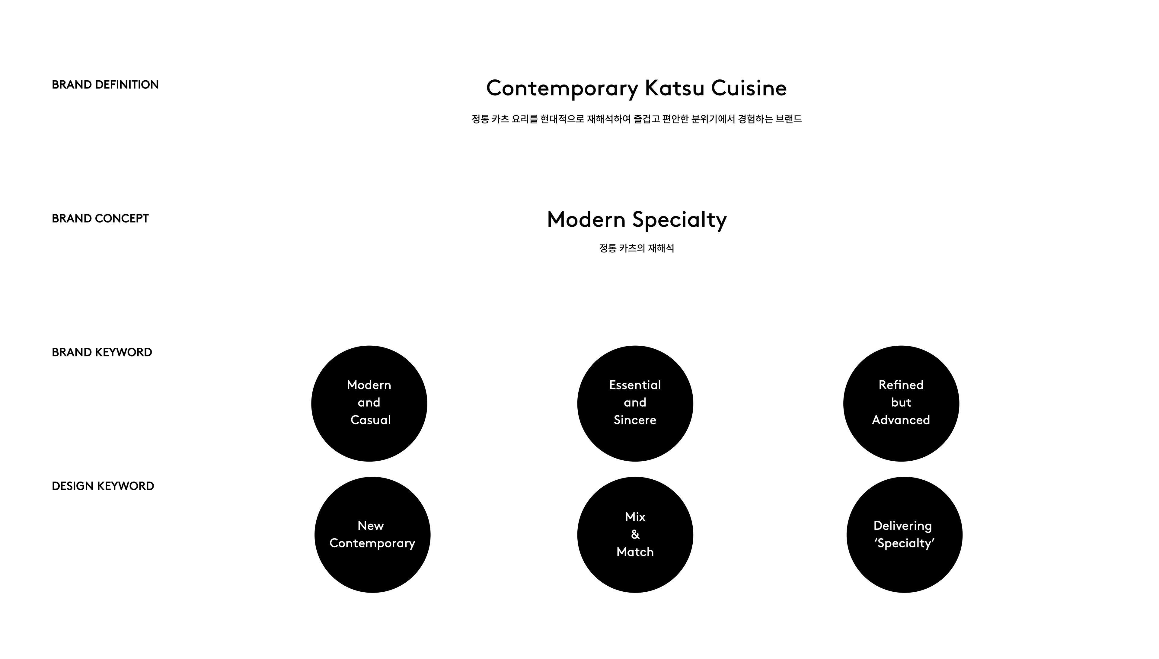
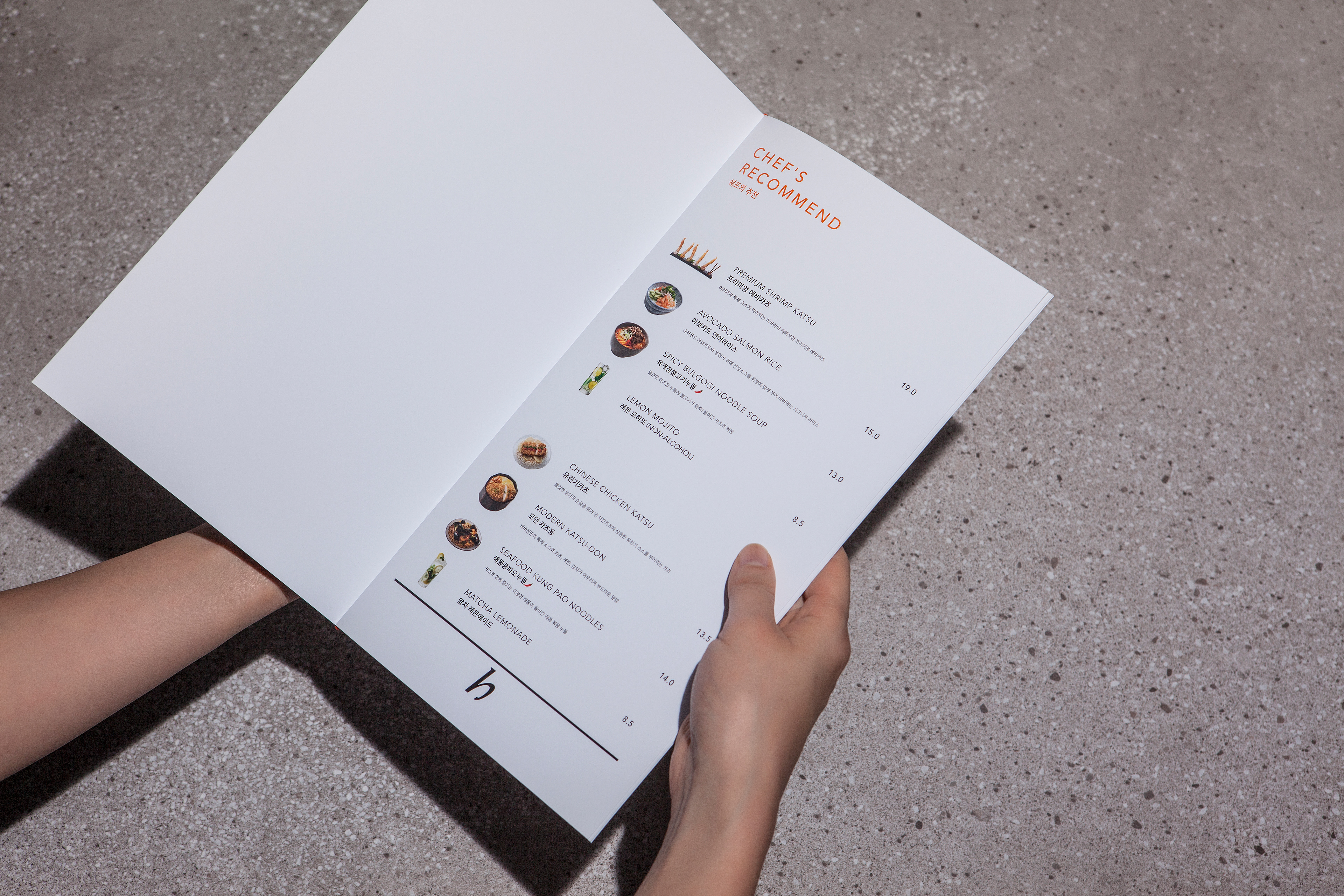
The goal of this project was to position Hibarin as a contemporary katsu dining where you can experience authentic katsu and healthy cuisine with a modern reinterpretation.
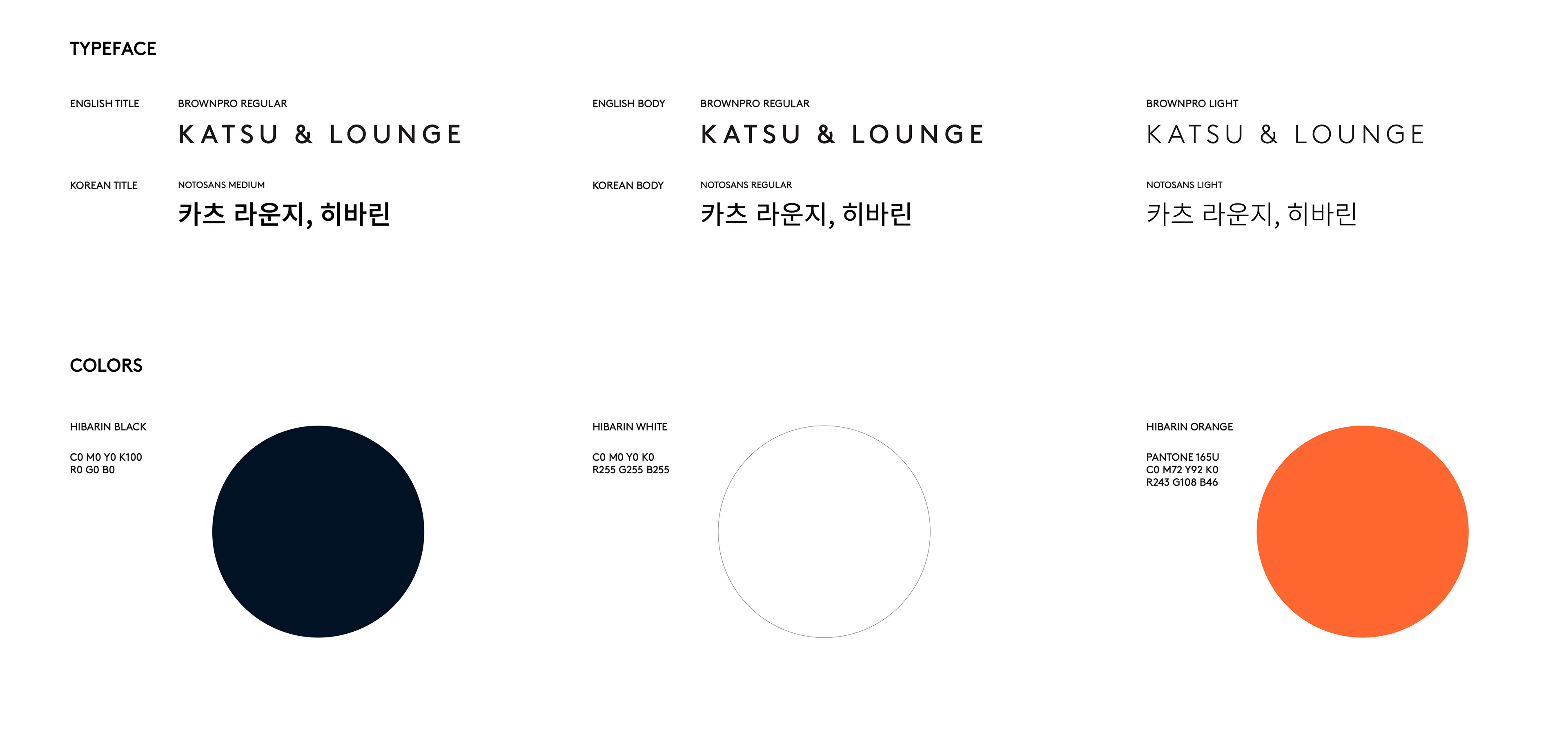
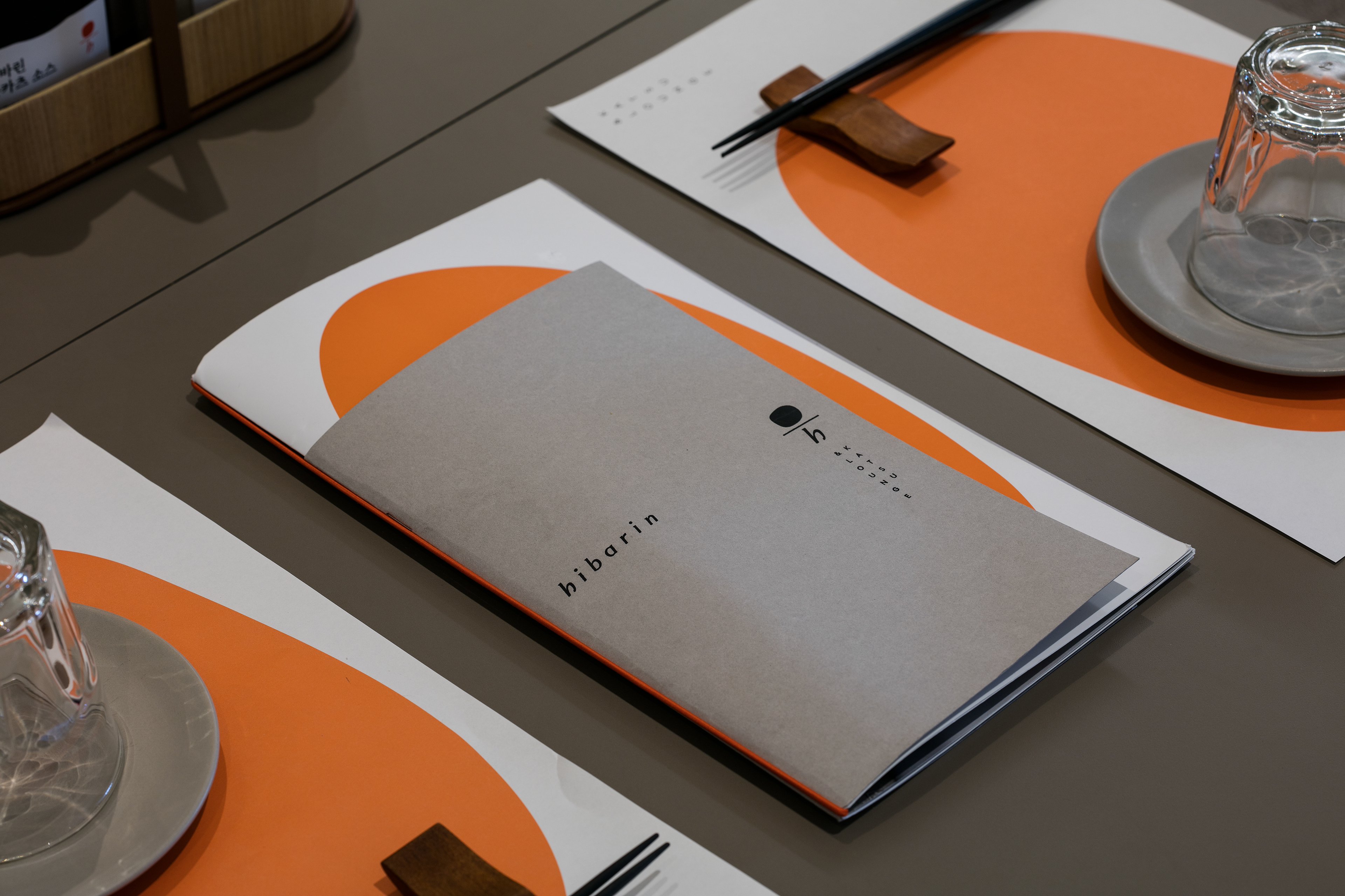
Hibarin's contemporary, defined by CFC, pursues a harmony between authenticity and modernity, refinedness and naturalness, elegance and comfort.
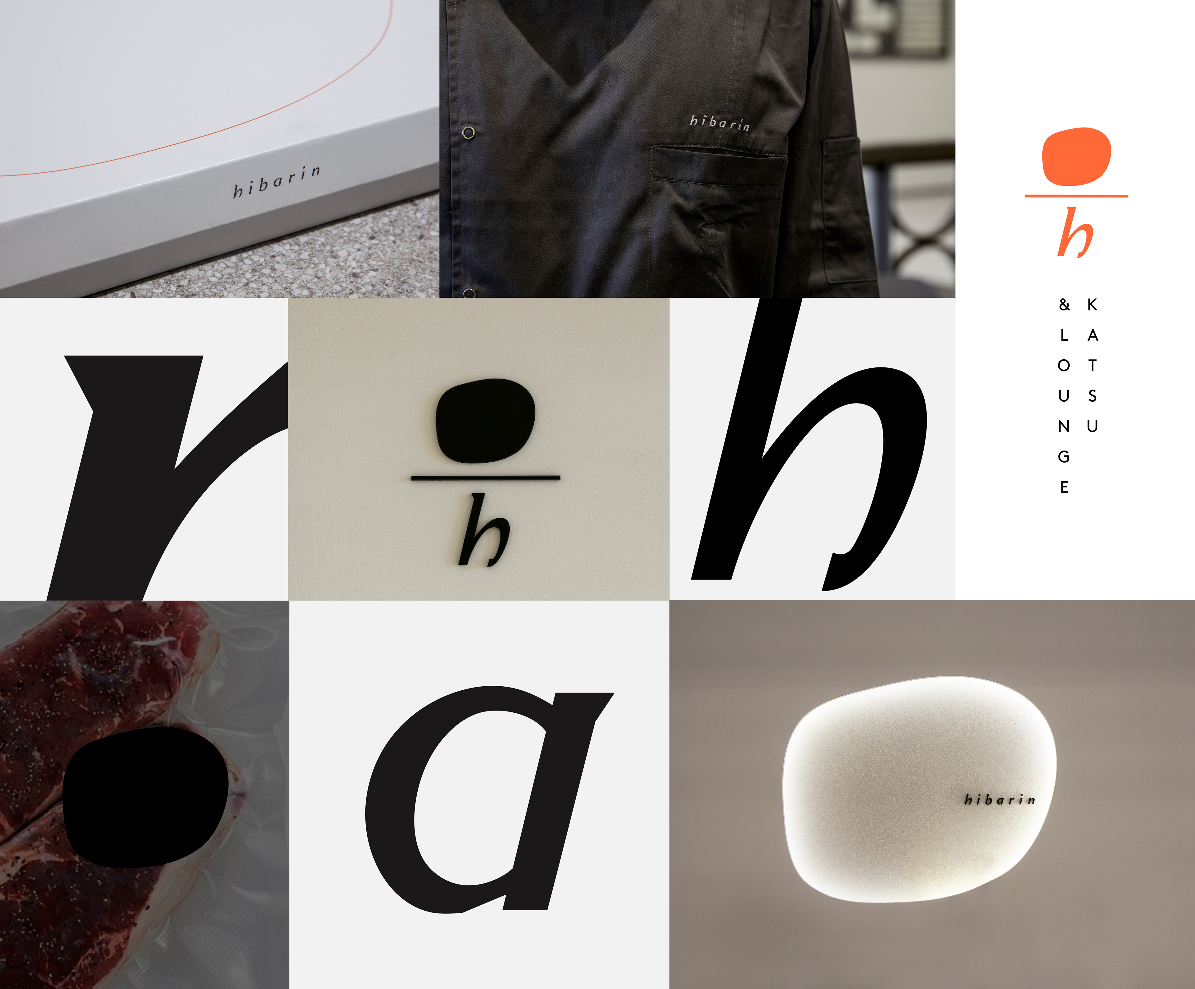
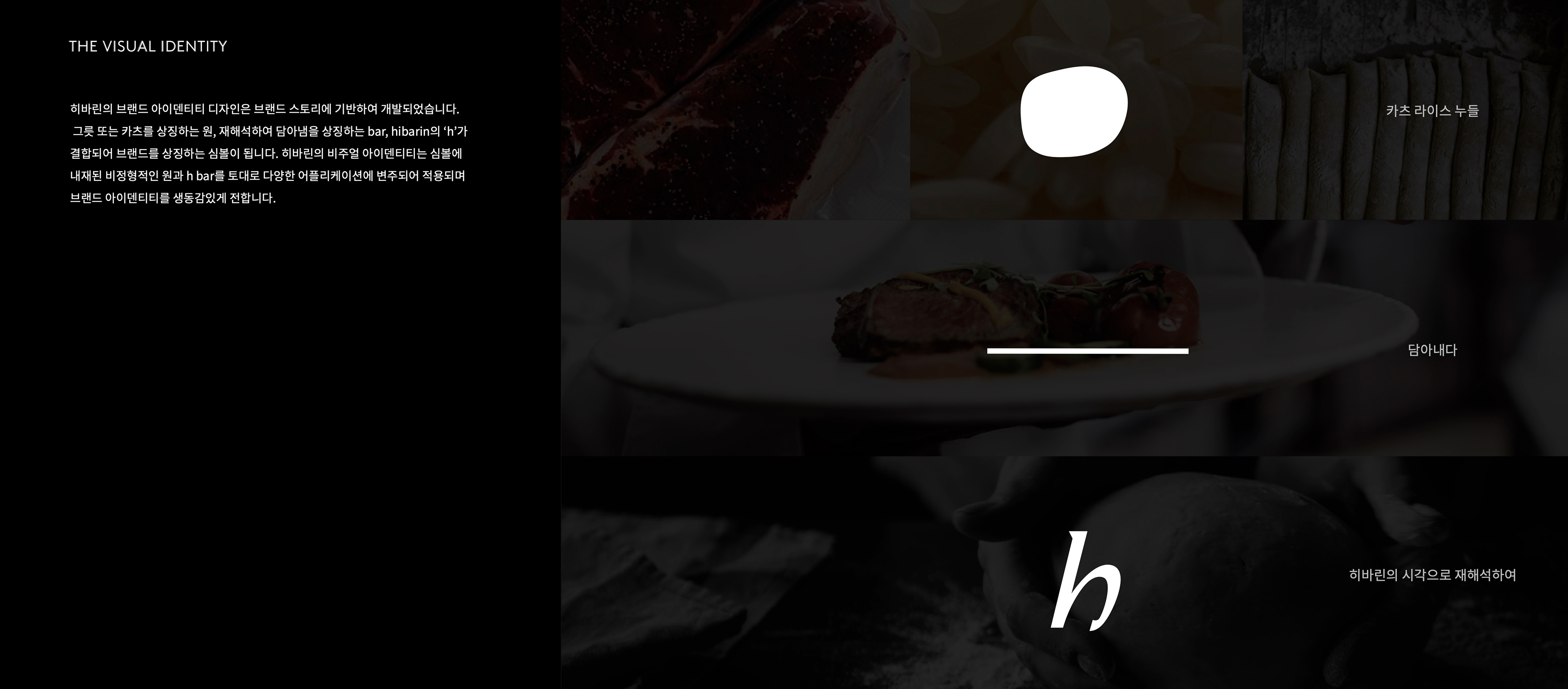
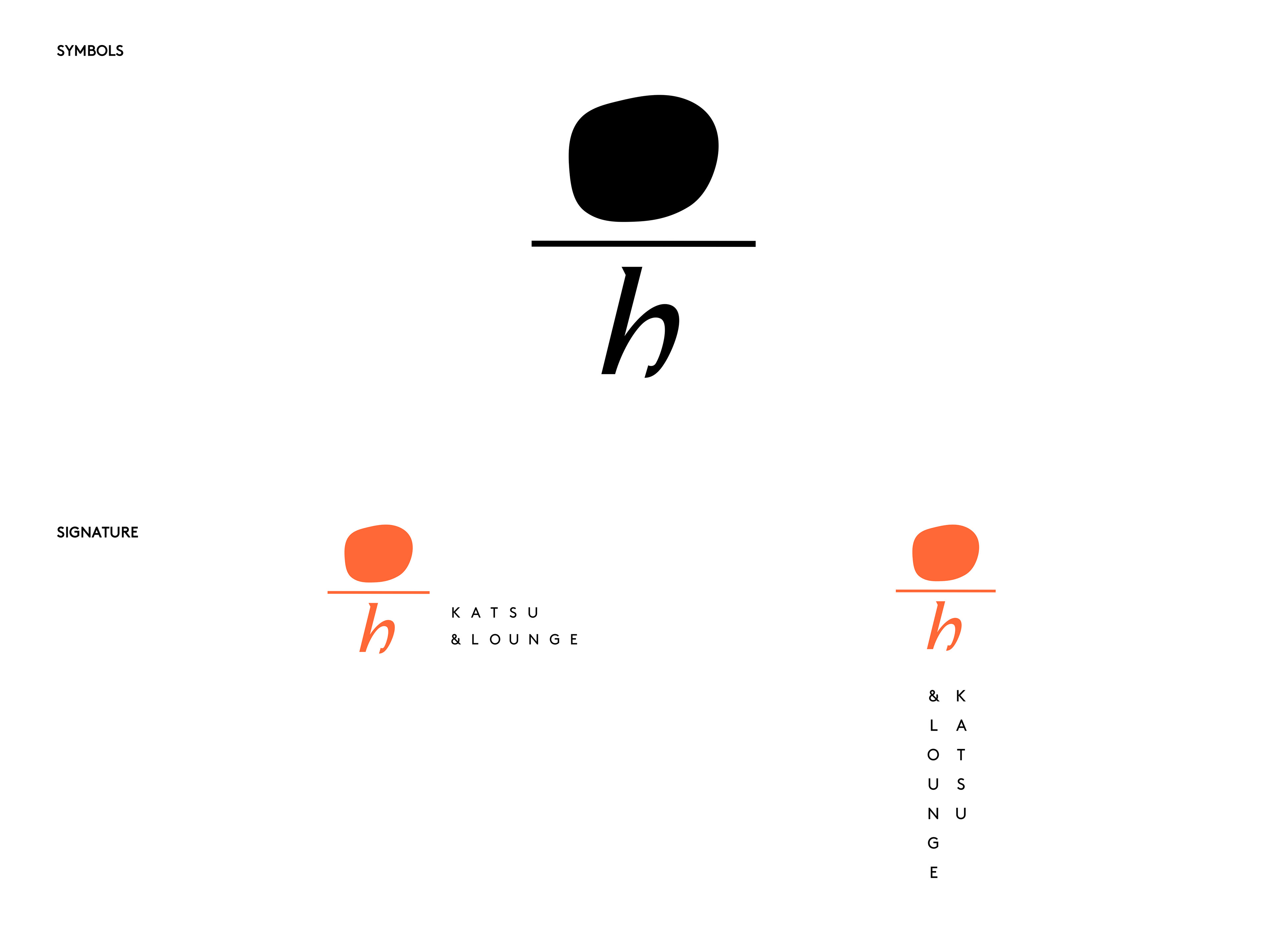
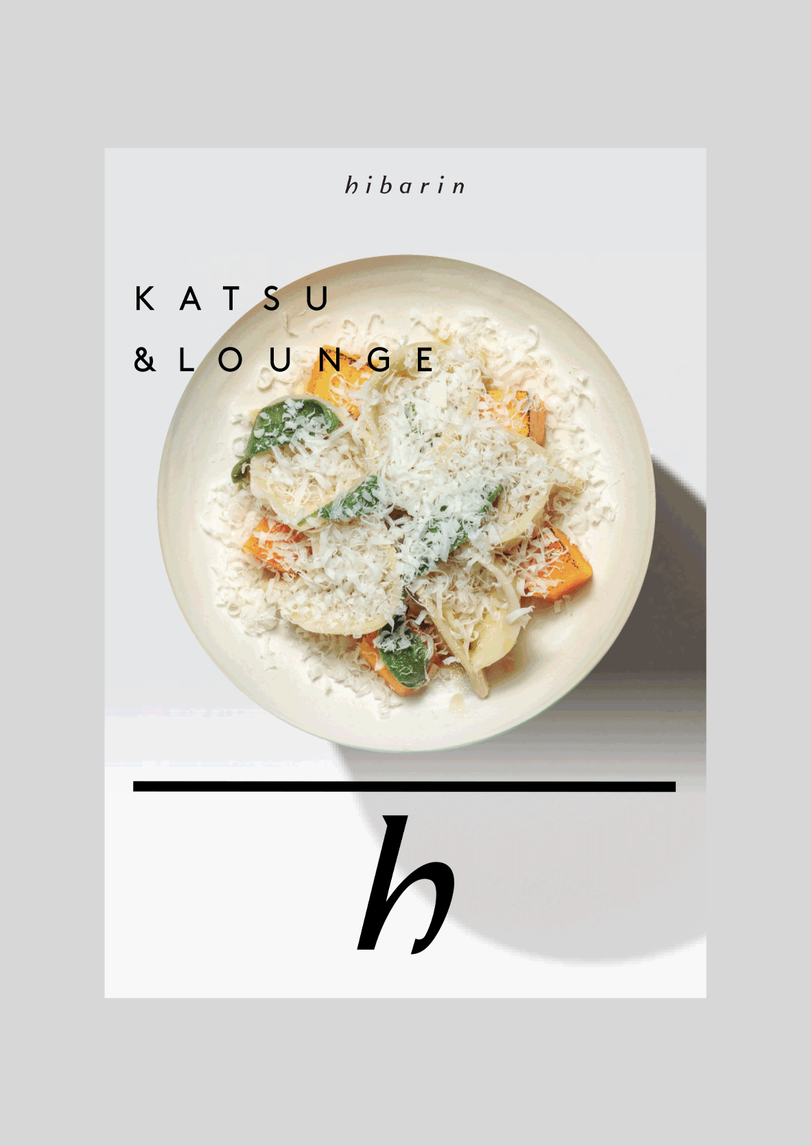
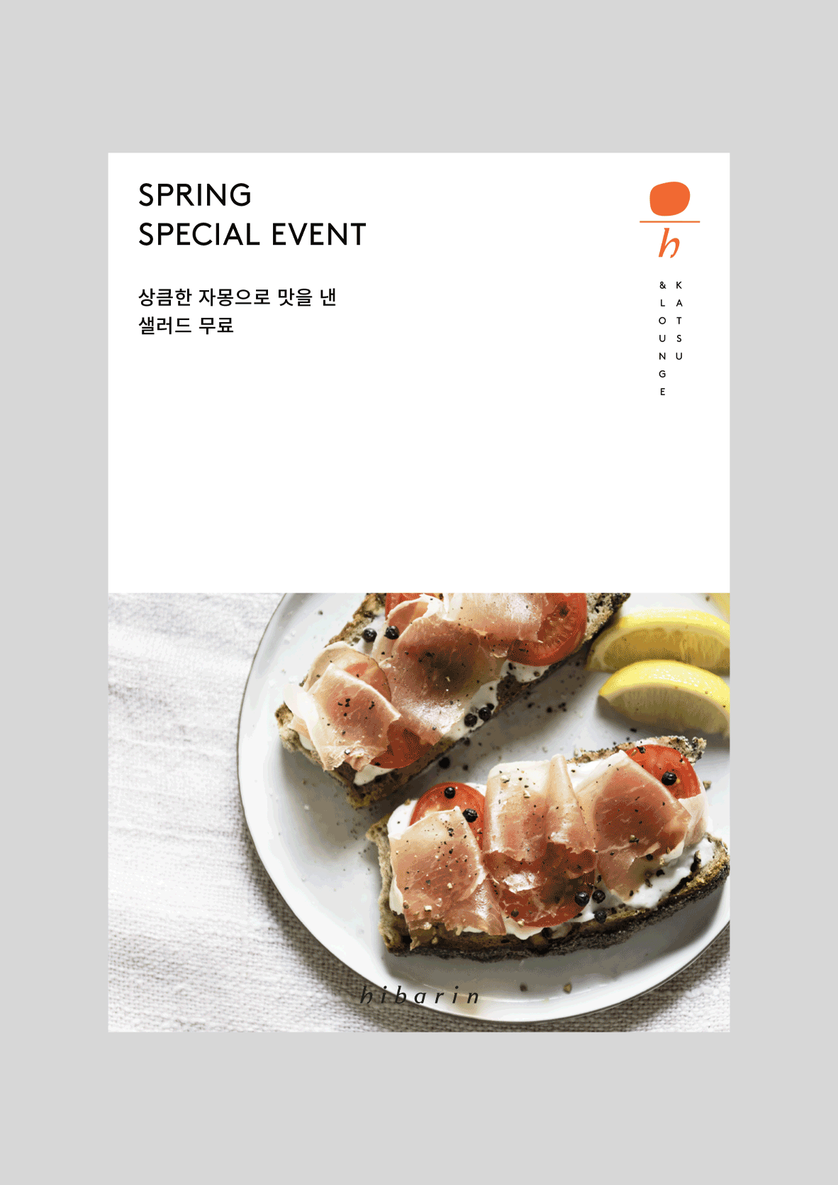
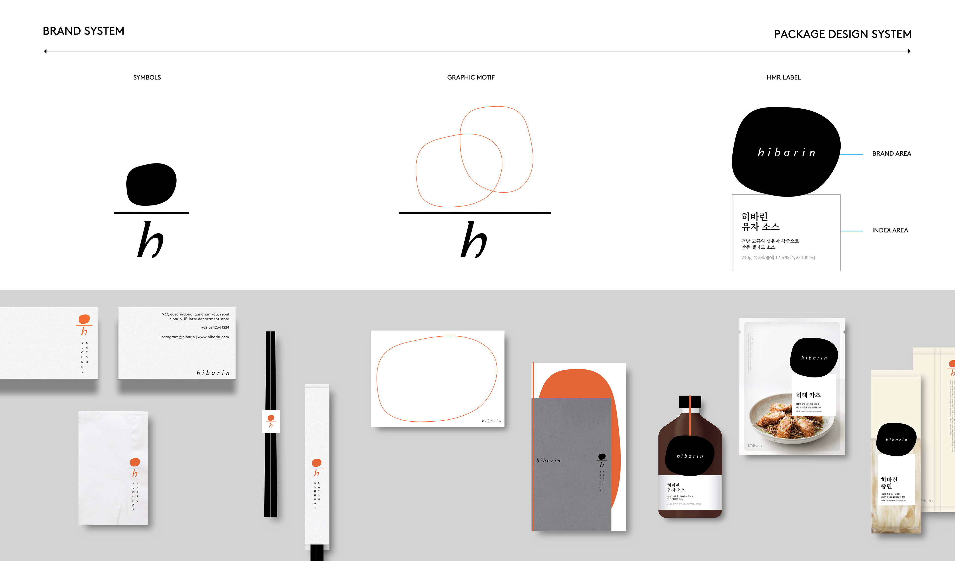
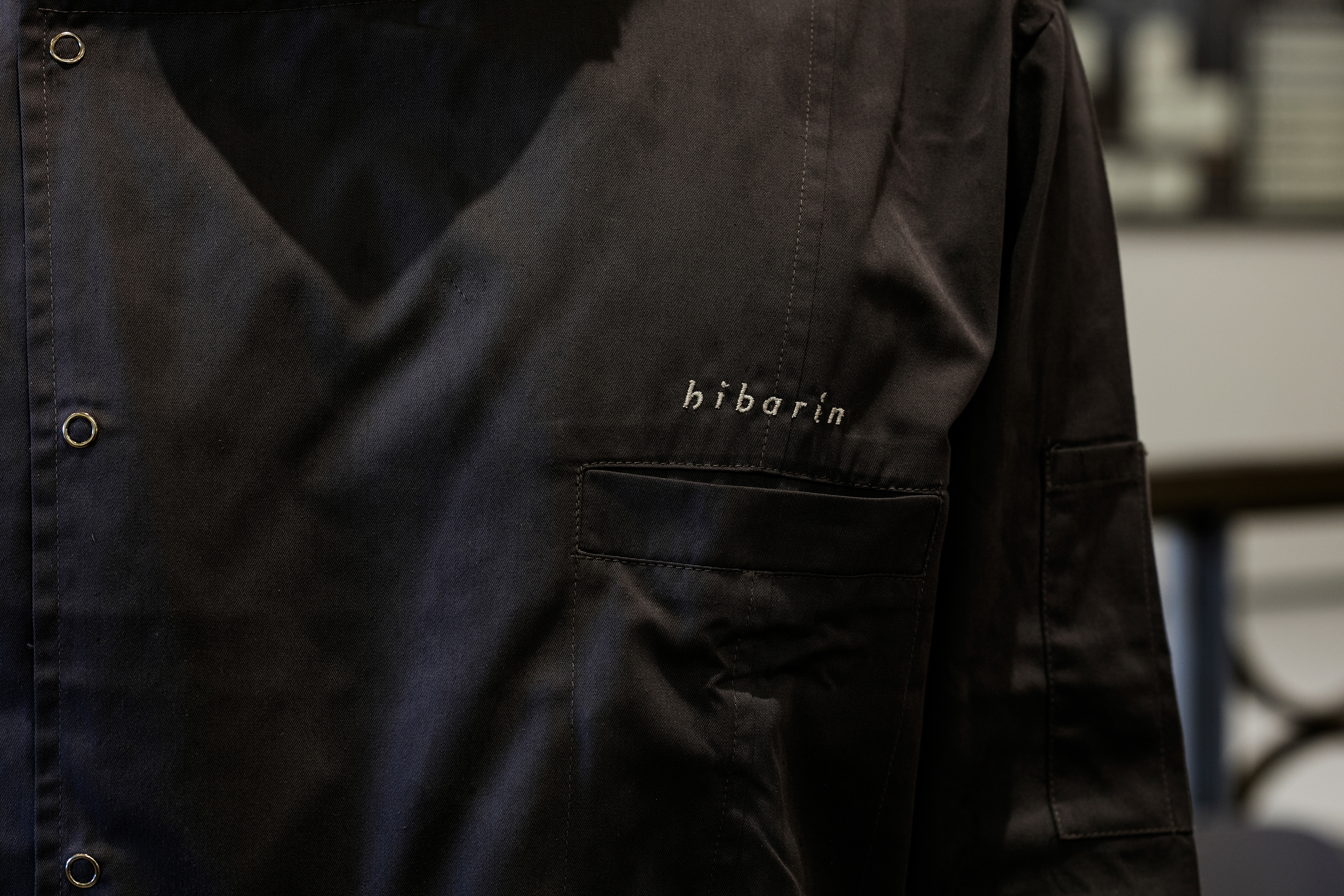
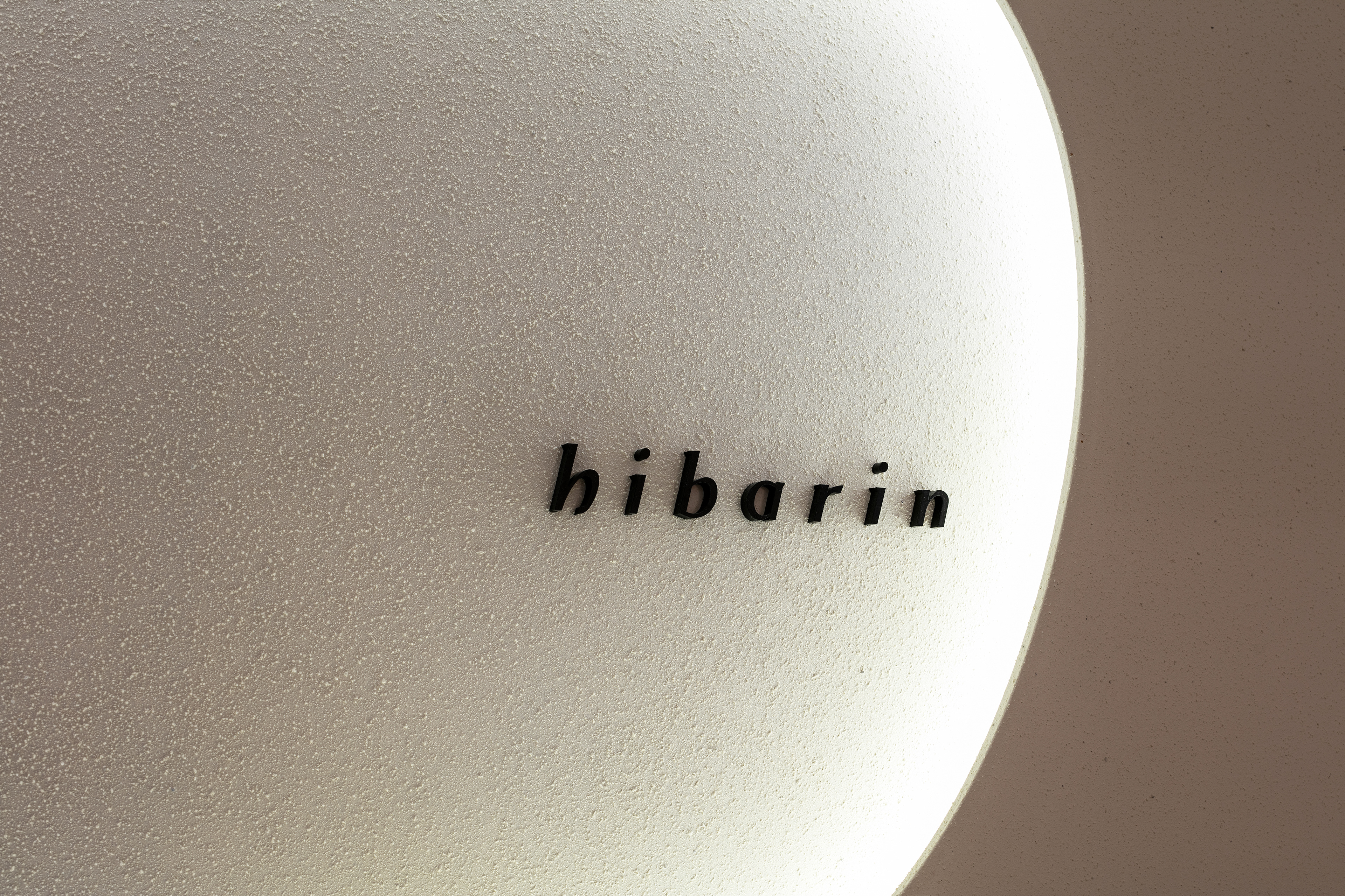
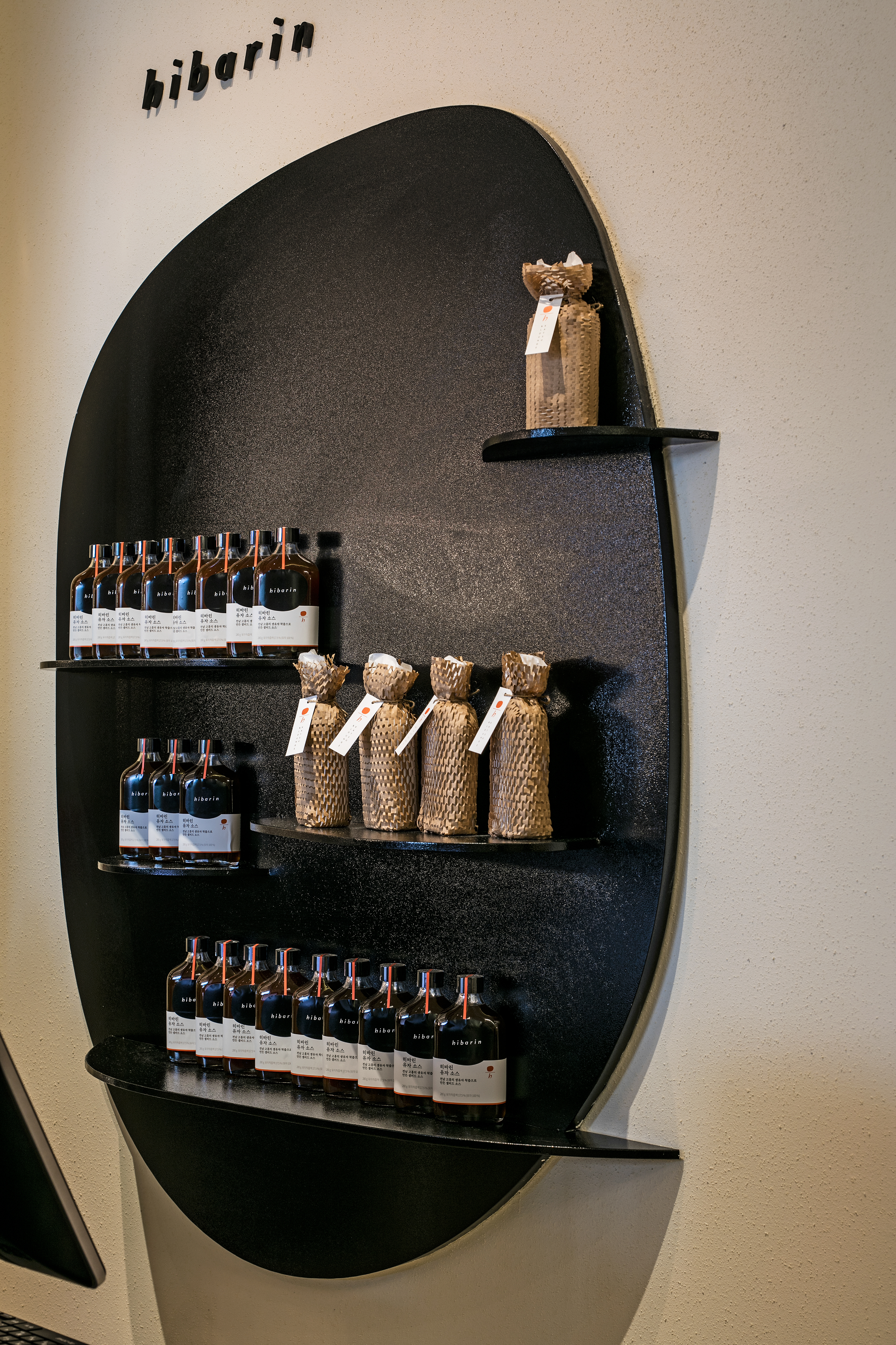
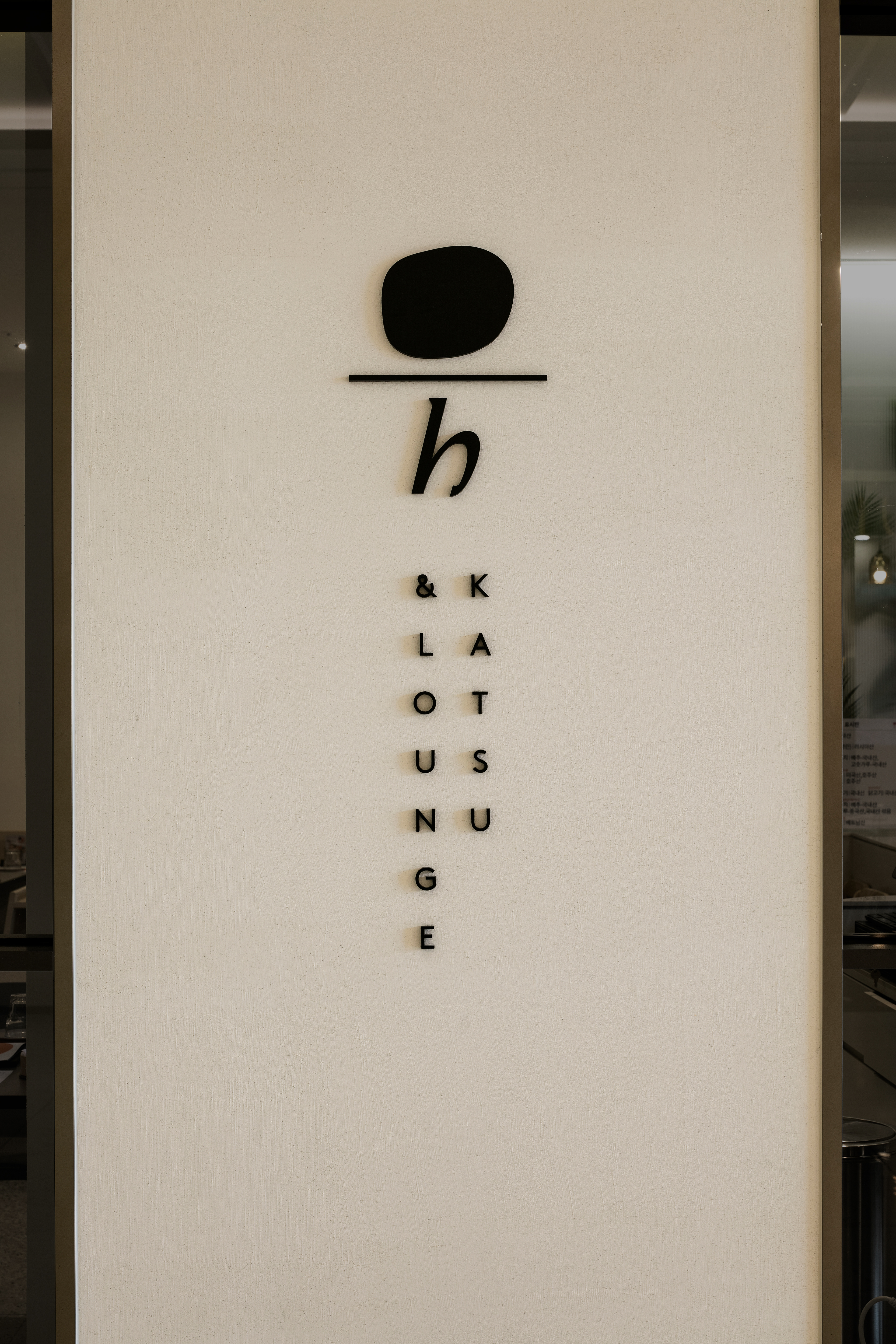
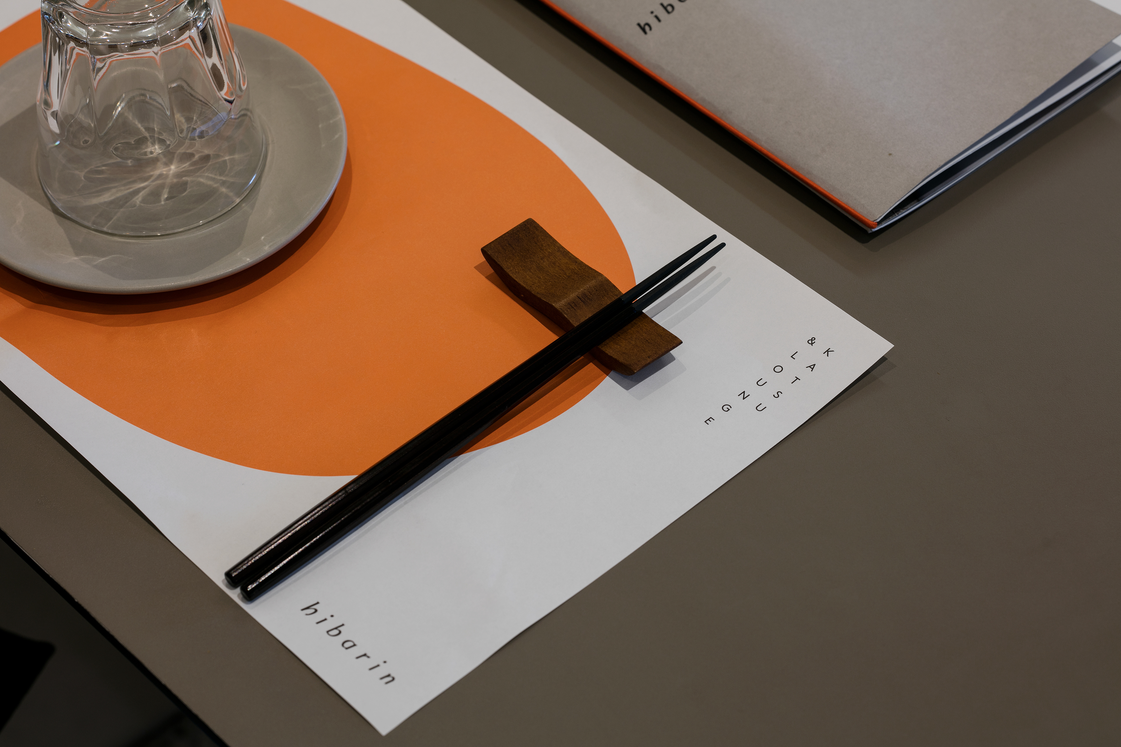
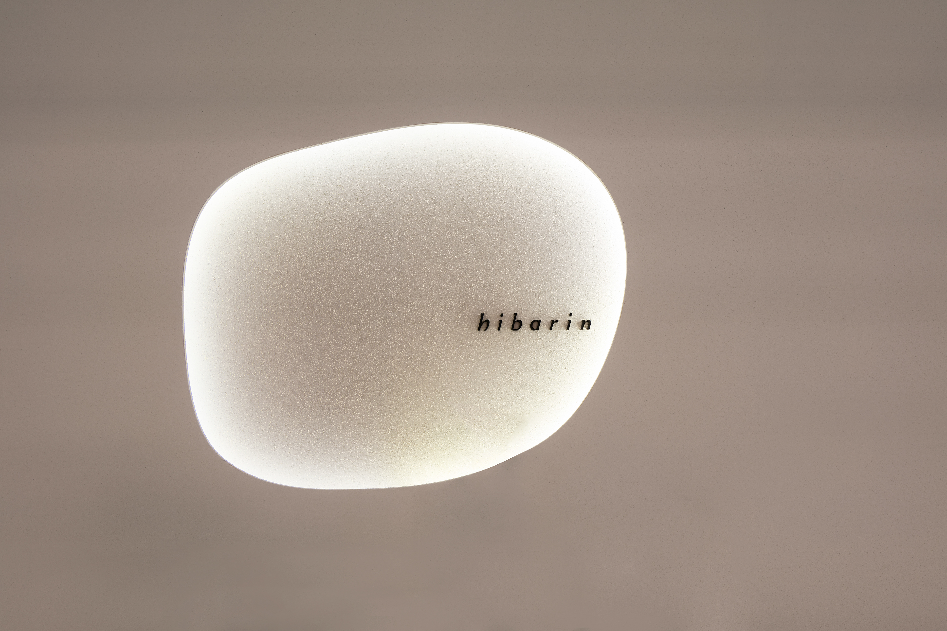
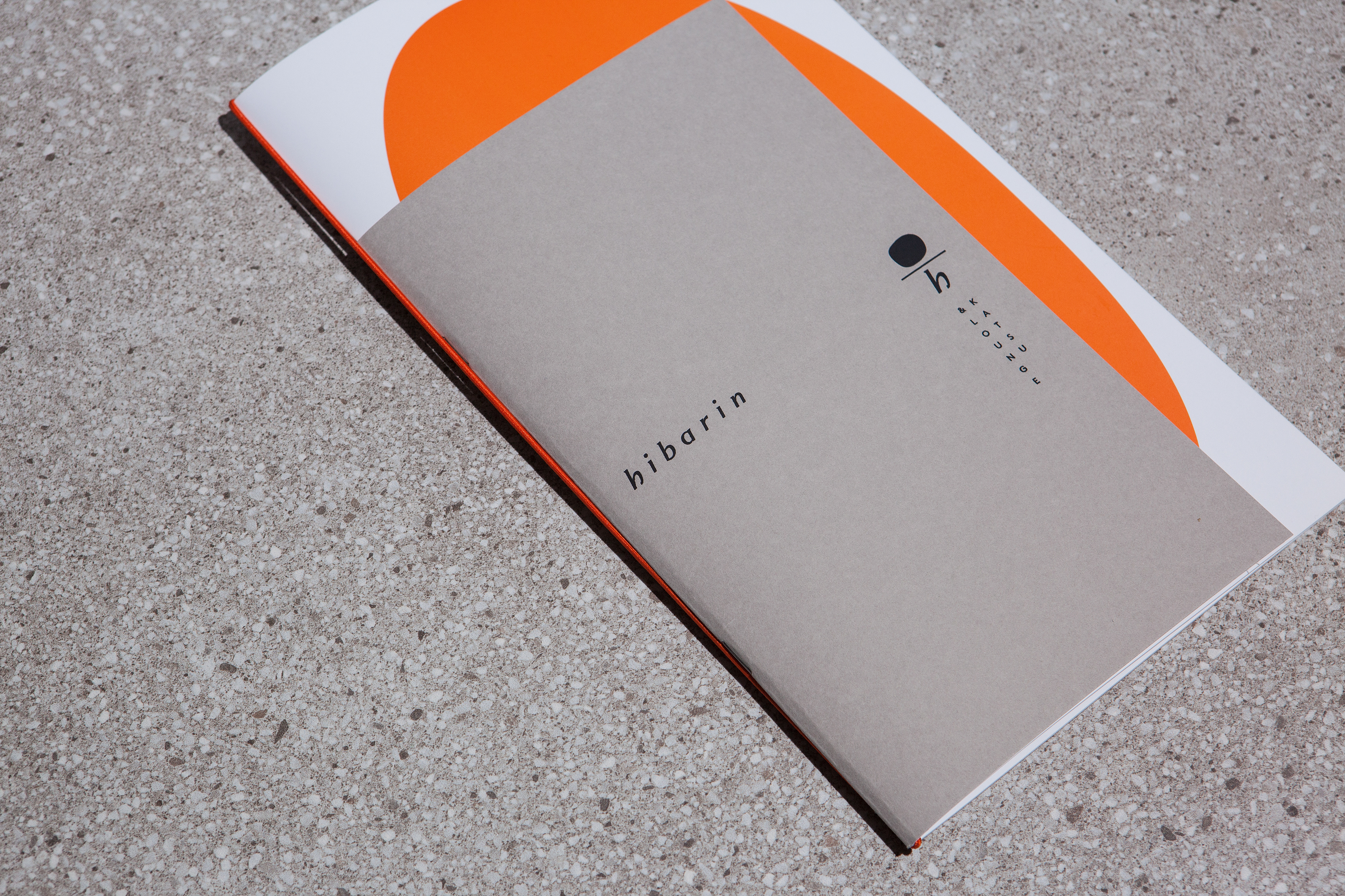
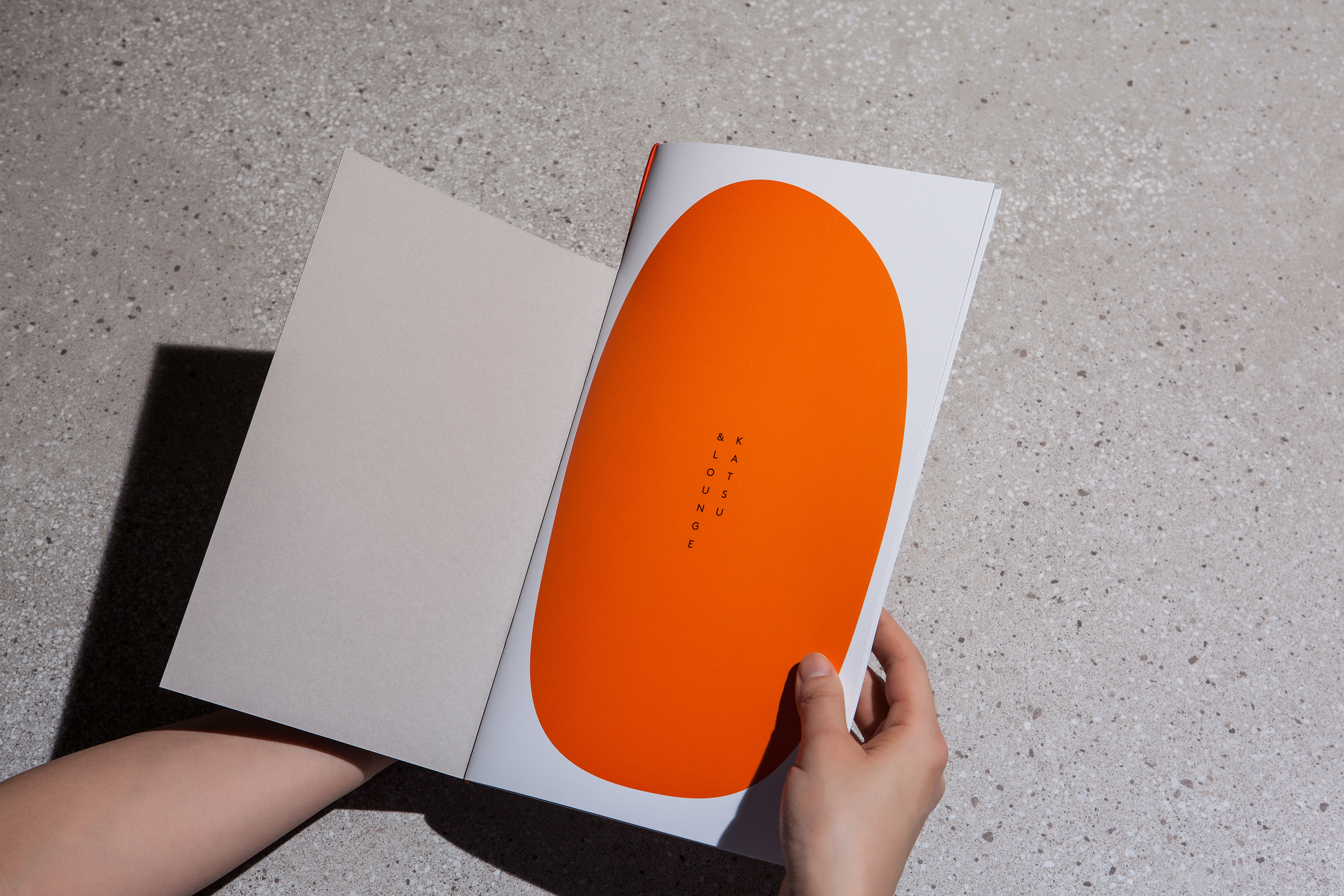
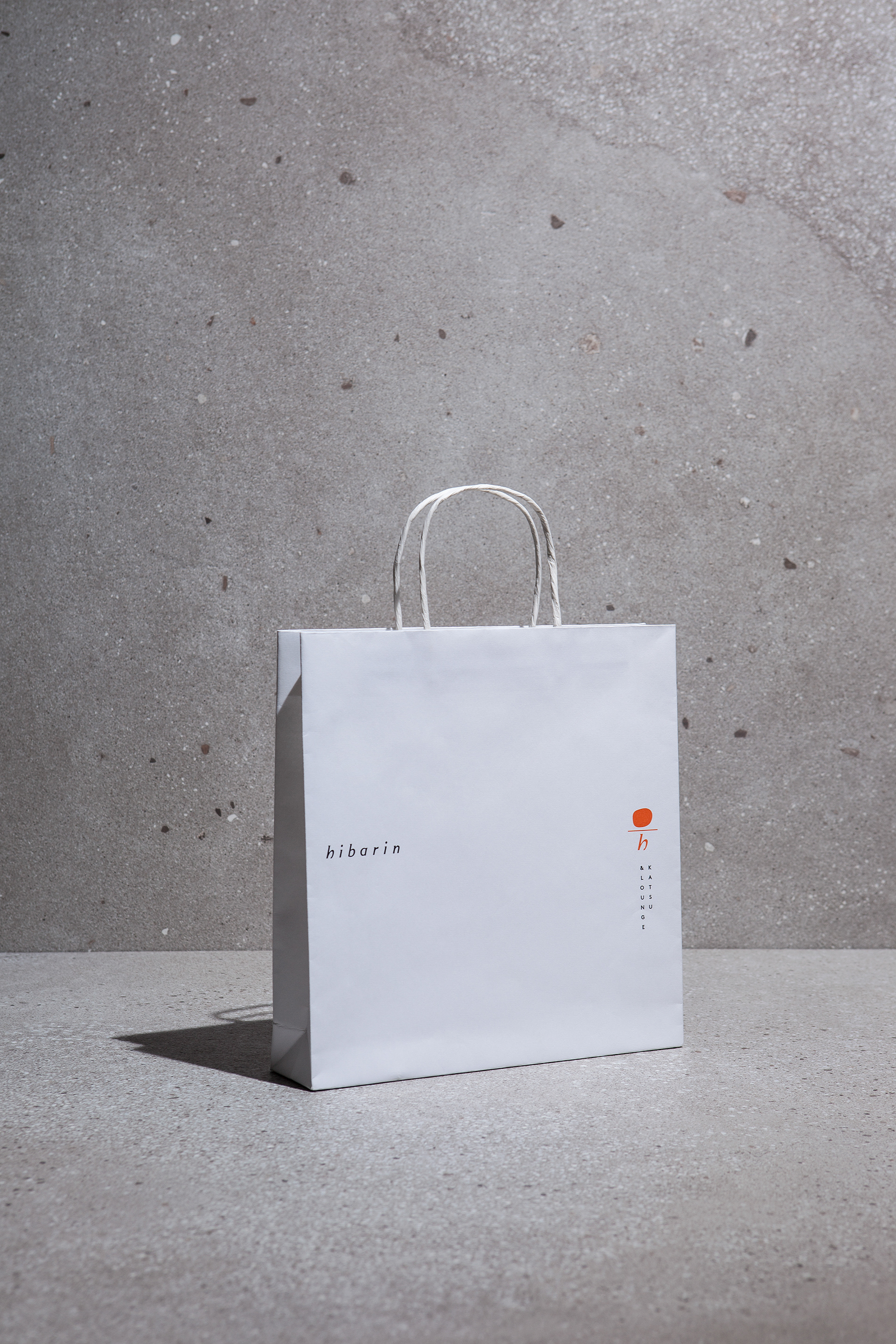
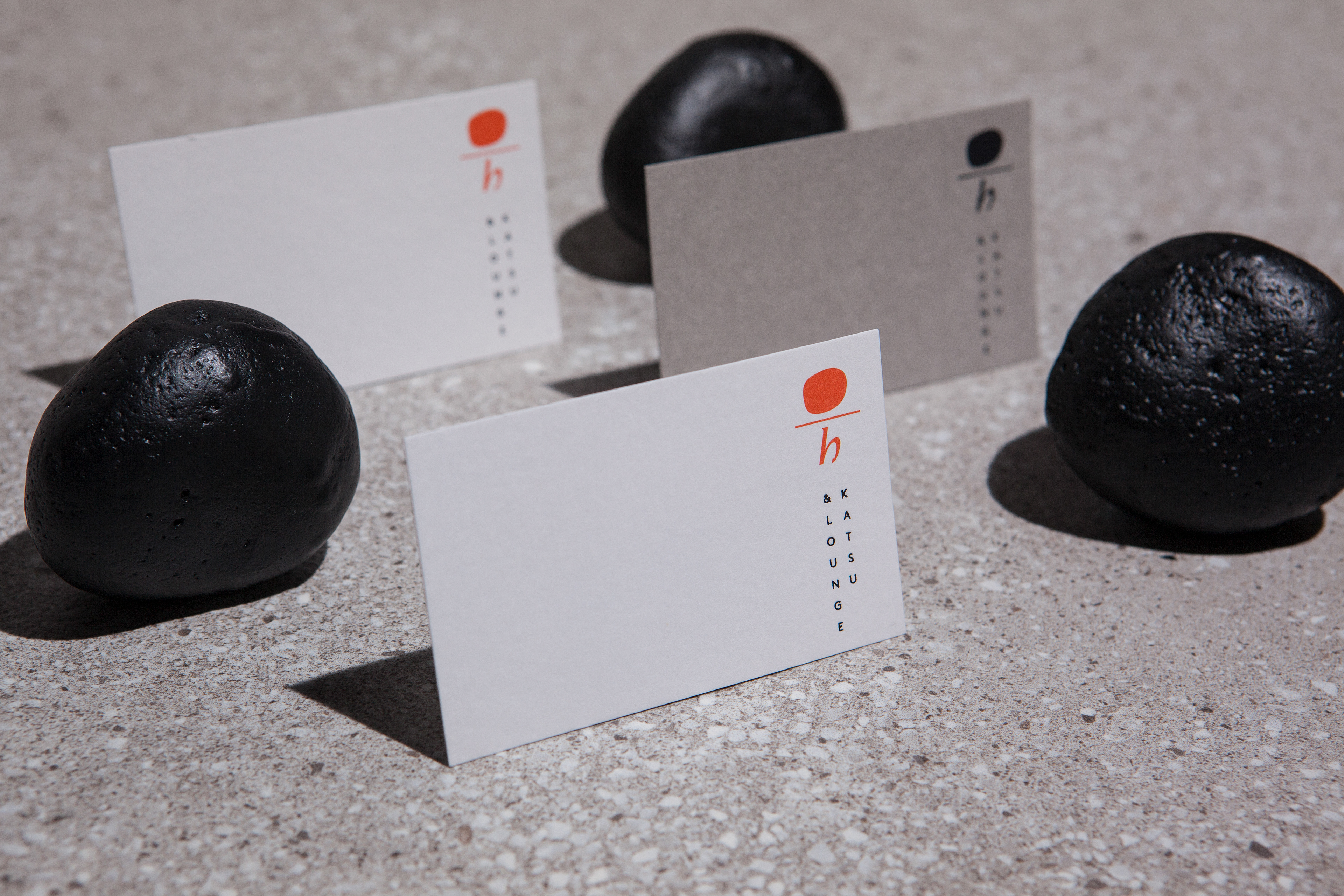
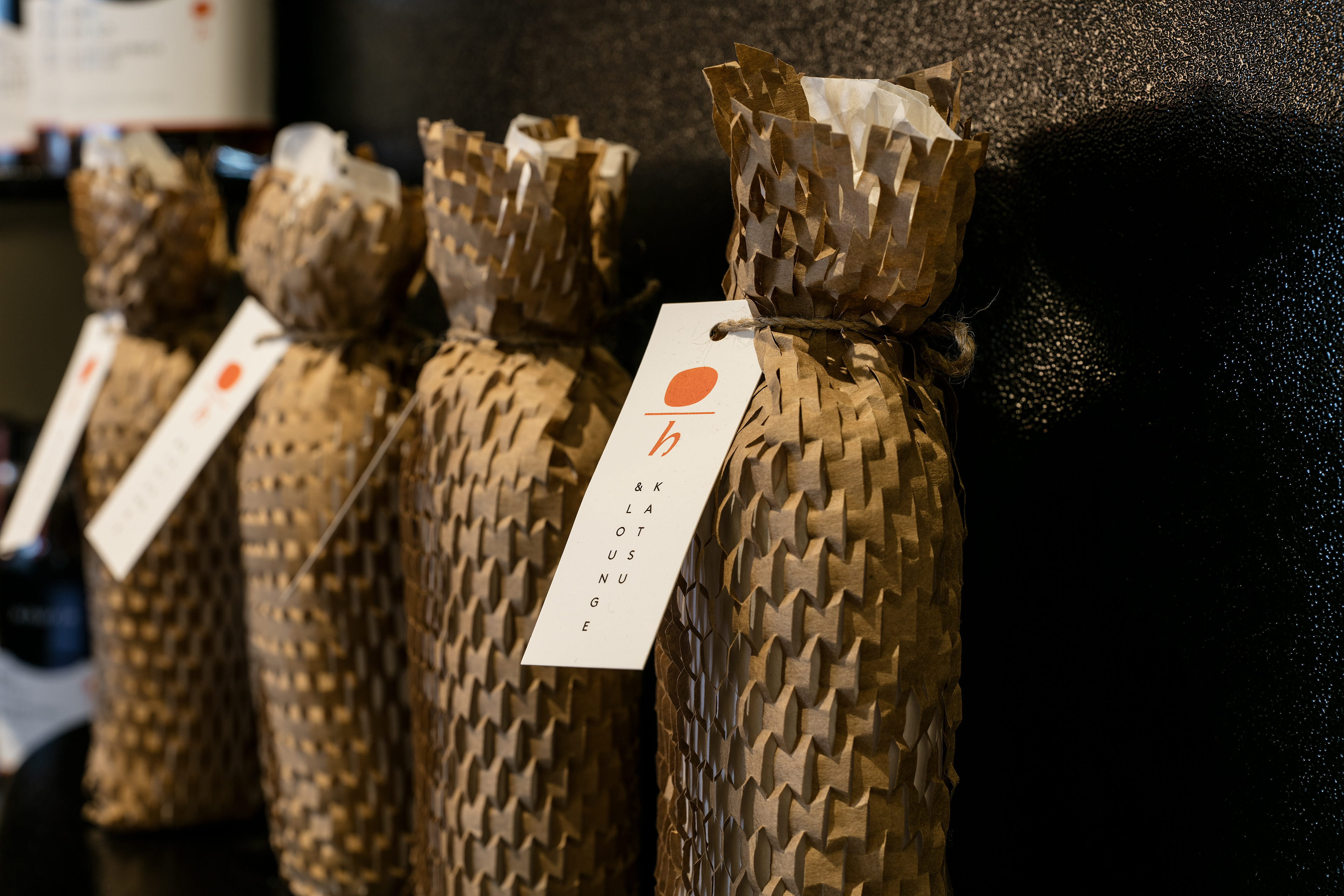
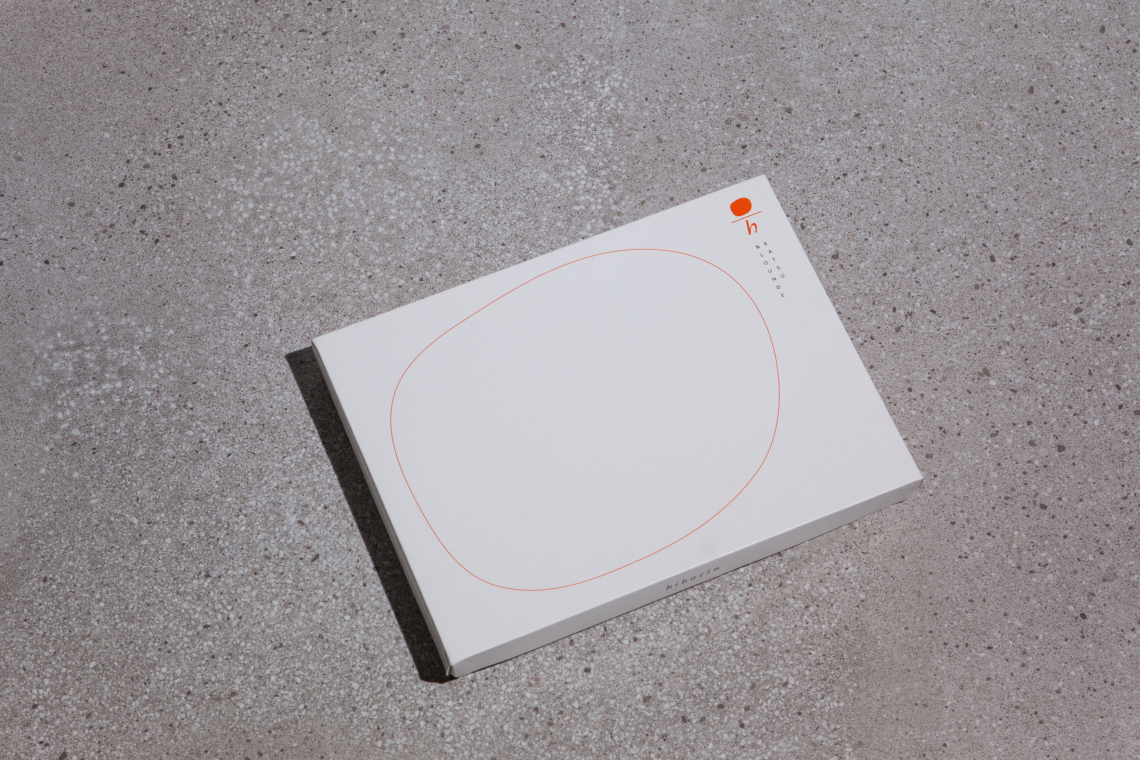
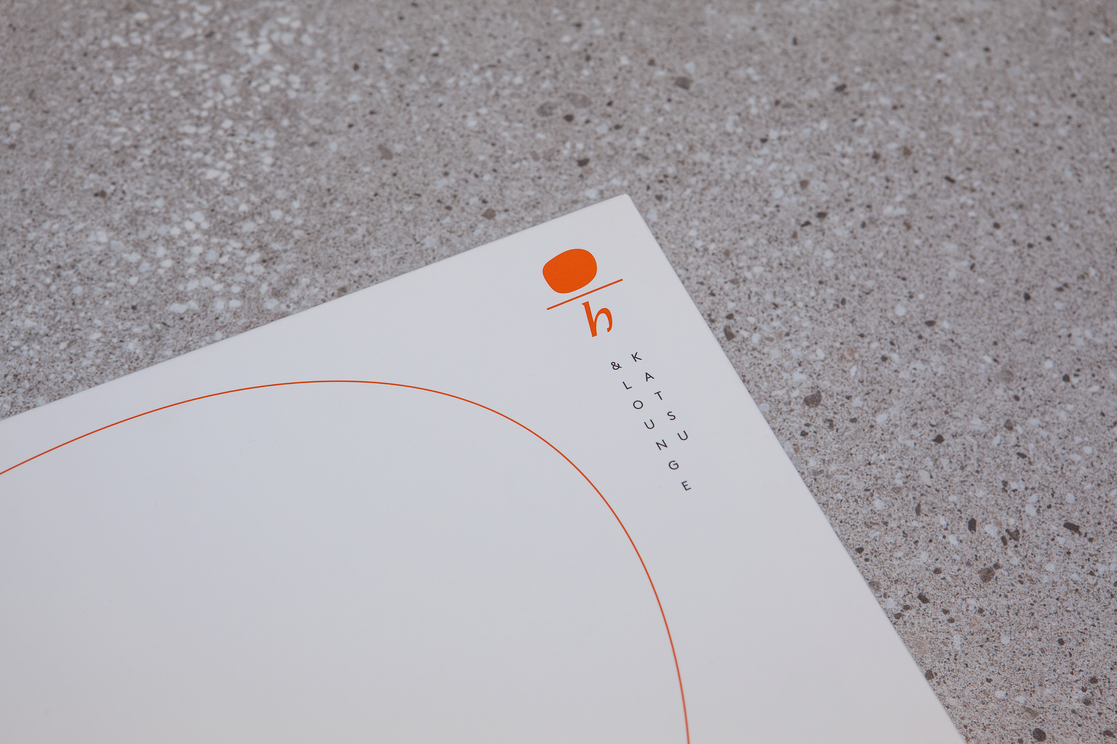
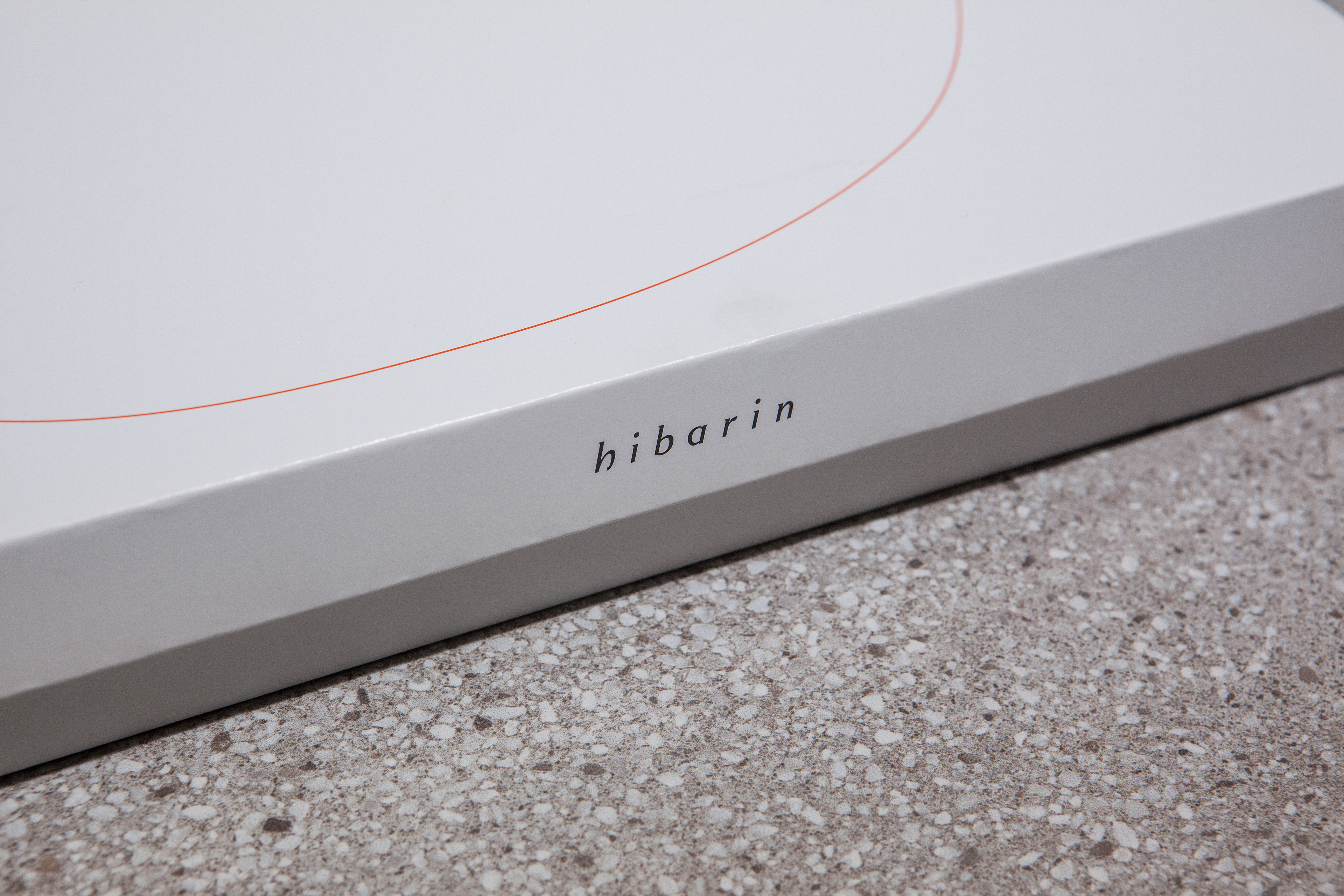
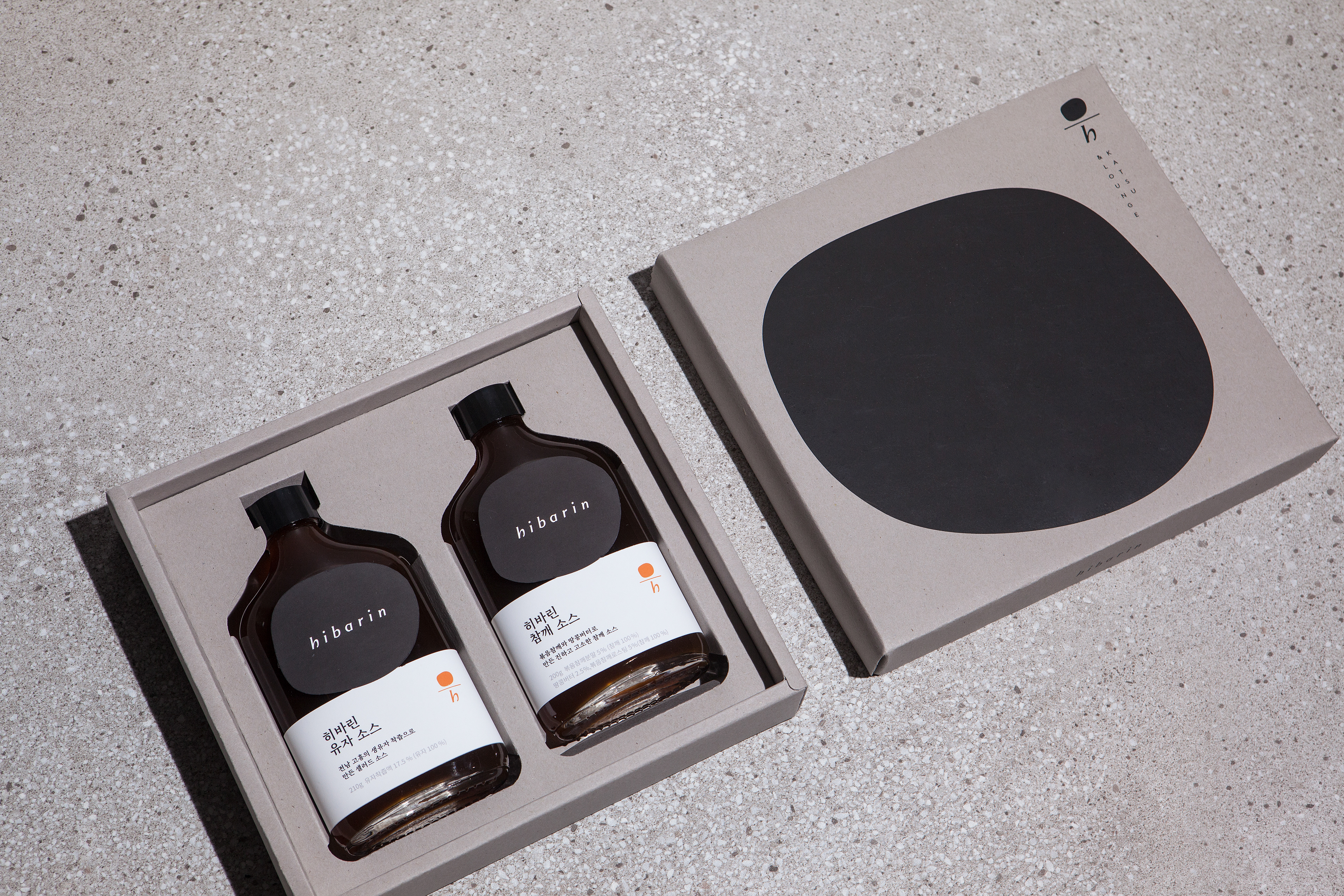
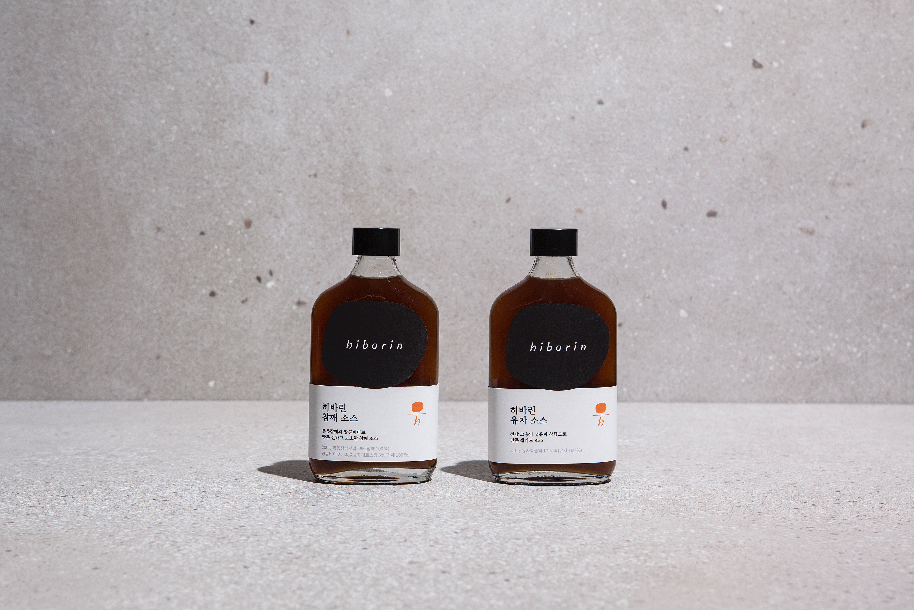
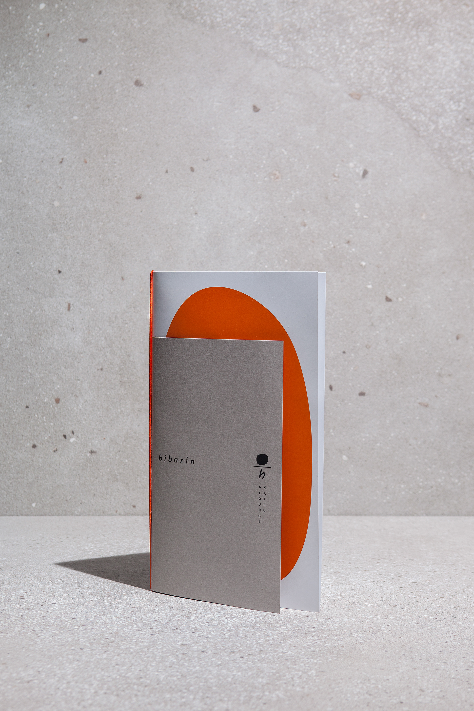
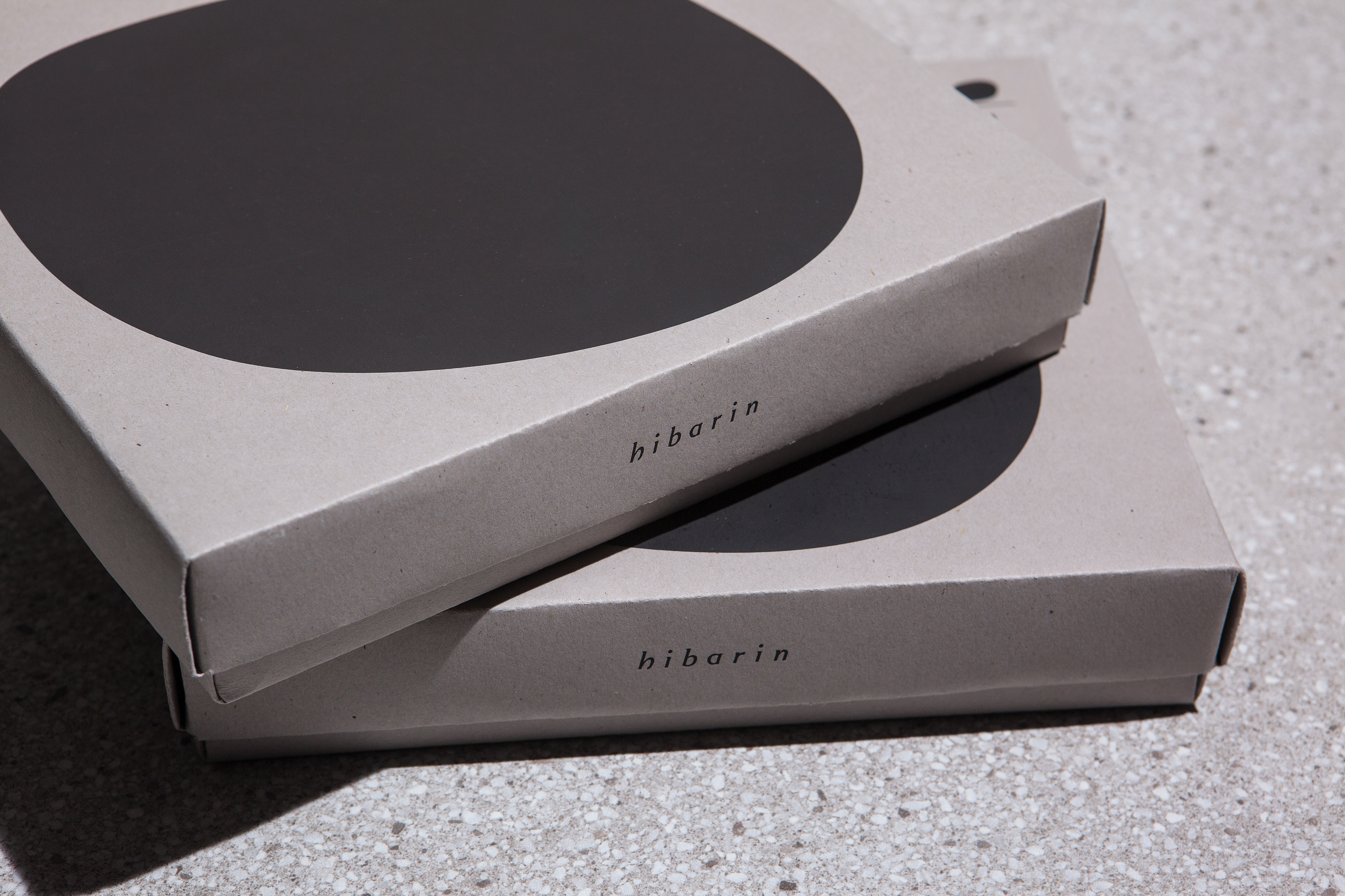
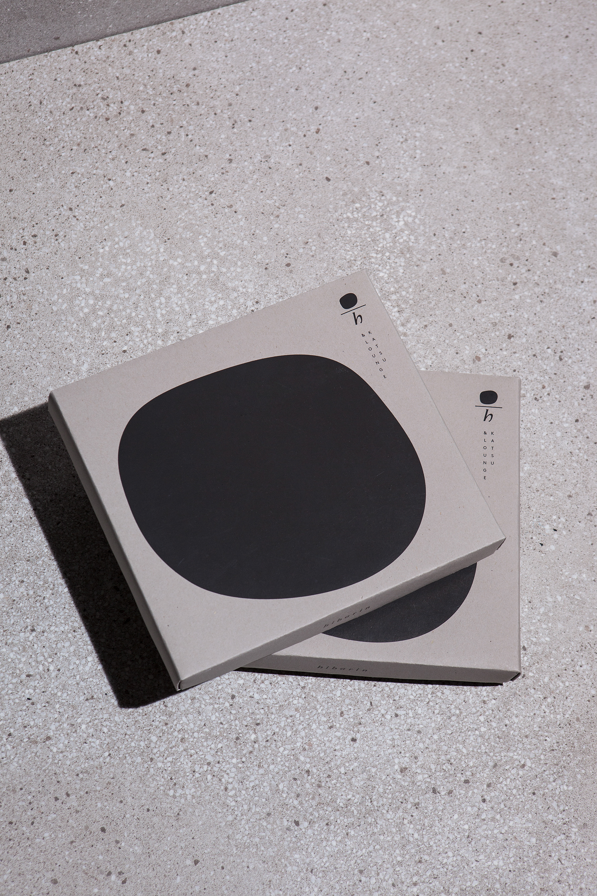
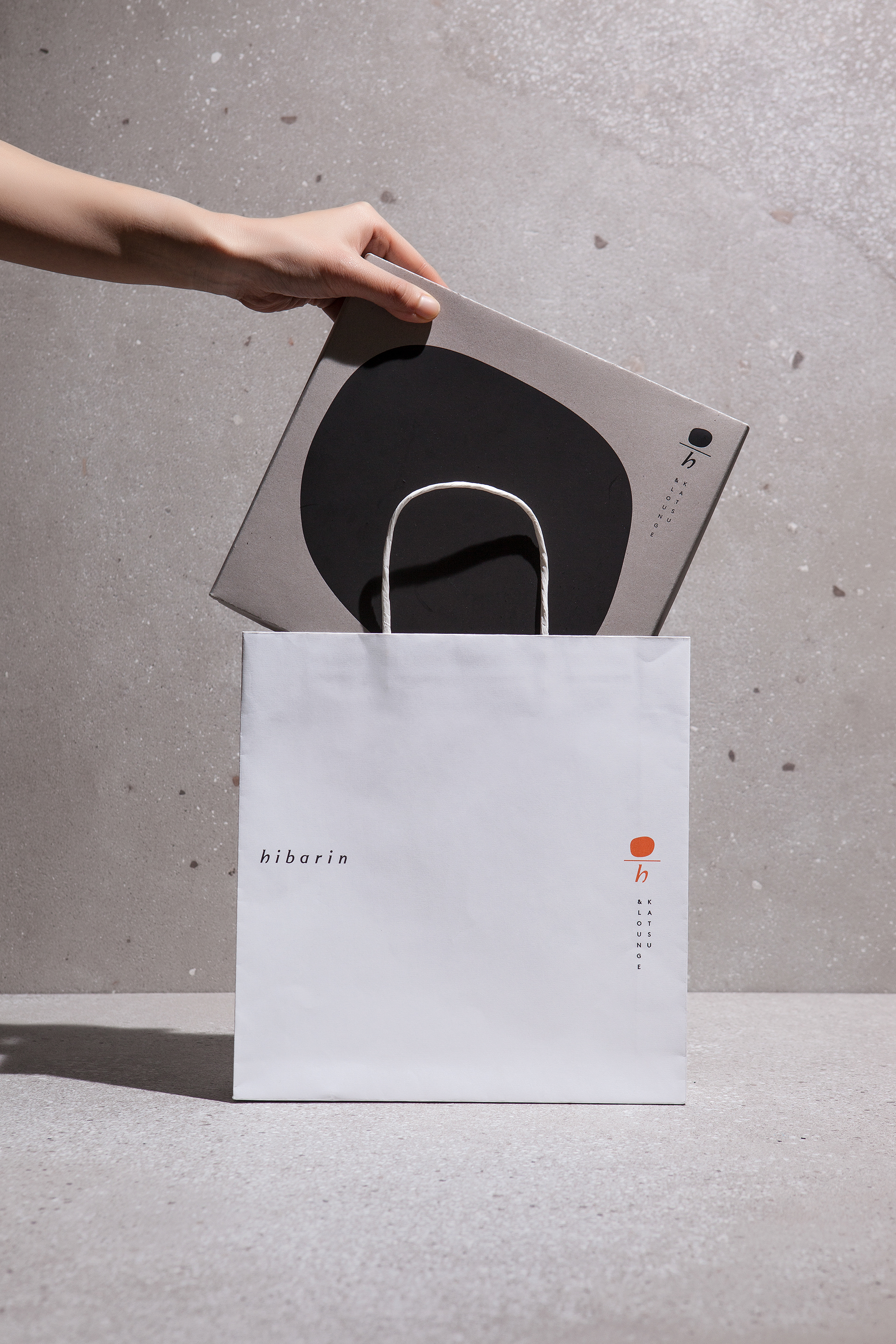
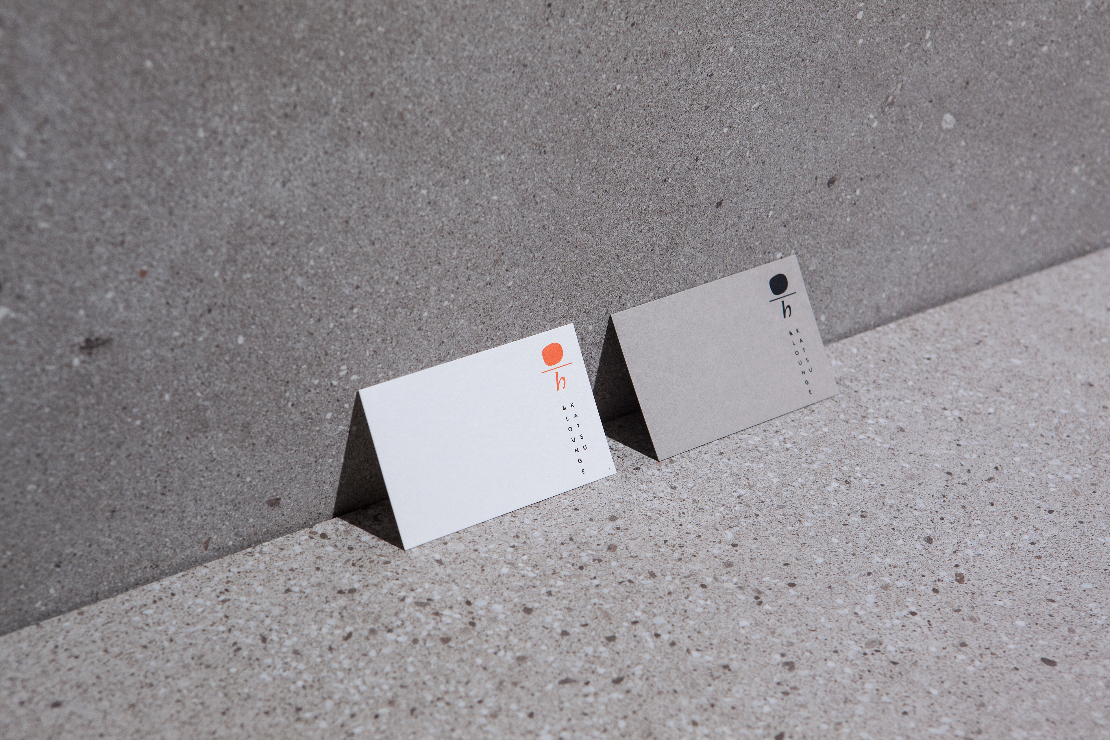
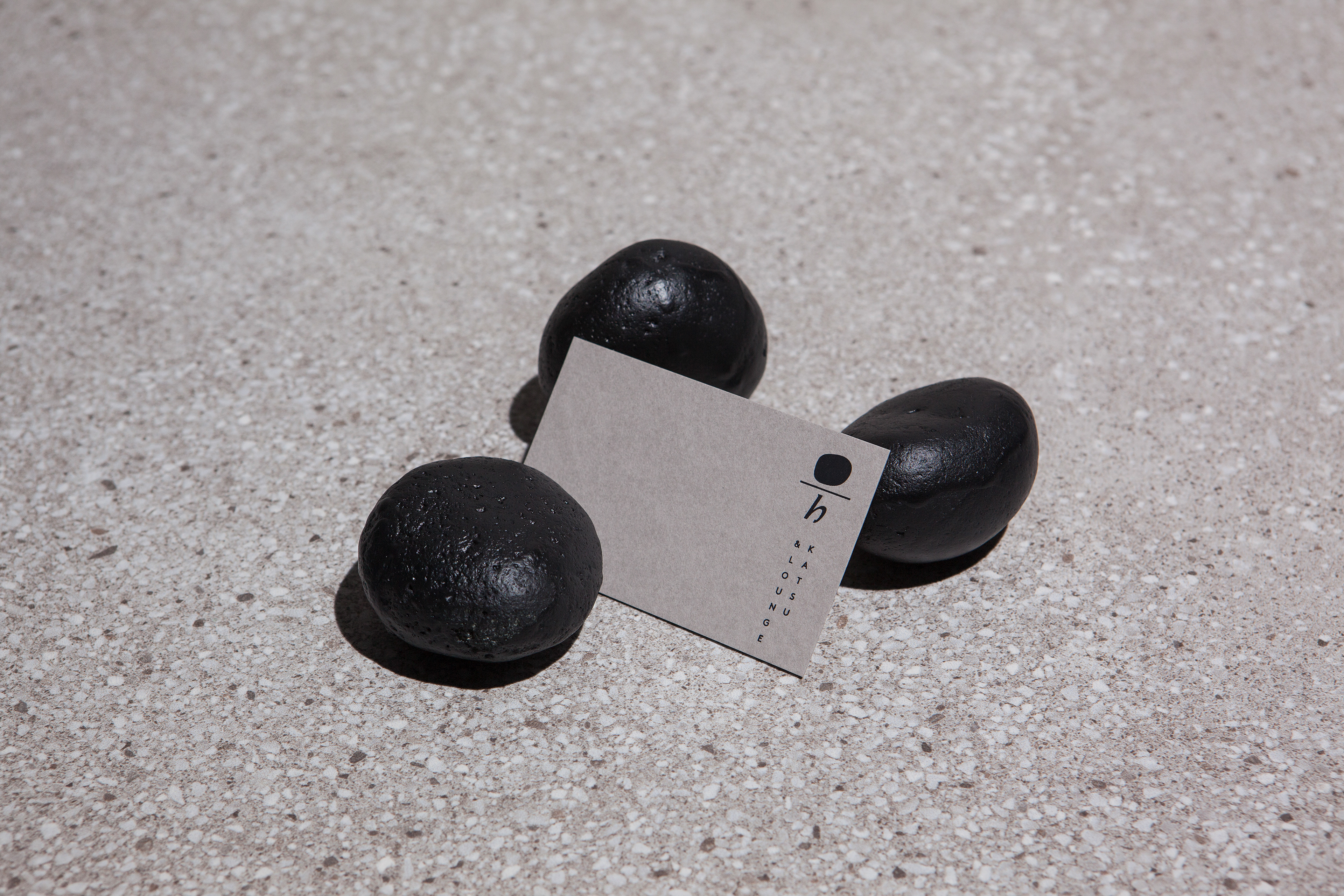
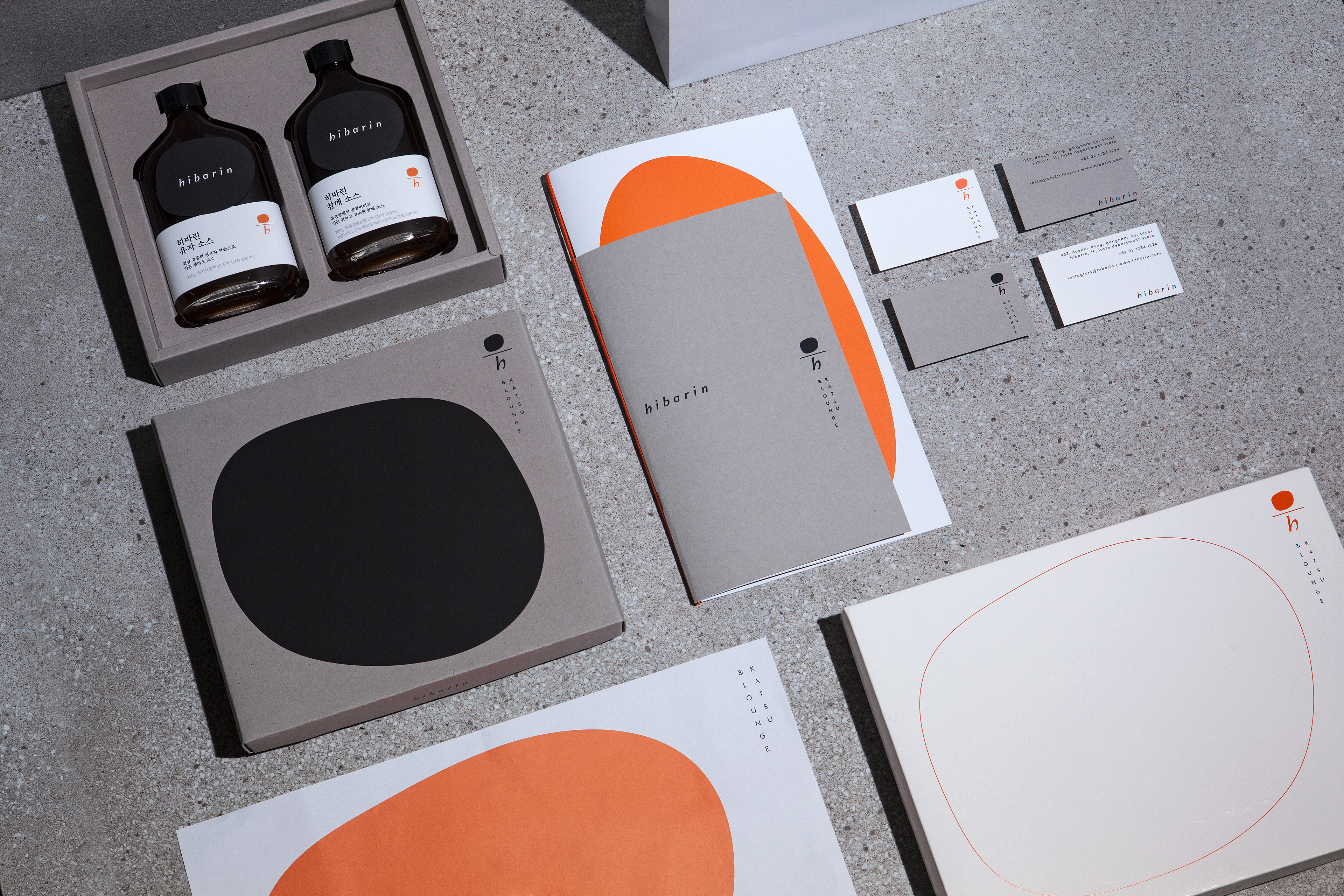
The symbol, combined with an atypical shape that metaphorizes thin and round meat, a horizontal line, and the'h' of Hibarin, means Hibarin's reinterpretation of various dishes. The wordmark and tagline, with an oriental beauty, convey an refined impression with its elegant form. The round shape of the symbol is expanded and used as a graphic motif in various items, and in HMR products, it is responsible for a unique type of label.

Hibarin Brand Identity Development
2020
Client: Kalisco
Project Team
Brand Concept & Tagline: STNDRD
Design Concept & Visual Identity: CFC
-
CFC
Art Direction & Design: Charry Jeon
Design: Saerom Kang
Assist: Minsun Lee, Jeongmoon Choi
Photography: Kiwoong Hong
www.contentformcontext.com