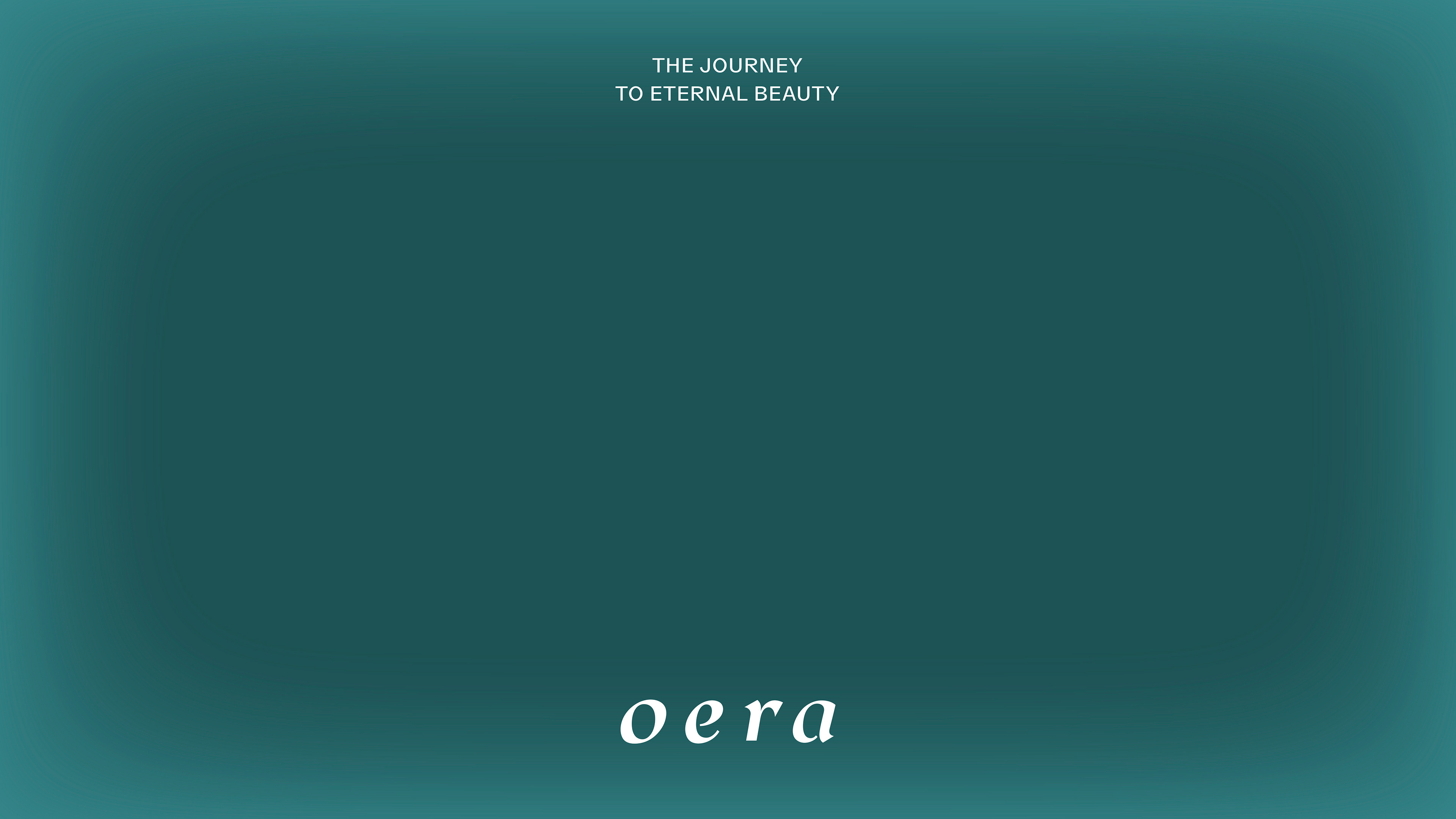
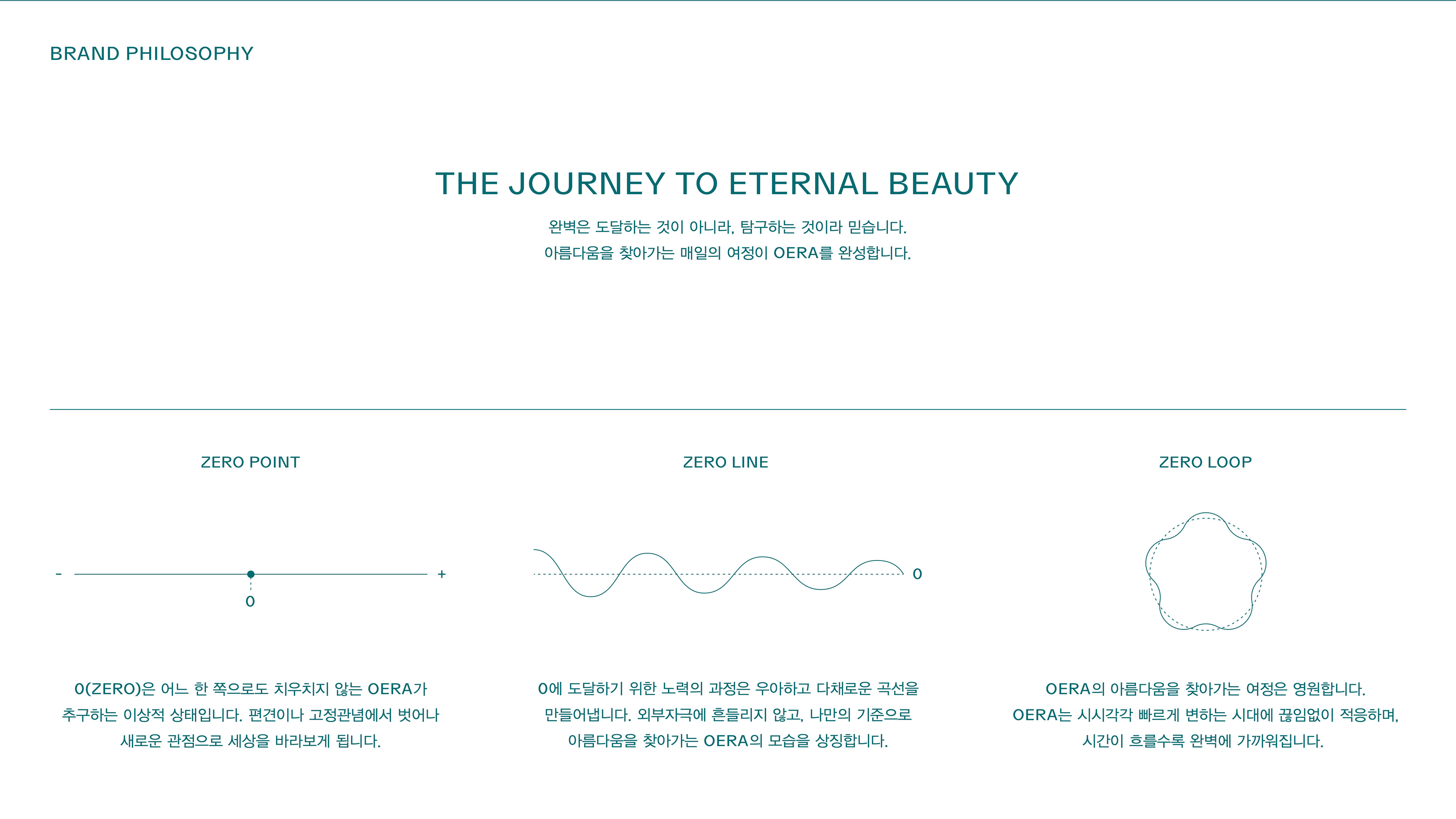
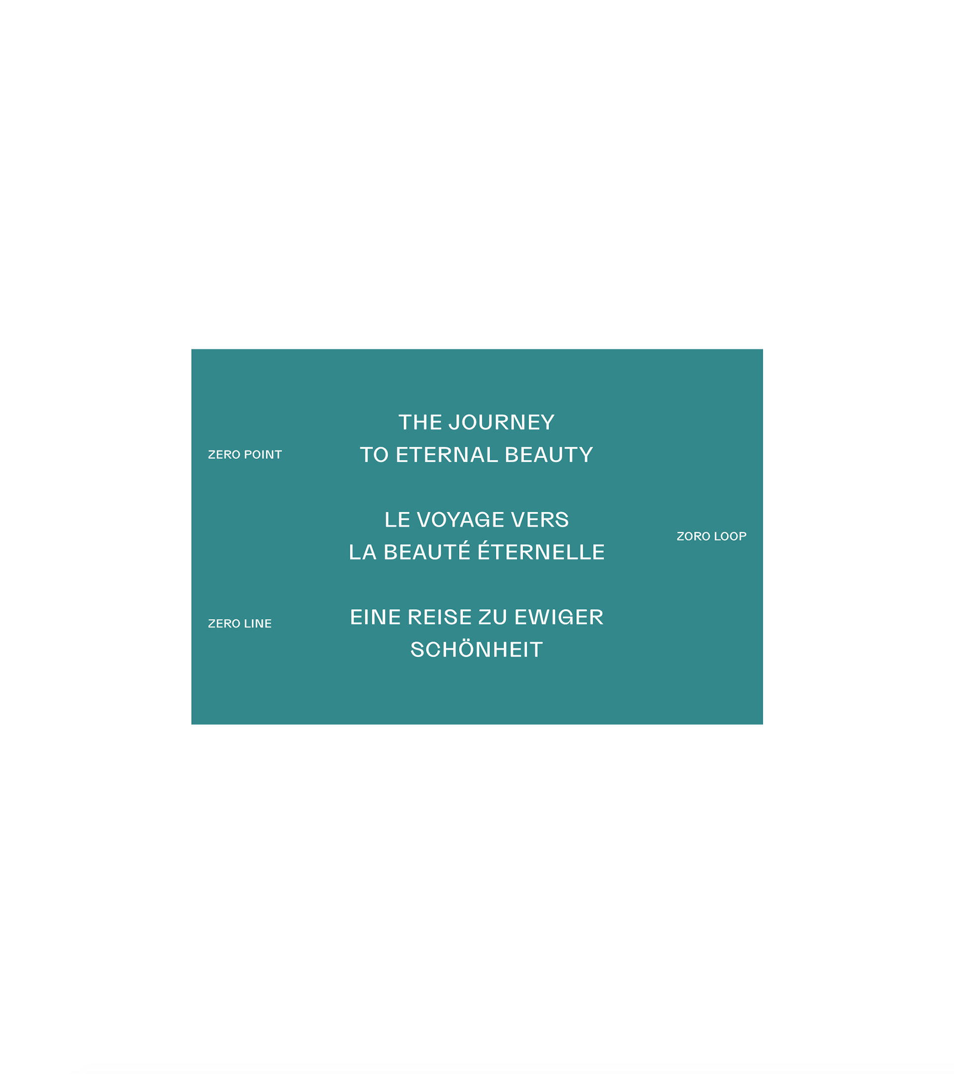
The Journey to Eternal Beauty
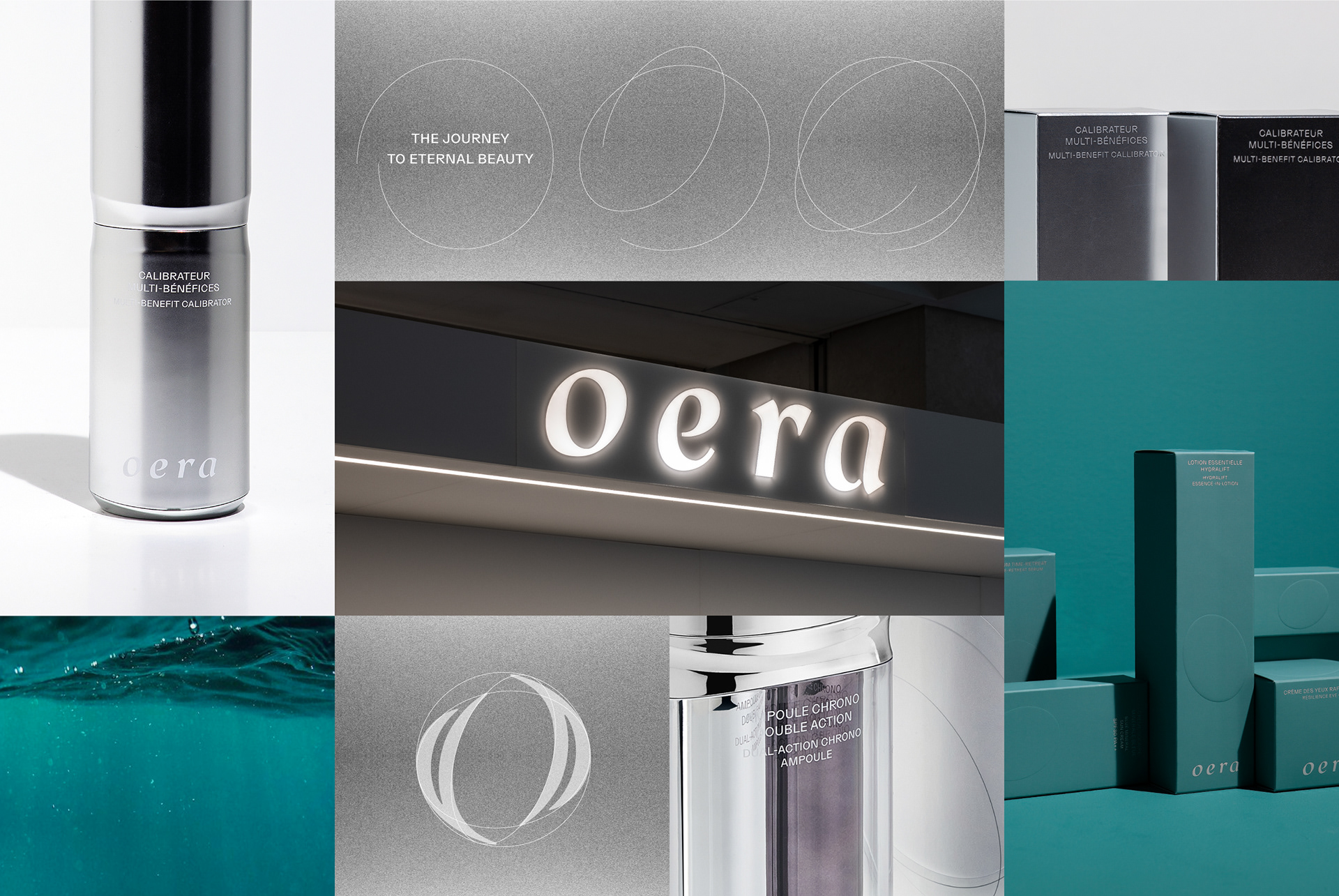
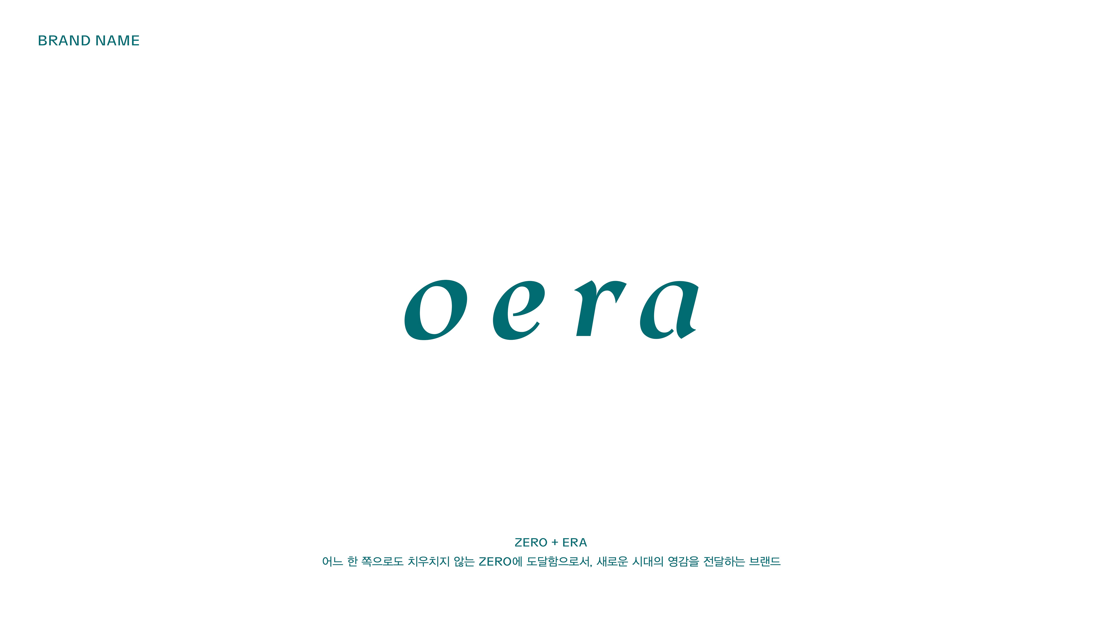
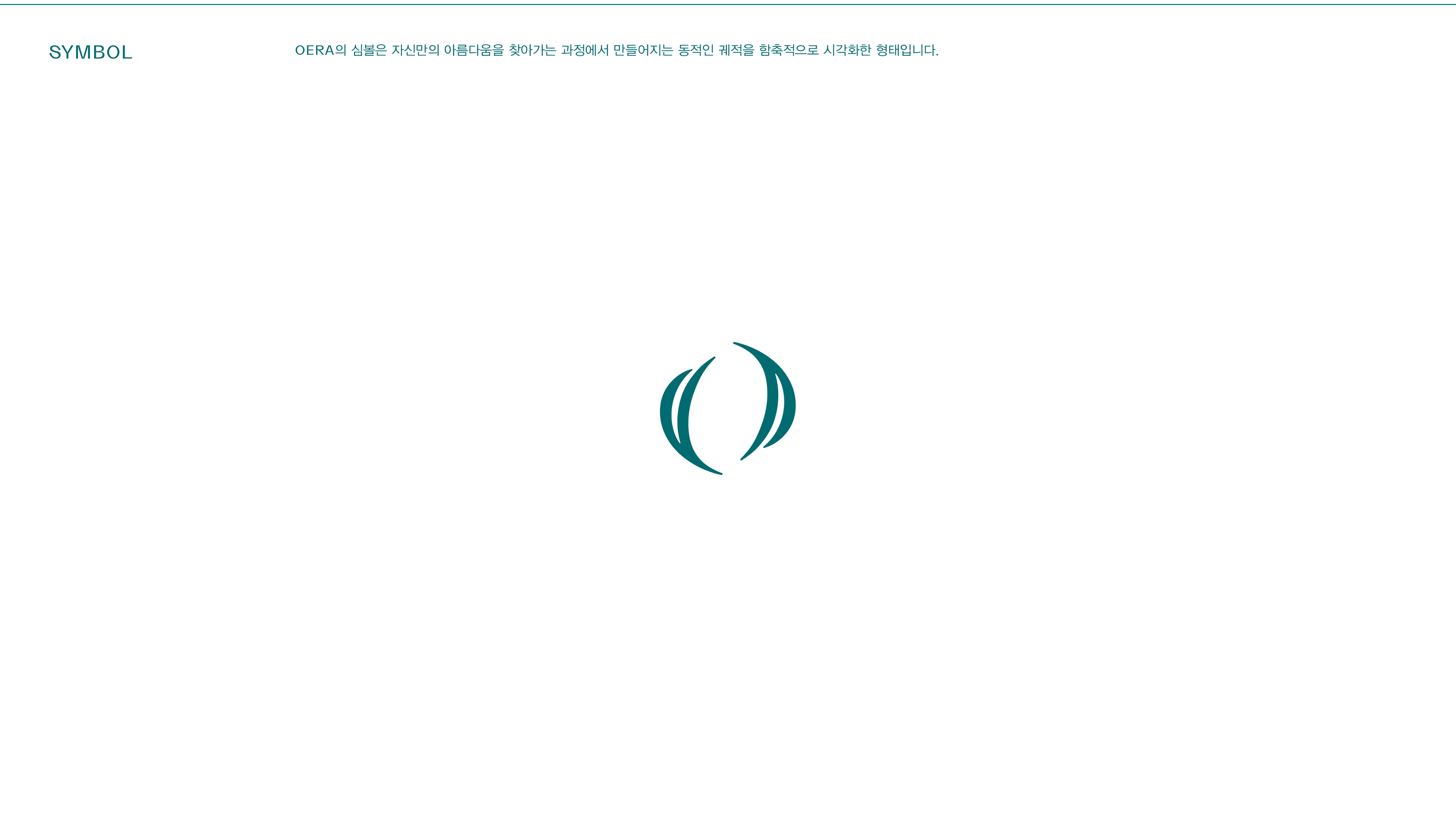
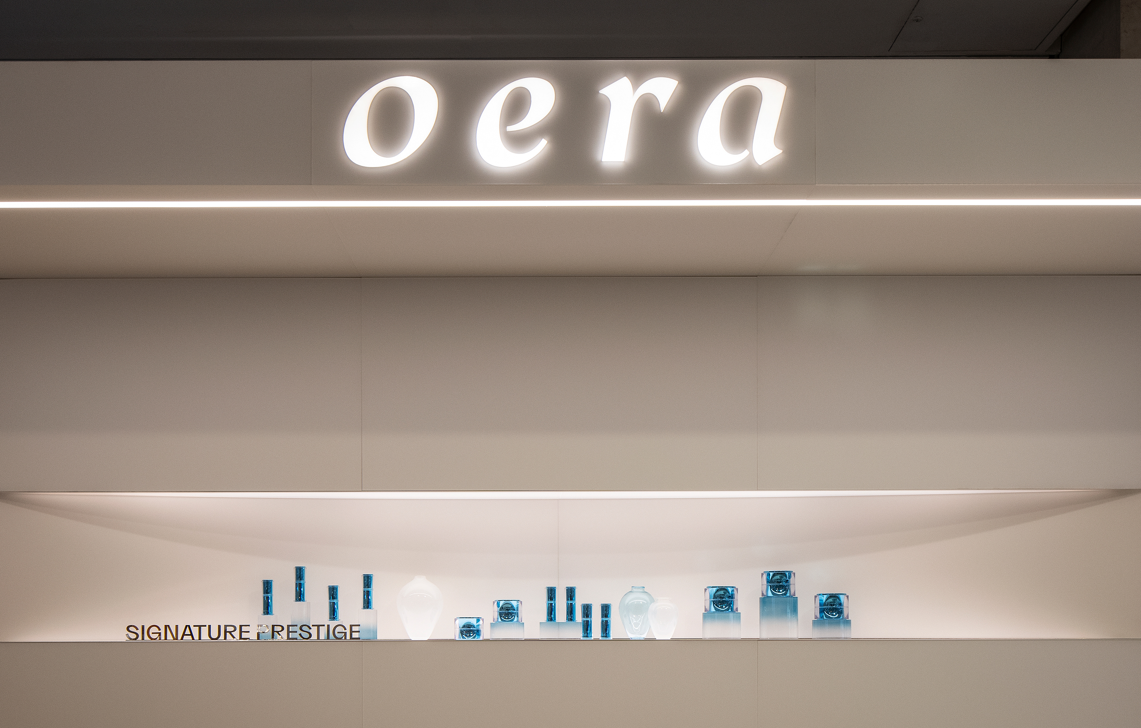
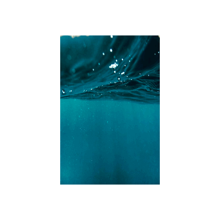
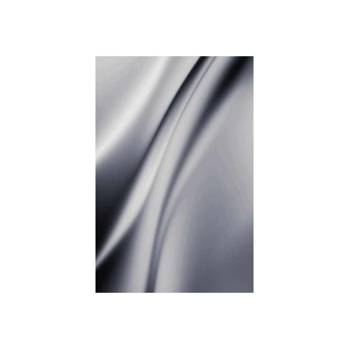
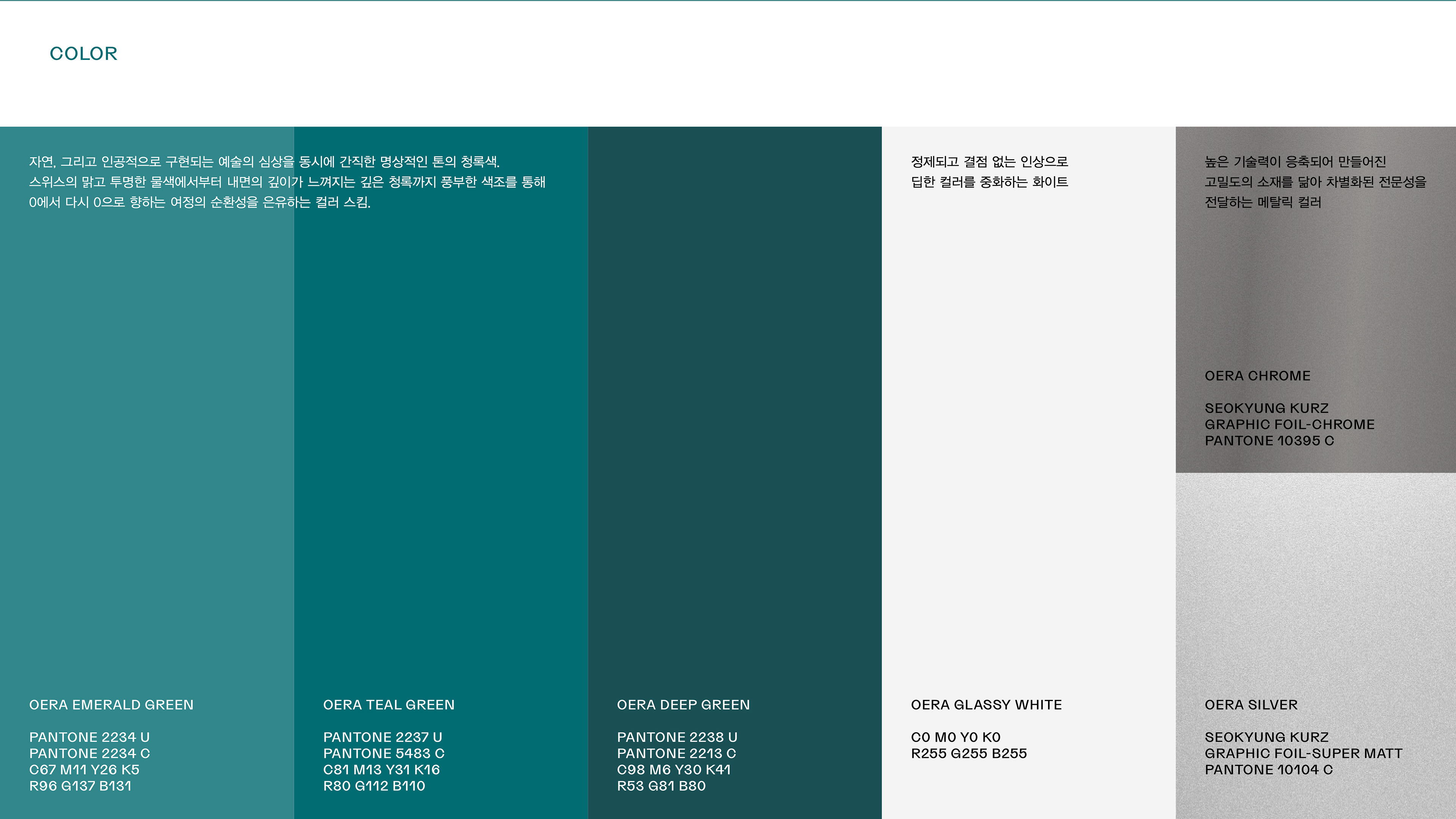
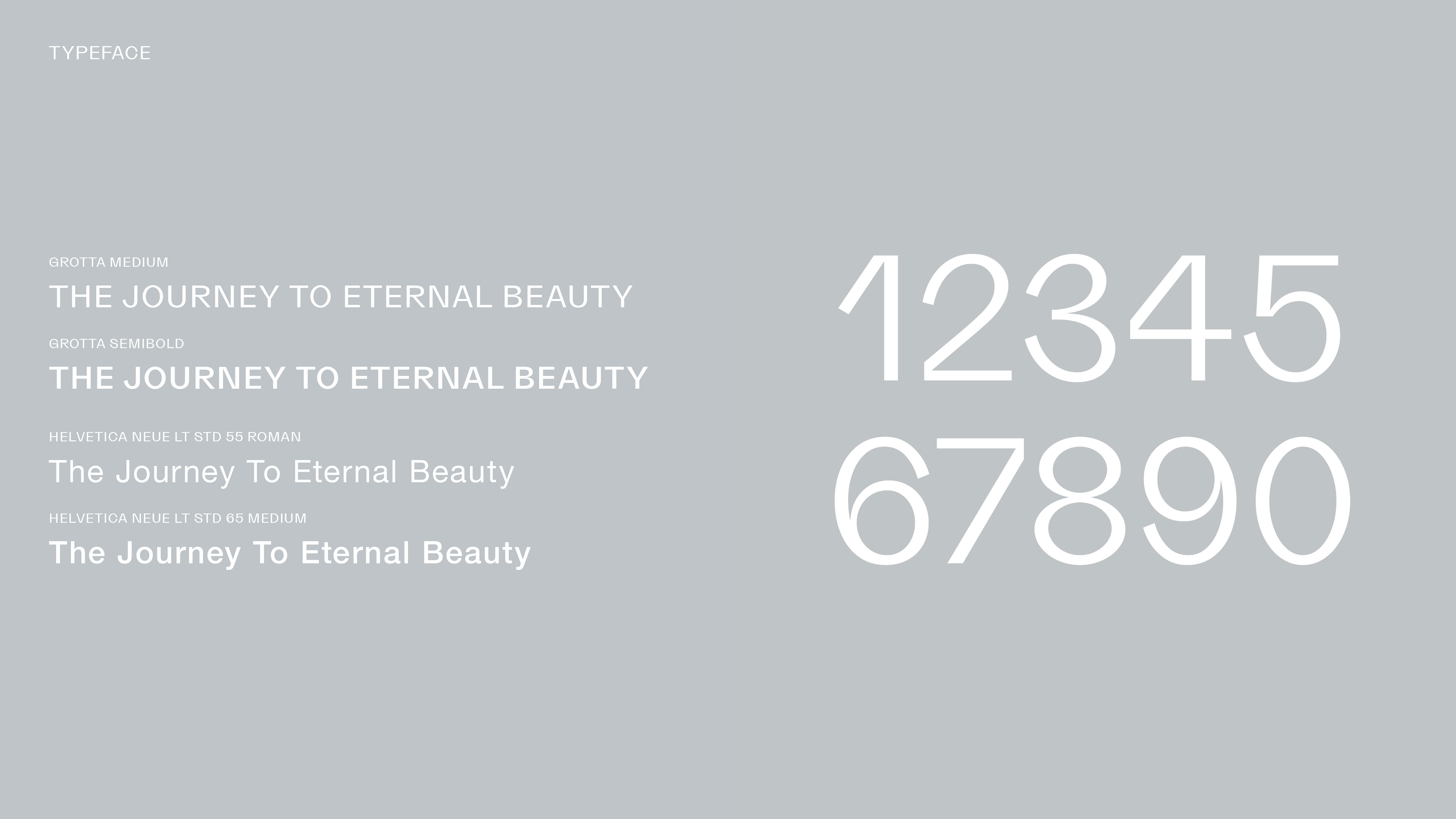
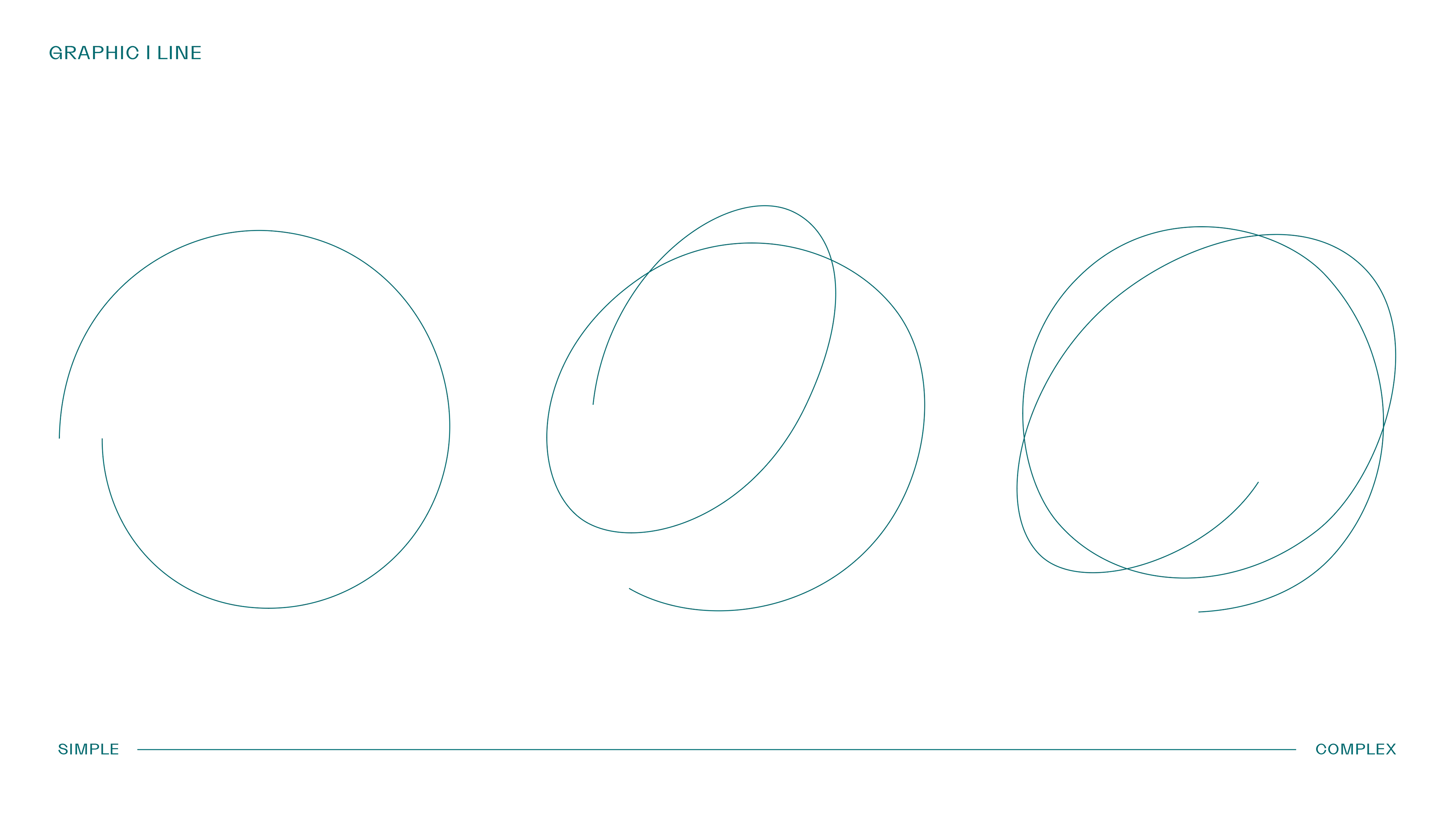
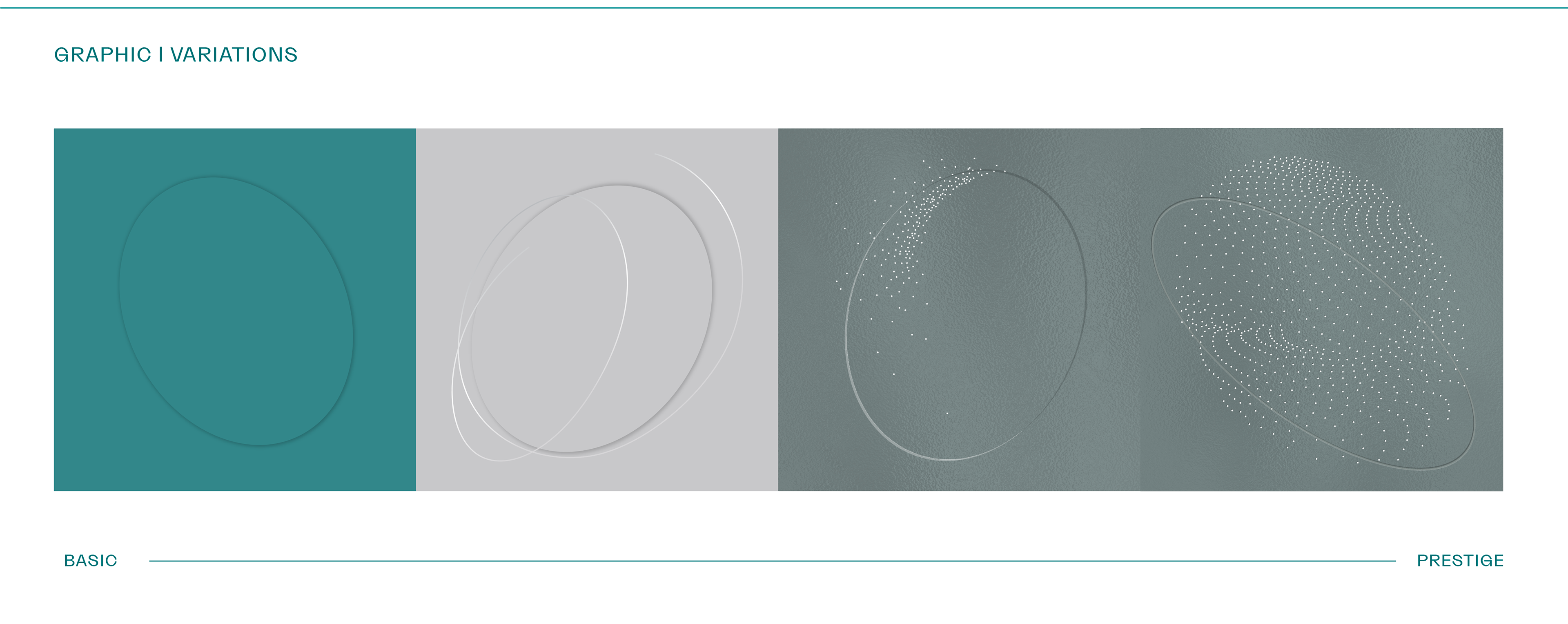
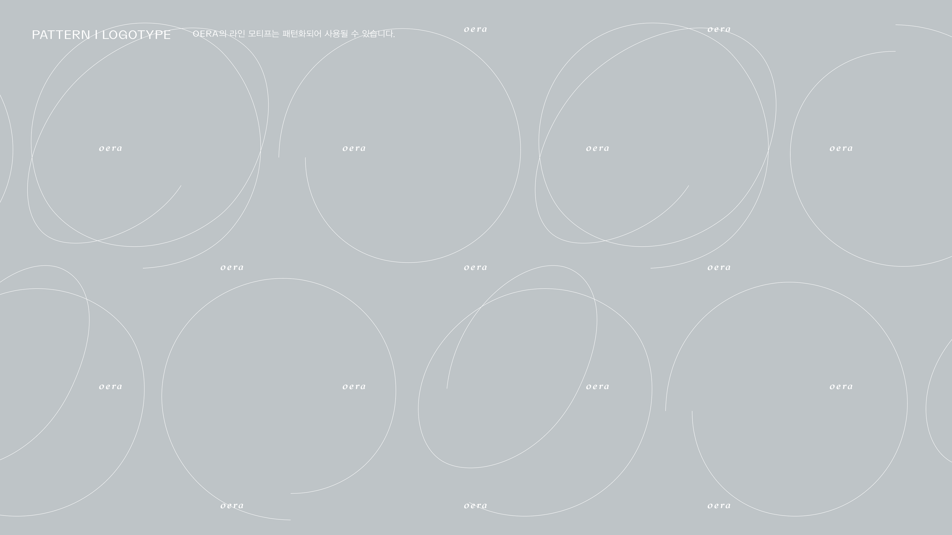
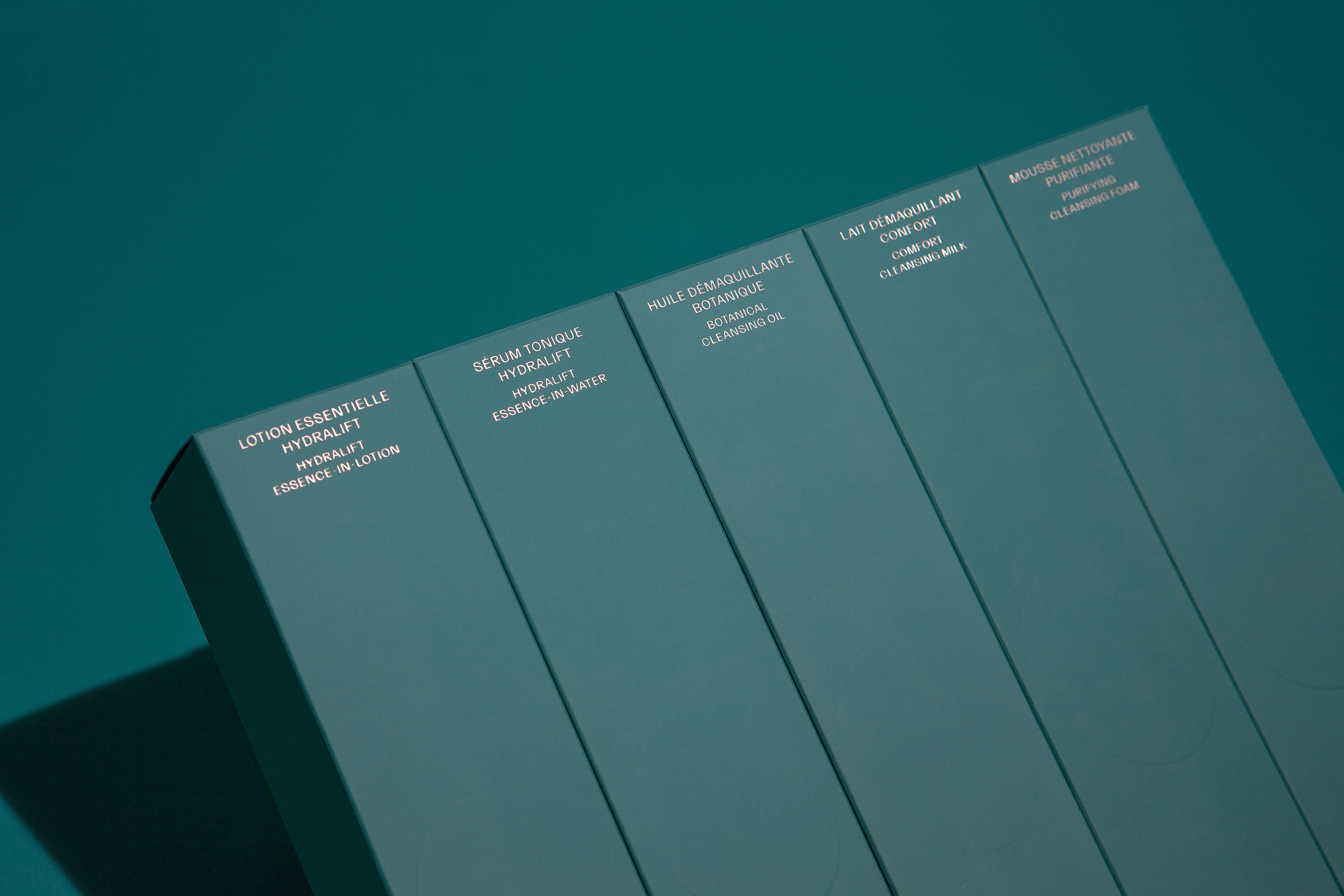
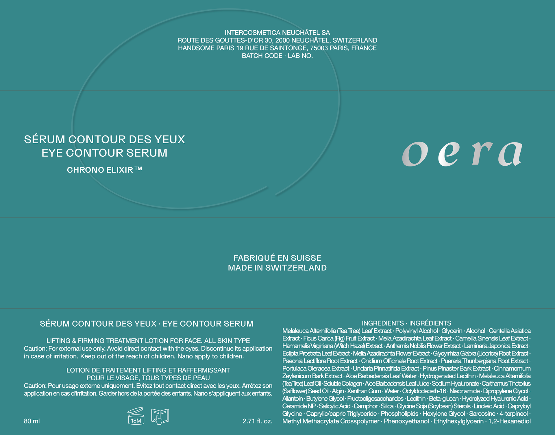
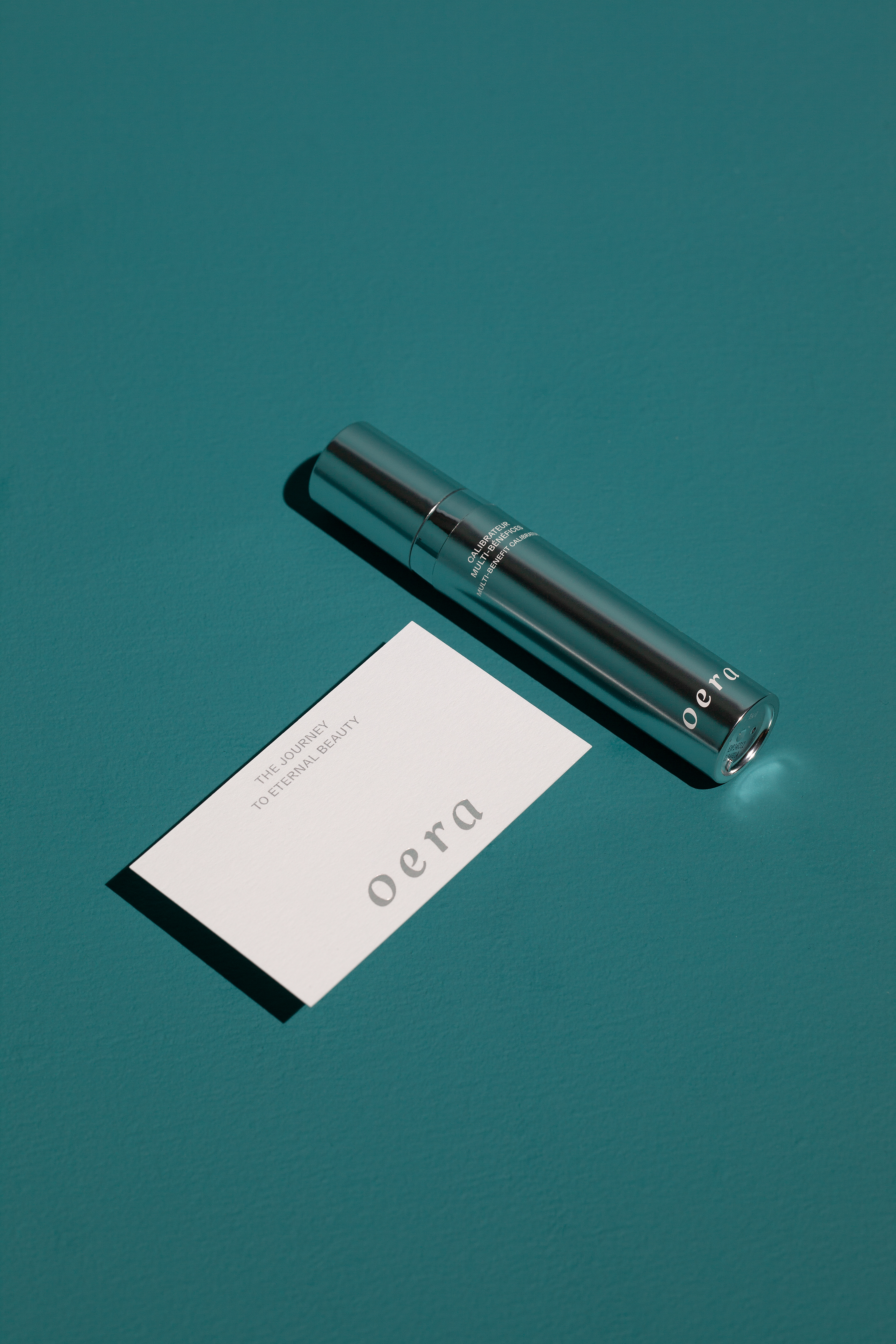
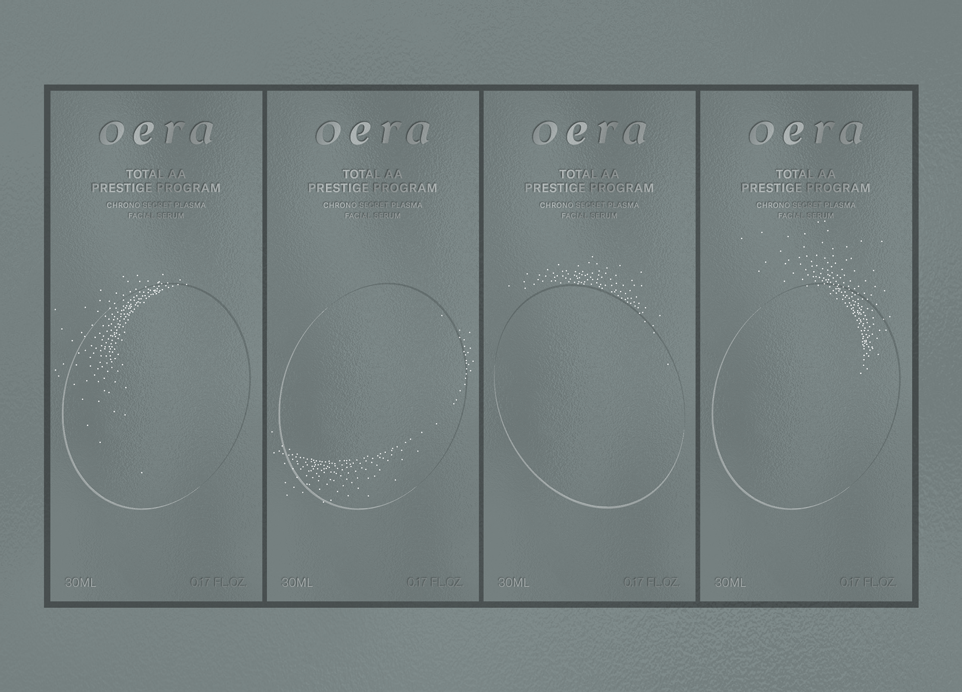
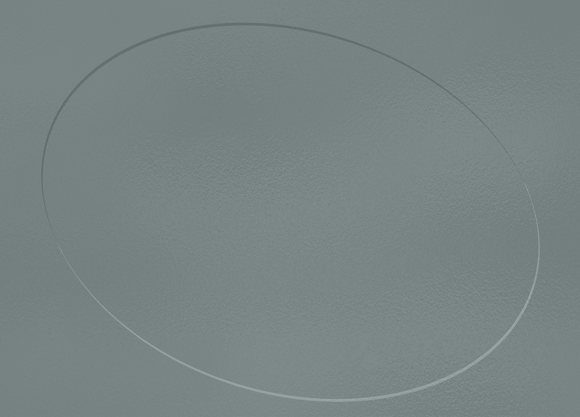
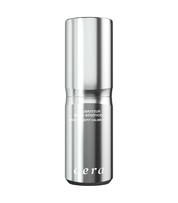
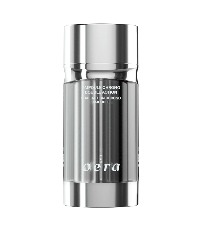
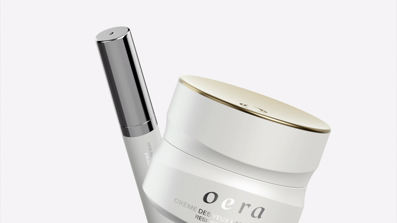
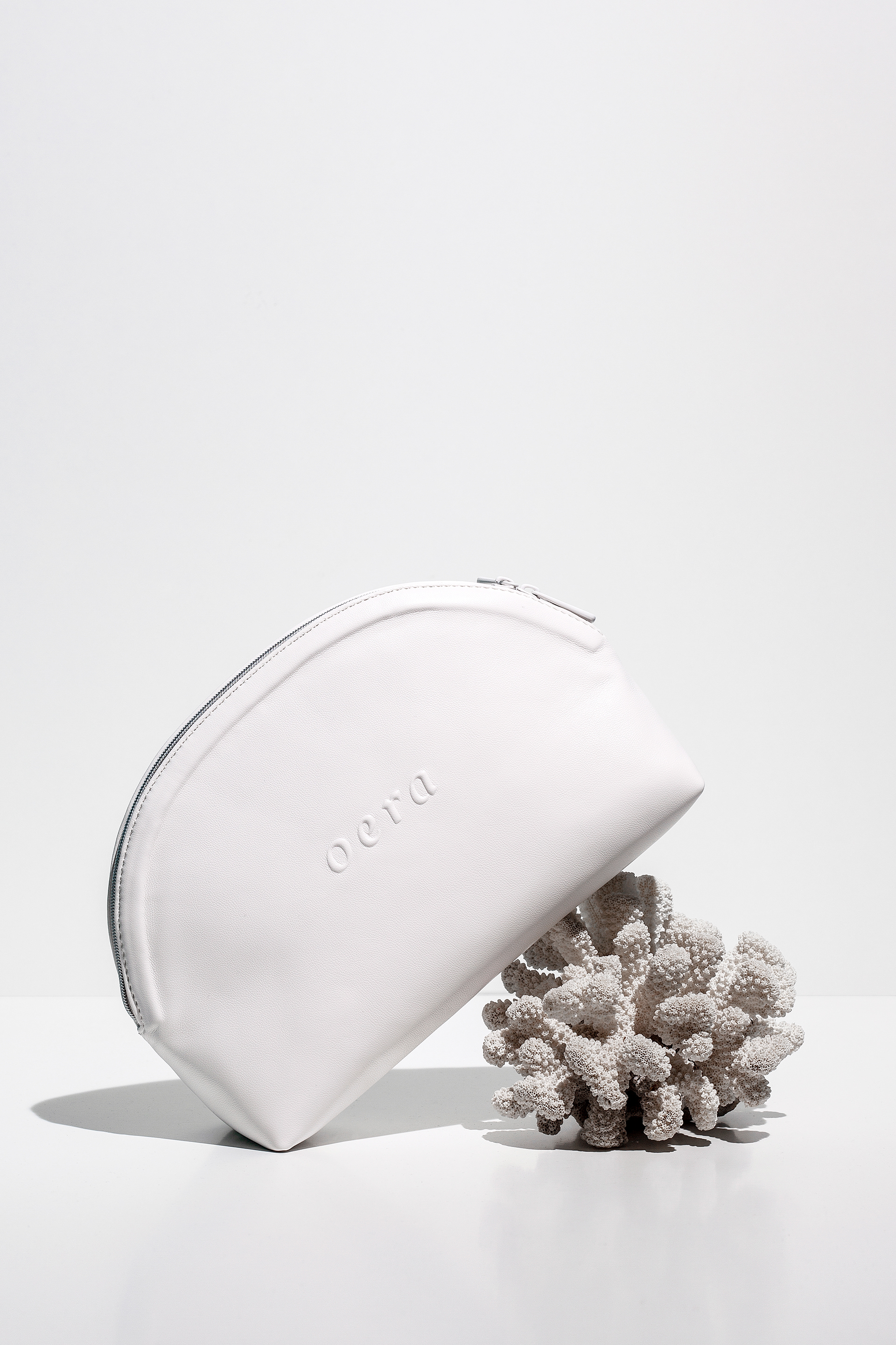
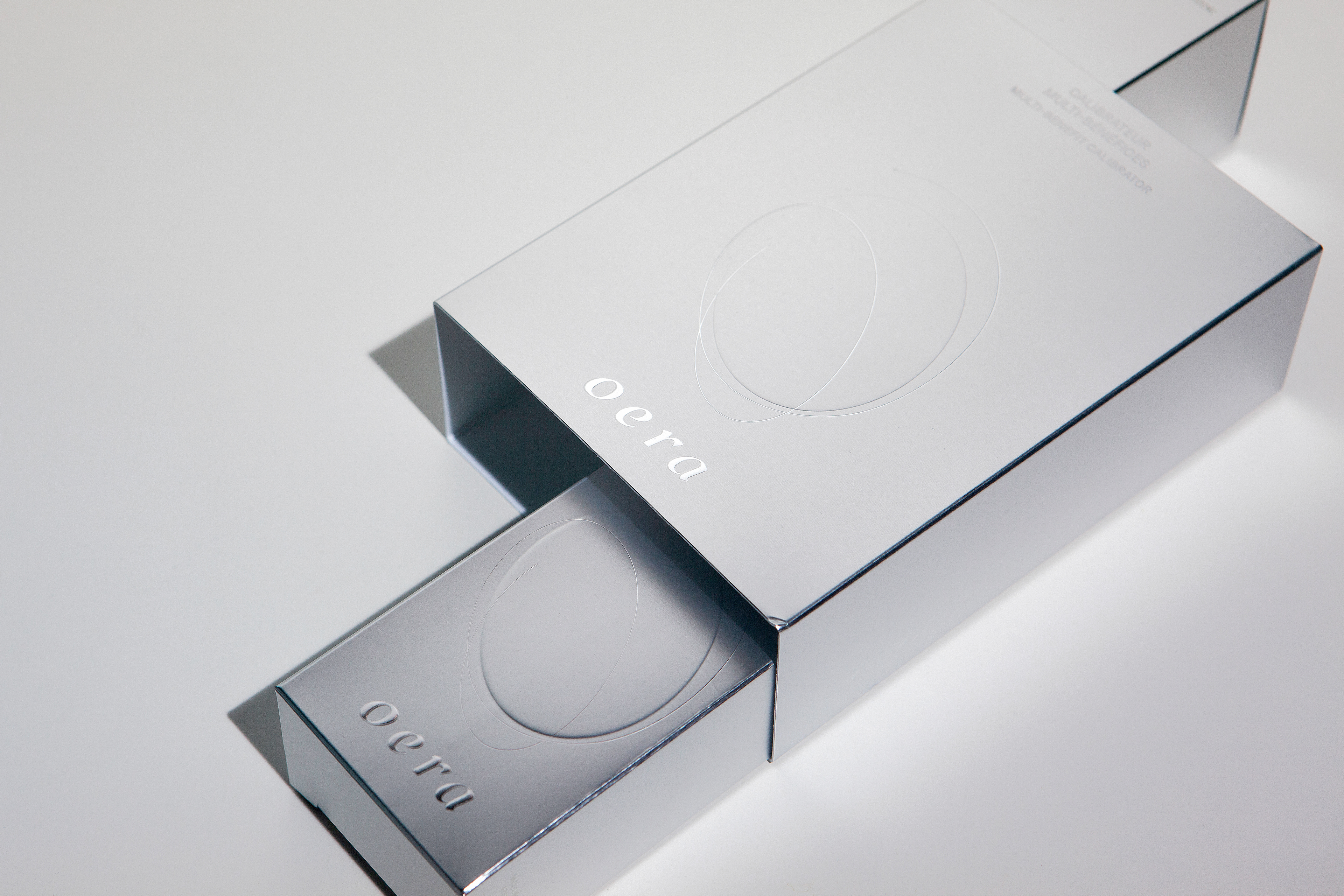
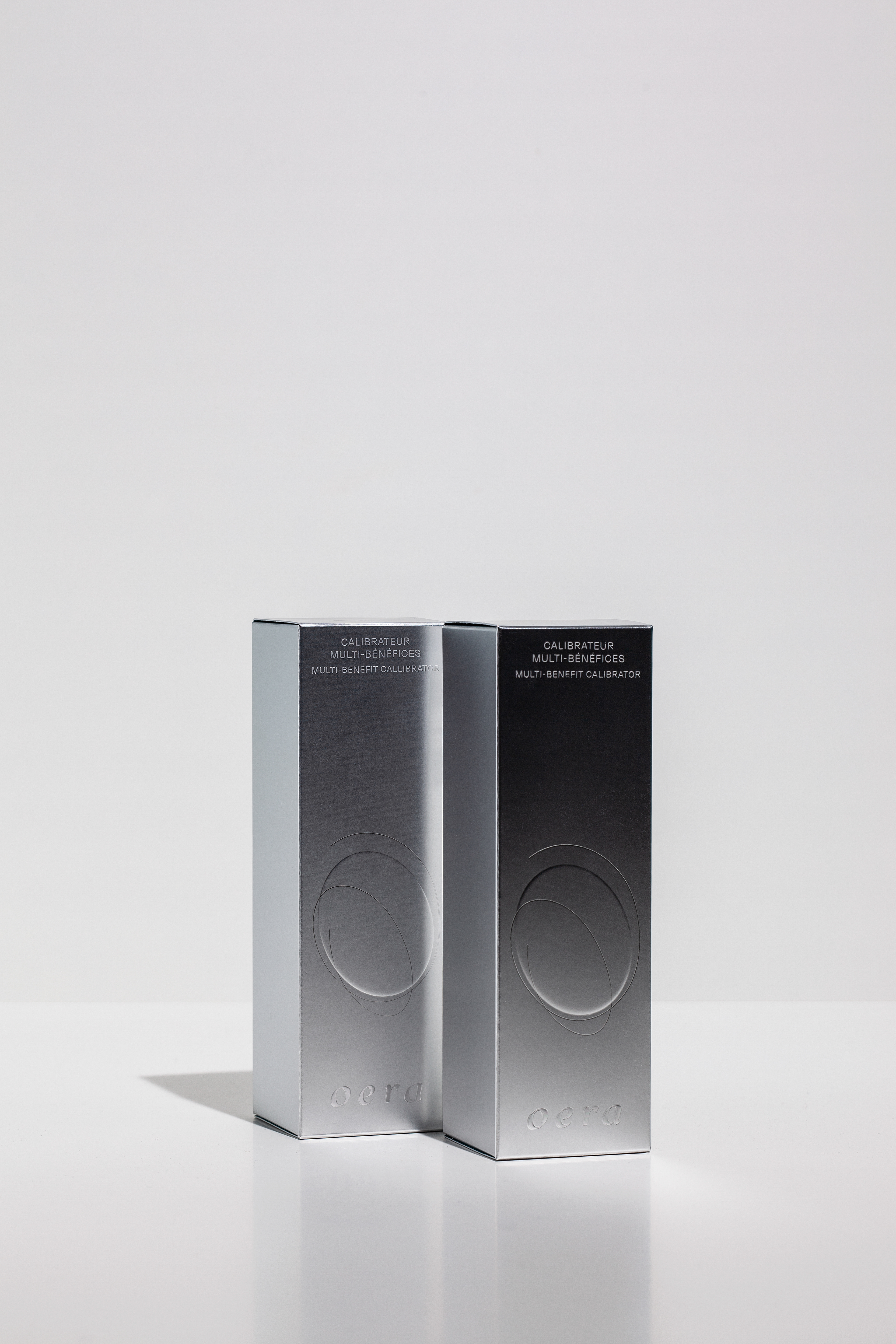
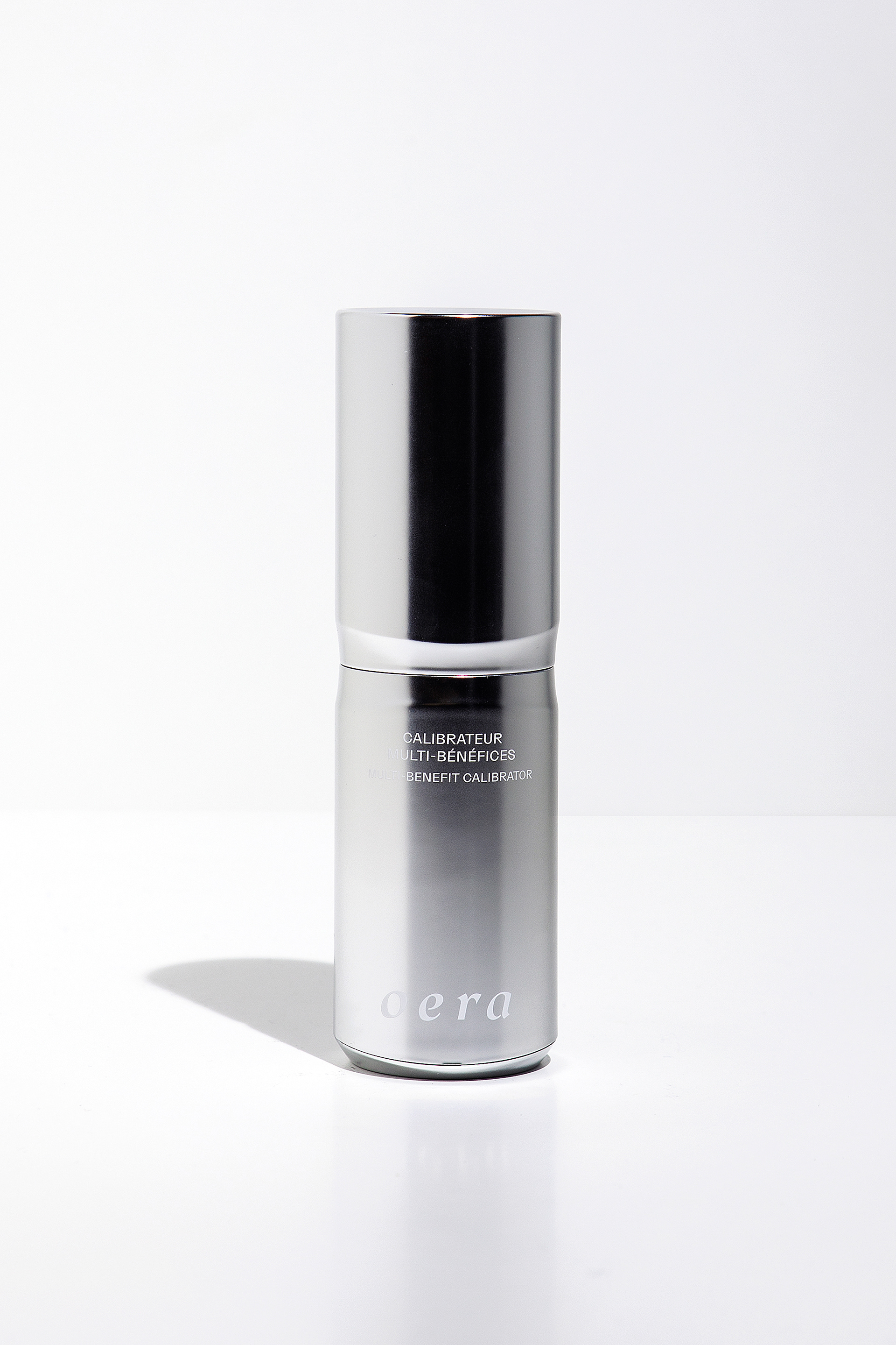
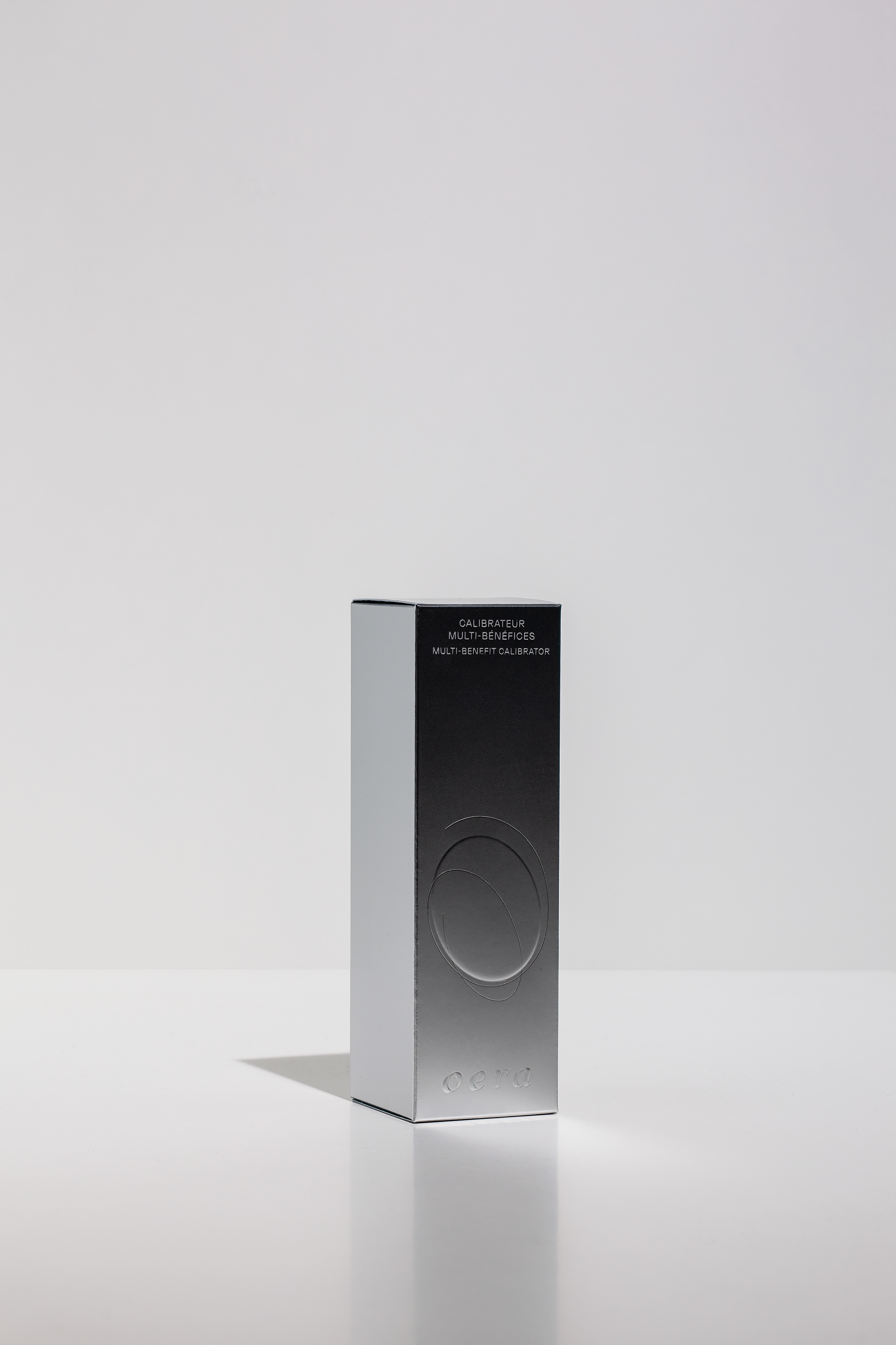
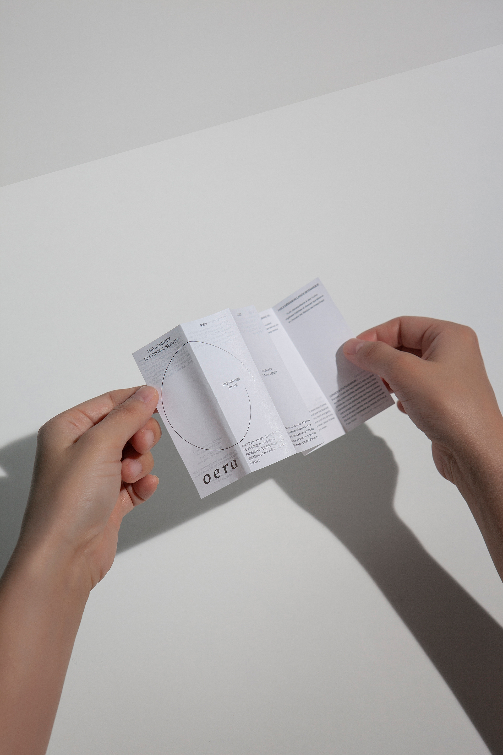
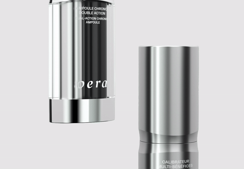
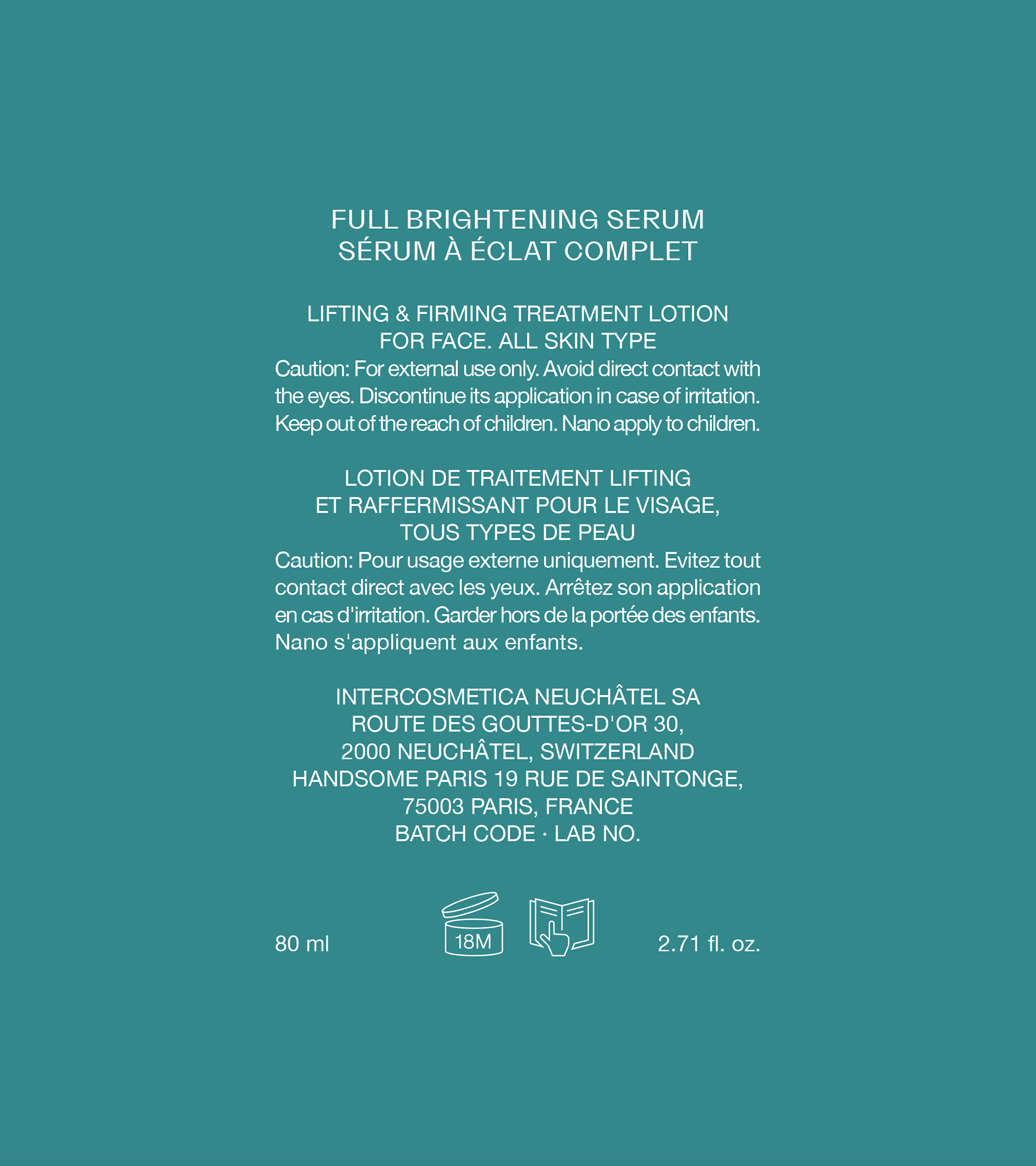
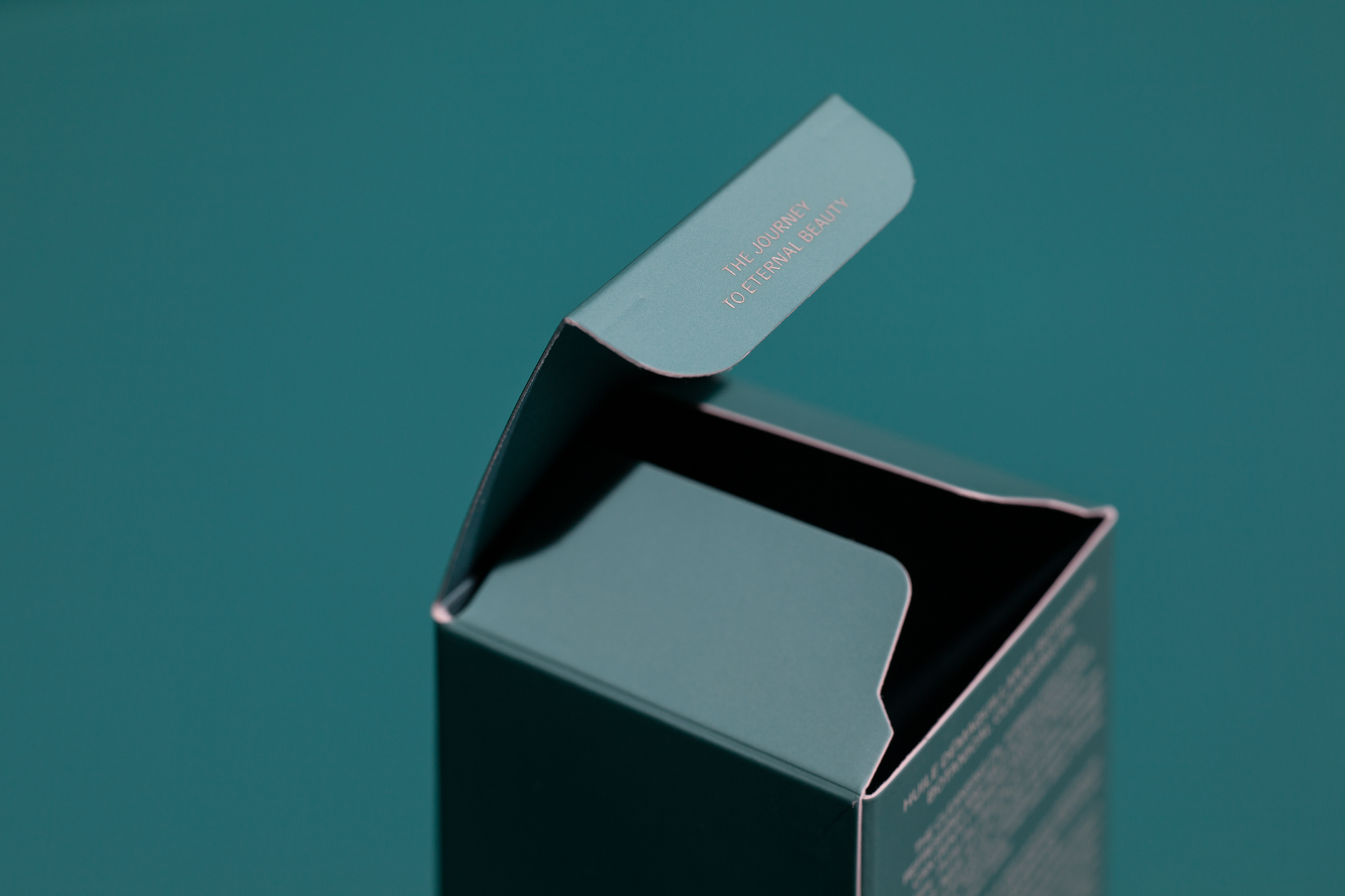
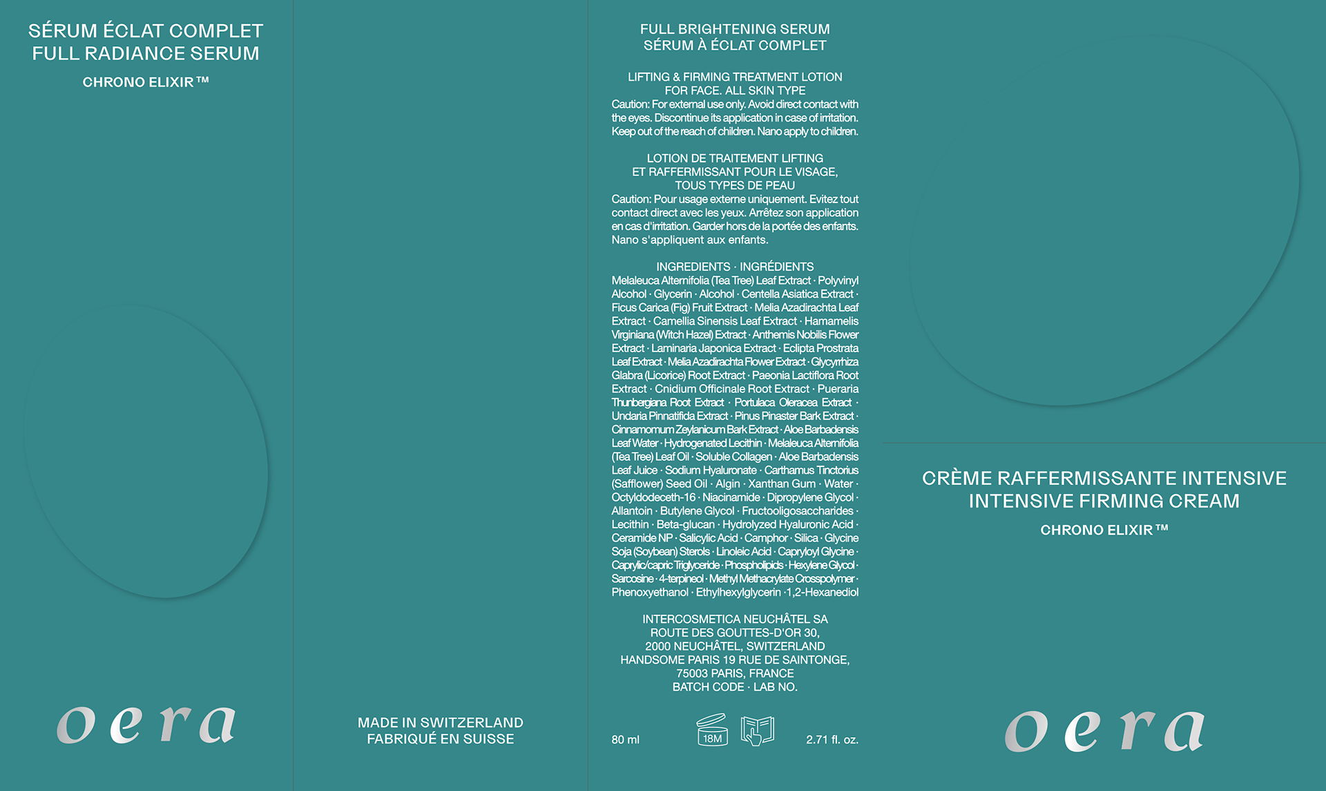
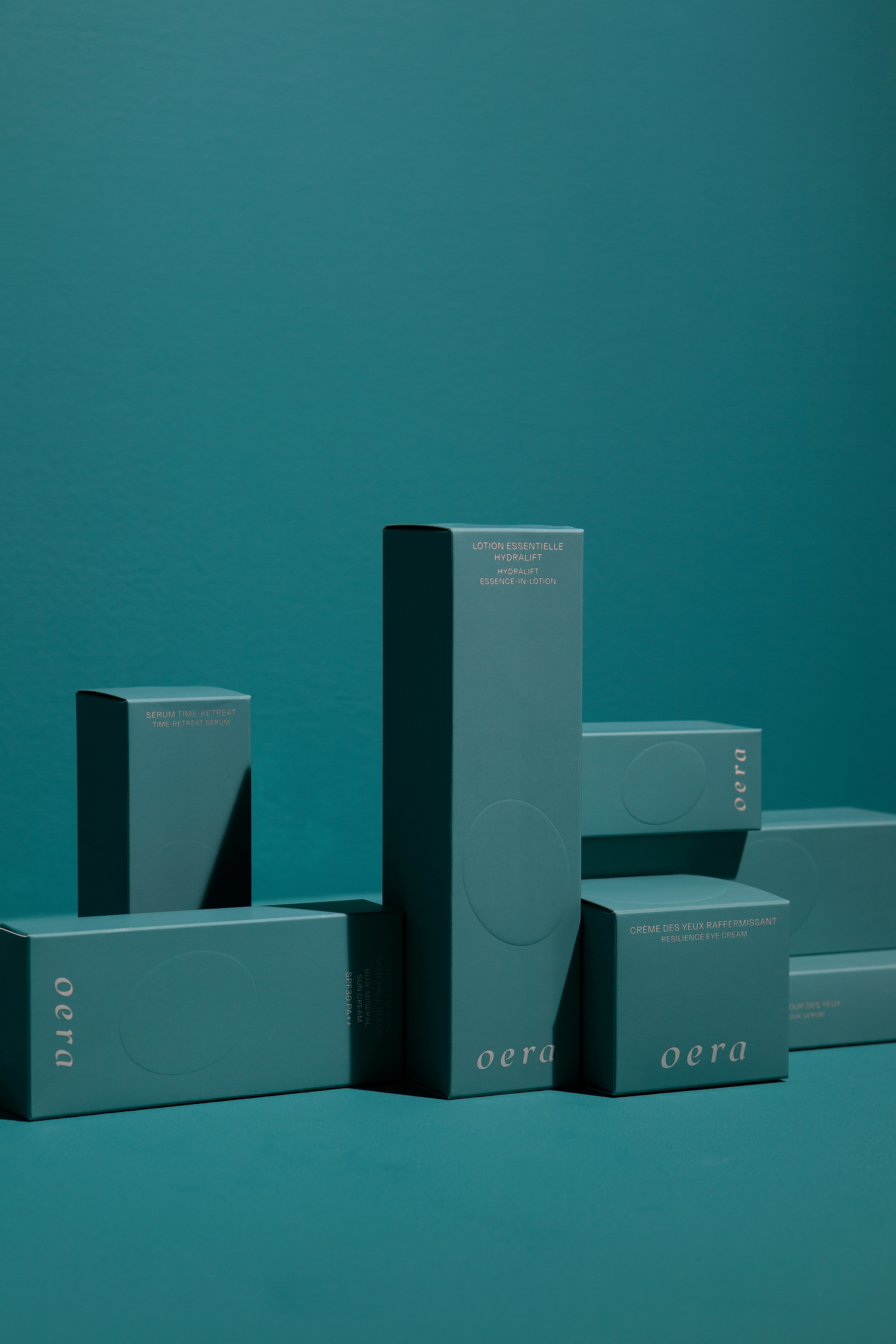
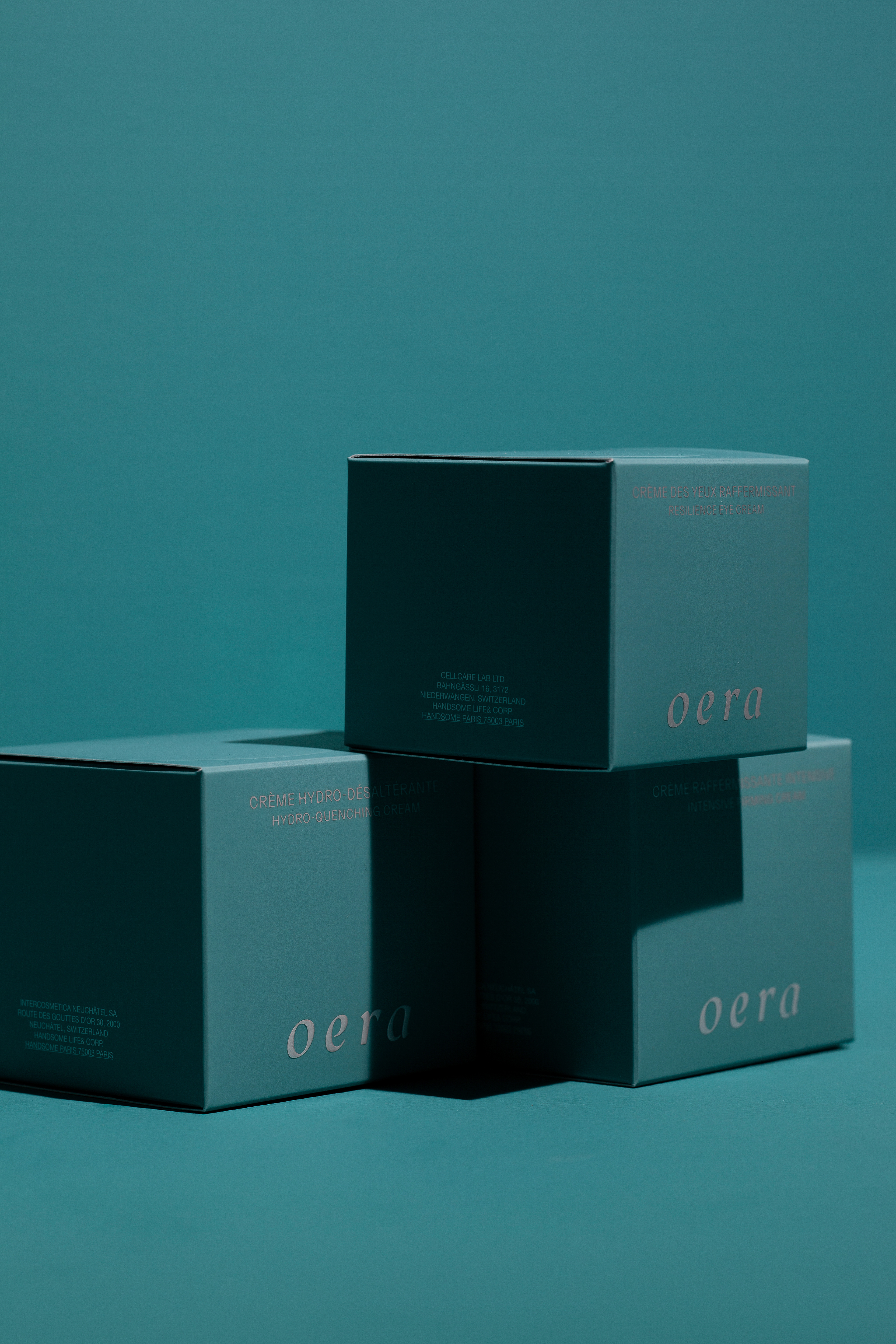
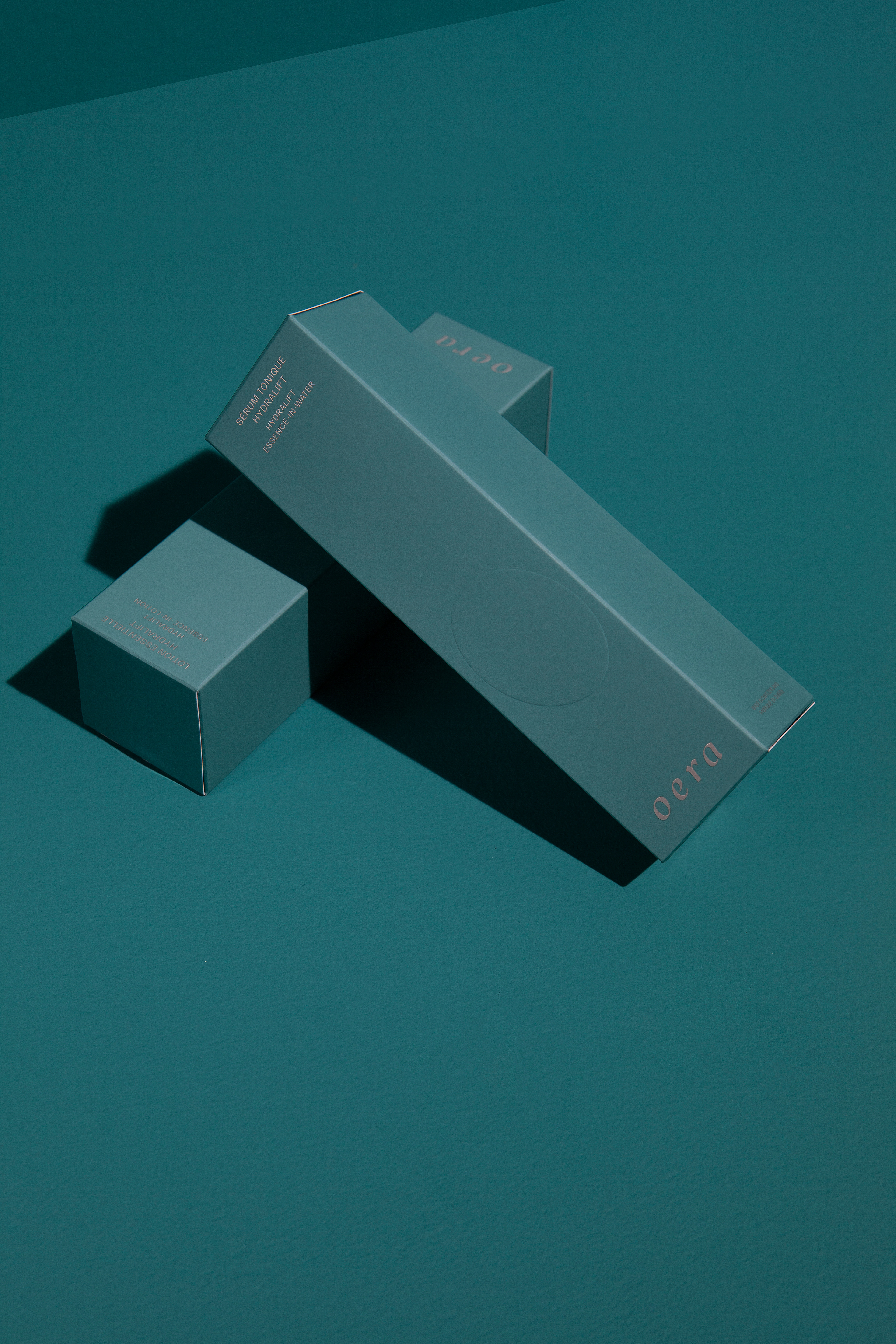
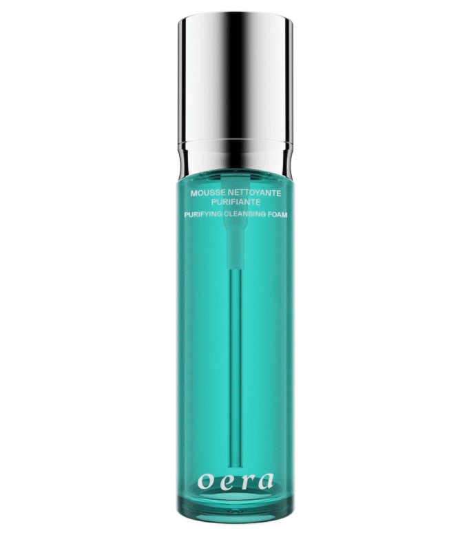
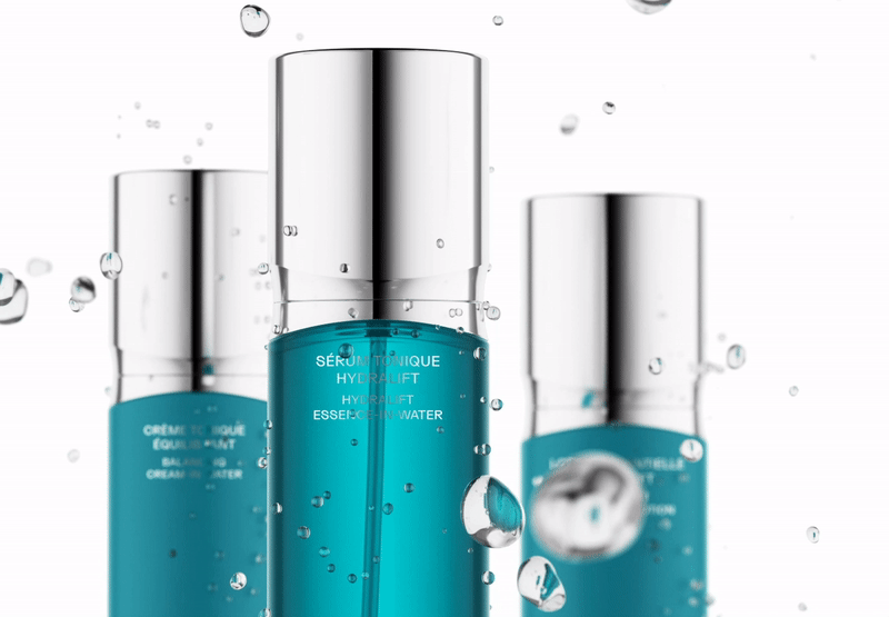
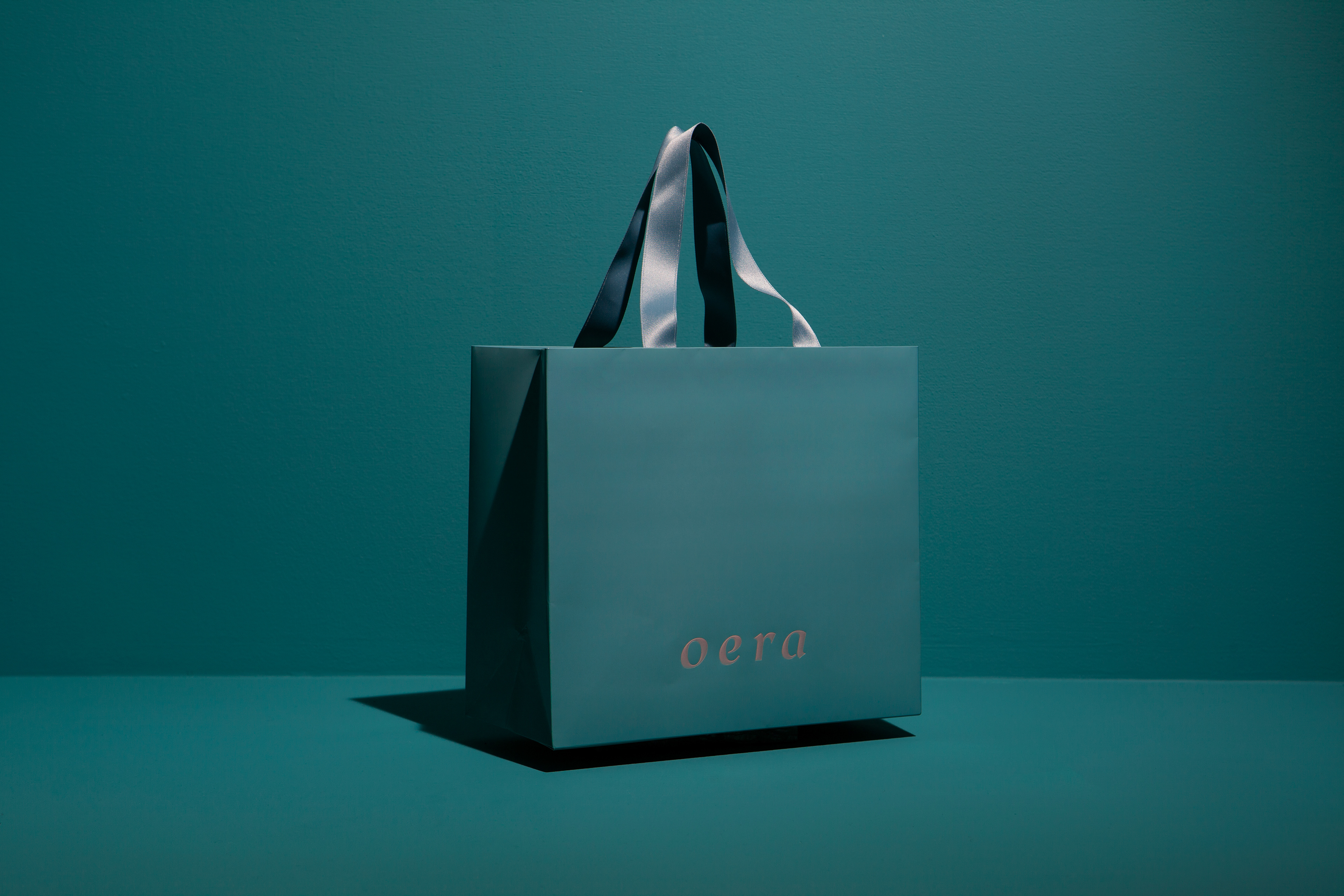
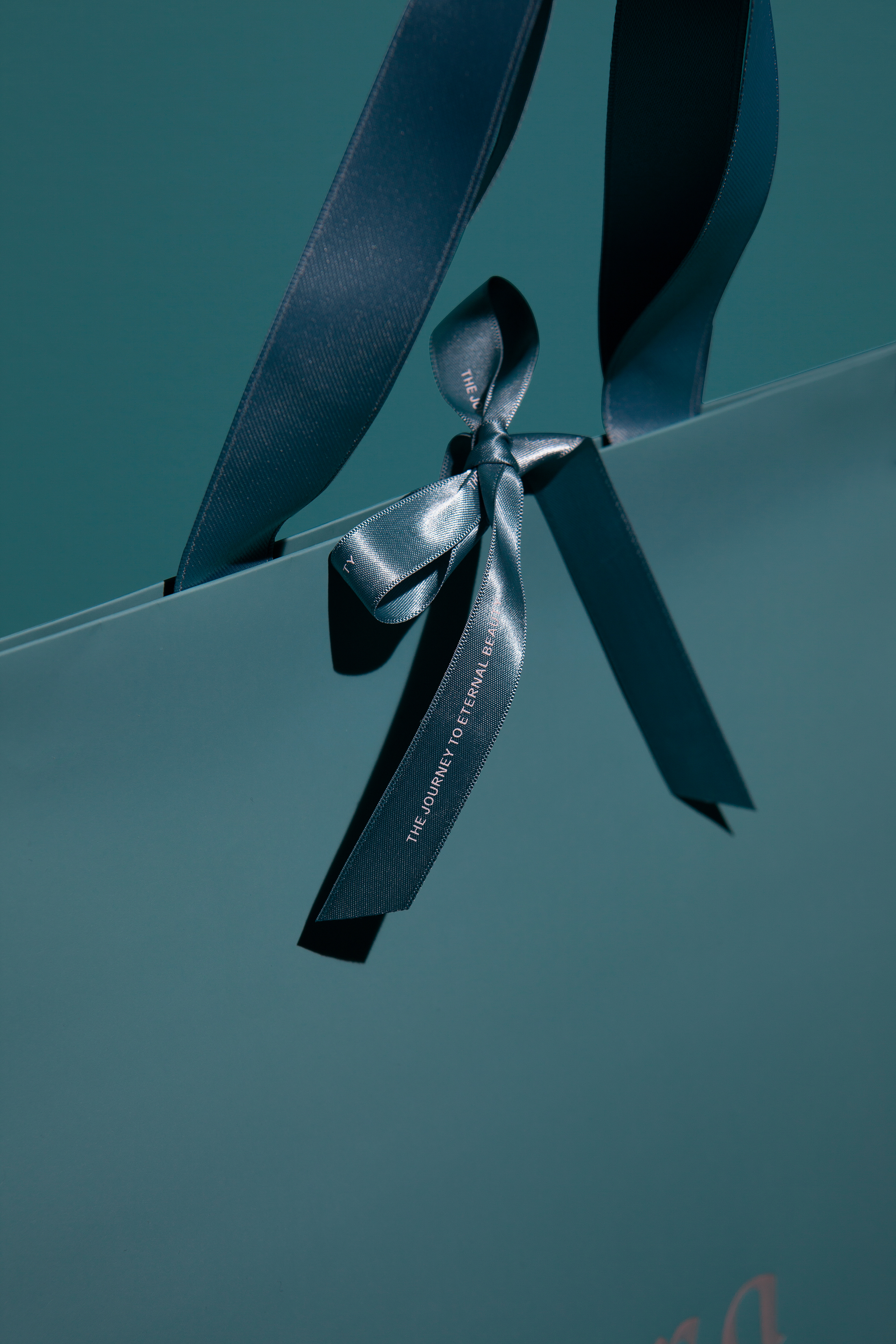
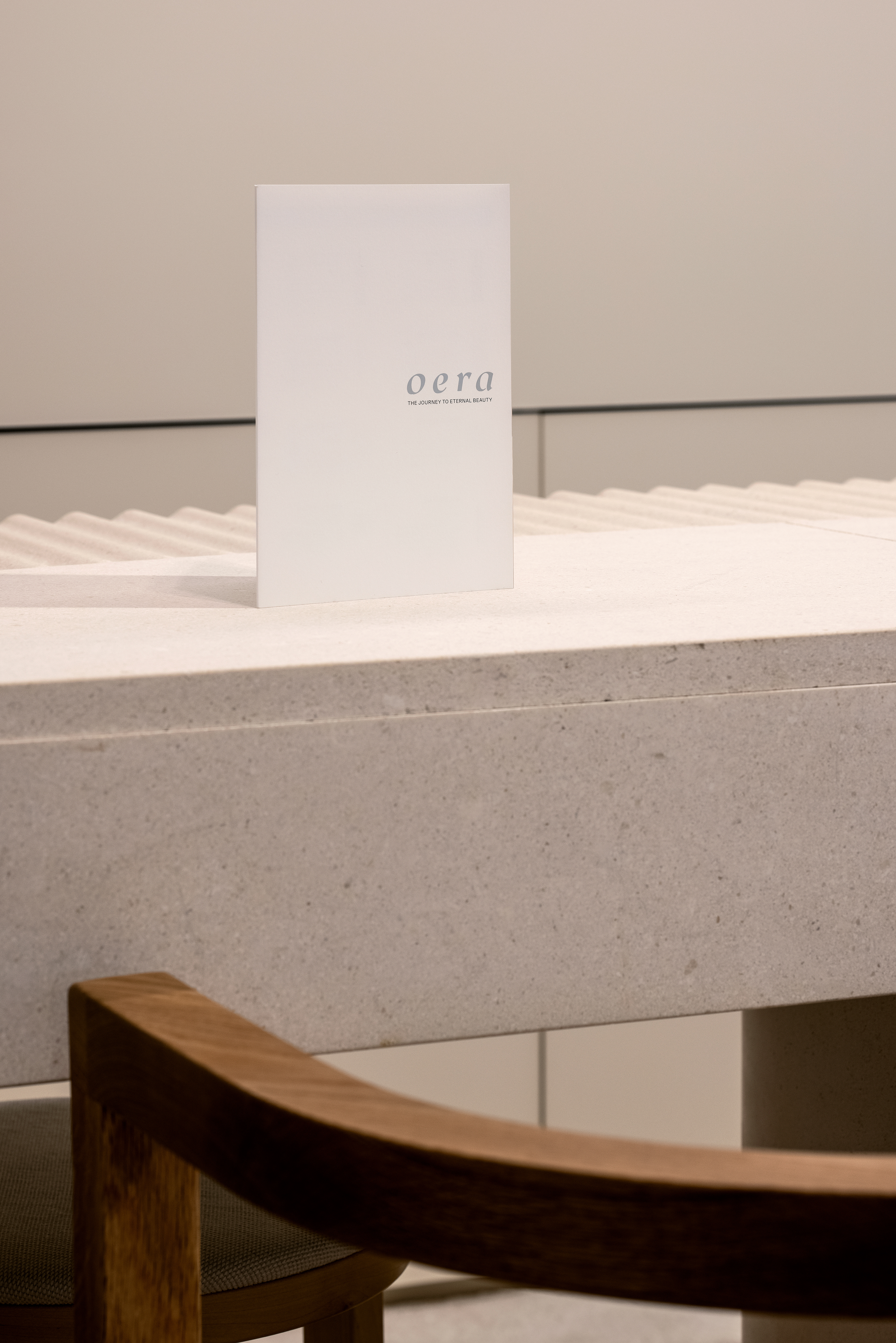
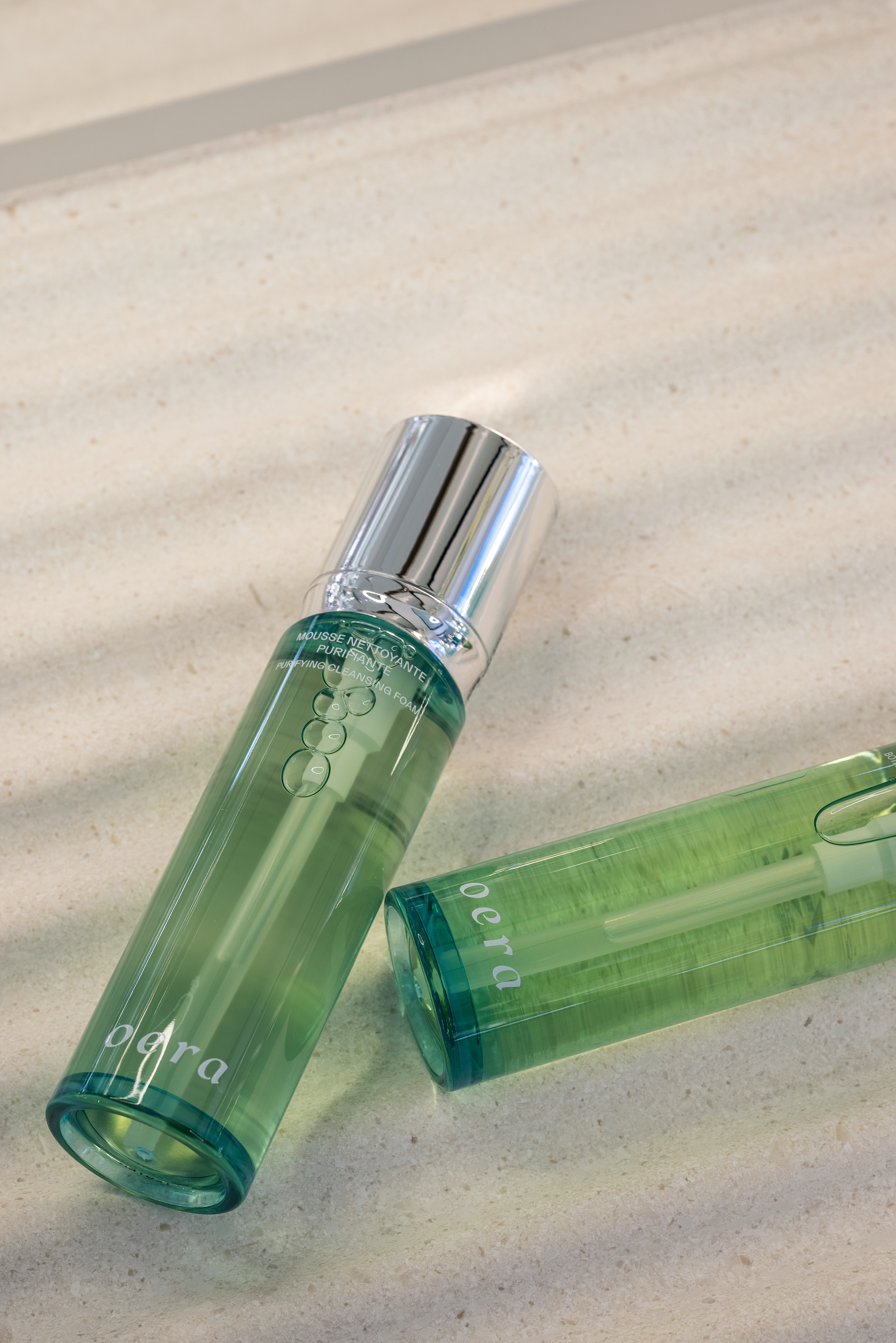
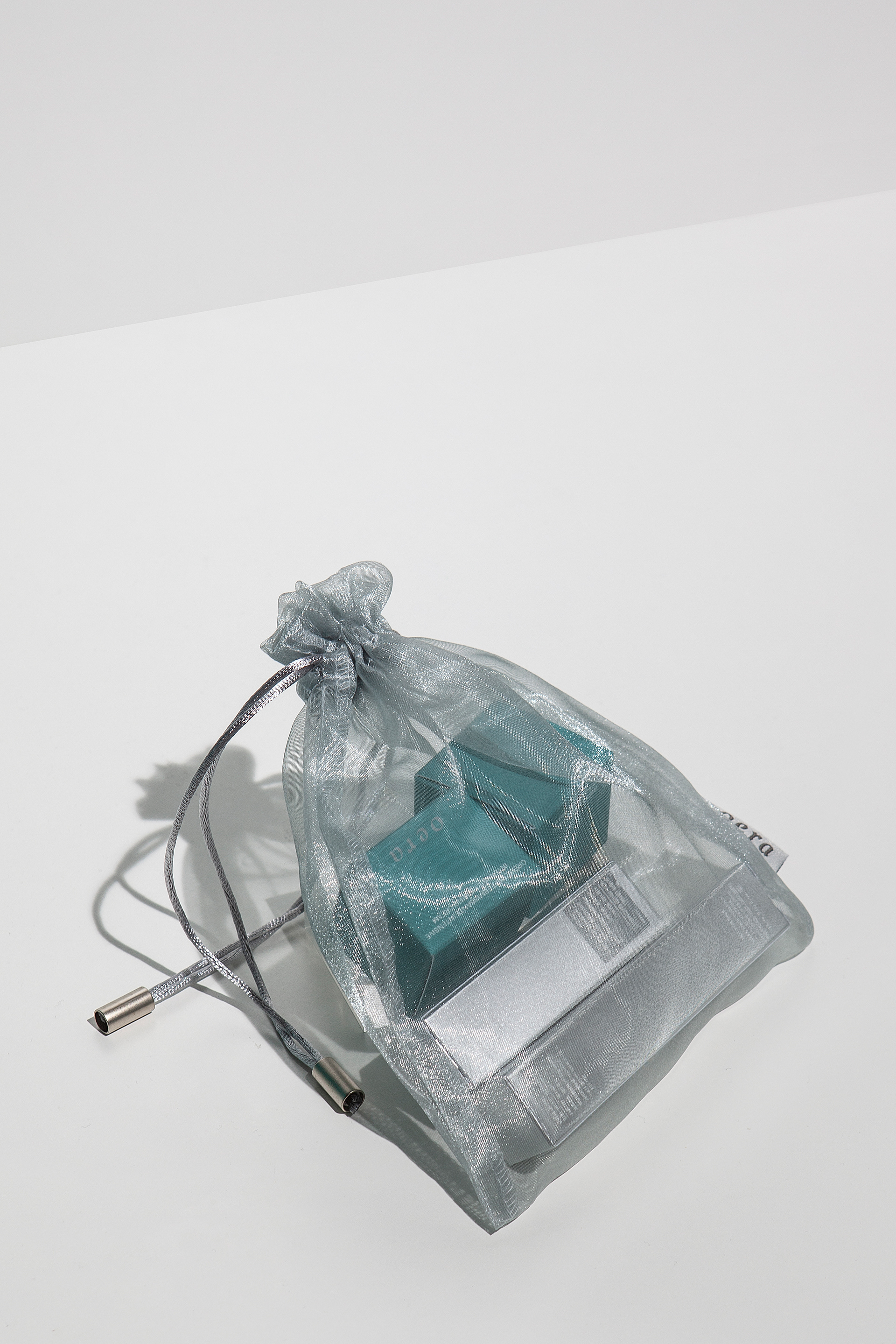
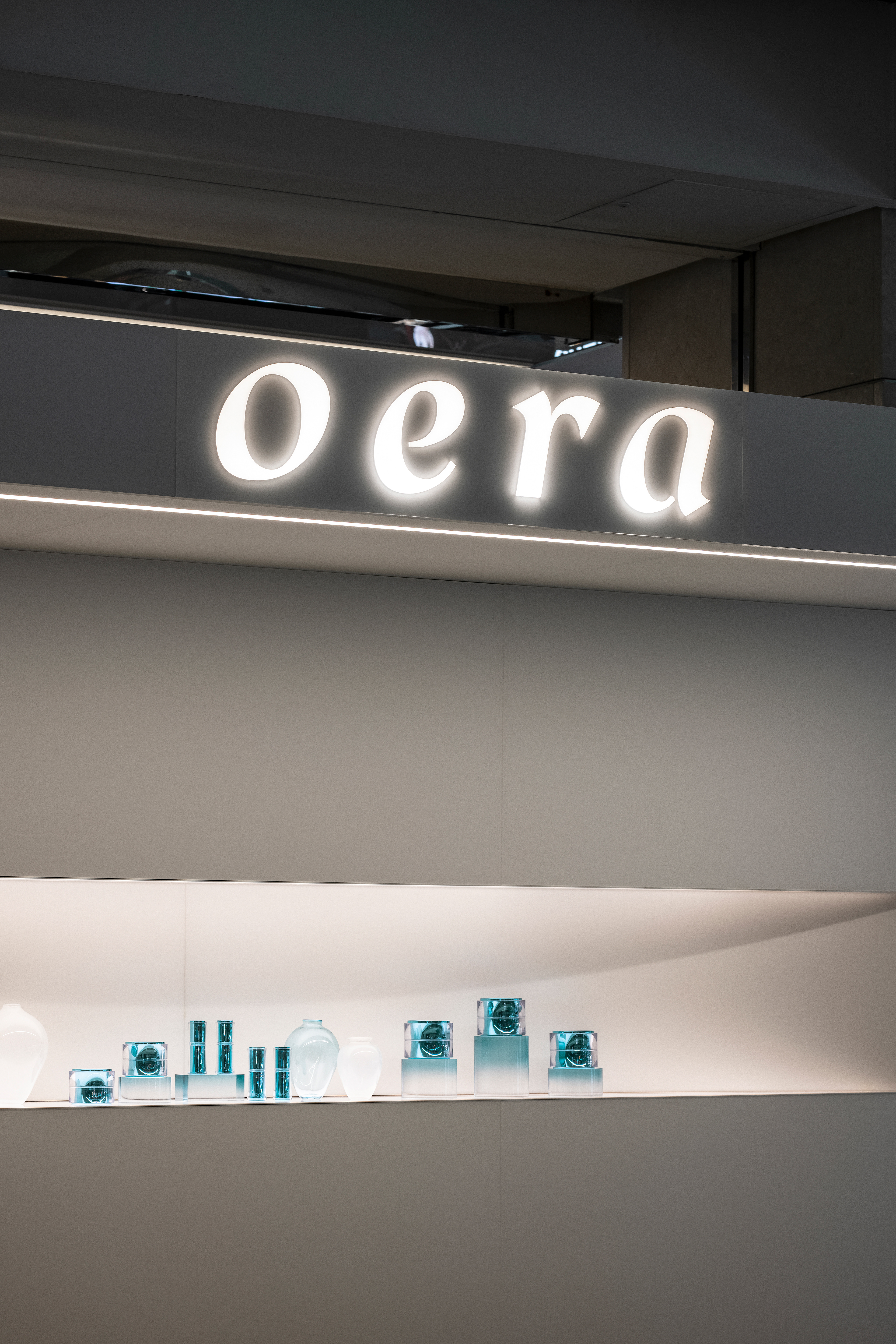
CFC developed a brand identity and package design system for the premium skincare brand Oera last year. The name Oera means reaching a state of zero, expressing its commitment to be a brand that inspires a new era. Being alive means that cells are constantly active. Our skin also seeks homeostasis towards a stable state. The appearance of the cells in the skin that do not stop their activities to reach balance became the motif of the design concept ‘The Journey to Eternal Beauty’. We believe perfection is not to reach, but to explore. CFC interpreted the daily journey towards beauty as a circle that constantly circulates, which is implied in Oera’s logotype, symbol, and Form Language. Inspired by the clean waters of Switzerland, the emerald-like brand color is applied throughout the package design and application to deliver an impression of elegance. Oera chrome and silver colors, which symbolize Oera's sophisticated technology, are used in the prestige lines to deliver the image of high-tech luxury.


**All the 3D Modeling images/GIFs above are designed by Design Fever and copyrighted by Handsome Life&.
Oera Brand Identity & Package Design System Dev.
2021
Client: Handsome Life&
-
Project Team
Project Direction & Management: Handsome Life&
Brand Strategy & Naming: Perception
BI & Package Design System: CFC
Product Design: MOJO
3D Modeling & Website Design: Design Fever
-
CFC
Art Direction: Charry Jeon
BI System Design: Charry Jeon, Nara Yoon, Minsun Lee, Seyoun Kim, Saerom Kang
Package Design System & Design Application: Nara Yoon, Minsun Lee
Photography: Kiwoong Hong